| The Manhattan Art Advertisements Inquire for Rates     
|
"The Manhattan Art Review"
Support us on Patreon
Follow us on Twitter or Instagram or YouTube
Consider buying our merch
Feel free to contact me at hankjwimbleton@gmail.com
The Manhattan Art Review does not accept unsolicited submissions.
The Manhattan Art Journal is Now Available
The Manhattan Art Review is participating in the Fractured Atlas Spring Match campaign
Sean Tatol:
| The Manhattan Art Advertisements Inquire for Rates
|
Editorials
The Manhattan Art Review's Best & Worst Art Shows of 2023
A Museum Roundup & The Gober Show
It's Pablo-Matic: Picasso According to Hannah Gadsby @ Brooklyn Museum
The Manhattan Art Review's Best & Worst Art Shows of 2022
KIRAC Episode 25, Male Love
The Painter's New Tools @ Nahmad Contemporary, Manhattan @ Claude Balls Int
Art and Money
Why Does The Whitney Biennial Suck So Much?
Jasper Johns
The Manhattan Art Review's Best & Worst Art Shows of 2021
A Response to Eric Schmid's Press Release for Henry Fool @ Triest
The Rules of Appropriation; Liz Magor, For Example, Liz Magor @ Andrew Kreps
Cézanne Drawing @ MoMA
The Aesthetics of the Refusal of Aesthetics, Sara Deraedt @ Essex Street (2016)
Cameron Rowland @ Essex Street
Paul McCarthy and the Negative Sublime, Paul McCarthy @ Hauser & Wirth
The Manhattan Art Christmas Movie Review Special: Notes on Eyes Wide Shut
In Search of the Worst Painting on the Lower East Side
Isa Genzken @ Galerie Buchholz, Art Club2000 @ Artists Space, Jef Geys @ Essex Street
Josiane M.H. Pozi @ Gandt
Eric Schmid @ Triest
Magnus Peterson Horner & McKinney @ Gandt
Gerhard Richter @ Marian Goodman & Lise Soskolne @ Svetlana, Park McArthur @ Essex Street, The Cleaners of Mars @ Reena Spaulings - Addendum: Notes on Psychedelic Art
Jana Euler @ Artists Space
Concerning Superfluities @ Essex Street vs. Georgie Nettell @ Reena Spaulings
Alex Da Corte @ Karma
Florian Pumhösl @ Miguel Abreu
Robert D. Scott @ The Middler
The Manhattan Art Book Review
Michael Krebber Catalogue Raisonné Vol. 1
Lillian Paige Walton - Meter-Wide Button
Emily Segal - Mercury Retrograde (The Question of Coolness)
Theodor Adorno - Aesthetic Theory - *****
Andrea Fraser: Collected Interviews 1990-2018
-----------------------------------------------------
TMAR Worldwide
Three Painting Shows by Simon Smith
Vertigo of Color: Matisse, Derain, and the Origins of Fauvism @ The Metropolitan Museum of Art by Scott Newman
Look Again: European Paintings 1300-1800 @ The Metropolitan Museum of Art by Troy Sherman
Two December Reviews by Scott Newman
TMAR Worldwide, The Introductory Reviews by Troy Sherman, Simon Smith, Quin Land, and Scott Newman
Amalia Ulman's El Planeta by Almog Cohen-Kashi
The "Worst" by Almog Cohen-Kashi
The Manhattan Art Comic by Andrew Newell Walther
-----------------------------------------------------
Kritic's Korner
Key
***** Great
**** Good
*** Okay
** Bad
* Awful
4/12/2024
Wiley Guillot, Nicholas Verstraeten - Kayemes - ***.5
At first blush this stuff is way too cute for my tastes, but on closer inspection it quickly becomes clear that their intertwined processes of little sticker drawings of hearts, flowers, clouds, squiggles, etc., are the surface elements of an expansive hermetic language that goes much deeper than the basic signifiers they're composed of. In particular there's an effect of motion in many of them, rendering the abstract sense of objects being blown in the wind in an effective and formally complex way. Honestly I didn't get much chance to take them in during the opening so I'm mostly basing this on the four pieces I took pictures of. The quality seemed consistent, I just regret not getting photos of everything.
4/11/2024
Ella Walker - After Great Pain, A Formal Feeling Comes - Casey Kaplan - **
Her style is a kind of copy-pasted motley Renaissance harlequin sense of fashion plus a kitsch approach to medieval landscapes, with floating houses and copies of pre-Brunelleschi attempts at perspective, and a flat, cartooned approach to portraiture. In the sense that Renaissance figuration was somewhat schematic the portraits have some accuracy of motivation, but her interest in rendering likenesses isn't developed enough to make any figures meaningfully differentiated from one other, the splotchy paint on every other surface is flattening and kind of annoying, and there's an apparent carnival punk sensibility beneath the superficial classicism that's not doing the attempted gravitas any favors. They're trying very hard to be interesting, which isn't helping to make them interesting.
Matthew Ronay - Sac, Cyst, Sachet - Casey Kaplan - *.5
Ha ha, organs without bodies. Clearly very CCRU which is unfortunate enough, except it's not even Lovecraftian horror, it's a bit cute.
William N. Copley - LXCN CPLY - Kasmin - ****
Copley is a small-scale genius, less focused on whatever Hegel wanted out of art than pragmatic qualities like pleasure and wit, sort of like a 20th century analogue of the Rococo, if only in temperament. To be clear, it's much better to content oneself with one's own modest approach to art than it is to force yourself out of your depth, and Copley's particular talent seems to be in residing precisely within his own comfort zone in his art. This probably has something to do with his cartoon-derived style, where, as in the example of George Herriman's Krazy Kat, the simplicity of the format allows for a broad scope of invention and amusement without the usual striving and suffering one usually associates with "major art." His caricatured nudes manage to retain a light sexuality in spite of their simplified rendering because the familiarity of his symbolic language; he uses them as a reliable shorthand to play with and he plays well, but there's a distinction to be made between his miniature women and, say, Rembrandt's Bathsheba. In particular his improvisations within his visual language succeed when it proliferates itself in the format of a nonlinear comic strip like Free Sample, or the one in the viewing room in the back of Kasmin's main space that's structured like a crossword puzzle. At those points he churns his imagery to kaleidoscopic heights while showcasing the apparent ease with which he could invent images ad infinitum, suggesting with uncommon solidity the enjoyment stereotypically associated with being an artist that's so seldom palpable in reality. Only a few pieces in themselves create that effect of density, but all the pieces taken together have the same effect, and there's no bad work here.
Claude Viallat - Templon - ***
These aren't bad, and for such a limited process of what's essentially a single painted pattern he manages an impressive range. But, compared to his last show at Ceysson & Bénétière, there's enough work that feels forced (when he makes too much of sewing his fabrics together into a new shape) or by rote (when he doesn't do anything to the fabric) that his method starts to feel more like a basic limitation than a productive constraint.
Kazuo Shiraga, Akira Kanayama - Fergus McCaffrey - ***
Japanese abstractionists desperately trying to wriggle out from under the influence of the Pollock phenomenon, and they don't quite manage it. The one Shiraga in the front room is good and Kanayama's two dense ones are enjoyably bleak, but considering there's only three Shiragas and five Kanayamas (two of them drawings) there's just not much to chew on.
Vito Acconci, John Baldessari, Donald Dennis Celender, Christo & Jeanne-Claude, John Divola, Joan Jonas, Dennis Oppenheim, Marcia Resnick, Lewis Thomas, Bill Viola, William Wegman - Conceptual Matters: Photo-Documents of Performance Art & Other Conceptual Explorations of the 1960s & 1970s - Deborah Bell Photographs - ***.5
I just bought A Something Else Reader from Primary Information because there was a good bundle deal with The Fluxus Newspaper, and I regretted it immediately after flipping through it because all my disdain for happenings and most of what Dick Higgins did came flooding back. I was into concrete poetry around 2015 and I tried my best to find an appreciation for that whole network, but, in spite of our romanticization of the '60s and '70s, a good 90% of it was total stonery bullshit that doesn't hold up at all. That's not to say that these photos are anywhere near as obnoxious as Allan Kaprow, but it crossed my mind because, like the Terry Fox show at Artists Space, performance documentation is almost always a disappointment. The general air of far-out headiness predominates, which is something we're right to envy even if the photographs are mostly unconvincing proof of it. Only the Acconci photos really stand out as artworks, abstracting the mediation of life by art by the means of self-consciously dumb performance procedures that for the most part translate something of their substance into photographs or incorporate the camera itself, as in Jump Piece.
Josef Koudelka - Industry - Pace - **
Big photos of industrial wastelands and concrete. The wasteland ones are pretty, but the concrete is really a trite invocation of oppression that feels less like a commentary than a throwback to Cold War aesthetics. I get Israel (not a very interesting image), but Italy just looks like a parking garage or a racetrack, which isn't very scary. He's going for moody, profound statements on the human condition but these are mostly pretentious.
Valentin Bousch, Robert Bergman, Robert Gober, Mark Grotjahn, Wang Guangle, Caroline Kent, Willem de Kooning, Albert Oehlen, Agnes Martin, Adam Pendleton, Ed Ruscha, Rudolf Stingel, Antonio Susini, Sarah Sze, Joos van Cleve, Liu Wei, Christopher Wool - A Dark Hymn - Hill Art Foundation - **
The perils of attempting to appear tasteful: Sure, there's a very Richterian Oehlen, a nice little Agnes Martin, a Stingel and a de Kooning sculpture that are dumb and funny, and some photos and Renaissance works that are perfectly fine. I can take or leave Wool's text works, but then there's these monstrous, hideous abstractions by Sarah Sze, Liu Wei, and Wang Guangle that dominate the central space and bungle the whole thing. It wasn't terribly impressive to start with but it could have been unobjectionable, kind of like a cartwheel that ends in a faceplant.
Art and Spirits of Mali - Pace African & Oceanic Art - ****
Crazy. How do they preserve a mask from the 19th century if it's made out of dirt?
Dan Walsh - Paula Cooper - ***.5
He gets a lot of mileage out of a simple lexicon of shapes and colors that he uses to move the eye around the canvas. The single-mindedness of his form superficially resembles something of Villat, but where Viallat negates expressiveness Walsh aims for a manipulative visual effect. His variations enhance that effect by building in sequence, and the overall effect does envelop you by the end. It occurs to me that, also superficially, these resemble a lot of techno-futurist painting that I don't like, but here the aesthetic is the means, not the end, and his end works out well.
Arthur Jafa - ***** - Gladstone - **
Hey wait, *****? When I did a panel with Jerry Saltz last Monday (video recording forthcoming, although it's not very exciting) he mentioned this show for some reason and seemed to be implying that changing the people in the last scene of Taxi Driver (except for de Niro and Foster) from white to black was a powerful gesture, but I don't see why. I guess it's supposed to be a symbolic, but I don't believe in symbolic gestures. I think the press release said the film is an hour and 15 minutes long, but it's a loop of a five minute scene so maybe there's variations? It's pretty impressive how convincingly the visual changes were done from a technical standpoint, although the audio seemed muted and glitchy to me, I think where he scrubbed out some original lines of dialogue and didn't dub in new ones. I get the vague feeling that Jafa was more interested in the technical ability to do it than anything else. Anyway, isn't Taxi Driver totally played out in culture right now after Joker and incels and all of Schrader's own variations on the theme? I never saw the movie until at some point during the Covid era and I got the sense that it would have been authentically shocking anytime between its release and, I dunno, 2017, but since then it's become a cliché in a world where that degree of nihilistic cynicism has gone mainstream. I'm sure it made a strong impression on Jafa when he saw it in his teens, but that personal relationship is the only context given by the press release and that doesn't affect my own feeling towards the work, which is primarily confusion. Is changing the race of some pimps and johns and a cop supposed to be an edgy commentary on representation? A joke? Really, what does it mean? It's sort of like a punk rock cover of a Christmas song, it may be a cosmetic variation but the content itself remains unchanged, it's still Taxi Driver. I guess the lighting and the bench are well-designed.
4/6/2024
Mieko Meguro - My Love - 89 Greene - ***.5
Dan :')
Kazuko Miyamoto - Kazuko Miyamoto in New York City - Zürcher Gallery - ***
Just the angular, geometric, disembodied whatever you please that's just what one expects from minimalist fellow traveler, primarily expressed through her shapes traced out by strings nailed into the wall and floor, of which there are two here. At first I was most convinced by the walls sculpture composed of wood slats because the shadows cast by the slats were so clearly an integral part of the piece, but the string pieces have their own effects of ocular interference that comes from the density of the strings. Still, while the effect "works," her dedication to stripping her work down to the bare minimum isn't complimented by a sense for the fundamental in the manner of a Martin, a Serra, or a Judd, etc. Therefore the shapes feel more arbitrary than refined; parabola, square, patterning, etc., they're basic but they don't quite constitute a sensibility of the basic, suggesting an awareness of minimalism's spatial, abstracted qualities without articulating much within that mode.
Claude Lawrence - Reflections on Porgy and Bess - Venus Over Manhattan - ***.5
In his better paintings the squiggly, presumably aleatoric quality of his line contrasts with the matte flatness of the patches of color to create a somewhat fleshy, tactile surface and a slight illusion of depth, but even without those moments of ambiguity the paintings all have a strong grasp of form. There are slight moments of figuration in the loosest sense of silhouettes, but they only serve to generate a sense of detail within the abstractions, stepping beyond the flat materiality of marks and splatters without ever betraying the commitment to being abstract paintings; they're resolutely not "exploring the space between figuration and abstraction" and are better off for it. A lesser-known old guy still doing abstraction almost 70 years after the death of Jackson Pollock can only go so far in the terms of really decisive vitality and importance, but within the category he's certainly one of the better ones.
4/1/2024
Marysia Paruzel - How To Make It In America - Jenny's - ****
I saw the brief Jenny's component of this show a couple of weeks ago, but I held off making up my mind about it because it felt like it was secondary to the part at Emberly Furniture, a store on 5th Avenue that sell midcentury furniture acquired from vacated office buildings. The show as a whole centers around a totemic use of five heart-shaped bathtubs that Paruzel salvaged from the abandoned Penn Hills resort in the Poconos. Two of the tubs were at Jenny's, accompanied by three videos: one of a Russian refugee friend playing with a Tech Deck in one of the tubs that had been filled in to approximate a skatepark bowl and reciting passages from Joseph Conrad's Heart of Darkness in Russian, one of a camera roving through Emberly Furniture, and another of a camera perusing through images Marysia has collected documenting the wreckage of Penn Hills and kids hanging out in it. At Emberly Furniture are ten polyurethane sculptures that were cast in the tubs in a variety of colors and textures, two of them posing as coffee tables surrounded by couches and the other eight hanging on the walls. The heart sculptures are cute, particularly the purple one with two inflatable guitars in their surface, but show as a whole wasn't quite convincing until I stopped regarding it purely as a visual experience and started to consider what could loosely be called the conceptual implications of the work. The press release sets up this relational chain in an appropriately muddled fashion, but let's parse it out: A resort catering to honeymooners decides to romanticize the bathroom by installing heart-shaped bathtubs; the resort falls out of fashion and eventually closes, so teenagers loiter in the abandoned building and get up to whatever in that desolately romantic way that teenagers do, getting high, dragging the heart tubs into the forest to use up frustrated hormonal energy, etc.; the artist finds out about these strange symbols of romance in the ruins of a lover's getaway-turned-derelict hangout for wistful kids and somehow gets a hold of some of them; the artist makes artworks with the tubs and displays them in a store that resells furniture from other shuttered businesses. Even the lines from Conrad included in the press text invoke this same desolation and anguish, the spent remnants of a world crushed by the profit motives of private interests. And isn't that exactly the world we live in? What becomes touching in the work is the full-hearted desire to take art outside of the purview of art-as-art-in-the-gallery and to circulate in the Real World, amongst everyone's struggles to survive and the love that still persists between people in spite of all our ever-worsening circumstances. The moment that brought the whole show together for me was when I started thinking about it in relation to Christopher Wool's exhibition in FiDI, that potentially whatever used to be in his space could have passed through Emberly Furniture. His show utilized the possibilities in our decaying city to show his art, which was a smart and generous decision, but for young artists without work that sells for millions there's no opportunity to mobilize capital towards realizing a grand idea. Instead we're limited to trudging through these decrepit, subterranean networks to hopefully cling to whatever slivers of possibility we can to stay afloat and maybe even accomplish something that still holds some sense of meaning for us. This exhibition, then, doesn't so much capture entropy in art as it does reveal the entropy, sadness, and downtrodden hopes of contemporary life in its substance by circulating its ramifications outside of the closed circuit of the art world, with all its two-faced artists putting on a play of cultivated professionalism and mock profundity to paper over the tired aimlessness of their work in the hopes of receiving a few crumbs by triggering the knee-jerk acquisitiveness of the wealthy. Which is just to say that artists almost never reflect the world back at us like this anymore because they have bills to pay and collectors prefer the self-serving flattery of rehashed figuration with a tacked-on political sentiment. If art is ever political, though, it doesn't come from regurgitated slogans from the Democratic Party; it comes from art like this that unflinchingly cuts through the bullshit and brings us back into the life we actually live.
3/30/2024
Alex Vivian - House minded - Jenny's - ***.5
To list, each painting (Oil stick, I think, I forgot to look at the checklist) on stretched dirty bedding: 1. A vertical 5th Avenue bar, a horizontal Butterfinger bar. 2. Instructions for some kind of concealer or ointment above a patchy, discolored blob that covers some unclear text and maybe some silverware. 3. A school chair and a deli slicer in a perspectival space barely suggested by a ground made from grime and/or mold. 4. Instructions on how to wash bed sheets above a washing machine flanked by six branded laundry detergent boxes. 5. Five logos for vacuum companies: Hoover, Dyson, Kenmore, Electrolux, a mostly obscured Oreck. There's also some sketched elements in pencil, like a Hershey's bar in the first painting, that only emerge as you get close to them. The simple effect of hollowly reproduced labels successfully revisits the best moments of early pop logic, i.e. that any painting from 1960 that includes a Lucky Strike logo looks great, but Vivian's infatuation with domestic abjection and his just-so-slightly-off rendering occupies its own sphere that's not at all derivative. I quite like them, but compared to his older works they're much smaller and less elaborate. That isn't necessarily a problem because they work on their own sparse terms, but the cumulative impression is slightly scanty. I imagine that's all just a practical consequence of his having to decamp from Guzzler HQ to slum it in Berlin.
3/29/2024
Ross Simonini - Scrolls - François Ghebaly - ***
More of Simonini's patented trippy baby Klee-Ensorian pareidolia, which is a reliable methodology if not a revolutionary one. The scroll format doubles down on the enveloping psychedelic sprawl of the process compared to the work from his previous show, which plays to the work's strengths. While this time around I'm more appreciative of his ability to generate, rather than replicate, images, there's still something intangible that holds it back from eliciting outright enthusiasm. There's a sense of harmlessness, which isn't to imply that good art should be harmful, but the stakes set up by the work are relatively low like they are in art made by children, which seems to be another relevant point of reference.
Mickael Marman - zeit und gefühl - 47 Canal - **.5
This is probably the million-and-first attempt at post-Rauschenberg mixed media abstraction, and I might have been amenable to it if he had avoided the temptation to pretty things up with the polka dots and bright colors, which negates the attempt at (midcentury) radicality. What makes a Barnett Newman work, for instance, is the audacity of considering a sloppily-painted line all the painting needs. These paintings aren't without sensitivity, but they're held back by hedging their bets.
Parmen Daushvili - Lonely Planet - Nathalie Karg - ***.5
Like Arisa Yoshioka, whose show I saw yesterday, this is an artist from a relatively peripheral Eastern country doing relatively conventional figuration, which is, I guess, connected in some way. I'm pretty sure Georgians and Mongolians have some credible grasp of premodern reality, at least in comparison to Americans. Daushvili tends towards the minimal and sketchy, taking pleasure in the hazy quality that comes from not quite unfinished but barely fleshed-out images. The big one with the alligator is a perfect realization of that sensibility, in its way, where the negative space only heightens the appeal of the subject in isolation. Of the other three large paintings the Mercedes and the two men are appealing but less novel in their conventional occupation of the canvas space, and the last one with just a very small man overshoots its attempt at a lopsided, destabilized canvas space. The smaller paintings are quiet and charming, the rare sort of work that's easy to imagine having in your house, although they're also mostly slight, "minor" works, if I have to pretend to be objective.
Gene Beery - Practice Quotidian Ecstasy - Derosia - ***
I like Gene's work a lot, but this second round of the Beery revival shows the obvious limit of his practice: it isn't always funny. The curation seems specifically oriented away from showcasing his sense of humor in favor of emphasizing his painting's metaphysical, temporal, and poetic qualities, but any moments of significance or loftiness in his work need to be generously compensated by his ironic wit. Without that it loses the sense of casual, almost Zen offhandedness that makes the existential moments hit home. Only Success is one of his more straightforwardly hilarious paintings, the rest taken together make his work seem more pretentious than it actually is.
Robert Moskowitz - Paintings and Drawings from Four Decades - Peter Freeman - ***.5
Moskowitz's idiosyncratic pop-adjacent approach to images runs through an interesting system of referential languages: architecture, obviously, but it also has something of the rigid, monolithic logic of Suprematism (and not just in the Malevich-derived crosses), the sloppier moments of hard-edge painting, a sometimes slapstick approach to iteration, and an apparent personal symbolism that motivates his choices of imagery. It's somewhat unusual to explicitly tie together so many various modes, and in doing so he extends the modernist gambit of those older styles beyond their expiration date by treating them seriously and and unseriously at the same time. A lot of the works are more about the system of repetition than their discrete compositions, which is fine because there's enough work present to make the system clear. Only Atlas, the smiley face one, and Wrigley Building (Chicago) (which comes together thanks to the little drips and the centered yellow line that have little to do with the building) stand out as independent images.
Jim Dine - The '60s - 125 Newbury - ***.5
I've never really figured out Dine's deal, he's kind of like Jasper Johns' evil twin? All of his multimedia elements and his sensibility for deconstructed imagery mock the seriousness of his own procedures, as if he saw what Johns and Rauschenberg were up to and asked someone to hold his beer. I came in somewhat skeptical, but after a few minutes of wariness the work did start to grow on me because it negates the painterly in a way that I wish Marman had been, and because I ultimately can't help appreciating his bullheadedness, even if I can't restrain an eyeroll at his use of a handsaw and a parlor chair as "mixed media."
Anne-Mie Van Kerckhoven - Rendezvous in Doctrineland - Ulrik - ***.5
For someone of her generation she's really "committed to the bit" in an unusual way, continually smashing rational scientific language against the immanent haeccity of sex and the female body that always exceeds the bounds of orderly thought. The early 2000s collages on plexi have aged particularly well, landing right on the edge of retro-coolness with enough chaotic ugliness that they avoid Groebel's incidental misfortune of being a bit too on the nose with contemporary fashionability. All the work is likable and redoubles her insistence on this mind/body theme to a productively ridiculous degree, but the Theory of Stress series on terrycloth, which dominates the space, is funny but a bit slight, more held back by the technical limitations of working with the material than they are enhanced by its own qualities. I really like the prevailing tone of psychedelic hysteria, but on the whole there's a subtly nagging feeling that the show is just a bit sparse. I'm left wanting pieces from one more series, a dominant standout piece, or even just one big thing, and I think it would have all been tied together into a thoroughgoing survey. But does that mean I'm asking for a museum-quality retrospective? I don't know if that's fair. Where do I think I am, Gagosian?
3/28/2024
Christopher Wool - See Stop Run - See Stop Run - ****
In the texts available on the exhibition's website there's a review from Two Coats of Paint that starts with an anecdote from Wool's student days where Philip Guston visited and shrugged off Wool's paintings, saying that sort of all-over work should be shown to Larry Poons instead of him. The review notes the irony that both artists have in common a bucking of then-contemporary orthodoxies, but what's even more relevant is that many of the paintings here literally recall Guston's fat, cartoonish line, and even his use of pink paint, only the lines inhabit a non-space that bends a few degrees past figures without going far enough to become properly abstract. They look a lot like painted copies of the sculptures composed of found wire, as well as their corresponding enlargements in cast bronze that have been painted pink, but that puts the cart before the horse; he was drawn to the tumbleweeds of wire he found in Marfa because they looked like his drawings. In this we already have the essence of his practice, namely the entropy of the material world and a similarly physical approach to the process of making. A squiggle is one thing, or, more particularly, not very much of a thing. But when those squiggles are juxtaposed with coils of wire, Rorschach test drawings on paper that are painted over or enlarged on canvas and covered by monotypes, photos of desolate dirt roads and his fire-damaged studio, photos of small wire squiggles in the proximity of their cast enlargements with the welding points left visible, a smaller version of stone mural commissioned for a skyscraper lobby near Hudson Yards (the choice of his first ever mural prompted by the logistics of how to get such a large work into the building), let alone the space of a hollowed-out office space on the 19th floor of an office building just off Wall Street, then the persistent not-muchness of the squiggles starts to take on a logic greater than itself. The space has led to some complaints that the work just looks really good in an unfinished building, and while it's true that I'd probably be less convinced by his work in a white cube, it's also just a canny idea, not a cheap trick. Taking work outside of a gallery puts pressure on it to respond to its environment, and it can very easily be smothered or degraded by the setting instead of improved. Here in particular the bleeding of the art and the space into one another is almost staggering, with the workman's graffiti and cracked floors transitioning contiguously into the art on display, and even a few pink pillars with white polka dots that pass as artworks in your peripheral vision. His artworks are contextually so concerned with their own materiality that they become something like the residual traces of a process, which mirrors exactly what's at work in the accumulated layers of history that are revealed in an unfinished office building. He moves his procedural logic through various formats to develop them by a process of accrual, mutually informing and reinforcing one another, and in this sense the setting is just as much a component of his paintings as are his photographs. This extreme mode of what could be called formalism, if only for lack of a better word, has a strangely organic quality, again like entropy but also like the problem of how to move while standing still, development not in a consciously linear fashion but more the way a tree can develop into a forest without "doing anything." And yes, none of the work is for sale, he got the place himself, etc. etc., which is great, but it should be less romanticized than appreciated for the baseline of generosity and authenticity that one should expect from an artist towards their own work. That should be a lower bar than it is, but in this climate it stands out as a sadly exceptional gesture because artists like Wool have to go to such great lengths to come up for air outside of the dank mines of the art world. That's not to say that I don't generally admire him for doing this, only that I've tried to avoid being swayed in my judgments by idealizing it.
Arisa Yoshioka - IDLER - American Art Catalogues - ***.5
Very charming, but only It's Okay to Paint Cute Stuff Sometimes really draws me in beyond the general appeal of well-painted figures with a Vuillard-adjacent palette, which, to be fair, is plenty of appeal. They're all nice paintings, particularly My Friend passed out at the bar, which has a sufficiently gentle air to make napping seem like a more appropriate term. I missed her 15 Orient show, unfortunately, but that one seemed to have more compositional eccentricities that made those works look slightly more engaging.
Margarete Schütte-Lihotzky - Pioneering Architect. Visionary Activist. - Austrian Cultural Forum - ***
I really know nothing at all about architecture, but what I will say is that this collection of modernist utopianism calls to mind the cultivation of a refined intellectual frame, a quality that was important in early modernity that I regret our loss of, as well as the insistence on rigorous rationality as the means of cultural progress, a quality that was important in early modernity that I'm glad we've mostly lost. These are mostly sketches, diagrams, and photos that don't signify much to my ignorant eyes, but they do look good. The music video on the top floor for a song about the "Frankfurt kitchen," her most famous design, sucks, but her own apartment is beautiful enough to trigger feelings of covetousness in me, which I don't feel often because I'm too used to being poor to want nice things.
Gustav Klimt - Klimt Landscapes - Neue Galerie - ***.5
I have to admit that I do on some level enjoy my own perplexity at Jackson Arn's criticism, if only because in the current climate it's so rare that art writing elicits any reaction at all from me that I see even confusion and exasperation as a step above complete indifference. In Arn's review of the exhibition at hand he, as usual, nitpicks both relentlessly and aimlessly, disparaging the Vienna Secession for not being avant-garde enough, the eroticism of his figures for being too teenage and squirmy, the flatness of his landscapes for not being flat enough, and Klimt himself for being a showy people-pleaser, but also shy and anxious. I'm the last one to hold it against anyone for not enjoying things, but the thing that irritates me is his apparent inability to take something for what it is, reflexively poking holes in everything for not meeting some unarticulated absolute ideal that, of course, doesn't and can't exist in reality. There's a world of difference between having high artistic standards and sneering anhedonia, and if you dislike everything under the sun then at some point that starts to reflect more on you than on the world. As a particularly flagrant example, he accuses the depth of a view through the window to the other side of the house in Forester's House in Weissenbach II (Garden) of leaving "a slight aftertaste of insecurity," apparently implying that, to his mind, this detail somehow spoils the painting by contrasting with the flatness of the rest. Would he have liked the painting more without that detail? I get the sense that he'd just complain about something else. From where I'm standing it's an absurd thing to take issue with, to the point that it feels as though he was more looking to pick a fight with Klimt than to judge the art. Personally I like it because it makes me think of, well, an evocative moment where you see through a window to the other side of a house. I don't know anything about Klimt's personal life so I'll take that Arn is editorializing these psychological interpretations in from somewhere else; it seems reasonable enough considering his era's taste for opulence, and it's even a fairly penetrating complaint about the superficiality of Klimt's work except for his landscapes, but then I also think it's overbearing to hold an artist accountable for the excesses of the society he lived in. To be clear, I'm no great fan of his art: All of the proto-psychedelic gilding that characterizes his best-known pieces is plausible enough at a casual glance or in reproductions, but up close those ornate details turn floridly self-indulgent and unsubtle, his sensuality is convincing if not necessarily enticing, and I really can't stand the 19th century's prissy Wagnerian visions of mythic history articulated mainly in his design work but implicit in his paintings. His landscapes are really all I like because they work against the decadence of his Art Nouveau symbolist impulses to end up something like an eccentric Impressionist who, unlike the rest, was unashamed of evoking the classical, idealizing a moment of verdant immersion instead of a candid moment from life. His humid and dense trees and hedges always tend towards the sense of an infinitely large block of foliage, which is both more fanciful and flatter than any Impressionist would allow, but the ensuing effect of pure texture anticipates an equal but different lineage of abstraction from the one suggested by Monet's water lilies. There aren't many landscapes in the show considering the title and the degree to which the rest of the space is padded out with reproductions and design work is more than a little glaring, but the set of five landscapes in the back room is enough to be a cohesive representation of that body of work against the context of the rest of his oeuvre. Still, for $28 this isn't very much and I would have been annoyed if I had to pay to get in. Better quality-to-dollar ratio than the Whitney Biennial, though.
3/22/2024
Brett Goodroad - Rainy - Greene Naftali - ***.5
As I said in my last Goodroad review, the art world sure doesn't make them like him, so I was vaguely worried that his sudden success and recognition (just as he was about to give up on his truck driver/backyard painter lifestyle and settle down with a real job) might mess him up somehow. Not that he'd turn into a downtown fixture doing coke and hawking NFTs, but that the pressure of being a gallery artist might disrupt the formula he'd worked out as an outsider. I think it did, if only a bit. There's a ton of paintings here considering that all but two were finished last year or this year, and they do feel comparatively rushed. His 2021 Cushion Works show in particular had a sense of being labored over, as though he'd struggled productively in making them and ended up with a classically-informed but precisely indeterminate quality that managed to treat figuration and abstraction as a both/and a neither/nor simultaneously. These paintings work in the less ambiguous categories of full-on abstraction and simplified landscape, and it seems he ended up there because it was a practical expedient for an artist with a big show coming up. His handling of paint and color is still beautifully done and the work is very far from bad, but I'm detecting a sense that there was more pressure to produce than there was in the past. That's more the art world's failing than it is Brett's.
Giangiacomo Rossetti - Cabbage Field - Greene Naftali - ***
Ugh god, really? This is what we're doing? Downtown hipster portraiture makes sense on the level that reification of a social scene through media was all Dimes Square ever was, and portraiture's main function has always been reification. The thing with the Drunken Canal is that the writing itself was painfully dull to anyone not in that friend network, but no one outside of downtown knew that, so the hype took on a life of its own. There's never been much to show behind the curtain, so any straight-faced invocation of the scene is a little painful to see. I thought Amalia Ullman's caricatures at Jenny's were a cheeky parody of that self-inflation and Joseph Geagan's Lomex show (from last month...) at least had some of the flâneur's ironic distance about it, but the seriousness of these is pushing an already barely-tolerable trend into the exasperating. Rossetti is easily one of the more talented painters we have in a purely technical European history sense, so he's unimpeachable there, but the annoying part is exactly the earnestness of his desire to paint the loved ones in his life who just so happen to mostly be people I know or see around town. Certainly, this only bothers me because I'm just as much of a downtown hipster as anyone in these paintings, but having no context for these portraits just creates a different problem of disinterest. Based on the title's reference to Pissarro it seems that his aspirations are self-consciously humble and uninterested in the idea of hipsterdom, but artists don't get to control how their work reads. Like a lot of technical painters, he's tried to sidestep the problem of modernity entirely and leap back into a historical not-yet-disenchanted relationship to the world, but, sadly, it doesn't work like that. Painting a portrait of your friend to capture their essence in their likeness doesn't work like it used to, and doubly so if you're a traditionalist. Adopting a past manner wholesale always implies a repressed avoidance of the conditions of the present, no matter how well it's done, and that's a fundamental limitation to an artistic achievement in the realm of painting. Still, in spite of all my bitchy grumbling, these are technically pretty perfect. If he hadn't had the bad luck of Geagan's show being up just a month ago I'd probably be much more forgiving.
Berenice Abbott, Brassaï, Bill Brandt, Helmut Newton, Irving Penn, Weegee - Nightlife - Marlborough - ***.5
Chic, of course, precisely because the glamor is of a piece with the depravity. I knew Helmut Newton got a taste of peak Berlin decadence in the '30s, but it never occurred to me that his entire aesthetic imagination was just using fashion models to restage scenes that Brassaï could have found in real life. Which, to be clear, isn't a critique.
Thomas Nozkowski - Everything in the World - Pace - **.5
I think I like these more than his later work, which I remember being kind of facile and pretty (Pace doesn't have any documentation of his show from 2021), but I see the latent tendencies that got him there. His shapes are schematic and decorative which leaves his compositions stiff and planar, like he was a cartoonist trapped in an abstractionist's body. It's not exactly deficient, but I don't find much to appreciate in it either. Untitled (LP-10) isn't too bad.
Walead Beshty, Cosima von Bonin, Keith Edmier, Derek Fordjour, Nikita Gale, Georg Herold, Sean Landers, Allan McCollum, Rodney McMillian, Malcolm Morley, Jorge Pardo, Joyce Pensato, Seth Price, Stephen Prina, Jon Pylypchuk, Tschabalala Self, Raphaela Vogel, Heimo Zobernig - Soliloquies - Petzel - *.5
People rightly complain about the painting-centric conservatism of the art world, but here, at a rare capital-s Sculpture show, it's hard not to sympathize with the move away from sculpture in our current climate. If painting, a much narrower medium, is overwhelmed by the scope of technical and stylistic possibilities, then sculpture is in a state of complete and utter chaos. Almost everything here is insufferable and the few that might not be are dragged into the dirt by this company. Tschabalala Self's piece is cute and funny, and I can imagine liking the Georg Herold and maybe the Joyce Pensato in a sympathetic environment, but for the most part I'm at a total loss of what these artists think they're doing. Then again, Petzel is having an extremely bad week in my book so this is probably all their fault, not sculpture's. I wonder if their curators have a contagious brain parasite?
Chuck Close - Red, Yellow and Blue: The Last Paintings - Pace - *
If I wanted to see a sloppy downgrade of a boring photo of Brad Pitt that would be one thing, but why the hell would I?
Karl Wirsum - Eye Adjustment 1963-2020 - Matthew Marks - **.5
Kinda cool, I like Spawning a Yawn with a Yellow Awning On, the one used in the press materials, but this is very much not my thing. It mostly reminds me of how much I hate weed.
Jamian Juliano-Villani - It - Gagosian - *
Compared to her JTT show in 2020 she certainly tried harder for her bigger and better customer base, but it's also a lot less "imaginative," assuming that's the right word. If abject trash that's this bluntly obvious really amuses you guys then your dopamine receptors are more shriveled and broken than I thought they were. Basquiat, Elvis, Alex Katz, Henry Kissinger, Western Beef, SpaghettiOs, mannequins, selfies, hubcaps... Even by the standards of brain-damaged nihilism this isn't particularly adventurous or weird, or much of anything. Edginess used to derive its value from challenging the hypocritical norms of a repressive society, but society has crumbled, everything got worse, and the only thing this work takes pleasure in is its own cynical complacency. That's why it's at Gagosian. If this is radical then so is littering. Wow, throwing on another log to watch the world burn a little more, amazing!
Francesca Woodman - Gagosian - ****
Of course I knew of Woodman as the "blurry naked emo ghost girl artist that died" and "the patron saint of confessional selfie artists," but I had no idea her work was so effortlessly potent. In particular my vague idea was that her photography had a horror-gothic tone that I associate with Alice in Chains album covers or whatever, but I was surprised to find that instead her work conjures an extremely convincing vision of classical beauty that's timeless, evocative, and sophisticated all out of proportion with what one expects from a literal teenager. I don't care that much for the big one with the caryatids that the press release seems to making a big deal about, but these photographs are consistently remarkable and convincingly, dare I say it, poetic. Most of my mental associations with poetry as an adjective are disparaging, so it's a testament to her talent that I'm being induced to use it as a compliment.
Richard Prince - Early Photography, 1977-87 - Gagosian - ***
These are often funny and plainly enjoyable to look at, but Prince's dedication to blunt stupidity and anti-curation as a virtue is always hard for me to get past. I've said this before regarding Pictures Generation artists, but the '70s-'80s subversion of images is all but invisible to someone of my generation that grew up on the internet, I'd get the same enjoyment out of looking at an old magazine or some old commercials. Like I said with my review of his Gangs series at Gladstone a few years ago, it's proto-Tumblr. It's not Prince's fault that the image economy has changed entirely since he made these, but I still find it impossible to retcon myself into seeing these works as the deconstructions they once were.
Martín Ramírez, Domingo Guccione, American Game Boards - In Common - Ricco/Maresca - ***.5
Martín Ramírez is probably my favorite outsider artist, and while these are far from his most dynamic works (there are no figures populating these hallucinatory archways), the pairing with antique game boards is clever and apposite. Guccione is a bit of the odd man out, but he manages to appropriately pad out a relatively singular lineup.
Hannelore Baron - Michael Rosenfeld - ***
Yeah I dunno, these are a nicely rough and rustic combination of folk art, children's drawings, Schwitters, and Dubuffet, moreso than the obligatory Cornell reference because she made boxes. The surface qualities and textures are appealing, but all the works are so similar to one another that they feel like a single thought stretched to the point of thinness, like repetitions instead of iterations. Okay, I've been to 23 galleries in two days, my brain is officially cooked.
3/21/2024
Paul Thek - 5 Paintings 1962-1963 - Galerie Buchholz - ***.5
Of the four central pieces the two red-green paintings, Fjord and Sicily, manage an engaging perceptual confusion where multiple tensions dilate our comprehension of the image. On top of your average tension "between figuration and abstraction" they also go between macro and micro (Are these landscapes or textural close-ups?), and the content is certainly organic but of an indeterminate nature (Trees? Gravel? Iguana skin?). In combination they pull off the subtle maneuver of making it clear that the ambiguity is the point while still forcing you to try to parse what it is. Boyadale and Boyadale / Fjaerland III are comparative fumbles, their textures too obviously mineral-derived and dedifferentiated to generate much frisson, like a photo of lava so zoomed-in that you can't tell what it is, or a picture you thought was beautiful when you were high that looks like nothing in the cold light of day. The Television Analyzations painting is unremarkable on its own but charming in this company, and the serial Hujar portrait is quietly marvelous. Don't miss the dings on its surface it got from being in a high-traffic area of Hujar's home for a couple of decades.
Eric Fischl - Hotel Stories - Skarstedt - ***
Hm, I don't know, they're funny. The figures have an odd feeling of being copy-pasted into the space whenever they're standing, and the, ahem, economy of application is hard to ignore, although it's clearly deliberate. His tourist-class banality-as-subject may be knowing, but his self-implication isn't quite offering enough to not also be self-incriminating. He may succeed at presenting the vacuity of falling asleep to an episode of Modern Family, but on some level that emptiness-as-substance really is just empty. It seems like he tried a little harder on the two downstairs paintings; King's Highway: Killing Time features a man laying on his bed playing a guitar with an assault rife leaning against a chair across the room, which qualifies as an approximation of menace or wit (i.e. the title) depending on your disposition, but Breakfast Begins the Day or Ends the Evening is the only one here that feels as though he focused enough to cook up a composition that holds together as a whole, instead of a 60/70/80% thought-out image along the lines of "Yeah, well, see, so they're in a hotel room..."
Olive Ayhens - Metabolic Metropolis - Bookstein Projects - ****
These are really hard to get a grip on; they're just as quaint as they are tripped out, crude as they are technical, overly literal in the juxtaposition of the urban and then natural but also convincing in moments of ridiculous caricature, traffic schematization in the manner of Richard Scarry's Busytown, and free distortion of perspectival planes. It's truly jarring to see the effort put into rendering of a mountain vista overlooking Malta with its cute little cars and undulating city blocks fully disrupted by a near-stick figure of a giant blue woman reclining on the rocks across the bay. The moments of outright dumb ideas, like a traffic jam in a fuchsia swamp of pollution connected by vines to an outcropping city or a luxury high-rise populated entirely by crudely-inserted, oversized tree frogs, sit so closely astride virtuosically disorienting perspectives and authentically weird details like giant army men (more assault rifles) presiding over a crowd of tiny people and wavy cars at a mall that they manage to make the flaws into endearing elements that actually improve the whole.
Rudolf Stingel - Gagosian - ***.5
Three utterly dull photorealistic paintings of bottles of alcohol, a horrendous blue and orange striped carpet, blaring cock rock being piped into the room. C'est tout, and you've gotta hand it to him. I couldn't help but think of Mathieu's show a couple of floors down, if only because this nails a kind of self-immolating humor I can't imagine any other artist even attempting besides the two of them, much less pulling it off. Even the press release ("A bittersweet appeal to nostalgia") is funny, which I assume comes from the brilliance of Stingel's derangement colliding with Gagosian's unflagging decorum, and is much preferable to an intentionally funny press release.
Frank Gehry - Ruminations - Gagosian - *.5
"The leaflike scales on the copper fish represent a new motif inspired by a hike that Gehry took with his granddaughter." Huh, okay! This show makes me wonder, with fear, what the interior decor at Gehry's house looks like. You'd think one of the world's most famous architects would have some taste, but then again...
Zoe Longfield - Paintings & Works on Paper, 1948-1950 - Van Doren Waxter - ***
Biomorphic AbEx not quite liberated from the grips of Picasso and Surrealism, which makes most of the work muddled and at odds with itself. The smallest square piece in the front room plays productively with paint as a form of layering and the two larger, more dauby ones in the back are formally confident and satisfyingly colored, looking something like a 15 Orient abstractionist seven decades early. In those cases she subverts her tendency towards unproductive modeling, which is what limits the rest to the realm of "just another postwar painter."
Simon Denny - Dungeon - Petzel - *
Holy shit, are you kidding me? I don't hold Petzel to any kind of standard, but that anyone would put this in their gallery is brutal. Inasmuch that he seems merely to be plucking imagery from '80s gamer culture and printing/3D printing it I have to give him credit, he appears to have a modicum of business savvy for a completely abject idiot. This is so pathetic that I struggle to put it into words; it's an easy early contender for worst show of the year, and I'm hard pressed to think of anything I've ever seen that I hated this much. What on earth would compel someone to think it's a good idea to make a print of an screenshot of a Game Boy screen and call it art? This is just the most soulless, miserably bereft conception of art that I can possibly imagine. Ready Player One was nihilistic enough, but at least that was counterbalanced by a spectacle of pure special effects filmmaking that perfectly mirrored its moral void; Denny pairs just as much nihilism with all the technical curiosity and pleasure for making of the dumbest kid in school with a hangover and a concussion making a science fair exhibit the morning before it's due. This ruined my day.
Öyvind Fahlström, Genevieve Goffman, Jack Goldstein, Matthias Groebel, Peter Halley, Yngve Holen, Tishan Hsu, Josh Kline, Isabelle Frances McGuire, Seth Price, Harris Rosenblum, Avery Singer, Suzanne Treister, Anicka Yi - Multi-User Dungeon (MUD) - Petzel - *.5
It's impressive, but unsurprising, how many of my least favorite artists he managed to fit in here. Not everyone is on my blacklist, but he knew how to pack some of the best ones in. Even more impressive, in spite of the deeply unpromising setup, Denny is the one who comes out looking like a comparative hack. It's stuff like this that makes me think art should be a licensed profession; some people are simply too stupid to be trusted with such dangerous equipment. Devote your lives to video games and your vile little fantasies in your goon caves if you must, but leave us human beings with a will to live out of it! Fuck!
Marguerite Louppe - Rosenberg & Co. - **.5
Basically nice enough in their foundations as mid-century still lives, but she runs into trouble because she tries to straddle post-Cubism and pre-Cubism while also merging semi-Synthetic Cubist tabletops with semi-Analytic Cubist overlays of angular geometry. By trying to have her cake and eat it too the result ends up moderately tarnished, if not entirely. She would have been better off sticking with one direction and following it, but I guess that kind of certitude is less a quality of common sense than a hallmark of talent.
Robert Mapplethorpe - Unique constructions - Gladstone - ***.5
Man, he must have felt on top of the world when he was making these. There's a clear affective pleasure that drives his choice of subjects, a precision of formal sense in his execution that elevates reality into a distinct image, and a movement between those two poles that exults in the real thing and reinvents its nature in a higher realization. No faint praise, certainly, but all the same the show is somewhat sparse and only manages to hint at the breadth of his vision. I really know nothing about his work beyond the absolute basics, maybe someone better acquainted will find more to draw from how atypical these objects and mixed-media pieces are in his oeuvre.
3/9/2024
Marian Zazeela - Dream Lines - Artists Space - ****
I've probably fallen in and out of love with Zazeela and La Monte Young's work four or five times since I got into minimalism in college; it's impossible to fully resolve the tension between the rigor of their practice on the one hand and their overtly condescending, pretentious control-freak tendencies on the other. Like sure, The Well-Tuned Piano in the Magenta Lights "87 V 10 6:43:00 PM — 87 V 11 1:07:45 AM NYC" may be 6 and a half hours long, but $50 for an MP3? Fuck off... Their excesses are easy to object to, but by those same means they also dispelled the hippie looseness that plagued the eastern spiritual appropriations of so many of their peers and gave their work a singular refinement that actually succeeds at their goal of a sort of east-west cultural synthesis. It's also really sick that they swapped out their Indian robes for full biker gear a few decades back. Regarding these drawings, the ones made up of dots are a little absent and the earlier calligraphy pieces feel more like practice on blotting paper than "serious art," which isn't to say that they're bad, but you can see quite clearly that the curators are leaning on the artist's venerable reputation to turn the slightest scrap into something significant. That's what Zazeela and Young have been doing for six decades though, intentionally withholding material to inflate the stature of what is officially released, and admittedly it usually works. The press release notes that her signature squiggles are often their initials, MZ and LY, which is a frightening insight into the depths of their private ego-trip, but then who can complain at seeing a hand-painted show flier for a 1962 performance by Young and Angus MacLise? And, regardless of their narcissistic semantic content, the squiggles themselves are exquisite. They're a systematic exploration of classic psychedelic patterns that are familiar to anyone who's ever been high, but the extent of her focus on the visual effects of mandala forms and the optical illusion of inside-outside made with simple lines is probably unprecedented. The general scrappiness of the work helps too because the apparent incompletion of most of the work leaves the patterning open-ended, as opposed to the horror vacui of the few larger and denser pieces that would be oppressive if they were dominant. As a collection of fragments they have a quality akin to a momentary acid flashback that snaps you back to a half-remembered epiphany that reorients your perceptions, which is to say they're made more potent by stopping at the level of suggestiveness without attempting to impose a totalizing vision. It should go without saying that in the early sixties a loose collective of half-crazy proto-hippie artists in New York dreamt up some of the most outlandish fantasies of the 20th century (i.e. Flaming Creatures), but in terms of documentation it's hard to come by anything that's as tangible and undiminished in visionary quality as these drawings.
Terry Fox - All These Different Things Are Sculpture - Artists Space - ***
In spite of the overlap between Fox and Zazeela in the far-out loft artist scene, this work is almost the complete inverse of hers in the sense that Fox was a dematerialized performance purist, so this is essentially all ephemera and documentation. As a result the exhibition only vaguely suggests the stoned intellectual paradigm he lived through, leaving the viewer to wonder what it must have been like to be in those rooms watching him mess around with mud or whatever because these traces do nothing to convey the experience. I've known about Fox for a long time but I've never been able to find a way in to engaging with his art, which seems to be the fault of how he did things more than my own unfamiliarity. Only his sound pieces, like the collaborations with Beuys in the back room, avoid a lingering, mild disappointment because music recordings are more comprehensible than performance documentation. Even then, The Labyrinth Scored For The Purrs of 11 Cats is better as an anecdote than a listening experience, and as usual with multimedia-heavy exhibitions it's sort of impossible to focus on any one work with so many sound and video pieces competing for your attention at the same time. I'll take his record Berlino / Rallentando over anything here.
Raymond Saunders - Post No Bills - Andrew Kreps - ***
They did the dumb wall thing here too, but the curation avoids his more facile tendencies that bothered me at the Zwirner show. It's a bit sparse though, and for whatever subjective reason I'm mostly fatigued by what's at work here instead of enthusiastic like I was two years ago, even though I still think he's talented. The two smaller pieces in the back room seemed the strongest to me, I don't particularly like the title of the show (there's also a group show with the exact same name up right now down the street) but the piece it comes from is the highlight.
Max Weber - Art and Life Are Not Apart - Schoelkopf - ***
Uneasy lies the head that lives in the shadow of the crown; these overt imitations of Cézanne and Cubism are almost painfully derivative, although they're not without value. Inevitably the Cézanne impressions are more convincing because there's a more cohesive style to copy, his lite-Cubism is far too genteel to muster the requisite inventiveness the mode demands and often ends up in the realm of the merely pretty or the merely ugly, although the three that ape Synthetic Cubism (Still life, The Pewter Cup, The Pitcher) work better because they're more compatible with his conventionality. A few, like Three Tulips venture into Sunday painting territory, but at his best (Chinese Planter with Green Leaves, The Blue-Labeled Bottle) he combines a near-Juan Gris high-angle perspective with a Cézanne-adjacent impasto and flatness of rendering to achieve something not entirely predetermined by his role models, if only in a quiet way.
Ann Greene Kelly - My Pussy's A Giant Computer - Chapter - *.5
If I ever see another artist my age doing "cute spooky fantasy art" again it will be too soon, and today is not my day. We're in our mid-thirties, Jesus! The fragmentary sculptures made of plaster are almost breathtakingly aimless: fluttering notebook pages, a standing dress, a jacket on a skeletal bike frame, toilet-chairs on a wall. As subject matter they're depressingly bereft of significance, which includes quotidian non-significance-as-significance. The drawings are at least "trippy" in an unconvincing way. Early contender for worst show title of the year and I highly doubt I'll find one more incongruous with the work.
Elene Chantladze - Kaufmann Repetto - ***
Cute and heartfelt, real in the way one expects from folk art and can't get from gallery art anymore. These are directly pleasurable, but Ceja Stojka at Fleiss-Vallois was better in recent memory so I can't quite call them exciting. Not that it's a competition...
Philip Pearlstein - Figures, props, objects and other things - Bortolami - **.5
The man can paint, of course, but the musical chairs of naked bodies, rugs, African masks, and antiques is so tightly delimited that it's tiresome, as if he's unintentionally reducing his models to the level of mannequins. The pile of props from the paintings in the center of the room only emphasizes his unfortunate literal-mindedness.
Robert Rauschenberg - Late Editions - Bienvenu Steinberg & J - **.5
I wonder why this "show" happened?
Jacqueline de Jong - Narrative / Non-Narrative - Ortuzar Projects - ****
Who doesn't love pool? Outside of Van Gogh's The Night Café (off the top of my head) it's a strangely neglected subject in art in spite of its visual appeal, at least when compared to playing cards or chess. This isn't the tour de force of her last show, but that's just because it's smaller and has the misfortune of competing with Julia Scher's shrill bullshit in the other room. Everything that's here is packed to the gills with her talent: the faux geometric abstraction of the floors in the pool halls, the weird flatness of the figures that recalls the better qualities of early Hockney, the textural variations between the treatments of faces, clothes, and objects, the detailing in the pentaptych of pool cues, a weird giant swimming in a mountain lake screaming at a fire(?), every single detail works wonderfully and her range is staggering. I don't like this term or use it lightly, but I think she's genius.
Frank Stella - Recent Sculpture - Jeffrey Deitch - ****
Hahaha yes! This shit rules. King Frank's crown, as you can see, does not hang uneasily. I'm no booster of maximalism but these are undeniable. What, you're going to complain about giant 3D-modeled nonsense blobs made with Belgian shipbuilding equipment that they had to close lanes of the Manhattan Bridge to transport into the city from upstate? Come on, live a little.
3/8/2024
John Duff - Reena Spaulings - ***.5
Postminimal sculpture by the books: foregrounding of texture; attempts to find a space between doing something and doing nothing; shapes that are sort of "fundamental," i.e. not particularly composed but not just boxes or circles; that classic pale brown resin-y color of uncolored fiberglass and other industrial materials that Eva Hesse and everyone else at the time loved. As usual, it's nice to see a minor figure from an art world that everyone's overly familiar with, giving you the chance to revisit the ideas of the era without the attendant boredom of just another, say, Richard Serra, but the reasons he's not a household name are also evident. He doesn't seem to have ever settled on a signature style, which is in part likely a virtuous failure to adhere to the market's demand that artists brand themselves, but also a weakness where he never managed to focus his working methods into an exploration completely distinct from that of his peers, like an eternal student. That's not at all a guarantee of failure; certain works like the snaking Concatenation pieces are fully realized formally, and the three pieces in the alcove to the right of the entrance, Curved Channel, Silver Serrated Wedge, and Untitled dance productively around the tension between semi-organic (yonic) form and raw material. The problem lies more with the unconvincing craftiness of his recent series of ceramic fragmentations, which underscores the gaping maw in time that separates the ideas that were in the water when he started out and the complete paucity of ideas in our current art ecosystem. It seems that artists tend to withdraw from the world in middle age and continue to develop the artistic "formula" they came to in the social context of their twenties and thirties, even long after those social conditions have changed entirely, which is just a practical fact of aging, and good formulas can adapt and develop with the times. My misgiving with Duff is that I get the sense that he never settled on a secure working formula and he missed his window of opportunity in the '70s and '80s, so his work lacks a focus that's impossible for him to find now.
Alex Carver, Charles Gaines, Jean-Luc Godard, Wade Guyton, Kate Mosher Hall, Tishan Hsu, Scott Lyall, Helen Marten, Richard Prince, R. H. Quaytman, Raha Raissnia, Blake Rayne, Cheyney Thompson, Andy Warhol - When Image Processing Became Painting - Miguel Abreu - **.5
Yet again Miguel Abreu puts forth the thesis that the progress and proliferation of technology is determinant in artistic progress, and yet again I have a problem with it. Briefly, this perspective emphasizes the means of image-making while taking for granted (neglecting) the ends. More elaborately, the infatuation with media leads to a forgetfulness towards the literal quality of "mediatedness," or that there's still a real world at the end of all these mediations. Mediations of mediations lead to a recursive loop of representations of representations of representations, a self-induced antinomy that places art in a sort of Gnostic relationship to reality, as if the nature of media guarantees a priori our banishment from experience. My response is, as they say, "touch grass." There is good work here, though; there's a cool Warhol, the Quaytmans and Guytons look good, Prince's Allman Brothers piss-take is very funny, Thompson's reworkings of Cézanne's copies of Rubens manage some visual appeal out of his overwrought copy-theory, and Godard is the best. Godard is a precise counterexample to this tech futurism, though, because his adoptions of new technology was always distanced and critical, deconstructing and poking holes in the self-seriousness of novelty from a vantage that grasped the relativity of new and old, playing up the artifice of filmmaking without ever forgetting the falsity of its mediation. At a screening I went to years ago of one of his more difficult films (The Darty Report), the speaker introducing the film said something to the effect that Godard's key quality was that he never stopped being an amateur, in the sense that he preserved the feeling that his films are actors acting in front of a camera instead of mainstream cinema's goal of verisimilitude. Doing so takes a mature comprehension of reality and of the means of art, not to mention a lot of talent. Giving up reality in favor of its means of representation is shooting yourself in the foot, and that's what most of the unmentioned artists in this show are doing.
Bosiljka Raditsa, Elizabeth Yamin - Accomodating the Object - Milton Resnick and Pat Passlof Foundation - ***.5
Yamin's angular, often mechanistic semi-surreal compositions have enough color to match Raditsa's more chromatic impulses, and while some of them get a bit too spindly the quality is generally high. I did clock Raditsa's oldest painting from 1967 as the best in show, though, which suggests this may not be a selection of her work from her peak. Perfectly good abstract painting, if not profound. Don't miss the huge Resnicks upstairs, at least one of them verges on the profound.
Color Photographs from the New Deal (1939-1943) - Carriage Trade - ****
This is a restaging of a 2012 show of, like the title says, a collection of color photographs taken by WPA workers during the New Deal. Aside from the obvious shock of images from the era in vivid color, there's a surprising correlation of sentiment between these and something out of a Dovzhenko film; a nakedly propagandistic romanticization of the worker and the social whole that was quickly labeled un-American post-WWII. The New Deal's flirtation with socialism to save capitalism was a brief muddying of the waters that led to programs that are bizarrely foreign to contemporary America: public funding for the arts, the edification of a social collective, the notion that common people are vehicles of innovation and growth, not just bosses? Not in my country! Naturally, the American establishment was only too happy to discard all that junk in favor of the absolute individualism that could be bolstered by covertly financing abstract expressionism while pushing the image of the self-made man living in the suburbs with his nuclear family, etc. I don't mean to imply that the New Deal was perfect or that its architects really did it for the sake of the people, but it's still worth being reminded what it looked like. Even putting aside the whole CIA AbEx thing, putting public money into the arts definitely helped produce a talented generation of artists. To hammer home the causal relationship between politics and culture, the exhibition also includes photos of labor struggles in the '30s and newspaper clippings of anti-worker propaganda, lest we think social change is something presidents create in a vacuum of their own volition. A rigorously intelligent presentation of an incredible archival discovery, as you can safely expect here at Carriage Trade. If anyone else ever did something like this my jaw would be on the floor, but I'm not holding my breath.
Clytie Alexander, William Bailey, Jake Berthot, Alfonso Fratteggiani Bianchi, Rudolf de Crignis, Rackstraw Downes, Greg Drasler, Elizabeth Enders, Andrew Forge, Judy Glantzman, John Lees, Stanley Lewis, Gordon Moore, Graham Nickson, Joan Snyder, Mia Westerlund Roosen, Alison Wilding - The Last Picture Show - Betty Cuningham - ***
Alas, goodbye to one of the better old school, resolutely unfashionable, figuration-heavy downtown galleries. Rackstraw Downes (I prefer his sketches like the one here) and Stanley Lewis in particular are their treasures, but the Graham Nickson is also great and the Snyder is decent. Maybe the roster wasn't particularly deep, and the weaknesses show in most of the abstractions on display in this show, but I always had the sense that Betty Cuninham was a gallery whose program was dictated more by taste than anything else, which is not exactly common these days. Hence the unfashionability. I, for one, will miss it.
Jess - Piling Up The Rectangles: Paintings, Paste-Ups and Puzzle Collages - Tibor de Nagy - ***
Very weird puzzle collages and Victorian Surrealism-lite, plus some not bad thickly-painted still lives and landscapes. Classic "minor art world freak" stuff that used to be easier to come by; not particularly brilliant work, but more notable for its excess of charm than for any particular artistic achievement.
William Wegman - Favorite Models - Sperone Westwater - ***.5
Good dog pictures, deeply phoned-in presentation.
Ellen Cantor - Joy of Love - Participant - ***
I realize that an adult making self-aware teenage sketchbook doodles and cartoons hit different in the '90s, but I have a hard time seeing this divorced from its bad influence on a lot of less self-aware childhood nostalgia art. That's not fair to her, I agree, and although I like the giant multi-layer sketch and don't dislike the rest there's a feeling that her sensibility isn't on full display here, or at least it's eluding me. Maybe it has to do with the layout of relatively few, mostly very small works in a kind of cavernous space. I looked at some more of her work online and I think it's pretty brilliant, but it seems like it only really picks up when you're poring over it in a big mass.
David Armstrong, Daniel Arnold, Alexander Brook, Drake Carr, Hugh Cecil, Steven Cuffie, Arthur B. Davies, George Valentine Dureau, Charles Warren Eaton, Jerry Farnsworth, Serge Czerefkow Gres, Maurice Grosser, Helen Hatch Inglesby, George Platt Lynes, Pierre Amédée Marcel-Beronneau, Sam Penn, Bradford Perin, Robert Philipp, Leo Roth, Elsa Schmid, Moses Soyer, Raphael Soyer - Salon - New York Life Gallery - **
The Arthur B. Davies on the SeeSaw listing coaxed me in, but I correctly guessed I was being had. The portrait photography is bland, as is most of the painted portraiture except for some of the ones by Raphael Soyer. The painting of a pair of nudes by his brother Moses looks promising from a distance but falls apart into stiff student work up close. The name of the gallery implied dryly academic life painting and I got what I asked for.
Hélène Faquet - Nuit De Cellophane - Ulrik - ***.5
Photographs of bubbles in cheap decorative frames is something I would hate on paper, and indeed I thought I wasn't going to like this at all. However, the photos themselves fixate enough on bubbles as a visually fecund physical phenomenon that they're compelling on their own material terms rather than leaning on a dreamy girly aesthetic, which is mostly what I was worried about. The frames also help to keep the pictures discrete from one another as images to be considered on their own; a more conventional grid of images on the wall would taint them with clinical pretension and likely make them blur together, so they serve an effective self-justifying purpose even if they're a little cutesy.
2/24/2024
Mary Abbott, Nell Blaine, Lynne Drexler, Jimmy Ernst, Sam Francis, Jane Freilicher, Grace Hartigan, Elaine de Kooning, Emily Mason, Robert Motherwell, Pat Passlof, Fairfield Porter, Hedda Sterne, Anthe Zacharias - Tide Pool - Kasmin - ***
A fair smattering of abstract-ish nature painting and natural-ish abstract painting, which comes to the usual end result of a fair smattering of good, decent, and some bad paintings. Fairfield Porter's The Plane Tree is almost embarrassingly dominant in this company, as if the rest of the show serves to orbit around it, which the curators seem aware of judging from the way the show is being advertised. The Passlof is good, as are the nice Zacharias, and the Freilicher is decent but a bit out of place for being the most conventionally rendered. I do not like the Jimmy Ernst, and I didn't much like Lynne Drexler to start with but now I'm actively sick of watching her paintings get passed around between various Chelsea galleries.
Lee Krasner - The Edge of Color, Geometric Abstractions 1948-53 - Kasmin - ***.5
I tend to think of Krasner as being too doggedly consistent with her jagged shapes, but here there's so much variation that it feels a bit scattered, like she's grasping for a form to work with. Only two paintings in the right-hand corner are in her signature mode, and, of the two, Promenade is one of the show's better paintings thanks to its subtle employment of bright colors that peek out from behind the foreground's white forms and its rich surface texture. The earlier paintings from her "Little Image" series are also materially engaging through the thick layers of paint in the background grids contrasted with the thin, decorative hieroglyphics of the top layer, but I'm less receptive to the more actively geometric works because they feel stiff and a little forced. The procedural layering of grid areas seems to be intended to create a panting-in-painting effect, but without a totalizing formal rigor they end up slightly arbitrary and less resolved in comparison to her usual chaotic density. Cleanness and austerity seem to be qualities at odds with her natural proclivities, so these experiments in Mondrianism strike me as a misstep; evidently Krasner felt the same since she destroyed most of the series. In spite of the inconsistency of quality, this range of styles ultimately helps the exhibition because the contrasts add substance to the whole where a show of just a single series might have been a bit thin.
John Knight - A work in situ - Greene Naftali - ***
In the cold, harsh light of the illiterate and postconceptual 2020s I think we can now safely say that John Knight's practice perseveres mainly by the force of humor, i.e. that this only works because it's clever. I don't think I could take it if someone was seriously trying to convince me that putting lights on the floor is a scathing critique. And I like John Knight!
Dan Christensen - Calligraphic Stains & Scrapes (Paintings from 1977 to 1984) - Berry Campbell - **.5
The press release goes on ad nauseam about Christensen's interest in the science of paint; I'm not surprised because I wouldn't be able to pin down what he was thinking through with such haphazard paintings by just looking at them. Outside of his love for angular diagonals, pastel colors, and, to be fair, the unusual texture of the paint, there's not a whole lot going on. I do like a couple of them though, like Teton II and YT3.
Maureen Gallace - February 2024 - Gladstone - ***
Tiny, pretty landscapes, oceanscapes, houses, flowers, etc., which is something I tend to go in for. However, in spite of her impasto and the slightly sketchy detailing, the paintings hover on the edge of the photographic whether or not she's actually painting from photos. The images just feel more informed by the objectivity of the photorealistic than by the subjectivity of rendering a subject in paint, so they're slightly boring in the way that a photograph of a sunset over the ocean tends to be. Only July 14, the painting of a flowering tree in front of a house that's used in the show's promo photo, goes beyond the strictures of a suburban sense of the quotidian.
Jennifer Guidi - Rituals - Gagosian - *
Ugh, Jesus Christ, what the fuck, whoever gave Guidi a career should be in jail. This is like if someone laser-focused their practice on marketing to the lowest common denominator of the stupidest collectors there are, but also their only artistic frame of reference was the kind of stuff 4th graders draw with gel pens. It's kind of insane how much worthless garbage I've seen in this space between world-class shows. Anyway, I felt like going out of my way to see one bad show, so consider that one bad way gone out to.
Paul Cadmus - The Male Nude - DC Moore - ****.5
As someone who's generally wary of virtuosity, I'm blown away by his technique. He manages to get something of Michelangelo into his mastery of Renaissance modeling, particularly in his sketches. Crucially, it's also incredibly horny, which is what twink art seems to lack these days. I suspect the prodigious desire of his eye and his coextensive love of transmuting that desire into a rendered image is both the impetus of his skill and the reason his work isn't reducible to mere skill. I might even go so far to say that this is hornier than Tom of Finland because Tom's outlandish pornographic fantasies are comparatively limited for being disembodied; Cadmus instills his subjects with a devotional quality that's both real and transcendent, a worship of the classically idealized male body and the ecstatic pleasure in beholding the infinite variations of musculature and bodily pose, etc. His imaginative scenes are also great as caricatures, satires, and fantasies within their own distinct purview. Spectacular.
Jean Dubuffet - Pace Prints - **.5
I like Dubuffet but his work doesn't benefit from the sanitizing effect of these prints. Roughness is at the heart of his work so these feel comparatively emasculated. His paintings and drawings already toe the line of being overly iterative, so turning them into reproducible prints feels like crossing a line. The earlier prints in Pace African & Oceanic Art in the back of the space are rougher and much better for it.
Vija Celmins - Winter - Matthew Marks - **
As someone who's generally wary of virtuosity, I never got her work and I still don't. This extreme foregrounding of photorealist technique is gauche in my book, and the video of snow makes all the kitschy self-seriousness undeniable. Oh wow, it really looks like snow and it took a long time to make. Big fucking deal! Just because the roast took all day to make doesn't necessarily mean it tastes any good. Maybe age has started to take its toll on her ability to render detail compared to her older work, but verisimilitude isn't a quality I value. As an aside, I respect Matthew Marks for not pretending that the handful of works next door is a real show by not putting it on their website or See Saw. A gallery with a sense of discretion, who would have thought...
Bernd & Hilla Becher - Paula Cooper - ****
The industrial sublime! Supply chains as transcendence! Lost modernist utopianism revived by means of the indexical! Of course, most of these industrial operations were closed or in the process of shutting down as these photos were taken, to say nothing of the miserable reality of working in them. But god, they're incredible.
Bill Traylor - Works from The William Louis-Dreyfus Foundation - David Zwirner - ****
Traylor is a no-brainer; immediate, potent, inscrutable, harmonious, etc. The work speaks for itself, so there's not much to say except that I'm impressed by the deep feeling of Americana in these that you only glimpse elsewhere in things like early New England headstones and, I don't know, Emily Dickinson? All the stuff Susan Howe is obsessed with, I guess. These might not be his most elaborate works, but between pieces like the animal trapping scene, the mottled horse, a leopard (?), a weird potted plant, and a blue dog (how did he get such a vibrant blue?), there's more than enough to dwell on once you start to hone in on the fine distinctions between each person and each animal.
Richard Hambleton - Conversations with Art History - ACA Galleries - **
I came to this because last year I saw a documentary he was in about people on the fringes of the '80s art scene. The whole time he was on screen his nose (but not his mouth) was covered by a surgical mask, I guess because something unsightly was going on; judging from an image search it seems to be a fashion motif for him, or a persistent health issue. I know he's a street art legend of great importance to a certain lineage, but I don't think his work holds up that well in conversation with art history. I'm not particularly receptive to this sort of thing but I have some friends who are into graffiti that would probably like this. I still kind of want to watch his own documentary, but I'm mostly interested in him as a figure.
Raymond Saunders - Post No Bills - David Zwirner - ***
I liked his Kreps show from two years ago, and I think his Rauschenberg/Twombly impression generally works. The over-elaborate installation is trying too hard though, as if they didn't trust the work to deliver a proper Zwirner show on its own, and his tendency to throw in a centered square two-thirds of the way down the canvas is a compositional strategy that's more facile than anything I remember from the other show. These didn't hold my attention much this time around, for whatever reason.
2/9/2024
Nokkoist (Bear's Heart), Ohettoint, various Great Plains Native artists - Fort Marion and Beyond: Native American Ledger Drawings, 1865-1900 - David Nolan - ****
Beautifully "primitive" work, which I mean as a compliment. I'm more or less anti-virtuosity whenever a lack of technical instruction allows for a distinct point of view. A series of sixteen almost-identical horse drawings deals in such minutiae that it almost feels modern, the larger muslin in the left room reminds me of nothing so much as the Bayeux Tapesty, and the top-down perspectives of forts, islands, battles, and the like convey a map-territory ambiguity that's a welcome deviation from the conventionally optical treatment of space, which is to say nothing of the rich renderings of tents and clothing. These are all so raw and immediate that they don't require much explanation; their internal logic is laid plainly on the surface.
John Wesley - The Elkon Gallery - ****
More Wesley, and while these are larger and more substantial works than what was at Pace I find the whole ensemble slightly less effusive. The three boxers with gloves covering their top halves, the five angel fish, and the clothes that have just been abandoned by a man running out of frame are all spectacular. At least I got to glance at it, but it was mostly painful to see the Fondazione Prada book. Prices online range from around $800 to a cool $5k. (Never mind, I found one... Don't tell anybody...)
Francis Bacon, Miquel Barceló, Pierre Bonnard, Louise Bourgeois, Willem de Kooning, Jean Dubuffet, Lucio Fontana, Lucian Freud, Jasper Johns, Henri Laurens, Ed Ruscha, Camille Pissarro, Pablo Picasso, Jackson Pollock, Wayne Thiebaud, Édouard Vuillard - Masterworks: From Bonnard to Barceló - Acquavella - ***.5
I loved the Pollock and the Pisarro, and the Dubuffet is fun. I could almost swear I've seen that Bacon next door at Skarsdedt, but I guess I haven't. The rest is very far from bad, but you know how these shows are.
Ceija Stojka - We lived in Secrecy (a Roma Memory) - Fleiss-Vallois - ****
Effusively bucolic landscapes and equally harrowing images of concentration camps; like the Plains artists at David Nolan, the self-taught quality makes the work more emotive than more conventional renderings would. Her pastoral scenes convey a familiarity with the sensations of nature that a more technical painter would smother with their rigor, but at the same time there's a surprisingly expressionist materiality to her use of paint that gives the work a modern edge that folk art usually lacks. The use of glitter in the headscarves of otherwise naked internees at a concentration camp on their way to the crematorium is the most affecting moment in the show, making an otherwise unfathomably brutal and painful image legible and poignant by the pathos of such a small contrasting detail.
Hans Bellmer, André Breton, Erwin Blumenfeld, Serge Charchoune, Paul Citroen, Jean Dubuffet, Marcel Duchamp, Suzanne Duchamp, Max Erns, Albert Gleizes, Arshile Gorky, Paul Joostens, On Kawara, Edward Kienholz, Frantisek Kupka, Wifredo Lam, Roberto Matta, Wolfgang Paalen, Francis Picabia, Ed Ruscha, Kurt Schwitters, Tom Seligmann, Yves Tanguy, Tom Wesselmann, Adolf Wolfli - Pivotal: Drawings and Works on Paper from Artists of the XXth Century Avant-Garde - Galerie 1900-2000 - ***.5
The novelty of their stock isn't hitting as hard now that I've definitely seen these Duchamps and Picabias, and maybe a few others. But I'm also not about to protest. Picabia's ephemera still fares better than most and I'll eat up anything from Schwitters or Wolfli. The Tanguy, Dine, and Richter are also great, which isn't guaranteed in my book.
Carl Andre, Alexander Calder, John Chamberlain, Beauford Delaney, Adolph Gottlieb, Philip Guston, Franz Kline, Willem de Kooning, Jeff Koons, Lee Krasner, Joan Miró, Joan Mitchell, Elizabeth Murray, Milton Resnick, Gerhard Richter, Susan Rothenberg, Kazuo Shiraga, Sylvia Snowden, Frank Stella, Mark Tobey, Jack Tworkov - Abstraction - Mnuchin - ***.5
Okay, three "gallery storage musical chairs" uptown group shows back to back is a lot to subject yourself to. The Resnick, the Chamberlain from the '50s, Guston's The Day and both of the de Koonings, etc. etc., but I've seen a lot of them before, maybe all of them. I definitely haven't seen the Rothenberg, which was exciting.
Piero Manzoni - Michael Werner - ***.5
Fun work from that small sliver of time when everyone was obsessed with Duchamp and thought anti-aesthetic art was a definitive clean break with art history. But the perennial difficulty with the avant-garde is that one generation's negation of art becomes the next generation's norm, and as such this work is almost quaint from our vantage. That's not to say that it's bad; he might have done things that changed the face of art if he hadn't died at 29. That quaintness is just our contemporary cynical reaction to the idea that anyone has ever been convinced of the newness of anything.
Mathieu Malouf - Women and Penguins - Nahmad Contemporary - ***.5
I've enjoyed watching Mathieu grapple with the weaknesses in his art in the last few years. Trolling is a limited strategy in the sense that it's a reactive mode dependent on the shock or offense it causes the audience, which can lead to work that feels hollow if you're not participating in that cycle of provocation and outrage. But the real trouble comes when it turns into a problem of one-upmanship; pulling a prank once is one thing, but once you're labeled a "troll artist" you have to keep outdoing your audience's expectations to avoid getting tiresome. Having put his enfant terrible days behind him, Mathieu has instead been working out a painterly approach to his sense of humor, and he's managing it pretty well. The self-consciously lazy Schnabel reference works better now that he's changed his glued-on mushrooms to glued-on broken plates, and the series of cartoon penguins smoking weed mostly works because such a stupid joke benefits from insistently repeating it. Actually, one of my friends in college was obsessed with painting cats smoking cigarettes, and the impulse of dumbly painting something you think is funny over and over seems to be the same. The women are a subtler, more ambitious joke, imitating art historical nudes with mostly quiet insertions of humor, like one holding a realistic penguin (the awkwardly straight legs made me think of Blake's Newton, but I think that's a coincidence), another smoking weed, and a third that's in the army, but naked. And then there's the "phallic references," as opposed to dick jokes, of long-necked swans or a woman polishing a candlestick. The lesbian serenade at the end of the hall does a pretty respectable evocation of Titian's Venus and Musician, but a few of the others don't go far enough or are hampered by his technical limitations. It's not quite there yet, but he's on his way to what one could (not without irony) call a mature style.
Lois Dodd - Outside In: Recent Small Panels - Alexandre Gallery - ****
Dodd is virtuosic in the way I like, more in terms of her eye than her technique, although she can be technically refined when she feels like it with pieces like Plant Study or Dried White Hydrangea Flower. Rather, more than just her eye, her skill is in navigating the dialectic between seeing and rendering in paint what one sees. Classic Cézanne stuff, in short. Also like Cézanne, there's a pronounced difference between her still lives and her landscapes, which is a surprisingly rare quality when you think about it. It seems clear to me that a close-up object study should require a categorically different approach from a wide expanse of space, but then I'm not a painter and I guess people don't really paint from life that much these days. Even when they ostensibly do they're usually so imitative of art history or photography that they're barely "from life" in any real sense. That's too bad, I'm of the belief that something real, like a plant in your backyard, will always be more complex than anything purely from your mind.
Clive van den Berg & David Goldblatt - Excavations - Goodman Gallery - ***
A surprisingly successful pairing of decent, but not at all exceptional, landcape-ish abstractions with pre-Apartheid South African documentary photographs, but there's not enough of either to deliver more than an appetizer of their work. It's not their fault they took over the space, but I miss Cheim & Read.
2/2/2024
Takesada Matsutani, Kate Van Houten - Paris Prints 1967-1978 - Hauser & Wirth - ***
Very May 68, Anti-Oedipal psychoanalytic Parisian tripper abstract printmaking, if you know what I mean. Post-Rodchenko mechanistic blobs and vapor, etc. At one time I might have loved this; say, back in high school when my mind had recently been blown by Fantastic Planet and I was more credulous about trippiness. I don't mean that backhandedly, these are perfectly fine but psychedelia doesn't seem so infinite and unbounded to me anymore.
Mario Martinez - Mindscape - Garth Greenan - ****
In spite of being generic and borderline trite, the show's title is instructive; Martinez effectively blends the Yaqui imaginary with the techniques of abstraction to evoke a dreamlike semi-figural logic. "Techniques" is the operative term because these really aren't very abstract in the sense of the AbEx preoccupations with the materiality of paint and physical gesture, even if there are some passages of pure paint. The press release mentions his fondness for de Kooning and Gorky, and it's possible, if you squint, to see a connection between de Kooning's later work, Gorky's near-surrealism, and these visionary constructions. It helps that the lineage is covert, where it doesn't immediately register but seems obvious after it's mentioned, because he doesn't need those reference points to legitimize his work. These are overflowing with content, pushing and pulling the tension between images and paint so fruitfully that the work becomes self-sufficient. Your average artist "investigating figuration and abstraction" sutures the two together so obviously that you can see the stitches, but it would be impossible to extricate the figuration or the abstraction from these works without destroying them entirely. I'm not particularly attracted to his sense for color and the glitter in one of the paintings would usually annoy me, but he's so definitively harnessing the intuition inherent in all inspired image-making that I'm not about to quibble.
Thomas Hirschhorn - Fake it, Fake it — till you Fake it. - Gladstone - ***.5
This is absolutely idiotic, a trainwreck, a travesty, very nearly the antithesis of everything I stand for. It reminds me of, or rather it's directly reminiscent of, Jon Rafman's video for Oneohtrix Point Never's Still Life (betamale), which really is one of my least favorite things, sensationalist negativity-porn that mistakes its own uppity scandalized condescension for transgressiveness. I see that I referenced that video with regards to a group show last summer but that was just an insult, this is dealing directly with the same internet-induced nihilism. And yet! Instead of some vulgar digital video of a troll farm, this is a huge room filled with shitty facsimiles made with markers, tape, and cardboard. It inverts that insufferable puritanical scatology by being so gleefully stupid and forthright about its own abjection that I can't help liking it. The sheer wastefulness and amount of labor (which I imagine was actually fun for the assistants for once) gives it a sort of mock monumentality that's nevertheless undeniable. Oh, I know, this is the opposite of that Helen Marten show! Hirschhorn might seem more flagrantly excessive than her, but I'm sure it cost millions less and mailing all her work from Europe was probably worse for the environment than a few pallets of cardboard.
David Smith - No One Thing, Late Sculptures - Hauser & Wirth - **.5
It took me a while for me to warm up to Smith, I don't think he clicked until I looked up some specific works that Greenberg liked. Same thing with Hans Hofmann, neither of them is that enticing off of a Google image search. For the record, while we're on the topic, I don't particularly love Greenberg. I enjoy his stridency and I respect his eye, but his thought hasn't been influential to me and I don't think about art the way he does. Anyway, I know I like some Smith but I still haven't seen any of his best work, presumably because his estate doesn't have any of it anymore. I'd be more forgiving of his 2021 uptown show now, but these ones really don't work on me. The workmanship is too clarified and tends towards the direction of minimalism and color field, which makes them blocky and rigid as opposed to the wiry, almost delicate complexity of the works that I enjoy, like Hudson River Landscape. Also, sorry Rosalind Krauss, but I think Greenberg might have been right about Smith and color. That yellow accent wall is horrendous too, it's the real nail in the coffin here.
Etel Adnan, Emma Amos, Helene Aylon, Jo Baer, Firelei Báez, Rina Banerjee, Jennifer Bartlett, Lynda Benglis, Merikokeb Berhanu, Carol Bove, Andrea Bowers, Cecily Brown, Rosemarie Castoro, Barbara Chase-Riboud, Judy Chicago, Mary Corse, Olga de Amaral, Aria Dean, Jadé Fadojutimi, Freedom Quilting Bee, Sonia Gomes, Jenna Gribbon, Mary Grigoriadis, Françoise Grossen, Trude Guermonprez, Harmony Hammond, Marcia Hafif, Zarina Hashmi, Mary Heilmann, Sheila Hicks, Jenny Holzer, Sheree Hovsepian, Jacqueline Humphries, Suzanne Jackson, Virginia Jaramillo, Rachel Jones, Allison Katz, Jutta Koether, Maria Lassnig, Simone Leigh, Sherrie Levine, Tau Lewis, Julie Mehretu, Joan Mitchell, Carrie Moyer, Elizabeth Murray, Senga Nengudi, Magdalene Odundo, Laura Owens, Helen Pashgian, Qunnie Pettway, Naudline Pierre, Howardena Pindell, Christina Quarles, Faith Ringgold, Veronica Ryan, Pinaree Sanpitak, Miriam Schapiro, Dana Schutz, Elizabeth Talford Scott, Joyce Scott, Judith Scott, Kay Sekimachi, Tschabalala Self, Joan Semmel, Amy Sillman, Lorna Simpson, Rose Simpson, Jaune Quick-to-See Smith, Joan Snyder, Janet Sobel, Pat Steir, Sarah Sze, Toshiko Takaezu, Lenore Tawney, Anne Truitt, Andra Ursuta, Charline von Heyl, Kay WalkingStick, Marie Watt, Mary Weatherford, Anicka Yi, Lynette Yiadom-Boakye, Portia Zvavahera - Making Their Mark - Shah Garg Foundation - **
Is this the house that mediocre art advising built? The logic seems to have been "Let's give you a theme... Women and bright colors? Perfect!" and then they went buck wild. Judgment doesn't seem to have been a central consideration. Well, I don't know how indicative this show is of the whole collection, but I'm not optimistic. There's a handful of familiar names that come out fine: Lassnig, von Heyl, Mitchell, Levine, Steir, Truitt, an inevitable Adnan, and I sort of like the Benglis. Among the names I don't know it's not all bad, like Portia Zvavahera or Virginia Jaramillo, but they don't begin to make up for the overwhelmingly dominant through-line of crafty textile art and unintentional kitsch. Can someone justify the existence of this Firelei Báez? Jenna Gribbon? 2019 Jenny Holzer trapped in a Trump-spiral? This terrible Laura Owens? The junk weighs everything down so much that even the good works become difficult to appreciate; I think the von Heyls were the only things I actually liked. As they say, money can't buy you class. P.S. The show information was unbelievably confusing. I still had trouble keeping track in spite of using the wall labels, print checklist, and map on my phone all at once, mainly because none of them were done well enough to be sufficient on their own.
Thomas Trosch - New Paintings - Fredericks & Freiser - ****
Extremely crude and campy, something like Joan Snyder doing drag queen figuration, and it's fantastic. The "impasto," if you can even call it that, looks more like sculpey than paint, and the general roughness of technique is so resolutely outlandish that it takes the borderline amateur surface and imbues it with a trance-like potency, something akin to Jack Smith's dialectical synthesis of squalor and mystical ecstasy. Many of the paintings are on a blank white background or even unprimed board, but the heaviness of the figuration plays off the lack of finish to create a harmonious imbalance that preserves the suggestion of an ideal by not trying too hard to convey it. This is kind of a pretentious reference in context, but it's something like those unfinished Cézannes that feel more perfect than the ones he finished. Decidedly minor painting, but in the best sense of a "minor literature." Almost unjustifiably good, even his abstract/surrealistic digressions in the back room are no worse than his usual glamorous ladies.
Martin Barré - L'Indissociable / The Inseparable - Matthew Marks - ***.5
Even as a fan of conceptual formalism I was skeptical at first because they seemed undeniably limited, even though I appreciated the ridiculous extent of the austerity. But up close there's the small pleasant surprise that the brushstrokes aren't nearly as hard-edged as they seem, and from a distance there's a larger enjoyable sensation of taking in the series as a contiguous unit, as if the paintings of the same color are excerpts of an imaginary meta-painting.
Tony Bechara - Lisson - ***
I could feel these starting to give me a headache, but in a good way.
Leon Polk Smith - 1940-1961 - Lisson - ***
Classic "student of" work. It's cleanly and earnestly derivative, not so much deficient as hamstrung by working in the shadow of artists with more expansive conceptions of their art. It's plainly obvious the early work was done under the direct influence of Mondrian (but less rigorous), the press release says his later work was inspired by his Native heritage (imperceptibly in comparion to Mario Martinez) but it looks like Ellsworth Kelly (but less rigorous), and the lasso piece seems to be a digression into Warhol (but less brazen). There were so many big personalities in mid-century American art that it was hard to escape their orbits unless your personality was just as big. Smith doesn't seem to have been one of them, but he did have good taste in his influences.
Ross Bleckner - Mashber - Petzel - **
I was optimistic ahead of time that Bleckner's post-era whatever-core abstraction, i.e. The Petzel Special, might work on me. But I've seen too much good work today, I'm in no mood to read these dumb flowers generously.
John Wesley - WesleyWorld: Works on Paper and Objects 1961-2004 - Pace - ****.5
Daddy's home. Wesley is one of the most direct and unencumbered artists of pure pleasure that I'm aware of; extremely few artists fill me with the kind of excitement I had while staring at his man with a saw and a walrus. In that moment I was both perfectly content and struck by how luxurious it felt to know I had yet to look at the rest of the show. Pace's site doesn't have a checklist so I can't list the names, but the apple tree with a burned airplane, a lamp decorated with a naked woman surrounded by clouds, a bird's view of a farm through clouds, a mess of white ducks surrounded by black ducks, his "jokes," a mass of legs, I can't pick out the best examples because I'm like a kid in a candy store. That's not a feeling I have often, obviously, although I did feel about the same earlier today when I went back to the Gagosian Picasso show. I don't even think this is a particularly exception collection of his work, but who cares. Similar to how Bach is the best proof of the existence of God, Wesley makes me happy to be alive in ways that I don't believe in outside of these occasional fleeting moments. Someone should put out some new books on his work, I'm definitively priced out of getting any of his two or three decent catalogues.
Eddie Martinez - Wavelengths - Mitchell-Innes & Nash - ***
I looked back at my review of his last show here three years ago and it's still largely the same street art-meets-abstract mode. The major development is that almost every painting has been overpainted with thin layers of white that work as a lightly extreme abstract measure, like bits and pieces of effect taken out of Twombly in the '60s or Jasper Johns' Usuyuki. The occasional clear cartoon elements of a flower or a butterfly are a bit of a turnoff, but I like the white.
Leon Berkowitz, Dusti Bongé, Allan D'arcangelo, Jimmy Ernst, John Grillo, Ralph Iwamoto, Chloë Lamb, Alfred Leslie, Sven Lukin, Knox Martin, Roy Newell, Richard Pousette-Dart, Ludwig Sander, Rolph Scarlett, Kendall Shaw, Turi Simeti, Theodoros Stamos, John Stephan, George Vranesh, Michael (Corinne) West, Roger Williams - Dynamic Rhythm: Geometric Abstraction from the 1950s to the Present - Hollis Taggart - **
Not much to report, the Knox Martin is fine and the Pousette-Dart seems good according to the checklist but it wasn't in the gallery. There were half-packed boxes around some of the work down the hall and the first piece you should have seen walking in had apparently been removed recently because its hooks were still in the wall. Everything else was neither good nor bad enough to deserve comment.
1/27/2024
Cindy Sherman - Hauser & Wirth - *
Photo? Shop? Never heard of it, but I certainly don't approve. It's impossible to look at these "figurative distortions" and not compare them unfavorably to Picasso, whose fabulously ugly Bust of Sylvette is up the block. Deconstructed figurative paintings are expressive mediations of the gap between reality and image-making (when they're good), Sherman editing her selfies "to a point where I'm basically not recognizing myself" is goofing off. At least when she does her old-person-AI-posting on Instagram there's no pretense. She's less repetitive on social media too. Suffice it to say that this shit belongs in SoHo.
Pacita Abad, Diyan Achjadi, John Allen, Kim Anno, Todd Ayoung, Shelly Bahl, Rina Banerjee, China Blue, Emily Cheng, Mel Chin, Al-An deSouza, Uday Dhar, Skowmon Hastanan, Zhang Hongtu, Michi Itami, Yun-Fei Ji, Ik-Joong Kang, Betty Kano, Byron Kim, Nina Kuo, Li-lan, Bing Lee, Colin Lee, Hung Liu, Stefani Mar, Yong Soon Min, Kazuko Miyamoto, Helen Oji, An Pham, Athena Robles, Carol Sun, Barbara Takenaga, Rirkrit Tiravanija, Mary Ting, Rumi Tsuda, Martin Wong, Tony Wong, Charles Yuen, Garson Yu - Godzilla: Echoes from the 1990s Asian American Arts Network - Eric Firestone - **
Hm. Very crafty and socially-oriented in a very '90s way. Whatever made this work novel or exploratory at the time isn't perceptible now. I imagine that the practical social function of the network took precedence over any particular concern for the art in itself, and I've said this about a thousand times now but I don't find that attitude particularly edifying for art. It's perfectly sensible to critique the art world on political grounds, but if you're also contemptuous of art history you're giving yourself such artistic license that you end up in an amorphous, self-defeating soup of unselfconsciousness. Good art doesn't come from unrestrained self-expression, in spite of what people think, and people probably never thought that more passionately than they did in the '90s.
Asad Raza - Ge is for Gaia - 3A Gallery - ***.5
I always say 3A shows are modest, partially because they are. But it's also a unique quality that I can't immediately think of seeing anywhere else, as far as I can tell because the works often feels free from context. Not hostile to context like the Godzilla show, but neither engaged with any particular contemporary trend nor isolated or unaware enough to qualify as outsider. Maybe I'm just ignorant of the art world Mieko's friends come from? Regardless, Raza's video goes along semi-poetically, semi-diaristically, semi-fictionally, and semi-informatively, covering a range of the natural world, hanging out with kids, recipes, soil, etc., without trying too hard to be anything in particular. That's a relief because the nature imagery is allowed to stand by itself as something simply to be looked at without being boxed in to any narratively cinematic or gallery installation format, almost like a vacation video made for YouTube, not Instagram, so it's mostly raw footage instead of an aggressively idealized aestheticization of reality. Hills and trees, boats and the ocean are beautiful on their own, they don't need our help. I'm not sure I get what he was trying to "say" with the film, but I don't really care either.
Anna-Sophie Berger, Sanya Kantarovsky, Oliver Osborne, Minh-Lan Tran, Banks Violette - Nine Oils - Francis Irv - **
Anna-Sophie's piece is apparently modular, as in the work is the drapery that acts as a tarp or hat that covers whatever you put under it. It doesn't much excite me much visually (could be the unsympathetic context), but any artist doing minimal-conceptual gestures without aesthetically rehashing the '70s is a positive step in my book. Sanya's painting is decent, the rest are not; Tran's in particular is abysmal. The wannabe Decadent press text and title suggests a theme that doesn't relate to the artworks, nor do the artworks relate to each other. Too clever by half.
Eileen Agar - Flowering of a Wing, Works: 1936-1989 - Andrew Kreps - **
Too cute by half, as a "synthesis of Surrealism and Cubism" these couldn't get much more trite. That's too bad because the oldest painting, from 1949, is far better than the rest, so maybe her early paintings are good. The '30s photos of rock formations in Brittany are also good, like most photos of impressive rock formations.
Gertrude Abercrombie, Alexander Calder, Ann Craven, Julie Curtiss, Jean Dubuffet, Natalie Frank, Robert Gober, Nan Goldin, Emilie Louise Gossiaux, Edward Hicks, Morris Hirshfield, Peter Hujar, Joan Jonas, Nina Katchadourian, Allison Katz, Jon Kessler, Lyne Lapointe, Robert Longo, John Lurie, Diana Michener, Yoshitomo Nara, Robert Nava, Richard Pousette-Dart, Lucas Samaras, Kiki Smith, Carolee Schneemann, Nolan Simon, Saul Steinberg, Bill Traylor, Mose Tolliver, Jonas Wood - Animal Watch - 125 Newbury - ***.5
A rare no-brainer theme show that mostly works out because everyone loves animal art. Folk/outsider/self-consciously "rough" artists in particular excel at animals, and the majority of work in the front room is a pretty fantastic roundup of that: Gossiaux, Pousette-Dart, Traylor, Calder, Dubuffet, Hirschfield, Hicks, Steinberg, Jonas. Also great but of a different are six lovely Hujar portraits of farm animals; I fondly remember the one of the two dogs from a great Bureau group show in 2020. The back room takes an unfortunate sharp turn into hacky commercial territory, although Michener, Steinberg, and Goldin buck being reduced to the level of their bad company. The curation as a whole is awkward and almost nonsensical, as one can safely expect from Pace much of the time. 125 Newbury seems to be addicted to quirky hanging, like those stupid Kiki Smith butterflies that singlehandedly make the whole show look cheap whenever it's in your field of vision. Not to be a narc but if whoever wrote this (the full trainwreck of this wall text was toned down to a half trainwreck on the site) wrote the current show's press release then they and whoever hired them should not be doing those jobs.
1/20/2024
James Rosenquist - The Holy Roman Empire through Checkpoint Charlie - Castelli Gallery - ****
As to be expected, the press release is overly serious about a manifestly ridiculous 40-foot-long painting of an American bluntly appropriating European grandiosity while diligently avoiding all of the requisite gravitas. As such, they leave unacknowledged some of the more interesting parts, like the weird mirrored masses astride Frederick the Great that refract details of the statue, or the fact that Frederick's torso and his horse's neck are transparent. The red and blue orbs seemed pretentious to me at first and maybe unintentionally silly, but once I realized this painting predated the Eye of Sauron in the Lord of the Rings movies by a good seven years I got around to seeing that it's both a funny and a semi-visionary image, if still farcical. The charcoal drawing of Nike educating a boy on the great generals of Europe, the column of the Brandenburg Gate, a mounted piece of burnt wood, and a miniature ladder are all a bit of a stupid mess, but, again, it works if you accept that that's the point. The more I think about this painting the more I like it; it's not beautiful or powerful or particularly visually impressive in spite of its size, it's just funny. But beyond that there's something existential in its absurdity, a bomb of abstract logic beneath the humor that renders the whole of reality into an absurdity that makes such a dumb painting start to seem brilliantly sane by comparison. The unreal quality of the imagery approaches something like AI, but there's a precision of intention and effect that goes far beyond mere randomized combinations of the given material into something that's actually weird with a sense of depth. Compare this to the "make it more" AI meme, which felt like a sad joke from the desolate imagination of Elon Musk but for some reason continued to amuse people after two (or ten) videos in spite of its painfully repetitive formula.
Richard Artschwager - Boxed In - David Nolan - ***.5
Weird guy. His work is sort of like Duchamp if he were a carpenter and a draftsman, and thus an artist more comfortable with work and the inherent problem of repetition that comes from continuously making things. His sense of humor and for the qualities of materials merges with the worker's ability to reproduce iteratively, with variations of scale, material, shape, and so on, into an enjoyably productive sequence. Still, although there's a lot in the show, it's pretty much all minor works that quietly suggest his underlying logic and wit rather than any resounding achievements that you can satisfyingly sink your teeth into. There's some nice things like the formica box-tables, the very Duchampian boutique boxes enclosing strange objects of impractical utility, and the drawings, but there's a lingering disappointment when your eyes scan through the show, waiting for them to fall on something really exciting, until you realize you've seen everything. Nolan certainly isn't a MoMA or a Zwirner, so I imagine the problem is more one of access than of curation.
Astrid Klein - Sprüth Magers - **.5
Her early pieces, enlarged photographs of collaged images of women, are nowhere near the lofty recontextualizations they're presented as; they're simultaneously not doing enough and trying too hard. The original collages themselves would at least be modest, blowing up a photo just highlights their slightness (her brief snippets of typewriter wordplay are mild interventions at best) while over-aggrandizing them. If any piece is better or worse than another it's entirely up to the quality of the source image. The predominantly white paintings (1988-93) with pasted on foil and even briefer snippets of text have enough raw vacancy that they're interesting, kind of like deconstructions of techno record sleeves from the era in which they were made.
Christian Ludwig Attersee - Beautiful Like His Paintings - Galerie Gmurzynska - ***.5
His two sides of pop psychosis and over-explosive florid brushwork are more firmly delineated into their own camps than they were at O'Flaherty's, and it suggests more of his own unconventional taste than Jamian's program of tastelessness for its own sake. I'm less resistant to admitting he's funny here; an artist using their own name as a part of the painting is a classic painter punchline, and the sexualized, anthropomorphized, gluttonous cats have an undeniably jovial stupidity. The looser, flowing works remind me of Graham Lambkin's art, which I imagine is intentional considering his love of obscure Teutonic art freaks.
Carla Accardi & Tam Ochiai - Meredith Rosen - **.5
Ochai's barely-painted paintings of city names feel more like a forced joke than a deconstruction of language, which I wouldn't mind if they were just slightly less haphazard. Hoboken, New York (Alfred Stieglitz) pulls off non-painting by making it feel austere, but Bonn, Vienna (Beethoven) falls victim to Triest logic, i.e. "Haha this painting sucks, don't you love it?" Accardi's slightly exoticizing calligraphy is less erratic but they don't definitively clear the hurdle of not being boring.
Ken Price - Special Presentation | Cups 1962-1975 - Van Doren Waxter - ***
A cute little show of cute little cups, they're very nice cups and I'd love to have one at home to drink coffee out of. Too bad they run from $25k to $45k. They're perfectly pleasant but only the Salamander Cup drawing suggests the extent of Price's talent.
Edward Hopper - Edward Hopper as Puritan - Craig Starr - ***.5
Hopper in a rural mode is always nice, and these don't have to compete with the memory of his New York-oriented Whitney show from last year. There's one painting, two charcoals and watercolors each, and five etchings. The painting isn't exceptional, but Kelly Jenness House (watercolor), Gloucester Boats at Wharf (charcoal), and Aux Fortifications (etching) are.
Ed Ruscha - Works on Paper - Craig Starr - ***
On the other hand, these prints, sketches, and proofs definitely have to compete with Ruscha's MoMA show that just closed, and it's hard to work up any enthusiasm in its shadow. Even Standard Station strikes me as one of those artworks that's too familiar to appreciate. Well, I guess I like Corn with Screw.
Isabella Ducrot - No Words - Petzel - ***.5
I was skeptical that these were going to be a weak reduction of forms Picasso made up in the '30s, but the fragility of the Japan paper makes the Tendernesses on Grill series much more delicate and languidly sexual than I had expected, and her simple fabric patterns make good use of an effective color palette. The flowers are bland by comparison, but they're fine.
Matthew Langan Peck - Gandt - ****
It's funny seeing these boxes on the same day as some Artschwager boxes because there's a continuity between the two that would be obvious anyway, although it's not so blatant that they feel derivative. The floating sides of Peck's boxes, their slightly outsized presence in the room, and the fence/cardboard/TikTok hustle culture content give them an air of disjointed unreality, like item blocks from a video game in real life, which is more or less the inverse of Artschwager's reduction of a table into a solid block of formica. So many artists try to pull off an intervention of the virtual entering the real with technology and "immersive" installations, but that virtuality always falls flat because it presumes a presentation of digital or aestheticized content automatically bridges the gap into reality. Effectively working in that gap takes rigor and subtlety rather than a blunt force use of media, and the quiet weirdness of these physical objects suggests that bridge itself without going across it. In particular, Peck's interest in the culture generated by Instagram Reels provides his subject, the addiction we have to that sickening feeling of being sucked into inane content on our phones even though we know it's idiotic. That's a common topic in "the discourse," of course, but I've never seen it addressed directly in art without condemning or idealizing it, rather just using it as a baseline fact of life. There's humor in his work, of course, like in his audio monologues or the straightforward joke of an egg painted in an intentionally slapdash trompe-l'oeil, as if it were made of chrome and reflecting Gandt (although it lacks the other artworks and there's too many ceiling tiles), but the humor is ambivalent, taking pleasure in the weirdness of everything instead of adopting the pretense of a commentary. Instead we just have the art, some strange boxes and even stranger eggs painted to look like things that don't exist by surprisingly simple means: the trompe-l'oeil seems complicated but copying a 3D-mapped image of the room onto an egg is a relatively straightforward process, and the other egg is just covered in a dark blue paint that's so matte that it looks like a hallucination that won't go away.
1/12/2024
Wacław Szpakowski, Paul Pagk - Wacław Szpakowski in Continuity - Miguel Abreu - ***.5
A nice, almost too-perfect pairing, but with just enough frisson to make it work. Szpakowski's logical patterns focus single-mindedly on the whorling potentiality of lines and problematizing the way the eye reads inside versus outside, which makes them act something like a two-dimensional Klein bottle. Pagk shares his interest in generating an illusion of space out of a single line, but he exchanges devout rigor for a modest roughness that lightens the austerity. If this were a full show in their main space it could have been impressive; as is, it's an amuse-bouche.
Christian Ludwig Attersee - Snappy Armpits and More - O'Flaherty's - ***
Extremely stupid food imagery and an oppressively kitsch use of the sort of amateur techniques you find in thrift store paintings (a few passages remind me of minor Cubists) plus some psychedelic body horror. In other words, an O'Flaherty's show. I can appreciate that his dedication to tastelessness amounts to a talent of some sort, but I wouldn't go so far as to say that it makes it good or particularly unique. These days it's pretty easy to find this level of trash/obscenity-indulgence on TikTok without even looking for it.
Robert Grosvenor - Karma - **.5
A spray-painted piece of wood on the wall no longer carries whatever significance they're trying to pin post hoc to Hal Foster's quote from 43 years ago, and although I'm mostly a fan of Grosvenor's automotive romanticism I'm not drawn to this car. The dark purple is gaudy and I don't like that the car is so whole that you might plausibly be able to drive it out of there. More to the point: his Paula Cooper show from exactly a year ago pulled off its spareness by making that emptiness feel precise and intentional, this one just doesn't have enough to deliver his vision.
Kyle Staver, Jason Harvey, Chuck Bowdish, Marcelle Reineke, Giordanne Salley, Beth Kaminstein, Richard Morrison, Peter Acheson, Andrea Belag, Gideon Bok, Stanley Rosen, James Lee Byars, Stephen White, Kayla Edmonston, Barbara Ess, Angela Dufresne, Marsden Hartley, Anne Harvey, Catherine White, L. Brandon Krall, Glenn Branca, Gregory Botts, Paul Villinski, Bob Thompson, Susanna Coffey, June Leaf, Bill Rice, Sangram Majumdar, Paul Resika, EM Saniga, Kurt Knobelsdorf, Mary Flinn, Elise Siegel, Christopher Wool, Gandy Brodie, David Wojnarowicz, Howard Lerner - 12/21 Solstice - Steven Harvey Fine Art Projects - ***.5
This is an unreasonably good group show for a collection of odds and ends packed into a scrappy little gallery I've never heard of. Barbara Ess, Christopher Wool, David Wojnarowicz, Glenn Branca, and even a piece by Joseph Beuys, who isn't included on the show flier, are some of the more obvious celebrity surprises, but they're outshone by four wonderful little Bob Thompsons, a Gandy Brodie, and a spectacular Bathers by Marsden Hartley, all of which are more in the spirit of the gallery, which seems to be "the return to figuration before it was marketable." I only found the gallery by accident a few weeks ago because a friend told me about Brodie, and when I looked his work up I found to my dismay that there was a solo exhibition of his paintings here in October. There's more modest standouts as well, like Gideon Bok's little painting of a Bob Dylan record encircled by an extension cord, Kurt Knobelsdorf's moon landing and gorilla cage, and Kyle Staver's near-farcical religious/mythical sketches, although naturally there's also plenty of work by obscure artists I've never heard of that doesn't fare so well. Still, it's heartening to see a random gallery punching above its weight for once, apparently due to little more than the gallerist's own sense of taste and maybe some old social connections.
Rosemarie Castoro - Y Interference Paintings 1964/1985 - Tibor de Nagy - ***
The paintings are a decent experiment in all-over minimal-formalism, but the method is too automated to generate much interest outside of the two with diamond-shape slices that radiate out as if they're bubbling up from beneath the surface of the painting. I'm not capable of summoning any thoughts about the one steel sculpture. The painting I thought I'd like based on the documentation (Red Yello Blue Pink Brown) wasn't what I ended up liking, and vice versa for the diamond ones, which isn't nothing; I appreciate whatever unpredictability I can get these days.
Erik Lindman - Helian - Peter Blum - **.5
My first guess was that these were made from some sort of chemical reaction, but he mainly uses a lot of collaged webbing and strips of rubber. The streaks on the sides of the central ruptures seem borrowed wholesale from Ron Gorchov, which doesn't bother me but is worth noting. The more serious issue is that I can't tell if the central blobs work or not because they look more like melted action figures than any act of considered composition. They don't separate from their ground as much as they seem to want to, which ironically Castoro does a better job of by much quieter means. The drawings suggest he's more hampered by an emphasis on process than a lack of compositional sense, but that's the way it goes. I saw some info somewhere that suggested Lindman was inspired by Georg Trakl, but that doesn't succeed in adding any gravitas to the work.
Elisabetta Benassi - The Drowned World - Peter Freeman - **.5
Weird appropriations that seem derived from the European burden of too much history; I don't know why these big animal skulls seem Italian to me, but they do. The skulls and J.G. Ballard paperbacks speared to the wall don't do much for me outside of the vague suggestion that they're meant to be funny, but the pairing of two antique morse code lamps with charcoal rubbings of animal names as logos (Sky Hawk, Skylark, Jaguar, Bluebird, Panda) is charmingly incongruous.
Robert Arneson, Joan Brown, Roy De Forest, Viola Frey, M. Louise Stanley, William T. Wiley - Going Our Way - George Adams - ****
By the metric of "shows that confront you with a big bust of Willie Nelson as you walk in" this is off the charts, but it's actually pretty great in general. The Bay Area '60s-'80s amalgam here drops any pretense of coolness after the first abstraction by Wiley, which is already a decent painting, and settles comfortably into an extremely unhip crunchy mode that suggests stoner culture, community gardening, parenthood, and acid casualties all in one breath. Maybe I just get the subtext because I'm from the Bay. Both Joan Brown's Krazy Kat painting and her pair of crude dogs with a comically large signature are charming; M. Louise Stanley provides variously a quaintly recursive painting of a painter drinking wine with her nude models in front of a canvas of Adam and Eve leaving the garden of Eden, another of a giant man vomiting into a giant woman's bucket on a bandstand surrounded by normal sized people, which is as funny as it is unnerving, and a psychotic cartoon reminiscent of Jim Nutt; and Roy De Forest manages to make his brick people, his dogs, and even his tiny early abstraction cohere in the consistency of his cracked imagination. It's all outrageously colorful, principled in its steadfast valorization of primitivism, weird, and directly earnest in a way that's hard to even fathom today. As art from my native land it's kind of shocking for me to see work this good wrought by people with the same hippie parent vibe that I spent my teens resisting, but I guess this stuff is from before my time.
Brian Buczak - Man Looks at the World - Ortuzar Projects - ***.5
As an AIDS-era update of Johnsian appropriation-formalism this should be up my alley, but there's not quite enough pointedness in the logic behind the images he's working with to turn them into something more than what they are. Less than what they are would have been fine too. They're likable enough as a catalogue of wistful moments, but they only get distinctive in the drawings and a few points where the rendering gets rough, like Materialization and Drawing the Universe. The Money for Food Press ephemera in the vitrine displays more wit, which suggests that that was his more inspired outlet. A modest success, albeit enough of one that I might be sufficiently interested in to go by Gordon Robichaux, no small feat considering how unlikely I am to go to Union Square to see one show.
Andreas Eriksson - Two Columns and a Sunny Day - Stephen Friedman - **
I didn't go in but I walked by (it's annoying how some galleries are stubborn about not letting people in before 6 on the day of the opening) but it confirmed the impression I got from documentation: he's superficially somewhere in the vicinity of the Michael Werner "Cologne highbrow idiot" and the Mitchell-Innes & Nash "post-graffiti abstractionist," except he's cooked it down to the bare, barren essentials. He's shooting for a new Clyfford Still but it's just cartoon-meets-abstract without going anywhere or having any personality, like a bunch of empty backdrops.
1/5/2024
Harry Smith - Fragments of a Faith Forgotten - Whitney Museum of American Art - ***.5
I found out about Harry Smith when I was in high school, through reading about Bob Dylan or someone and the influence of the Anthology of American Folk Music on the '60s New York folk scene. As with a lot of things I discovered through the internet circa 2006, I was mostly limited to reading about his work, and what little I could find was impenetrable except for the Anthology itself, which is easily his highest achievement. I listened through it for the first time in maybe a decade at some point last year and it holds up flawlessly. The Whitney clearly tried to accommodate for its preeminence by reserving the back room with the view of the Hudson River for playback of the compilation along with couches, information packets, and binders, but naturally a museum isn't the place to consume six hours of music (seven and a half if they included volume four, my favorite). The rest of Smith's output looks impressive on paper, and it would be if we could take it in as a whole, but even a museum exhibition can't overcome the sense that the key to understanding Smith's secrets remains out of reach. The show is certainly flawed and lacking in content, seeing as how the whole thing is padded out with filler: most of the space is taken up by the outrageously excessive seating for his film Mahagonny, the giant boxing ring on its side and Rubin vase, which can't be works by Smith but don't have any other justification that I could see, and deliberately inefficient free-standing walls, but that seems to be as much the fault of his own chaotic eclecticism and bad archival practice as it is of the curators. His abstract paintings that attempt to render Charlie Parker and Dizzy Gillespie records visually only exist now as slides, for instance. More generally, as an early beatnik freak anthropologist, experimental filmmaker, drug enthusiast, and hermetic magician, he's a figure that's easy to romanticize in your teens as a mystic who possessed some esoteric secret that could unveil the nature of the universe. Now that I'm seventeen years older than I was at seventeen, I mostly think he's a crackpot, albeit a crackpot capable of genius. That's nothing against crackpots, it's just that I no longer think stoned mysticism and intuitive ethnography might lead to the discovery of alchemical truth. Still, although his paintings and drawings are merely quaint and his films are esoteric to the point of boredom (only No. 1 and No. 15 are visually engaging), the figure of Harry Smith remains fascinating in direct proportion to his work's elusiveness. All of his output may add up to little more than the ramblings of a nutjob, but he was an exceptional nutjob, a classic American freak of the sort that used to be tolerated in those margins of society that have since been scrubbed out of existence. Anyways, the work never adds up because he was unclassifiable, too eccentric to pass as a real anthropologist or even as a real artist, a person so intoxicated by the fullness of life that he refused to adhere to any limits established by conventional society. If there's any key to his work, it's that it expresses a passion for human knowledge and culture that's palpable but impossible to pin down because these artworks are just the incidental byproducts and traces of that passion; the real core of it was when he at work, immersing himself in his various subjects. In that sense Harry Smith's art is something like the famous Zen line, "Zen is the finger pointing at the moon, don't confuse the moon with the finger." His work always points elsewhere because he was researcher first and foremost, an incredibly eccentric one but a researcher all the same. We can only vaguely intuit the extent of what he did, but an anthropologist's work is always a documentation of human activity for the sake of human memory; the thing itself is always elsewhere.
Henry Taylor - B Side - Whitney Museum of American Art - ***.5
First off, Henry Taylor is a good painter. His control and range of facture and ability to emotively render faces and figures is beyond reproach and, since I'm not a fan of portraiture in general, the fact that I wasn't bored by a portrait show this large is proof in itself that he's working to a high standard. In particular his canny sensitivity to paint comes through in the frequent moments of abstract lyricism, like his pervasive drips of off-color paint or in THE TIMES THAY AINT CHANGING, FAST ENOUGH!, a painting from a photo of Philando Castile shot dead by the police in his car, where an orange-brown sky is ruptured in the center by a patch of blue, red, and green. His sensitive formal arrangements are visible in bits of offhand weirdness and wordplay, like Resting's collaged papers on the table and his niece's sweater spelling "CALIFIRNIA", or just about every element of Warning shots not required. In general his painterly intrusions that violate conventional portraiture are employed deftly and intelligently, the vitrines filled with miniature paintings done on cereal boxes and cigarette packs are clever and pleasurable, etc. It does feel as though the most exciting moments happen around the portraits themselves, rather than in them, which may be subjective, but I don't have that misgiving with Noah Davis. I also suspect Taylor has over-developed his technique at this point, because his best works seem to be from the 2010s. I'm not entirely sure if the portrait of Haile Selassie with the words "Tupac" and "Coffee" scrawled next to him is intended to be funny, but it is, and there's overt humor in many of his earlier works, but the Whitney's curation seems hell-bent on ignoring anything that can't be whipped up into a fervor of political significance. That brings me to my second point: I don't believe in symbolism in art, period. That probably has something to do with my indifference to portraiture, but I'm broadly opposed to sentimentality, romanticization, most kinds of interpretation, and basically anything that tries to make art "mean" anything besides the thing that it is. I've never seen a metaphorical reading of a painting that made a painting any better. I'm being polemical, of course, but I think it's fair to assert that it's unbearably corny to suggest that the painting of Martin Luther King throwing a football symbolizes his statement that "the arc of the moral universe bends towards justice," or that a painting of an Olympic high jumper over a backdrop of a neighborhood symbolizes her "metaphorically overcoming social and economic barriers." Both quotes are from wall texts for the show's first two paintings, and to be fair those are the worst instances of editorial overreach. I don't mean to imply that Taylor's decision to paint Philando Castile is wrong or illegitimate; it's a good painting and his documentation of the systemic oppression of Black people in his work has led to quite a few good paintings. What I don't buy is that these paintings are more significant than well-done, mostly conventional figurative paintings with some abstract elements. Significant for whom? The painting is stylistically conservative, if anything, particularly the more recent work, so I don't see why so many magazine critics have been heralding this as a shining beacon of hope for the future of art. Jackson Arn at the New Yorker may have been more desultory, but it was with his trademark incoherence: Regarding Warning shots he describes the central figure of Tookie Williams, of all people, as "utterly vulnerable" before saying a wall of printed photographs of people later killed by the police is more powerful (a near-scandalous opinion coming from an art critic), and then dismisses THE TIMES, one of the show's strongest paintings, as an example of his "slack composition" and "size used as a shortcut to gravitas," while admonishing it for being "one of the most upsetting paintings" he knows. He considers a painting of a dead Black man to be a cheap trick, but a wall of appropriated photographs of not-yet-dead Black people is extremely powerful? I'd think the opposite, unless the critic holds an artwork's impact to the standard of the news. On the question of content, I can't imagine this show is anyone's introduction to racial violence in America, so I don't think there's any radicalizing of the public going on. To be clear, art can have mass sociopolitical significance, it just hasn't done so since modernity. Delacroix's Liberty Leading the People so fully captured the spirits of Parisians that it was paraded through the streets (I think, I heard that in a lecture somewhere), but it's delusionally ahistorical to act as though the United States currently has those kinds of social conditions where a painting can rally a social group. Our society is disenchanted and dispersed, and images have lost their power. There are too many images, too many horrible events at a distance shown to us every day. We already know these things happen all the time and that injustice and cruelty are foundational to American society, so there's nothing incendiary in showing all of it to us again. The Black Panthers were radical in the '70s, mannequins wearing the Panthers' black jacket and beret in 2023 is not, let alone a portrait of the Obamas. Considering these images meaningfully progressive is to consider the New York Times to be progressive. They may be good paintings, but to assign them political import is to engage in the symbolic self-flagellation of liberalism and espouse the idea that shedding tears over a painting of a dead Black man, "thoughts and prayers" once removed, is enough to change the world. It isn't, and moreover it's actively corrosive to find absolution in one's feelings of guilt over their own complacency. The Whitney is not a nexus of social change (Remember Warren Kanders, and whoever else is still on their board?), and neither is the art world (Remember the recent Artforum reveal of who really pulls the strings in art?). Taylor, no matter how accomplished he is as a painter, is a participant in the market's most flooded and tired genre, figuration-meets-abstraction, which doesn't disqualify his work but does prevent him from being an envelope-pushing artist who challenges any sort of establishment. Good for him that he's at a blue-chip and making money, but the art market merely uses their championing of him and his political content as a religious indulgence as well as, of course, a safe investment. That's not his problem, but it's a bit pathetic that it needs stating that having a Whitney retrospective precludes the possibility of political import. Even if he was painting images of dead Palestinian children that would still be recapitulating the news, not making a powerful artistic-political statement. It's just that the Whitney just wouldn't touch it with a ten-foot pole.
12/9/2023
Andrea Fourchy - Blue Moon - Lomex - **
I liked her piece at Derosia, but my enthusiasm flagged significantly once I saw the other works from the series and realized she was doing a series off of one landscape painting. I still like the one here that was made with reflective tape that's somewhat similar to the Derosia one, but I like it because the materials mitigate the presence of the image she's working with; the other paintings get more annoying in proportion with the level of detail in the rendering. In general the appropriation of a motif feels like a dated ironic gesture, and an appropriated landscape is a more inert vehicle for formalism than figures. Tina Braegger's bears may feel worn after years of reuse, but this landscape feels like a bad idea from the start and Fourchy is on shakier ground as a formal experimentalist. The press release is a painful exercise in straining for signification, which doesn't help.
Carolee Schneemann - Of Course You Can / Don't You Dare - P.P.O.W. - ***.5
I'm not much into this happenings-adjacent era of "anything goes" trash assemblage, but it is interesting the way she smashes the physicality of the nude, whether painted, filmed, or photographed, with the logic of abstraction into a material mode, i.e. the physicality of the bodily and the destructive/passionate impulses of sex extended to objects. Most of the results are unexceptional figurative drawings or assemblages that look like a big mess, sort of like Jasper Johns' gray paintings without any formal constraints, although a couple of her more abstract paintings remind me a lot of Cecily Brown, which is pretty shocking considering they're from 1960. Her sensibility seems grounded in a raw, aggressive embrace of chaotic instinct, which reminds me of nothing so much as a bad trip or a nervous breakdown, particulary the Eye Body photos, so I can't say it appeals to me very much. Fuses is totally insane and amazing though, in part because a deconstructed sex tape is less corny than messy studio selfies, but also because her free-form excesses are more constrained by the structural limitations of film editing. Plus, like a damaged Greek statue, early art films on horribly degraded film stock are easy to romanticize.
Charlie Ahearn, John Ahearn, Janette Beckman, Fred Brathwaite (Fab 5 Freddy), Cathleen Campbell, Henry Chalfant, Joe Conzo, Martha Cooper, Jane Dickson, Brian Donnelly (KAWS), Chris Ellis (Daze), Sandra Fabara (Lady Pink), Aaron Goodstone (Sharp), Eric Haze, John Matos (Crash), Leonard McGurr (Futura), Osgemeos, Phase 2, Lee Quiñones, Rammellzee, Revolt, Don White (Dondi), Andrew Witten (Zephyr), Martin Wong - Wild Style 40 - Jeffrey Deitch - **
The Martin Wong is unsurprisingly great, but the overall impression is a pretty jaw-dropping spectacle of what can happen when people with a very tenuous grasp of art decide that art is cool. (Bland portraiture mainly, when it's not graffiti on canvas.) There's a few points in some of the earlier works where the graffiti vernacular leads to some raw inventiveness, like Rammellzee's collage that's halfway to Raushenberg or Crash's clearly gifted calligraphic sense, but really, a lot of this is dumb as hell. I do appreciate that this sucks in a way that I'm not used to, though, like the guitar samurai with his flying skateboard ninjas...
Charles LeDray - Shiner - Peter Freeman - ***
Cutsey little trinket art that feels like going to an antique store in the PNW, i.e. quaint and fun but nothing special as far as "fine art" goes. It makes sense that he's from Seattle, I guess. The painted thread bobbins, which are impressively varied and exactingly painted, are particularly precious in a good way, but also in the way of mere craft.
Max Guy, Lea Cetera, Nobutaka Aozaki, Sunday Fall, Sam Anderson, E. Jane, Pedro Wirz, Andrew Ross, Irina Jasnowski Pascual, Elliott Jamal Robbins - Emerald City Blue - Kai Matsumiya - *
What? I'm rarely at a loss for words with art but I can't fathom what any of these works are supposed to be doing on their own, let alone as an ensemble. The press release says something about folk tales. What?
12/8/2023
Calla Henkel & Max Pitegoff - Signs of Wear - Reena Spaulings - ***
Chill, almost cute work. The car dent and handbag photos are generically appealing and the video's ambient shots of LA with poetry cum diary entry subtitles manage to mostly avoid being cringey, which is more a negative accomplishment than a positive one. The line about all the blinds in a skyscraper going up at once reminds me of "the feeling of the idea of silk scarves in the air," which is a positive comparison, of course, but also a daunting one. It's a polished and canny formal whole, but what it lacks is a sense of content that surpasses ambiance. That's a tall order these days, we can't all be Robert Ashley.
Guyton\Walker, Sara Cwynar - Post Times - **
I guess these 2006/2014 works made from mediated/appropriated images are trying to preempt a nostalgic revival of earlier internet aesthetics, but it's not yet ahead of the curve so it's still behind. Culture hasn't meaningfully moved on from this point, these are just relics from a period when digital media saturation wasn't yet totalized so it was still interesting. It won't be interesting again until we somehow get past this condition. Oh, look at the name of the gallery! Ha.
Zac Segbedzi - Angst - Jenny's - ***.5
The reason this quasi-reactionary edge-baiting is funny is because Zac is post-edgy, regurgitating the signifiers of provocation without any interest in provoking anyone. Cunt, cock, suicide, decapitation, mass murder, festering wounds, dead babies, blah blah, it's the most obvious, unimaginative shit in the world! Usually this sort of thing is deployed ironically, sneering at the audience while desperately begging someone to be offended for the sake of the artist's own tenuous sense of superiority, but here it's the reactionaries themselves that are on receiving end, being taken to task for confusing their own stupidity for radicalism. This work looks ironic, but the nuance that keeps Zac apart is that he's not an ironic troll. He's an earnest cynic, which is decisively different. As a quintessential Melbourne artist, his subject of inquiry is inevitably the hopelessness of the hipster art scene, whether in the form of the NYC downtown crowd, Melbourne's own doomed, claustrophobic scene at the edge of the world with its petty squabbles and tall poppy syndrome, or their self-effacing addiction to obsessing over the NYC scene even though they know that it sucks here. Thus the sculpted nudes of Mathieu and Jenny, a photograph on a staged reproduction of Pell Street littered with dead Australians, and a reference to Picasso and Rops' Pornocrates for good measure. The arts is a pretty miserable affair on its own terms, and since there's nothing to make us excited or hopeful, we can at least mock our own degeneracy. This is starting to sound a lot like my art criticism... That would have been an unusually frank commentary on the art world, at least, but the show was augmented by pressure from the gallerists to remove a few works from the show, who eventually compromised with Zac to leave the works in but to cover them in paper labeled "CENSORED." The largest of these was intended as the show's centerpiece, a triptych featuring images related to a certain authoritarian political party that used to exist in Germany. In the gallery's defense, from what little I know about collectors, it seems extremely easy to be soft-canceled in the market and alienate even the weirdos that buy art from Jenny's, so I can see that they had to prioritize staying in business over risking another Boyd Rice Incident. I did see a photograph of the censored piece and it would have been the best work in the show, and the covered pieces do cripple the whole a little by making it feel slightly sparse, so that's too bad on the level of aesthetic judgment. But I think it actually strengthens the show conceptually by taking what would have just been a blunt statement of pessimism and turning it into evidence that proves that even Zac is is too optimistic and idealistic about the state of things.
Bettina - New York: 1965-86 - Ulrik - ***.5
Very 1970s geometry/mirrors/systematic art is right on time for likable and almost leisurely nostalgia, unlike the premature Post Times show. Bettina's relatively conventional set of artistic concerns makes the work not quite "the output of an unheralded genius that starkly reconfigures our understanding of the era," but the simple materiality and self-evident endlessness of her process reflects an accessible and inspired analytical lens through which she mediated the world. Photos of reflections off of skyscrapers or circles mutated on a mathematical plane showcase the inexhaustible potential of a conceptual framework for art that investigates the formal structures of reality instead of art that derives its content from the outside. It's something like a loosened-up (but not commodified) Dan Graham.
Olga Balema - The third dimension - Bridget Donahue - ***.5
Balema's 2019 show with the elastic bands on the floor was one of my favorite exhibitions I've seen by a young artist; the messy ephemerality of the materials felt very of the moment, even "new" in spite of itself (a good example of how newness is less about technology and means than it is about ideas and ends), while the way those non-art materials mediated and controlled the room articulated a well-informed awareness of a post-minimal approach to space. It also went so perfectly with Bridget Donahue's famous floor that it was basically site-specific. These barely-there plastic sculptures retain her interest in that weird, tactile resistance to objecthood and the condition of capital-a Art, like an inversion of Judd's specific objects where they subvert their own existence instead of affirming it. But since these objects are more definitively sculptural (and transparent), they exist discretely and lightly in the space instead of pulling off her previous show's sleight of hand where the work's lack of presence simultaneously dominated the room. In saying that I almost feel like Greenberg fetishizing an all-over quality, but I think there's a categorical difference between an installation that revives a minimalist sensibility and objects that are informed by minimalism but occupy the space in a relatively conventional manner. "Relatively" is the operative word considering the art world is so conservative now that all sculpture is near-impossible to sell. From a market perspective it's a infinitesimal concession to go from elastic pinned to the floor to pieces of plastic that you can differentiate as discrete artworks, but from my critical perspective I think it's lost something, even though I sympathize that Balema's gotta eat too. Without the burden of her past show in my mind I'm sure I'd be more enthusiastic, and taken on their own terms my only complaint is that they're somewhat inconsistent. The one hanging off the pedestal is great, and the others waver between non-sculptural forms and actual junk you might find on the floor of a warehouse. Which, to be clear, is an accomplishment, although it's one that takes some mental effort to appreciate. I have more reservations with the ones with bits of paint on them because the paint is a too-hesitant attempt at introducing variation, but I can easily imagine her better integrating paint as an element in the future if she sticks with these plastic forms.
Alice Adams, Regina Bogat, Agnes Denes, Ted Joans & Laura Corsiglia, Harriet Korman, Al Loving, Alix Le Méléder, Kazuko Miyamoto, Harvey Quaytman, Lynn Umlauf, Merrill Wagner - Papel Papel - Zürcher Gallery - ***
Pleasant (mostly post-) minimal and (neo-) expressionist works on paper that, true to their medium, are relatively slight. Alice Adams' chain links, Agnes Denes' pyramid, and Harvey Quaytman's rectangles are enjoyable minimal exercises, Lynn Umlauf does a good neo-de Kooning, and Al Loving's monoprint is successfully both minimal and expressionist.
Elliott Arkin, Ana Benaroya, Judith Bernstein, Ashley Bickerton, Louise Bourgeois, J.M. Charcot, Robert Colescott, George Condo, Patricia Cronin, R. Crumb, Woody De Othello, Carroll Dunham, Steve DiBenedetto, Mark Thomas Gibson, Mark Greenwold, Daniel Herwitt, Julia Jacquette, Jamian Juliano-Villani, Deborah Kass, Martin Kersels, Maria Lassnig, Asher Liftin, Paul McCarthy, Gladys Nilsson, Jim Nutt, Gary Panter, Ed Paschke, Joyce Pensato, Lamar Peterson, Raymond Pettibon, Peter Saul, Sally Saul, Dana Schutz, Jim Shaw, James Siena, Art Spiegelman, Robert Storr, Keiichi Tanaami, Chibuike Uzoma, Kara Walker, Rebecca Warren, John Waters, Robert Williams, S. Clay Wilson, Karl Wirsum, David Wojnarowicz, etc. - Retinal Hysteria - Venus Over Manhattan - **.5
So what is "retinal hysteria," you may ask? In a word, it's the stoner cartoonist mindset. As such, R. Crumb introduces the show in the main gallery and sets the tone; even the Louise Bourgeois is surprisingly close to something you could find in Zap Comix. In the '60s it was innovative and countercultural for comics artists to imaginatively stretch and deform the baseline of figurative reality, but now it's pretty mild stuff in comparison to the psychic horrors the internet delivers us in the palm of our hands every day. As such, the earlier works are generally better for taking more pleasure in the retinal liberation art offers, like Robert Colescott or Karl Wirsum, or in the hysteria of the Wojnarowicz paintings and the comix artists. The majority of the work, though, is post-millenial and a warmed-over enterprise of forced wackiness on the whole. The second gallery is more painting-meets-cartoon than cartoon-meets-painting, which is an improvement, but this tired curatorial thesis of caricatured insanity neutralizes whatever enthusiasm I might be able to drum up for individual works in a different context.
Yuichiro Ukai - Venus Over Manhattan - **.5
It's interesting how common the autistic/neurodivergent interest in drawing cartoon characters is, but these are pretty restrained and unadventurous in comparison to Susan Te Kahurangi King, or even to Sonic the Hedgehog fans on DeviantArt. They're uniformly engaging visually, but they're also entirely invariant. Outsider artists have a reputation for an effortless inventiveness and immediacy that puts a lot of insider art to shame, but being an outsider is no more a guarantee of genius than anything else.
11/29/2023
Charlemagne Palestine - Bibbidi-Bobbidi-Boo - Meredith Rosen - ***
Like his music, Palestine's art is essentially the same immersive experience over and over again (enough content that the form doesn't matter), which is fine because it's a real ritual fetish that's being perpetuated by a real earnest freak. He really lives that life. Teddy bears are easy to enjoy and there's automatically a lot to look at, but his methodology isn't built to function in this small of a space so it can't get going and fire on all cylinders.
Francis Bacon, Cristina BanBan, Georg Baselitz, Jean-Michel Basquiat, George Condo, Eric Fischl, Louis Fratino, Rachel Harrison, Jasper Johns, Martin Kippenberger, Louise Lawler, Pablo Picasso, Richard Prince, Andy Warhol - In Dialogue with Picasso - Skarstedt - ***.5
Cristina BanBan delivers a heinous combination of Instagram-oriented copy-paste Photoshopped selfie figuration and Instagram-oriented big sloppy splatters of paint, and Fratino and Harrison are boring. Prince's defaced Picasso catalogue plates are mildly amusing but they're no more amusing than the originals, which makes them self-defeating. Basquiat and Warhol are fine, the Kippenberger isn't particularly great, and the Fischl succeeds as a cute little condescending wink painting. On the other hand, the Baselitz is pretty good, the Bacon, Lawler, and Johns are fantastic, unsurprisingly, as is the Condo, surprisingly, and the show's easily crowned by the four late Picassos, which are astounding. Unusually strong curation for Skarstedt all in all, but, lest someone think the gallery isn't dealing in over-moneyed hackdom, the wall text needlessly organizes the artists into five subcategories of Picassosity: The Body (Bacon, BanBan, Prince), Childhood (Basquiat, Warhol, Baselitz), The Past (Kippenberger Fratino, Johns), Appropriation (Condo, Johns, Harrison), and The Moving Image(?) (Fischl, Lawler, Harrison). The others are acceptable, obvious groupings, and I know Picasso watched TV later in life, but I wouldn't call "the moving image" a theme in his work. Do you really have to connect these artists to Picasso by theme when most of the work explicitly copies or references him?
Jose Andoe, Karel Appel, Farah Atassi, Jean-Michel Basquiat, Oliver Beer, Brian Calvin, César, Antoni Clavé, George Condo, Timothy Curtis, Jose Dávila, Urs Fischer, Jorge Galindo, Jameson Green, Peter Halley, David Hockney, Marcus Jahmal, Jeff Koons, Maria Lassnig, Cristina De Miguel, Pablo Picasso, George Rouy, Claire Tabouret, Genesis Tramaine, Zio Ziegler - The Echo of Picasso - Almine Rech - **
Yeesh, lest it be thought I'm going easy on all the big names at Skarstedt, this show is proof positive that big names aren't automatically good. The Condo here sucks as much as I expect, and even the late Picasso isn't exciting. Two of Picasso's sculptures are very good, Femme and Le Verre d'absinthe (the vase is bland), there's two Lassnigs, a de Kooning drawing, and a Peter Halley that I like, but they grate so shrilly against all the bad, mediocre, and randomly selected work (a Koons snorkel and rocking horse? Why?) that making one's way through the gallery feels like chewing on tinfoil. The shitty stuff is so overwhelming that the good work almost recedes from where it stands, as if they're embarrassed to be in such company.
Tracey Emin - Lovers Grave - White Cube - ***
These remind me of recent Baselitz, of all things, but I like these more because they're expressive and figurative whereas Baselitz seems to be repeating his schematic motifs in his sleep. Ironically, the current Baselitz show is called "The Painter in his Bed," and almost all these paintings are of people fucking in bed. They're certainly not novel or adventurous; her colors hover around some intersection of Twombly and Bacon and her line reminds me of someone I can't quite place, not de Kooning, Guston's drawings around 1960 are almost close... I don't know. Regardless, there's a midcentury AbEx point of reference in her painting makes the work technically, if not compositionally, familiar and therefore a bit facile. There are a couple of moments of corniness in the patterned pyramid (rug?) and the Nefertiti bust, but three floors of what's essentially a stubborn repetition of one sexual image manage to avoid feeling like an exhaustion or a forced repetition of a theme, which is no small achievement.
Maki Na Kamura - Michael Werner - ***.5
Pretty, subtle, tasteful, even clearly intelligent painting in the evergreen contemporary genre of "abstraction with figurative elements." In other words, it's a Michael Werner show. It's certainly of the moment, but by that same token that sense of being perfectly up-to-date makes me hesitant about showing unreserved enthusiasm. I don't think it's bad to be on trend, on the contrary, but the issue is with the nature of the trend itself. The standard task of contemporary painting is to straddle the void of the present with a perfectly calibrated scope of references that avoids the obviousness of explicit reference, which is to say it's a problem of negating the burden of painting's history, not the affirmation of any kind of painting. The outcome is an apparently "pure" non-position in painting that operates on pure sensibility. That endpoint certainly works with some artists, and these paintings are immediately reminiscent of some of my favorite contemporary painters, particularly in the handling of color, such as Rafael Delacruz. The only thing these paintings lack is a certitude of vision and personal language. Like a good student, she's arrived at the "right" kind of painting, which is a rare enough accomplishment, but beneath all these negations of form and style I don't see much more than the airiness of absence. I mean, aside from being very appealing and well-done and everything.
Lee Miller, Roland Penrose, Joseph Cornell, Max Ernst, Dora Maar, Man Ray, Henry Moore, Valentine Penrose, Pablo Picasso - Seeing is Believing - Gagosian - ***
Mostly documentary photography of a social scene in the '30s that happened to include some extremely famous artists. In spite of a few good Picassos from the era, an always-welcome handful from Cornell, and some fine fare from Henry Moore and Man Ray, it's mainly just some vacation snapshots. That's not a big deal, it's just a slight exhibition by design.
Art Club 2000, Leo Copers, Noah Davis, John Dogg, Nicole Eisenman, Derek Fordjour, Wade Guyton, David Hammons, Chris Johanson, Hans Namuth, Betty Parsons, Richard Prince, Henry Taylor, Rirkrit Tiravanija - Drum and Flag - Tilton - *.5
The Betty Parsons assemblages are cute and the Noah Davis is good, but I have no fucking clue what's going on in here. John Dogg and Art Club 2000 next to a Namuth picture of Newman, Pollock, and Smith in a room with a white flag and a mechanical mallet hitting a drum? There's a very weird clash of classic New York with '80s to '00s art, none of it really goes together or carries enough substance on its own to stand out. This feels like a lot of work that inhabits my art historical gray area of "not quite old and not quite contemporary" that I might have more of a handle on if I had gone to art school, like Hammons and Eisenman, but I don't think the majority of my incomprehension is my fault (see the press release).
Master of the Acquavella Still-Life, Cavalier d'Arpino, Carlo Bonavia, Ippolito Caffi, Guido Cagnacci, Canaletto, Annibale Carracci, Bernardo Cavallino, Bartolomeo Cavarozzi, Michelangelo Cerquozzi, Jacopo Fabris, Luca Forte, Fede Galizia, Artemisia Gentileschi, Antiveduto Gramatica, Guercino, Master of Hartford, Gerrit van Honthorst, Antonio Joli, Johann Liss, Giovanni Paolo Panini, Pietro Paolini, Domenico Remps, Jusepe de Ribera, Antonio Maria Vassallo, Gaspar van Wittel - Time Travel: Italian Masters through a Contemporary Lens - Petzel - **.5
I didn't go upstairs to see the contemporary work because I didn't see anything suggesting that the show continued on the next floor. I was surprised when I only saw the Italian paintings but I thought that was my mistake. I guess the press release would have clarified things but it was so short that I barely glanced at it, and I don't want to hear what Petzel has to say about the Baroque anyway. Why separate checklists, saving money on paper? I guess the Italian paintings are up for a month longer than the contemporaries, but that's certainly doesn't make things feel less awkward and sloppy. Anyway, in my book if there's anything heartening to be learned from the Baroque it's that all great eras of art starts to rot after it blooms, substance wanes into superficial, decadent decoration for the idle rich. Also, just because it's old and adherent to old standards of technique doesn't mean it's any good. Gramatica and Gentileschi, for instance, have a talent for painting entirely inexpressive faces (the foreground figures in the Gentileschi have black eyes and look undead). I like the flatness of the Master of Hartford's still life, but the rest is mediocre and charming only to those who are seduced by superficial "aesthetic vibes" and don't have the attention spans to differentiate good painting from dutifully rote execution.
Mel Bochner, Alexander Calder, John Chamberlain, George Condo, Willem de Kooning, Niki de Saint Phalle, Shepard Fairey, Keith Haring, Robert Indiana, Alex Katz, Yayoi Kusama, Roy Lichtenstein, Richard Prince, David Salle, Kenny Scharf, Mickalene Thomas, Manolo Valdés, Andy Warhol, Tom Wesselman, Kehinde Wiley - Muses: The City & The Artist - Opera Gallery - ***
I came in here on a lark (the woman at the desk asked me if I was interested in any of the works, as if she was unfamiliar with the idea of someone going to see art they can't afford to buy) but honestly this is no less attentively curated than plenty of uptown galleries with far more pretense, barring the more gauche street art bro moments like Shepard Fairey, Indiana's LOVE, and Scharf. I like late de Kooning, the Katzes and Lichtensteins are good, one or two of the weird Calder wall pieces are interesting, there's a nice Salle, and a LeWitt that wasn't in the checklist, true to form for galleries not used to worrying about whether visitors will notice that sort of thing.
Ed Atkins with Steven Zultanski - Gladstone - *.5
I have some affection for Atkins, at least in comparison to other post-internet video art vibelords like Jon Rafman, because his approach has always been more grounded in a formalist approach to the technical qualities of digital deconstruction. Unfortunately the few red colored pencil drawings of a guy's face and two mechanized matresses are going for an aestheticization, even if it's a mundane one. The weird colorized silent film thing is, well, weird, but it's hardly enough to unite the show into much of anything; it feels more like a found YouTube clip with sentimental associations than a fully-baked artwork in any conventional sense. The press release is misleading for focusing on the videos in their Chelsea gallery, so I'm guessing those are the meat and potatoes of this show split halfway across the city. I'll withhold my disappointment until I see that one, I do like Jurg Frey. As it is, I wouldn't recommend going a few blocks out of the way from Madison to see this addendum.
Rineke Djikstra - Night Watching and Pictures from the Archive - Marian Goodman - *
The framing of her photographs is supposed to be generic and straight-on to avoid getting in the way of the pictured individuals, of course, but rather than being an invisible means I find this classically Northern European "generic" vibe totally suffocating, something like what you get from modern art films that mistake anemic vacuousness for profundity because it's slow and quiet. This banally affluent eye feels like a shallow affirmation of depth, like liberalism's farce of universality where the supposed acceptance of difference and individuality actually smothers any real radicality by sabotaging all extremes in the name of a pervasive normalcy. It makes me think of how everyone thinks the New Deal was a Democratic Socialist win but really it was a half-measure done to preserve capitalism and avoid the possibility of more systemic and long-lasting leftist reforms that would have been a much worse thing (for the rich) in the long term. This is a repressive, half-measure vision of social utopia, and it turns my stomach. The new film, composed of groups of mostly young people in a blank space talking about Rembrandt's titular painting, is a good example. Nothing against the kids, who are all earnest and thoughtful, but who fucking cares what a bunch of teenagers think about Rembrandt? Are we supposed to find their comments suffused with deep insights? It's maddening how insistently art is treated as something that is somehow "free" and "beyond expertise" because the experience of art isn't rational or precisely objective, and therefore the ideal venue of expression for this milquetoast democratizing. I prefer the considerations of a good art historian on one of the world's most famous paintings to some students having a conversation about it, and, as a matter in fact, I don't think that even makes me a fascist. I actually think it's authoritarian to approach the world with a radically "nonjudgmental openness" that refuses to acknowledge or differentiate qualities and differences between things. What's worse, that's an authoritarianism that capitulates to stupidity and mediocrity. What the world could use is a proliferation of expertise and depth of knowledge in all of life's subtleties complexities, not a broad spectrum acceptance of ignorance running everything into the ground. Certainly there's nothing stopping the subjects of Djikstra's work growing up to be tomorrow's thought leaders, I just don't share her idealizing of the youthful potentiality you see in a school field trip. The world as it is squanders far too much potential for me to take any solace in that.
11/18/2023
Dana Schutz - Jupiter's Lottery - David Zwirner - **.5
Hmm... Sure, there's plenty of chaotic activity and there's usually at least a couple of good moments in each (i.e the sheep in The Island, my favorite piece in the show), but on the whole the execution is frustratingly scattered. What's worse, it's overwrought. In spite of her conspicuously wet application I don't find any of this particularly painterly, by which I mean indicative of the experience of the paint as the quality of paint, not paint as a component of an image. Guston, her most blatant point of reference, managed materiality and cartooning at the same time and did so expertly, but his figuration was far more austere and focused. Schutz's attempts at introducing texture feel self-conscious and forced, as if she does it out of a sense of obligation to her idea of what a good painter is instead of integrating it into the whole of her conception of painting, which seems to be wholly imagistic. She has other references as well: Ensor is big here, there's bits of Balthus and Currin, even shades of Picasso and Dalí. It's good for a painter to have a wide range of influences, but she never quite makes the transition from overt reference to an emergent quality that feels distinctly "Schutzian." She never killed her idols, and that's a fatal flaw. Her grotesques are more performative than exploratory, the humor more grating than ingratiating, and the unrelenting zany extravagance makes the mood boring. The sculptures are big. My friend remarked that the work's a bit Everything Everywhere All at Once, and while that makes it sound worse than it is, it does characterize very clearly what makes it annoying. It's even very close to good, but that proximity to success makes the gulf that separates her from what she aspires to that much more obvious.
Robert Ryman - Robert Ryman: 1961-1964 - David Zwirner - ****
I've never seen any major (or at least big) Ryman, and since his work is impossible in reproduction I don't know it that well. He's essentially the epitome of the painterly quality that I find lacking in Schutz, and it's that painterliness that makes it necessary to see his work in person. The rule of thumb is "does the painting suck me in as I get closer?" and that's a notoriously elusive effect, although Ryman harnessed it if anyone ever has. Zeroing-in on such a delicate feeling is inevitably precious, but the fine attunement to the activity of seeing nails an absolute truth about painting, the way the eye scans the surface, each of his strokes functioning as discrete particles like bacteria moving around under a microscope. The level of attention he was working on still contains lessons about painting that haven't been exhausted yet, and I think we all know how hard that is to come by these days. Having said that, the work isn't absolutely consistent and he, uh, has a limited range. None of the work is bad, but the flow of the exhibition starts with the best work, which is unfortunate because the first works get you excited for the rest and you win up mildly disappointed. The two large untitled all-over white paintings on the shorter walls in the first room are the standouts, the one nearer the entrance does the fullest job of his "color peeking out under white" strategy and the one nearer the second room has a brilliantly physical gradient of paint that starts with a thick impasto at the top and thins on its way down. The unique effect of his near-absolute subtlety is that his paintings get better the closer they tend towards pure monochrome; the less he gives you, the better it is.
Pablo Picasso - A Foreigner Called Picasso - Gagosian - ****.5
I mean, yeah. You and I can complain about Gagosian's iron-fisted imperial stranglehold on the art world, but when Larry feels like flexing you can't say he's squandering the power that's been vested in him by the complete marketization of art. A chronological survey of Picasso's entire career in the space of a single gallery, no matter how big, is of course a fool's errand, but it's difficult to imagine a better attempt if only because no one else in the private sphere has the connections, influence, and wherewithal to get this many of his paintings together. Sure, there's only one analytic Cubist painting, but there's been plenty of Cubism around recently, and what's much more precious is that the largest room is dedicated to his late work from the '60s and '70s. I think it's one of his most frenetic and inventive periods thanks to his impotence caused by a botched surgery and the expressive intensity of his increasingly brash technique, but you never get to see it because the art world had moved on at the time and wasn't interested when he was making them. I'm sure that's why the era is so well-represented here, since that's what's available for loan from private collections, but so much the better for me. The curatorial/biographical narrative is totally unenlightening, but outside of the one room with nothing but wall text and documentary images it's blissfully easy to ignore.
Anne Truitt - Matthew Marks - ***.5
I've always known Truitt as one of those monolith minimalists but that's about all I know. I tend to be somewhat skeptical of artists under that umbrella, or at least ready to be disappointed by contemporary showings. Usually Judd, Sandback, et al., are done a disservice by being plopped in a very clean and very boring mega-gallery, but Matthew Marks has a sensitivity of touch that's adequate to the work. In particular I think the show works precisely (only?) because the lights are off, and the dim daylight activates the hazy visual effects of her coloring that I imagine would be ruined entirely by antiseptic LEDs. New England Legacy and the early works on paper divert away from any monotony as well, which is another classic pitfall of monolith minimalist shows.
Luigi Ghirri - Meditations - Matthew Marks - **.5
Pretty, like a decent "aesthetic" Instagram account back in 2015. I mean that as an insult, but it is pretty!
Pipilotti Rist - Prickling Goosebumps & a Humming Horizon - Hauser & Wirth & Luhring Augustine - *
I am going to kill myself.
Georg Baselitz - The Painter in His Bed - Gagosian - **
I like the big central one of the four stags and some of the studies on paper have good passages, but this is only marginally less phoned-in than his last show. The stockings weren't cutting it as an innovation anymore so he started gluing on gauze to represent bedding? I'm not sure that constitutes a late-career revolution in his practice. I guess a stag tucked in for bed is a funny image, but in general his "motifs" are employed so unthinkingly that they cruise past the limits of credulity for me. Maybe if I thought splattered ink was the most interesting thing in the world I'd feel differently, but I don't.
Peter Alexander, Vicky Barranguet, Carol Bove, Ha Chong-Hyun, Lynne Drexler, Heather Guertin, Peter Halley, Kathleen Jacobs, John Mason, Shara Mays, Sabine Moritz, Kenneth Noland, Sean Scully, Joel Shapiro, Joan Snyder, Hiroko Takeda, Norman Zammitt - Dialogues: A Convergence of Color and Form - Hunter Dunbar - **.5
This show falls squarely in the Chelsea gallery subgenre (Hollis Taggart, Berry Campbell, etc.) of "here's some abstraction by an artist you don't know," although since it's a group show it's roughly an even split between the knowns and the unknowns. It's a fine strategy in my book and offers pleasant surprises more often than most anything else, but the problem here is that only three of the works predate the 21st century. Sabine Moritz and Shara Mays make valiant efforts to imitate classic AbEx but there's no emotional charge, they're just the byproducts of studied formalism. I've never understood why anyone would want to copy the past wholesale when the real thing is still accessible, like some dad rock band obsessed with "getting that classic rock tone" or an '80s goth night cover band. Doesn't everyone know that being the new Joan Mitchell would just mean you're succeeding at a second-rate imitation of Joan Mitchell a couple decades after the fact? Again, kill your idols. Anyway, the Joan Snyder that I saw last year at Franklin Parrasch is brilliantly cracked, the Nolands are strong, Peter Halley still doesn't do it for me (his piece is titled Immanence, I like Deleuze but I can't abide Deleuzians), Bove and Scully are fine but far from exciting, and the rest hover around fair, middling, and wonky. I'm a fan of the obscure abstraction gallery model, but it's far from surefire.
Gary Hume - Matthew Marks - ***.5
I like how his graphical method manages to make these not really look like anything else (deconstructed John Wesley, maybe?), and the results are formally strange, even a little difficult. They're a little "decorative" though, in the sense that their fragmentary composition makes their overall form a little weak.
Alex Katz - Gladstone - ***.5
I'm still somewhat lukewarm on Katz, but this simple move/gag effectively emphasizes his dogged insistence on an absurdly reduced figuration that would be ascetic if it weren't so clearly driven by his ego. (We're both Leos so I'm allowed to say that.) I was going to complain about the tree but I decided that even that was good after I looked at it for a while.
Pablo Picasso - 14 Sketchbooks - Pace - ****
A very interesting, in-depth research survey for the geeks and heads to contrast with Gagosian's brute force (and welcome) steamroll through a Wikipedia summary of his career. This is the kind of thing I'd love to pore over for most of a day if it was in an empty library instead of a crowded mega-gallery, but I'll still probably come back on a day when I don't have fifteen other galleries to see.
Louise Bourgeois, Carol Rama - Bricoleuses: The Art of Louise Bourgeois & Carol Rama - Fergus McCaffrey - **.5
Bourgeois can get overly insistent at times, but Rama starts blunt and only gets more unsubtle from there. Bricolage is a dangerous game, as her glued-in eyeballs make readily apparent. The two certainly have matching sensibilities, but Bourgeois is the far better artist and, considering that Rama's work outnumbers hers somewhere around five to one, she unfortunately doesn't even get a chance to get insistent.
Ettore Sottsass - Ettore Sottsass 1947-1974 - Friedman Benda - **.5
Cool, but this is a lot more drab than I was expecting. I guess the Memphis Group was later. I don't know, I really couldn't care less about interior design. The idea of knowing the name of the person who designed your couch makes me gag. But what do I know, my finances deny me the finer pleasures of living space customization.
Stan Allen, Grace Albee, Richard Artschwager, Dotty Attie, Xenobia Bailey, Jennifer Bartlett, Hugo Bastidas, James Carroll Beckwith, Judith Bernstein, Robert Blackburn, Andrea Blum, Ferdinand Thomas Lee Boyle, Paul Broches, Cecily Brown, Paul Cadmus, Charles Shepard Chapman, Asa Cheffetz, Mel Chin, James Cutler, Moseley Isaac Danforth, Stephen Dean, Anne Deleporte, Mark di Suvero, Jim Dine, Jackie Ferrara, Avram Finkelstein, Charles Gaines, Sonia Gechtoff, Frank Gehry, Emilie Louise Gossiaux, Michael Graves, Joanne Greenbaum, Charles Gwathmey, Richard John Haas, Hock E Aye VI Edgar Heap of Birds, Samuel Isham, Jasper Johns, Alex Katz, Stephen Kieran, Christine Sun Kim, Sol LeWitt, Mateo López, LOT-EK, Ana Mendieta, Robert Mangold, Mary Mattingly, John Moore, Robert Motherwell, John Newman, Nora Maité Nieves, Claes Oldenburg and Coosje van Bruggen, Clifford Owens, Renzo Piano, Cesar Pelli, Judy Pfaff, Howardena Pindell, Jenny Polak and Dread Scott, Liliana Porter, Robert Riggs, LJ Roberts, Shellyne Rodriguez, Adam Liam Rose, Zilia Sánchez, Katy Schimert, Catalina Schliebener Muñoz, Joel Shapiro, Arlene Shechet, Lorraine Shemesh, Walter Shirlaw, Elena Sisto, Kiki Smith, Prentiss Taylor, James Timberlake, Billie Tsien, Johanna Unzueta, Rafael Viñoly, Michael Waugh, Claire Weisz, Charles Wilbert White, Tod Williams, James Wines - Drawing as Practice - National Academy of Design - ***
There's a lot of big names peppered through this and some good work, like the contributions from Jim Dine, Emille Goussiaux, Jasper Johns, Cecily Brown, Paul Cadmus, and a sketch from Michael Graves. I didn't even register the Artschwager while I was in the gallery because the checklists are almost impossible to see on your phone. That underscores the first part of the show's difficulty, which is that everything blends together when it's all packed in this tightly. The second is the limitation of artistic practice considered merely (or mostly) from a technical standpoint, in the absence of a vivifying sensibility or artistic "problem" for the artist to grapple with. The drab classical sketches suffer from the same lack of perspective as the unappealing contemporary works, in spite of their radically different means; boring and ugly are two sides of the same coin, a lack of perspective leading to an inattention towards the overall visual effect. As an extremely broad survey of technique in general it's still interesting to take in, though, even if few of the works manage to leave an impression.
Norman Carton - Chromatic Brilliance, Paintings from the 1940s-60s - Hollis Taggart - ***.5
My capacity for enthusiasm towards second string abstractionists is wearing pretty thin at this point, but these are actually exceptional for the category. His broad splatters recall (in my very recent memory) Katy Moran here or Ed Clark there, but both his command of overall form and sense for discrete detail is much more active and thorough, and his flatter works competently manage a deconstruction of analytic Cubist lines. If anything, his failure to become a household name seems to be due to an apparent absence of personal style, but his capacity for cycling through different modes of abstraction seems less opportunistic than devoted to his material practice and wary of the easy traps of a signature stroke or habits of palette. Style is indispensable for great artists, of course, but I often prefer a good technician to a mediocre inventor in the case of talented artists that aren't quite possessed of genius. Anyway, genius is as much a question of time and place as it is of intrinsic skill.
11/11/2023
Valerie Keane - like a cluster of dust charged with an activity that decomposes it - Lomex - ***
Keane's work has always mediated the struggle between chaos and form, and these end up on the side of pared-down sigils that are rather austere in comparison to her usual barely-contained cyber-flame-scrap metal extravagances. I'm not much drawn to either mode in terms of personal aesthetic preference, but there's a convincing compositional quality in the sparsest pieces, such as the untitled one, and the ridged fiberboard is an effective element especially when there's a lot of it, like stilfragen. I used to think this work was too nakedly fashionable, then I thought it was dated when the fashions changed, but at this point she's been at it long enough that fashions have become irrelevant.
Lynda Benglis - Skeletonizer - 125 Newbury - *
As Benglis puts it, "I think of crush and mush." I couldn't have said it better myself. If you like wads of used tissues, you might love this.
Kayode Ojo - Eden - 52 Walker - *.5
A deconstructed Nordstrom display? I wonder what it means... Just kidding. The flute rope ladder is the only thing that approximates cleverness or any legitimate artistic intervention. I guess it looks nice in the sense that department stores "look nice."
Cecily Brown, Jutta Koether - Good Luck Spot - Bortolami - ***.5
The hanging on the left wall is awful, but I like the series of tall paintings reminiscent of room divider screens. They both made some large rectangular paintings across four or five panels, then they hung all the panels out of sequence and separate from one another. The authorship gets confusing because their works are interspersed together, and Brown seems to be doing her best Jutta Koether impression in hers; at first I thought they were all by Koether and Brown was underrepresented until I looked at the checklist. My first impression of the show as whole was confused and hesitant, and it never fully clicked even after I figured out who painted what. That left wall really grates with me, even though some of the paintings are very good. The whole thing feels jumbled, uneasy, and not quite adequate to their talents, as if they tried to turn the hanging into a game that didn't quite work out. It doesn't help that Brown's one painting that isn't from 2023, Boy Trouble(R) (1999), is the best thing in the show.
Peter Saul - Selected Works on Paper from the 1960s - George Adams - **.5
It seems like there's always a Saul show up, what's the deal? I even missed his last Venus Over Manhattan show that came down last month and it still feels unrelenting. I've already seen a show of this work from this period and that one had a hell of a lot more than five pieces, so this feels pretty unnecessary even if I like the work. He lived in Mill Valley? That's cool.
Frank Auerbach - Frank & Julia - Luhring Augustine - ***
He's good but these pale in comparison to his 2020 show. They feel like a series of studies for a single painting instead of a proper series, no matter how much I earnestly enjoy his pick-up-sticks, jumble-of-lines approach to portraiture.
Carlos Almaraz, Elsa Flores - Carlos and Elsa - Ortuzar Projects - ****
Weird how two galleries right next to each other have shows right now with titles that are the first names of the artist husband and his wife (here an artist as well)... Anyway, these are great. Humid sexuality alternates with hazy visionary landscapes, and much else besides. There's one of a car on fire flying off of an overpass that successfully imitates the atmosphere of a Wayne Thiebaud, another of a clown on stage where the sliver of backstage not covered by a curtain reveals a painting class sketching a nude model, a naked guy with a devil face working on a painting just out of frame, etc. Flores' expressive impasto contrasts nicely with Almaraz's more technically controlled but no less ebullient imagery. I don't really like their very '80s pink/purple/aqua palette, but this is real, passionate, and thoroughly-felt stuff.
Farah Atassi, Brian Calvin, Timothy Curtis, Genesis Tramaine, Karel Appel, Claire Tabouret, Thomas Houseago, Zio Ziegler, Louise Nevelson, Antoni Clavé, Rashid Johnson, Urs Fischer, Marcus Jahmal, George Rouy, Cristina BanBan, Cristina de Miguel, Jose Dávila, Oliver Beer, Jameson Green, Jorge Galindo and Pedro Almodóvar, Joe Andoe - The Echo of Picasso - Almine Rech - *.5
If you put every dumbass Picasso tribute-copy you can find in a room together (plus some tangentially related modernism to fill up the space, what does Louise Nevelson have to do with Picasso?), you're bound to get a lot of bullshit. I like the Appel, and the two smaller Nevelsons and the Rouy are fine, but the rest pretty much sucks. Lord knows what they were thinking doing a two part show with the galleries 90 blocks away from each other, but that's none of my business. Seems like all the "serious stuff" is uptown.
Eyrie Alzate - Forces - Kayemes - ****
Luke's text is the first good press release I've read in who knows how long, a piece of writing that (can you believe it?) actually explicates the art sensitively and fruitfully. I compared it to the notes I scribbled on the train home and the press release is better, so here's a picture of it. All I'll add is that Eyrie's work, and Kayemes, is anachronistically earnest, maybe even idealistic, while harboring no illusions about that earnest idealism, which is crucial. Seeing the world for what it is without devolving into cynicism is about as easy as getting a camel through the eye of a needle, but if you're delusional or cynical then you've got nothing. The tinkered-with printer works look like bits and pieces from Vuillard without feeling trite (a nice payoff from the lack of delusion and cynicism) and are wonderful enough on their own, but the strip of taped-up stuff in the kitchen, a decoration from her room that's been relocated to the gallery, has an inscrutable abstract presence that I associate with the best contemporary art; something that's so out of time that it feels entirely of the present.
11/10/2023
Ser Serpas - Tool - Maxwell Graham - ****
It's come to my attention that Serpas is apparently a relatively divisive artist, and I sort of get it. You could call it stylistically tired, what with the messy, raw, "shit around my studio/shit from Home Depot" approach to objects and the "bodies, my body, The Body, the bodily, etc." content; there isn't anything obviously "new" in her approach that's not fundamentally a rehash of well-worn artistic tropes. There's even a generative AI component now. All those conceits don't look promising on paper, but I still find the work totally convincing on the level of surface, physicality, and form; stylistic conventions themselves don't bother me, it bothers me when an artist affectates a style to obscure their lack of substance. It took some work for me to come around to her paintings at the Swiss Institute show, where they seemed like the side-project to her sculpture practice, but these are an obvious improvement. I'm the last person to be supportive of AI, but it makes perfect sense that digitally generated figures would work as a pretext for extending her existing practice of painting close-up details of bodies. That practice seems to have started as something relatively realistic a few years ago, but she's been moving in a progressively more abstract direction up to this point where the figurative elements are practically hanging on as a barren substrate, or a means towards the end of exploring the materiality of paint and texture. Some of these pieces seem to have erased the figures entirely, but they all retain an immediacy that never feels burdened by reference to any AbEx lineages, a sense of freedom of approach that's nearer to actual newness in art in comparison to any simplistic notion of so-called "innovation." The install of the drywall structure propped up on sawhorses is kind of showy, but it recontextualizes the space far more effectively than Helen Marten's Greene Naftali show for what I bet was 1/100th of the budget, so it's not really all that much in the grand scheme of things and it helps the paintings a lot. If I were to quibble, the objects in the drywall cube are a little heavy-handed with the paint-splattered studio aesthetic, but since it's pushing against the usual Maxwell Graham eye-burning LEDs and devout minimal austerity the extra heaping of grit might have been necessary.
Lisa Alvarado - Spinning Echo - Bridget Donahue - ***
As a west-coaster, I'm a sucker for new age meditative stuff when it's done well. For once the ambient sound installation feels integrated and conducive to improving the experience of the work, although I've been getting back into Andrew Chalk since the temperature has cooled off so maybe I'm feeling predisposed. The rough, textural grass/rope pieces are more consistent but less engaging than the wave/flame ones, but the flowing graphics of the latter are sometimes stifled by the stiffness of the overall form, as in the tree-like one with the pink and green background. The sand pieces on the floor are a nice touch. Hippie-spiritual art can only go so far in my book, but this is checking all of the boxes for that category. I actually liked the feeling of being in the room, which is pretty rare. I'm usually too busy thinking to legitimately enjoy being in a gallery.
Jennifer Carvalho - Looking Perfectly Still - Helena Anrather - **
Renaissance/Classicist Issy Wood? I don't know enough about painting to speak to the technique but to me it seems like she's doing the exact same thing in terms of both appropriation and execution. Hands... They even have the same problem, which is that they're not doing enough to get past the fetishization of their subject matter; if these look good it's purely thanks to what already looked good in the borrowed content. The interventions, when there's any evident, just emphasize the bad conscience of a copyist. It occurs to me that someone like Lichtenstein did this much the same, but he wasn't so meek about it, and these moves, as well as his sources, had very different ramifications in his day. These mostly make me look forward to the reopening of the Met's European painting wing, which is not an edifying association for these works.
Chino Amobi, Matthew Barney, Mathew Cerletty, Whitney Claflin, Shuriya Davis, Nancy Dwyer, Witt Fetter, Sylvie Fleury, Andrea Fourchy, Karen Kilimnik, Charles Long & Stereolab, Michel Majerus, Andy Meerow, Sarah Morris, Sturtevant, Christopher Williams - Holly Village II - Derosia & Gems - **
The show has an inevitable selection of good work considering the big names on loan, although outside of the older canonical artists there's some winners as well, like the semi-abstractions by Davis and Fourchy (her Derosia painting is great, the one at Gems is more muddled), or Claflin's goofed-up flowers. The problem is more with the whole, which overextends in its attempt to integrate a wide range of media and styles while simultaneously feeling limited in its overall vision. The press release invokes Y2K, an unfortunate association considering the current indie sleaze revival, but that seems to be grounded merely in the mixture of late '90s/early '00s works on display. The show's loci are the three video works, each a distinctly turn-of-the-most-recent-century-type critique of TV: Sturtevant's Ça va Aller repurposes Adidas soccer ads and promotional videos (almost or entirely unedited, I think, except for the titles), Williams' Supplement is a cooking show that records the entire length of boiling, baking, cooling, and so on, stretching it to 5.5 hours, and Fleury's Walking on Carl Andre is what it sounds like, a faux fashion show of women's ankles in heels walking on Carl Andre's floor works. The first two have their own sophisticated critical languages to justify their negations of popular media and, although I'm not familiar with Fleury, hers seems to be more of an extended gag. The limitation of this anchor is that whatever intentions the artists had with their works when they were made have been discarded, leaving them decontextualized into a VHS nostalgia aesthetic for BFAs. As such, the show's actual perspective seems to me to be more like 2014 cased in amber, when the '90s was newly old and ripe for revisitation and everyone was into wearing normcore brand logo hats. Now that we're nearly ten years on from there, that outlook tends to land on a spectrum between the painfully obvious and painfully dated. Mathew Cerletty and Andy Meerow don't seem to have heard that puckishly ironic logo appropriation is more than dead (these days it has all the wit and subtlety of getting hit on the head with a hammer); Matthew Barney and Karen Kilimnik, although I don't particularly like either artist, are mostly objectionable for functioning like namedrops of people everyone knows; Chino Amobi's future flowers and Witt Fetter's billboard woman with a soft-serve hairdo in front of the Parthenon are simply mystifying. Who needed these to exist? The saving grace is Majerus, who stands as a rallying point of the scrappy freedom in the knowing absurdity of painting, a quality that's shared by most of the successful works here.
Heather Dewey-Hagborg - Hybrid: an Interspecies Opera - Fridman Gallery - *.5
I decided to check this out because it seemed refreshingly unusual, but as soon as I got here I realized I'd much rather read an article about pig genetics than watch an artist's video opera about it. (Robert Ashley this is not.) It is a pretty unusual show, but only because few would undertake such obviously pointless imitation of research as art. What is the point of snippets from interviews with pig scientists being sung by a kind of terrible chorus? I mean that quite literally. Does it improve the aesthetic experience of the subject? No, I'd prefer a documentary from an artistic standpoint. Does it better convey the information? Definitely not. The 3D printed pigs are pretty much filler and no more purposeful, although the circle of small pigs in the back room are kind of appealing, like something you might pick up in an antique store and look at for a few seconds before deciding not to buy it. The nicest thing I can say about this is that pigs are cute, but lord knows you don't need Heather Dewey-Hagborg and Fridman Gallery to find that out!
John Lees - Krazy Paradise - Betty Cuningham - ***.5
As is often the case at Betty Cuningham, these are post-abstract "return to impressionistic figuration" works by an older artist that takes forever to make their paintings. The deliberately over-labored proces that makes him work on a painting for 30 years is a temporal procedure rather than a question of necessary labor, naturally, it's not like we make Sistine Chapels anymore. The time pays off by making the surface so immediate and undeniable, but compositionally the figures are no great shakes. The landscapes are better, as are the two with "self-made frames," which in the artist's usage refers to the central composition being encircled by colorful words in bubble letters on the canvas. It's work that's easy to enjoy, but not exceptional. His emphasis on surface is a bit reminiscent of what I like about Ser Serpas, only this is more mellow and conventional and lacks her urgency.
Katy Moran - How to paint like an athlete - Sperone Westwater - *.5
I was expecting more of an AbEx revivalist and, although I sort of like the adamant roughness, the drippy splatters so entirely dominate any notion of painterliness (particularly the persistent cheap trick of paint marbling) that it's too brusque to claim even the rawest lineages of the abstract tradition, which is to say it's unintentional and aimless painting.
Elise Asher - The Vintage Years, Paintings of the 1950s and '60s - Eric Firestone - ***
Her semi-calligraphic stroke isn't very distinctive but her colors are occasionally combined in surprising ways, and the poem-in-painting thing is corny but endearing. The poems themselves combined with the paintings invoke the immediacy of subjectivity, which used to be the point of abstract painting; getting into the right headspace to convey something about the unknowable complexity of life, knowing the difference between a day where you're able to perceive and be in touch with something ineffable versus the next where everything is confused. That seems to me to be the real content of art; the intangibility of experience, the fleetingness of profound moments that break the fog of malaise and normalcy to get you in touch with the experience of something beyond semantic definition. Having said that, these aren't particularly great paintings.
Mark Grotjahn - Skulls 2016-2023 - Karma - **
I like the ones with a chromatic palette that approaches rainbow qualities, but this isn't iterative, it's lazy. The attendant had stepped out so I couldn't look closely at the big one in the smaller gallery, but it didn't seem to be an improvement.
11/4/2023
Christophe Verfaille - Galerie Buchholz - **
I wonder why Yves-Alain Bois likes these, maybe Verfaille was a friend or a colleague? The press release gives no hints whatsoever, it's just their bios. These remind me of Hofmann's late, blocky era when his career as a pedagogue of abstraction had so formalized his thoughts around art that he forgot to consider how his canvases actually looked, or at least that's how I read them. (I thought Hofmann was a bad artist until Greenberg's essay on him singled out some great canvases that are totally unlike what comes up when you Google image search his name.) These are Euro geometric abstraction to Hofmann's AbEx and, in spite of whatever attentiveness there is in their construction, their surfaces are so unappealing that I don't care to dwell on what's happening structurally. The ones with transparent layers of paint add some appeal, like the tiny oval one, but the self-conscious austerity of these feels more like a shortcoming than a feature.
Rosalyn Drexler, Robert Indiana, Jasper Johns, Roy Lichtenstein, Claes Oldenburg & Coosje van Bruggen, Robert Rauschenberg, Larry Rivers, James Rosenquist, Ed Ruscha, George Segal, Marjorie Strider, Wayne Thiebaud, Andy Warhol, Tom Wesselmann - Painted Pop - Acquavella - ****
Acquavella's brute force approach to curation either works or doesn't depending on their subject, like their minimalism show that collapsed under such an inattentive treatment, but honestly they seem to have enough pull that they can usually deliver on brainless conceits with big work by big names. There are some exceptions, like the Indiana LOVE pieces and later Warhols that are in there just to pander to the general public, but the majority of this show is a pretty airtight collection of pop from its early '60s peak. Great Rosenquist, Strider, Ruscha, Thiebaud, Warhol's Watches, Larry Rivers... Sure, there's no rational reason for a Johns crosshatch painting to be here, '00s Oldenburg is less than ideal, and Tom Wesselmann is overrepresented because his work was available, but hey, it's a bunch of good art. What more do you want?
Frank Stella - Indian Birds - Mnuchin - ****
These are ridiculous and really pretty ugly, a garishly crafty step on the journey towards his similarly outlandish but more artificial and polished recent work, but by the same token they're also lovable. I particularly like the scale models made out of beer and soda cans with their pop-automatic color compositions, but the big ones are wonderfully excessive, a chaotic, glittery brainfuck that might be willfully failing at the psychedelia they invoke. I'm guessing these weren't well-received in their time considering the brevity of this series, the polish of his earlier work that he's know and loved for, and, well, how they look. But in 2023 they look amazing, possibly for the first time.
Brice Marden - Let the painting make you - Gagosian - ***.5
I'm no Marden devotee, as I've said in the past, but these are undeniably enjoyable. Of the large canvases they're at their best when the elements are clashing with one another, like the red lines against the navy background, the yellow one with the small asemic writing, or the one with conflicting black and gray lines. Without that conflict they're not bad, or boring, but they do feel a little rote. The works on paper have fewer reservations, I assume because he was better equipped to complicate works of this size at his age from a wheelchair. The larger untitled work with a blocked off bottom quarter is particularly pretty, but all this niceness doesn't drum up any significant or profound enthusiasm in me. I'm reminded of flipping through a book of art from a foreign tradition that I don't know anything about and appreciating it abstractly, which, to be clear, is something I enjoy. But the art that I really love tends to be more pointed.
Richard Prince - Freaks - Nahmad Contemporary - **.5
I was hoping these were going to be like the weirdo paintings of masses of figures from the '00s that I've seen in group shows here, but these are comparatively dull because of their schematic constraints. Even though the paintings have a surprising acuity of color and occasional passages of authentically strange body distortions, and the drawing series goes on long enough that their near-automatic figurative system starts to feel (moderately) inventive, I can't shake the feeling that he's playing Mr. Potato Head.
Ad Reinhardt - David Zwirner - ****.5
Weird, funny, foreboding work, very ahead of its time for the '40s (as the wall text says, so I probably don't need to say it...) and nakedly tormented by the difficulty of the problems he's set up for himself. The painting is most definitely unpretty, and it excels when the clashing colors and fraught resistance to all forms of objectivity push him past the unfortunate awkwardness of lesser artists from the era into making lopsided discordance his actively chosen endpoint. At their best some of these still feel confrontational and disquieting 80 years after they were painted, which is kind of unbelievable for abstract art. The two earlier works in the hall are an interesting counterpoint because they seem straight out of '60s minimalism, and I had assumed they were from much later until I consulted the checklist and was shocked to find out they're from 1940. Those minimal pieces are more aesthetically appealing and feel like the resolution of the other works' problems rather than their starting point, but that also invigorates the raw, uncomfortable strangeness of the rest of the show and emphasizes how intractably he refused any received notions of pictorial harmony. That strident confrontation with convention leads to more inscrutable, difficult, singular work, and for the moment I prefer it. As with the Stella show above, I'm apparently into ugly, messy work right now.
Gifford Beal, Guy Pene du Bois, Constantine Brancusi, Manierre Dawson, Edith Dimock, William Glackens, Marsden Hartley, Robert Henri, Leon Kroll, Walt Kuhn, John Marin, Kenneth Hayes Miller, Jerome Myers, Agnes Pelton, John Sloan, Joseph Stella, James Abbott McNeill Whistler, etc. - Artists of the 1913 Armory Show - Lincoln Glenn - ***
A fascinating collection, if only for documentary purposes, of what Duchamp was up against with Nude Descending a Staircase, No. 2, as well as showcasing what art looks like when the artistic norm is in line with what "The Culture Critic" is always blathering about on Twitter. Dogmatically hewing to tradition is no more a guarantee of inspired work than dogmatic avant-gardism (or dogmatic anti-dogmatism, for that matter), which is why most of these little landscapes that seem to belong in an old hotel and bronzes of WWI soldiers are so boring; traditional forms of art had become so sclerotic that the Duchamps of the world had to come into being out of necessity before art lost any claim to interest. The little Whistler sketch, the oldest piece in the show, is good, as are the Mardsen Hartley paintings, and sure, Bluemner, Arthur B. Davies, Arthur Freund, and John Marin have their charms, but the main interest here is purely antique.
Arman, Milton Avery, Johan Creten, Thomas Downing, Friedel Dzubas, Sam Francis, Helen Frankenthaler, Dorothy Fratt, Adolph Gottlieb, Robert Graham, Hans Hofmann, Yves Klein, Penelope Krebs, Morris Louis, Conrad Marca-Relli, Roberto Matta, Joan Mitchell, Robert Motherwell, Manuel Neri, Kenneth Noland, Jules Olitski, Irene Rice Pereira, Larry Poons, Man Ray, Rotraut, David Smith, Jesús Rafael Soto, Frank Stella, Günther Uecker, Esteban Vicente - 60th Anniversary Exhibition - Yares Art - ****
That list of artists is incorrect because it's a rotating show, but the checklist isn't online so my hands are tied. This is like Greenberg's vision of heaven, and while I'm not particularly into color field, most of this is great work. The early Stellas, the '70s splatter Poons, the '60s dot Poons, Milton Avery, Jules Olitski a couple of incredible pieces by Morris Louis; even the names I don't recognize like Thomas Downing, Conrad Marca-Relli, Friedel Szubas, and Dorothy Fratt are quite good, if not the showstoppers in this company. On the other hand, Arman and Rotraut are extremely corny (seems to be a thing with mononymic artists), I don't like late Hofmann, the Motherwells aren't first-rate, and Irene Rice Pereria and Jesús Rafael Soto are pretty plainly awful. It's funny too that they left up an alcove of new Stellas from his previous show. It's hard to complain though, this feels like an excavation of an alternate history, a course not taken by the art mainstream that's poorly represented outside of this gallery, if not quite forgotten. It's refreshing to see this semi-famous, formerly lauded work because big names can get boring: great painting but too familiar, where you nod at the genius of Twombly or whoever but you already know it so it's hard to be excited or moved all over again. A not insignificant portion of these artists can hold their own against many of the more canonical artists of their generation, and I think Louis and Poons are criminally underrated top-tier artists. The best of these works showcase a particular focus on the unique effects of scale and chromaticism, but there's also a nagging sense that it's not plausible to integrate these lessons into the present. Yares Art is an unusually spacious gallery, the artist would need an enormous studio, or a ridiculous working method like Louis, to make work this huge, a collector would need a particularly enormous house to display one, and it seems like a lot for even museums to deal with. Maybe color field is scarce because it's too big?
Abelardo Morell - New Ground - Edwynn Houk - *.5
It's impressive how convincingly the images transition from foregrounding the projected images to emphasizing the grass the image is projected on as you get closer, but it's just a hokey trick and it looks like shit.
10/27/2023
Jack Ryan - Spectator - The Meeting - ***
Pointillism seems to be a ripe subject for appropriation at the moment, maybe because it's so overt as a technique that it feels less contrived than imitation of other historical styles of painting; pastiche is preferable to faking it. The two building facades are fine as exercises in layering Edward Hopper referentiality over the pointillism, but they're also a little bland and the color isn't interesting enough to make their pairing feel productive. The chairs are more impressive as exhibitions of his ability to render light and perspective by his chosen means, but the three other works that are more ambiguous and collaged are what stops this from feeling academic. Reticence is the show's strongest moment, where the colors of the house break out of the pastel-y complementary color wheel, and the fragmentary and unresolved spaces of the other two are an effective counterpoint to the formality of the more fully rendered works, if not necessarily successes. From what I can tell Ryan's body of work has been an interesting process of cycling through of various stylistic modes, and the result has been an output that's refreshingly hard to pin to any contemporary trends. While I appreciate that, as well as his willingness to change up his methodology from show to show, this iteration feels somewhat uptight and not yet fully realized. There's certainly potential here though and I don't doubt that he'll improve in the future.
Shuvinai Ashoona - Fort Gansevoort - ****.5
Ashoona's figures in pen and colored pencil appear ostensibly crude at first, but that's quickly outweighed by the effective economy of their subtly morphed perspective (wrong in a technical sense, but controlled and active) and, more importantly, the distinct and rich scope of her visual language. Most of the work on the first floor consists of scenes of the practical labor necessary for life in Kinngait, an Inuit hamlet off the coast of Baffin Island in Nunavut, which is an interesting and likable subject in itself but not significantly compelling as art. The second floor centers on a series of classroom scenes, like Polar Bear Sketching People, which introduces elements like the picture-in-picture conceit of children and anthropomorphized animals (including a bear with an erection and enlarged testicles) showing their drawings to the viewer, kids transforming into animals or standing in a line holding hands with abstract sea creatures and giant mosquitoes, and a general kaleidescope of dense, complicated, and generous imagery. The third floor's Eggs and Rocks and Sliding Down seamlessly integrate aleatoric lines, precisely the kind of line that I don't like from Charline von Heyl, into compositional techniques for creating a rocky landscape for birds to navigate and a child using a bubbling cluster of planets as a sled. In spite of the modesty of setting that necessarily comes out of living at the absolute furthest edges of human civilization, the near-psychedelic surrealism of these images feels more in touch with, for lack of a better term, a spiritual experience of life than anything we're liable to get out of living in cities. Ashoona expresses this elevated state of being with shockingly humble means, as if the potency of these dream-logic figures comes as easily as a boat delivering mail and provisions. Although the specific compositional devices seem to be of her own invention, the general sensibility is unmistakably derived from her native Inuit heritage and way of life, which is to say it seems like she's not alienated. Nunavut might be a long way to go to preserve an authentic sense of cultural belonging, but Ashoona does a lot to prove its positive points. Really alluring, beautiful work.
Roy Lichtenstein, Henri Matisse, Pablo Picasso, various African artists - Affinities: African Art & Modern Expression - Pace African & Oceanic Art - ****
I usually pop in here to look at the art because African masks are more beautiful than whatever else I'm seeing, but I refrain from reviewing because I don't know anything about this art and the curation usually seems too phoned-in to invite any judgment. The complete lack of information about the show on the site (there's a title and an image, but the link redirects to their contact page) and that their exhibition archive hasn't been updated since 2021 reinforces the impression that this is basically a glorified storeroom. But in this case there's a Matisse aquatint, four Picasso linocuts (same image) from the sixties, and a very cool and very weird Lichtenstein from 1989 of clown face on top of fake thick brushstrokes, and the Wé/Guéré mask, the Dan mask, and the Grebo mask are all exceptional, so I recommend the show. The work is great even if the supposed affinities, by which I guess they mean the influence of African masks on the modern artists here, isn't directly evident in any of the works actually on display.
Delcy Morelos - El abrazo - Dia Chelsea - ***.5
I tend to dislike Dia's derivative recapitulations of grandiose minimalist moves that were pioneered six decades ago, and there's no question that that's exactly what this is. But the materiality of dirt, its impact on sound and smell, the ambiance of a dark room lit only by the natural light through skylights, is, at the very least, uncomplicatedly pleasurable. Similarly, the maximalist scale that so often feels like a cheap (or rather, expensive) compensatory trick is effectively assertive and impressive. I usually get annoyed when I imagine how much Dia shows cost to put on, but here the excess is more a self-justified means than it is a frivolous extravagance.
Ellsworth Kelly - An Exploration of Color - Gemini G.E.L. at Joni Moisant Weyl - ***.5
I like Kelly en masse, and while it has enough work to outline his subtle ability to push shapes into precisely inscrutable forms, this isn't necessarily a curatorial triumph. As a trip through their print archive it's not trying to be, and it doesn't have to be either. Hell, maybe it is a curatorial triumph! I'm no expert on him. The blue/black/green/red ones are indelible and the riffs on the Romanian flag in the small room across the hall are funny, to me.
Josef Albers, Alexander Archipenko, Milton Avery, Will Barnet, Wendell Brooks, Edmond Casarella, Herman Cherry, Lee Chesney, Minna Citron, Warrington Colescott, Stuart Davis, Adolf Dehn, Jim Dine, Leonard Edmondson, Fritz Eichenberg, Richard Florsheim, Antonio Frasconi, Gego (Gertrud Goldschmidt), Cleve Gray, Hans Haacke, Saburō Hasegawa, David Hockney, Shigeru Izumi, Sister Corita Kent, Misch Kohn, Lee Krasner, Jacob Landau, Gerson Leiber, Peter Lipman-Wulf, Margaret Lowengrund, Alice Trumbull Mason, Boris Margo, Dean Meeker, Edward Millman, Erich Mönch, Seong Moy, Shikō Munakata, John Muench, Reginald Neal, Lowell Nesbitt, Gabor Peterdi, Michael Ponce de León, Liliana Porter, Walter Rogalski, Clare Romano, John Ross, Stanislaw Rzepa, Louis Schanker, Karl Schrag, Arnold Singer, David Smith, Andrew Stasik, Miroslav Sutej, Valerie Thornton, Ansei Uchima, June Wayne, Kang Yul Yoo, Adja Yunkers - A Model Workshop: Margaret Lowengrund and the Contemporaries - Print Center New York - **.5
A bunch of weird, mostly obscure midcentury American print work that feels generally burdened by the shadow of Picasso and America's not-yet-resolved insecurity about being artistically provincial. The Stuart Davis is good and Archipenko, Krasner, Haacke, and David Smith catch the eye, but that might just be out of recognition. Most everything else is in a distinctly minor mode of American art on unsure footing, which is an interesting snapshot of a period that's been forgotten. It may have been a productive resource in its time, but it didn't coincide with a generation of artists that knew how to explore printing as a medium, especially in comparison to the heyday of Gemini G.E.L. next door.
Sarah Crowner - The Sky, the Sea, a Window - Hill Art Foundation - **
Crowner's site-specificity is based around her interest in set design, which I didn't realize ahead of time but is exactly what I thought of her work when I saw it anyway, in the sense that it feels like a backdrop that can't stand on its own. That's fine, sort of, since the Twombly sculptures interact with her pieces well enough in their stated aim, but what's the explanation for the rest of the show? Isn't she just cheating? The breakthroughs of minimal and conceptual art stop being radical if you're not as rigorous as the originators were, otherwise it's just a loophole a mile wide for lazy artists.
Sam Gilliam - The Last Five Years - Pace - **
I've never understood the appeal of drape paintings by anyone, and I've never understood what Gilliam's sensibility is supposed to be outside of the drape. I guess there's supposed to be a free jazz-style "form through chaos" substructure, but that only occurred to me when I looked back at the documentation, where it's easier to see the formal qualities beneath the busy surface. I even like some of the amorphous compositions that emerge in the photos online, but in person I just thought they looked like what people who hate abstraction think abstraction is like; random splatters and "my kid could do that" and so on. I feel like I'm underestimating him but I basically never struggle this much with figuring out what a respected artist is doing. I would never try this hard to figure out an obscure artist, I'd just call it bad. I could second-guess myself but it's a little late for me to start questioning my gut...
Julian Schnabel - Bouquet of Mistakes - Pace - **.5
I kind of appreciate the drama of how complacent and self-satisfied these paintings are, like his ego is too big for him to even recognize how bored he is. All the same, these repetitive imitations of ad hoc gestures still manage to land on a sense of the abstract "decisive stroke" more often than not, maybe from muscle memory, and there's plenty of textural detail for those inclined to scrutinizing surfaces. His Angelico copy sort of feels like something he threw together before lunch and the frames have a weird, unpleasant enclosing effect that clashes with the paintings, but these are the details masquerading as "variation" that I'm amused by. So, I don't like them much, but I enjoy something in their profligacy. My friend happened to send me a clip from Basquiat earlier, David Bowie as Warhol is just enough of a stupid idea that I sort of love it, what with the obvious cognitive dissonance of an iconic celebrity playing another iconic celebrity. I basically like this in the same way. Ironically?
Eiji Uematsu - Works in Clay - Alison Bradley Projects - **
I took it for granted that Japanese ceramics are always exquisitely refined. Not always, apparently!
Judith Godwin - Modern Woman - Berry Campbell - ***
A student of the Hofmann School in the '50s, doing work roughly as you'd expect. Her black and tan palate is a nice touch, harkening back to the anti-colorism of Cubism, and while some are too blunt and blocky like, well, Hofmann, there's a Clyfford Still effect in her best ones, like Big Show or To Anne Barclay, with a stark contrast of light and dark that creates a spatial ambiguity where the shades collide. The violins are a letdown, maybe an attempt at Cubist still life that winds up decorative and hokey. Not bad at all, not exceptional at all.
Dana James - Pearls & Potions - Hollis Taggart - ***.5
Looks almost like Diebenkorn plus pink, and while the cut-and-paste strips and unusually shaped canvases try valiantly to complicate and formalize an otherwise obviously retrograde working method, it's still obvious. I'm tempted to be forgiving because she really does have a good sense for a distinctly outmoded style of composition, but it's just too warmed-over for a contemporary artist to pull off doing formal abstraction that could have been made anytime in the last six decades without so much as a wink. You can't run from the present, the only way out is through... Still, it's hard to imagine someone in 2023 doing this sort of paintings any better. She's better than Judith Goodwin, for instance.
Helen Marten - Evidence of Theater - Greene Naftali - *
Totally insufferable, ugly, overcomplicated and forced abuse of art handlers for the sake of a half-baked non-idea. I can't even look at these MS Paint and fabricated trash abominations long enough to think about them because they make my head hurt, like some nightmare of a '90s video game from hell. People seem to like this, but they're just outing their own infantile desire for amusements that are easier and more superficial than art, like Immersive Van Gogh for people with BFAs. That or they're just impressed by the amount of work that went into the install, which amounts to the same thing. And don't get me started on her poetics either. I know, the internet, the breakdown of structures of meaning, blah blah. Artists have to deal with the world around them, of course, but it's a classic mistake of kneejerk vanguardism that it considers slapping "the contemporary condition" on a platter to be the height of progress and profundity. Gluing a new iPhone onto a canvas doesn't seem like an articulate critique to me, although that would be funnier than this overwrought and self-serious imitation of "play." The real comparison is that this show revels in making real the psychic damage caused by phones, social media, etc., but it's so tired to even have to acknowledge that the internet makes us all miserable that it's painful for me to have to type it out. Art isn't about re-presenting the new things in the world. It's about presenting the world anew, which requires the artist to fashion a new self in reaction to the conditions of contemporary life and to articulate an understanding or an eloquence regarding that world. To be fair, Marten has been around for a while, and I remember the first half of the 2010s when this was more novel, like artists were on the cutting edge for reflecting this shit back at us. But that stuff always felt like leaning in to a corrosive, nihilistic accelerationism, which is obvious in 2023, and it doesn't even feel new anymore. We're trapped in this mental hellscape and we're sick of it and it sucks, and this show is supposed to, I guess, present that as some kind of fun free-associative poetry. The real tragedy of art right now is that artists, to say nothing of everyone else, myself included, seem helpless in the face of this onslaught, incapable of finding a way out from under our crushing submission to looking at feeds instead of living an engaged, functional life as a part of an active social fabric. If you're lucky enough to be from Nunavut like Shuvinai Ashoona you might still be able to function in reality, but even if your parents are rich and they can finance you leaving New York and living off the grid you're still liable to be stunted by dopamine loop brain damage and the bread you bake might trigger your celiac, so you're probably fucked regardless. Given these conditions you can lobotomize yourself with TikTok and act like you love this dumb Adderall-fueled assemblage of meaninglessness, or you can read a book and try to piece together what living used to look like when we weren't so ruined. That's not to label myself as a traditionalist; if you want to learn things you've always had to get it from the repositories of the past, and it's only the virus of digital media that's overwhelmed our senses and reified our amnesia about anything existing before right now. I'm not a Luddite either, I'm as addicted to the internet as anyone. But in my experience you have to protect and nurture your own humanity against its encroachment by developing a sense of self through other means like books, community, an interest in good art, gardening, or whatever the fuck, anything that isn't fundamentally mediated by the internet. Life is horrible and individuals are denied agency to resist all the fucked systems of the world, etc. etc., but it's still true that the sickness and stupidity and brutality that surrounds us is contingent and ideological, and you can still find things that make life worth living if you look hard enough. Helen Marten's vision of art as "using Chrome without Adblock" isn't one of them.
10/14/2023
Omari Douglin & Lukas Quietzsch - Scam Likely - Ramiken - ***
Lukas is still good, but the range he had on display in his last show feels less expansive with these four, even though I do like the new weird running figure(?). It might not feel that way if he wasn't splitting the space with someone else and had more work up, who knows. Omari's one in the back is good for its abstraction by means of palimpsest and the inclusion of a miniature copy of Lukas' painting that hangs to the left of it, but his other three cartoon figures are far less adventurous. In this company they're banal, frankly. I'm not particularly attracted to his usual idiom that attempts an uneasy marriage of a "nerdy black teen" vernacular with contemporary painting moves, but these are almost a pure regression to sketchbook doodles. Not a good pairing.
Georgia Gardner Gray - He Bombs - Reena Spaulings - **.5
Like most technical painters who try to flaunt their self-awareness that being a technical painter is "wrong" in the 2020s, she's trying too hard. The series of menacing bald men in wifebeaters in biblical, casual, or degenerate situations (plus a baby, Jesus, and a woman for good measure) is an allusion to the idea of formal exploration of a theme, but it functions as little more than a pretext for making a series. That's the real problem of conventional painting now anyway: How do you land on a subject that doesn't feel like an arbitrary excuse to make (i.e. sell) paintings? The garish-but-intentional use of clashing colors for highlights and shading are a savvy move, but it only feels like a continuation of that sense of self-conscious wrongness. Again, as usual, a virtuosic painter has put their nose to the grindstone and hoped that focusing on technique will lead them to resolve the problems that come from focusing on technique to the neglect of painting's more abstract, and fundamental, formal qualities. Forest for the trees, etc. I have trouble looking at these and seeing anything other than the exertion that went into them, and I'm not interested in labor for its own sake.
Flint Jamison - Sequence 9: one work, one week... - Miguel Abreu - ***.5
This is hard to evaluate for a number of reasons. One, a one-piece-per-week show can't be held to normal standards, especially if you're not seeing every iteration and evaluating it as a whole, two, Flint's work is adamantly dedicated to the opacity of meaning and artistic experience, and three, Yale Union, the arts space co-founded by Flint, singlehandedly got me into contemporary art, so it's probably impossible to divorce his work from its outsized and formative influence on my own perspective. It's probably not an exaggeration to say that the curation and documentation work he did with the Ian Hamilton Finlay collection at Reed College changed the course of my life. Anyway, the show is a restaging of a piece from 2019, then called Game Ready, now The Game Ready. In the first instance it was a letterpress printed book held on a burl wood holder, now the book and holder are ensconced in a sort of display case made out of what looks like a matte black computer casing and panes of glass, plus there's a Yeti cooler on the ground with shipping labels still attached and seven copies of his book Nested Meridians inside. The press release is text appropriated from a brand of compression wraps called, naturally, Game Ready. The Game Ready book itself is mostly blank with an occasional repeated (or maybe subtly shifting) circular image, which is a nice object as always, but I'm more amused by the way this installation plays with the perceptions of "can I touch the art or not" by making the book barely accessible (I probably wouldn't have touched it if the gallerist hadn't shown that I could). It reminds me of the time I was gallery sitting for the Yuji Agematsu show at YU and one of the little cigarette cellophane sculptures collapsed so Curtis just dug his finger in there without hesitation and somehow fixed it. He broke the hypochondriac aura of art's untouchability for me then and there, but now I'm getting into misty-eyed digressions, so I'll just stop.
Tracey Emin, Rebecca Horn, Barbara Levittoux-Świderska, Jessica Rankin, Leonora Carrington, Magda Bolumar, Angélica Serech, Rosemarie Trockel, Anne Ryan, Woty Werner, Toni Ross, April Street, Faith Ringgold, Sion - Threads of Expression: Textile Art Unraveled - Shin Gallery - ***
I don't tend to expect much from textile art, but I actually only went to this because it caught my eye when I walked by last week. I was surprised at the stature of some of these artists when I looked up the show, and it shakes out pretty much as you'd expect: the Emin is admirably demented, the Carrington is lovely (and I hate the fantastical), the Trockel is sublime, even devout, and a few of the less familiar names like Anne Ryan, Woty Werner, and Toni Ross, with their tiny pieces all huddled together in a corner, are quaint post-cubist and post-minimalist miniatures. The rest is, predictably, less engaging, and even the Japanese boro quilt didn't catch my eye until I read that it's about a century old. Everything else doesn't require (middling) or deserve (bad) comment. A mixed-er bag than usual, it's pretty rare to see work this good alongside work this bad, which is kind of fun.
Kate Mosher Hall - Big View - Miguel Abreu - ***
It's almost a truism that the mirror is the central icon of minimal art and just about everything that's subsequently built off of those foundations, as shows at Miguel Abreu often emphasize. The difficulty that arises in post-minimal mirroring is that the mirror commanded attention by acting as a philosophically-charged locus for problematizing the subject/object relation back in the days of Smithson, Graham, et al., a dynamic that's always been at play since the origins of art's impulse towards representation and verisimilitude but was finally pinned down by novel developments in the '60s. That usage of the mirror was a narrowly-defined, anti-aesthetic negation of conventional artistic experience, but since then it's become a highly aestheticized and even fetishistic device to give an appearance of a lofty deconstruction of art without necessarily being so. Now, Mosher Hall doesn't actually use physical mirrors, but her methodology is so grounded in the deformation and multiplication of images that the mirror and the disembodied eye of the camera loom large in the mental space surrounding her silkscreens. The two "zoom-in quilts" are cool, but their effect underscores the arbitrariness of the source material, and other works, except for the two dog pieces, tend to emphasize a conscious lack of content in the subject matter, like moiré patterns, lights, windows, and street lamps, at least when there's anything identifiable at all. This resolute ambiguity makes the work hopelessly obscure in a slightly frustrating way, but the persistent resistance to form also helps the work to avoid coagulating into a superficially identifiable mode or style. I don't buy that they're anything more than aesthetic objects, but by that metric they're appealing enough.
Milton Resnick & Matthew Wong - U + ME - Milton Resnick and Pat Passlof Foundation - ****
It's sort of a surprise that these two go together so well, but they're both committed to darkness (if not muddiness in Wong's case) and figuration that leaves the physicality of the individual brushstrokes as clear as the figures (far from always with Resnick, but these are all late figurative works). Plus they both wrote poetry too, apparently. It took me a while to warm up to Wong, but I've come to accept the simple effusiveness of his color as a visionary quality that's rare and precious in any era, let alone the recent past. He's unexpectedly well-represented here and sensitively curated to pair with the Resnicks on display; on average I might like these more than his Cheim & Read show from last summer, although there's a fair amount of pieces that were in both shows. Still, I prefer Resnick's moody modulations of earthy color and, more importantly, their lopsided compositional sense that more often than not leads to a hard-won sense of formal harmony, which makes me realize that my misgiving about Wong has always been the way his handling of space is claustrophobic regardless of whether his scenes are melancholic or bucolic. But Resnick was in the fifth decade of his painting career when he made these and Wong's had just started when he died, which makes it tragic to imagine what Wong could have done with fifty years of painting instead of just five.
Elizabeth Milleker - Edge of Emergence - Loong Mah - ***
These are pleasant little sumi ink drawings that would be nothing more than pleasant in most situations, but the uncommon precision and delicacy of the execution belies that Milleker was the curator of Greek and Roman art at the Met for 25 years. (I have this catalogue that she coauthored, which is a very good, beautifully-produced book.) They're not exactly profound pieces of art, and a couple of works with the yellow triangles are slightly awkward, suggesting that these are more an expert's hobby than her secret passion. But, as the press release states, these are the product of a life lived, like all creative output; the culmination of decades spent dedicated to the study of art. The extraordinary thing is how these are essentially abstracted, zeroed-in exercises in technical grace with little to no concern for fashions, or contemporary art, or really anything else that happened in the twentieth century. Loong Mah is the perfect spot for this kind of work and it's great to have an appropriate context for such deeply uncommercial art, but, by the same token, art made as a pastime can only go so far.
10/4/2023
Matthias Groebel - Ulrik - ***.5
I'm pretty sure I've never seen Groebel's work in person before now, but he seems to have been all the rage with a certain crowd for a while. I didn't get the appeal at first because I just saw ur-hipster German culture nostalgia, but it became understandable once I heard about the homemade printing machine and how long he's been doing it. I'm still not that enamored with the work, they remind me of screenshots from '90s/'00s Harun Farocki films (I made a lot of those in my day) but in Farocki the aesthetic appeal of the image is heightened by being an incidental component in an eloquent documentary exploration of social systems. Here they're just images, which makes them comparatively inert, or just more purely aesthetic. The fascination comes from the DIY technical ingenuity of the process, which I don't understand at all except in the most general terms. In essence these really are screenshots, except that he made the system himself in the '80s to grab images from long-forgotten late-night public access TV, and that the cropping, text, color, and so on required the artist's intervention. This makes him a strikingly homegrown prefiguration of what became a normalized activity thanks to Tumblr and the ease of saving images on the computer, but it also comes from a place of envisioning technology and media as an expansive, utopian horizon, a feeling I can only dimly recall at this point. There's a whisper of that sense of possibility that comes out of grappling with this work, but it's a lost future that only serves to remind us that technology doesn't need to suck as much as it does now. Maybe some people romanticize that sentiment, but it makes me sort of depressed.
Rachel Fäth - (Coördinator) - Francis Irv - **.5
These look nice with their considered and worked-over little details and the conceptual overtones of sculptures appearing to go through the wall, but an abstraction (and thus aestheticization) of conceptualism is a tough needle to thread. If I think Michael Asher's work is beautiful, for instance, it's because of the crystalline logic and intellectual rigor behind it, not the cleanly industrial visual effect of a room full of wall studs. This invocation of conceptual austerity with only the vague air of an idea behind it doesn't do anything for me. It seems to me like the accumulation of details is the artist's conscious or unconscious attempt to deal with the work's inability to operate as an intellectual gesture.
Yoshitaka Amano - The Birth of Myth - Lomex - ***.5
I don't discriminate against anime as a form, but I do have a hard time taking it seriously in a gallery context. The overt fantasy and pleasure-oriented iconography of it all is geared towards superficial entertainment, which is fine at home but too straightforward for contemporary art. The big paintings in the usual Lomex space of a centaur, a pegasus, some hero stabbing a demon with a lance, a witchy girl, etc., bore me because they don't operate comfortably as "gallery art," but everything across the street has an appealing delicacy. The Dean & DeLuca bags work better than the paintings as a recontextualization of his aesthetic; paper bags from a bougie grocery store give the work a casual freedom of invention and a fashion-adjacent tone that showcases the breadth of his talent, and the watercolors and murals have a warmth in their technique that I don't find in the paintings. Maybe working large-scale strains his usual sensibility?
Susan Te Kahurangi King, Philip Emde - Playdate - Ruttkowski;68 - ****.5
King's drawings, made in her teens in the '60s, range from stoner-y scribbles that you can find in the margins of most college notebooks to fully psychedelic explosions of colors and Disney characters. Such doodling has no guarantee of lasting value, even if you do preserve it for 60 years, but these have an incredible internal harmony and formal logic that's common with autistic and outsider artists but uniquely electrifying here. It's difficult to explain, but a drawing of three columns, one full of striped colors, the second a quarter-full with a wave of blobs and the rest left blank feels exacting as well as presciently experimental, landing on aesthetic decisions that even the furthest out fine artists of 1964 would have killed to be capable of. The two drawings to its left, a trippy, completely filled-in landscape and a finely-detailed perimeter surrounding some actually childish scrawls in the middle, are just as audacious even without coincidentally landing on something that feels vaguely minimalist or color field. Her range throughout is impressive and incessantly proficient, inasmuch that proficiency signifies her talent for a lack of a better word. Some of her figures are nothing more than outline, some are colored in perfectly without any outline, some manage purely abstract shapes that retain a unique sensibility, etc. I didn't know her work at all or even really get a look at it before I went, but she's perhaps my favorite discovery of the year so far. After all of that Emde is at a disadvantage, and his work, apparently inspired by his stuffed animal collection, feels both tongue-in-cheek and cutesy by comparison. That could easily be annoying, but he's good at nurturing this self-consciously dumb style with earnest sentiment and a lack of irony, and he balances it with a good sense of color and composition. In another setting I would probably like his work a lot, but King's (much smaller!) drawings commanded almost all of my attention here.
Peter Hujar - Echoes - 125 Newbury - ***
I think Hujar is a great photographer, I'm just generally not that attracted to portraiture. I realize that's most of what he did, but I loved two pictures of farm dogs laying on some hay and a horse from a 2020 group show so much that I'm sure he's great, and nothing here makes me doubt his talent. I'm just not that into it. My fault, not his.
Gerald Ferguson - Last Landscapes - Canada - **
Boring blocky black-on-canvas landscapes. I took a chance on the Ruttkowski;68 show and it worked out, this one didn't. Not abjectly horrible work but I couldn't start to pretend to care.
Syotatsu - Ubusuna - Guild Gallery - **.5
The weird textures that come from his process are attractive and there's a pleasant sort of traditional-Japanese-cum-traditional-African figural sensibility. Unfortunately, outside of the big lumpy piece in the front room, he's way too repetitive to the point that there's essentially five copies of every painting. At a glance this looks like a gallery that tends more towards pottery and decor, so maybe it's a business model thing.
Katherine Sherwood - Kajal's Revenge: Paintings, 1998-2008 - George Adams - ***
Big, blobby, and fragmentary abstractions from the period following the artist's stroke. The thick paint, and maybe the (necessarily) limited compositions make me think a bit of Jasper Johns' sensitivity to texture, but basically they're nice enough. The brain scan collage stuff could have easily ruined the whole thing, but they're not so overt that it becomes a problem. In retrospect the brains in her last show were pretty obnoxious.
Heji Shin - The Big Nudes - 52 Walker - ***
Almost next door and here we are with more brain scans, weirdly. The pigs are funny, and maybe I'm just an animal-loving misanthrope, but I respond more to these pigs parodying anthropomorphic feelings than I do Hujar's objectification of his subjects. I mean, an imitation of Helmut Newton with pigs is a legitimately good joke. The brains feel a bit forced as a contrast, like sure they're both pink and the brain projection looks cool, but it's more like a pretext than a concept. It also inspires the press release to go into some really horrific directions, but what can you do? That's not the artist's problem.
Ben Sakoguchi - Belief & Wordplay - Ortuzar Projects - ***.5
All of the work is suffused with the artist's transparently insufferable finger-wagging liberal tone, fully-formed with the earliest works and increasingly shrill as time goes on. Sometimes the accumulation of imagery becomes generous and engaging, like when he whines about the Whitney's purchase of Three Flags for $1 million, or a portrait of a boat and plane with naval dazzle paint, or especially the series Comparative Religions 101, which proliferates such a psychotic mashup of religious icons, all surrounding a large painting of the Grand Canyon, that the visuals drown out whatever dumb boomer point he's trying to make. Mostly it's hard to shake the feeling of arguing with your relatives that love watching CNN and think they know everything, which makes a lot of the work kind of suck even when they images are abstractly cool. By the end the tone cracks up and he gets into painting screaming mobs of neo-Nazis or Obama protesters, or various configurations of the American flag, and all the liberal rage spiraling out of control into an unbounded hysteria where you're not sure what he's saying actually improves the work significantly. It's very rare to find a show that manages to be so insufferable and sort of amazing at the same time, which makes it hard to make up your mind on. At least it's not boring!
Sofia Sinibaldi - You're So In Your Head - Jack Hanley - ***.5
Coolly collaged and well-designed, like a hazy memory of the hazy memories '90s album covers liked to evoke without succumbing to nostalgia, because that feeling comes through materially rather than referentially. I know Sofi so I feel like I should keep it short, but it's also the kind of work that doesn't want to get between you and the act of looking, which is a good thing.
9/23/2023
Lutz Bacher, Isa Genzken, Anne Imhof, Michael Krebber, Henrik Olesen, Josephine Pryde, Jack Smith - Critical Melancholia - Galerie Buchholz - ***.5
The curatorial conceit feels labored, or maybe I just take Adornoian pessimism for granted. At any rate, the annotated checklist with texts on the art didn't inform my experience of the work, except for the note that Bacher's The Color Red has never been exhibited before. The show really just seems like a pretty obvious Buchholz roundup, which isn't a complaint. The aforementioned Lutz is fantastic but the car seat pads feel like filler; the annotation's claim that their decay is humanizing and emotive is awfully precious. Genzken's Spiderman is a showstopper but the lamp kind of sucks, and the annotation is, again, insufferably self-serious even in the face of a Spiderman teddy bear wearing big silver boots. I usually find Olesen overwrought and half-baked at the same time, but it's hard to say no to big green alligators. The Prydes are a little too quiet in this company, but Krebber fits right in, especially the one with the dots from 2007. I can't tell if it's actually taking from Jack Smith's Flaming Creatures or if the annotations are just being extravagant, but it's good either way. Regarding the annotation to his two others, I had no idea someone could talk about a spray-painting of streamers so humorlessly. The thing that makes most of this stuff work, for me at least, is the sense of levity and unseriousness, but again and again the show tries to pretend that these works are not only serious, but downright grave. Maybe it's just a Germanic thing, but framing all this sullenness around Jack Smith and camp seems overtly ridiculous to me. There's a great Smith piece and two videos in the back, but is he in the show or not? Oh, and what the hell is Anne Imhof doing here? I thought Buchloh established that she's the epitome of the artist-as-sellout? I mean, it should go without saying, but I'd think Rebentisch is the kind of person who has read his Venice Biennale takedown and takes the word of October people as holy writ. That's show business, I guess...
Jim Nutt - Shouldn't We Be More Careful? - David Nolan - ***
Funny and stylish drawings in spite of their economy; he manages to make each figure entirely distinctive and entertaining with an apparent bare minimum of exertion. It kind of reminds me of CGI kids shows from the '90s, anyone remember ReBoot? They're slight, certainly, but the preponderance of style make me nostalgic for a time when such a thing was easy to come by.
Hans Josephsohn - Skarstedt - **
They're big, monolithic even, but they're so stiffly repetitive that I don't see the point. They look appropriate at Skarstedt, I guess? That's kind of an insult...
Paul Kremer - Sets - Alexander Berggruen - ***
Pretty, hard-edged flowers, foliage, and mountains. It's nowhere near as rigorous as Ellsworth Kelly or as imaginatively fecund as John Wesley, although the works sort of recall both, which is a good way to make your work likable by association. However, the lowered ambitions successfully meet the level of his feeling for shape and color, so they're unavoidably nice, if nothing more.
Niki de Saint Phalle - Masterworks 1959 to 1970 - Fleiss-Vallois - ***
The assemblages are vestiges of an overly-aleatoric period in the '60s when people were newly empowered to get high and improvise, and it hasn't aged well even if she gets points for being an early adopter. Some of the more restrained ones like the target and shirt are better for their restraint, but that one also shows her direct derivation from Duchamp, although the small one with the gun is more to my tastes. The miniature tumbling women from the end of the decade are great, although I wish there were more of them. Basically I like her very early and late '60s work, but it's the middle that I have a problem with. That's what dominates in this show, unfortunately.
Hans Bellmer - The Surreal World of Hans Bellmer - Galerie 1900-2000 - ****
One of the freakiest to ever do it, and he's a good artist on top of it, unlike a lot of perverse outsiders who care more about their perversity than their art and just coast on their fetishes. His psychosexual precision takes the surrealist impulse in a far less loose, free-associative, psychoanalytic, etc. direction, which is to say he never feels like he's bullshitting. You don't have to like it (I'm not sure I do), but you do have to hand it to him. I mean, Study after The Machine Gun in a State of Grace? Even if it wasn't a masterpiece of psychic-genital transformation, titles don't get much better.
Aaron Curry - Michael Werner - *.5
Blech! Sorry buddy, rendering Yves Tanguy figures with flat wood models plus the influence of "BMX culture" (I guess that's what he calls his 4th grader scrawls of paint and colored pencil) isn't building anything up culturally. Tragedy, farce, etc.
Roy Lichtenstein - Lichtenstein Remembered - Gagosian - ****
I don't really get the stubborn emphasis on his sculptures, or cups for that matter, but his method of rendering images is always pleasurable no matter their dimensions. These are basically pictorial sculptures in the sense that they work as flat images despite being three dimensional, like Picasso's Cubist guitar constructions, and these works emphasize that tension masterfully. The steaming coffee cups and the desk lamp are particularly effective in their spatial illusionism that oscillates between being an image and being a thing in space. Lichtenstein makes this shit look easy, which everyone knows is one of the hardest things to do.
Cady Noland - Gagosian - ****
I was extremely skeptical going into this. I figured that, at best, I could consider it cool and ballsy to do a comeback show at Gagosian, packed to the gills with a paint-by-numbers collection of the old Noland hits for around a mil a pop, and then just cash out. I've never even been particularly convinced by her adversarial appropriation of Americana, so I was all set to be a contrarian and hate it. But, to my surprise, I found it hard to resist. I thought of something I read recently that pointed out that pop art wasn't a commentary on the commercialized '60s as much as it was the artists' exploring their own childhoods during the preceding decades. The whole thing is suffused with a baleful nostalgia for the good (bad) old days when American cultural hegemony seemed like a good thing to more people: Coke, Budweiser, STP, the Kennedy 50 cent piece; a vague sense of the Vietnam war, muscle cars, and a shiny new modernized infrastructure. The imagery feels almost too obvious, but it just keeps going. Cans, badges, bullets, and grenades encased in resin, a mini shopping cart, metal trash cans, boxes of cables, chain links, a mini chrome horse and a French nobleman in a plexi box, an archival collection of Polaroids... What seems arbitrary at first successfully draws you in to inspect further, and eventually it all clicks together into an encompassing precision of intent. At that point you just have to drop your guard and accept that she's still got it.
Sophie Taeuber-Arp, Nicolas Party, Leonon Antunes, Ellen Lesperance - Exemplary Modern. Sophie Taeuber-Arp with Contemporary Artists - Hauser & Wirth - ***.5
Taeuber-Arp is great, her shifting styles all work no matter their mode thanks to a good design sensibility, which for post-Cubist, Dada, early avant-garde, etc., is far from guaranteed. It's wonderful to see her patiently working out whatever formal exercises or occupations she turns to with the same attentiveness and the same success. Her range makes the others look comparatively limited, and that's because they are! They're not bad, per se (I definitely like these weird heads by Party more than his show in Chelsea that I willfully avoided), they just pale in comparison to an artist who was working in a truly exploratory time in art. Antunes' room literally stinks though, as in it smells bad.
Vivian Suter - Tintin, Nina & Disco - Gladstone - ***.5
The same old big gestural abstractions, but she makes it different by not giving a shit. The canvases are unstretched and hanging from the ceiling, laying on the floor, and packed in so tightly that almost all of them are impossible to see in full. The indifference to presentation works here because it eliminates pretense, actively presenting the works against the grain of evaluating one painting as successful and another as unsuccessful. Some feature hunks of plant matter, and they manage to work against the odds; the one hanging over the mantlepiece (the promo image on SeeSaw) is the highlight for feeling harmonized with her working logic, where a lot of the others might have been improved if they were actually mounted. In general they're fine to decent, and stylistically she alternates between a Motherwell-type shape creation, crude color field imitations, and basic freeform splattering without leaning too hard on any one technique, but it doesn't really matter because she cares more about us seeing the forest than the trees.
Morag Keil - Needs & Wants - Jenny's - ***
The paintings, close-ups of people eating, have pretty good colors, and they work compositionally even though the production strategy is a bit too nakedly automatic. Otherwise there's a few tiny cameras in plastic tubes with video feeds, although you can't really see anything on them except the shadow of your hand if you wave it near the camera, and a built out wall fixture with a green light on the edge. Keil and her associates like Bedros Yeretzian have the aloof thing down (I mean that positively) and they're good at keeping people guessing, but I just can't get excited because the work always feels a little too easy. I think I'd be sold if they just tried slightly harder. It's hard to juggle effort with aloofness, but art is hard!
9/15/2023
Louise Bourgeois - Once There Was a Mother - Hauser & Wirth - ***
The umbilical cord pieces are funny to the point of profundity, but in general I find Bourgeois' later explorations of motherhood somewhat dissipated. They're so comfortable with repetition that the pain becomes complacent, casual, and a bit dull, unlike, say, Marguerite Duras, who also obsessively dealt with the agonies of French femininity but without wearing the agony out. Different mediums, sure, but their subject matter is so similar that I can't help comparing the two.
Wolfgang Tillmans - Fold Me - David Zwirner - ***
To my surprise I like this a lot more (well, more) than his MoMA show, which almost explicitly documented the arc his career as a tragic decline into soft-brained liberalism. The work still feels like Instagram, i.e. images that seem random but are actually enacting a tightly-delimited mode of variations, and the painfully "playful" hanging only emphasizes how narrow his apparently liberated parameters are. Still, it's lively and dumbly pleasurable, just like the Instagram of an art world person who's good at curating images to make their life appear charmed and carefree. Nice and superficial.
Toba Khedoori - David Zwirner - *.5
Photorealism that tries to substitute visual feeling, or even just indulgent virtuosity, for a faux-minimal austerity that makes it deeply banal. The closest the work comes to doing anything is when you check the brushstrokes to make sure that these are indeed paintings; once you see the strokes, if you're anything like me, you feel a little stupid and vaguely disgusted.
Ashley Bickerton - Susie's Mother Tongue - Gagosian - ***.5
I don't know if I've loosened up since his O'Flaherty's show or if I'm more sympathetic to the curatorial direction (definitely), but I'm less resistant than I was then. I appreciate the extremity of his fried surfer mindset but ultimately I'm not seduced by this kind of flashiness, I prefer art that turns towards reality rather than abstracting away from it. Put it this way, it occurred to me that this work is kind of like if Josh Kline let his imagination run wild instead of curving it back into an inane thick-skulled "critique," which is to say Bickerton was a purist about aesthetic escapism, and I can respect that. It seems like the Blur paintings may have been his last works so I get why they were included, but I don't think they needed to take up half of the show.
Jay DeFeo - Inventing Objects: Jay DeFeo's Photographic Work - Paula Cooper - ****
Cool, stylishly psychedelic images, mostly photographs that are only marginally less trippy than Bickerton. They're also less affectated and engaged with material forms and textures, like tide pools, teeth, trees, plaster, etc. This language of viewing is more observational and therefore ages well, whereas more stylized work like Bickerton's feels tied to a temporally-limited aesthetic mode. Bickerton's extreme exotica camp was a galaxy-brain vision that was ahead of its time, but it's always going to be tied to a '90s-'00s imaginary. DeFeo's images feel visionary in a timeless way.
Ed Clark - The Big Sweep - Hauser & Wirth - **.5
The broom is a bit easy for my taste. The 1955 painting is a likable exercise in post-cubism (already a pretty tired mode by '55) and Locomotion from 1963 is strong, but Orange Front is bad faux-Rothko. In the late sixties a motif emerges of pink and blue "sunset over the ocean" stripes that feels decorative, and decoration is a death knell for abstraction. The late works take a positive step away from that nadir, but I don't get the sense that he ever found a real sensibility in his painting as much as he found a trick that let him avoid finding one.
Wade Guyton - Matthew Marks - **.5
Cool hanging, but four NYT front pages? The New York City skyline with One World Trade and the Long Lines building? Studio shots, shots of other works in the studio, shots of a camera taking pictures of other works in the studio? Clearly, he's desperate to liven up his practice because these works are too easy to make and he's getting bored. There was plausible deniability in his Reena Spaulings show because there were few enough works that the composition of the whole worked, but with this many (aren't most of the Reena pieces here too?) it's clear that he's painted himself into a corner. Sort of like Tillmans, his way of working may have once seemed technologically prescient but now it's obvious. You can't involute forever, at least not with a technique this stubbornly simple.
Ken Price - Sculpture 2001-2011 - Matthew Marks - ****
This is giving me flashbacks to the Fecteau show: tiny, rigorously formalist exercises in an invariant mode, in the same space, only these are rounded blobs and Fecteau is angular. These could be accused of repetitiveness, but the scope of the blob-world he composes within speaks to an extreme level of compositional refinement, which is to say nothing of the virtuosic technique. To be honest, I read a long interview with him in an old Chinati Foundation newsletter recently that did a good job of contextualizing how he arrived at his late work, but I don't remember any of the specifics. It probably just helps when you place it in the arc of his whole career.
Edmund de Waal - this must be the place - Gagosian - *
It's easy sometimes to wish you were European, what with their quality of life and all that. But then something like this comes along and you thank heaven now and forever that you were lucky enough to have this stuffy pretentiousness leave your bloodline generations ago. Worst show title of the year too.
Roy Lichtenstein - Bauhaus Stairway Mural - Gagosian - ***.5
Impressively insane, but I don't really know how to review this, particularly because I don't have the slightest shred of expertise on Lichtenstein. It suffices to say that successfully pulling off a painting this big is no small task. I thought it was weird that the security guard asked me to back up when I was about 8 feet away from it but that's none of my business.
Maureen Dougherty - Borrowed Time - Cheim & Read - **
I'm not much of a fan of straight portraiture in general, but as I understand it portraits are supposed to be about psychology; everyone here is as impassive as a sphinx so I don't get it. I recently read a review by Greenberg from the '40s where he mentioned that no one since Modigliani has had a proper feel for portraiture, and by and large I think that's still true. Clementine and Veronese at the Frick suggest an interesting light surrealist direction that the work could go in, but that isn't followed through anywhere else. Regarding the rest I'm generally at a loss to identify what the artist was going for. Rear View? What?
Charline von Heyl - Petzel - ***.5
The frequent "all-over" quality and the jagged, quasi-totemic shapes remind me of early Pollock, of all things, although obviously her main stylistic conceit is a hostility to style. She's mastered her technical methodology, but this pretext of infinite mutability leads to change as a constant, which makes non-style become a style in spite of itself. The result is that the emergent signifiers feel almost unintentional, and a lack of intent leads an artist open to missteps. This isn't a serious issue per se, but she's almost maddeningly inconsistent. Donkey Girl and a handful of the smaller pieces are fantastic, many are quite decent to fine, and Attic and Aléatoire are miserable messes. The resulting impression isn't that she's untalented or overrated, but that her compulsion towards freedom of approach ultimately undercuts the strengths of her successes. An aversion to limits can be a limitation.
Gerasimos Floratos - X-ing - Mitchell-Innes & Nash - ***.5
Floratos pushes the homegrown graffer impulse to invent abstract shapes to the point that he ends up creating formal spaces somewhat reminiscent of early abstract expressionism. The thick, sloppy handling of paint doesn't always improve the work on close inspection, but from a distance I find the aporias of his not-quite-fully-formed knots and loops to be a lot more enjoyable in their incompletion than they are let down by their self-conscious crudity. The occasional vestiges of cartoon skater eyes and limbs don't feel strictly necessary, but they're suppressed enough that they don't become a problem. The colors are adequate, if not quite arresting, which is something like the work in general; it stand of the edge of suggesting a strong sensibility without quite staking its claim.
7/21/2023
Balthus, Pierre Bonnard, Jean-Baptiste-Camille Corot, Henri Matisse, Adolphe Monticelli, Henry Moore, Berthe Morisot, Gerard Mossé, Graham Nickson, Odilon Redon, Theodore Rousseau, Alfred Sisley, Edouard Vuillard - Summer Stock: Modern Masters - Jill Newhouse - ****
The list speaks for itself, obviously. There's five Bonnards and Vuillards, which are necessarily sketches and minor paintings (Vuillard's hand generates a more reliably identifiable personality, minor Bonnard is near-anonymous), but who's complaining? The six Redons are quite nice, the Balthus vase of flowers is fantastic, and I might be more drawn to these three little Corots than I am to any they have around the corner at the Met. Speaking of which, the show (and the gallery in general) serves its function well as a little addendum to a trip to the Met, or a way to get your fix if you've memorized the museum's 19th century collection too thoroughly.
Rita Ackermann, Alex Carver, Guglielmo Castelli, Sedrick Chisom, Theresa Chromati, George Condo, Shuriya Davis, Carroll Dunham, Nicole Eisenman, Jana Euler, Jeremy Glogan, Jamian Juliano-Villani, Karla Kaplun, Izumi Kato, Jared Madere, Mathieu Malouf, Connor Marie, Jannis Marwitz, Takashi Murakami, Richard Prince, Benjamin Reichwald & Jonas Rönnberg, Daniel Richter, Peter Saul, Josh Smith, Matthew Stone, Ambera Wellmann - Ugly Painting - Nahmad Contemporary - **.5
The clear, inescapable problem of Ugly Painting is that it doesn't address what ugly painting is supposed to be. Rachel Wetzler's 2020 article on Jana Euler, quoted multiple times in the show's texts, sets up a dichotomy of ugly painting vs. "Bad" Painting, Marcia Tucker's famous coinage, and seems to be the show's conceptual ground. But Wetzler's rationale for separating the two is less than solid: Her claim is that bad painting "approaches the medium as something that can only be pursued ironically, through a posture of carelessness, haste, and disregard," and since Euler's paintings "are self-evidently labored over, made slowly and precisely," they aren't bad paintings. For one thing, a considerable number of Euler's paintings are self-evidently crude and quickly made, including the one here, even if her ability is always apparent, and for another, it's ridiculous to act as though bad painting is more about technique than irony. Euler's work is first and foremost ironic and hostile to taste, qualities that are far more foundational to "Bad" Painting than a lack of painterly skill, at least in the Kippenbergian German tradition of badness that Euler's generation inherited. Paintings like a nightmarish human/horse being ridden by a deformed horse/human, Ed Sheeran's gigantic face, photorealistic electrical outlets, sharks-as-phalluses, and "morecorns" are undeniably "bad" subjects, regardless of how well they're painted. It follows then that Euler's work is both "Bad" and ugly, and her innovation is to introduce virtuosity into "Bad" painting by using it to make her paintings ugly. In other words, whereas "Bad" Painting was a trend in the '70s that could be considered as an emergent phenomenon that implied new considerations of the relationship between the painter, the painting, and the audience, ugly painting remains only a subjective visual quality with no stated ramifications. The range of work on display is so inconsistent and the generation gaps between the artists are so wide that considering it a trend is impossible, almost as if the show wants to prescribe that it should be a trend even though it isn't. If there's any consistency to the show it's in the persistence of grotesque figuration, but what about it? Some are high-definition distortions of reality (Madere, Stone, Murakami), some are sloppy cartoons (Malouf, Prince, Dunham), there's crude abstraction (Condo, Ackerman, Davis) and garish abstraction (Saul, Kato, Chromati, Richter, Carver), plus some quasi-classicist figuration for good measure (Marie, Wellman, Glogan, Kaplun), the inconsistency emphasized by most of these categories being roughly partitioned into sections. There's also a wealth of glued-on implements that make for an easy sense of body-horror, like tumors on the surface of the canvas. Are they any good? To my surprise I found Murakami's vulgar precision undeniable, but for the most part the paintings clash with each other so densely that it's a little nauseating. Most, if not all, of the painting is indeed ugly, but, instead of building into a heterotopia of diversely powerful modes of ugliness, there's just a lot of it. In the end it doesn't matter if the ugliness is sublime, comedic, brazen, repulsive, or whatever else, because the range of applications stretches the theme so far that it doesn't mean anything. The nearest the show comes to a thesis (or an aspiration to one) is in Alex Carver's commentary on his own painting, where he notes that the postmodern deconstruction of pictorial gravity "perhaps indexes our collective disorientation as we hurdle ever further towards a radically dematerialized world of virtuality and total abstraction in the form of artificial intelligence and post-body being in the world," finally revealing Ugly Painting to be The Painter's New Tools, Pt. 2: a futurism of representation instead of technology. This outlook isn't necessarily shared by many of the other artists, but it seems to be the underlying logic that tries to justify this idea of ugliness as contemporary progress. Regardless, deconstructing the depiction of gravity is not even postmodernist, let alone a reflection of AI and the internet, it's modernist. Excepting the technologies used, there's no more pictorial radicality at work in Carver's digital "flaying" of Titian's Flaying of Marsyas than there is in Cubism. As such I can imagine this show improving if, instead of calling grotesque figuration a new phenomenon, it engaged more directly with its history. From Bacon, to Picasso, to Goya's Black Paintings, to late Titian, to François Desprez, to medieval church sculpture, to Greek sphinxes and chimeras (just to name a few), the grotesque distortion of the human figure is a deeply historical, nigh-universal impulse. After this show I went to the Met's current show of early Buddhist art in India, and I wound up thinking about the relationship between culture, craftsmanship, and aesthetics, as I usually do when I see ancient art. A yaksha with a lotus vine emerging from its mouth articulates a distorted, mythical image of the world, a representation of a fanciful reality that does not properly exist but was real in spirit to the people who made it. The image comes into being through the artist's reception of traditions and sculpting techniques that depict the yaksha as a real being, and in turn the image reinforces the belief in the existence of that being. By the effort of an entire culture to perpetuate its conception of reality, these images and spirits become real. The cultural infrastructure behind that worldview is what makes ancient art so strong and imposing, just as the "dematerialized world of virtuality" that we live in is what makes our art so shallow and bereft of meaning. Ugly Painting may aim to show the amorphous, destabilized state of the world we live in, but an art that expresses a lack of culture is just as useful as an argument that expresses a lack of sense.
7/19/2023
Andy Warhol - Thirty Are Better Than One - Brant Foundation - ****
First off, Peter Brant can go fuck himself for charging $20 for entry to a space that's smaller than some Chelsea galleries, which is also the only ticketed arts organization I've been to in NYC that "doesn't do press passes" (The Brooklyn Museum specifically didn't allow press passes for the KAWS show but that's funny). Anyway, the show plays like a greatest hits in reverse chronological order: the top floor has a late self-portrait, some Last Supper pieces and a huge camo canvas, the third a great car crash, 12 Electric Chairs, an Oxidation, a Rorschach, a good portrait of Merce Cunningham, a wanted poster, Bela Lugosi, some skulls, and the second has Marilyn, Mao, Elvis, Brillo Boxes, flowers, money, Campbell's, etc., and some interesting early stuff. I almost want to complain that the show sticks so resolutely to his most obvious and well-known work, but deep cut Warhol is beside the point, if not quite a contradiction in terms. Warhol's paintings occupy our consciousness as pop-cultural clichés, and no art can survive being a cliché if it's experienced as such. Literally anything can be reduced to an empty stereotype if it's addressed thoughtlessly, and the pervasiveness of iconic images makes it difficult to engage with them beyond the blunt fact of the icon. Just like the Mona Lisa, which makes an appearance here, the problem with these paintings is to actually see them as paintings. Doing so requires the viewer to go past simple recognition to imagine these pieces at the time of their making, when they weren't yet worshiped by sneakerheads or accused of singlehandedly commercializing the art market. In their time, his paintings were as jarring and confrontational as his films still are, not so much contradicting AbEx as calling its bluff: "If drips and blobs can be compositional triumphs, who's to say that 36 Elvises can't?" And that's the thing, a lot of these are triumphs. They're indifferent triumphs, but their carelessness is their genius. The sloppy textures of his screenprints and childish coloring-in of the Mao series make the AbEx connection undeniable, and White Disaster (White Car Crash 19 Times) is formally arbitrary to the point that it attains a nonchalant grace. The creative decisions are hard to see them at times; Shot Light Blue Marilyn is so familiar and natural that it barely registers that he came up with that color palette and the exaggerated eyeshadow. So there's plenty to see once you get to looking at them, but they're doubly great at the same time for being clichés in the first place. The Mona Lisa only became iconic after the publicity of its theft 400 years after it was painted, so you could say that its fame has degraded it in some sense, but Warhol knew exactly what he was doing. At at time when celebrity and pop culture were still fledgling phenomena he had a shrewd instinct for identifying, using, and manipulating their fickle currents. It's hard to see these paintings because it's difficult to imagine them before they were famous because, aside from their own fame, fame was always their subject. In retrospect it's easy to take Warhol's career and prominence for granted, as if it was all the case of dumb luck and being in the right place at the right time. Those things always play a role in success, of course, but it's worth remembering that the offhand, abrasive, cold, flat, "there-ness" of Warhol is the cause and the genius of his work, not a haphazard effect.
Andrei Koschmieder - When is Time - Jenny's - ***.5
Unlike Koschmieder's other work I've seen, which has been jarringly impenetrable, this is jarringly earnest and straightforward. The constructions of copper pipe and sticks hanging on the walls retain a hint of that old opacity by suggesting the shapes of letters without actually being anything, but the show's focal point is the collection of small sculptures on a table. Inspired by the artist's recent venture into fatherhood, there are 11 crudely handmade sculptures on a rainbow of pedestals that appear to be made of handmade playdough in a circular rainbow palette, plus black and white in the middle. Most of the sculptures are recognizable snapshots from the life of a parent (hiding from your kid in the bathroom, diaper changing, going on a walk, sliced banana, sitting under a blanket, a baby crawling), a few others are unclear, and the white and black pedestals respectively have a skull and what might be a cloaked figure of death on them. For all their conspicuous amateurishness (the point of reference seems to be one of those paint-your-own ceramics places you go to for birthday parties in grade school) the representation is modestly effective, especially in the diaper changing and bathroom ones, which are more elaborate than most kids would be capable of. It's goofy and fun, although the earnest childishness of it is somewhat less engaging than his more withholding work.
7/14/2023
Christopher Benson - Recent Paintings - Washburn - **.5
Benson essentially aspires to be a Diebenkorn, here he's doing abstract work instead of his usual figurative fare, but the comparison holds for either. They're not incompetent, just aimless and decorative (I could imagine these in a furniture store), and the intrusions of landscape elements are the weaknesses of a figurative painter who can't get out of his learned behavior.
Frances Stark - Serve the Dominant Ideology or Stop Being a Pussy - Gladstone - ****
I've gone on record that a painting of an Instagram screenshot will always annoy me, but these manage to succeed as paintings while using the internet as fodder for images and making a critique of the military industrial complex. Now, the cat in the corn cob meme painting is pretty fucking miserable, but unlike Leidy Churchman and Trevor Paglen, her interests in contemporary media and "the dominant ideology" don't generally cloud her aesthetic judgment. Why it works may be a supra-linguistic problem, but the format of book pages goes a long way in complicating the images themselves by foregrounding their juxtaposition. Nude selfies (clearly improved from the originals by their painted treatment), poetry, a gallery employee-turned-soldier, graffiti, a matchbox taken from a table in one of the nude selfies and enlarged into its own painting, repeated text and image references to war; none of those would work on their own, but by playing off of each other they manage to conjure something of all the densely packed, interpenetrated, and contradictory strata of reality we're constantly being forced to navigate in 2023. The ugly defaced mirror at a bar, people killing each other all over the world, art, mediating sexuality through the internet, memes, it's almost impossible to hold more than one of these things in our mind at the same time. We all know the feeling intimately, but I don't know if I've ever seen it evoked in a gallery.
Monkey Business: An Argument for Humanity - Susan Inglett - ****
A kind of brilliant and very funny conceptual research meta-commentary exhibition, Monkey Business revives the question of "Is Jackson Pollock art?" 70 years on. In a time where Twitter accounts can ask with a straight face why we don't paint like we did 300 years ago and have over a half-million followers (here's a hint: it's 300 years later), and DALL-E is mainly used by grown men to make rehashes of sci-fi imagery from their childhood, it's a question that bears repeating. The show contrasts Pollock's feature in Life with paintings by chimpanzees and DALL-E imitations of AbEx classics, supplemented heavily with photos of the chimpanzee painters, apparently a hot topic in the middle of the 20th century. The chimp paintings are nice in the way that children's paintings are nice, i.e. immediate, unrestrained, and unsophisticated, and they're a good counterpoint that reveals Pollock's attempt to harness that immediacy while retaining artistic sophistication. Meanwhile the DALL-E pieces have none of those merits, which I guess explains the show's subtitle, and it's a pleasure to have AI art in a gallery with the express purpose of showing that it sucks. Somewhat ironically, the dominant sensibility ends up being midcentury photojournalism and magazine design, which also doubles down on the moral of the show: If AI can't paint and magazines looked better when they were made by hand, aren't we losing something by outsourcing our work to computers?
Pati Hill - My old fur coat doesn't know me - Printed Matter - ****
Even if Hill didn't lead a charmed life, the narrative arc of it seems that way, like an artist's biography that you might expect to read in a piece of fiction that feels too specific to be believable. Model, mother, novelist, poet, pioneer of photocopy art, her artistic productivity appears coequal with the repression she had to resist to pursue her art, which in turn functions as her work's primary subject matter. Unlike most outsider/semi-outsider artists who inhabit insular fantasies, her personal vision articulates the condition of the housewife as a universal state; an implicated tie to the world at large while being held at a distance from it. Everyone is conditioned to some degree by simultaneous enmeshment and alienation, and Hill's reflexive self-awareness of those conditions in herself makes the work all the more singular. The clear depiction of a mutable sense of self creates a real image of the ambiguities of memory and imagination, just as the photocopies raise similar problems of the duplication of objects. Identity is ephemeral and freedom is yearned for more often than it is possessed, but these expressions of lack develop into their own form of presence in the same way that a xerox is both a discrete object and a copy of something else. Without this context the photocopies might not be as compelling as they are, but in the company of her poetry (which seems good, something I never say), cartoons, ephemera, and biography, there emerges a portrait of dry wit and a humbly sustained creative skill. The body of work on display must have taken a great deal of ingenuity to tackle considering how varied Hill's output was, and even if the portrait suggested isn't quite as filled-in as one might hope, it does more than enough to generate interest in her books that they have for sale at a reasonable price.
Kenneth Anger, Frank Bowling, Justin Caguiat, Melvin Edwards, Jana Euler, Simone Fattal, Rachel Harrison, Beate Kuhn, Jean-Luc Moulène, Howardena Pindell, Walter Price, Rachel Eulena Williams - Suncrush - Greene Naftali - **.5
Coloristic, "vibrant" abstraction, some trinket-adjacent sculpture, plus some camera imagery and a Kenneth Anger movie. It mostly "goes together" but not enough for me to care about it. The effect of the visual theme is to flatten and trivialize good work (Frank Bowling) by moodboarding it, since visual similarity, far from emphasizing variation or dialogues between the works, just makes it all bleed together into a dedifferentiated mass. I also don't understand the room with the camera stuff, it's weirdly disconnected from the rest (but still too repetitive), and Jana Euler's camera-washing machine isn't funny.
Sophie von Hellermann - Genius - Greene Naftali - ***.5
This is better than her last show, but I still have reservations about her historical referentiality. The frantic application of paint is effusive instead of lazy, and her use of color ranges from merely distinctive to occasionally masterful, like in Little Surfer and Ode to Joy, where the flows of tone and the lightness of touch produce something like the effervescent glee of a giant soap bubble. In Prometheus or Dancing Gods the classicism feels like a put-on, the paintings stuck in an uncomfortable juncture between irony and earnestness, as is the show's title and ostensible subject matter. But those are the exceptions, and the rest mostly falls somewhere in the middle. I imagine a consequence of her airy style is a capricious process that makes it hard to apply stringent quality control, but I also wonder if the show would be worse if the painting was more consistent. Taken as a whole I appreciate the dynamism that emerges from the highs and lows of it all, but the lows are a little too low, as if she just hoped no one would notice the bad ones.
7/7/2023
Cornelia Baltes, Jason Bereswill, Sara Berman, Janice Biala, Louise Bonnet, Katherine Bradford, Joe Brainard, Ginny Casey, Michael Cline, William N. Copley, Andrew Dadson, Eugène Delacroix, Conor Dowdle, Celeste Dupuy-Spencer, Alec Egan, Mia Enell, Esiri Erheriene-Essi, Nick Farhi, Kareem Anthony Ferreira, Matthew F. Fisher, Howard Fonda, Jane Freilicher, Lola Gil, Kate Gottgens, Melora Griffis, George Grosz, Hugo Guinness, Matthew Hansel, Andrea Joyce Heimer, Stephanie Temma Hier, Esme Hodsoll, Ridley Howard, Dylan Hurwitz, Pieter Jennes, Sanam Khatibi, Sally Kindberg, Minyoung Kim, Woomin Kim, Sally Kindberg, Kate Klingbeil, Ralf Kokke, Tomasz Kowalski, Friedrich Kunath, Peter Land, Sean Landers, José Lerma, Matvey Levenstein, Asher Liftin, Jake Longstreth, Rafa Macarrón, Marin Majić, Tony Matelli, Henri Matisse, Emily Marie Miller Coan, Nicolette Mishkan, Erna Mist, Peter Mohall, Rodrigo Moynihan, Larissa de Jesús Negrón, Christina Nicodema, Janice Nowinski, Justin Ortiz, Cindy Phenix, Pablo Picasso, Larry Rivers, Walter Robinson, Alexis Rockman, Fawn Rogers, Pieter Schoolwerth, Elizabeth Shull, Josh Smith, Magnus Sodamin, Kasper Sonne, Benjamin Spiers, Connor Marie Stankard, Kyle Staver, Jansson Stegner, Mònica Subidé, Iiu Susiraja, Corri-Lynn Tetz, Orkideh Torabi, Noelia Towers, Nicola Tyson, Jean-Pierre Villafañe, Jonathan Wateridge, John Wesley, Tom Wesselmann, Aaron Zulpo - Beach - Nino Mier - *.5
It's a built-in burden of the job I've imposed on myself that I have to at least acknowledge the dreaded "summer group show season." It seems like galleries have mercifully started to cool on the idea of using every July to cram their gallery with whatever they have in storage or the dumbest theme show they can imagine; I think guest-curated group shows or closing up shop until September are becoming the new normal. Most of these overtly phoned-in shows aren't worth anyone's time, as anyone involved in them will readily admit, but I felt the need to at least hit the most egregious offender up right now: Nino Mier's two galleries literally packed with work by 88 different artists on the subject of, that's right, the beach. I first went to the second part, which is comparatively restrained, and if one wants to be charitable the first impression is that the paintings are indeed "beach-y." The second impression is that these kaleidoscopically diverse expressions of beach-ness only serve to emphasize how pointlessly interchangeable and feeble each one is. All of these stabs at invention wind up in the exact same churn, a vague, indistinguishable sense of sand and saltwater. Still, Janice Nowinski's nicely crude and gloomy surfer portrait stands out, to say nothing of the Delacroix, and the various seascape studies and sketches from the '40s have a modest antique appeal. I can't offer any such equivocations for part one, which has the added theme of peopled beaches in addition to being crammed full of three or four times as many works as the second gallery. The shrill repetition of bodies is so smothering in this setting that even Picasso, Matisse, and Wesley can't avoid drowning. The feeling recalls the sort of media vertigo that net art used to hawk as profundity, like that awful Oneohtrix Point Never video by Jon Rafman, or having a drug-induced panic attack on a crowded beach. It sucks, in other words.
Jeffrey Joyal - Finalists - David Lewis - ***.5
Jeff has honed a particular sense for a style shared between various strands of '60s-'70s counterculture that resists a clear definition: stoner comics, bikers, rockers, organic farmers, radicals, and so on. Unlike most borrowed aesthetics, his reliance on outside imagery is fine with me because it feels like an excavation of lost "minor" sensibilities instead of just appropriating obvious ones, which means it looks fresh, i.e. good, instead of lazily derivative. That said, there's only three appropriated images: the show flier, a person with a giant tongue, and a repeated print of two children. The lopsided dominance of the kids seems like an attempt at a disjunctive harmony, but the effect is a withholding that feels more like a lack of content than an evocation of all the images of an aesthetic world that we aren't seeing. I like the blunt clash between the vintage deadstock posters and the barn doors printed on top of them, but I think the style he's working with would feel more fertile to me if there were just a couple more images in play. That said, again, I didn't think the sawhorse sculptures would work for me but the install looks good and works well as a whole.
Tomie Ohtake - 55 Walker - **
The one in the back reminds me of those great Lee Lozano paintings at Hauser & Wirth from last year, only if they weren't that great. The infatuation with shapes here tends towards a hippie spiritualism that negates the need for formal rigor, so the results are haphazard and usually bereft of any sophistication of content. It's fine to love circles, but if you're not doing anything with them that's not much of an art practice.
Cynthia Hawkins - Gwynfor's Soup, or the Proximity of Matter - Ortuzar Projects - **.5
Sure, as the press release claims, these abstractions do manage an interplay of planes, "[l]ike oil droplets swirling on the surface of soup broth," and effectively so. The problem is they're very ugly. The colors are awful, and the shapes and lines are so basic that they barely manage to integrate into a formal whole, like a bunch of disconnected doodles. It reminds me of what usually happens when I try to draw. Seeing that quality in a gallery setting is interesting (kinda) but it makes it hard to focus on the planes, which proves the value of making work that looks good.
Dove Allouche, Mel Bochner, Mohamed Bourouissa, Jean-Baptiste-Camille Corot, Tacita Dean, Jan Dibbets, Seth Price, Thomas Ruff - Misunderstandings - Peter Freeman - ****
This is a surprise, a group show that actually manages to grapple with a theme, where the works mutually reinforce and improve one another by their shared engagements with the same topic. That's rare enough, let alone in July. The introductory linchpin is a vitrine of flash cards by Bochner consisting of contradicting quotes about photography's mediation of reality: Proust hates it, Zola and Mao seem enthusiastic, Duchamp, Wittgenstein, and Merleau-Ponty are ambivalent, but the point is that photography is an ambiguous process. As such the subject is photography as a process, a technical filter that cuts up and rearranges reality, instead of pretending to simply reproduce it. Most striking are Bourouissa and Ruff's extremely lo-fi, near-mundane images, whose qualities I'm familiar with from back when YouTube was still a good place for finding weird random footage but not in a gallery setting, or at least not shorn of "post-vaporwave Tumblr aesthetics" baggage in a gallery setting. Admittedly, I liked that era of YouTube a lot so I might be biased, and it's easy to imagine a lot of people hating them. I like them though, and this is my blog so you can just deal with it. The rest cycles through other deconstructions of image like Bochner and Allouche's exercises in print variation, the negatives by Dean and Corot, and Seth Price's series of labored reworkings of a nondescript photo of someone's backpack on the subway. There's also some high-resolution close-up images of car bodies, but I don't remember who made them, I think either Dibbets or Allouche. The Corot works as an interesting technical and temporal contextualization of this mediation as a pre-photographic problem, not just a namedrop, and in this context Price's use of media comes off as more eloquent than usual, but all of it manages to work together with a generosity of inquiry that I'm not sure I'd feel towards any of these works if they were in solo shows. This exhibition proliferates technical confusions, as the title suggests, and the artists have been well-chosen insofar that their complications become more interesting in tandem than they would singly.
Sally Saul - People & Vases - Venus Over Manhattan - **
I thought this might have a folksy charm. It doesn't.
Ana Benaroya, Tom of Finland, Karl Wirsum - In My Room - Venus Over Manhattan - ***
Clearly the show's preoccupation is psychosexual, emphasis on the psycho, and at first I thought Ana's hulking women might outshine her illustrious forebears. Unfortunately, her horny naïveté lacks sincerity because it's so clearly a studied discipleship of the freaks who came before her instead of the compulsive inventions of a homegrown freak. Yeah, it's weird and inventive, but not enough to convince me that she's a weirdo first and a savvy self-marketer second.
Marley Freeman, Lukas Geronimas - Miniatures - Karma Bookstore - ***.5
Tiny abstractions and sculptures that are lovingly and precisely made; aside from the artists' solo works are some collaborations that manage to integrate the two practices with a surprising amount of harmony. I can't complain, but the works are also too precious for their own good. They're well-done without any possibility of risk or adventure, rendered crafty by their scale and the slightly cute bookstore setting.
6/24/2023
Christine Burgon - Powder and Water - Martos Gallery - ***
As we all know, it's tough to be an abstractionist these days. The press release invokes Lassnig, which fits with most of her figurative elements, but the otherwise angular painterly abstraction dominates even when you notice a stray leg or arm. As such de Kooning stands as the dominant point of reference, to the point that a large drawing in the back right corner's most prominent face seems explicitly derived from Woman. Technically speaking, she's done her homework and there's plenty of formal dynamism, so those comparisons are valid rather than embarrassing. More problematically, the text also asserts that the show revolves around "modernist doubt" and tries to bolster that with citations of T.J. Clark and Todd Cronan. Mentioning modernism doesn't automatically revive the conditions of Abstract Expressionism though, so all the huffing and puffing only serves to underscore that what she's nominally grappling with was grappled with 70 years ago, was revived 40 years ago, and now she's reiterating that revived grappling. It's a fine reiteration but it's not quite renewing what was at stake in those earlier iterations. She has a roughly concurrent show at NAP Contemporary in Mildura, Australia, and those works seem to benefit from a less persistently "all-over" AbEx treatment. The burden of history doesn't plague the paintings as much with some more prominent figurative elements and spaces to breathe compositionally.
Matthew Barney - Secondary - Matthew Barney Studio - **
I'd be the first to admit that I don't share Barney's interests; my father never tried to get me interested in sports, bodily fluids don't fascinate me, etc. But, even granting a wide berth to our different sensibilities, this still feels like an overwrought navel-gaze. I get that that's sort of his thing, but there's little of the ambitious scope he's known for on display here outside of the high-definition five-channel video itself and the muscularity of his athletic actors, himself included, playing athletes. The shifting complexity of the multi-channel video conceit seems to have dispersed his attentions from the formal whole, as complex multimedia often does, not to mention the attention of the audience. As a result much of the film feels like little more than an interminable series of tableau preludes in spite of all the rhythmic breathing and punctuations of screaming: ripped guys in jerseys taping stuff onto their head or portentously handling various goos and tools, portentously bending over or staring straight ahead. I audibly groaned when I looked up the length of the movie and learned I was only halfway through the hour, and I seriously considered leaving although I didn't. I'm no great fan of modern dance, but I would have liked more than a few fleeting moments of obvious choreography, if only to give the sense that at least something was happening, because in the first 45 minutes there's a sense of absolutely nothing happening for about 40. So sure, The Cremaster Cycle was mind-boggling for its time in terms of scale and visual/symbolic invention, ballet in a blimp in 1995 (or so I gather, in college I watched about 20 minutes of one of the films on the lowest resolution bootleg video I've ever seen), but this sort of style-mashing was normalized around the time Grimes started making music videos. Anyway, on the terms of aesthetic combination Barney himself pioneered, football players in a warehouse with an exposed pipe and some industrial materials is pretty tame. The central "plot" of the film, the collision of Jack Tatum and Darryl Stingley during a 1978 Raiders-Patriots game that left Stingley paralyzed, is too hermetic and subjectively important to Barney to interest me personally, but he does utilize it to generate what I found to be the only inspired passage in the film: in multiple slow-motion replays of the tackle, masses of lead, aluminum, plastic, and terracotta appear in succession, emerging between their bodies out of the force of impact. I don't know what the hell it means, but the inscrutability of the image has a quasi-mystical potency. That moment of real visual alchemy only appears shortly before the end of the film, and it winds up feeling all too tepid and brief in comparison to the preceding aimless bloat and the showy spectacle of the presentation. In spite of the brief flash of brilliance, the film mostly conjures the feeling of an artist going big in the hopes that the scale of the project will inspire them, or at least make them appear inspired, rather than starting from a conception that requires a grandiose project. I realize that this is pared-down for Barney, but it may be that the excessiveness of his practice works less effectively when his excess is tempered. It may also be that his work has always had few moments of real reward interspersed between long passages of self-indulgence. I'm not familiar enough to be sure, but I tend to think it's more the latter. I did like going to his nice studio space on the Long Island City pier, but I also liked the trip more than the movie.
Caroline Goe - Gordon Robichaux - ***.5
At first glance I wasn't particularly intrigued by these sketchy portraits of animals (mostly cats), travel scenes, and geishas, but they improve significantly on learning that Goe isn't a precious contemporary artist fresh out of college; she was selling these on the street in the '80s for a dollar. The colors and small details are canny and confident, and the expressive precision of the simple figures exhibits a talent that's far from granted in career painters, let alone those selling on street corners. I'm jealous of everyone who was lucky enough to buy from her and not because a dollar was, obviously, an unspeakable steal. They're paintings with that far too rare quality of easy appeal, a desirability that comes from just seeming like a nice thing to live with instead of lofty ideas of aesthetic or monetary value. I mean, I like "high art" as much as anyone but there aren't too many great paintings I'd actually like to have in my apartment.
Tony Feher - Tony Feher 1986-1994 - Gordon Robichaux - ***
Cute little ephemeral found object sculptures that are winning by virtue of their age and their earnest preciousness, which is only acceptable due to their age. As elegiac AIDS-era found object sculpture it's like a version of González-Torres that I can take seriously because it's infinitely more modest and it's not being enshrined at David Zwirner. Knives in a can might be a bit too "symbolical" a gesture but the whole thing is quaint in a good way.
6/10/2023
Larry Bell, Liz Deschenes, Dan Flavin, Frank Gerritz, Marcia Hafif, Peter Halley, Ralph Humphrey, Donald Judd, Ellsworth Kelly, Jonathan Lasker, Sol LeWitt, Richard Long, Robert Mangold, John McCracken, Howardena Pindell, Robert Ryman, Fred Sandback, Jan Schoonhoven, Sturtevant, Christopher Wilmarth - Minimalism and Its Afterimage - Kasmin - ***.5
Minimalism group shows usually strike me as a gamble because it can be hard to see how everyone is squeezing water out of a conceptual stone when you only have one iteration by each artist to go off of. I still haven't seen a Judd solo show that really pulled Judd off... Regardless, I do like the Judd here a lot, and the show as a whole makes the gambit because they got some of the rarer good stuff; in addition to the very good Judd, there's two fantastic Rymans, a good Sturtevant, and a great LeWitt. Perhaps inevitably, they're not all winners. Sandback, Mangold, and Deschenes bore me, and Lasker really feels like an odd, not austere enough duck in this company.
Jonathan Lasker - The Life of Objects in a Picture - Greene Naftali - ***
Like I just said, I don't think Lasker is really a minimalist, even if he thinks he is. Sure, they're serial works, but if you're going to call this minimalism then what's stopping you from throwing Dutch still lives in the category? They just don't look or feel like minimalist works so they aren't minimalist to me. Anyway, they're alright for what they are but getting so needlessly systematic with paintings that don't need to be systematic ends up feeling pretty dry, and I think the work would improve if it loosened up. The works on paper are a little looser and a little better.
Ruth Armer, Katherine Barieau, Bernice Bing, Adelie Landis Bischoff, Pamela Boden, Dorr Bothwell, Marie Johnson Calloway, Jay DeFeo, Claire Falkenstein, Lilly Fenichel, Sonia Gechtoff, Nancy Genn, Ynez Johnson, Zoe Longfield, Emko Nakano, Margaret Peterson, Deborah Remmington, Frann Spencer Reynolds, Nell Sinton, Masako Takahashi, Ruth Wall - West Coast Women of Abstract Expressionism - Berry Campbell - ****
Unlike a lot of obscure abstractionists, such as most of what was in the recent show across the street at Hollis Taggart, just about everyone here has a strong painterly personality. Even if the works aren't quite singular in their field, they don't seem bogged down by a neurosis about the looming presence of more famous painters, which lets them engage directly with the work and let their paintings breathe. Bernice Bing, Irene Pattinson, and the welcome surprise of some early paintings by Deborah Remington stand out but the overall quality is extremely high for the group show genre of "some painters from a minor scene of a bygone era, most of whom you've never heard of."
Rafael Delacruz - Healing Finger Clean Drawings - Mitchell-Innes & Nash - *****
I hesitated to give a good friend of mine the big five, but, on the other hand, he's the best painter I know and this is easily the best painting show I've ever seen by an artist of my generation. I've seen a few comparably impressive shows of historical collections, but great historical art is a reaction to a past moment that we can appreciate with hindsight. It's easy to say "Ooh! Picasso was so good in 1912!" or Lassnig or Lozano in the '60s, De Kooning, whatever. Those are past high water marks and it takes little effort to agree with established popular opinion because it's really easy to see something as great when everyone tells you it's great. I tend to trust the canon so I'm not against people following peer pressure to like great artists but, all the same, that kind of appreciation is a sort of low-stakes activity no matter how much you truly enjoy the work. You weren't there to see the art break new ground, so its importance will always be a kind of abstraction to you. Even late-career artists still making great work usually have a feeling of insulation from the world because they've established their styles and keep churning it out with the reassurance that their time has come and gone, even if they're still doing so productively and not resting on their laurels. I love Louise Lawler's recent work, but it succeeds because of Lawler's history, the conceptual lineage she came out of in the '70s, and so on. If a young artist was doing the same thing, even if they did it as well as she did, there'd be a staid inauthenticity of a young artist "doing '70s conceptual roleplaying in the 2020s." Having said that, the only comparable art experience to this show that I can think of is Jasper Johns' "Recent Paintings & Works on Paper" at Matthew Marks from 2019 which, to my mind, is probably the best art show I've ever seen. The best shows of all, the ones that are high-stakes, have a rare feeling of an acute "newness," a vital sense of the present. I've seen a handful, but outside of Johns and this, none have been painting shows. There's contemporary styles of painting, of course, but they all feel delimited, referential, trapped by style rather than freed through it. Painting is hard because it's so burdened by history that, in the absence of a new form and movement, it's almost always prevented from being itself before it begins. As I've made obvious many times, I don't think technology is any sort of a way forward. Rafael actually models his paintings on a computer before making them, or he did, I'm not sure if he still does. But it's immaterial either way, that's just a way of sketching. There's nothing in looking at them to suggest that computers were involved, thankfully. Anyway, after all this preamble I was about to go into describing the work, but I just checked back on my review of his duo show with Ken Price and I pretty much already said everything I was going to say. The important part is that he's pushed and pulled his way through so many methods and influences that he's negated the burden of painting and arrived at himself and, more importantly, painting in itself. I was pretty floored then, but if those were already a huge leap forward from his past work, this is an equally huge leap in scale, complexity, sophistication, color, and range. Like Johns, again, there's a sort of pure fullness of paint as material that takes over between the alternations of abstraction and figuration, becoming both and neither at the same time instead of tamely keeping one foot in each camp, but also completely captivating whether in the obscured abstract masses of Emperor tomato ketchup, the weird, almost straightforward narrative of a guy protecting his car from the sun in Bohemian savage, or Don't sleep while we explain, a coloristic masterpiece somewhere in the middle. Which isn't to mention the free technical acuity between lithographs, cochineal, oil, acrylic, and the video in the back room. There's an impressive disorientation to the work, a sort of formlessness that comes from a total, confident faith in process an instinct instead of the vagueness of uncertainty, which more often than not results in an overreliance on form. By not using compositional armatures, the paintings become all the more perfectly composed for their resistance to easy ways out and a sensitivity to each painting as a discrete thing. A friend said to me at the opening that he's blown painting wide open, and I think that's true. I also think that's the highest compliment that can be paid to a painter.
Louise Fishman - Dear Louise: A Tribute to Louise Fishman (1929-2021) - Cheim & Read - ***.5
I was pretty flippant about her 2020 show at Karma. I think she deserves more than flippancy; the smaller works in the first gallery are varied and quite nice, although the large late ones still make me think of budget Richter. I like these more than that show, which was all late paintings, but I've gotten more stringent with my ratings since then so in the end my rating is unchanged. I guess I'm still being flippant. Oh well.
Minjeong An, Shusaku Arakawa, Jennifer Bartlett, Gianfranco Baruchello, Forrest Bess, Joseph Beuys, Thomas Chimes, Mike Cloud, Janet Cohen, Alan Davie, Guy de Cointet, Agnes Denes, David Diao, Lydia Dona, León Ferrari, Charles Gaines, Renee Gladman, Joanne Greenbaum, Lane Hagood, Jane Hammond, Hilma’s Ghost, Thomas Hirschhorn, Alfred Jensen, Christine Sun Kim, Karla Knight, Guillermo Kuitca, Paul Laffoley, Barry Le Va, Mark Lombardi, Chris Martin, Stephen Mueller, Matt Mullican, Loren Munk, Antoni Muntadas, Paul Pagk, Yulia Pinkusevich, Miguel Angel Ríos, Leslie Roberts, Heather Bause Rubinstein, Julian Schnabel, Amy Sillman, Wadada Leo Smith, Gael Stack, Tavares Strachan, Jimmy and Angie Tchooga, Dannielle Tegeder, Bernar Venet, Ouattara Watts, Melvin Way, Trevor Winkfield - Schema: World as Diagram - Marlborough - **
Ugh. I hate this trippy map shit, it looks awful. There's a few good pieces here (Paul Pagk, Matt Mullican, a Jain mandala and a shirvan rug) but they're casualties to the oppressive style throughout, which feels too obvious to be called a theme.
Thomas Eggerer - Plaza - Petzel - *.5
Boring, oh my god, so boring...
Cosima von Bonin - Church of Daffy - Petzel - ***
I wasn't too sure going in to this about the whole Daffy Duck thing, but she knows what she's doing. The wall pieces are well-composed and the sculptures are precise enough that they don't feel lazy, which is what usually happens with this sort of work. Still, I'm not quite enthused. If those two Bambi pieces didn't have "Gaslighting" and "Love Bombing" in loopy fonts written on them I might have been able to get into it, but as it is I can't do much more than vaguely appreciate her skill in a métier I don't trust.
Carroll Dunham - Drawing - Gladstone - **
Kind of funny, resolutely unappealing. The repetitions don't help.
Lee Friedlander - Lee Friedlander Framed by Joel Coen - Luhring Augustine - ****
I'm an unequivocal Friedlander fan and I think all of his work is fantastic, but, oddly, I think I preferred his last show of nature photos in spite of this show's much more dynamic range of images in a mostly urban setting. It's still great, but I think his work benefits from being presented with the focus of a discrete series. The slideshow isn't really necessary, I think Joel just wanted to do something.
Richard Serra - Casablanca - Gemini G.E.L. at Joni Moisant Weyl - ***
I like Serra's bullheaded obsession with scale. His million-and-first big oil stick things aren't profound or even particularly interesting, but I respect the grind. I think it's funny and kind of charming.
Yanira Collado, Sofía Córdova, Nathaniel Donnett, Luis Gispert, André Leon Gray, Rashawn Griffin, N. Masani Landfair, Lee Quiñones, Onajide Shabaka - Post Hip-Hop? or Return of the Boom Bap! - Sikkema Jenkins & Co. - *.5
Hmm, huh... I came to this because the title and poster made me laugh. I don't know what I was expecting, but these haphazard assemblages of Black cultural signifiers don't make sense to me in any art historical sense. Maybe I'd feel differently if I related to those signifiers, but I suspect they don't make much art historical sense to the artists either. I did kind of like Lee Quiñones' graffiti wall.
Magalie Guérin - some mondegreens - Sikkema Jenkins & Co. - **.5
The compositional sensibility is decent, if a little one note, but the real problem that's hard to shake is the insistence of a bad color palette.
Luciano Fabro - Paula Cooper - **
I like when Arte Povera is sloppy and messy but this is sloppy and clean, which is disappointing. I like the pairing of the plants and the metal circle jutting out from the wall in the display window, and the chunks of marble gesture at the messiness I'd hoped for, but that's about it.
6/3/2023
Marie Angeletti, Merlin Carpenter, Michaela Eichwald, Peter Fischli, Kim Gordon, K8 Hardy, Calla Henkel & Max Pitegoff, Jacqueline Humphries, Larry Johnson, Devin Kenny, Jutta Koether, Marc Kokopeli, Maggie Lee, Jill Mulleady, Henrik Olesen, SoiL Thornton, Angharad Williams - We Smell Gas - Reena Spaulings - ***
This is self-evidently a cobbled together group show, but as a Reena cobbled together group show it's more various and aware than most. Fischli's floor does the heavy lifting by tying everything together into something that doesn't feel entirely offhand, Angeletti's fishing net readymade feels just offhand enough to benefit from the casual setting, and Kokopeli's TV looks great even if the anti-bullying video playing on it isn't exactly exciting. The rest is about what you'd expect, which isn't an insult, but none of it is anyone's best work.
Matt Browning - Two Shows - Maxwell Graham - ***.5
The press release is a bit pretentious (just a bit), but the pretense does its job by placing the works in the context of a "specific objects" revival, where the space around the artworks is just as important as the sculptures themselves. As wooden "scale models of minimalism" they're self-consciously provisional, but, considering what's happened to arts funding since the '70s, that's a solution, not a problem. The boxes are appealing, if nothing else, but the tall works successfully reorient the space through their intervention on our perception of scale and volume. Unlike so many other minimalism fanboys, he successfully adopts the substance of that era, not just its surface.
Nicolas Rule - Pedigrees, Trees, and Phobias - Mitchell Algus - ***
As works that toy with the organic qualities of ink washes they're not technically profound, but they are simply and directly appealing; he understands how to connect this abstract matter back to tangible referents like trees and deep sea creatures, which keeps them from settling for a literal materiality which would feel amateurish here. The coup of the show is the series of racehorse family tree pieces, a rare instance of good enough text to work as a text-based painting, although they also drown out their painterly elements.
George Widener - Tip of the Iceberg - Andrew Edlin - ***.5
These are interestingly semi-outsider artworks, clearly obsessive to a neurodivergent degree, but surprisingly canny and visually self-controlled as opposed to most outsiders whose output seem dominated by irresistible, unconscious compulsions. The accumulation of dates and numbers, ostensibly a form of logical research, far overshoots the limits of reasonable thought towards a quasi-mystical data matrix eschatology. Pretty cool, real shit. Highly recommended for war buffs and people who like big machines.
Terence Koh - Starting Now - Andrew Edlin - ***
Tiny, elaborate, and kind of gothy doodles that remind me of stuff that appealed to me at 16, like Johnny the Homicidal Maniac or House of Leaves. Stylistically it's not for me, but the obsessive intricacy is potent even if I much prefer Widener's Air Force-instilled anti-style.
Peter Halley - Paintings and Drawings, 1980-81 - Karma - **.5
This is a better space for his work than Craig Starr but I still think it's boring. His mild step towards reintroducing simple figural qualities to minimalism relegates it to a constriction that's neither/nor instead of both/and; it's not interesting as minimalism or figuration, less than the sum of its parts.
V/A - Works on Paper: 100 Years - Amanita - ****
There's a lot of big names that are usual for this sort of thing: Twombly (a dull one and a shocking Picassoid drawing of a face in a huge gilded frame), Guston (a fine one), Bourgeois (a dull one), Rauschenberg (a good one), Lüpertz (a great one), etc. But there's also some that range from less expected to outright surprising for a "little works on paper we could get our hands on" show: Mike Kelley, Vito Acconci, Bill Jensen, Robert Colescott, John Currin, Richard Prince, Leon Golub, Tracey Emin. Not everything is great, inevitably, but the Isabella Ducrot was new to me and one of the highlights. I walked by and went in on a whim, which I don't do often, but the standard of quality was much higher than I've come to expect from shows in this format. I guess when you see something like this uptown it's usually phoned in picks from a collection; Amanita has more to prove so they actually tried and the hard work paid off.
Richard Mayhew - Natural Order - Venus Over Manhattan - ***
The technicolor radiance of his palette gets overpowering about half of the time, but his facility for an impressionistic depth of perspective is impressive. The paintings border on the sublime, transcendent, whatever, but the landscapes themselves hold them back by being compositionally monotonous. His colors seems like an attempt at compensating for that, but it's no substitute.
6/2/2023
Juan Davila - Foxy Production - ***.5
This work is weird in the sense that it has an idpol preoccupation with "representing bodies," which I tend to find hollow or at least beside the point artistically, combined with that classically Australian, scrappy, trashy obsession with pop media and reference accumulation. The two '80s works are by far the most insane and therefore the best, but the rest manage to stay weird enough that the flat literalness of "look at this body" never becomes a problem. For instance, the two reclining nude women looking at portraits of men avoid feeling didactic because, aside from the men being physically appropriated paintings that have been pasted in, the background is a manic wash of paint that almost looks like something out of the Richter-era abstraction revival. I wish he'd kept up the fever pitch of the earlier works, or that there were more of those, but the show does succeed in convincing the viewer to do further research.
Gili Tal - You May See Butterflies: Castle Square - Jenny's - **
I'm more than willing to welcome post-Ellsworth Kelly hardedge color-work into my heart, but this feels more reticent than rigorous. The contrasting cute little prints only emphasize that. It's so aloof that it's kind of insulting, which is to say nothing of the hubris of showing this "body of work" at two galleries simultaneously.
Kathryn Kerr - Country Air - Lomex - ***.5
An (admirably) uncomfortable blend of surrealist semi-figuration and occasional raw abstraction. For some reason it all vaguely suggests a vacation in South America to me, I guess because the press release sounds like taking psychedelics in the tropics. The blobby/drippy one, Gigolo, is the most effusive and engaging, the rest land somewhere between weird and slightly too clever: a 3D ribbon foregrounding a blurry goose catching a fish, a mirrored snaking mural-ish patter with loopy clouds, trippy waterfalls(?), etc. I can't complain though, it's hard to paint so variously while avoiding the pitfalls of obvious signifiers and genre.
Uri Aran - I'm a Restaurant - Andrew Kreps - **.5
The small works on paper in the foyer are nice, but, in spite of him being good at what he does, the stylish sloppiness of his painting and the strained humor of his videos and assemblages wind up grasping for meaning instead of achieving the uncanny moments of touching emotion alluded to in the press release. Most of the show runs together and feels overly interchangeable with itself, but the large painting downstairs is better for feeling more elaborated and intentional. My real problem is that I can't shake how much the video monologue reminds me of The Shadow Ring's much funnier version of deadpan domestic surrealism.
Michael E. Smith - Andrew Kreps - ***.5
Smith's adhocism feels both freer and more precise than Aran's, and his ability to transform some barely-modified junk into something with a specific vision and attitude is startling. The only problem is that the work feels stifled and undersold by the Kreps project room, which is why the sculptures are spilling into the office. It's a clever reaction to having a miserly amount of space to work with, but it's still a marginal show hamstrung by extra-artistic limitations, which is frustrating.
Dena Yago - Capacity - JTT - *
It should go without saying that artists are not at all "much like the trend forecaster," quite the opposite. This is a case in point, where the subject matter of spotted lanternflies and teddy bears at cafe tables are a painful year or two out of date, which is not to say they'd be any less embarrassing if they were right on time. The "consultant mindset as artistic galaxy brain" attitude pretends to understand and possibly even deconstruct the functions of art, but rather than critiquing the churn of the eternal present it only falls victim to it all the more fully and desperately. If art has any intrinsic value it's intimately connected to its (i.e. good art's) incompatibility with trends, let alone forecasts. We already have a mediated, regurgitated image economy being imposed upon us at all times, and the general gist of this work is "Here, let me regurgitate it again, one more time. My pleasure, no need to thank me." Being aware of your own complicity and impotence doesn't make you any less complicit or impotent, but it does make you more unsympathetic than the innocent victims of culture. Even the polished color palette and schematic progression of works feels trapped in the world of eight to ten years ago, back when people liked to fool themselves into thinking that things like trend forecasting were cool. As for the undergrad poetry of the text snippets, I can't even think of an excuse.
Bice Lazzari - The Mark and The Measure: Selected Works from 1939-1981 - Kaufmann Repetto - ***
Her "Italian Agnes Martin" era from the late '60s and '70s reminds me too much of vintage stereo equipment, but the three collages and Sequenza 3 are quite good and sensitively constructed in a way that's deemphasized in her later work. Definitely not "one of the twentieth century's most innovative artists."
Mark Handforth - Half-Sleep City - Luhring Augustine - *.5
Okay, so he likes Newman and Flavin, but this is something else; it's simultaneously too pared-down and repetitive but also not focused enough in its austerity to be a legitimately minimalist exploration of space and sequence. The snake-circle and light/road sign works suggest a potential for range, but the lampposts spoil the purity and, damningly, the tubes themselves are oppressively boring and aesthetically imprecise.
5/19/2023
Frank Stella - From The Studio - Yares Art - ****
This stuff is pretty batshit; Stella's baroque hyper-procedural formalism feels like both an extreme pursuit of long-dead Greenbergian ideas and the kind of thing Greenberg would despise. This extension of abstraction into the 3D fabrication of computer models is, on the one hand, unspeakably garish and redolent of running shoes, net art, and whatever shit computers can do, but, on the other hand, made by an 87-year-old not beholden to those reference points. His productivity suggests a limitless, technologically-aided process where he can churn stuff out without much thought, but, rather than going to pains to keep up an act of pretentious seriousness that would hide the fact that he's practically a production line, he leans into packing the gallery as full as possible so that the chaotic accumulation goes from the phase of "these things are kind of ugly and messy" clear through to "wow there really is a lot of this weird crap." He's having fun, and after a while the vertigo of taking it all in becomes pretty fun too. I'm usually against this kind of artificial, near-readymade logic, but like Duchamp he pulls off something self-evidently dumb by presenting it in a context that makes the stupidity work for itself. What really cinches it are the actual readymades, a Ferrari engine and an old toy goose that erase any ambiguity about how serious he's being. The engine in particular is a great suggestion of industry as an external context for this sort of abstraction-made-physical. I don't know much about late Stella except that it's contentious, that he wasn't any good after the black paintings, blah blah, but it's considerably more fun to galaxy-brain this work into being cool than it is to get up in arms about it being gauche. Oh, and my dad sent me a clip on him from Sunday Morning not that long ago (he doesn't know about art but he sends me all of their art clips), and Stella seems chill, a guy who likes to smoke cigars in his airplane hangar-sized studio.
Fernando Botero - Botero 2023 - David Benrimon Fine Art - **
Speaking of my dad, he had a Botero poster in the bathroom when I was a kid and its strangeness was probably influential to me in some subconscious way. It's a pretty famous one, I think, a large naked woman standing in front of a bed with a man in it, the woman facing the bed, attempting and failing to cover her body with a towel that's much too small. The bed's also all out of proportion to the woman's size and there's no way she could fit into the bed as it's shown. It's pretty good, but everything here pales in comparison. The representations of conventional South American social types are so straightforward that they're rote and shallow. Outside of the sculpture of Leda and the swan and the drawing of St. George and the dragon, which are amusing, it seems like he's asleep at the wheel.
Serge Charchoune - The Early Years - Rosenberg & Co. - **.5
Like a lot of minor Cubists, Charchoune doesn't seem to have fully grasped the considerations of space and form that Picasso, Braque, and Léger were working through, so his more straightforward attempts at the style feel more like flat imitations with none of the attendant qualities. Some of the later pieces go in spiritualist and ornamental dimensions that cover up his lack of spatial facility, like the centralized, almost fractal pieces or the larger beige one in the foyer. But he also goes in a decorative, loopy direction that fails just as badly at Klee or Kandinsky. It's not uniformly bad but there are more fails than wins.
Edith Baumann - Stillness in Motion - Franklin Parrasch - **
The colors are distinctive, if not quite appealing, but her process of thin, transparent strokes contrasted over solid blocks of paint to simulate floating is far too one-note to constitute a serious practice.
Sherrie Levine - Wood - David Zwirner - ***.5
All of the works look good, even great, and the conscious spareness goes a fair way towards negating David Zwirner's inveterate and occasionally smothering air of refinement. Still, it's hard to take "found objects and readymades as critique" seriously when they're being shown at a place like Zwirner. I wonder if she's next in line after Richard Prince with the whole Warhol Supreme Court thing? I'm being flippant but the appropriated artworks are really, really nice, to the point that her eye for choosing objects lends some credence to the suggestion that "the works on view question the notions of originality, authenticity, and the commodification of art, as well as the differentiation between high and low," because they work so well simultaneously as appropriations and as art.
Peter Halley - Paintings and Drawings 1980-81 - Craig Starr - **.5
I like the way these paintings reflexively and literally show the prison of post-minimalist painting in the '80s, but they're also undeniably boring. Weird gallery. The gallery attendant seemed less than used to people coming in, the space is dark except for the spotlit paintings, my shoes squeaked on the floor, the rooms snake through awkwardly, and the checklist has a bunch of stuff that's not here (there's not much here). Judging from the checklist, his Karma show looks better.
Donald Judd - Gag osian - ***
Judd's writings have warmed me up to him after a long period of wariness. I think he's good, contemporary galleries just don't know how to do him right. I flipped through his Donald Judd Spaces book in the store downstairs and it's immediately clear that his work has to be contiguous with the surrounding architecture to come to life. Gagosian doesn't have a prayer of pulling that off because the austerity of Judd's sculptures thrive off of and are humanized by their contrast with the rustic domesticity of his own living spaces; white cubes stifle them. It's interesting to consider that he may have laid the groundwork for the architectural brand identities that mega galleries traffic in now, but naturally a commercial venture could never match what Judd built as his life's work for its own sake. The wall with all the drawings from the '90s conveys the breadth of his iterative process and the rest looks nice and clean, but the curation is deeply uninspired and his works flounder if they're not sensitively handled. The three sculptures downstairs in particular are almost embarrassingly neglected, but that's how that space usually feels.
Florian Krewer - light the ocean - Michael Werner - **
The paintings are big and the paint is painterly, but these figures sucking, fucking, and fighting are almost entirely bereft of any kind of charge, psychological, emotional, erotic, or otherwise. I get the sense that Krewer thinks these subjects are automatically meaningful, but I beg to differ. I like the one of the two white tigers fighting but that's about it.
Tina Braegger - I met your needs in the bar down the street - Meredith Rosen - ***
As a Grateful Dead nerd, my feelings towards Braegger are unresolved: I'm not sanctimonious about the appropriation; it's definitely to her artistic benefit that she's not actually a Deadhead; her apparently buoyant attitude is appropriate to the subject matter; sticking to a resolute motif instead of being cagey about repeating herself is smart; I even think she's pretty good at painting; but there's a lingering unease that I can't shake. I guess the brazen stupidity of it all is a little dated. When she started painting the bears it was a more common move to shamelessly come up with a trick to brand your work, and now it feels like a worn out joke. She's wrung an impressive amount of water from a stone, but at this point if she had the guts to throw away her crutch she'd prove herself in my eyes. Until then, the laughter feels hollow.
Arman, César, Gérard Deschamps, Raymond Hains, Daniel Spoerri, Jean Tinguely, Jacques Villeglé - Upcycling - Fleiss-Vallois - ***
I like the ripped posters mounted on canvas and other art surfaces by Villeglé and Hains, I'm not sure of the context but I assume they're found objects. Tinguely's Frankenstein tractor is sort of funny, but I wish it was turned on, and Niki de Saint Phalle's gun collage is decent. The rest don't make a convincing case for the art of appropriating trash. This gallery really needs an editor; Niki de Saint Phalle isn't listed on the site or See Saw, and the texts, while better than most gallery essays, could have used another copyedit.
Marcel Duchamp, Francis Picabia - Air de New York - Galerie 1900-2000 - ****.5
Picabia, if anything, has a more erratic range on display here, but Duchamp is naturally the more refined master of quirk. I didn't think Picabia's portraits show at Michael Werner was very interesting, and I still don't, but I'm much more endeared to him in this context where his practice feels more grounded in leaps of the imagination than any of his specific bodies of work. Just about everything that isn't a portrait is enjoyable, if not brilliant, and they're all improved by their proximity to completely unrelated pieces. Regarding Duchamp, what do you want me to say? Apolinère Enameled, Box in a Valise, Air de Paris (still), Boxing Match, Dust Breeding, an early nude painting; this is a more precious collection of works than a lot of museum exhibitions, even if the experience is slightly disassociated because most of these are more satisfying to read about than to see. The pair of jeans he painted with Niki de Saint Phalle is pretty thrilling to look at, though, not least because they're anticipating a well-loved practice among stoned teenagers. Not one to miss.
Andy Warhol - The Late Paintings - Skarstedt - ***.5
You can't say he's not funny! Well, I guess you can if you're the Supreme Court, and I suspect that the UES couple I saw take a picture of the oxidation painting didn't take the picture because they see the humor in painting with piss. But the funniest part, and Warhol's crowning achievement, is that they don't get it. In spite of all his fame and ubiquity, he's as inscrutable as ever.
5/13/2023
Jim Dine - Three Ships - Templon - **
I've glanced at Dine's work on Google Images a couple of times, and I feel like I recently read a positive reference to him in passing from a critic I like, but I've never seen the appeal. Most of the stuff on Google looks like something you'd see at Taglialatella Galleries. He's a talented draftsman and the paint is well-applied in the self-portraits, but the pop dumbness of the portrait clashes with the AbEx application in my book. The bigger works feel like watered-down, arbitrary (a popular word in this set of reviews) Rauschenberg.
Aria Dean - Figuer Sucia - Greene Naftali - *
According to Dean, in the centerpiece of the show, a gray blob on a gray pallet, "real action in illusory space becomes an illusory trace of action in real space." The press release frames that quote as a key insight to understanding the work, but it's a literal description. The piece was made by scanning a toy horse into a 3D modeling program, multiplying it, and making some kind of simulated collisions into them, the results of which were converted into the blob. Okay. It just looks like an ugly blob to me. The surrounding gradient wall works were sourced from Looney Tunes backgrounds, but they're just triptychs of dull gradients, and there's a bright pink pair of saloon doors as you enter the space, the same color as the big pink block that sealed off the back side of the gallery in her last show. That space is sealed off again here, which by its repetition suggests less of an interest in modulating space than an inability to fill the room. As to the significance of the doors, they "mark a threshold that is also a passage, though it's unclear where it leads–their doubled hinges swing open and closed in both directions, eroding the line between who is inside and who is out," so I guess going in and out of a door is conceptual now. The doors and the gradients feel like background and the press release discusses them as such, leaving only the blob. And what's with the blob? There's a vague assertion of an interest in technological procedures, but what of it? She wiggled a toy horse around and made a blob. It sort of looks like a John Chamberlain, as the PR also points out, but Chamberlain was a sculptor making sculptures. This feels more like an excuse than a sculpture, a vain, cursory attempt at justifying the existence of a blob because it sure as hell doesn't justify itself. Again, per the press release: "If you put a figure through this process instead of a cube," she asks, "does it elicit something more from the viewer?" No, it does not. Not every question is rhetorical. I honestly can't process this work as artwork, it's too indifferent and disdainful of the need to suggest an even cursory interest in itself. Most tech artists try to seem passionate about their tech even if the work sucks, but this doesn't even start to convince me that her process goes beyond picking a toy and handing the rest off to a guy behind a computer. It's almost nihilistically arbitrary. I'm not sure she has any real interest in technology beyond it being marketable. Like people writing for Rhizome who churn out imitations of thought and observation for the sake of being thought of as the kind of person who writes for Rhizome, these vague suggestions of conceptual grounding only serve to feel like a sales pitch for institutional shows, "subverting" the format of salable commercial work with not-particularly-site-specific installations and the right number of buzzwords in the press release to flatter the intelligence of a museum curator. To anyone who expects to experience anything from art, it's an insult.
Patrick Hall - A Living Earth - Fergus McCaffrey - ***.5
A weird body of work, disjointed in an appealing way. The recent works, which dominate, feel somewhere between folk art and landscapes that themselves straddle Smithson's dialectic of map and territory. There's also an odd recurring motif of floating eyes, which could easily push the work into surrealism if it wasn't the only overtly dreamy element. Their lack of clear points of artistic reference is constructive, as is the luxurious application of paint. The '50s works are comparatively awkward and rigid attempts at geometric experiments, but he was only in his early twenties at the time, and the two '80s paintings are, jarringly, erotic male nudes that I mostly appreciate for their being jarring. Interesting work, although the attempt to show all of his periods may have ultimately done a disservice to the show as a whole. For an eighty-eight year old who's never had a solo show in New York it's a laudable late debut.
Rosemarie Beck, Leon Berkowitz, Norman Bluhm, Dusti Bongé, Henry Botkin, Charles Cajori, Mary Callery, Norman Carton, Willem de Kooning, Amaranth Ehrenhalt, Audrey Flack, NAnno de Groot, David Hare, John Hultberg, Ben Isquith, James Kelly, William H. Littlefield, Knox Martin, Fred Mitchell, George L.K. Morris, Kyle Morris, Robert Motherwell, Pietro A. Narducci, Joan Oppenheimer, Lilian Orlowsky, Stephen S. Pace, Betty Parsons, Philip Pearlstein, Larry Rivers, Tony Rosenthal, William Scharf, Theodoros Stamos, Richard Stankiewicz, George Vranesh, Michael West, Wilfrid Zogbaum - From Provincial Status to International Prominence: American Art of the 1950s - Hollis Taggart - **
Group shows of obscure abstractionists can be fun, but especially in this much of a jumble the work starts to blend together into a spectrum of imitations of more famous abstractionists. De Kooning and Motherwell are excepted, of course, and the Rosemarie Beck caught my eye. The difficult of abstraction is that its an individualistic medium, there's no format to coast on if you can't construct a mode of working that's recognizably your own. Without a personal language you're just arbitrarily applying paint or ripping off someone else's language.
Seth Price - Ardomancer - Petzel - **.5
Price has a very "post-art" perspective as a believer in technology as progress, what with the AI and these illusions of reflective surfaces. The process takes precedence over product, and his implementation of procedural complexity is definitely more serious and expansive than most who claim to care so much about means and tools. It's a sort of rigorous mess, a worked-over refusal of conventional considerations like composition and aesthetics. From an intellectual standpoint I can appreciate his deconstruction of the process of making, using the proliferation of material modes with an arbitrariness of result, putting on display the very real aimlessness of making art in the present. However, at the end of the day, it feels purely academic to use means as such an elaborate justification for ignoring ends. Maybe I'm a reactionary modernist (definitely), but I don't think all these techniques enrich the result unless they're used towards a particular goal, and the particular goal of having no particular goal doesn't undo that problem.
Trevor Paglen - You've Just Been Fucked by PSYOPS - Pace - *.5
I like parapolitical research but a gallery exhibition is an extremely stupid place to try to present that kind of information. A couple document printouts that you can't touch, leaf through, or actually read, an hour-long interview with an op, a few seemingly unrelated pictures of space; this isn't a "research-based practice," it's a guy who likes research stuck in the arts. Everything he's working with would be better served by a podcast done by shut-ins who read too much. The skull bullet-halo thing is kind of funny, as is the title, but this is idiotic.
Trisha Donnelly - Matthew Marks - ****
Donnelly does "pretty" better than just about anyone these days. At first I was wary of the sparseness, but on my second pass I realized every single image is engrossing; they mainline pure natural beauty, clouds, fog, mountains, etc., in a way that I'm unable to resist, being a West Coast guy and all. The really compelling part is that these convey the experience of nature in a way that goes beyond obvious sublime vistas and majestic views to suggest something that's much deeper and harder to express. I know the feeling personally but I don't know if I've ever seen it in art before. For a while Donnelly's policy of silence towards her work had started to feel like a forced posture, but now it's become an incredible relief to be presented with artworks that successfully exist as artworks without any shred of context or baggage.
Richard Aldrich, Frank Auerbach, Francis Bacon, Kevin Beasley, Cecily Brown, Francesco Clemente, Robert Colescott, Verne Dawson, Willem de Kooning, Edgar Degas, Martha Diamond, Lucio Fontana, Giambologna, Robert Gober, Mark Grotjahn, Charline von Heyl, Reggie Burrows Hodges, Callum Innes, Tamo Jugeli, Karen Kilimnik, Doron Langberg, Brice Marden, Henri Matisse, Albert Oehlen, Giuseppe Piamontini, Pablo Picasso, Walter Price, Andrea Riccio, Peter Paul Rubens, David Salle, Amy Sillman, Salman Toor, Cy Twombly, Willem Danielsz van Tetrode, Nicole Wittenberg, Christopher Wool - Beautiful, Vivid, Self-contained - Hill Art Foundation - ****
Salle, being an artist and not a curator, inevitably does a refined, perceptive, star-studded, obvious, and totally uninteresting job of curating. This reads like a good art advisor's checklist, not a group show. Being an older painter with good taste isn't a very interesting way to curate, but the work is well-selected and almost uniformly undeniable, so his own eye for good particular works pulls this off where a lot of name-maxing uptown shows fail. Salle's own painting is a highlight, which is cheeky, and only Nicole Wittenberg, Mark Grotjahn, and Salman Toor fail to make the (high) grade.
Katharina Fritsch - Matthew Marks - **
Her color palette is savvy, and sure, so is her range of mundane objects. But why should I give a shit? The green cutlet is funny because it takes a second to figure out what it is, the rest puts me to sleep. I guess someone could argue this is building on something like Ellsworth Kelly's paring down of art to flat essentials, but where Kelly is grappling with art's mediation of space and form at its outer limits, Fritsch's use of Kelly's saturated color plus appropriated objects feels comparatively facile and, indeed, arbitrary. The perfect fabrication of her sculptures also recalls Charles Ray without his sensitivity to alienation, or even Jeff Koons' without the garishness, opting instead for a German, antiseptic flawlessness. They're just things, and her "ongoing interest in toys, figurines, and retail display mechanisms" seems like little more than a pretext to lazily pluck whatever object out of a lineup as an adequate artwork. In essence my misgiving is that this reliance on the outside world of existing objects is too resolved, taking too much for granted about what art is and how it works. She knows how to make anything look good in nice matte colors, but the process of craft seems to have overwhelmed any sensibility or intention, leaving the work to feel more like nice artisanal trinkets than art. Then again, I only know of her as the "big blue rooster lady," and her larger works seem more successful. This might be a cobbled together odds-and-ends show that doesn't work for reasons outside of her control.
Richard Avedon - Avedon 100 - Gagosian - ****
Very nice, often even sublime. But! It's also too nice, too pretty. He photographs everyone like they're famous whether they're laborers, artists, waitresses, children, models, actors, writers, artists, whatever. I'm sure the non-celebrities (and the celebrities) were flattered to get such a treatment but I find the pervasive glamor narrow and a little oppressive, if not quite one-note. I tried to see the Lee Friedlander before this but it was at the peak of the opening so I gave up; I'll take him over Avedon any day because Freidlander is real even when he tries to be fake, and Avedon is fake even when he tries to be real. That's not an insult; Avedon's personality-inflating artifice was singular and hugely edifying for culture, but it's not the way my preference runs. The picture of Warhol's Factory is the only one that pierces his veil of celebrity, and as such it's the show's masterpiece.
Robert Rauschenberg - Spreads and Scales - Gladstone - ****
Rausch's freedom of form never suggests imprescison, and his still-unprecedented intuition for navigating the flux of modern image media (Polke was a good disciple, if not his equal) is the genius that holds it all together where so many other assemblage artists careen into chaotic arbitrariness, like Jim Dine. There's something amazing about noticing the Alien logo on Earthstar Express (Spread), both from 1979, because it works so well and has, if anything, improved with age. If someone included that in an artwork today I'd push them into the lockers.
Luc Tuymans - The Barn - David Zwirner - ***
The titular barn painting is amazing, and I love the one of the spotlight on a landscape from some Ukraine broadcast, but the rest is fine to not-fine. Bob Ross? Voter demographic charts? His sensibility for appropriation is clearly at odds with what works and doesn't in his images, and he's a victim of the aging liberal mindset that confuses the news for insight into the real world. I mean really, the voter graph ones are astonishingly stupid... It's kind of amazing, actually, to have a solo show with such success and such failure in the same body of work, although that's not an amazement that improves the work.
Bill Traylor - Plain Sight - Ricco/Maresca - ***.5
Sick. I wish I had a spare $18k (or was it $81k?) so I could buy the lizard drawing.
Yayoi Kusama - I Spend Each Day Embracing Flowers - David Zwirner - *
I almost wanted to give this credit for just how dystopian it is that everyone is obsessed with this; the Disneyland-ass selfie-optimized snaking wall thing and flowers are bad enough, but the paintings are such horseshit that it erased whatever condescending goodwill I was trying to have. You'd have to pay me at least $300 to wait in the line for the infinity room.
Giorgio de Chirico - Horses: The Death of a Rider - Vito Schnabel - ***
De Chirico was one of the first artists I liked after I found out about him from the cover art for the PS2 game Ico in high school. In retrospect that "metaphysical cityscape" vibe is nice enough, but it's also the kind of middlebrow that attracts high schoolers. None of that magical realism moodiness is on display here though, just some modest attempts at classicism. The lack of pretension is charming, but aside from the fantastically crowded battle scene on the beach it's not very distinctive; if I didn't know who he was I might think he was an obscure hobbyist. It's almost interesting that the dates of these range from the '20s to the '70s, but his style develops so little that it mostly makes him look boring.
5/5/2023
Bob Thompson - So let us all be citizens - 52 Walker - ****
So continues the Thompson trend. I thought this work was ramping up to a retrospective somewhere, but it's come to my attention that these shows have been bonus rounds for the paintings making their way back to their collections after his recent touring exhibition whose stops included Waterville, Maine but not New York. This is certainly trying harder than the Rosenfeld show, what with the Zwirner money and all, but in spite of the quality of the paintings the space feels a bit empty. I guess everything I've seen here has felt sparse and awkward, actually. The main difference from Rosenfeld is that the explicit referentiality is cranked up, which on one hand makes the work feel slightly literal and simple, but on the other has the added benefit of showcasing his range of references. Italian Renaissance painting is what I associate him with, but here he goes into Fragonard, de la Hyre, Bruegel, maybe even possible overtures towards Cézanne and Gauguin. The earlier work reminds me of the roughness of late Titian, but then he clarified the work into a unique combination of an economical, almost streamlined classicism with his flat, single color figure silhouettes. I wish I knew his work better because I don't really get why or how he ended up at this formula, but he pulls it off even when the borrowing toes the line of getting too overt. I'm not convinced that his Triumph of Bacchus is based on Titian, and the texts don't mention that An Allegory is a direct pull from the back of della Francesca's Diptych of Federico da Montefeltro and Battista Sforza, which is nitpicking but I think they should have been rigorous about their scholarship if they were going to do it at all. Still great work but both shows have just begged for a big museum exhibition where you can really dive in instead of just getting your feet wet. Here's hoping we get one soon.
Rute Merk - XP - Tara Downs - *
A woman in an Arc'teryx jacket holding the Wikipedia logo, two paintings of matcha lattes, fruit, flowers, etc., all painted in an imitation of PS2 graphics that doesn't look impressive or appealing regardless of the technique required, but I'm not under the impression it's particularly demanding either. Oh, she's collaborated with Balenciaga? Say no more, I knew this pretentious, gutless, commodified rehash of Berlin from ten years ago reminded me of something.
Deanna Havas - Message From the Source - Tara Downs - *.5
I mean, I guess making art that reflects your own amphetamine-fried nihilist burnout is honest, but I'll still take an artist with some serotonin left in their brain any day. Her cooked, internet-induced anhedonia was some small part of the zeitgeist before she got canceled; now it's just sad, although there is a slight twinge of that disassociated vertigo that was considered interesting in 2016 and is now mostly forgotten. Still, why would anyone bother making these, let alone put them in a gallery, or, god forbid, buy them? The world certainly doesn't need Luke Turner, but it doesn't really need Deanna Havas either.
Ernst Caramelle - actual size - Peter Freeman - ***.5
The shifting, incessant representations of gallery space are fun and I appreciate the unflagging commitment to the concept. It turns what would be pretty dull, overly simple paintings into a slideshow effect that accrues a sense of movement, if not meaning, through the series. The doodles and ephemera keep the sense of play going, although I don't really like the wall-faces. A pleasantly oblique practice, if not a particularly profound one.
new.shiver - The Elders - Tibor de Nagy - **
At first they seem like decent, heavy impasto palette-blobs, but they're arbitrary to point of pushing the abstract "materiality of paint" to its upper limit. Paint as paint is fine, but I draw the line when I feel like I could make it myself. There's also a recurrent shade of blue that throws off the compositions; they might have pulled off a subtle colorism without it.
Rackstraw Downes & Stanley Lewis - On-Site - Betty Cuningham - ***.5
Lewis is very good, as his last show here established. Downes is less of an eccentric (likely equally neurotic though), and his methodology of traveling to his quotidian panoramic sites begs the question of his need to travel to them and what he sees in these locations, aside from the undersides of bridges and overpasses, when Lewis manages so well on his back porch. Downes paints nicely enough, to be sure, but his prudence towards visual realism doesn't elevate the scenes beyond a literal representation of landscape, whereas Lewis manages to be more evocative through his more fraught and ridiculous process.
Miriam Schapiro - The André Emmerich Years, Paintings From 1957-76 - Eric Firestone - ***
She's a bit all over the place, jumping from late AbEx, to semi-minimalism, to fully geometric computer-assisted work, along with a couple of later, unfortunate forays into mixed media with fabrics, which first struck me as potentially pop-influenced but are the result of her taking an interest in feminism. What's interesting is that this flightiness follows through in the stages themselves, to mixed results: Her abstract expressionism works because it embraces inconsistency (although the heart one in the back is corny); her minimalism in the first half of the '60s grasps uneasily for a methodology to ground the work, symmetry here, Barnett Newman-esque divisions of the canvas space there, awkward old master references there, but the style requires a consistency and certitude of form that she can't supply herself; from '67 to about '71 she starts doing math-influenced, polished compositions that pull off their simple effect for a few years, before abruptly coming to the fabric mixed-media, which is tentative and forced here, like the introduction of pasted-in materials made her forget everything she knew about composition. It looks like she ran with the style and found her voice with it later, but these feel like early experiments and frankly, they're ugly. On the whole there's as many failures as there are successes here, and the successes aren't particularly spectacular. Still, the sheer inconsistency is admirable and makes me respect her dogged search for an authentic style more than if she hadn't developed, and the variety is entertaining.
Nilo Goldfarb, Andrew Christopher Green, Úlfur Loga - Kayemes - ***.5
This is the new Ridgewick/Bushwood apartment gallery on the block, which makes it the place to watch if only because it's the only space in town with a nascent sensibility. Thankfully, it's already clear that they're the most rigorous project space in the neighborhood, because all three shows so far have featured quotidian post-conceptual photography that implies more literacy and self-reflection than anything that's ever happened at Triest. Loga's painting is Kippenberger-core slop, but the goofy rainbows and doodles on top are backed up by a pretty funny combination of Rachmaninoff on his deathbed and Lenin in a Bolshevik uniform. R.I.P. on an airplane banner flying over Rachmaninoff's body is a good bit of dumb wit, and he put some effort into the actual figures which makes the self-defacement of the rest of the painting work better. Someone said he's into drinking while painting, which I think achieves more of the Cologne school magic than most people's attempts at self-consciously acting like enfant terribles. Andrew Christopher Green's piece is a print of a newspaper article in German in a lightbox, which is a bit too caught up in arch art school logic for its own good, but at least it's a kind of pretense that isn't too common. The article itself is about a vacant bakery storefront where cakes had been left decomposing for a couple of years, which is funny if not quite enough to justify the work. But I think that's intentional, so I'll allow it. Nilo Goldfarb's work consists of two photos of the arches of a cloistered arcade, I don't know where from but it reminds me of California. The resolution is weird and makes it kind of look like they're photographs of miniatures, my friends commented that the pieces were hung too low and too close to one another, but that didn't bother me. I don't really know what the artist was going for. It's not exactly fully-realized or polished or anything, but everyone involved seems to be trying which is a rare enough quality at the moment.
4/29/2023
Sarah Rapson - The Second Show - Maxwell Graham - ****
A fun bit of trivia, at least for myself, is that I thought I reviewed her last show in 2019 but I actually saw it in the window of September-October 2019, which was after the founding of TMAR but before Kritic's Korner started that November. My memory of the first show is that it was pleasant and suffused with an organic, textural quality that's evocative of what I imagine life in a beach cottage in Dorset to be like; art inspired by worn floorboards, burlap sacks, and old tarry ropes in a storage shack near the dock. Basically a glass of Ardbeg as art, which is up my alley. There were art historical references too, and some Super 8 films more concerned with a nostalgic '70s vibe than anything specific. My reservation with that show was that these little details, pasted on newspaper clippings and details on the sides of canvases, the material sensitivity and pretty images, weren't enough to overcome the self-evident problem that the canvases were really just plain monochromes. This show overcomes those misgivings, largely because Rapson installed the show herself, which extends the quirks and details beyond the work into the whole of the space. Holes and screws left in the walls where she had experimented with hanging heights, the majority of the work crowded together into the back of the gallery, a picture of a baroque mirror taped to the stairs; it all makes the pieces come together in a way that's snuffed out by a conventional hanging. What also becomes evident is a certain quality of fashion, in the best sense, where all the fetishized details begin to suggest a whole life unto themselves. Like Margiela in its prime, where the deconstruction of impeccable tailoring managed to suggest a perfection greater than even the classic garments they were referencing, the tactile precision of her work and its arrangement creates a harmony out of imperfection that most polished and exacting artists can only dream of. Her obsessive iconography of historical (one piece is named Marcel Proust Yves Saint Laurent, another piece of paper lists Lacan's home address) and art historical (Riley, Prince, Johns, Rauschenberg) doesn't interest me much on its own terms, but as signposts for her own obsessions, they're evocative and stylishly inserted. An elegant show.
Katarina Janečová Walshe - Motherland - Harkawik - ***
These may be pretty dumb "sexually awakened hippie cowgirl" paintings, but, for all their crudity and self-objectification, the sloppiness is more effusive than incompetent and they're also pretty funny. Her butt smothering a man's face (and one of the cheeks is a landscape!); a naked woman spread eagle at a kitchen table with a wave behind her on one side and a man doing dishes in nothing but a cowboy hat and boots on the other; a self-portrait in a cowboy hat, awkwardly peering out over a table of sex toys. The full-on new age empowered woman "look at my vagina!!!" thing is uncomfortably unrelenting, and thinking it's profound to paint your ass as a galaxy crosses the line from goofed-up spirituality to navel-gazing narcissism, but all things considered I liked this a lot more than I expected to.
Eileen Quinlan - The Waves - Miguel Abreu - **.5
Her focus here on the correspondence between sexuality and the ocean centers the work and restrains the compositions from going too deeply into "xerox-core" blobs, but I still can't say I find much to enjoy in her palette of images and manipulations. I still don't like it but at least it didn't exasperate me like her last show.
Etel Adnan, Candida Alvarez, Lisa Beck, Andrea Belag, Lecia Dole-Recio, Pam Glick, Joanne Greenbaum, Clare Grill, Mary Heilmann, Shirley Kaneda, Al Loving, Jiha Moon, Rebecca Morris, Jamie Nares, Pat Passlof, Sandra Payne, Erika Ranee, Miriam Schapiro, Peter Shear, Alan Shields, Amy Sillman, Lesley Vance - The Feminine in Abstract Painting - Milton Resnick and Pat Passlof Foundation - **
I unwittingly set myself up with a series of "feminine" shows, and their quick succession plus this curatorial conceit begs a few questions: Does feminine art have to be flowing? Does it have to be earthy and naturalistic? Does it have to be bright and shiny? Well, of course not, and anyway there's men in this show, so it's a dubious sensibility that they're courting. Rather, if I see a trend in this show, it's that almost all of the work seems unconcerned with any sort of art historical tradition or context in favor of an intuitive expressiveness. At its best the work is savvy and coherent without appearing to have any referents (at least not any that I'm aware of), at worst it leads to a garish craftiness that I have trouble imagining anyone liking. Pat Passlof, Andrea Belag, Amy Sillman, and Alan Shields are firmly in the former camp, a few are somewhere in the middle, but most of the artists fall into the latter.
Milton Resnick - Insignias - Milton Resnick and Pat Passlof Foundation - ****
These cross paintings are well-executed and mature works that exercise a precise colorism combined with a rough yet sensitive looseness of rendering, like a deconstruction of Albers that plays fast and loose with form without sacrificing the productiveness of iterative consistency. As symbols, they're simultaneously suggestive and resolutely obscure. His preserved studio is great too, I wonder what would happen if more artists these days worked in such monastic hovels.
Gia Edzgveradze - The Charm of the Surface and the Grammar of the Abyss - Shin Gallery - ****
The small works on paper are good surrealism in the idiom of eastern Europe (although Georgia is further east), à la Kafka, Gombrowicz, and the Czech New Wave. For whatever reason its seems like only people from that part of the world have an ability to combine outwardly normal figures and situations into arrangements that end up all the more surreal for their near-normalcy. These small pieces are proficiently done and displayed generously, almost gratuitously, although the scenes themselves take precedence over their execution. At any rate, the evidently inexhaustible stream of images speaks for itself as a kind of ingenuity that's not unheard of but exceedingly rare. The big works are strikingly different, in black and white with markings reminiscent of notebook scribbles. They might not be of much interest on their own, but they work here as an effective counterpoint. A strong voice of a particular variety that isn't seen much in New York.
Ken Jacobs - Up the Illusion - 80WSE - ****
I intended to go to this in person but I didn't because of the rain, so I went home and watched the movies on my computer, also because of the rain. There's a lot of it and a few are feature-length so I didn't watch them all, but it seems promising. The later works are mostly stereoscopic (and more recently, digital) camera experiments, the earlier ones are structuralist home movies and straightforward home movies, and the oldest is a local color documentary of what things were like on Orchard Street in 1955. It all looks really nice, although without sound or even a Stan Brakhage-style method of abstract development a lot of them are hard to watch in full. The later strobing works are really very captivating in their focused experimentation with generating illusions of depth, and the increased capabilities with a computer seem to have helped because in general it seems like his latest works are some of his best. His drawings seem good too. Anyway, this exhibition will change films three times, so I'll keep my eye on this and see if my thoughts develop with further inquiry.
4/22/2023
Francis Bacon, Seth Becker, Fernando Botero, Cecily Brown, Paul Cadmus, Miriam Cahn, Harry Callahan, Jordan Casteel, Francesco Clemente, John Currin, Diane Dal-Pra, Giorgio de Chirico, Edgar Degas, Urs Fischer, Eric Fischl, Jared French, Lucian Freud, Domenico Gnoli, Jenna Gribbon, Barkley L. Hendricks, Anselm Kiefer, Gustav Klimt, René Magritte, Aristide Maillol, Danielle Mckinney, Yoko Ono, Philip Pearlstein, Michelangelo Pistoletto, Larry Rivers, Jenny Saville, Egon Schiele, Pavel Tchelitchew, Mickalene Thomas, Félix Vallotton, Andy Warhol, Andrew Wyeth, Carrie Mae Weems, Issy Wood - Rear View - LGDR - **
I call it the uptown special: a brute force approach to "curating" where a suitably vague concept (read: excuse) is employed to cram together as many big name artists as possible into a single space. I guess asses could qualify as a relatively clever theme compared to the usual conceits like big, i.e. expensive, paintings, the color blue, abstraction, minimalism, whatever. When you've got this much money and can pull Schiele, Klimt, Vallotton, Degas, Rivers, etc., you're bound to land on some good stuff, and I liked a few names I didn't know like Seth Becker and Harry Callahan, so it's not like the art is bad. My bone to pick is that this is the inverse of curation: instead of the works interacting with each other and heightening their mutual effect, this dumb repetition serves just to flatten and desensitize the whole. It's akin to reducing the art of the nude to porn, where the reverence of the body is squandered through an indifferent treatment of bodies as interchangeable inhuman objects. And then there's the room of frontal nudes that spoils the concept for no reason, which just further cheapens the cheapness by scrapping the constraint in a failed attempt to be playful and clever, and I can only assume the trompe l'oeil painting of the back of a painting is a sad imitation of wit. I wonder how many of the next six group shows in this run will be this gauche?
Lynda Benglis, Louise Bourgeois, Cumwizard69420, Ron Gorchov, Bill Jensen, Marco Pariani, Jack Pierson, Serge Poliakoff, Kimber Smith, Matthew Wong - Spring Can Really Hang You Up the Most - Cheim & Read - ***
I've seen every one of these artists at Cheim before. It feels phoned-in compared to their usual, consummately constructed group shows, but their stable is good enough that they mostly get away with it. I don't care for Benglis or Pierson (is Sigh supposed to be funny?) and the Cumwizard and Poliakoff are decent as far as those painters go, but the Kimber is the only work that feels like a presentation of an artist at their best, at least in this desultory context. Good song though!
Jean Messagier - La Belle Lumière, Paintings 1980-1993 - Ceysson & Bénétière - ***.5
Kind of silly, light abstraction. All the arabesques and scribbles done with the back of the brush, glitter, crayon(?), and spray paint(?) are dumb flourishes, and it's hard to tell if they're funny or desperate for novelty. The wide, textural brustrokes are nice, but they also toe the line between dumb and sensuous. Really, the thing that ties it together are the two paintings with Betty Boop and the Pink Panther, which turn the dumbness into something undeniably intentional and charming. My friend pointed out that the Pink Panther is a cheap trick in painting (Betty Boop isn't much better), but since they were done by a French guy in his 60s in the early '80s it turns that criticism around and becomes a brilliant move. I like these a lot, but I don't think it quite has the substance for a full four stars. I thought about going 3.75 but I've never been torn like this before so I'm not about to revise my system for the sake of one show.
Bennett Miller - Gagosian - *
Big time garbaggio. The dull frontal compositions and near-constant blurriness just reveal AI's crutches; the program itself makes lazy decisions, as if the "artist" outsourcing the task of making art to AI wasn't already lazy enough. The fact that anyone on earth likes this just proves that people will swallow anything if they can "ooh" at some technology and if it's vaguely familiar.
Amoako Boafo - what could possibly go wrong, if we tell it like it is - Gagosian - **
The post-abstract rendering of skin is effective, but it's also just one good trick that he's leaning on to make his whole career. As the simplicity of everything that isn't skin makes clear, he's mostly concerned with churning out a product.
Francis Bacon, Jean-Michel Basquiat, Georges Braque, Daniel Buren, Alexander Calder, Giorgio de Chirico, Jean Dubuffet, Philip Guston, David Hammons, René Magritte, Giorgio Morandi, Cady Noland, Albert Oehlen, Francis Picabia, Pablo Picasso, Richard Prince, Kurt Schwitters, Cy Twombly, Jonas Wood - The First Decade: Ten Years at Nahmad Contemporary - Nahmad Contemporary - ****
I figured they'd fuck this up somehow because they always seem to, but they pulled out the stops and went big enough that you, or at least I, can't complain. The Dubuffets are great, as is the cartoony later Prince, the Schwitterses, and the Picasso studio painting. Jonas Wood is the only bizarre outlier, was that a joke or bullying or something? I don't really think Basquiat quite fits in with this company either, and his inclusion proves Nahmad's blunt, market-minded fine art hypebeasting.
John Chamberlain - Five Decades + - Mnuchin - ****
Chamberlain is great because his sculptures never feel like cars or scrap metal, in spite of everything they're just formal materials that extend "the joy of painting" into physical, imposing objects. Even when they look like crumpled aluminum foil or a fake floral arrangement, there's a definitive, literal distance from the thing represented that keeps it formal. As usual with Mnuchin, a review is a token gesture with someone this canonical. I like the miniatures, and there's a hell of a lot of works in here.
Marjorie Strider - Girls, Girls, Girls! - Galerie Gmurzynska - ***
The '60s works, pinup illustration paintings of women with built-out breasts, are funny, even very funny. They manage to harness a hilarity of pop consciousness that's rarely been realized so directly; Richard Hamilton's Just what is it...? comes to mind. But there's an immense gap between those and the dull, hollow rehashes from 50 years later.
Magdalena Abakanowicz, Jennifer Bartlett, McArthur Binion, Louise Bourgeois, Bethany Collins, Joseph Cornell, Willem de Kooning, Jim Dine, Jean Dubuffet, Torkwase Dyson, Helen Frankenthaler, Theaster Gates, Alberto Giacometti, Ewan Gibbs, Arshile Gorky, Philip Guston, Grace Hartigan, Mary Heilmann, Al Held, Eva Hesse, David Hockney, Rashid Johnson, Alex Katz, Ellsworth Kelly, David Klamen, Franz Kline, Lee Krasner, Yayoi Kusama, Claes Oldenburg, Ellen Lanyon, Fernand Léger, Tony Lewis, Roy Lichtenstein, Jim Lutes, Henri Matisse, Agnes Martin, Joan Miró, Henry Moore, Carrie Moyer, Elizabeth Murray, Alice Neel, Louise Nevelson, Barnett Newman, Pablo Picasso, Jaume Plensa, Jackson Pollock, Susan Rothenberg, Ed Ruscha, Richard Serra, Leon Polk Smith, Evelyn Statsinger, Saul Steinberg, John Stezaker, John Storrs, Bob Thompson, Cy Twombly, Jina Valentine, Andy Warhol - Gray at 60 - Gray - ****.5
This wipes the floor with Nahmad in spite of mostly being small works on paper. There's no way a decade of hustling a painfully unsubtle portfolio of the biggest names in art can compete with a real collection that's been lovingly culled over six decades. Packed to the gills with great stuff from big, pervasive names (Dubuffet is fucking everywhere!), big, more elusive names (the presently omnipresent but historically rare Bob Thompson, Joseph Cornell <3), and smaller names punching above their weight class. A pleasure.
Pilar Albarracìn, Evelyne Axell, Alain Bublex, Robert Cottingham, Tetsumi Kudo, Eulàlia Grau, Henrique Oliveira, Emanuel Proweller, Peter Stämpfli, Jacques Villeglé - A First Display - Fleiss-Vallois - ***.5
An interesting, refreshingly unfamiliar (to me) collection of French pop and pop-adjacent art. The theme is consumption, whether of food, drink, gasoline, or bodies. I was suspicious at first but on closer inspection it manages to hold up, carving out a sensibility that's almost familiar for being derivative of better-known American artists but differentiated enough that it's surprising and unique. Kind of an uncanny valley effect, like how being an American in London feels weirder than being an American in Paris because England almost feels like home and the differences are put into starker relief. Not that that metaphor makes sense in a French gallery...
Hans Bellmer, Alexander Calder, Jean Dubuffet, Man Ray, Francis Picabia, and others... - A Selection of Works - Galerie 1900-2000 - ****
I mean, there's an Air de Paris here, although it's not in the checklist; from the one photo on their site it looks like they swapped out the Calder. I like Calder, but seeing a Duchamp in the flesh is always more precious. This is a French version of the archive show format that's on display this week. It's not quite as lovingly assembled or effusive as Gray's, but the undeniability doesn't feel like being steamrolled by the sheer force of money like it does at Nahmad and LGDR. The money just makes it possible. This gallery really has to get their shit together on the housekeeping/admin side though, you can't change the language on the site, there's no info on the page outside of the one picture and the names of four out of more than a dozen artists, and the checklist in the gallery is alphabetical instead of by hanging order so it's annoying to follow. What are the names of these galleries anyways? Fleiss-Vallois? Galerie Vallois? Galerie 1900-2000? Galerie Georges-Philippe & Nathalie Vallois? They're different practically every time they're listed...
Pierre Bonnard - Bonnard: The Experience of Seeing - Acquavella - ****
Another "duh" show, although to be honest Bonnard has never been my favorite. I prefer Degas for nudes, Matisse and Vuillard for color, Cezanne for formal weight, Monet for hazy Impressionism, etc. He's always seemed to me like a man in the middle and a jack of all trades, which isn't to say it isn't great; I've just never pinpointed what's fully his. The best parts are the bowls of fruit, which are often sublimely abstract masses of color that are as inscrutable as only the best artworks can manage to be. So yeah, it's not bad.
Ian Hamilton Finlay, Julia Fish, George Grosz, David Hartt, Jörg Immendorff, Mel Kendrick, Barry, Le Va, Markus Lüpertz, Jonathan Meese, Ciprian Mureşan, Norberto Nicola, Jim Nutt, Paulo Pasta, A.R. Penck, Dorothea Rockburne, Dieter Roth, Jorinde Voigt - Digging - David Nolan - ***.5
Nearly, but not quite, another uptown "here's what we've got" show, because Nolan already did that in January. This has a bit too much focus, or maybe it's just a half-dozen works away from the maximalism of the format proper. The south gallery is strong, what with the Roths, the Finlay, Immendorf, and Kendrick. The north is less so and tends towards the crafty post-abstraction that I associate with the more unfortunate side of the gallery, excepting Mureşan's Artforum drawing.
Curtis Cuffie - Galerie Buchholz - ****.5
Only a real one can make trash this funny. Kids, take note!
4/15/2023
Pentti Monkkonen - Oscillator - Jenny's - ****
A multimedia gag-type show that manages to be simultaneously clever, fun, and rigorous. The space is built out as a faux wood-paneled '70s office building (the grain painted by hand in a convincing trompe l'oeil) with a working synthesizer in an old computer casing installed in one wall, two "paintings" of credit cards with generic Visa and Mastercard logos (and the owner's name, King Kong) on two other walls, and a stuffed Mothra hanging on the fourth wall. The best part, though, is that next to one of the cards is a constructed "view" from the office of a skyline, including two other skyscrapers that have open floors with similarly constructed wood-paneled rooms with stuffed Mothras on the wall. As a whole it's an overt trip to the world of Godzilla, which could very easily be a cloying gesture of nerd nostalgia, but it sidesteps the threat because it's presented matter-of-factly. Specifically, it seems inspired by old monster movies because those movies were a great pretext for inventive constructions, building sets and models and imaginary creatures, an industry of creative labor that the show manages to tap into. The monsters themselves are secondary, it's really about the enjoyment of making, which is what makes the show so likable.
4/14/2023
John Knight, Brandon Ndife, Tom Burr, Diamond Stingly - Greene Naftali - *.5
The John Knight credit cards are a great material illustration of the ins and outs of globalism, debt, Bretton Woods, the reduction of humanity into National Geographic stereotypes by the force of the global financial system's indifferent flattening of life into numbers on a balance sheet. I don't see any subversive commentary or even conceptuality in the other works. Put it this way: I read the press release as I came in, I looked at the work, and I had to read it again to see if I'd failed to process some contextual information that would have justified the works, let alone their combination. I hadn't. Sticks in a bed doesn't seem like much of a "primal scene of sexuality" to me, some bouquets with bronze casts of hands and feet and newspapers on the walls feel more random that expressive, and some dirt in a box is frankly an embarrassing attempt at evoking cruising culture. I guess this is supposed to be some kind of "the personal is political" argument, but if the personal isn't being used to convey something accessible to the audience then it doesn't matter. Stingly's bouquets are supposed to be evocative of her childhood, but I don't see what that has to do with anyone else. If I had a mix CD from middle school that I had formative associations with, it would be ridiculous of me to expect that personal significance to transfer to other people if I played it for them. Maybe that's too much, in this case a better analogue would be putting the CD in a gallery and calling it art.
Victor Pasmore - The Final Decades - Marlborough - ***.5
The press release notes that Pasmore considered abstract a bad word for his work, and I'm surprised that I agree. They're not figurative, obviously, but they resist the conventional category of abstraction for feeling more "assembled" than painted, straddling painting and sculpture in a nicely inscrutable way for once. He has a few tricks: playing with frame size and placement, a focus on shapes "growing" out of the bottom center, spray paint, cut-outs. Some moments come close to Matisse or Miró, but the effect is his own on the whole. Some of the later works slip into a sloppiness that's a bit boring and keeps me from unreserved enthusiasm, but they're the exceptions. Misleading title, I didn't realize they're calling the sixties to the nineties his "final" decades decades until I double-checked the online documentation.
Red Grooms - Ninth Street Women meet The Irascibles - Marlborough - **
The portrait/imitations are kind of funny, but I don't like portraits very much, let alone when they're this crude and literal. Am I supposed to consider "Oh, I remember that photo he's painting Greenberg from" an interesting feeling? The show concept is pretty pointless too, as if Krasner, Frankenthaler, and Mitchell aren't more canonized than at least half of The Irascibles.
Leo Villareal - Interstellar - Pace - *
Okay I admit it, I went to this just to take the piss. MilkDrop is an infinitely better, more dynamic artwork. Obscenely stupid.
Mark Bradford - You Don't Have to Tell Me Twice - Hauser & Wirth - *.5
The emphasis on texture recalls Richter, only if his work was garish and unattractive instead of austere and masterful. This is actually effective proof of Richer's greatness because it can be easy to fall for the illusion that anyone putting on that many layers of material is bound to come up with something good. These feel arbitrary by comparison, the shapes wrought from the unconscious accumulations of urban decay, like piles of trash and years of posters pasted on top of each other. That seems to be intentional, but unlike someone like Yuji Agematsu, the works recall that materiality without an attunement to its subtleties. If anything, when he adds layers of composition with text or imagery it feels actively discordant, in the sense that, for instance, the jungle figures that emerge out of the abstraction only serve to make an ugly abstraction even uglier. Pointlessly large too, never a good sign. I tried, but I can't find anything to like in this.
Sol LeWitt - Pace Prints - **.5
I don't hate his work per se, but it does occur to me that this is the kind of stuff that could credibly be made by AI without much loss of quality.
Tauba Auerbach - Free Will - Paula Cooper - **
I don't hate her work per se, but it does occur to me that this is the kind of stuff that could credibly be made by AI without much loss of quality. For all her rigor and polish the work feels a bit simplistic. The images in the paintings are too zoomed-in and micro-scale to achieve the "macro-molecular universal systems" thing she's going for; they seem to have been a lot of work up close but that didn't pay off because they're boring from a distance. Likewise, the sculptures might impress me if they were five times more complex, but I don't think that would help the glass pieces. I'm not one to idealize anything AI can generate, but I think she puts a lot of painstaking effort into making kind of underwhelming realizations of these totalizing mathematical forms that come much more naturally to computers than they do to us.
Rosalyn Drexler - Happy Dance - Garth Greenan - ****.5
This sensibility of every part of this, garish colors, gloopy sculptures, ad hoc assemblages, easy collages, is usually not at all my thing, but I found myself entirely won over for their muscular (viz. her wrestling photos) execution and effusive range of works. It all feels very "charged," as if each one has had a dense store of emotion packed inside of them, suggesting a great sense for intuitively suffusing her work with enthusiasm regardless of the means. The wood sculptures, the little nudes, whether they're serious or slapstick, the tiny, almost Venus figure-like sculptures, the abstractions, even the collages that are mostly single cutouts over a solid color background, it's all great and exercises an organic sensitivity that's very hard to find in this kind of format where the arbitrariness of means usually keels over into pointlessness of content. I almost didn't go to this because I could only find unhelpful install photos before I went (why do galleries bother taking those photos when you can't see any of the work in them?), but I took a chance and was more than pleasantly surprised.
Bob Thompson - Agony & Ecstasy - Michael Rosenfeld - ****
These are extremely attractive and effusively classical in spirit, if not technique, but spirit is what matters, naturally. The use of bodies actually feels dynamic and playful in a very un-classical, exploratory way that wouldn't have gone over in a Venetian master's workshop, but he's learned his lessons in sensibility so he knows how to compose without subjecting himself to a regressive formal conservatism. Some of the collections of figures turn into a mass where the individuals become subsumed into a bodily whole rather than a spatial arrangement of individuals, which reminds me of Goya's Black Paintings. Extremely good, I can only imagine where his work would have gone if he had lived.
Taro Masushio - Liar, Liar - Ulrik - ***.5
Polished, austere, domestic, and horny, with a weird sense of humor. Very Japanese!
4/8/2023
Patricia L. Boyd - Where You Lie - Reena Spaulings - ***
Autobiographical minimalism can be a sort of easy move; at worst it's the cheap trick of "you're not allowed to criticize this because it's personal." That's not the case here, happily, because taking apart a bed is a funny enough move that it negates the risk of seeming self-important. The photographs of sliced foam padding, cityscapes, pork, and fabric lay out a compelling scope of imagery, but the sculptures themselves are kind of desultory in the sense that they still present as furniture. The work feels caught between her usual conceptualist precision and an apparent desire to make the near-improvisatory action of dismantling the divorce bed into something freer, more confrontational, more Reena. As a result the show seems unsure of itself, like it could have succeeded if she'd really risked doing a weird non-show made exclusively of bed materials and entirely sacrificed her usual sense of object specificity and resolution, but she did a half measure and ended up forcing the work into an awkward middle ground. Getting out of your comfort zone can be good, trying to completely change gears is risky. I watched an episode of Top Chef last night where a finalist with expertise in Asian cooking tried to impress the judges with a French-style quail, he lost because the quail was fine but he didn't know the style well enough to excel. This show is sort of like that.
Travess Smalley - Number colors burn randomly - Foxy Production - ***.5
Unlike almost all art overtly made with a computer, I like these. They approach computing as an organic, material language that seems grounded in an actual understanding of how computers work instead of taking it for granted as a polished aesthetic medium. Weren't looms the first computers or something? The rugs feel like a logical extension of the images that benefits from their material realization instead of an offhand online shopping decision to turn a .psd into a wall hanging, which is usually the case with this sort of thing. The real success of these, besides being well-composed and looking good, is that they prove that computers are real things too, that the whole virtual world is made out of real circuits and math and whatever else. The MS Paint sloppiness of the videos doesn't win me over, but they feel suitably marginal in the space.
Barbara Ess - Inside Out - Magenta Plains - *.5
I think this is supposed to operate on some NYC punk rock frequency that's fundamentally foreign to me. I definitely don't like it!
William Wegman - A Number of Problems - Magenta Plains - ***.5
At first glance these are a little disappointing for not being as funny as usual, but then the logic of the assemblage starts to come together and you realize these fucked masses of carpentry are their own form of tongue-in-cheek, like the creative problem-making and solving that makes Buster Keaton's One Week so funny and brilliant. The most impressive part is that the mess is rigorous, inventive, and logical instead of a random, confused morass that results from someone trying to create density when they don't know what they're doing. It's weird that Wegman got stuck with the project space show, there's not enough work to get a full handle on the series.
Trevor Shimizu - Cycles - 47 Canal - ****
I gave Trevor's last landscape painting show five stars, which I've often thought in retrospect was overenthusiastic, but it was my 25th review so I was feeling enthusiastic. That show felt like a sort of eruption of excitement where he landed on a mature style, but now it's clear that his formula ain't broke and he's not going to fix it. To be clear, it ain't broke, and he has developed in a slightly more finished direction so it's not like he's stuck in a rut. Still, the additional finish is a little at odds with what gave the last show its sense of loose "Monet water lily" mastery. Anyway it's just a fact of the times that no one can afford to give up a formula that works, and more importantly, sells. I don't blame Trevor for that, of course, it just sucks that the art market sucks.
Dan Graham - Dan Graham's Schema, 1966-1975 - 3A Gallery - ****
An attentive (great table) and lovingly done archival presentation of all the original publications that Dan's Schema appeared in, plus One, a puzzle from 1966. The show is done exactly right in that it's actually laid out to encourage people to sit down and flip through the books, and 3A is the perfect venue because it's unassuming enough that you can actually do so comfortably. I love this place, even the little details like that the guestbook has a pencil instead of a pen.
Matt Mullican - Sunday, August 9, 1908 - Peter Freeman - ****.5
Deconstructing Little Nemo in Slumberland is dangerous because you have to grapple with the greatness of the original while avoiding the temptation to ride on its coattails. Mullican seems to know exactly what to do with the work by processing it this way, each frame of the comic remade in bright primary colors in a diptych with the same frame "covered" by a white grid that only shows circular segments of the same frame, plus some equally engaging studies that reveal the process. Most importantly, the copies aren't exact but are reworked into his own Yellow Submarine-style of pop cleanliness, with slightly streamlined shapes and flat, hardedge colors. Really wonderful, a perfect system of enjoyment in every detail down to the scuff marks, without which it might have felt too clean. I'm not familiar with his other work but it's worth noting as well that, based off of a flip through the book in the gallery and a Google image search, none of his other work seems to hit quite this pleasurably.
Thornton Dial, David Hammons, Robert Rauschenberg - Dial / Hammons / Rauschenberg - David Lewis - ***
The three go together well, all too well. Dial and Hammons respectively handle the textural and playful sides of Rauschenberg's influence, although the text suggests that the resemblance between the works of Dial and Rauschenberg comes from the shared influence from Southern folk art. I won't debate that, but it does seem like they went with the most Rauschenbergian Dials they could find. If I had to pick between the two I'd choose playful over textural, and since Hammons is comparatively underrepresented the whole gets too murky for my tastes. Curatorially, this stops being an inspired combination and winds up feeling overly obvious, which actually dulls the effect of otherwise great work; they resemble one another so much that the works bleed together into a gritty haze instead of highlighting their particularities.
Anne Tippit - Surely Any S is Welcome - Nicelle Beauchene - *.5
Painfully dull paintings that might as well be second-rate children's illustrations trying to hide behind "conceptualism" (painting the wall).
Silas Borsos - A Shape Called Lily - Nicelle Beauchene - **.5
Technically an acceptable impression of Degas, but formally they're too slight. If they were bigger, or more compositionally adventurous (like Degas...), or there were forty of these then we could talk. As it is they're too reticent, a personality hiding behind technique instead of making use of it.
Robert Moskowitz - Paintings from the 1960s and 1970s - Kerry Schuss - ***.5
The '60s blinds pieces feel like a lightly campy noir twist on Jasper Johns' gray paintings, and one of them is nearly the right proportions to be an American flag reference. The perfunctory marks on the black ones also remind me of Johns' later reference games, in particular the perfectly executed drip of paint that acts as a cipher for abstraction, although he hadn't started making anything of the kind by the time Moskowitz did these. At any rate, the tension between the barely visible black-on-black corners and the sprinkling of doodles that do and don't interact with the background have their own sensibility and succeed in a very non-Johns way, like the blue and yellow checkered shape on Chess Piece for Bob Owing. The later Empire State and Flatiron building pieces are less certain in their uncertainty, but at least I'm curious about what they're going for. I'm endeared to this because, unlike Rauschenberg with his whole constellation of assemblage-makers who were liberated by his freedom of spirit, the closed-down Johnsian method of painterly anti-painting is considerably harder to follow in the footsteps of, at least directly. These may not be an exceptional interrogation of the form, at least as far as I can tell from this selection, but I'm always a fan of seeing artists who have chosen to paint themselves into a corner to see if they can paint their way back out.
Jo Baer, Roland Barthes, Jordan Belson, Robert Bittenbender, Lee Bontecou, Cameron, Barbara Chase-Riboud, Mel Chin, Ilka Gedő, Morris Graves, Hu Zhengyan, Steffani Jemison, Arnold J. Kemp, Mohammed O. Khalil, Duane Linklater, Janet Malcolm, Walter De Maria, Yutaka Matsuzawa, Elizabeth Milleker, Georgia O'Keeffe, I. Rice Pereira, Julia Phillips, Betye Saar, Andrei Tarkovsky, Lenore Tawney, Warlimpirrnga Tjapaltjarri, Bernadette Van-Huy, Jack Whitten, Cici Wu - Of Mythic Worlds: Works from the Distant Past through Present - Drawing Center - ***
As the title suggests, this is a spiritualist take on abstract drawings, that outsider approach that tries to forgo any sort of formal language in favor of direct transcendental inspiration. Hilma af Klint would be the archetype in the current zeitgeist, I guess. The standouts are the legitimately devotional works that predate abstraction, namely the Shaker drawing and an 18th-19th century Indian grid piece that looks like a Klee, but Jo Baer has quite a few very good works of earthy minimalism, and Jordan Belson, Ilka Gedő, Barthes (??), and Bernadette Van-Huy do a good job of straddling sketchiness with a self-aware understanding of what the drawings are doing aesthetically. There's some other decent ones like O'Keeffe and De Maria's cute doodles, but the majority fall victim to the tendencies of the genre, crossing over into the realm of the too-intuitive and visually amorphous, confusing an unconscious lack of thought for a subconscious symbolic order.
3/31/2023
Peggy Ahwesh, Paul Auster / Spencer Ostrander, Gretchen Bender, Sihan Cui, Mona Leau, Corky Lee, John Schabel, Charles Van Schaick - Model Home (New York), After Wisconsin Death Trip - Carriage Trade - ****.5
An immaculately constructed group show, as is the norm at Carriage Trade. As the title indicates, the show is centered around Wisconsin Death Trip, Michael Lesy's (unfamiliar to me, but clearly remarkable) book of photohistorical research, itself centered around the also remarkable work of Charles Van Schaick, the town photographer in Black River Falls, WI from 1890 to 1910. The book's methodology, in the manner of most good sociopolitical art, is to present facts that the viewer can then draw conclusions from instead of treating their subject as a preconditioned illustration of a political norm. We see photos of fin-de-siècle Wisconsin and read news clippings from the era about crime, suffering, and gossip; we feel one way or another about the information we are given, but we are not told what we should think about it. The show's main room is dedicated to extracts from the book, and some of the other pieces, such as the photo and video works on Chinese life in Flushing, Queens, operate on a similarly documentary level. But the show's prevailing thesis, which takes it beyond simply copycatting the book, turns this materialist (as in historical) lens towards the skewed dissemination of information by the news. Everyone, hopefully, realizes that the New York Times presents a less-than-objective view of the world, but, notwithstanding the newspaper's considerable imperfections, it has to be admitted that the media can not do anything other than mediate, and distort, reality. Corky Lee can take a picture of a protester bleeding from the head and being carried away by the cops because he was there at the time; the picture is one thing, the way a newspaper uses his image and reports on the protest is another, the actual moment itself is a distinct, irreducible third. Likewise, Paul Auster and Spencer Ostrander's photo-text documents the locations of mass shootings with a stark normalcy, revealing an unremarkable suburban scene when scrubbed of a sensationalizing news context. Peggy Ahwesh's collage of awkward Korean animations of US news stories makes its caricature explicit, and Gretchen Bender's video combining Cops with a car commercial does a fair job of exploding the ideological underpinnings of television as a whole in the span of about fifteen seconds. Life is something that happens, the document of life happening is something else, and the distance between the two is impossible to bridge. The strength of the presentation in Wisconsin Death Trip is that it does not pretend to provide a full portrait of a small town from 120 years ago, and the strength of Model Home is that it portrays the act of portrayal. That doesn't provide a clear-cut solution to anything (not that anything ever does), but it does highlight the mechanisms that are always influencing our understanding of reality, as well as reality itself. After all, we can't understand anything if we don't know what we're looking at.
Neke Carson - Evening Fabric in Morning Light - Mitchell Algus - ***.5
The drapery still life photos almost look like jetsam in the corner of a dock, but their compositions are just precise enough that they don't. Those pieces might be a bit dull on their own, but the psychosexual stoner '70s drawings have an undeniable sicko charm and the two halves contrast so dramatically that they mutually improve the whole.
Jake Berthot - What Happened to Abstraction? - Betty Cuningham - *.5
Boring. It seems like the artist was caught in the crossfire between minimalism, abstraction, and the return to figuration. The changes of direction are too timid to make any of them into something substantive, it's just cycling through self-negating combinations of genre.
Susan Jane Walp - Paintings on Paper - Tibor de Nagy - ***.5
Very pretty and austere but a bit too one-note to be great. Her compositional range makes Morandi look adventurous. The melon with the sketchy seeds and red grid marks suggests a productive route that could complicate the work, but it's also obvious that it's just a piece she decided to leave unfinished, so maybe not.
Beverly Buchanan - Northern Walls and Southern Yards - Andrew Edlin - ****
The abstractions articulate a sensitivity to texture that's carried through in the rock sculptures, which are really brilliant for pulling off an organic charm that manages to make them feel like artworks and found objects at the same time. Unlike so many minimalists, the work stays true to the genre while articulating a distinctive sensibility. Her later works in the back room get too crafty for my tastes but they don't drag the show down; even though I don't like them, they portray her strength of personality for doing a stylistic about-face à la Guston. She didn't vacillate, unlike Jake Berthot.
Thaddeus Mosley - Recent Sculpture - Karma - ****
Almost like a synthesis of Buchanan's earlier minimalism and later folk work, these manage to feel like both while not fitting comfortably into the conventions of either. The folksiness wins out with an overarching feeling that most of the pieces resemble nothing so much as birdhouses and cairns, but their forms ultimately work towards an abstract sense of compositional strength, if not quite grandeur.
Alice Adams - Work from 1964 to 2023 - Zürcher Gallery - ***.5
The urban analogue to the rural organics of, again, Beverly Buchanan. As works they're not quite Buchanan's equal, but they're engaging for breaking down the dialectic of nature and culture, proving that the city is just as entropic and irrational a force as the wilderness. I don't usually like this sort of postminimal Eva Hesse-and-Robert-Morris-adjacent sensibility, but these work on me, I think because they flirt with gloopiness without surrendering formal rigor.
3/25/2023
Jane Freilicher - Abstractions - Kasmin - ***.5
For abstractions these are extremely non-abstract, as if she's trapped in the visual syntax of landscape no matter the application technique. That's not a bad thing, her tensions between gesture, form, object, and composition are more interesting than nearly every painter working now "on the line between figuration and abstraction."
Reinhard Pods - A Sort of Homecoming, Paintings: 1979-2022 - Fergus McCaffrey - **.5
The punk rock framing of the press release is funny because abstraction is never going to be rude and rebellious no matter how hard you try. They're not bad, but they're close to as anonymous as you can get with abstraction. I could probably paint like this if I bought a bunch of paint and felt like it. That's a criticism.
Peter Shear - Following Sea - Cheim & Read - ****
"Less is more" can be a pretty risky gambit for an abstract painter, but Shear does it with ease. Each painting feels like it's been built from the ground up, to the point that even two near-monochromes next to each other don't feel like parts of a series. That's why these tiny almost-nothing pieces work together: they're all singular works unto themselves that resist correlation with one another, which is really an impressive accomplishment considering the simplicity of means. I'm just guessing, but I imagine he self-edits a lot and has very stringent standards for which of his paintings are successes and which are failures.
Kenneth Noland - Stripes/Plaids/Shapes - Pace - **.5
I've always thought shaped canvases are a bit too easy of a conceit. Ellsworth Kelly at least has an extreme systematic rigor to his process, these border on arbitrariness. I tend to resist this hard-edge stuff and these don't make me reconsider my bias.
Richard Tuttle - 18x24 - Pace - ***.5
I like this a lot more than Noland, styrofoam is funny and it takes the shaped canvas conceit to its logical limit. Fun, if a bit slight.
Hermann Nitsch - Selected Paintings, Actions, Relics, and Musical Scores, 1962-2020 - Pace - ***
The paintings have monumentality down pat, but talk about one note! I don't really like Actionism's whole stuffy Euro Christian ritual transgression thing, it's so serious that it has no idea how hilarious it is. Maybe I just don't get it as an American, but I'll take Paul McCarthy over Nitsch any day.
Markus Brunetti - Facades III - Yossi Milo - ***.5
What's that Dolly Parton quote, "It takes a lot of subjectivity to look this objective"? Seriously though, these are very pretty, obviously. The world could stand to have a few dozen more Bernd and Hilla Becher-style obsessive photo-documentarians.
Dan Graham - Here's Looking at You - Lisson - ***
It's ironic that the wall text goes on about hating the sterility of museums and galleries because, as I always say, no one is going to sit in a gallery and watch these videos in full. Past/Future/Split Attention was playing and I couldn't make out a single thing they were saying, I think the sound was too low but the video's original fidelity wasn't making it any easier. These are, in spite of Dan's dislike of the label, conceptual performances that are more about the concept and its real-time realization than they are about watching the surviving video documentation. A flawed presentation of good performance art that's poorly preserved and hard to watch in the best circumstances.
Robert Bechtle - Gladstone - ***
As a Bay Area native these work on me because these views of San Francisco and West Coast liberal domesticity are familiar and a bit nostalgic. The technique is impressive, clearly, but the resulting images are evocative in the sense that '80s Woody Allen movies are an evocation of the upper middle class. Some people eat that stuff up, I'm not that passionate about it.
Buck Ellison - Little Brother - Luhring Augustine - **
The photos are good but he fucked it up because he felt like they weren't enough. The wallpaper sucks, and the video is so short that it just emphasizes the thinness of the show. Plus, if that's supposed to be a pointed ironic critique of Blackwater then I guess that makes Parks And Rec a pointed critique of local government. Better to remain silent and be thought a fool...
Helen Frankenthaler - Drawing within Nature: Paintings from the 1990s - Gagosian - **.5
Oh, I'm not into this at all. I'm not entirely sure why, I guess the compositions feel overly thin and precious? Ah, yeah, I hate the colors.
Albert Oehlen, Paul McCarthy - the ömen - Gagosian - ****
Both of these guys know how to work, first and foremost, and their common delectation of ugliness makes them a good pair, although I don't think these specific works make for an inspired combination. McCarthy is somewhat sidelined and outflanked by the intransigence of Oehlen's painting series, but the giant styrofoam mock-monumental paleolithic sculpture works monumentally and the big airbrushed canvases wrapped in plastic are very funny: visible are Henry Fonda, a sloppy collage of paparazzi photos of Britney Spears and Paris Hilton, and a Playboy-type nude. There's more behind them and I bet they're good too, but the big central platform with the pews doesn't do much for me, nor does the nude sculpture with the weird head in the first room. It seems like people like the sculpture, but I think that's because it's fun to post on Instagram. Oehlen does a good job of turning the aimless blah-blah accumulation of paint into its own system, making the meaninglessness of contemporary painting int a self-sustaining system. Good but not incredible, both artists are capable of much better. They feel a little commercially packaged here.
Chryssa - Chryssa & New York - Dia Chelsea - **
Uhh... Umm... These must have been a lot of work...? The newspaper prints are okay and there's one of wheels that I actively like, the rest ranges from boring to annoying. I don't like the way it looks.
Dan Graham - 303 Gallery - ***.5
Another tiny back room show, just like at Lisson. Again, no one is going to read all of these articles in the gallery, even if these pieces are a good showcase of the scope of his thought and the use of magazines as a medium is brilliant. They just aren't meant for a gallery.
Gerhard Richter - David Zwirner - ****
It's Richter, what do you want from me? I knocked it a half-point, subjectively, only because I remember a lot of these paintings from his last Marian Goodman show, which was, shit, already two and a half years ago, so my enthusiasm was tempered a little. I think it's fine if these are his last paintings, he's certainly made enough of them and the works on paper and inkjet prints may make for a more interesting final act to his career. So yes, Richter is incredible, one of the great talents of the 20th century, but you already knew that. Actually, I don't like the sculpture much, but whatever.
Franz West - Echolalia - David Zwirner - ***
I like the couches (I was tired by this point) and the sculptures make me think of those snake fireworks or a genie in a bottle, but aside from the novelty of their balancing act I don't find them particularly compelling to look at. I'm not familiar with his work but, considering that one of his books in the gallery featured a woman with horrifically large breasts on the cover, I assume there's an element of crude slapstick humor to his work that could have been helpful if it had been present.
Philip Van Aver - Paintings, Drawings, and Miniatures - White Columns - ***.5
These teeter on the edge of frivolous fairy tale escapism, but they're saved by their immaculate technique. It may be a hair too superficial and repetitive (there's like a dozen jewelry boxes), but they're undeniably a pleasure.
Lolly Batty - Philatelic Items - White Columns - **.5
The British stamp LeWitt. Whatever floats your boat, I guess.
Camille Holvoet - White Columns - ***.5
The more straightforward portraits don't interest me much, but head cheese and a Hoover? Washing machines and crayons? "Making as much money as a good artist"? The funerals, a drawing of one of her drawings in a gallery? Amazing. I went in skeptical but there's more than enough weirdness to prove itself.
3/24/2023
Dan Graham - Is There Life After Breakfast? - Marian Goodman - ****.5
For a long time Dan Graham's art struck me as strangely impenetrable. Not the work itself, because he was uniquely sensitive to the enjoyment of the audience for a minimal/conceptual artist, but rather the scope of his work and sensibilities as a whole. For instance, I read the October book on him a year or two ago and I don't feel like I learned anything, but that's really more about the limitations of art theory. Understanding his work is actually pretty simple; all of it makes perfect sense as soon as you get a sense of Dan as a person. He was first and foremost someone with a wide range of particular interests, and the work followed from that instead of adhering to conventional concerns about making a consistent, comprehensible body of work. I only met Dan a couple of times, but a friend was close with him and liked regaling us with anecdotes that gave me a secondhand understanding of how funny, intelligent, and just fucking weird he was, in the best possible sense. The personality of his work isn't immediately apparent from his glass pavilions, but with some context his skatepark model with tags like "Bin Laden," "I'm God," and "don(u)t(s) buy" becomes almost unspeakably funny. What makes Fischli's curation brilliant is that it makes explicit this extra-artistic quality of Dan Graham through the prominent inclusion of his famous "Greatest Hits" CDs, which are hilarious without any context (YMCA paired with I Saw Mommy Kissing Santa Claus). In this company, the relentless inventiveness of his architectural models with their playful explorations of physical space and geometry become something very different from the austerities of Judd, Flavin, Andre, and the rest; they take on a levity that matches the person he was in life. It's a great portrait of Dan, and although at first I thought it might not have the breadth adequate to his work, I don't think I would feel that way if I had watched the films. The floral couches were comfortable enough that I would have watched them if I had time, and the couches themselves are another characteristically idiosyncratic, funny, and cleverly pragmatic choice that feels appropriate to Dan's spirit.
Joaquín Torres-García, Willys de Castro, Hércules Barsotti, Gerd Leufert, Marisol, Horacio Zabala, Osvaldo Romberg, Mirtha Dermisache, Leandro Katz, Esvin Alarcón Lam, Emilio Chapela, Mercedes Elena González, Karina Peisajovich, Luis Roldán, Eduardo Santiere, and more not listed on their site - Drawings from the South of America: Master Drawings - Henrique Faria - **.5
A fair amount of this is enjoyable (Joaquín Torres-García, the Amazonian native drawings Willys de Castro, Luchita Hurtado) but none of it is great or particularly "masterly." The prevailing aesthetic is a confusion that wouldn't be remedied even if the gallery wasn't up to its gills in drawings.
KP Brehmer - Welt im Kopf [World in Mind] - Petzel - **
I can't make heads or tails of his decision to become an artist as an act of political pragmatism, or what big stamps are supposed to be for politically, artistically, or pragmatically. It's ironic that he became an artist instead of a member of the communist party because this work has the energy of the kind of fervently self-serious guys that plague radical politics and make those groups intolerable. It makes me think of a guy singing a ten minute long anarcho-folk song about a strike that's less informative and far more arduous to listen to than a lecture, completely missing the point that political songs are only politically useful if you can actually write a good song.
Bispo do Rosario - All Existing Materials on Earth - Americas Society - ****
His textiles are simultaneously overpacked and perfectly organic in a way that only institutionalized schizophrenic artists seem capable of, which is too bad because the effect is very beautiful. The boats in particular are preciously rendered and remind me of Ian Hamilton Finlay's nautical infatuation.
Winfred Rembert - All of Me - Hauser & Wirth - ****
Great stuff, but I saw most of it in his show at Fort Gansevoort, which came down on February 12, 2022; this show opened February 23, 2023. They even copied the curatorial flow with the prison work at the end, which makes sense because it's an effective climax. There's some pool hall pieces that weren't at the previous show and a few more/different pieces here and there, but it's basically the same. See my old review for my opinion.
Jack Tworkov - Drawings 1948-1981 - Van Doren Waxter - ***.5
The early figure studies are kinda whatever, maybe I'd be interested in them if I knew how to draw. The abstractions in the front are uniformly fantastic whether they're gestural, shapely, or in schematic grids. The later ones in the back are too rigid for my tastes. You can't win 'em all, but he had it for a good stretch.
Abdolreza Aminlari, Polly Apfelbaum, Marilyn Lerner, Fanny Sanín, Alan Shields - Van Doren Waxter - **
The Saníns are nice. The rest are not.
Chris Burden - Cross Communication - Gagosian - ****
With the wispy facial hair he looks like GG Allin or something, i.e. a creep. Without it he looks like Fassbinder, i.e. another kind of creep, more sadistic, less sociopathic. In spite of the work's obvious undertones of a deep-seated psychological disturbance inspiring all of this self-harm, Burden wasn't, as far as I know, a creep. An impressive act of sublimation! I respect his commitment to the bit both in terms of personal appearance and performance. The performance pieces are indelible and the TV ads are classics, vital not just for being funny in themselves but for revealing that Burden was a more complex person than the one-dimensional Marina Abramović stereotype of the performance artist as flagellant. It's also my pleasure to announce that they finally figured out a show that works in this space.
Markus Lüpertz - Et in Arcadia ego - Michael Werner - ****
The classical never dies, you've just got to find a way to get at it. It's a feeling, not a science, or even a style. His Greco-Roman/Renaissance sensibility for color and volume (and direct reference) works precisely because it's at odds with his Cologne-scene deconstruction of technique, not in spite of it, because he's got enough sense to avoid an ahistorical fetish for history. Anyway, Student might be my favorite, and that's the least classical one. The sloppiness of his renderings of muscle, skin, shadow, and so on are made perfect by their extreme economy of means, and the overt repetitiveness works better for being intentional. Trying to be more inventive and novel would make it look like he's self-conscious about appearing unimaginative, but he doesn't care. Traditional mastery is only really possible these days if there's an element of that mastery simultaneously mocking itself. Great frames too.
Rudolf Maeglin - 1957-1968 - Meredith Rosen - **.5
Cute. Too cute for me. Your mileage may vary.
Martin Kippenberger - Paintings 1984-1996 - Skarstedt - ***.5
I'm really no Kippenberger aficionado, but it's funny to see him pull off this shtick that so many of the kids these days can't. The trick? You can do your idiot shitstain paintings, but you also need to pull off something brilliant like the dinosaur egg sometimes. I mean, in theory. Kippenberger also could do it because no one else had done it before; in his wake it's too easy. The curation is phoned in, as is inevitable at Skarstedt.
Anna Uddenberg - Continental Breakfast - Meredith Rosen - *
Garbage. Calling this painfully obvious femme-Giger gag an "investigation of our modern relationship to technology" is like making a sex tape and calling it a critique of porn. It fetishizes its own stupidity, parading a boring, scandalized fantasy of milquetoast BDSM (wow, a woman being restrained in a suggestive posture??) as if making an aesthetic out of hypersexualized porn-brain disassociation is anything other than doubling down on alienation, and it's not even taking that alienation any further than pop culture already does. It feels like the whole show was made for no other reason than to have pictures from the opening performance go viral as a social media thirst trap. There's certainly nothing going on with the future airplane seat stirrup thing without a person in it, and I bet the performance was boring too. This DIS stuff always photographs better than it presents in person, which, conveniently, is a pretty reliable metric of bad art.
Marcus Behmer - Galerie Buchholz - ****
Often cute, but not too cute. I much prefer Behmer's literary German personality with its decadence and melancholy to Maeglin's Swiss sterility. The work is a great compilation of the last gasp of sophisticated (and perverse) European craftsmanship right before those damn world wars went and screwed everything up. It all feels quite effortless for being so unremittingly technical, and the overarching sensibility feels more culturally received than actively inventive. Even if you could call his style an obvious or stereotypical Art Nouveau aesthetic, the work is no less eloquent for it because conventional metaphors and jokes become conventions since there's truth to them. Sex and shellfish is a commonplace comparison, for instance. He's simply someone who was more comfortable in his métier than we're used to, content to invent (broadly and successfully) within the delineated parameters of a style, a technician as much as a talent.
3/18/2023
Jessie Stead - FREEs - Jenny's - *.5
Alright... I'll grant that it's kind of punk and very uncommercial, if nothing else.
3/4/2023
Larry Poons - The Outerlands - Yares Art - ****
Jesus fucking Christ, talk about maximalism! The scale, in every sense, is crucial here. The number of paintings, the size of the paintings (the 40 ft. long painting is so outlandish [outerlandish?] that you can't even accuse it of big for the sake of bigness), the explosive color, the physical amount of paint and junk on the canvas, the range of styles (all pretty standard ab fare: mixed media 3D impasto slop in the '80s and '90s, one exception with some Guston-y cartoon shapes that isn't as fundamentally about paint as material and texture, i.e. with planes of solid colors instead of a flat churning mass, and the later work that's lighter and more driven by gestural brushstrokes that ends up somewhere near a really good imitation of, say, Joan Mitchell). I don't know how convinced I'd be if this was an exhibition at a smaller scale, or if it was only the '80s-'90s works. Those are forbiddingly chaotic, tending towards memories of the murky colors you get from mixing all your fingerpaints together, but I get it, that's when abstraction itself had a major anxiety of influence and direction, you couldn't just do Joan Mitchell anymore. After the turn of the century he seized the opportunity to do a straight AbEx revival, and these late works have a great, mature control of form, color, gesture, and indeed, scale. The one to the right of the entryway that's just behind you as you walk in reminds me so specifically of some other abstract artist, but I can't place it. The tiny, meticulous strokes create a tension by suggesting spatial depth, like he intuitively follows the building up of forms into an unconscious illusionism, and I can almost see the other painting it makes me think of in my head. It's not Terry Winters... The closest I got was a series of Guston drawings from around 1960 that I like a lot, but I don't think that's it either. It's driving me nuts.
Danny Lyon - American Odyssey: Birmingham to Bernalillo - Edwynn Houk - ***
A little more dynamic than the Berenice Abbott Greenwich Village show, but no less literal. It's just a difference in era, subject, and photographic technology; of course medium format photos from the '30s are stiffer than '60s photojournalism. The pictures look good here, as Abbott's did at Marlborough, but in both cases it's not quite art photography. They're technicians carrying out the task of preserving images for posterity, aesthetic concerns are secondary and incidental. These kinds of photographs feel a bit out of place in art galleries because they're useful for things that aren't art, like magazines, history museums, Wikipedia pages, etc.
2/26/2023
Georgia Sagri - UNEGO - Ulrik - ***
A bit spotty (ha ha), but no really. The big "landscape" is an impressive and expressive intuitive composition, the dot grid paintings with smudges are less so but they work on the level of minimal/gestural simplicity, and the small pieces are basically blotting paper for fruit and vegetable pigments. The overarching sensibility seems to be some kind of hippie naturalist materialism, hence the pigments. I wouldn't have any qualms with the outlook but the "spiritual connotations of berries" angle feels like it's trying to act as a substitute for artistic content. I'd prefer another landscape.
Hans Hofmann - Miles McEnery - **.5
I'm sure he studied his Cézanne and they're decent enough studies. But let's be real, this isn't a show. It feels like those disappointing Marlborough 3rd floor shows of minor works by A-list artists, except Hofmann, who's no slouch, isn't quite A-list. Anyway it's not like he's remembered for his landscapes.
Miyoko Ito - Matthew Marks - ****
I've known Miyoko's work for a few years, there were some revival shows of her work in the Bay Area when I still lived there. I thought her paintings were great then, when I knew a lot less about art, and I still do. She pulls off a Klee-like personal language of non-representational shapes and forms, which highlights the abstract qualities of composition without taking the leap into "full abstraction" where you're not allowed to represent anything more complex than a brushstroke. The gradients and color palettes suggest something like an idealized iteration of 80s design modes, but they're too singular to be reduced to moodboarding and most of them are from the 70s anyways. I liked Untitled #119 the most, maybe, just because I really locked into the rigorous precision of the ribbon-y shape on the side, but there's those moments of inscrutable "liminal" representation in most of them.
Leidy Churchman - Giraffe - Matthew Marks - **
I really have no taste for this kind of "media language," painting an Instagram screenshot is never going to not annoy me. The Niki de Saint Phalle one is good because it's a good sculpture and feels expanded upon by being re-presented, but by and large I just don't see why these exist, whether considered singly or as the sum of their parts.
Pat Steir - Pace Prints - *
Blech! I prefer the KAWS in the storage room.
Cory Arcangel, Tony Conrad, Constance DeJong, Richard Hoeck, Jacqueline Humphries, Mike Kelley, Josh Kline, John Miller, Tony Oursler, Borna Sammak, Trevor Shimizu, Martine Syms, Julia Wachtel, Sue Williams - Future Shock - Lisson - *.5
I ran into someone here and they observed that this show is neither shocking nor futuristic. I couldn't put it better myself. Trevor Shimizu's pieces are great (their grunginess feels at odds with the rest of the show) and it's cool to see the Conrads (although I'd rather be able to comfortably watch the prison movie), but otherwise the only shock here is the nausea it provokes. I'd really love to hear someone defend this monstrous vision of "contemporary art" because I can't imagine any reaction other than mortification.
Paul Seitsema - Matthew Marks - ***
Virtuosity sure is a problem, isn't it? Sietsema navigates his technical affliction better than most but it still feels more like a burden than a gift, like the scope of possibilities is narrowed by skill instead of broadened. The interaction between the four diverse groups of paintings is productive because each would feel like a cheap technical game on its own, but as a whole it still feels repressed. Limiting yourself to "inventing" Picasso posters that are just copies with the title of an exhibition added on is a sad vision of creativity.
Jonas Wood - Prints 2 - Gagosian - **.5
Sort of nice, at least he's a craftsman. The feeling ends up somewhere between the pleasing landscapes of late Hockney and Leidy Churchman's haphazard imagery, but really it's all a bit dumb except for the pieces on the right wall (both in the main room and the back) because their settings feel immersive. I like the one of the cat in front of the beach house because it reminds me of Northern California. Wallpaper has got to be the lowest form of "cheeky artist joke."
Etel Adnan, James Biederman, Charles Burchfield, Gisela Colón, Beauford Delaney, Arthur Dove, Jacob El Hanani, Olafur Eliasson, Roland Flexner, Adolph Gottlieb, Sheroanawe Hakihiiwe, Nancy Haynes, Carmen Herrera, Denzil Hurley, Yayoi Kusama, Ernest Mancoba, Agnes Martin, Piet Mondrian, Giorgio Morandi, Gerard Mossé, Yulia Pinkusevich, Richard Pousette-Dart, Ad Reinhardt, Dorothea Rockburne, Tomás Sánchez, José Benítez Sánchez, Bob Thompson - In Search of The Miraculous - Marlborough - ***
The first room has a lot of nice work from the transitional days of early abstraction, but as the show progresses the curatorial narrative does the work a disservice by being a too-rote linear movement of transcendence. It's pretty ham-handed to pretend "semi-abstract room to minimalism room to shiny room" is a compelling spiritual image. Under this treatment even good artists like Martin and Reinhardt come off as corny. Still, you can do a lot worse.
Berenice Abbott - Berenice Abbott's Greenwich Village - Marlborough - ***
Pretty but artistically perfunctory. The history speaks for itself, her execution seems to do little more than follow the rules of photography.
Louise Bourgeois - What Is the Shape of This Problem? - Marlborough - ***.5
Unlike most of what goes in this space, like the meager Picasso and Matisse shows, this feels like a relatively well-selected small survey of her work. The text and image pairings work well, which is pretty rare coming from me given my general distaste for poetics.
Gedi Sibony - I Was Like Wait - Greene Naftali - ***.5
This could have very easily felt dull and lifelessly empty, like the Jacqueline Humphries show was, but he has a great control of space and pulls off the pacing that builds off of absence. If it was any less intentional it would have collapsed like a house of cards. There's a strange air to the work that evokes traces of Picasso (but what era? I don't know) or Basquiat without feeling referential. It's more like a shared vague feeling you got out of fairy tales as a child, or a dream, or a memory tied to a smell. It's definitely a more compelling sense than Sietsema's exacting copies of Picasso. The rigor of his looseness pulls off a subtle operation where you're not left begging for more, unlike:
Bernadette Corporation - Greene Naftali - **.5
Doodles on dry erase boards and stacks of coins are not, in the end, very satisfying, even when that's the whole point. In their defense, I saw a dead fly lying on its back in the gallery and thought for a split second that it might be a part of the show, and that does speak to the subtle value and sense of the possible that's contained in BC's practice, even if it does feel a bit tired and strained at this point.
Leonor Fini - Metamorphosis - Kasmin - **
It's fine but I really don't go in for this kind of Leonora Carrington "witchy surrealism" sensibility even when the artist is extremely inventive. Fini isn't particularly inventive.
2/11/2023 (catchup week, excuses for why the shows were stragglers in parentheses)
Bedros Yeretzian, Morag Keil, Nicole-Antonia Spagnola - Life Live - Reena Spaulings - ***
(I tried to go to this last week but no one answered the buzzer.) I liked the photos, from what I could make out, but I think these artists would be better if they weren't so certain of their own coolness; being aloof isn't everything. Are you still going to be making piss jokes when you're 50? I guess that begs the question of the Bernadette Corporation show at Greene Naftali, which I haven't seen yet, but it's not 2003 anymore and being content to laconically do whatever-the-fuck isn't as novel as it was 20 years ago. I guess having BC and Reena itself as a role model makes this gesturing feel relatively safe, which is why I'm wary of the cool-factor.
Paul Pagk - Miguel Abreu - ****
(I dismissed this out of hand based off the promo materials, but once I stumbled on some more pictures online I changed my mind.) Unlike a lot of artists at Abreu, Pagk's sleek formalism doesn't get weighed down by a lofty philosophical justification, which is a welcome change because the philosophizing usually ends up feeling more like an excuse than an illumination. Rather, this works like a more austere analogue to Terry Winters, where these rigorously mathematical geometries always remain a means to a painterly end, a subtle methodology that never deviates from its attention to the compositional whole. The paintings display a good minimalistic sensibility, a feeling for "difference & repetition" that knows how to manipulate patterning and self-similarity as singular qualities, variations that retain their relationship to each other without becoming dull copies. The roughness of his drawings are a revealing contrast to the more (but not entirely) polished paintings, as is their dating: seven of the thirteen are dated from September 11th and 12th, 2022, which suggests to me that his work avoids becoming too staid, polished, and dry through a counterbalance of impulsivity. That's to say he happily avoids the posthumanist attempt to pass off as interesting the act of foisting creative responsibility onto technology. I wouldn't usually consider this work my kind of thing, but let the record show that I'm happier to have my biases proved wrong than I am to have them confirmed.
Ser Serpas - Hall - Swiss Institute - ****
(It took me a few weeks to get up to the East Village.) The installation uses space very intelligently throughout and the photos are great, although I suspect the sculptures themselves are even better. As such, the broken wall feels like the only work that's fully "present" in itself. The paintings, for instance, aren't that interesting to me individually, but as a series the method and sensibility starts to come through as a material exploration of the body, its representations, and the physicality of paint, just as her sculptures are preoccupied with the raw, unromantic physicality of discarded household implements and hardware. The vitrined pages of undergrad doodles and emo phrases are pretty much what they sound like, but their indifferent display doesn't pretend they're anything other than that so they work as a showcase of youthful manic energy, a mental state that's easy to look back on fondly even if the byproducts don't tend to age very well. I'm sure they're less embarrassing than mine. Uncomplicatedly good work from one of the few promising young talents out right now, but, like the photos, I get the sense that most of the show is slightly displaced from the arena where she really gets going, as though there's a core to her work that's a subtext here instead of something palpably in the room. But hey, look, I really liked a Swiss Institute show!
2/11/2023
Tom Fairs & David Schoerner - Woods - Kerry Schuss - ***.5
Pretty, simple, pleasurable. These drawings by Fairs are sketchier and less compelling than his uptown paintings, but this pairing elevates them through shared context. Sure, Schoerner isn't quite Lee Friedlander, but that's an unfair standard; it would be cruel to dismiss the charm of his photos. I was watching a nature documentary recently and was struck, again, at how a mountain will always be more incredible than a painting. All we can hope to do is respect that. As they say, only God can make a tree.
Elsa Gramcko - The Invisible Plot of Things - James Cohan - ***
Her early hard-edge abstractions are loose enough compositionally that they're not too minimal or simplified, avoiding the pitfalls of many painters of that style who got in over their head by chasing after Mondrian's purity. Her later works move to a fetish for textures like old wood, cement, and iron, but it seems to have streamlined her interest in composition. So, conversely, most of those do feel too minimal and straightforward: a box, a square, or a circle, a couple doors. I like texture too, but the bluntness of the formal structure does a disservice to the organic quality of the surfaces, which is their real content.
Gordon Matta-Clark & Pope L. - Impossible Failures - 52 Walker - ***.5
Imposing and stressful, as I'm sure Pope L. wanted it. The artists go together well without stepping on each other's toes, each taking a particular direction but grounded in the same '70s New York conceptual artist freak-mode heritage. But once the overstimulation wears off the show starts to feel a bit slight, in spite of the mess. Aside from the 4 videos (which are more atmospheric than watchable) and Pope L.'s new dust machine (which I like a lot for working both as an overbearing annoyance from the outside and something that justifies all the commotion when you look inside), it's pretty much just ephemeral drawings. Matta-Clark's are funny architectural sketchbook gags, Pope's are too chaotic and doodle-y for my taste. It's not a bad show, but the presentation feels like a bit of a sleight of hand to distract from the lack of material. Just a bit, though.
Jennifer Bartlett, Alfred Jensen, Donald Judd - Bartlett/Jensen/Judd: No Illusions - 125 Newbury - ***
Jensen really knows how to use rainbows and singlehandedly carries the show, Bartlett's dots are aimless and slight, and Judd is Judd. I'm getting tired of my own skepticism towards Judd, I've always held out that his work might convince me if I saw a lot of it together but I missed the MoMA show. I'm sure all these phoned-in group shows and minor works I've seen haven't done him justice. I guess I should just go to the Judd Foundation. I've been looking into his writings a bit and I like how disapproving he is even if I don't agree with much that he says. Anyone who can complain about de Kooning has my interest.
Andrew Ross, Baseera Khan, Blake Rayne, Craig Kalpakjian, Elise Duryee-Browner, Elliott Jamal Robbins, Hunter Foster, Irina Jasnowski Pascual, Kate Manheim, Kayode Ojo, Maryam Jafri, Mira Putnam, Paige K. B., Paul Thek, Rachel Fåth, Robert Bittenbender, Robert Sandler, Shusaku Arakawa, Timmy Simonds, Yasmin Kaytmaz, Zoe Pettijohn Schade - Weathering - Kai Matsumiya - *.5
A whole bunch of junk glued together, like the byproducts of a tweaky hoarder intermittently assembling things into fake machines, symmetrical altars, conspiracy yarn maps, or just putting them into piles. That goes for all of it, I didn't think any of the work emerged out of the mucky atmosphere of a short-circuited brain. This sort of thing definitely seems to be Kai's M.O., but I've never seen it assembled in such unremitting density. I'm not attracted to the style to start with, so piling it on just makes me dislike it all the more, unlike Judd.
Paul Anthony Harford - The Circus Animals' Desertion - Peter Freeman - ****
Weird, gloomy drawings from the British coast with a vague symbolism of cars, flowers, birds, and ruined bodies (of people and cars). Elegiac and brooding in an inscrutable way that precisely evokes the singular qualities of a world that's extremely remote from New York. My friend who recommended the show to me compared it to The Shadow Ring, which is just about right because their music is steeped in the same environment. Like having an existentially severe hangover in a sleepy dead-end coastal town. I love it, personally.
David Adamo, Alvin Baltrop, Elisabetta Benassi, Arthur Jafa, Roy Lichtenstein, Adam McEwen, Catherine Murphy, Bruce Nauman - Back - Peter Freeman - **.5
Ha ha. Very cute.
Sam Anderson, Robert Bittenbender, Alex Chaves, Tyree Guyton, Bradley Kronz, Justin Lieberman, Sandy Williams IV - Passages - Martos Gallery - **
I'm sorry, but nothing can look good in the company of a Pikachu doll with a traffic cone on its head. Infantile cartoon iconography, which makes up about half of the show, drags the higher-brow art in the vicinity down to its own level. Brad Kronz's video is good and spared from the oppressive atmosphere because you can ignore your surroundings while you're watching TV.
Mark van Yetter - The Politics of Charm - Bridget Donahue - ****.5
The majority of the show follows a wonderfully simple formal conceit: A large piece of paper with two horizontal bands of three equally-sized pieces of colored paper pasted on, the left and right pieces creating a paired "background" image and a center piece of something unrelated, usually (always?) on differently colored paper from the left and right, which always match. The backgrounds are simpler: a vase, a room, a fountain, some patterns or stripes, usually semi-contiguous or semi-mirrored. The centers are focalized and mostly feature figures, but even when the subjects are things that do or could appear in the sides elsewhere, like a creek or a fountain, they're portrayed with a clearly intentional centrality. The subjects are mostly quiet and even "obvious" in their quotidian, often domestic way; there's a lot of nudes, but the range is too wide and weird to be easily reducible. For instance, one page has an anthropomorphic rabbit holding a stick and a suggestively-held carrot on the top band, the bottom shows a boxing match. Elsewhere there's scenes that seem influenced by classical Chinese painting, and the aforementioned fountains are bucolic without clearly drawing from any source or influence. The seeming inexhaustibility of imagery and his subtle range, based in technical application rather than a musical chairs of appropriated styles, prove the mastery of nuance in his working idiom. The still lives are shrewd and perfectly balanced too. Really, really great. The best work I've seen in a very long time from an artist that I'm not already familiar with.
David Ostrowski - Concerned with things as their own representation - Ramiken - **
Don't try to do Jasper Johns if you're not the next Jasper Johns. Protip: It's not 1959, and you're not Jasper Johns. Save yourself the trouble.
Matt Voor, S. Paul - The Red and The Black - Blade Study - *
Booooooooooooo! Terminally online losers who still think Soundcloud rap is cutting edge in 2023... Shameful. What the fuck is wrong with this gallery?
2/1/2023
Andrea Fraser - Marian Goodman - ***.5
The crux of my take on Fraser is that my appreciation for her work hinges on humor, when she uses herself as an ironic vessel for reflecting the glare of the art world's bullshit back into its own eyes. Following Untitled, her famous sex piece, she seems to have lost her taste for critiquing the art world, humor, and, as far as I can tell, being an artist and art in general. White People in West Africa, for instance, works as something more than an implicitly politicized series of vacation snapshots because of the occasional inclusion of Fraser herself, not only implicating her in the critique but acting as an object for a self-deprecating exhibitionism-as-slapstick-punchline. There's even a fraught subtext to that piece and the '90s video works, given their politics: The humor works thanks to her personal charisma and imposing presence, her "art star" aura. As an institutional critic I don't think she could have been comfortable with the insidious creep of succeeding at the thing she's critiquing, so it makes sense that she's moved on to more explicitly political and psychoanalytical themes. But in doing so I think she undoes everything that made her work good. Her new video is, like most of her late videos, a one-woman play where she recreates excerpts from group relations meetings, adopting the affects and postures of the speakers in the meeting. From my perspective, there's nothing particularly notable in what's said, and there's nothing I can see that's at stake in her embodying all these roles. My thought always turns to asking what value her acting adds that wouldn't be present in a recording of the original conversation, and my mind turns a blank. I even think it would be more emotive to see the actual thing as it happened instead of her imitation. My read is that group relations matters much more to her than art at this point because it's a "sublimated" outlet for the tendencies that charged her older work. Good for her, she's probably happier. I just don't think whatever she experiences in those sessions transfers into the work. The old videos and the Africa photos are still good to great, though. The pile of Carnival clothes feels like her big concession to the market's demand for object-making, probably archly, but it also feels invisible for being incongruous with the rest of her work. That's probably intentional.
Giacomo Balla, Morris Barazani, Maurice Brianchon, Christo, Jean Crotti, Dorothy Dehner, André Derain, Frank Dobson, Paul Éluard, Donald Hamilton Fraser, Albert Gleizes, Juan Gris, Henri Hayden, Jean Hélion, Peter Kinley, Oleg Kudryashov, Marie Laurencin, Henri Laurens, Marguerite Louppe, Jean Lurçat, Fernand Léger, Aristide Maillol, Beatrice Mandelman, Giacomo Manzù, Marino Marini, Bernard Meadows, Henry Moore, Kenneth Stubbs, Léopold Survage, Graham Sutherland, Henry Valensi, Jacques Villon, Jeffrey Wasserman - A Century on Paper - Rosenberg & Co. - ***.5
Pleasant, mostly "lesser" cubists (Léger, Duchamp's brother, Gleizes, a mostly conventional study of a vase of flowers by Gris) and the wake of post-cubist drawing. It's odds and sods, certainly, and none of it is particularly incredible, because all the incredible stuff is long off the market or, a bit tragically, out of the reach of such a modest gallery. It's still a fun collection of footnotes and marginalia; Graham Sutherland's vaguely Bacon-meets-Matisse study, Henri Hayden imitating Cézanne in 1913 and Picasso in 1920, the Derain... So, the uncomplicated charms of a bygone modernist tradition, etc. Fine by me!
Ross Bleckner, Joe Bradley, Troy Brauntuch, Keith Edmier, Tomoo Gokita, Stefanie Heinze, Charline von Heyl, Sean Landers, Maria Lassnig, James Little, Malcolm Morley, Jorge Pardo, Joyce Pensato, Stephen Prina, Pieter Schoolwerth, Emily Mae Smith, Nicola Tyson, Heimo Zobernig - An Apartment for Ghosts: '57-'23 - Petzel - *.5
Yeesh. The barely-there Bradley and two Lassnigs are decent because they avoid participating in the whole by being slight. Everything else looks like shit, some because the work itself looks like shit and some just because this show looks like it was curated by a 4 year old playing with mommy's makeup. Nauseating. At least Rosenberg put in some effort.
Dan Flavin - Kornblee Gallery 1967 - David Zwirner - ***
Listen buddy, I've got a Dan you can Flavin right here... But seriously, this is a much better staging than the Gagosian show that came down almost exactly a year ago. These faithful recreations of two relatively early fluorescent shows are sensitive to his intentions (as they should be, they were his idea) and, unlike your average MoMA or mega-gallery trot-out of Flavins, you get a sense for what he was working with. And sure, I get it; the white lights are a "subtle incursion," the green lights "wash" the space. I won't complain, but I'm also sure this constituted a lot more to reckon with 56 years ago. I keep thinking about Pollock stating that "easel painting is dead, mural painting is the future" at some point before he came up with his drip painting. I don't care that much about Pollock or that specific sentiment, but it's interesting to remember that at the time people felt that those sorts of statements were important. Flavin is another formal incursion of that kind, but now that that he's in the history books there's not much left in the gesture to care about. Not that I blame him, but doesn't this prefigure stuff like the Immersive Van Gogh exhibit?
Tom Fairs - In The Landscape: Hampstead and Beyond - Van Doren Waxter - ***
Pretty. Reminds me a bit of Klimt's landscapes, which I've always liked. I dunno, yeah. They're well-painted landscapes with odd perspectives, they work just fine. Some of the more abstract ones that focus on the blank rectangle of an empty field are a little less appealing.
Ettore Sottassas, Jessica Stockholder - The State of Things - Leo Koenig Inc. - **.5
Funny, dumb. I think it's a good pairing because I can't imagine the Stockholder pieces not pissing me off in another context. They don't piss me off here and I like the dumbness, but I don't think they're great either. The Sottassas totems are good, the glass less so; monumentality for kitsch isn't a good trade here.
Roe Ethridge - American Polychronic - Gagosian - *
Oh okay, so this is one of those "critiques of commercialism" that's just playing the role of accelerationist for virtualized hellscapes, huh. I'd rather have a hammer to the head, or a lobotomy. A critique of capitalism would require some basic literacy which, I know, is a lot to ask these days.
Cy Twombly - Gagosian - ****.5
The late works aren't my absolute faves, but god damn did the man know how to drip. His classicist poise is so stalwart that the work feels comfortable in Gagosian, neither overblown by the presumptuous inflations of wealth or diminished by the stale air of wealth, which is no mean feat. I wanted to resist Gagosian's vulgar immensity and criticize something about it, but by the last room I had to relent. Annoyingly, it's great.
Carl Andre, Richard Artschwager, Larry Bell, Ronald Bladen, Judy Chicago, Dan Flavin, Robert Grosvenor, Eva Hesse, Douglas Huebler, Donald Judd, Sol Lewitt, Walter De Maria, John McCracken, Robert Morris, Fred Sandback, Tony Smith, Robert Smithson, Anne Truitt, Jackie Winsor - Less: Minimalism in the 1960s - Acquavella - **
A few (Artschwager, Grosvenor, Hubler) manage some flashes of distinction, but phew, throwing a bunch of these boxes together really is fucking "less." As I mentioned with the Zwirner Flavin show, minimalism tends to lack innervating context now, especially in this moneyed travesty of historical curation that only seeks to play to rich people's love for antiseptic sterility. The guy at the door had all the menacing decorum of an off-duty Green Beret who's going to assassinate me tonight for writing this review. Anyway, I wonder if that McCracken has always had polishing scratches on it?
Rudolf von Alt, Richard Artschwager, Balthus, Georg Baselitz, Robert Bechtle, Hans Bellmer, Joseph Beuys, Lee Bontecou, Sir Edward Coley Burne-Jones, Vija Celmins, Théodore Chassériau, Christo, Jean Cocteau, Jean-Baptiste-Camille Corot, Edgar Degas, Sonia Delaunay, Marcel Duchamp, Max Ernst, Öyvind Fahlström, Gaetano Gandolfi, Théodore Géricault, Anne-Louis Girodet, Robert Gober, Leon Golub, Otto Greiner, Richard Hamilton, Antonius Höckelmann, David Hockney, Ferdinand Hodler, Cameron Jamie, Donald Judd, Louis I. Kahn, Martin Kippenberger, Konrad Klapheck, Jannis Kounellis, Barry Le Va, Fernand Léger, Kasimir Malevich, Brice Marden, Agnes Martin, Ludwig Meidner, Wardell Milan, Piet Mondrian, Jason Moran, Robert Morris, Bruce Nauman, Alice Neel, Herman Nitsch, Jim Nutt, Albert Oehlen, Claes Oldenburg, Gabriel Orozco, Sir Thomas Lawrence, P.R.A, Blinky Palermo, Odilon Redon, George Richmond, Dieter Roth, Susan Rothenberg, Thomas Rowlandson, Erhard Schön, Eugen Schönebeck, Kurt Schwitters, Stella Snead, Simeon Solomon, Nancy Spero, Giovani Battista Tiepolo, Johann Heinrich Wilhelm Tishbein, Rosemarie Trockel, Giorgio Vasari, Jorinde Voigt, Kehinde Wiley, Ray Yoshida - The Collector and the Art Dealer: Jack Shear and David Nolan, A 20 Year Adventure with Drawings - David Nolan - ****.5
If Petzel was brainless, Acquavella narcotized with capital, and Rosenberg trying their humble best, this wipes the floor with the lot of them without lifting a finger; a real collection assembled through the real partnership of a real collector and dealer with real taste and the real positioning and means to acquire great work. I mean, shit! A flower by Mondrian, a ham hock by Celmins that I like more than anything else I've ever seen by her, a great Staircase-era Duchamp, Palermo, Golub, Malevich, a fantastic Artschwager, Corot, Balthus, Hamilton, Roth, Schwitters, Redon, Jim Nutt??? God! Fuck! You get the point, you can read all the names above. But I had to type out the list of artists by hand because I could only find it on SeeSaw, and I wouldn't have bothered if the show hadn't bowled me over.
Michael Oppitz - Singers of Ten Thousand Lines - Galerie Buchholz - ***
Cool. I like the note Oppitz wrote since he couldn't make it to the opening with an anecdote about Jack Smith giving him a chicken, but ethnography isn't at its best in a gallery setting.
1/28/2023
Amalia Ulman - Jenny's at JENNY'S - Jenny's - ***
A cute little gimmick show: An imitation of Sardi's, the 96 year-old theatre scene restaurant on 44th Street that has its walls covered with caricatures from said scene. Here, naturally, the depicted scene is more or less the Jenny's extended universe, although I've never seen Anna or Dasha there, let alone Keith McNally. The drawings were commissioned from a Central Park caricaturist, who I'm told appreciated having the business during the slow winter season, and the inconsistency of techniques/accuracy adds to the entertainment of it all. I'm present in the lineup and I'm at least acquainted with almost everyone else, which must have had something to do with me not being turned off by the scenesterism. But I don't find it to be either self-congratulatory or cynical, which it could have been very easily, and I like how it sort of inverts the selfie-as-art ethos of Ulman's older work without betraying it. It's just a gag, and being in the art world is about being a personality in a scene; I think there's more false consciousness in denying that than admitting it. I found it amusing because I could participate in the game of finding yourself and everyone you know on the wall, but I think that was really more about being at the opening than being in it. If I went back I'd probably be bored. On the other hand, although I'm indifferent to the spectacle itself, I do love the apparently universal sour grapes it seems to have triggered in everyone who feels like an outsider, which, again, seems to be more about hearing about the show online. No one at the opening seemed mad.
Addenda: Shows from January I went to the openings of but didn't write about yet
Ellis and Parker Von Sternberg - New Works - King's Leap - **
The front window is blacked out, with a filming consent warning pasted on it. Inside are a number of security cameras attached to semi-modernist tables, and a nicer table and sofa borrowed from the gallerist. The back room has a handful of unclear "name one thing in this photo" images in a wide range of frames. In the basement space's back room, past Carolyn Forester's show, there's another leather couch with some shrink-wrapped worm-ish shapes on and near it. There's no press release to clarify what any of it is about. Answers: The unclear images are found photos of dead people, although you still can't make much out even after you've been told what they are, and the worm things have some kind of bones or remains inside of them. The bones aren't exciting visually, but photos look pretty good. The frames were chosen independently by a framing company as a method of implicating the framers' in the "crime," and the video recordings are intended as "evidence" of the viewer's own complicity. So the show is supposed to be a conceptual crime scene, but you wouldn't know it unless you asked. I get the feeling that they were reaching for an idea to justify the whole, but it never came and they tried being withholding to compensate. A press release or some more aesthetic precision would have helped, but in the end the show's conceptual ambition outstripped its physical results.
Carolyn Forester - New Derivatives - King's Leap - ****
These are dominated by a weird faux-pointillism, which is a more than welcome formal trick that results in refreshingly oblique painting. Apparently there are references to The X-Files and maybe The Matrix in these (I recognize that hallway in Dow Jones Industrial Average), but they're mercifully obscured. If they were clear I could see it veering into Myrtle-Wyckoff pop-culture painting. They aren't though, so the focus becomes the impossibility of focusing on what's shown, like an impressionism that isn't clear from close up or at a distance, and interesting either way. The dots both work as obstacles to seeing the image beneath them and objects of color that are worth consideration in their own right, so the end result is a painting that you're never quite comfortable or sure with. The vague background figures and simple textures of the dots aren't very complicated on their own, but together it turns into something that's distinctively hard to place. There's some pasted-in papier-collé elements too, which remind me of Juan Gris' collages from the recent Met show. Uncomplicatedly entertaining and an unprecious revival of historical techniques for up-to-date usage, which is the sort of "traditionalism" I like to see. People shouldn't be pretending they're in the 1880s, but there's no rule against picking up old techniques that were considered cutting-edge 140 years ago.
Engineering For the Human Spirit: From Gentle Wind Project to I Ching Systems, 1983-2022 - Theta - ***
As a native of Marin County and a graduate of The Evergreen State College I'm well-acquainted with far-out New Age eccentricity, and I'm even an empirical agnostic about hippie stuff. I like the I Ching and astrology but I don't think about them spiritually, I'm a big proponent of meditating but I prefer The Blue Cliff Record and The Avatamsaka Sutra to Thich Nhat Hanh, homeopathy doesn't make sense to me but it seems to have helped when my cat got a UTI, I think burning incense and sage smells nice and I might even admit that it improves the vibe sometimes. Likewise I think it's fun to learn about these subcultures: shitty Jefferson Starship space operas, Iasos, St. Germain meetings, DMT elves, secret chambers in the pyramids, breatharians who have been caught going to McDonald's, sungazers (Gertrude Stein was one, allegedly), early New York scene freaks like Angus MacLise (I recently looked up his wife's blog which I thought was great when I read it about 12 years ago), and the new right-wing health trends that seem like an odd descendant of this thought, what with the genital tanning, carnivore diets (Owsley "Bear" Stanley went carnivore in the late '60s and stuck with it for the rest of his life, to my knowledge), and focus on natural living. I bring this all up because I find it very easy to plug this show into a clear cultural context. It's weird, and the design sensibility of the work is interesting if only because of its resolute insistence. I had hoped Nick's publication would shed more light on what's supposed to be going on with this stuff, but it seems the organization is pretty tight-lipped after their lawsuits. The show's framing as an ambiguous, agnostic presentation of the work is perhaps integrally less interesting than a credulous one because a presentation of ambiguity leaves you with something you're not in a position to accept or reject. I could do my own research or attend one of their seminars and find out for myself if I really wanted to figure it out, and in the end that was always going to be the result with an art exhibition of these weird little plastic contraptions with herbs inside of them. The "real thing" isn't and can't be in a gallery, which leads me to the most interesting part of this work: There's an intangible spiritual remainder, a sense that this goofy stuff does apparently have some potency, at least to the creators, because if it didn't they would have dropped it a long time ago. To me, they're funny-looking trinkets.
1/21/2023
Terry Adkins, Olga Balema, Lyndon Barrois Jr., Patricia L. Boyd, James Castle, Leidy Churchman, Jenni Crain, Blacklips Performance Cult, Verne Dawson, Trisha Donnelly, Elise Duryee-Browner & Graham Vunderink, Elizabeth Englander, Donald Evans, Minnie Evans, Ryan Foerster, Raque Ford, Ellie Ga, Fernanda Gomes, Ray Hamilton, Yun-Fei Ji, Dominique Knowles, Marc Kokopeli & Matthew Langan-Peck, June Leaf, Maggie Lee, Agosto Machado, Danny McDonald, Peter Moore, Maria Nordman, Andy Robert, Rafael Sánchez, Ser Serpas, Jack Shannon, Ahlam Shibli, Bob Smith, Anita Steckel, Unknown Lakota Artist, Frank Walter, Johanna Went, Benjamin Péret & Robert Rius & André Breton & Thérèse Caen & Remedios Varo - Looking Back, The 13th White Columns Annual - White Columns - ****
A lot of beige, mostly small work, unsurprisingly aloof. Most of it looks good and intelligent, and, most excitingly, a lot of the standout pieces are by obscure older artists, like Donald Evans, Minnie Evans (no relation), Ray Hamilton, Frank Walter, and James Castle. Going in I was expecting to be fatigued by the predictability of all the fashionable young artists, even though I like almost all of them, but they turned out to be the exception instead of the rule. Rather, it's a well-done accumulation of art with a general sense for the naturalistic and a suggestion of something rustic and precious from all of the yellowed paper, which gives the whole a sense of cohesion without feeling like a narrow curatorial conceit. For instance, a 2022 piece by Lyndon Barrois Jr. seems old with its linen canvas, drawings of hands holding playing cards, and a pitcher on an old stool, except that the whole belies a contemporary sense of assemblage. Put it this way: I was expecting to feel jaded and unimpressed by all these artists I already know, but the show actually worked the way it's supposed to and introduced me to a good handful of artists I'd like to learn more about.
Félix González-Torres - David Zwirner - **
González-Torres is a problem, and not only because the more-than-tired candy sculptures have reached Warhol/Banksy meme-tier in the public consciousness. His work was a politicizing gambit, an aspiration along the lines of bringing in a social meaning to humanize minimalism and transcend the selfishness of artistic subjectivism. But the attempt at artistic objectivity undoes the aspiration towards the singularity that characterizes quality in art, and generalization (as well as staking profundity on the general) acts as a smokescreen of plausible deniability against accusations of repeating yourself and criticism in general. In saying that I'm thinking less of González-Torres himself than the door he left open for artists after him, but, then again, if "Untitled" (Portrait of Ross in L.A.) was an inspired gallery intervention that intelligently memorialized those who died of AIDS, the candy piece here, "Untitled" (Public Opinion) is significantly less precise in intent; I looked it up and couldn't get a straight answer on the significance of 700 pounds of licorice candy except that it's supposed to be a comment on the conservative political climate in 1991. I guess because licorice is dark and scary, just like conservatives? The dateline portraits strike me as more of a trivialization of portraiture than a pointed inversion of it, but the pools look good. Probably most interesting for me were the billboards with the bird photos, but only because it made me remember that I got a poster from that series of images at SFMOMA in high school. At the time I had no idea who he was and just took it at random because it was free, but I remember wondering if there was a secret significance I was missing. Now I know it just means "Hope", like an Obama campaign. I've laid out my opinion on art like this plenty of times, but, to put it bluntly, I think trying to reconcile the personal and the political does a disservice to both.
Tom of Finland - Highway Patrol, Greasy Rider, and Other Selected Works - David Kordansky - ***
I watched a Clement Greenberg lecture the other day where he said pornography can't be good art because it contradicts art's moral imperative. I don't know if I agree, although I do agree that art has a moral imperative in some abstract sense. Tom of Finland is an icon, of course, but it's also very hard to make aesthetic judgments on this level of smut. It seems fair to say that the extremity of his campy fantasies constitute a stylistic invention that's beyond the level of a jobbing pornographer, but Highway Patrol and Greasy Rider are so bluntly intended as masturbation material that it feels impossible to evaluate critically. The show being focused on two complete sequences may do a disservice to his prodigious imagination, it seems like it would be easier to think through a show that sampled his body of work more widely.
Afro, Carla Accardi, Franco Angeli, Luigi Boille, Alberto Burri, Giuseppe Capogrossi, Piero Dorazio, Tano Festa, Giosetta Fioroni, Philip Guston, Franz Kline, Willem de Kooning, Jannis Kounellis, Conrad Marca-Relli , Gastone Novelli, Achille Perilli, Robert Rauschenberg, Mimmo Rotella, Salvatore Scarpitta, Mario Schifano, Toti Scialoja, Mark Tobey, Cy Twombly - Roma/New York, 1953-1964 - David Zwirner - ****
Naturally, there's a lot of great work here, but the theme is a little imprecise. I had assumed the American artists had made these paintings during their time spent in Rome, but after rechecking the press release I'm not sure that's necessarily true. I had figured it must have been because all the reds, blacks, and golds suggested a clear Roman influence, which was natural enough for the Italian artists and Twombly, who turned that sensibility into a career, but seemed to be the result of suggestibility on the part of de Kooning and Rauschenberg. Kline and Guston don't seem to have been affected. I like Rauschenberg's black piece more than the gold one I've seen posted a half dozen times on Instagram, and the graph paper Twombly is an entertaining diversion from his more usual forms. Regarding the Italians, Afro and Schiafino are great and the others are no slouches, although Festa, Fiorini, and Novelli are a little dumb by comparison, and it's evident that the second floor is a digestif after the first. It's a good snapshot of an era and provides a sense of a shared approach to painting being explored by many minds at once, something we should certainly mourn the lack of today. The average quality is very high, but the paintings also lack a certain precision of intent that emerges in the later work of some of the more towering artists in the show. It's less well-tread than a focused retrospective on one or two great artists, but don't you also get something more out of a deeper engagement with one artist's sensibility? I don't know, I might just be making excuses to avoid being adulatory to such an obviously "must see" Zwirner show.
Robert Grosvenor - Paula Cooper - ****
Sometimes it's just great to see an old guy with a deep, tactile infatuation with cars. Richard Prince did something similar with his hoods next door at Gagosian, but Grosvenor is a much more credulous devotee and elevates his obsession to a quasi-religious sublime. The photo works also recall Prince's 70s biker culture collages, and overall the two seem to share a utopian attachment to vehicles from the middle of the 20th century. The difference is that Prince executes his work with an offhand audacity, as if to say, "Yeah? What are you going to do about it, asshole?" which grafts a cast-off air of unconcern for the end product's particularities as long as it adheres to the general vibe. By contrast, Grosvenor is a pious craftsman. The extreme precision of his objects turns the viewing experience into something conversely ambiguous, going beyond aesthetic genre to the ineffable beauty in the details of the most incredible vehicle you've ever seen. I prefer the latter.
Hans Haacke - Taking Stock, 1975-1985 - Paula Cooper - ***
The piece made up of biographies of the owners of the Seurat is entertaining and plays off the mock-seriousness as a good joke. The rest strikes me as a bit too arch and whinging, but only a bit, except for the Thacher portrait which feels like an insult that doesn't land.
Bruno Dunley - Clouds - Nara Roesler - ***
Colorful and fun.
Hanne Darboven - Fin de Siècle - Buch de Bilder - Petzel - ***.5
Another year, another Darboven show at Petzel. It must be nice to represent an artist with so many big works that you can trot a new one out whenever you feel like it. Alright fine, I checked, it was over a year and a half ago, and it's only their second solo show of her work. But this is a lot more fun than the uptown show in 2021 because in addition to the grids and numbers there are pictures, which stops the rigor from getting too stultifying. The layout works well for displaying images, especially these ones of appealing and uniformly Teutonic household objects. All the same, they're just appealing pictures of household objects. It may be flippant of me, but I don't care to understand her structural methods any more than the way they make things look. They look nice enough here.
David Hockney - 20 Flowers and Some Bigger Pictures - Pace - ***.5
The pictures of doubled Hockneys looking at the flower paintings are dumb, but I think the paintings feel very fresh (as in spring, not as in new) if you make sure to avoid looking at them closely. I'm not scandalized by his iPad stuff, unlike a lot of people and to my own surprise. The staging itself is sort of haphazard and makes the work feel more "minor" than it needs to.
Diane Arbus - Untitled - Cheim & Read - ****
Very pretty photographs of a situation that feels indelibly historical and therefore lost to time. They feel all the more real and tangible for their remoteness from the world we have access to now. All credit to Arbus, but it does occur to me that old photos of Halloween costumes always tend to have that feeling. I think their homemade preindustrial quality articulates a materiality that's hard for us to wrap our heads around now. I have no idea why I liked this more than the Zwirner retrospective from September, maybe it comes off as less exploitative when you're only seeing one of the unusual settings she put herself in, even if it is of disabled children.
Cumwizard69420 - The Americans - Cheim & Read - **.5
His economy with rendering proves he's not bad at painting, but these aren't really funny, which is a problem. I liked the idea of this pairing of shows, but the over-familiarity of the celebrities and the leering eye turned towards the other figures actually makes these feel like an inverse of Arbus' eye for people and puts it in a bad light. I like the cowboy and the guy autofellating under a streetlight because they're more imaginative and funnier. I think his paintings in the 2021 group show curated by Mathieu Malouf at Jenny's were more along those lines, so it seems like he can come off better in the hands of someone more attuned to where the humor actually occurs in the work.
Mary Dill Henry - The Gardens (Paintings from the 1980s) - Berry Campbell - ***
This level of constructivist rigidity is usually boring if it was made as recently as the 80s, but Henry was a student of Moholy-Nagy and in her 70s by the time she did these, so her mature handling of the schematic approach allows for inventive uses of shape, color, and composition that keep things lively. Judging by the drawings it seems that her full range isn't represented by the paintings on display, so it's dinged half a star for curatorial disappointment.
1/14/2023
Lotte Andersen, Nicholas Bierk, Asta Lynge, Ian Waelder - Balusters - Francis Irv - **.5
Clean and not insensitively curated, but also glaringly arbitrary. Balusters, ok, why? The David Berman poem that serves as the press release supplies no answers as usual, and its Americana narrative, telling your younger brother that snow angels were shot by a farmer for trespassing, feels out of step with the gallery's Euro vibe (I don't know anything about the people behind this gallery, it just feels Euro to me). There's a painting of a brown sunflower, some balusters (I guess that's why it's called Balusters), some cutout bodily shapes on a plate, and a big abstraction that seems more like stretched dirty fabric than a painting, which is the highlight. As a whole it makes me think of Suhail Malik's instructive series of talks from 2014, where he lays out how contemporary art is trapped within the present, as in "it's here, it's what we have, that's enough curatorial logic for me." It wasn't enough then and it isn't now, which isn't to say the work itself is particularly bad.
Cora Pongracz - erweiterte portraits - Maxwell Graham / Essex Street - ****
Very good looking black and white photographs of 60s-70s Viennese life, with a self-evidently of-the-era critical intelligence expressed in the sensibility towards the framing, printing, formatting, and subjects. I don't know if it's "conceptual photography," portraits of women composed of multiple images of the women and various other subjects suggested by the women seems like a standard exercise in poetics to me. Is Gertrude Stein a conceptual poet for describing objects less than literally? But that's just the inevitable Maxwell Graham over-editorializing, it's not Cora's problem.
SoiL Thornton - Painting, the shorter of the longest, 2023 - Maxwell Graham / Essex Street - **.5
Easy work from an artist who's too confident in their process, or just tired of painting. The rainbow one pulls it off, the others are things a more self-critical artist would reject. Slave > Salve in particular is the kind of pun that pops into your head when you're watching something not particularly good at 11:30 on a Wednesday night. I didn't make note of it when I glanced at the checklist but I think this was all made in the last two weeks, and it shows. Call me old-fashioned but I think artists should struggle with their work, not being disappointed by what you make is a creative death knell.
Lotte Andersen, Richard Artschwager, Leilah Babirye, Darren Bader, Olga Balema, Frank Benson, Huma Bhabha, Amy Brener, Ernesto Burgos, Tom Burr, Kat Chamberlin, Wells Chandler, Nicole Cherubini, Christo, Susan Classen Sullivan, Michael de Lucia, Woody De Othello, Michael Dean, Leah Dixon, Madeline Donahue, Michael E. Smith. Jes Fan, Lauren Fejarang, Jackie Ferrara, Tom Friedman, Nikita Gale, Daniel Giordano, Harry Gould Harvey IV, Rachel Harrison, Sue Havens, Marguerite Humeau, Ryan Johnson, Laurie Kang, Josh Kline, Fawn Krieger, Ajay Kurian, Gracelee Lawrence, Mark Leckey, Michelle Lopez, Nancy Lupo, Rosemary Mayer, Ohad Meromi, Ragen Moss, Paul Myoda, Brandon Ndife, John Newman, Claes Oldenburg, Sarah Oppenheimer, Louis Osmosis, Catalina Ouyang, Virginia Overton, Jennifer Paige Cohen, Bayne Peterson, Judy Pfaff, Oren Pinhassi, Ken Price, Richard Rezac, Libby Rothfeld, Talia Rudofsky, Alan Saret, Loup Sarion, Michelle Segre, Anna Sew Hoy, David Shaw, Arlene Shechet, Fin Simonetti, Jennifer Sirey, Sissi, Kiki Smith, Jessica Stockholder, Chang Sujung, Tianyi Sun, Catherine Telford Keogh, Alina Tenser, Sarah Tortora, Alix Vernet, Danh Võ, Kristin Walsh, Nari Ward, Lawrence Weiner, H.C. Westermann, Ryan Wilde, Jesse Wine, B. Wurtz, Tamara Zahaykevich - Drawings by Sculptors - Helena Anrather - ***
A mildly infamous exhibition (it was last week, we've moved on) with an egregious execution of the ignoble "more is more" curatorial strategy. These shows usually prove the motto wrong, but to my surprise I don't think this would improve if it was trimmed and streamlined. The salon-style hanging encourages a slow perusal while trying to follow along on the checklist, and there's a large enough proportion of famous names that it doesn't feel like they were used as bait. I guess the idea works because there's no way to predict what sort of drawings a sculptor makes. My favorites are unsurprising: Olga Balema, Michael E. Smith, Artschwager, my friend Libby. I also like the Lawrence Weiner and I'm not usually a fan. Complaints: The checklist is confusing, some of these "drawings" are definitely sculptures. Overall not a disaster, which is high praise for this sort of show.
Elizabeth Orr - The No Name Lightbulb - Derosia - **
Another show that was apparently constructed since the new year; I can imagine the argument that it's some sort of modular site-specific conceit, but if it's intended as a critique it's in precisely the opposite direction of what the arts needs. Rigor in the form of minimalist industrial design is a cop-out and a formal shortcut, self-imposed artistic rigor is something else entirely. "Recontextualization" is a blanket term for artistic evasiveness, the plausible deniability that something profound happens by virtue of sculptures almost looking like slats or blinds, or putting a ruler behind an outlet's wall plate. But this new context is just "art objects that look like other things," so as viewers in an art gallery, who are expecting to see art, I imagine they'd only subvert the expectations of people who've never heard of Donald Judd. Actual recontextualization and subversion takes a real confrontation with the materials on a conceptual level, something that breaks down formal categories and reorganizes their nature. That's hard to do, but that's my point; you shouldn't confuse an interest in sleekly designed materials for an art practice.
Yasunao Tone - Region of Paramedia - Artists Space - ****
I was an experimental music nerd a decade ago and I still love this stuff: Dick Higgins, fucking around with scratched CDs in the 80s, a spread in a magazine featuring contributions by Tone, Laurie Spiegel, and Ilhan Mimaroglu, people getting naked, shaving their head, etc. In a word, Fluxus has aged well. The era may be a hard nut to crack in terms of audience pleasure, but you can't say the artists weren't inspired and having what must have been a great time. Very cool, this is what I like to see. A return to form for Artists Space.
Renee Gladman - Narratives of Magnitude - Artists Space - **
An artist's abstraction of blackboards in a math class. Given the choice I'd rather take a chalkboard from a math class.
Roe Ethridge - AMERICAN POLYCHRONIC - Andrew Kreps - *.5
A dead ringer for Christopher Williams if he was stupid.
Ryan Sullivan - 125 Newbury - ***
Big, blobby, gestural abstraction. It's adequate, even pretty, and entirely unexciting.
Ravi Jackson - Hardcore - David Lewis - *.5
It's hard to believe or even imagine that Braque's papier collés were once considered a breakthrough; collage is almost exclusively a developmental scourge to artists today. Lil' Kim is great but printed screenshots do nothing to transmute her potency into artistic substance. Take out the pop culture and what do you have left, some perfunctory daubs of camouflage?
12/17/2022
Angharad Williams & Sophie Gogl - Francis Irv - ***
A rare compliment from me: the press release is a fun piece of writing, even if it is overbearingly European. But what the multiplication of lifetimes based off the comparative incomes of a cashier at Lidl and the owner of Lidl has to do with the art is left unstated. The art itself consists of three paintings that say "LOVE" in various orientations and various unexpected colors, and a sideways painting of someone looking through the window of a toy airplane. It's not obvious work, I'll give it that, but I'm also skeptical when art (especially painting) is oblique and withholding just for the sake of being oblique and withholding. I guess the "theme" is love, because it's mentioned in the press release and, whatever Gogl's relationship to the girl (?) in her painting, the setting feels maternal. Maybe something about reorientation too because three of the four paintings are sideways, and love is an experience of reorientation? That's all well and good, but these are also just themes, i.e. pretexts for coming up with ideas about the work, and, like the press release, they're content to bounce around their clever suggestions of meaning without having to commit to anything because the art itself is intentionally impenetrable. I find it a bit vacant and pretentious, but Europeans might consider vagueness more profound than I do.
Jason Hirata - MINUTES - Ulrik - ***.5
Jason's also vague, but, being a conceptual artist, he's very precise about it too. There's some shadowy photographs of some candles and a lighter (the candlelights on the edge of the image are a nice touch), lightbulbs installed near the floor, the intercom is rewired so you can hear the noise coming from the street, and a contract for a loan of two thousand dollars from the artist to the gallery. It's tongue-in-cheek as usual for Hirata, a lot of objective and official-sounding language used to ends that are neither objective nor official, and a general attitude of pranksterism towards the gallery space. I'll take conceptualism-as-joke over plenty of other contemporary conceptual trends, but all the same I can't quite make sense of the whole from the parts. The modus operandi seems to be a site-specific free-associative reaction to the space, but that doesn't apply to the photos, and the interventions aren't quite substantial enough to avoid feeling offhand. Or maybe the relative normalcy of the photos makes the show feel too substantial? I liked his Svetlana show from 2019 more because it was barely-there in a very specific and weird way, this isn't quite as cohesively incohesive.
Charles Alston, Norman Bluhm, Ilya Bolotowsky, James Brooks, Jay DeFeo, Beauford Delaney, Burgoyne Diller, Claire Falkenstein, Fritz Glarner, Michael Goldberg, Hans Hofmann, Norman Lewis, Conrad Marca-Relli, Robert Motherwell, Alfonso Ossorio, Richard Pousette-Dart, Milton Resnick, Theodoros Stamos, Alma Thomas, Jack Tworkov, Esteban Vicente, William T. Williams, Hale Woodruff - Postwar Abstract Painting: "Art is a language in itself" - Michael Rosenfeld Gallery - ***.5
I was at MoMA with my dad last week and I said something like "seeing a famous artist's contemporaries is a good way to make you appreciate the famous artist," or in other words, the minor artists of a movement usually serve to clarify the talent of the major ones. That doesn't really apply here because most of it is pretty solid while also simultaneously tracing the inherent limitations and tendencies of abstraction's supposed freedom. There's not that many ways to do expressionist brushstrokes, so most of these look like decent imitations of more famous abstractionists, but most are quite serviceable regardless. Some like Resnick, DeFeo, and Motherwell have their own reputations and styles, others clearly liked Pollock or Mondrian or de Kooning a lot. Surprisingly, there's only a few groaners, like the Norman Bluhm and Claire Falkenstein, it's otherwise an interesting collection of less than household names, which is fun whether or not the work is "important." Speaking of recognizable names, going off of the documentation I'm reasonably sure I didn't notice the Hofmann or the Tworkov because they weren't there, but I guess I wouldn't swear it on my life.
From Forest to Savanna: The Art of West Africa - Pace African & Oceanic Art - ****
Beautiful objects, but it's a showroom, not an exhibition, so there's not much for me to evaluate. Which is just fine in this case.
Ragnar Kjartansson - There is a song in my heart and a hammer in my brain - Luhring Augustine - *.5
I have no idea if this is intended as a joke or not, but either way I don't think it's funny. The salt shakers are more effective than their dumb artisanal promo video led me to expect, but I'm mortified if a bunch of salt shakers with "Guilt" and "Fear" written on them is actually meant to make us think about suffering. The video turned my stomach.
Richard Pousette-Dart - 1950s: Spirit and Substance - Pace - ****
Unlike most of AbEx's reputation for moody, macho alcoholics, Pousette-Dart seems to have been a proto-hippie spiritualist, overly predisposed to a bucolic utopianism. I tend to think artistic genius in the modern era needs at least some degree of torture and misery to add some piquancy to the artist's perspective, and I'm sure that transcendence should never be optimistic or uncomplicated, so I have my misgivings with his exuberance. His goal seems to be some shiny stained-glass vision of heaven, but it's so unmediated that it borders on the fetishistic. Still, there's a few, like Head of a Poet, Blood Wedding, and The Fountain where the layers are composed with such a dense delicacy that my resistance breaks down and I have to admit that they achieve a legitimately visionary radiance. Those are the exceptions, not the rule, but that he ever did pull it off does a lot to validate his attempts in general.
Heimo Zobernig - Petzel - ***
So bluntly stupid and ugly that, to my surprise, I kind of liked it. Am I getting soft?
Martha Rosler - Changing The Subject... in the Company of Others - Mitchell-Innes & Nash - **
At the end of the day, isn't collaging ads with pinup girls kind of obvious? Or I guess I mean that this critique feels dated, too pinned to its own time to resonate now. Putting aside the evergreen subject of porn and the male gaze (although I don't know if a collage of porn qualifies as an incisive critique of porn), putting images of space into living rooms to "focus on Cold War space exploration" feels extremely arbitrary now, and in general the second-wave feminist critique of women being treated like domestic appliances isn't relevant when the single income family is a distant memory and knowing how to boil an egg is ableist. Art isn't automatically bad when it stops being timely, but there's not much to the work here in aesthetic terms now that their timeliness has expired.
Shadi Al-Atallah, Mira Dancy, Miranda Forrester, Elizabeth Glaessner, Anya Kielar, Katherina Olschbaur, Mark Yang - Somatic Markings - Kasmin - *.5
I don't think figuration is dead, but a show like this makes me start to wonder. Are these ugly wavy lines supposed to make me feel something? Shadi Al-Atallah is a bit more acceptable than the rest.
Viola Frey - Faces, Masks, and Figurines - Nancy Hoffman Gallery - ***.5
I came to this because I liked Female Nude Without Arms when I saw it posted on Instagram, and I still do, but the rest of these swirling masses of doll-people are harder to digest. The few early paintings are nice and fatly painted, the pastels and ceramics are more or less flatly executed, and the subject matter is hectic and doesn't possess any aesthetic, or even anti-aesthetic, sensibility that I'm aware of. After a few minutes of grasping for some sense to make of these I settled on appreciating my inability to make sense of them, that maybe their dullness is weird, not just dull. Between this and Zobernig I'm starting to worry that I'm becoming more forgiving in spite of myself, like I've finally seen too much art so I'm just liking things out of desperation.
Jonas Mekas - A small table with a bottle of wine, garlic, sausage, bread - Microscope Gallery - ****.5
I like that the strategy with Mekas gallery shows seems to be to lean in to the practical problem of video being at odds with the art exhibition format instead of trying to fix or ignore it. He certainly knew how to look at the world with plenitude; this overwhelms in a way that actually makes you want to look at it more, and by extension look at the world more, a precious reminder that art can refresh your sense of seeing instead of just exacerbating our omnipresent fatigue and sensory overload. It's certainly a welcome change of pace for me personally, what with me being cruelly subjected to all these galleries all the time. Likewise, the gallery offering bread and wine is a cute idea that proves the concept: simple pleasures are actually much more important than most other things.
12/11/2022
Cubism and the Trompe l'Oeil Tradition - The Metropolitan Museum of Art - *****
The whole trompe l'oeil conceit is strained, unilluminating, and precisely wrong; Braque and Picasso were making a game out of the pictorial mechanisms of painting, and, because their aims were precisely the opposite of what was basically 17th century novelty painting, their use of illusionistic techniques was more of a coincidence than a historical continuity. But I don't care, the Cubism overwhelmingly outnumbers the vintage kitsch, which is pleasant enough and easy to ignore anyway. After discarding the curatorial window dressing the show becomes a generous survey of Picasso, Braque, and Gris, and by far the most invigorating display of possibility in painting I've seen this year. Unlike the standard gallery treatment of a big name artist, like Mnuchin trickling out a small handful of classic pieces or Marlborough baiting you with a meager selection of unimportant drawings, the Met pulled out a few stops and got enough first-rate Cubism that you get a chance to properly wade through the material process and scope of what they were grappling with; the excitement at their sense of freedom and the manic inventiveness it triggered is palpable, especially when you realize this is almost exclusively a very narrow mid-late period of Synthetic Cubism made between 1912 and 1914. As such it's an unfortunately rare museum show that utilizes its resources to go in-depth on a single body of work in greater detail than would be possible otherwise instead of a lowest common denominator overview geared towards the general public, making it probably your best chance to study up on Synthetic Cubism in New York in person for at least the next decade or two. Regarding the work itself, Gris is less consistent than the other two and can get obnoxious at times, but he also offers a counterpoint of sensibility to remind you that Cubism wasn't just Picasso and Braque. I didn't know this was up and just stumbled on it when I went to the Met with my dad, but by coincidence I've recently been getting into/buying books on the prewar avant-garde, and Cubism in particular, as a new pet project, so I'll probably write something more substantial later. It's not like I need to sell anyone on Picasso...
12/10/2022
Robert Colescott - Women - Venus Over Manhattan - ****.5
This is decidedly better than his George Adams show from earlier this year, which I already liked. How did I not hear about his retrospective until now? I guess that's what I get for never having been to the New Museum... Anyway, the chronological layout here is a revealing document of his rapid progression in the '60s from relatively conventional figurative paintings (I heard the gallery attendant mention Elmer Bischoff) to rigidly geometric canvas collages to coloristic semi-abstractions until the early '70s when he landed on his mature style of painterly cartoon caricatures that navigate race, à la Guston from a Black perspective. This selection also does a much better than the Adams show at showing the edge of his depictions of race and sex, like the frank psychological parody of a painting of a white woman on a run backgrounded by the fear/fantasy of her being raped by a black man, or the crudely sexualized version of a grandmother in a root beer ad. His caricatures remain offensive and humorous because they lean into the emotional pressure points of society, twisting the knife on our ingrained reflex of dehumanizing and othering one another. To hazard a generalization, it seems to me that this works as "political art" where so much contemporary art does not because it documents the fraught reality of these deep-seated social tensions without passing judgment from the ivory tower of one who pretends to know better; it's far more profound to recognize that you're inherently bound by ideology than it is to mistakenly believe that you're liberated from it, as I guess Žižek would probably say.
Eve Beresin - Aktenkundig (On Record) - Amanita - **.5
The drippy, loose application gives the paintings a sense of movement and density that's at odds with the otherwise static figures, but they also smother the composition in some places and make the whole feel somewhat arbitrary and messy. The ones in the back are more formally successful, but the references (Raphael's angels as frumpy fairies, some Michelangelo sculptures near Duchamp's Fountain, Modigliani, Kahlo, etc.) aren't quite specific enough to enrich the paintings with a sense of a personal artistic canon. Her technique shows promise but she seems unsure of what she should be doing with it.
Elizabeth Enders - Finding Yellow - Betty Cuningham - **
Minimal beachscapes that err on the side of dull. The weird shapes in the distance of a few of them suggest something beyond casual horizontals and diagonals, but it's a pretty feeble suggestion.
Mathieu Malouf - "SCULPTURE" - Jenny's - ***.5
The title "SCULPTURE" for a painting show sets the tone rather clearly, and the paintings themselves follow through: a potato wearing sunglasses, Francis Bacon imitations with pieces of bacon instead of figures, a wrapped bust "of Steve Jobs" that reminds me of de Chirico, some very long titles of paintings about 5G towers and crucifixions that people seemed to like, a farmer feeding an eggplant to donkeys (?), etc. I like that these are a lot less technical than his Naftali show from way back in 2020 (I assume he did these ones himself) because it leads to humane moments where the idea/joke falls into a hazy mess of dark paint where you can't really tell what's going on, which I find more dignified than the straightforward circuit of "idea-execution-realization." The attached mushrooms are funny too because I've never understood what they're for. It's enjoyable and even modest work, if not necessarily spectacular.
Mona Kowalska - Mignolo - Kerry Schuss - **
Hmmmmmmmm... I have nothing to say.
Luciano Ventrone - Succulent Mortality - Friedrichs Pontone - **.5
Impressive, which is not something I say lightly with hyper-realism, but I'm also not entirely convinced he's not cheating because every painting is "oil and mixed media on linen." Regardless, the fact that there's an uncanny valley where you can't tell if he's painting over high-definition photography or doing it entirely with paint underscores the ridiculousness of this undertaking in the first place.
Sue Coe - Political Television - George Adams - ***.5
In the front pieces, Boomer radical politics are raised to near-Bosch levels of psychedelic violence, in the back they're channeled into the Left's version of Ben Garrison, fittingly executed in the Anarcho-punk linocut tradition. The rabid anger and almost frighteningly literal-minded "metaphors" (except when communication breaks down and it's not at all clear what point she's trying to make) has all the same characteristics as Trump-nut political comics, only Trump is treated as arch-villain instead of superhero. Likewise, it's often unintentionally very funny for its shrill and clumsy "commentary," like the one where Trump's body is held behind an X-ray machine and it's shown that the word "racist" is written on every bone in his body, or where a doctor holds a "vaccine against fascism" in front of a line of cowering Republicans (what does that mean?), or one where a two-headed man-pig creature seems to be gutting itself over a conveyor belt with the phrase "SOCIAL DISTANCING" over the top of it (is she for or against social distancing? What does it have to do with slaughtering pigs?). So, clearly, I'm making fun of it, but at the same time there's also something potent and enjoyable about its psychotic zeal. It's as though her rage, which is surely very real, is being channeled into some kind of pictorial inventiveness that's potent as a spectacle even if you can't agree with its sentiments. Basically, it's an experience that's very common online, but very rare in art galleries, where you laugh ironically at something but you also think it's kind of cool.
Gabriella Boyd - Mile - Grimm - **.5
She seems to have some sort of tripped out conception of human contact, the visions of which she tries to render in paint, but the results are too faint for me to figure out what these visions are, or even if they're good paintings, which isn't a good sign. She does have the imaginary exactitude proper to a visionary painter, but the images themselves just aren't that convincing. The colors are a conservative iteration of contemporary unexpected color combinations, which is to say that they're entirely expected.
Dave McDermott - The Varieties of Religious Experience - Grimm - ***
A weird one. They're nice enough technically, with their vaguely Symbolist style, references to Courbet's splayed nudes and Guston and Da Vinci's hands, and the painted wall and big yarn mats are tasteful, but the sense of the whole wasn't presenting itself to me. My dad (who came with me) suggested a narrative theme of tampons to explain the repetitions of the naked women, bloody fingers, and gold thread, but when I got home and read the press release it became clear he's just into psychoanalysis. That demystifies the weirdness by exposing the Freudian sexual logic, although I think it proves my dad's theory wasn't so far off the mark.
12/3/2022
Peter Saul - Early Works on Paper (1957-1965) - Venus Over Manhattan - ***.5
These are nice, more openly under the influence of de Kooning and Rauschenberg than his mature work, although his stream of consciousness Looney Tunes machine constructions are already at hand. His style isn't distinctly formed at this point but he makes up for it with youthful insouciance, and to be honest I think I prefer this sloppy expressiveness to his later polish. He's also a proud purveyor of that winning '60s formula: "Why not throw in a pack of cigarettes"?
Theaster Gates - Vestment - Gagosian - *.5
Eh. I guess it's salable, I don't know why he'd keep making the exact same composition otherwise.
Jean-Michel Basquiat, Alberto Giacometti, Ellsworth Kelly, Robert Mapplethorpe, Henri Matisse, and others, alongside 17 ancient works - Contemplating Form: Juxtaposing Ancient, Modern and Contemporary Art - Yoshii Gallery - ****
The curation is quite blunt and not particularly nuanced, but there's a lot of interesting pieces too, like a minuscule Rouault and a badly damaged Vuillard. Ancient art is always an easy win too, and the fact that they're mostly fragments helps avoid it coming off as immodest. It's a welcome effect because the artists are museum-tier but the works are too marginal for museum collections, so it becomes a rare opportunity to see minor work from artists whose minor work is worth seeing. An uncommon success from an overtly commercial uptown gallery.
Alexander Calder, Davide Balula, Danielle Brathwaite-Shirley, Libby Heaney, Jakob Kudsk Steensen, Analisa Teachworth - Every Kind of Wind: Calder and the 21st Century - Nahmad Contemporary - **.5
The Calders are good, but I don't know what he has to do with video games. What's worse, most of the games and otherwise digital/vr/etc. art seem grounded in the color palette of a Twitch streamer's rainbow backlit keyboard, and they tend to fail both as an art experience and a video game experience, out of place in a gallery and not engaging enough for anywhere else.
Antonius Höckelmann & Arnulf Rainer - Michael Werner - ***.5
Rainer is an odd kind of angsty Germanic manic expressionist, Höckelmann is more restrained but similarly tormented; he seems mainly invested in exploring the illusion of space within a dreary nightmare. It's fitting that the exhibition essay (I didn't try to read all of it in the gallery because it's far too long to read there, but it's not online?) starts with a quote from Musil because this work has the same strange and brutal fatalism as something out of him or Döblin. It's not bad stuff, but they're so blunt that I almost find it hard to differentiate the paintings from one another, like trying to make a language out of screaming and rattling a cage. I'm personally at a loss for how to get into them, at least.
Lynne Drexler - The First Decade - Mnuchin - **.5
The compositions are formally complex and leave plenty of room for contemplation, and the erratic clashes of color are, well, distinctive. But what I can't get past are her signature brushstrokes; she negates the expressivity of application to focus on color and form, I get that much, but they just don't look good. There's potential in the parts that work, but her working method's sacrifice of basic aesthetics is just too dear a price to pay. She could have been a notable artist if she'd just figured out a nicer shape. Circles instead of squares?
Silke Otto-Knapp - Versammlung - Galerie Buchholz - **.5
I don't get it. I see the frame of reference with early avant-garde art, Brecht, and the '20s in general, and I guess the panels are supposed to suggest stage decor for a play, but the simplicity of the paintings feels vacant instead of precise. Just some more impenetrable Teutonic art, it seems, too dense for my simple American mind to digest. I do like how they occupy the space, but that's all I've got.
11/19/2022
Jacqueline Humphries - Greene Naftali - *.5
Ew, boring. They look mass produced because they basically are. I guess it's interesting if you think recognizing a print on canvas from Ikea in a coffee shop is interesting.
Brett Goodroad - Greene Naftali - ****
I much prefer this overt classicism to Humphries because Goodroad has a real investment in his technique, color, form, etc., where technological futurism is always trying to divest itself from the responsibility of doing anything. Unlike many apparently traditionalist painters, though, Goodroad (who plays the lute) is sufficiently immersed in the past and unconcerned with the contemporary that he emerges untainted, capable of suggesting traces of the great moments of European art history without blushing. It's a rare consolation to find a real purist these days; the art world sure doesn't make them like this, I can tell you that.
Alex Katz - A Tribute to Alex Katz - Marlborough - ***
I've come to terms with Katz's thing now but I still don't like it that much, I think it's a little disturbing. I've never really liked portraiture though. Obviously this pales in comparison to the Guggenheim exhibition, and why is an Alex Katz show a "tribute" to him?
Henri Matisse - Portraits - Marlborough - ***.5
What Matisse has over Katz (a ridiculous line if I've ever written one) is the facility of genre, in the sense that he can draw "a woman" instead of a portrait, so he has more room to address form. It's Matisse, what do you want me to say? Naturally, as a third floor Marlborough show, it's far from his most notable work.
Kimber Smith, Marina Adams, Matt Connors, Joe Fyfe, Joanne Greenbaum, Eric N. Mack, Monique Mouton, Peter Shear - Regarding Kimber - Cheim & Read - ***.5
A good survey of recent abstraction, excepting Kimber himself. The work is neither properly expressionist, geometric, or minimal, but rather a surprisingly consistent combination of all three, sort of like a painterly Krebber. Typical good curation from Cheim & Read.
Anselm Kiefer - Exodus - Gagosian - ***.5
Kiefer reminds me of Ingmar Bergman in that he's so self-serious that I think it's funny; at one point in my early 20s I would watch Bergman movies when I was depressed to make me feel better because it made despair seem ridiculous. Anyway, the scale and the effect is all very grandiose, not to mention all the gold, but, like the June Leaf show, it's got an aesthetic that I can't divorce from mall goth Tim Burton spookiness. It's certainly not bad, but the silliness of the posturing undercuts the intended impact.
Vincent Fecteau - Matthew Marks - ****.5
Basically doing abstract scale models of skateparks is a very sick and pretty genius formalist solution to the burdens of art history, an earnest return to cubism. Great, no notes.
Richard Aldrich - Shadowrun - Gladstone - **.5
Eh, I don't know. When I saw the first painting I thought it might be bad, when I saw the second I thought there would be a lot of formal invention. There were a few modes, but not enough to convince.
Cheyney Thompson - Several Bellonas - Lisson - ***
Better than the Kreps show thanks to Rubens, but his process feels something like putting the human quality of drawing into a trash compactor, which we've already established is not my thing. It's like a Pink Floyd animation or something, it feels apocalyptic to me but it's not bad, and I'll allow that some might find mechanistic dehumanization interesting. I like it a hell of a lot more than Jacqueline Humphries.
Xinyi Cheng - Matthew Marks - **
Is this zombie figuration? These paintings feel dead inside to me, at any rate.
Paul McCarthy - Drawing, Painting and As Action, Performance 1965 to 2021 - Hauser & Wirth - ****
Phoned in curatorially but it's nice to see archival work, and his paintings are always, ahem, "potent" regardless. Painter is still one of the greatest works of art that's been made in my lifetime so I can't possibly complain.
Rudolf Stingel - Paula Cooper - ***
Humorously impressive, in terms technique.
Sterling Ruby - TURBINES - Gagosian - *.5
Commercial formalism is fine if you're interested in commerce, but if I had to I'd rather buy an expensive watch. At least that would tell the time.
Joan Mitchell - Paintings: 1979-1985 - David Zwirner - ****
Good, resplendent. No shade, but I don't see the point of Joanne Robertson's paintings when they'd been done so much better in the '80s. I mean really, I googled "joanne robertson paintings" to make sure that my observation wasn't off-base and the results were riddled with pictures of Mitchell's paintings for some reason.
William Eggleston - The Outlands - David Zwirner - ***.5
My only thought on Eggleston is that the print quality is so high and the colors are so bright that they make the past feel more contemporary than any other media I've ever seen. I had that thought in a museum a decade ago. The pictures look good but I can't conjure anything else to say.
11/16/2022
Merlin Carpenter - Grunge - Reena Spaulings - ***
Funnier (but less clever) than his last show, and I appreciate the extent of the ill-tempered intransigence, but I still can't help feeling that this abjection is less subversive than it is being painted into a corner. Water from a stone is one thing, this is just a stone. Maybe a Barbie car box, a piece of wood, and "Merlir" spelled out with stretcher keys are comparatively "expressive" by Merlin's standards, but most of the pieces that aren't just primed canvas are old, so I'm completely incapable of deciding if he's out of ideas or a genius of exhaustion. I guess that's the point, but I'm just as undecided on if it's good show or not.
Sara Deraedt - Maxwell Graham / Essex Street - ***
I'm a fan of Deraedt because she's one of the few conceptualists who goes the oblique route instead of the critical route, but this is so oblique that I have trouble following it. Or rather, the problem is that these human-sized cages are more recognizable as art objects than her other work, so even though the table and layout suggests something spatial the pieces aren't disembodied enough to make the obliquity dominate. The simple answer may be that these pieces were in a museum solo show in Belgium a year ago, so this is probably a comparative afterthought that lacks her usual intentionality.
K.R.M. Mooney - extence - Miguel Abreu - ***.5
Mooney fits in to the Abreu roster like a fish to water, but his working methods mostly avoid the tendency of over-philosophical pretension by merging the material and intellectual components of the work. Polished floors and oxidized metals are as considered visually as they are conceptually, and the pieces themselves are sleek and precise, as always. I said mostly avoid, because I read the accompanying text for Radial Affordance (c.) i about four times, and, as far as I can tell, the set of light fixtures on the floor are supposed to make one reorient their experience of light and space in the infrastructural space of the gallery, which I find a little far-fetched, and I never did figure out what this meant: "It was important that the body of the viewer scale the length or distance of an object on the floor, other than that of the gallery space itself, providing a kind of bodily feedback." The works are very refined in every other regard, although I thought Housing (c.) series was slightly too repetitive.
David Flaughter - Yard with Lunatics - Lomex - ***.5
The still lives are painterly without being overtly historicizing, which isn't too common these days, although they're also unfortunately contemporary in the sense that they feel like a made-to-order set for the show instead of a document of an ongoing body of work. But then everyone knows I'm a backwards traditionalist who refuses to condone the current facts of the art world production line. The highlights are the rendering of light and the Cézannian modulation of brushstrokes; I'm not receptive to that kind of sculpture but they're easy to ignore.
Cheyney Thompson - Intervals and Displacements - Andrew Kreps - **
The big tech futurist paintings aren't bad as far as big tech futurist paintings go, but I still think they're unattractive and dull. The 10 second drawings remind me of something you'd see in a gimmicky TikTok.
Alex Mackin Dolan - Really New God - David Lewis - *
I was expecting some teen-regression gaming nostalgia, what I wasn't expecting was that the game would be so boring; I got annoyed when I'd win some coins because I didn't want to prolong the experience. You either immediately lose or the screen elements change colors/images most rounds, and when you do play something it's just variations on slot machines with a bit of effort put into the visuals. Either way it's over in two to ten seconds. The press release talks about addictive media but I don't see how this could engage anyone, let alone get them addicted. Slot machines aren't fun if you can't win money, video games aren't fun if you just insert a token and hit a button once or twice, and it's all too fleeting to even get a good look at the graphics, which are clearly the intended content, and that's just the aforementioned gaming nostalgia. I never thought I'd acknowledge an upside to NFTs, but at least you can look at those as long as you want!
June Leaf - Ortuzar Projects - ***.5
The miniatures and mobiles are too much like spooky claymation for my tastes, but the materials are rustic and gritty in a good way. The same goes for the paintings, which are freely but precisely handled and have a consistent sense of energy and movement. In particular I like Man with Coattails Climbing a Staircase and the paintings are inspired in general, but like I said it all reminds me of The Nightmare Before Christmas or Salad Fingers or something. As usual, it's easier to find the content beneath the style in the work of older artists.
11/12/2022
Genevieve Goffman - Before It All Went Wrong - Hyacinth Gallery - *
Fantasy is always escapism, and escape is a childish pastime. Yugoslavia is no less an irrelevant affectation than elven grottoes and winged lions, because costumes never constitute substance; world-building always reproduces the banality of the real world that it tries to avoid. One of art's biggest problems now is its sense of entitlement, that an art practice can be called a historico-political "critique" without any accountability when there's nothing of substance to differentiate the art from toy dioramas. Similarly, regarding 3D printing, per Adorno: "The fascinated eagerness to consume the latest process of the day not only leads to indifference towards the matter transmitted by the process, but encourages stationary rubbish and calculated idiocy. It confirms the old kitsch in ever new paraphrases as haute nouveauté."
Arnold G. Kemp - STAGE - Martos Gallery - **
Sort of like Josef Strau's tin pieces without his attention to form and detail, which is to say if they weren't good.
Joe Brainard - a box of hearts and other works - Tibor de Nagy - ****
Brainard has a very goofy sensibility, and the early pop collages are appealing for their signs of age as much as anything else; that antique yellowing that I associate appreciatively with Duchamp, which is not to belittle their qualities otherwise. 7-Up in particular is great, a rare example of pop art from that sliver of time when pop was more exciting than it was sardonic, although of course it's both. Nancy comics and cigarette packs are always good for a joke, and if the still lives, portraits, and cityscapes are only compelling for playing the straight man, they do so consciously. Very nice.
Marion Brown, Bill Dixon, Douglas R. Ewart, Ted Joans, Oliver Lake, Matana Roberts, Cecile McLorin Salvant, Wadada Leo Smith - The Art of Counterpoint, 8 Musicians Make Art - Zürcher Gallery - ***
I've always thought musicians don't usually make for particularly good visual artists for whatever reason, I guess they're comparatively unconcerned with form because that's less of a necessity with music. There's only subtle differences between a performance of a song from one night to the next and art by musicians often feels similarly repetitive, like they're performing the same artwork over and over. Bill Dixon overcomes the trope with some perfectly respectable formal abstractions (good musician too), otherwise I have trouble discerning any pronounced visual sensibilities, except for maybe Matana Roberts.
Peter Williams - Nyack - Eric Firestone - ****.5
The figures are ugly and unappealing, but that's the point, his figures exercise a sardonic minstrelry of society from a Black perspective. The manic inventiveness of colors and patterns easily overwhelms any qualms of conventional taste, and even the suggestion of cynical derision is washed away by the force of painterly exuberance. The technical scope is impressive and expertly handled: Murakami flowers and harlequin checkers, seas of caricatured, cartooned, and realistic faces, free-associative networks of spatial blocks, Guston eyes, marching soldiers elsewhere morphed into textile backdrops, basketballs as bubblegum and so on. The use of language is masterful as well, like Money, Power, Desire, where the map of the words in the title also connects with "jizz" with backwards z's in the center, and "Al Queda" and "SISISISI" in the corners, or Nyack, where a jumping man with "BACON" on his back isn't far from a bust with "Hisstory" written on its base falling on the head of a man in the ocean. I laughed out loud multiple times, and as a rule I tend not to go too deeply into description, but here the paintings beat me into submission.
Edward Hopper, Dike Blair - Gloucester - Karma - ***.5
After the superficial impression these are pretty easy to tell apart; almost all of the Blair pieces are light-polluted nightscapes that would be anachronistic for Hopper even when modern vehicles don't give it away, and the daylight beach scenes have a hyperrealism that's clearly contemporary. That's not to say that their similarity is the point, nor that he's gauche as so many modern realists are. Still, Hopper's compositions feel full, resonant, and precise by comparison, which again isn't a slight to Blair as much as a reflection that this approach worked a century ago in a way that it doesn't now. The pairing mainly serves to elevate Blair by association, but there are certainly more shameful tactics than that.
Xiao Jiang - Continuous Passage - Karma - **
The gradual influx of Chinese figurative traditionalists with classical training makes sense, for obvious reasons (it's telling that Anna Weyant studied in China), but you can't revive the Western tradition in the East, especially when that training attempts to act like the last 100 years of art history didn't happen. There's an occasional non-threatening suggestion of slightly Cubist forms, but a lot of the straight lines that compose the mountains and buildings read as simple tradesman's shortcuts, and the sunlight falling on bodies, as well as the bodies themselves, feel like they're painted with techniques learned out of a manual. Maybe there are moments where the colors blend nicely, but overall they're too conservative and hesitant to be expressive.
11/5/2022
Gabriel Orozco - Spacetime - Marian Goodman - **.5
I didn't realize until I looked up this show for the link that it's a sort of informal storage show; I mean, it seemed like one, but I hadn't read the explanation in the press release. The context makes me forgive the clutter a bit, although the mindset that wrought this idea to exhibit what feels like a glorified closet is in line with my misgivings about the work itself: The trinkets are garish and neither visually or conceptually appealing, and the geometric abstractions feel similarly aimless and offhand. I don't think I get the perspective of the era he came from.
Tony Cragg - Incidents - Marian Goodman - ***
Well-polished sculptures, alternatively blobby and angular. Some of the blobby ones (a stack of clouds or zeppelins, deconstructed Botero bodies, a stack of jackrabbits) tend towards being over-formalized and almost indistinguishable from each other except for variations in material, but the angular pieces (3D renderings of Nude Descending a Staircase, shapes that seem drawn from some space between Calder and Klee) have a more dynamic range. Not bad but the abstract forms feel sort of stiff, like digitized shapes generated by a screensaver, as opposed to a naturalistic engagement with the material.
Ron Gorchov - Watercolors: 1968-1980 - Cheim & Read - ***.5
I mentioned in my last set of uptown reviews that I chose not to come to this because I'm not a big fan of Gorchov for being a "one-shape pony," but since this show is up for almost four months (why are shows up for so long now?) I figured I had to cave. Ironically, I think I prefer these watercolor experiments to his actual paintings because the iterative details are exaggerated by the unwieldiness of the medium, as opposed to the stolid, insistent repetition of his saddle canvases. The one from 1972 featured prominently on the site is particularly good, and for whatever reason I'm more impressed by the monumental quality of his stacks here than the actual huge things themselves.
Roger-Edgar Gillet - 1965-1998 - Petzel - ***
Splotchy imitations of Goya, Ensor, El Greco, etc., the press release handles the references on its own. They're a bit odd because, unlike other modernist classicists like Bacon or Freud, they feel purely imitative, except that he just splatters over the faces. Unlike the dynamic facial deformations of Auerbach or Bacon, those splatters are vacant, like they've simply been paved over. Otherwise they are admittedly convincing and competent imitations of the canon, but I have trouble making out what it's all for.
Lucio Fontana - Sculpture - Hauser & Wirth - ***.5
A well-staged presentation of Fontana's more obscure works. I'm not the biggest fan of his slashes so I might be predisposed against his interests, but the paper works on the second floor that approach a near-trypophobic organic texture are much more appealing to me than his more famous works. The classical sculptures made with terracotta feel like a failed concept, and a lot of the orbs and so on are too mythological/symbolic for me. It's a generous survey though, and it shows an impressive breadth of methodical experiments, so I think it deserves more credit than I'd give it personally.
Milton Resnick - Hawkeye - Van Doren Waxter - **.5
Resnick's '50s works at Cheim & Read last year made me think vaguely of Monet's water lilies for inhabiting a similar space between figuration and abstraction; these remind me of them even more, but they're zoomed-in details of pond texture that are spread so evenly that there's no form or dynamics to speak of. They may be sensitively handled, but they're boring.
Mary Weatherford - Epilogue - Gagosian - **
I walked by without going in, I wasn't in the mood for aimless expressionism.
Anna Weyant - Baby, It Ain't Over Till It's Over - Gagosian - **.5
It's very funny that John Currin has become Gagosian's winning formula, but it makes sense: Rich people want technical, classicizing paintings, and modern figurative formalism inevitably ends up depicting our pervasive social unease. Weyant can certainly paint, whether it's the cherubic lightness of well-moisturized skin, competent Renaissance techniques of drapery, or still lives that aspire to Zubarán's saintly lemons, so yes, for a 27 year old she's a technical prodigy. But Currin's mastery with paint is coextensive with his talent for psychological manipulation and disturbance, which by comparison makes Weyant's attempt at the vaguely sinister feel affectated at best. "Uncanny" expressions on baby-faced blondes that are more goofy than unsettling, a stick figure with a knife in the reflection of a stainless steel pot, a revolver with a bow on it; the effect is a sanitized Depop coquette girl Balthus-lite that's swapped any danger of actual transgression for the faintest possible suggestion of sexuality, a masquerade of depth by an artist who's only ever thought about surface. Regarding virtuosity, I'm reminded of this very nice documentary about Alfred Brendel's mentorship of Kit Armstrong. Kit's technique is already perfect, so Brendel's teaching revolves around honing his sensitivity to the works, the discipline of refining your inner life to match the emotional layers of the music beneath the plain facts of the notes in the score, which takes a lifetime of devotion and vigilance. Our culture is perfectly capable of producing virtuosity these days, but we've completely lost track of the mature depth of feeling required for works of real genius. I'd hope Weyant would mature, but she's already made it to Gagosian for painting ever so slightly quirky portraits of celebrities, so why would she bother?
11/3/2022
Kosen Ohtsubo - Christian Kōun Alborz Oldham's Selections from the Photographic Archive of Kosen Ohtsubo - Ulrik - ****.5
Japanese artistic traditions have an unremitting rigor to them, which in ikebana is counterbalanced by its natural ephemerality. That balance doesn't alleviate the rigor, however, because the human mediation of the natural seeks to transcend both. Kosen further complicates this dynamic in his avant-garde approach that widely expands both the range of techniques and materials as well as the subject matter; the conservative tradition was limited to expressions of heaven and earth through the rarest and most precious flowers and plant material, Kosen packs cabbage into a plastic tube as a reference to an amputated limb. His respect for the tradition lets him preserve the rigor alongside the creative explosion of methodology, as proved by the one purely traditional arrangement amongst the bright and futuristic reds and greens of his other compositions. The high-definition austerity of the medium format photography recalls the level of precision you usually find only in Christopher Williams and, well, Japan. The photographs themselves are mostly bewildering objects, but what really makes this show outstanding is the care and generous attention that Christian has taken in presenting the work, with its supplementary essay, lecture, and documents to convey the richness and range of Kosen's work as well as the living tradition of ikebana in general. The position he's working from, as a student eager to share his master's work with the world, is a more than welcome change from the usual attitude of an exhibition of a lesser-known historical artist, with the nagging impression that the artist might as well have been caught in a rabbit trap by the greedy art dealer who wants nothing more than to pick the meat from their bones.
Louise Lawler - NOT ENOUGH TO SEE - Sprüth Magers - ****
Five dye sublimation prints of blurred shots of Jasper Johns' Three Flags, two small silver gelatin prints of the same, and three (although I could only find two) of an obscure lithograph of two hands, also by Johns; no more, no less. There's something about it that feels "obvious," but that's why it's great. For one thing it's not like anyone else would do it, and for another the unusually overt display of idolatry for one's forebears is a brilliant summation of the current state of the arts, where we're left looking through our viewfinder at the great historical works that we have no hope of surpassing. Which isn't to belittle Lawler, her recursive documentation gets around the apparent dead-endedness of the problem. Her Judd show at Metro Pictures was a more revelatory inquiry to the museum as an entity, but the formal structure of the theme and variations between the photographs themselves is impeccable.
10/29/2022
Quintessa Matranga - NYC Man - The Meeting - ****
Quin is a good friend of mine so I'm not going to pretend to be figuring out what I already know, but the thing that impresses me most about her work is its canny precision. It's clear that she starts making a painting with a specific idea of what it will be, how to do it, and why it will work, which takes an encompassing knowledge of painting to pull off without being too literal, too evasive, too showy, or boring, or unfunny, too much or too little of anything, etc. Painters these days always seem like they're ill at ease, or affectating, or struggling to find their subject matter, but Quintessa still knows what makes a good painting.
Ilya Bolotowsky - The Last Paintings - Washburn Gallery - **.5
It's hard to imagine work like this not living in the shadow of Mondrian's purism. You can't out-pure him, and what else are you supposed to do with this style? It is subtle and delicate, but it's not very exciting either.
Julia Phillips - Me, Ourself & You - Matthew Marks - **
The pseudo doctor's equipment sculptures just make me think about what they're not: scary, or psychological, or interesting. The wash-y drawings are at least light and airy, but they're vacant too.
Marjolijn de Wit - Sorry for the Damage - Asya Geisberg - *
I looked up her work ahead of time to check if it was worth seeing (another week of meager offerings), and I don't know what I was thinking because this is not worth seeing. Art for, and presumably by, braindead rich people who would lose all sense of meaning and direction in their lives if they couldn't go to Cervo's or whatever four nights a week, because eating a shellfish tower is the closest they'll ever come to an aesthetic experience.
Anicka Yi - ÅLñ§ñ - Gladstone - ***.5
"Cool" looking organic abstraction, I don't understand how these were made (printed?) but the textural quality is nice. Reminds me of forward-thinking, i.e. shroomed-out, post-noise synth album covers from, what, 2011? Yeah, I did some digging, I specifically thought of this. It's a bit stylistically dated in that sense but it also makes me remember a time when art felt a lot more exploratory and it still looks pretty good.
Albrecht Dürer, Richard Serra, Roy Lichtenstein, Analia Saban, Philip Guston, Rembrandt van Rijn, Bruce Nauman, Vija Celmins, Ronald Davis, Francesco Fontana, Dorothea Rockburne, Franz West, Tacita Dean, Richard Tuttle, John Baldessari, Peter Halt, Jonathan Borofsky, Terry Winters, Frank Stella, Ellsworth Kelly, Toba Khedoori, Ann Hamilton, Susan Rothenberg, Martin Schongauer - Dialogues Across Time - Gemini G.E.L. at Joni Moisant Weyl - ****
Enough names that it's a no-brainer, and the thematic sections work well. It isn't uniformly great but there's enough great work and the curation is attentive enough that there's no question of it feeling half-assed. Who am I to complain about Winters, Rothenberg, classic-era Stella, freaking Dürer?
Corinne Wasmuht - New Paintings - Petzel - *
God damn this is ugly! Why bother?
Emily Mae Smith - Heretic Lace - Petzel - ***
This is so horrific and repulsive that I'm actually kind of impressed. It's like the cold sweat of panic on the back of your neck, the ugly images that pop into your mind when you can't sleep, the abject dread of reading statistics about the percentage of animal life that's gone extinct in your lifetime, a vertigo of existential disgust that makes living feel intolerable, a cop eating edibles and calling 911. So, I don't really like it, but I do have to respect how much I hate it.
Dean Fleming - Fourth Dimension - David Richard - ***
I wasn't going to go to this but I ended up here by accident while looking for the gallery's other show. What look like inert blocks of color in the photos turn out to be exacting optical effects that work much better in person. Pleasant enough, and I prefer it to Ilya Bolotowsky, but they're still not a lot more than formal exercises.
Phoebe Adams - Nomad Walking - David Richard - *.5
Lo and behold, the show I meant to go to is much worse. Abject hippie naturalism... I'm very sorry but these paintings are not going to raise awareness about climate change, nor are they evocative of the beauty and serenity of nature.
Dusti Bongé, Betty Parsons - Kinship - Hollis Taggart - ***.5
Nice '40s and '50s painting that's of its era, definitely competent if not entirely distinctive. Bongé's '40s work seems influenced (or burdened) by the looming figures of Picasso, Cubism, Surrealism, etc., before developing into abstraction that's both less referential and more generalized. It's all nice, but I can't go around pretending that every midcentury painter was a genius just because it looks good in comparison to what we get now. Parsons isn't too shabby for a dealer. It reminds me of an anecdote I read somewhere, apropos of nothing: If you got a few drinks into any European jazz promoter back in the day you could be sure that, before the end of the night, they'd sit down at the piano to show you their handling of a few standards, and every one sounded just like Bill Evans.
Kazumichi Komatsu, Akiyoshi Kitaoka - 522w37 - ***.5
I'll take a quirky project space wherever I can get one these days, and they've got the part down pat in this strange little office space that's slated for demolition with the expansion of Hudson Yards. Komatsu's mostly LED-oriented constructions aren't extremely compelling on their own terms, but they fit well into the gallery's methodology with their modular use of the space, and the glitter writing on the wall adds to the refreshing sense that this is more of a squat than a gallery. Akiyoshi Kitaoka is a psychology professor with an interest in perception and illusion, and the calendars that collect his optical illusions are purely entertaining in a way that's rare with art. This might not be great, "high" art, but it's definitely fun, which is something almost entirely absent from art in New York lately.
10/18/2022
John Chamberlain, Hanne Darboven, Jasper Johns, Robert Morris, Mike and Doug Starn, Lawrence Weiner - Far Away and Close - Castelli Gallery - **.5
A not particularly major presentation of works by major artists; only Castelli has enough of this stuff kicking around to throw it together indifferently. As usual, "space" as a curatorial theme is sufficiently vague to justify almost anything, especially when picking from this stock. Two of the Johns pieces include his childhood home's floor plan, sure, but why the one with a watch and eyes? Because eyes see space? Why the tree collage from the Starn brothers? Because trees exist in space? You get what I mean. Shows like this really underscore the importance of context because these works feel inaccessible in spite of all of their combined reputations. Anyway, Morris dominates, although the Americana of his later work doesn't pair very comfortably with his earlier minimalism, Chamberlain's drawings don't have any of the monumentality of his sculptures, and Darboven doesn't really work for me unless her work overwhelms the space.
10/15/2022
Liza Lacroix - you whores in my heart - Magenta Plains - ***
Not the worst thing I've ever seen, I don't know. I like the uneven hanging and there's nothing in particular I can single out as something that would distinguish it as bad abstraction, but I can't point to anything that would distinguish it as good either.
Jane Margarette - Cheer Up, Kitten - 1969 Gallery - *
What the hell is this? A press release about Six Feet Under, one-note ceramics of bug locks, kind of like Chloe Wise's food sculptures, but they're not even a joke here, they're just twee and unattractive. Where do artists like this come from? Why does this art exist? Does the world need it, in any sense?
Dan Burkhart - New Paintings, Sculptures, and Drawings - Mitchell Algus - ***.5
And where do artists like this come from? In the case of Algus, it's, as usual, an off the radar artist of the type that you can only find if you've kept in touch with the obscure fringe artists you met back in the '80s. Mitchell has, and Burkhart's been honing his sharp-edged Bellmerian psychosexual fantasy surrealism ever since, with no signs of stopping. Not exactly my thing, but they don't make freaks like they used to and I always love to see one of the old guard.
Sally Kindberg - Lay of the Land - Thierry Goldberg - *
Sometimes I have to go for it and subject myself to some utter crap, but damn this shit really sucks. Bubble gum? She's not even trying! Detail-free photorealism might have been a (doubtful) "commentary on pop commercialism" once, now it's just a lazy shortcut. Shameful, pathetic.
Emma Amos, Ida Applebroog, Jennifer Bartlett, Betty Blayton, Vivian Browne, Cynthia Carlson, Martha Diamond, Louise Fishman, Suzan Frecon, Nancy Graves, Cynthia Hawkins, Mary Heilmann, Virginia Jaramillo, Jane Kaplowitz, Harriet Korman, Lois Lane, Helen Marden, Dindga McCannon, Ree Morton, Elizabeth Murray, Ellen Phelan, Howardena Pindell, Sylvia Plimack Mangold, Faith Ringgold, Dorothea Rockburne, Susan Rothenberg, Joan Semmel, Jenny Snider, Joan Snyder, Pat Steir - Painting in New York: 1971-83 - Karma - ***
A miscellany from back in the days when painting still felt unsettled and full of possibility, which is to say it's deeply inconsistent. Susan Rothenberg and Mary Heilmann get off some memorable paintings, if not mature ones, but the Joan Snyder is ugly and overworked in comparison to the new works I saw earlier this year. The general sense is of uncertainly grasping in the dark towards a style, which I imagine was the prevailing feeling for artists at the time. That's definitely a more interesting state of affairs than the one we have now, but it also doesn't mean that everything was memorable. It's always been hard to make good art, which is a comfort to remember.
Doug Aitken, Walead Beshty, Martin Boyce, Angela Bulloch, Valentin Carron, Matias Faldbakken, Liam Gillick, Mark Handforth, Matthew Angelo Harrison, Wyatt Kahn, Justin Matherly, Ugo Rondinone, Eva Rothschild, Oscar Tuazon - Sculptures By - Eva Presenhuber - **
Very incoherent, a great document of how confused everyone is about what they should be doing. I'd say I kind of like a couple of pieces (Ugo Rondinoe, Matias Faldbakken) but really they're just threatening to poke through the otherwise pervasive haze of confusion so they look good in comparison.
Nina Yankowitz - "Can Women Have One-Man Shows?" - Eric Firestone - **.5
Draped fabric as painting is something of a '70s female artist cliche, and at this point I've seen and failed to comprehend it so many times that I'm starting to wonder if I'm literally prohibited from understanding it because of my gender. A "femme-phobic blind spot," as some would say. I remain skeptical though, because the box graphics, draping, and use of dyes all feels arbitrary to me. Like the Karma show, a lot of painting in these decades was deconstructed to the point that artists had a hard time figuring out what they themselves were doing. I like the polygraph detector test readout-looking drip paintings in the basement a lot more.
Alexandra Noel - Three, Four - Derosia - ***.5
Small paintings are a good way to inject a show with some quietude, and the images work together pretty well in a way that suggests some sort of imaginary space terrarium, but most come from more tangible sources. The effect kept me guessing from piece to piece, a rare enough quality these days. I thought this might be dull from the pictures I saw online, but they come together as a whole.
Darja Bajagić, Gretchen Bender, Eliza Douglas, Kate Mosher Hall, Nina Hartmann, Calla Henkel & Max Pitegoff, Dani Leder, Rute Merk, Heji Shin - The American Friend - Downs & Ross - *.5
D&R definitely like things to be sleek and shiny, they're certain of that, but otherwise it's anyone's guess. Why is this, a show of female artists, named after a Wim Wenders movie? The press release, predictably, only serves to muddy the waters. Let's enumerate: Bajagić, Shin, and Douglas signal a vague gesture towards edginess, if nothing else (Shin's photograph looks good, at least), Rute Merk's digital render paintings of a steak and two euros aspire to the "wit" and "technique" of Avery Singer, Henkel and Pitegoff's "weekend at the villa" snapshots are nice enough, if entirely innocuous, as underscored by the random inclusion of their big mirror box, although the mirrors do rhyme with Kate Mosher Hall's boring recursion painting. Dani Leder and Nina Hartmann have a few awful things, less minimal than vacant and ineffectual, and Gretchen Bender rounds it out with a dose of historicism. I guess it all goes together, but who and what any of it could even pretend to be relevant to is far beyond me.
Austė - A Mistaken Style of Life - Lomex - ***.5
Makes perfect sense that Austė has shown at Mitchell Algus, there aren't that many aging dyed-in-the-wool weirdos with tenuous connections to the art world around. This is very much high goth camp, in the manner of the mid-century suburban imagination that created Edward Scissorhands, The Jetsons, and Tomorrowland, I think in large part from the decorative use of circles, plus some fantastical Leonora Carrington wistfulness. A lot of the components that make this up are a dime a dozen with younger artists, but these benefit from being from before it was cool and therefore hard to place. The busyness feels earnest and thorough rather than affectated; my favorite was probably the busiest, the dense, messy one with a decaying face that made me think of Akira. Based on the application I thought it was an older work, for whatever reason, but it was by far the most recent, for whatever that's worth.
Magdalena Suarez Frimkess - The World is My Menu - Kaufmann Repetto - **
Boring, amateurish in a restrictive, unimaginative way.
Katherine Sherwood - Pandemic Madonnas and Other Views from the Garden - George Adams - ***.5
Bluntly luxurious still lives, nudes from the rear, and patterns with an almost comical resistance to depth of perspective. I noticed the brain prints before I read what they were, and they're an effective discursive strategy without being overblown. I like the paper she paints on too, the backside of old art prints; the Madonnas that use the front side of the same prints are dumber but clearly the secondary segment, so they don't get too in the way. The whole disability activism angle bugged me a little as a needlessly literal tack-on, but ultimately I just like her painting technique.
Christina Forrer - Luhring Augustine - **.5
I have no nostalgia for children's books so that kind of preemptively nixes the whole thing for me.
Cathy Wilkes - Ortuzar Projects - ****
Lady Krebber? The ephemera and low hang height crystallizes the paintings into a precise evocation that wouldn't be there otherwise; it's pretty bleak, disturbing even, and that's clearly the intent. Unlike most art I've seen that claims to investigate motherhood, this suggests to me something of the desperation and trauma of raising children in difficult circumstances, which I find much more engaging than being slapped with the conventional iconography of children and child-rearing. The sunken vitrines with a notebook page, drawings, squares of fabric, a photograph of a woman's groin (wearing underwear), and a balled up piece of what could be the same underwear, maybe something else I'm forgetting, are sticking in my mind in a way that escapes articulation. Really captivating, I'll probably go back.
Andrew Kerr - Kerry Schuss - ****
Quite nice, delicate, hard to categorize paintings: quietly coloristic, sort of cubist in their concern with shapes but mostly flat, some remind me a bit of Klee's compositional freedom, but they're hazier and without his sparse cartooning. I don't know what he's going for, which is a pleasure, a rare case of someone squeezing through the cracks of influence into their own space. Judging from my flip through the book in the gallery he's only recently mellowed his technique from good, conventional abstraction into this quietly distinctive sensibility.
Spencer Lai - Academy for the Sensitive Arts - Theta - *.5
It's none of my business if you want to self-infantalize, but don't try to tell me it's a commentary on modernism. Only the felt works are identifiable as Melbournian, what with the bold, scary words, but the constructivist-lite aping of the imagery (hammers, screws, conveyor belts, indistinct faces) seems deeply arbitrary because I don't think they actually "[trouble] the delineation between form, feeling and structure in a softened echo of educational initiatives for the post-woke proletariat," if that does indeed mean anything. There's a lot of the Fontana-referencing egg/snowflake things and the ball-cylinder dolls with wigs because they're even more arbitrary; each one is indifferently interchangeable with the next in a "fuck it, who cares" kind of way. Some of the parts of the eggs are scratched in ways that seem unintentional, but fuck it, who cares?
10/5/2022
Merrill Wagner - David Zwirner - **
Your average proto-Andy Goldsworthy minimal-conceptual naturalism; an obvious development when the fundamental order of space and geometry slides into the fundamental order of the organic. This stuff bugs me though because the antiseptic polish of minimalism butts heads with the tactile, messy plenitude of nature, doing a disservice to both sides. Pieces of slate in a gallery with a straight line of chalk across them is not an improvement on the same slate used in a garden path, sorry. Artists often want to subvert selfhood to express something greater than themselves, but as far as I can tell the universal comes more from developing the particularities of a subjective art practice than a self-negating avoidance of subjectivity. If you like entropy you should get your hands dirty.
Casa Malaparte - Furniture - Gagosian - **
Nice furniture, the fake windows are silly and look bad. Is the Stanley Whitney in the show or not? Every time I've been to this space it's been disappointing, it's probably just too small for a Gagosian.
Claude Viallat - Recent Works - Ceysson & Bénétière - ***.5
I decided to go here at the last minute because "one-shape pony" painters grate on my nerves (you'll notice I declined to attend the Gorchov show at Cheim & Read), but I was pleasantly surprised that the range of various fabrics and refusal of stretcher bars here were enough to animate the work above the level of drudgery. I'm not sure if if he's having a late-career comeback or if this is just well-curated, but I like this more than Google images prepared me for.
Richard Artschwager, John Wesley - Puzzler - Leo Koenig Inc. - ****
A great pairing of less-than-obvious good artists, which seems to be the strategy Koenig has settled on. This is a real pleasure to see, I don't think I need to argue in favor of either artist but the curation is attentive, earnest, and well-executed, unlike that of a lot of uptown galleries. The front wall with the three Wesley paintings and one Artschwager contrasts to the back alcove with his drawings and the two Artschwagers. Shows here always feel very deliberate and balanced no matter what the work is, and here the work also happens to be excellent.
Issy Wood - Time Sensitive - Michael Werner - ***
The application of paint is interesting but, as with most photorealism, the content of the image takes center stage. The range isn't narrowly reducible to a simple category, which is good, but it is reducible to a pretty obvious aesthetic sensibility: lingerie, leather jackets, muscles, teeth, an image sourced from Mad Men, "erotics" in general, the tension between the mannered and the animalistic, etc., you get it. Only Courtship! Valuables! For Fun! seems to really try to push beyond copying or conservative combinations of images; if there was more of that sort of thing I could get enthusiastic pretty easily, but as it is I'm not particularly invested.
Le Corbusier - Nomadic Murals - Almine Rech - ****
Great stuff. It may be slightly simplified Cubist/Picasso-aping but it's all the more pleasurable (if less profound) for being a well-executed, less volatile and violent version of what his less design-centric contemporaries pursued to more memorable ends. He seems to have been precisely aware of the limitations and capabilities of weaving as a medium.
Philip Guston, Giorgio Morandi, Sean Scully - Guston/Morandi/Scully - Mnuchin - ****
Scully's no Morandi or Guston, although he doesn't look bad in their company. Unsurprisingly, there's about four of his pieces for each of the masters', and, all due respect, I'm all set on Morandi for a while after the Zwirner show from early last year, but you can barely see his quiet little still lives with all these big abstractions drowning him out anyways. Four primo abstract Gustons is a huge deal though. In spite of everything, maybe his best period?
Richard Hamilton - A little bit of Roy Lichtenstein for... - Galerie Buchholz - ****.5
How lovely, such wonderfully talented people once walked among us. I don't really know how to review this, maybe I would if I was some kind of expert on Hamilton but I'm basically clueless. The sheer range of work is shocking; maybe it shouldn't be, because design should ideally open up space for the possibility of a range of adaptations, whether in commissions, work in tribute to older generations of artists, or one's own practice exploring new techniques and technologies, but it's exceedingly rare to see this level of overflowing thirst for formal inventiveness. Anyway, I don't feel capable of summarizing the show, but the tire works are crazy and this is probably my favorite show I've seen so far this fall. Joyce really is in this season, I wonder if this was done in tandem with the Morgan Library Ulysses show or not.
10/1/2022
Josef Strau - Ulysses - Greene Naftali - ****
I'm predisposed in favor of this show because Josef is well-liked in my social world and I'm in the middle of reading Ulysses. As a reference it's a clever catch-all for referentiality in itself, the ur-text of modern authenticity and individual encyclopedism, but there's also an interaction between the textural mass of these "approximations of paintings" with the linguistic density of Ulysses. The book manages to convey a world through the overabundance of content that obscures semantic meaning while deepening the pleasure of words themselves, details and evocations that suggest phenomena with more depth than is possible with simple description, something vaguely similar to the effect of these shiny surfaces, although I don't think I would have made the connection on my own. As a whole lot of willfully scrappy soldering, this is, in some sense, a bunch of junk, but in another they've been made with clear painterly skill and feel like a revived approach to abstraction through non-painting, dodging the baggage of paint to paint by other means. By its wealth of visual material it's also simply pleasurable to look at, like the sea life in a tide pool, an organic experience of looking that's difficult to achieve by any means.
Eduardo Arroyo - Marlborough - ***.5
This is some kind of post-European goofball painting, a weird, semi-braindead jumble of commodified reference to art history, pop culture, and dated menswear. It's plain dumb enough that I liked it more than I expected, the cartoony rendering is enjoyable enough and the concepts for the works are so resolutely blunt that it doesn't wear out its welcome, like an overbearing drunk stranger at a bar who steamrolls you into a conversation but ends up being charming in spite of himself.
Picasso - The 347 Series - Marlborough - ***.5
I like this drawing series a lot, the weirdness of the artist and model fucking in front of the pope (I think I read somewhere that it's a reference to Raphael's papal commission), the flowering abundance of hair and wrinkles, etc. These aren't the best ones, though, and they're holding out on us by displaying so few of them. It's funny how the impulsive-compulsive horror vacui makes them kind of feel like stoner doodles.
Marco Pariani - Trees and Traditions - Cheim & Read - **
Dully garish, viz. the gradient backgrounds. The forms are too repetitive and feel cheap, like a street art abstractionist who's taken an ill-advised conservative step back from Basquiat.
Antoni Tàipes - Transmaterial - Pace - **
A few of these are okay, like the big cardboard one, but mostly it feels like a dryly grandiose mashup of Rauschenberg, Beuys, maybe a little Twombly, and, oddly, David Lynch's paintings. The adventuresome choices of materials feel forced, like a rote attempt at innovation to the detriment of the works themselves as painting.
Urs Fischer - Denominator - Gagosian - **
Lol ok this was actually so fucked that I'm not even mad. The projection of people's faces over a recreation of the impressionist room at the London National Gallery is so crassly, unbelievably demented that I have to respect it. It's all pretty cool as a stupid trick to draw in audiences by taking advantage of their gullibility, but oh man, you know what would make it even sicker? That's right, if it was an NFT you could own on your computer... That would be so tight...
Georg Baselitz - 20th Century Prints - Luhring Augustine - ****
Woodcuts are so tactile, so easy to fetishize, so German. Baselitz's sloppy scrawl feels perfectly married to the form, as do the decrepit, emaciated bodies he takes as his subject. These are as base as Picasso drawings, but instead of desperately horny they're just desperate, ill at ease and traumatized, but this is a much more thorough and exploratory survey than the Picasso. If the traumas of World War II made Baselitz then maybe WWIII will make art good again!
Sturtevant - Matthew Marks - ****
Sturtevant is totally insane, the narrow, pure remainder of content generated by this self-obliteration-as-practice is still incredibly difficult to grapple with, and these works are sill far beyond any kind of popular comprehension. Admittedly, the work is devoutly intellectual and more fascinating to think about than they are to experience in person, but the chance to do so is precious all the same. But Simulacra, the video from 2010, is engaging, its invasive audio ties the real unreality of the whole show together and has aged surprisingly well for a found footage video work by an older artist, evident proof of the productive rigor of her thought and practice.
Milton Avery, Romare Bearden, Oscar Bluemner, Charles Burchfield, Paul Cadmus, Robert Colescott, Robert De Niro, Sr., Arthur Dove, Janet Fish, Mary Frank, Jared French, Mark Innerst, Yvonne Jacquette, Valerie Jaudon, Joyce Kozloff, Robert Kushner, Jacob Lawrence, Whitfield Lovell, John Marin, Katia Santibañez, Claire Sherman, Barbara Takenaga, George Tooker, Darren Waterston, Jane Wilson, Alexi Worth, Jimmy Wright - Form, Figure, Abstraction - DC Moore - ***.5
The abstract works are mostly too decorative, but this is a very nice, humble group show. A lot of the more figurative work, for instance the De Niro and the Bluemner have that rare modesty of something that would look good over the kitchen table, pleasant to look at every day but not too flamboyant, an underrated quality these days.
Jenny Holzer - DEMENTED WORDS - Hauser & Wirth - *
I was expecting this to be a suffocating work of inane boomer hysteria, taking great strides to undo whatever legacy Holzer has left (Why in the world would you make a show centered around Trump's tweets when he's out of office and has been banned from Twitter for almost two years? When was the last thinkpiece on Qanon?), but I wasn't expecting it to look like such complete shit, like, didn't a single person in her life try to tell her this isn't working? The text screen rectangle on the ceiling is elaborate, at least, the rest looks cheap, ugly, and awful. I guess Trump really just ruined some people's brains wholesale because there's nothing redeeming about any of this. What really makes me indignant is the attitude that seems to presume that Trump is the worst thing that's happened in living memory. Like, for fuck's sake, the Mueller Report? Did she not pick up a newspaper when Iran-Contra was happening? What does she think intelligence agencies are?
Sol LeWitt - Wall Drawings & Structures - Paula Cooper - **.5
I get that LeWitt's methods were very exciting at the time, but you can't convince me that these wall drawings ever looked exciting. The cubes get a shrug, the drawings are riveting in comparison. His purism is what made him important, but that's also what makes him one of the most poorly aged minimalists.
Jill Mulleady - Bend Towards the Sun - Gladstone - **.5
The imagery is pretty resolutely young adult gothy, à la A Series of Unfortunate Events: child vampires, syringes, carcasses, a panther in a weeping willow, sunflowers, etc. It is nicely painted, I could make an obvious reference to Balthus, but I won't. I don't go in for childhood escapism, but your mileage may vary.
Diane Arbus - .cataclysm.: The 1972 Diane Arbus Retrospective Revisited - David Zwirner - ***
They had nudists in the '60s? Well I'll be!
Lucy Bull - Piper - David Kordansky - **
I was skeptical beforehand for some reason I couldn't quite identify, but as soon as I got to the gallery I figured out the problem; these look better in photographs than they do in person. From a distance they seem to imply you should go in for a closer look, but up close they repel the viewer instead of pulling them in. I don't find them formally attractive, there's something of Michaux's psychedelic drawings in the composition but his were restrained, not to mention unburdened by post-hippie baggage. These feel overbearing and are only a few steps away from a black light poster, by contrast.
Ei Arakawa, Math Bass, Katherine Bernhardt, Judith Bernstein, Kerstin Brätsch, Cecily Brown, Theresa Chromati, Leidy Churchman, Matt Connors, Patricia Cronin, Thomas Eggerer, Nicole Eisenman, Hadi Fallahpisheh, Rochelle Feinstein, Keltie Ferris, Wade Guyton, K8 Hardy, Charline von Heyl, Jamian Juliano-Villani, Sanya Kantarovsky, Marie Karlberg, Deborah Kass, Jutta Koether, Maggie Lee, Nick Mauss, Marilyn Minter, Jill Mulleady, Jeanette Mundt, Willa Nasatir, Jonny Negron, Lorraine O'Grady, Sarah Ortmeyer, Laura Owens, Pope.L, Giangiacomo Rossetti, Borna Sammak, John Sandroni, Dana Schutz, Katja Seib, Ser Serpas, Will Sheldon, Raphaela Simon, Josh Smith, Ryan Sullivan, Mickalene Thomas, Rirkrit Tiravanija, Betty Tompkins, Stewart Uoo, Ambera Wellmann, Jonas Wood - A Maze Zanine, Amaze Zaning, A-Mezzaning, Meza-9 - David Zwirner - *
Oh god no, you can't expect me to engage with art presented like this, I don't care who's in it. Heinous.
9/30/2022
Zac Segbedzi, Mathieu Malouf, Evie Poggioli, John McCrackpipe, Alex Vivian, Luke Sands, Pierre et Gilles, Cosima von Bonin, Amelie von Wulffen, Pat Larter, Morag Keil, Jeremy Glogan - Sex is [Censored] Part 3: Le Pissoir du La Perle - Jenny's - ****
If someone told me to close my eyes and describe what I see when I think of "group show by someone from Melbourne" it would look a lot like this. Sex, dicks, drugs, sewage, graffiti, poison, basically anything you can cram into an ironic, knowing shitheaded attitude, but who said that's a bad thing? All art shows are predictable, at least you only get this stuff when an Australian visits. This is what Zac likes; he's got a global cabal of self-similar artists that go well together and, more importantly, it doesn't feel phoned-in for being predictable. The Guzzler boys submit a rat bait station, "JOHN" spelled out in syringes and fake blood, and a pretty fantastic oil stick painting of people with urinal heads holding baseball bats, from Cosima von Bonin a cute little stuffed Saint Bernard in a hat with a scarf, a painting from Amelie von Wulffen of a woman with a rainbow face, some pretty funny Jeremy Glogans, a mixed media collage with some pretty exotic photos of naked men posing by Pat Larter that feels a little too on the nose until you realize it's from 1994 and Pat was almost 60, which improves it quite a bit, and so on. Basically, as suggested by Zac's press release and the texts of his two pieces, the pose here is the poetics of abjection and cynicism, an exhibitionism of the very real misery of art and life intermingled with just enough camp and mockery that it somehow comes out the other side as something earnest. For example, Zac got a guitarist who does Van Halen shredding to play the opening, he just saw him playing on the street for change and asked him to play the opening. That could come off as a prank on the audience or a condescending hipster joke, but Zac said he made a drawing years ago of a guitarist shredding at an art gallery and this was making his dream a reality. And I think that's beautiful <3.
9/24/2022
Andy Giannakakis - Forced Hand - Tif Sigrids - N/A
I wrote a press release for this show (they decided to save it for an upcoming book instead), so I guess I shouldn't review it. I do recommend it though, they're paintings you really have to see in person.
Jasmine Gregory - Heirlooms - King's Leap - ***
A clever conceptual painting mash-up of the Cologne school of stupidity with photorealistic recreations of Patek Phillipe ads. The main interest of the ads appears to be the repetition of the well-known tagline, "You never actually own a Patek Phillipe. You merely look after it for the next generation." which, playing off the show's ironic air, serves as an efficient swipe at the pretensions of intergenerational wealth, art collecting, and the inheritance painterly traditions all at once. The collage junk paintings too have a knowing irony to them, as if Gregory makes them for the fun of it while being simultaneously aware that making dumb paintings for the fun of it isn't "enough," although maybe her knowledge that they're not enough makes them enough, ironically. I like the attitude, but it also feels as though she's so focused on the idea of painting that it's somewhat to the detriment of the painting itself. Seems like a common problem in Europe.
Jutta Koether - eVEryTHinG WilL ChaNGe - Reena Spaulings - ****.5
Jutta's style is tightly delineated: a bright, red-dominated palette; light, sketchy brushstrokes that suggest abstraction more from the transparency of their application than from their drawing, which is always at least loosely figural; a whole bunch of circles that the artist refers to as "unhinged grapes." I don't agree with the press release's comparison of her text elements to Cy Twombly's "impatient graffiti-like scrawl," even if there is a painting with "APOLLO" written on it, because Twombly's barely-contained expressionism has little to do with Koether's methodical consistency, which is just to say they're apples and oranges, or grapes. These are more compositional, like a harnessing of the abstract resonance of the painted circle and all of its glorious resemblances to globular fruits. From that point of departure she stretches the idea into a modern day mannerism that suggests an update to the florid abundance of a Rubens or Goltzius: Stacks, rows, clusters, topographies of circles, hazy bucolic gardens sourced from ads in the Financial Times, an oblique referentiality that avoids embarrassing credulity or sneering irony by apparently prioritizing the opportunity to draw more circles over an interest in the images themselves. The whole posses a sort of bountiful, psychedelic confusion, an intoxication with painting that does indeed recall something of Twombly's evocations of classical mythology, albeit by different means.
Ghislaine Leung - Balances - Maxwell Graham / Essex Street - **
The work in this show is only on display on Thursdays and Fridays from 9 AM to 4 PM, which corresponds to the only times in the week where Leung can go to her studio due to much of her week being spent taking care of her child. At other times the art is removed from the space or covered, and I work Thursdays and Fridays so I can't see the real show in person. As a conceptual constraint on the context of a gallery show it's a cleverly obstinate gesture and sensibly tied-in with the artworks that mainly consist of items related to childcare, but, considering how Leung's practice already revolves around objects she doesn't make or install, I'm a bit confused as to why she was driven to a point of crisis (cf. the press release) by having limited studio time. I have no idea what her process consists of, but the difficulties of juggling motherhood with an art career seems like something her immaterial practice is uniquely well-equipped to handle, and Leung does childcare as "an active and empowered choice to be a mother," not out of necessity, so the stated crisis of her situation feels somewhat insincere. The problem of being both a mother and an artist is a well-worn feminist subject, and artists like Bernadette Mayer have managed to navigate the interrelation of the roles in ways that have been artistically productive, but here it seems to act as little more than a pretext. What do child safety gates and baby monitors installed in the gallery have to do with her experience of being a mother, besides being things in her life that she thought would look good in a gallery? Moreover, it feels in poor taste to lament the difficulties of child-rearing at at time when no one I know can afford to have a child, and wouldn't have the choice to prioritize taking care of their child to over their career if they did. They certainly wouldn't be able to capitalize on it with an art show either.
Peter Acheson, Yasi Alipour, Adam Bartos, Tony Bechara, Susan Bee, Andrea Belag, Lauren Bon and Metabolic Studio, Phong H. Bui, Arthur Cohen, Ann Craven, Thornton Dial, Aleksandar Duravcevic, Mitch Epstein, Lucy Fradkin, Joe Fyfe, Rico Gatson, Glenn Goldberg, Guy Goodwin, Ron Gorchov, Joanne Greenbaum, Marcia Hafif, Josephine Halvorson, EJ Hauser, William Hawkins, Bill Jensen, Ben Keating, Jon Kessler, An-My Le, Matvey Levenstein, Margrit Lewczuk, Sam Lewitt, Scott Lyall, Chris Martin, Tom McGlynn, Sam Messer, Andrew Moeller, Cy Morgan, Loren Munk, John Newman, Richard Nonas, Louis Osmosis, Paul Pagk, Joanna Pousette-Dart, Florian Pumhösl, Raha Raissnia, Jimmy Raskin, Bill Rauhauser, Blake Rayne, Dorothea Rockburne, Clifford Ross, Nellie Mae Rowe, Sean Scully, Arlene Shechet, Rirkrit Tiravanija & Tomas Vu, Liliane Tomasko, Bill Traylor, Martha Tuttle, Inez Nathaniel Walker, George Widener, Peter Lamborn Wilson, Bob Witz, Purvis Young - Singing in Unison - Miguel Abreu - *.5
There's a couple of good works (Bill Jensen, the photos of Chris Marker's studio), but in a gallery this packed it's statistically likely for at least a few winners to get in. Mostly, though, I'm just disturbed that the guy who runs a major New York arts publication has such bad taste. It's telling that the Abreu artists stick out like sore thumbs in this company because they mostly feel like interruptions to the embarrassment, and I'm not even an unconditional fan of their roster. I get that the idea for the show is for the curators to do all their friends a favor, but this type of salon-style hanging isn't flattering anyone. And god, those yellow walls...
Israel Aten, Tony Hope, Michael Pybus, Mike Shultis, Joel-Peter Witkin - In Absentia X: Property from a Private Collection - Ashes/Ashes - *
Pathetic trash for emotionally-stunted, jokerfied men who never grew out of their high school 4chan phase. This desperately stylized cartoon cleanliness plus "edgy" internet-influenced media mashup is about as inspired as a sneakerhead one bong hit away from a rare moment of self-awareness because, although I know it's pretty spooky to see a plexi vitrine with a cartoon spider on it filled with pill bottles and a literal Joker costume or a painting of SpongeBob hanging Yoshi with a ball gag under the text "The Art World Needs You," it's really just a pale imitation of the tweaker glue art that was happening at Lomex and Bed Stuy Love Affair like 7 years ago minus the art historical credentials and plus the cloying stupidity of meme-brain. It looks like that semi-abstract black and red painting is aspiring to the level of Soundcloud rapper album art and failing, and Insects Reenacting the Crucifixion looks like those corny early David Lynch shorts that people should lose interest in after their teens. The press release about a fictional failson art collector is, to its credit, appropriate. I haven't been to this gallery in like a year and a half because I hate it so much, but my friend sent me a picture of that SpongeBob painting and I wasn't about to let that bullshit come and go without a public shaming.
Andy Medina - Mitla / 34 artists - Friends With Benefits - Estrella Gallery - N/A
I came for Friends With Benefits but I couldn't tell what was going on, I looked around for a bit and left disoriented. That show was all crowded into the front room, I couldn't find a checklist to figure out who did what, and I think some pieces were missing so I wasn't sure if it was in the middle of being taken down. Anyway, I didn't get much of an impression, but I was surprised how so many young artists made what felt like senior citizen hobbyist art. I get why Andy Medina had enough work for a three-part show, it looks like each piece took about 20 minutes and the imagination of an 8th grader.
Jessi Reaves - At the well - Bridget Donahue - ****
Her furniture mod practice is funny and very entertaining in its own quiet way; for instance a cabinet or shelves that have been chopped up, rearranged, mounted on the wall, and plastered intermittently with blue feathers. More importantly, these look distinctive, even unique (a word I hate to use). Imagine if the visual effect of these were in the form of paintings or clothes; they'd be the first real breath of fresh air that either field has had in a long time. Speaking of fashion, that seems to be the nearest reference point, but this has a cleverness and a thirst for invention that in fashion was run into the ground by Eckhaus Latta, et al. a long time ago. There's also a side table covered in photographs that makes me think of that Isa Genzken slot machine sculpture at MoMA, and Genzken herself is another good point of reference. I don't feel like I'm being very articulate about this, but this begs to be seen and not described. The important thing is that, like Genzken, Reaves' work could very easily be completely embarrassing crap, but it isn't because she's good at what she does. I don't know how to explain that, which is fortunate because if I did criticism would get really boring really quickly.
9/21/2022
(This violates my work ethic, but since I missed September's opening weekend because of my sister's wedding, came back with the flu so I missed the next weekend, and still have the flu so I couldn't catch up during the week like I wanted to, I've resorted to reviewing some shows through documentation as a pressure valve for my overpacked checklist. As a compromise I only chose shows that I was indifferent about seeing.)
Kristi Cavataro - Ramiken - **.5
These would be cool as furniture, and that would excuse the incessant repetition. One cool shape doesn't make for an art career but that's more than enough for a design studio.
Peter Sacks - Above Our Lands - Sperone Westwater - *.5
Unattractive collages paired with silly NPR-ass portraits of lib icons. The audio pieces on the site really drive it home; you have to spiritualize terms like resistance, or hope, or change to cling to your sense of self-importance when you don't have any political convictions outside of an entitled desire to preserve the status quo.
Alix Le Méléder - Les Grandes Rouges - Zürcher Gallery - ***
I like the almost absurd austerity of these, but other artists have achieved inner quietude by more engaging and various means. No shade but it's pretty obvious why she stopped painting.
Cora Cohen - Works from the 1980's - Morgan Presents - **.5
I'm usually a staunch opponent of the "my kid could do this," but between that sickly brown you get from mixing all the colors together and the smeared application this literally reminds me of finger painting. That's not necessarily an insult, but the works also feel limited; the palette is dominated by yellow/red/brown, the forms are mostly inert blobs, and she seems to habitually separate the canvas space into thirds. It looks like her later work is better, she was still figuring stuff out here.
Mario Ayla - Truck Stop - Jeffrey Deitch - *
Obviously I've relaxed my standards if I'm acknowledging the existence of Deitch, but I'm just excited to be back and subjecting myself to garbage is going to get old again real quick. This is just a vile, useless appropriation of LA folk art, regardless of Ayla's cultural background and the press release's insistence on the work's knowing references to 20th century art history. It's only related to the "working class art" he says he wants to make on the most superficial terms because that working class art already exists in the actual culture that surrounds actual car customization. He's just sucking the life out of something real and slapping it onto the walls of a New York gallery where none of the mechanics he grew up with will ever see it.
Haroshi - Dive In To The Pit - Jeffrey Deitch - *
Old decks being carved together into "canvases" is incredibly inane and a great example of how craft and art are fundamentally unrelated, because those must be a lot of hard work to make. There should be a law against skaters being artists, I think publicly exhibiting this level of lobotomized stupidity is literally corrosive to society.
Julian Schnabel - Predominantly Natural Forms, Mexico, 2022 - Vito Schnabel - *.5
That has to be one of the most flamboyantly pretentious press releases I've ever seen, and the Schnabel quote is even more arrogantly stupid, although this is less shameful than his Brant Foundation show from last year. They certainly are three paintings by an artist, but an artist so entrenched within a haze of most gouty, dissolute celebrity that he's completely divorced from any sense of authenticity or reality. In other words, this is lazy hackwork on autopilot, and I doubt he knows and/or cares. Schnabel's level of decadence reminds me of a story my aunt, an event planner in Napa, told me about seeing Francis Ford Coppola at a lobster boil: Everyone else got up from the table after the meal but Coppola stayed behind, sucking every last bit of meat left in the shells held between his bloated, greasy fingers. She said it was the grossest thing she's ever seen. Coppola is great though.
9/15/2022
Justin Caguiat - Carnival - Greene Naftali - ***.5
The video in the front hall feels superfluous, even impure in comparison to the paintings, not that a tacked-on dashcam video ever ruined an art show. The paintings are less subtle and painterly than I was expecting, more matte and slightly cartoonish in the manner of the San Francisco art scene, which I knew he was affiliated with but hadn't recognized from photos of his work that I'd seen. Simplistic figuration is a touchstone of the SF scene, but I don't think the occasional intrusion of figures enliven these otherwise abstract compositions. The uniformly large paintings feel of "new gallery jitters" and are a little try-hard, although it would be inhumane to belittle an artist for the very real pressures of their first show at a new gallery, especially in September. The scale does work towards allowing for expansive compositions that work to the benefit of this style, but I do wonder if some smaller works would have shown more range and/or more satisfying brushwork. This sounds like a lot of complaining, but they're really quibbles that are far overshadowed by the formal scope and complexity of color in the compositions. Taken in from a distance they supply a decadent psychedelia that's something like an idealized extraction of the best parts of Klimt and Klint. The problem is that their appeal shrinks somewhat as one gets closer and finds that the details are less compelling than they seemed from across the room. I like it less than I anticipated, but not bad work by any stretch of the imagination.
Lise Soskolne - RULES - Ulrik - ****
I thought Lise's last solo show at Svetlana two years ago was too direct in its use of source material; the imagery comes from her collection of vintage magazine ads, and the paintings consisted of a reproduction of one ad (minus text) or an ad combined with a fractal pattern also taken from an ad. There I found it hard to appreciate the quality of the painting, which was high, because they felt more like good copies than original works. The relationships of these seven paintings to their source material is significantly less literal, and that's much to their benefit. The checklist still reveals most of the source material, but the paintings themselves consist of combinations, interrelations, and additions: A large and impressive 2004 painting (I tried describing it and wasn't impressed with my word salad) has the text "BLACK AND WHITE IS DEAD" in the center; the source ad for that text was also the image source for a new painting of pallbearers carrying a television. I won't enumerate every item, but an owl statuette on an ionic capital, a hand grabbing a bag of Utz chips, and overlaid outlines of a solar eclipse and a crescent moon combined on a black background makes for a brilliantly wild painting, as does a rainy black scene of a profile of a unicorn with a hand holding a layer cake, the cake painted with thick and tactile squiggly lines that make me think of Wayne Thiebaud without actually looking like him. Crucially, the juxtaposition of the paintings with their sources makes clear that this conceptual system for using and reusing imagery is grounded by a complex network of figural resources. As a result, the gaps between the grouped images also makes welcome space for examining the obsessively intentional execution of the paintings. In a word, I get it now.
9/6/2022
Lorna Simpson - 1985-92 - Hauser & Wirth - **.5
The photography is luxuriously executed, but I'm phobic to this kind of poetics. I thought at first that I might respect it as "just not my thing" but the majority of the textual elements are extremely narrow in scope (descriptions of hair, in/out, synonyms, etc.), as are the photos themselves (backs, hair, masks). As a result they feel like a conservatively conceived formula for generating work instead of an expansive, iterative exploration of the artist's subject. Some of the works feel very reminiscent of Marianne Wex's documentation of gender and posture in "Let's Take Back our Space": 'Female' and 'Male' Body Language, but where Wex opted for exhaustive street photography and a consequent plainness, Simpson chose the professional polish of what must have been expensive and painstakingly made studio images. On a one-to-one level, Simpson's pictures may be more beautifully composed than Wex's, but as a whole I fail to see the substance of what she's doing with her rather obvious use of a limited range of cultural signifiers. Maybe they felt less obvious in the '80s, but they do now. Then again, Wex's feminist tropes are just as obvious, but the breadth of its self-conscious seriality makes the work just as fascinating at a time when the MTA puts up ads about manspreading. I see nothing of comparative interest in Simpson's work, just Hauser dragging out old unsold work that they think will sell in the current market.
Before Fall 2022
Joan Snyder - To Become a Painting - Franklin Parrasch - ****
Good abstraction, thick and gloopy, a lot of it pond-like as though she's going from late abstraction back to where it began with Monet's water lilies. The rough drips, scrawls, and literal pools of paint are all handled judiciously and with a sensitivity to form; a diptych of drippy black and pink puddle on one canvas with stripes of red, green, and brown on burlap on the other makes no obvious sense but nevertheless pairs perfectly. Put it this way: one canvas has a paper towel pasted onto it and it works, something only a consummate painter could pull off. If lesser hands had tried that I would have been holding my head and screaming.
Richard Aldrich, Lynda Benglis, Louise Fishman, Bill Jensen, Joan Mitchell, Giorgio Morandi, Milton Resnick, Kimber Smith, Ryan Sullivan - Summer Hours - Cheim & Read - ****
Not much to say except that it's uniformly good abstraction, as reliably supplied by Cheim & Read. Maybe the 70s Resnick is a little boring, but his 50s one in the office is good, and I love the Morandi landscape. Bill Jensen and Ryan Sullivan supply respectable 2010-era abstractions that aren't embarrassed to be seen amongst their upperclassmen, an accomplishment in itself. Sure it's a near-automatic summer group show, but it's hard to complain in this company.
Geles Cabrera - Museo Escultórico - Americas Society - ***.5
Mexican nude sculptures of women in a Latin American modernist vein back from the 50s and 60s when angular modern architecture and sculpture was always paired with an organic earthiness. As such, the sculptures are displayed on loose brick pedestals and sleek modern tables, and the space is peppered with cacti and ferns. A good if not exceptional document of the era, they succeed in being sensual if not exactly singular.
Frank Walter - By Land, Air, Home, and Sea: The World of Frank Walter - David Zwirner - ****
Pleasant and relaxing Caribbean landscapes that feel like appropriate viewing for a humid summer day in Manhattan. Especially judging from their size and material they could easily come off as slight or unserious, but instead they're extremely refined and too beautiful to be confused with any sort of frivolity. In their best moments they even approach the solemn beauty of an Albert York, and even if they don't quite achieve that same monumentality, who am I to complain that they're only moderately sublime?
Per Kirkeby - Geological Messages: Paintings from 1965-2015 - Michael Werner - ***.5
Good "crazy blotto Euro guy" abstract landscapes, but I preferred his overpaintings. He's certainly talented and there's no question that these are well done, but I feel like the qualities in his paintings that articulate his talents, i.e. what distinguishes his work from painters before and after him, is so thoroughly of the Kippenberger era that they're played out at the moment.
Theodora Allen, Chino Amobi, Joseph Beuys, Madeline Casteel, Dachi Cole, Hamishi Farah, Sylvie Fleury, Sophie Friedman-Pappas, Maggie Lee, Liz Magor, Win McCarthy, Beaux Mendes, Josef Strau, Randy Wray - Scouring - Meredith Rosen - **.5
A contemporary group show, it's all very aware of the present and none of it is even all that bad. However, all of it together is such a disparate blob of competing and interlacing perspectives that I can't be bothered to think about it. I like the Strau a lot.
Bill Bollinger, Peter Gourfain, Barry Le Va, Brice Marden, David Rabinowitch, Dorothea Rockburne, Paul Sharits, Richard Van Buren, Joe Zucker - A Tribute to Klaus Kertess' Bykert Gallery 1966-75, Part II - David Nolan - ***.5
Man you know I love to see a collection of mostly obscure 70s minimalists. The Bollinger room and the hallway, especially the Van Burens, are strong, but the collection in the other room doesn't sit together comfortably. Even then, the good stuff is more "nice to see in person" than particularly revelatory, but it's always interesting to see a cross-section of an era when it hasn't been pared down to its historical icons.
Jennifer Bolande, Jack Goldstein, Brigid Kennedy, Kogonada, Vernacular Photographs from the Collection of A. & D. Winter - Untitled (hands) - Carriage Trade - ****
Mercifully, one of my last reviews before Kritic's Korner takes July and August off is likely to be the only good summer group show of the year. Carriage Trade can pull it off when no one else does because they're just about the only gallery that treats curation like something of an art in itself, which, guess what curators, it is. Brigid Kennedy's hand washing paintings are an unappealing sort of community center art, but part of Carriage Trade's charm is that they do things that are entirely out of step with NYC commercial gallery behavior, like their Social Photography series, or not having a roster, or a regular monthly exhibition schedule. The rest is good: Kogonada's Hands of Bresson is something I saw online probably in 2014, and I remember it clearly for being one of those cheesy homemade YouTube film buff compilations that was done simply and gracefully enough that it's actually great, Jack Goldstein's film is a simple performance of a hand pounding on a table until it knocks over the glass of milk on the other side, a classic conceptual stoner goof off with a sense for the ridiculous that's so tragically missing in art now, and it's perfectly paired with Jennifer Bolande's sculpture of a splash in a glass of milk. I think there was a traditional Southeast Asian hand sculpture on a wall too, but I didn't look at it closely. The centerpiece however is the collection of vernacular photographs, all of which prominently feature hands. I don't know their backstory or if they were the impetus for the show (seems likely) but they're a great showcase of the pleasure of photography's ability to capture iterations of objects and motions in all their simple plenitude, and they're enjoyable to look at for as long as you care to look.
Olga Balema, Ernst Caramelle, Kent Chan, Susan Cianciolo, Lynn Hershman Leeson, Faith Icecold, Jessica Jackson Hutchins, Kim Jones, Satoshi Kojima, Sahra Motalebi, Ragen Moss, Ulrike Müller, Nikholis Planck, Rajasthani Snake Drawings, Jessi Reaves, Evelyn Reyes, John Russell, Martine Syms, Franz Erhard Walther, Philip Van Aver, Mark van Yetter - Catechism - Bridget Donahue - ***
A classic summer group show that simply displays a gallery roster, which usually makes for a dull and barely coherent exhibition, but BD has a consistent sense of taste that's nevertheless hard to pinpoint. It's mostly vaguely crafty, but someone like Philip Van Aver is almost a neo Pre-Raphaelite technician with no craftiness and fits right in, and Olga Bolema's floor piece introduces a post-conceptual use of space and material while remaining visually engaging as well as crafty. The exhibition has a better scope than your average phoned in summer group show, but a lot of the works don't draw attention to themselves other than blending in with the Bridget Donahue "brand", so it doesn't quite transcend the stereotype of the summer group show either.
Trey Abdella, Matt Grubb, Ravi Jackson, Jeffrey Joyal, Cindy Ji Hye Kim, Damian Loeb, Ser Serpas, Joseph Yaeger, Leah Ke Yi Zheng, Danny Bredar - A Mimetic Theory of Desire - David Lewis - **
Mostly dull photorealism, overwrought photography, or paintings or drawings that are needlessly assemblaged to try to cover up the fact that they're boring, although Jeff and Ser both have works that are the result of refined working methods.
Lee Friedlander - American Musicians - Luhring Augustine - ***.5
I love Friedlander but I'm not a boomer so I'm not interested in photographs of musicians, which is ironic because my personal Instagram is just pictures of Jerry Garcia.
Anita Steckel - My Town - Ortuzar Projects - ****
Psychedelic NYC penis paintings that make me think of Dorothy Iannone, but more as female artists from the same generation who made sexually explicit art than any stylistic similarities. Her translucent painting and photomedia techniques create a hazy figural shapeshifting that's more convincingly reminiscent of psychedelic experiences than your average fractals, although there is some fractal stuff too. Some of the ephemera and early work to the right as you walk in is a bit dull, but most of the larger pieces from the 70s ranges from good to brilliant, the best of it still almost shocking 50 years later. The photo collage of the woman on the subway sitting between two men and the two skylines of NYC that have been drawn and painted over are particularly good and particularly tripped out.
Laura Davis, John Henley, Steve Reber, Mindy Rose Schwartz - Microwave - King's Leap - ***
A funny document of what almost feels like an parallel universe: art by middle-aged professors in Chicago. Just about none of it feels related to anything I ever see in New York, the type of humor and, I guess, literalness of it is bewildering. Unfortunately I was talking to Alec the whole time and the documentation isn't up yet so I didn't write anything in the gallery and I don't remember it well enough to go into detail.
Jean-Luc Moulène - Clearly - Miguel Abreu - ****
Moulène is the ideal Abreu artist seeing as how he's the only artist I know of who's as full-on philosophy-core as the gallery is. Consequentially he can be a little-heavy handed, i.e. "an incarnation of thin air," but thankfully he's not humorless; the incarnation of thin air refers to a description of a concrete cast of an inside-out sex doll. Also, his theorizing directly informs his sculptural sensibility so that the two blend together into a single methodology instead of theory arbitrarily floating on top of the art, which is what often happens with artists who try to pose as philosophers. This theory blending works quite well with the exquisitely produced blown glass pieces that work sort of like A Thousand Plateaus visualizers, but makes the readymade assemblages (bottles and household tools cast together into clusters, a baby doll with a bronze arm, etc.) a bit silly thanks to overblown inflations of tools into a classical idea and the baby doll into the "object of projection par excellence". The packet of his commentary on each piece is entertaining and a good way to get people to pay close attention to the work, but it also underscores his reliance on lofty conceptualizations to inform the work. As I already said, he pulls that off better than most, and the majority of the works are good, but there are moments of unselfconscious absurdity. Something that makes it succeed as a whole is that the range of objects work well together; his aesthetic inconsistency proves that his philosophical approach is a real mode of inquiry as opposed to the posturing of artists who want to appear intellectually cultivated but just find a style that they can rinse and repeat while claiming they're some exploring an idea.
Stanley Lewis - Paintings and Works on Paper - Betty Cuningham - ****
Lewis' hyper-obsessive attention to detail (he worked on the first painting in the gallery for 13 years) creates a jagged reworking of impressionism where the layered density of paint first appears sloppy and incomprehensible before coalescing into an incredibly detailed image that avoids all of the usual banality of photorealism. In spite of, or because of, his attention to detail the perspective sometimes assumes bizarre distortions that feel like carefully wrought content rather than haphazard mistakes. Really, just very good painting in the manner of French painting around the end of the 19th century. He's not doing any formal imitation of that era, but his manic desire to capture the entirety of an unremarkable subject like his backyard or suburban driveways comes very close in spirit and function to someone like Cézanne, Monet, or Pissarro.
William Wegman - Writing by Artist - Sperone Westwater - ****
Wegman is a genius of art humor, an economical wit that's always funny but never "ha ha" funny, just that kind of humor that makes you feel a little disoriented and weird, which is exactly the comedic tone that's suited to art. Humor lends itself to conceptuality because both are so contextual, and he knows how to dig into that space expansively. Some pieces here and there stand out as blunt and borderline pointless instead of funny, like some of the paintings, but the exhibition is on the whole generously curated and actually fun in a way that art rarely manages to be.
Verne Dawson - Autochthones - Karma - **
Boring. Overtly attempting to present a vision of paradise is a bad way to produce work that feels either visionary or paradisiacal. Karma reliably supplies technically competent painting, even if it's often safe and conservative; this just strikes me as stale. Maybe I would have been nicer if I hadn't just been so impressed by Stanley Lewis.
Danny McDonald - 80WSE - **.5
Everyone seems to love this except for me. They're funny, precise, and imaginative sculptures made out of action figures, but I have such a pervasive disinterest in everything involved (Marvel superheroes, classic Hollywood monsters, Star Wars, etc.) that I can't connect with the obviously intended effect of a pop cultural psychedelic confusion. I do get a glimpse of it from taking in the spread of everything at once in the back room with the Hulks in a bell jar, but I just have to admit that my brain chemistry is built against enjoying this.
Robert Motherwell - Lyric Suite - Kasmin - **.5
Ink blots that make me think of zoomed in fragments of Kline. They're not badly composed, but they're a bit too stark to the point that they don't manage to go beyond the simple process of ink on paper, like a Rorschach test. I've never gotten into Motherwell, I've seen his work of course but I don't feel like I've ever pinpointed what he was exploring, and I'm not convinced that's my fault.
James Rosenquist - Kasmin - ***.5
A lot of people try to pull off this kind of tasteless, demented post-pop, but, unlike most, Rosenquist's range of images (a sailboat, pencils arranged into wings, a soda can, a cluster of rolled up $100 bills, an origami dragonfly, a French horn, all floating in space on one enormous canvas, or the hands of a clock installed sideways into the middle of a painting which actually works because there's an empty space cut into the wall behind it) are unhinged enough to be likable and inventive, and he uses his equally pop lifeless photorealism effectively to heighten the absurd sterility of his images. Feels like a Polke-ish Cologne artist approach to images, but with a distinctly American perspective.
Walter Price - Pearl Lines - Greene Naftali - ***
I didn't cross reference the documentation of his last Naftali show, but from memory these feel more concerned with textural landscapes, like clouds of mist enveloping a mountain in Chinese calligraphic painting. As such the cartoon figurative elements have comparatively disappeared and the compositions are more flat and expansive, or have generally moved in the direction of traditional abstraction. I think, or I'm sure, that my tastes have changed since his last show, and although I'm more into abstraction than I was, I'm less impressed by this relatively conventional exploration of the space between figuration and abstraction, so although this is well done they don't particularly contain anything impresses me at the moment. Post-Guston isn't doing it for me right now, I guess. The smaller panel works in the back feel like exercises, and I'm sure they are. That's not a crime, but they make the show feel overcrowded and diminish the impact of the main space because the pieces in the front are so obviously the serious works that I don't see the use of the offhand, and I think older, works.
Alex Israel - Sunset Coast Drive - Greene Naftali - *
I keep stumbling onto people talking about how Koons is an important artist lately, and although I'm too conservative to galaxy brain myself into liking his work, I can accept his importance to the development of art in the 80s and the ways in which his work was radical at the time. This, which is not radical and mostly some kind of Miami Vice nostalgia, is an insipid hellscape that's so abject that it's almost interesting how it seems to long for the good old days when soulless superficiality was Real and Glamorous. I guess there's supposed to be some kind of a joke here, but it's the same joke that artists have been making for over 40 years so it just feels like a shameless, craven act of narcissism because you can't be this on the nose and expect to get a laugh. God, I hate Los Angeles.
Robert Rauschenberg - Venetians and Early Egyptians, 1972-1974 - Gladstone (W 24th St.), Gladstone (W 21st St.) - ****.5
These crappy cardboard non-sculptures have a great vibe and showcase his radicality more effectively than the stuff we always see (people would kill to pull off this level of stupidity) and the non-color palette nails down gradations of earthy shades that can move Tumblr aesthetic fashion people to tears. The reflection of color on the back of the boxes against the wall is an elegant touch that reveals the brilliance of his working logic: moments of inspiration emerging in the middle of the frenetic energy of working and the ability to harness those moments fluidly. I also love that it's still pretty crazy that these are artworks that are preciously handled, conservated, shown in museums, and worth millions, a difficult feat considering how reliably one era's non-art usually becomes the epitome of the next era's serious art.
Ellsworth Kelly - Blue Green Black Red and Postcards - Matthew Marks - ****
1. (523 W 24th St.) I've always thought Kelly's best known works are boring, i.e. the titular blue, green, black, and red rectangles in the back, but the shaped canvasses take on very subtle shapes if you stare at them for a bit. I know what he's doing and he's doing it well, but I'm not sure if it's just too dialed in for me to love it.
2. (Postcards, 526 W 22nd St.) Like his plant drawings, these reveal a different side of his precise sensibility that feels more implied in his major work. They're also kind of funny, which is surprising.
3. (522 W 22nd St.) Okay I'm sold, the big floor piece is mindboggling. I feel bad because I used to go to SFMoMA and roll my eyes at the big Kelly area, but now I wish I could see a lot more of his work together because you (or at least I) only grasp his perspective by seeing his works in sequence. Also, to be honest, for a show spread across three galleries the presentation feels a little too sparse.
Nam June Paik - Art in Process: Part One - Gagosian - ***.5
Dumb and funny but not transcendently so. The grid of repetitive crappy drawings of TV faces is good, for instance, but the crooked jumble of small canvases feels affectated in its childishness. Like most Fluxus, I love the energy but the documents themselves often leave something to be desired. Actually, the last room I saw was the lion TV arch thing, and that one is amazing. To my point, sometimes he nails it but he's indifferent when he doesn't, which I appreciate as an attitude but it hampers my critical estimation of the show. Who knows, maybe it's Gagosian's fault and the shows were better presented when he was alive.
Nicole Eisenman - (Untitled) Show - Hauser & Wirth - **
I'm not crazy about the sculptures, they're funny to see between two Rauschenberg sculpture shows because the material roughness recalls his work, although these are much more refined into a visual ecosystem of figurative cartoons, which, to be blunt, I don't like. Her paintings are better because her technical range is virtuosic, but it's more impressive than affecting. The styles are all over the place, which makes the whole into something inconsistent, unfocused, and dissipated instead of an expansion of one's natural breadth of expression. In the end it's just too twee for me, during my 8 years in the Pacific Northwest I developed an allergy to this style.
Lee Lozano - ALL VERBS - Hauser & Wirth - ****.5
Incredible. Her formal process as a painter is bewildering refined, as evidenced by the labor that goes into the notebook drawings. It's always shocking to remember that she was such a dedicated and skilled painter in spite of being best known (I think?) for her antisocial performance pieces. It's odd how distinct her application of paint feels considering that half are imaginary globular still lives and the other half are hard edge plus color gradient abstractions, but the precision of vision and construction in their making has always been a rare achievement. It just goes to show that hard work pays off; even the cracking of the paint is sublime.
Richard Prince - Hoods - Gagosian - ***.5
As a friend put it the other day, he likes Prince for being just a guy who had interests common to many men of his generation with a genius for channeling those conventional passions directly into artworks. I'm somewhat resistant to embracing that logic as a formula that generates good work, but I do have to admit that these hoods work well as a form of serial abstraction to the point that they outclass a lot of artists who are trying to do similar things much more seriously.
Richard Serra - Sculpture, Drawings - David Zwirner - **.5
:O!!!
Malcolm Mooney - Works: 1970-1986 - Ulrik - ***.5
A successful combination of minimalist grids, an interest in African traditional art and clothing, and theater that ends up not looking much like anything else but without any sign of the strain of a neurotic desire for uniqueness.
Marc Kokopeli - die Pampertaarten - Reena Spaulings - ****.5
The diapers finally come home to New York. The structure, ATVs and motorcycles made out of baby diapers, feels completely arbitrary, and it may as well be, because the content is turning the work into an impressively imaginative play within the format to dress up the creations in a dizzying range of costumes: a Popemobile with a Swiss Guard, a barrister's costume, a blue one, some devils, a few decked out in MUJI items, or Elmer's glue, or covered in some cement, or safety pins, a properly giant excavator, etc. The crux of the game is to turn the usual faux pas of shopping art, which almost always relies too heavily on the purchased items, into a process of applying the range of what one can buy into a system for implementing invention and having fun making things. It succeeds in that fun to a degree that's extremely rare to see so purely honed in art.
Julia Wachtel - Fulfillment - Helena Anrather - **
Wachtel is one of those ahead of their time pioneers who was waiting for the internet to come around, but now that it has it puts her in a tight spot of looking played out in spite of getting to there before everyone else. Appropriating mass media images from the internet is now the epitome of convention, everyone's had a phase of collecting weird pictures online, so if she wants to succeed her sensibility has to distinguish itself. I think a lot of her work does manage to pull that off, but these ones feel stale. Duck Dynasty, suburbia, drones, etc., the abjection of the contemporary is a well-worn subject, and the Amazon fulfillment warehouse image is really what breaks it for me. Beeple's Jack Hanley show and Andrew Roberts in the Whitney Biennial (one of the worst pieces in the whole show) used Amazon imagery, which is to say as an image it's more abject in itself than a commentary on abjection at this point.
Sylvia Snowden - Green Paintings - Andrew Kreps - ***
Gloopy, garish abstraction; the thickness of the paint makes the compositions feel clunky and a little ungainly, but not in a bad way, and the colors and space are treated attentively. Since there's only three paintings I felt cheated out of a full experience of her work.
Anna-Sophie Berger - Sin - JTT - ***.5
Using medieval imagery can be a delicate operation because the potency of the source material can drown out the artist's perspective, but since Anna-Sophie comes from a fashion background she's better equipped than most artists to work with historical reference. Reinterpretation of history is de rigueur in fashion, but referentiality in art can get too fetishistic quickly. So, the work has a clear, Cloisters-y framework for most of the construction, but it's shot through with enough contemporary material that it creates its own content that isn't purely appropriative. However, aside from that balancing act of context I'm not too sure what to make of the works as a whole. An arched window shape covered in tiny found affective images, sewing patterns with excerpts from The Divine Comedy on them, ladders zip tied together, and a muddy dress don't seem to cohere into any idea that I can think of, although the resistance to coherence is an accomplishment in its own right.
Nora Turato - govern me harder - 52 Walker - *.5
Extremely conventional designer-core that attempts a concrete poetry based on the idea that stretching boring phrases makes them interesting, but it doesn't.
Daniel Buren - The Colored Mirrors, situated works, low reliefs - Bortolami - **
I don't get what's supposed to be site specific about a bunch of colored mirrors, I've never cared to get into Buren's thought because I don't think his art looks good in the first place. Dan Graham's mirror sculptures are much more engaging visually as well as more up front about their shameless populist impulse to give people selfie opportunities. These are too stylized to feel particularly "in situ" and too consistent to not come off as a tired automatic reflex.
Emily Sundblad - Underlivet - Bortolami - ***.5
Humble and quotidian, a throwback to the domesticity of impressionism when you didn't need any more content to drive your practice than flowers and children. This may seem easy but it's actually very hard to make this sort of stuff feel fresh again.
Robert Colescott - Frankly... - George Adams - ****
Colescott's figuration borders on the cartoonish without quite landing in the realm of the proper cartoon. Instead he stays in the space of caricature, stereotyping and exaggerating while still dealing with the ideas of real people behind the depiction. This obviously relates to his interest in race as a subject in his work, the way in which the baggage of racial bias both skews the perception of others and defines one's self-image, no matter how untethered anyone tries to be. The paintings themselves are exciting, some free exercises of abstract space occupied almost arbitrarily by people, a dense jigsaw puzzle of a restaurant scene, and a handful of portraits that range from straightforward to grotesque, all adeptly executed and engrossing in detail.
Anne Imhof - AVATAR - Galerie Buchholz - *
I don't know whether Imhof is a real person or a deep state plant on a mission to negate contemporary art's last few shreds of dignity, but this shit is such a farce that it certainly feels like the latter. You can call phoned-in laziness a "concept" all you want, but this is the emperor's new clothes, literally; the assumption at the opening seemed to be that all one needs to be intelligent and cultivated is to wear nothing but Balenciaga.
Jenna Bliss - HOMING - Ulrik - ****
The disorientation of early aughts Apple ad aesthetics and 9/11 stories is funny and feels very of 2022 in a weird way. If I wanted to be dramatic I could say it's the document of the rupture that ushered in our contemporary state of apparently permanent confusion. Part of the relevance may be the perennial rule that 20 years ago is always in fashion, but that usually functions as a nostalgic fetishism and this doesn't feel like such a flagrant usage of hollow stylistic imitation because it seems less concerned with imagery than in the recontextualization of plain reality from twenty years ago and having us reflect on that from our current vantage point. I often complain about things being too stylized in a desperate search for something that feels "new," but it's also a real process of artmaking that one always has to grapple with not reenacting something old. Sometimes something old can be approached as something new in art because newness isn't a problem of catching something no one else has done before, it's pulling off the trick of seeing life anew in its essence, which doesn't work when the work feels tethered to its reference. This work is plainly referential, but the reference doesn't tie it down to what it's referencing, it stands as a new contemporary construction. The pigeon photos are conventional by comparison, but they do nothing to detract from the whole.
Louise Bourgeois - Paintings - The Metropolitan Museum of Art - ****.5
I wasn't familiar with Bourgeois' early paintings before this, but they're are probably my favorite works of hers that I've seen. They're a startlingly inventive utilization of psychoanalytic thought as a formal pretext for painterly invention, a mapping of the mind's architecture and the structures of the motherly and the familial. The compositions alternate between the rigidity of cubist objects/buildings and a flowing primordial ether, all of it densely packed with agile imagery and psychological depth. Something about it reminds me of Marguerite Duras, which makes sense because they're of the same generation, the way their work dwells in the agony and beauty of motherhood and feminine existence and manages to convey it so devastatingly.
Lawrence Weiner - Apropos Lawrence Weiner - Marian Goodman - **
Honestly I've never cared for Weiner, I guess I just don't respond to his sense of poetics or design. His minimalism is more direct and concerned with linguistic meaning than I usually go for, which makes me feel like I don't quite get his angle but also don't care enough to put the work in to figuring it out. The wall of fliers suggests something of his range in spite of their consistency but nothing about it tempts me to start caring.
Marguerite Louppe - Diagramming Space - Rosenberg & Co. - ***
Loupe is Cubist-lite, a still life painter from an era where that wasn't enough. Some of it is a bit perfunctory, like the crosshatch drawings, but most of the paintings have a delicacy of color, space, and form that might have been mid then but are good by today's standards. The signature Cubist lines don't seem to add much most of the time, though.
Cindy Sherman - 1977-1982 - Hauser & Wirth - **.5
A woman dressing up, sitting, standing, etc. The small black and white photos on the top floor have a cinematic and compositional sense that makes them work for me as snapshots from an idealized Antonioni movie, but everything else on the other two and a half floors just feels claustrophobic and unimaginative. To the extent that the work is about assumed personas they're mostly pretty oblique, the variations are too minute and I don't find them suggestive of an implied idea which makes them feel narcissistic. Or maybe I don't like them because she kind of looks like someone I dated briefly in college.
Fred Sandback - David Zwirner - **.5
These make Weiner seem electrifying by comparison, although at least I understand the spatial stuff Sandback is playing with. But the red one in the stairwell is the best part, and isn't that just because the gallery is in a nice building? I'm no hedonist but I think is what they mean by "anal retentive."
Joshua Nathanson - Drink More Water - Van Doren Waxter - ***.5
Joshua is a modern-day classicist in the sense that his devotion to the history of painting is evident, but he lack the affectations of an ahistorical historicist fetishism. He just loves painting and is trying to make it happen now, which is, as we know, difficult. His aesthetic ground is in the cartoonish figures and semi-repulsive color palette of children drawing with Crayola markers; some of it recalls Richard Hawkins, but where Hawkins is exaggerating the disgust of neon Nathanson is more interested in the freedom of a child's indifference to sensibility. As such the work is crude and erratic, in a good way, and although there are moments where the compositions fall into ugliness, on the whole he manages to make the paint feel alive instead of imitating the liveliness of past painters. That's what classicism should be, the synthesis of so many influences that one ends up with a style that doesn't wear its heroes on its sleeve.
Frederic Tuten - In the Fullness of Life - Harper's Apartment - **.5
Kinda goofy cartoons, somewhere between Guston and the psychedelic landscapes of Yellow Submarine and The Point (great kids movie, I'm indebted to my dad for showing it to me when I was like 3). The paint is satisfying enough, but the variations are so tightly wound that they get kind of dull.
Cy Twombly, Barry X Ball - A History of Painting and Sculpture - Mignoni - ****
This was exciting because I've been wanting to see some old Twomblys, which I think I actually prefer to his better-known later work. The reason his classical temperament works so well is that he combats the idealism of classical perfection with an impulsive yet pious crudity (no shit Sherlock) which still makes his work surprisingly distinct in spite of time and his influence. Take, for instance, the balance created in the untitled 1976 piece by contrasting the blank top half of the larger piece of paper with the smaller piece taped on top of it. The resulting harmony of composition reminds me more of Greek sculpture than any outright imitations of the Greeks. Take for instance Barry X Ball, who's competent but garish and not very compelling, especially in this company, in spite of the superficial connection between the two artists.
Takashi Murakami - An Arrow through History - Gagosian - *
Fucked and horrifying. I don't care how avant your NFTs are, you can never live this down because this kind of idiotic trading card shit is baked into its foundations.
Francis Picabia - Women: Works on Paper 1902-1950 - Michael Werner - ***
The weirder ones are engaging, like the famous one of the layered embracing couple, the two naked women, one holding her face in despair, the other looking directly and suggestively at the viewer, or a woman's back overlaid with a penis and eyes at her lower back. But most of the portraits are rather generic, an attempt at indexing female facial structures from the first half of the 20th century, I suppose, without much personality articulated on the parts of either the artist or the women in question.
Philip Rich - Drawings: 1965-1967 - Egan and Rosen - ***.5
Fun and cartoonish, a little like Tuten but less children's stoner and more adult stoner, like Raymond Pettibon or Zap Comix. A consistently inventive strangeness runs through the work, playing with the spatial system set up by his way of drawing. It's simple, but they're nakedly pleasurable to look at.
Robert Rauschenberg - Exceptional Works, 1971-1999 - Mnuchin - ****
I'm not sick in the head, I like Rauschenberg, but I don't really love him. There's a sort of "rustic memories of the Dust Bowl" Americana running through his sensibility, whether in the appropriated imagery or the old decrepit furniture, and I don't really relate to that personally. There's nothing objective about that, I know, but one's tastes do determine what they're drawn to and what you get out of different artworks. His technique and range are prodigious and I wouldn't dream of calling his work bad, but all the same it doesn't excite me that much.
Francis Bacon - Faces & Figures - Skarstedt - ****.5
On the other hand, Bacon does excite me, and the proof of his power is that even Skarstedt can't throttle him. I prefer the dynamics of his larger 70s works like Figure in Movement, but his treatment of faces and flesh is untouchable. He can be hard to get into these days because his "scary" atmosphere feels gauche, but beneath those surface aesthetics lies the work of the last great painter of the classic European tradition, capable of provoking a sublime immensity through portraiture, paint, and form.
Andrew Chapman - The Oft and the Howl - The Meeting - ***.5
Chapman's work occupies a rare field of consciously stiff, hi-def abstraction that counterbalances its polish with its range of approaches. None of the works hold a close relationship to one another, but the appearance of a grid in two of them suggests a cohesion within the modeling of the digital picture plane. All the work is in oil or acrylic, but the execution has a formal cleanliness that hides its construction and is reminiscent of artificial, digital space, almost like the different filters on a visualizer. The textural variation overcomes what would otherwise be a lack of compositional content by creating an architectural framework that arises out of the works as a series. They're still ensnared by the specter of digital and industrialized images and make me think of nothing so much as PAN records from, say, 2014, but I think that was a good era for the collision of art and design so that's not really an insult. If anything that's what the whole feels like, a range of album covers from one arty label.
Richard Pettibone - The American Flag - Castelli Gallery - ***.5
I feel like when I was recording the podcast with Christian the other day he said something about Sturtevant that suggested a new angle on her work that I hadn't considered, but I don't remember what it was. I didn't know about Pettibone before this, it's pretty funny that there's just another artist doing the same rip-off thing from the exact same canon, and it's also funny that the first time I've gone to Castelli they're showing a stereotypical parody of what's probably the most iconic work associated with them. Anyway, I'm not sure I've gotten to the bottom of this, although from my by no means exhaustive research it seems like Pettibone doesn't back his work up with polemics like Sturtevant did. Mostly I like that this idea is so stupid that it's ballsy. The application of paint is sort of calming, and the variations of canvas sizes on a wall of paintings that are otherwise the same size is subtle enough that it saves the work from feeling outright idiotic, so I definitely enjoy it even if I don't know if I know what to make of it.
John Miller - Civic Center - Maxwell Graham / Essex Street - ****
My first impression when I saw images of the show was that I didn't quite get what Miller is up to, so I browsed through all of his shows on his website and I still don't feel like I really get it. I usually enjoy mundane realism, but this is more about object-based appropriation and iteration than it is in documenting reality. The photographs are stiff and a bit solemn, but intentionally so, the impasto segments in various shapes like an L, an I, a NO, etc., are pleasantly awkward, and the quality of the printing has an odd effect that makes you do a double take to make sure they're not actually photorealistic paintings. The inserted mirrors, the I and O carpets, it's all very oblique, withholding in a way that I have a hard time processing. But actually, just now as I was writing this I got around to watching the slideshow, mainly of the police barrier/fence things that are everywhere around city hall, and I realized the show is an ode to those barriers. That's both funny and a well-done reference to the heritage of conceptualism, when people in the '70s were obsessed with architecture and space and all that, and I walk through that area on the way to work a lot so I like those barriers. I guess I get it now.
Lukas Quietzsch - Parallel Warnings in Simple Arrangements - Ramiken - ****
Good psychedelic painting, which is one of the few methods left for painters to work earnestly without forcing their hand. I don't feel like describing them, I'm tired. What are you going to do, fire me?
Sam Pulitzer - If the muck of ages and the wealth of nations were identical, would there be any need for a weekend? - 15 Orient - ****.5
15 Orient continues their break from their usual fare of reliable semi-figuration with more photography. The photos are mostly cityscapes and nature shots that could almost pass for stock images, but with a mobile enough breadth of subject that they avoid being facile. On their own the show might be a bit dry, but they're shown in matte frames with interrogative sentences on them, a formulaic structure of "If...., would...?" that generates a set of textual inventions that manages to feel simultaneously ironic and profound, obscure and obvious, dumb and smart. Although I think most or all of them were invented by Pulitzer, they feel somewhere between commonplace sayings that are so true that they're trite and trolley problem-ass questions from an ethics class. This is a delicate maneuver of the highest post-irony, non-sequiturs that feel significant. The disconnect between the image and text creates an unresolved complexity, a sort of mental negative space for the viewer to chew on, perhaps aimlessly but not without pleasure, or a sleight of hand that makes something out of nothing, a magic trick where someone pulls a quarter out of your ear. I'll describe the eleven pieces I took photos of, why not:
-Military jets flying over the Brooklyn skyline and the East River, with text in the image: "Better, I say, to break sod as a farm hand for some poor country man, on iron rations, than lord it over all the exhausted dead." Frame: "If one were to undo by right that which price commands, would there be any need to keep up appearances?"
-Some currency (a $100 bill, a 100 DDR mark bill with Karl Marx on it, some coins) blending into some tall-ish buildings, probably in Brooklyn, and streaks of red light, foregrounded with text in a mix of Arial caps and handwritten cursive, "Our life is a road and we must keep going, for the one who stops reveals they have never known their goal." Frame: "Would one never see the sun if one's vision weren't itself sunlike?"
-A small, bare branch in the foreground, an out of focus road in the background. Apparently taken from up in the tree. Text in the image: "...the future will come to an end only when the earth dies. Until then, every second presents a new consequence— the road taken and the one that wasn't." Frame: "If one were never to have climbed a tree, would one be entitled to boast of having never fallen from one?"
-A row of fake miniature brownstone apartments. Frame: "If the days gone by were a world to come, would a gravedigger rely on a separate income?"
-A man's hands holding open a wallet. Frame: "If one were possessed by that which they possess, would the cry 'Thief!' be as natural as a bird's song?"
-Some buildings, photo taken from the river. Frame: "If the muck of ages and the wealth of nations were identical, would there be any need for a weekend?"
-A drawing of the Manhattan skyline with the One World Trade Center, but with 18th century shacks near the shore and tall ships in the water. Frame: "If shareholders and stakeholders were identical, would heaven be missing angels?"
-From the water, warehouses and a wind turbine. Frame: "If the water were to be trusted to remain where it is, would there be any need for higher ground?"
-A ray of sunlight through the trees; train tracks. Frame: "If there were no endings, would it be a relief not to have to fret over a good one?"
-A field of reeds at sunset. Frame: "If everything under heaven were merchandise, would everyone have a right to a rich inner life?"
-Buildings at dusk, one with lit windows straight ahead, the other cutting diagonally across the right half of the frame with a few fire escapes. Frame: "If essence and appearance were identical, would there be any need to keep the lights on?"
Richard Hawkins - The Forrest Bess Variations - Greene Naftali - ***
An admirably inconsistent follow-up to his last GN show in 2019, although something remains of his sense for color and the libidinal, albeit in a restrained and sublimated form. The danger of the concept is, of course, that Forest Bess is a fantastic painter, so imitating his work sets Hawkins up to be overshadowed by Bess. And he is, these really are more of small variations on Bess' originals than independent works. It feels like an album of remixes or covers, it might be perfectly fine for what it is but you don't think of it as a real album.
Sophie Von Hellerman - Making Myths - Greene Naftali - **.5
Greek mythology, Proust, Henry James, yes yes we know, artists are inspired by literature, but these watercolors feel more like illustration than the harnessing of a timeless emotional wellspring and rerouting it through the expression of the painter. À la Twombly, the appeal of the literary lies in the poetics of interpretation, translating the profundity of narrative or myth into an image. The scenes here are literalized, simple imitations more concerned with showing Medusa's head in Von Hellerman's usual idiom than in any engagement with the idea of Medusa that makes her such an enduring symbol. The energy of the myth is not renewed, it is clung to as a pretext for making some paintings that are fun and easy to whip up. The side show of the other painters based around James' The Turn of the Screw underscores her reliance on the literary as a trick, as the association feels perfunctory at best. There's a difference between being inspired by something and leaning on it as a substitute for ideas.
James Turrell - Aten Reign - Pace Prints - **
Nine ovals, three layouts (five of one, three of another, one of a third), a very narrow scope of color. These feel like sci-fi production mock-ups, and I guess they pretty much are. Just goes to show you that Turrell is a special effects technician first and an artist second.
Andy Goldsworthy - Red Flags - Galerie Lelong & Co. - **
Goldsworthy is a lot like Turrell in that they're both defanged and digestible minimalists, although this is organic nature fetishism and Turrell is a sterile hi-def transcendentalist. The main hall is a bunch of flags hung in a dense row, the side rooms have two videos of flags blowing in the wind. He's zeroed in on the natural beauty of dyes and billowing fabric, but outside of this pre-artistic phenomena there's not much of an apparent artistic sensibility. The sequence of the hanging flags feels arbitrary and a video of a flag on a windy day is an indifferently automated exercise, and the work is far too precious for this indifference to be an intentional element.
Maggi Hambling - Real time - Marlborough - *.5
AbEx meets Chinese landscape paintings, too loose to be sublimely intricate like the latter and too restrained to grasp any of the brash violence and emotion of the former. I never go to Marlborough because it always looks like home furnishings to me, and this did not disappoint.
Victor Pasmore - Prints - Marlborough - **
Kind of nice in a Klee-ish "abstract shapes inhabiting the landscape of the picture plane" vein, but it's Marlborough so naturally it's too conservative to be actually interesting.
Etel Adnan, Mark Bradford, Sonia Gomes, Philip Guston, Carmen Herrera, On Kawara, Kerry James Marshall, Thaddeus Mosley, Laura Owens - Courage Before Expectation - FLAG Art Foundation - **
Horrifying press release, the curator literally lists their favorite motivational speakers and apparently chose these artists based on their having overcome obstacles to make it as an artist, as if that was somehow meaningful and not a narrative any artist can peddle. Anyway, it's a random grab-bag of art. I hope the Laura Owens "When you come to the end of your rose, make a knot, and hang on" piece was supposed to be ironic, because it doesn't feel like the curator takes it that way, Guston and Adnan go without saying, the Mark Bradford is fun, but it all coheres about as much as a motivational speaker's conception of reality. Oh actually, I just looked back at the press release and noticed that the curator is a former NFL linebacker, so it all makes sense now. As a professional athlete he's had the power of positive thinking tattooed on his brain and his taste of art is whatever his advisor tells him to buy, thus the show.
Walton Ford - Gagosian - *.5
Fantastical versions of naturalist field notebooks and 19th century American landscape painting, which is to say it's pure insipid technicality. As conservatively inventive as humanly possible (a giant snake, a wolf standing at a desk, a monkey measuring another monkey's head), formally static, and dead in the water.
Charlotte Park - Works on Paper from the 1950s - Berry Campbell - ***
Like Eric Firestone, Berry Campbell deals in obscure mid-century abstraction, but here it tends to be a bit of a letdown. The blockiness of her composition is too consistent, it seems like a semi-automatic method built from collaging and tracing cutouts of paper, and stops it from finding a place of risk and distinctiveness.
Eva LeWitt - Luhring Augustine - ***.5
I've seen a lot of optical phenomena art recently, but this is definitely the most technically refined work that I've come across in the genre. Staring at the pattern caused by the walls that peek through the colored tubing is rhythmic, hypnotic, and authentically hallucinatory, the white lines made by the wall seem like oscillating lights crossing the solid ground of the tubes because it disorients the eye's ability to process what's going on dimensionally. The presentation is tasteful and clean in a way that doesn't feel reductive and blank, something rare in minimal art these days.
Leidy Churchman - New You - Matthew Marks - ***
Churchman is an "idea painter" inasmuch that the contrast of subject from painting to painting is supposed to enlarge the conceptual space of the paintings as a whole, but the range here is pretty tepid for such an approach. Windows, animals, the ocean, and phone apps are all within the same comfortably domestic range which lacks the sense of surprising juxtaposition of actual randomness, although they're less tightly delineated than a lot of painters these days who operate in a self-imposed cage of absolute consistency to maintain their branding. The large painting in the back points towards an attempt at a synthesis of disparate images in a single piece, but the gesture is too gentle to challenge the perceptual network in the way that it's apparently trying to do. The paint itself is mostly straightforward outside of the subjects, so the end result is too shy to achieve much.
Shahryar Nashat - Hounds of Love - Gladstone - *
Ugly, vibeless digital-ass non-sculptures.
Jordan Belson - Landscapes - Matthew Marks - ***.5
Good use of color. Cute!
Camille Norment - Plexus - Dia Chelsea - *.5
Aurally as generic as imitation 70s meditative drone gets, visually the planks assembled into benches and fake trees look dumb but the horn bell thing is alright. Hardly an idea in the building, let alone an original one.
Robert Grosvenor - Paula Cooper - **.5
Some photos of colored snow, a couple shape sculptures, and a gold and steel umbrella pavilion thing. It's all suggestive of something interesting, but it's too barren a presentation to grasp what he's up to.
Thomas Bayrle - Monotony in a Hurry - Gladstone - ***.5
Weird. Huge printed portraits made from distorted repetitions of source images: Kim Kardashian made from a iPhone, Xi Jinping made from a Chinese postcard from 1971, and the Pope out of a cartoon pair of shoes. They're almost boringly one note but they're so big and shameless that I like them; I have to confess an affection for art that's self-consciously dumb and wasteful. The smaller pieces upstairs don't improve the joke but they don't tarnish the charm of it all either.
Alan Michael - Matchmakers - Jenny's - ****
This has a passing similarity to Churchman (disparate imagery) and Bayrle (appropriation and repetition, shoes) but manages its diversity to better effect. Michael's variations are drawn from commercial photography, and the shoe ads, restaurant interior design, and models cast a wide net in spite of their consistent context. The images as a group feel at variance with one another which lends some complexity to the arrangement, unlike Churchman's mundane quietude, as does the interpretive reuse of older works and range of techniques. He's not Christopher Williams, which is an unfair standard to hold him to, so I won't, but Williams is a useful point of reference because both artists rely on non-artistic industrial image-making to give them a space to work in, which can give one a greater freedom and range than the supposed purity of the personal. These pieces aren't a spectacle, they could be even considered somewhat anonymous, but that doesn't matter because good work doesn't have to be loud or groundbreaking, an intelligent and cohesive series of images is plenty. The sensitivity of treatment is essential; a lot of paintings beg the question of why the artist went to the trouble of painting instead of doing something easier like a photo, but the work's simplicity would become a liability if these paintings were the original photocopies that they're based from. Instead, the rendering of a low toner print in paint becomes one of the centers of the work's content and keeps things interesting. The process feels something like squeezing water from a stone, taking simple subjects and narrowly managing to stop them from becoming dull through a subtle ingenuity of presentation. But isn't that just what art's like these days?
Josephine Pryde - Taylor Swift's "Lover" & the Gastric Flu - Reena Spaulings - ***.5
A panoramic series of photos of a bathroom counter, bronzes of driftwood topped with pieces of gum, a short video displaying the titles of the driftwood pieces (I FORGOT THAT YOU EXISTED, LONDON BOY, and CORNELIA STREET, for instance), all inspired by having the flu and chewing gum while listening to Taylor Swift. It's funny, and I'm very fond of Pryde's ability to assimilate a mundane material reality into her work without making it too dull or obvious. The driftwood reminded me of some similar old beach souvenirs that I threw away when I visited my mom's house recently; a lot of people have collections of stuff like that because it's nice, but a collection of nice things does not an artwork make. The faux-grandeur of bronze plays with the irony of "junk art" without being dismissive, both acknowledging their frivolousness and leaving space for the viewer to appreciate their qualities, which is appropriate because driftwood is nice. The countertop photos also mediate and elevate the subject's banality by the means of formal presentation, a classic and all-too-rare trick of good conceptualism. All the same, her Gandt show from almost exactly a year ago was more direct because the images themselves were simultaneously dull and outlandish, which made it unnecessary to punch up the content because they were already beautiful. This is clever and good, but beautiful might be a stretch.
Jay Milder - Broadway Nonstop: Subway Paintings from the 1950s and 60s - Eric Firestone - ***.5
Eric Firestone appears to be locked in to a program of shuffling through lesser-known mid-century semi-abstractionists, and that can make it sort of hard to address what's going on. On the one hand they start to run together in my head a little, on the other it's definitely better than most of the contemporary painting I see. The abstract era made it mandatory for painters to be preoccupied with their materials, the abstract qualities of paint, color, line, etc., painterliness in general. All artists have to carve out their space in some way, and with abstraction those got to be pretty small categories: "I do drips," "I do squares," "I only use black paint," "I do squiggles," and so on. Milder does faces here, specifically those of people running to catch the subway, not that that really matters. They're all reduced to a single line mouth, a two-sided triangle nose, and circle eyes, sometimes with a line through them to signify a cartoon iris. What matters is the impasto, the colors, the dynamics, and they're pretty good, if not exceptional. But as to the reason why this is better than most of what you see around these days, that's because the cultural climate of abstraction was much better poised to create good painters than our current one. There's no real formal "rules" for what's in and out in painting right now, the only mandatory preoccupation is for artists to do the carving out of their own space. That usually translates into the artist desperately searching for a subject that no one else has claimed already (examples: fire trucks, purple frogs, one brand of alcohol, underwear) and then clinging to that shtick for dear life as if straying from their "thing" would kill them. This is a flawed logic because, for starters, it's boring for everyone, most problematically for the artists. Subject matter should be a pretext for the artist to explore the process of making art, not a branded signature that's repeated ad nauseam, although I understand that collectors prefer that kind of consistency. More abstractly, the focus on the represented subject instead of the representing medium prioritizes the thing (the idea of the purple frog) over how it's painted, an appropriated aesthetic as opposed to the creation of an aesthetic through the artist's treatment of the subject. All that serves to do is beg the question of why something should be a painting in the first place and direct painting into a dead end for artworks, for the artist's development of skill, and for the trajectory of art in general. Anyway, this is perfectly adequate painting. Too bad that work this good isn't still easy to come by, although I'm probably overestimating how much of this stuff was around in the '50s and '60s.
La Monte Young, Marian Zazeela, Jung Hee Choi - Dream House, Sound and Light Environment - Mela Foundation - ****
Always a vibe. 100
Niklas Taleb - "'s Place" - 15 Orient - ****
The strength of photography is that it's a contemporary medium. Unlike painting, where the artist is forced to directly grapple with the burden of history and struggle to find a way of working that's "new" rather than simply imitative of history, photographs are automatically a document of the present. Photography has its own baggage, of course, but since the arts generally feel incapable of novelty right now I often feel refreshed by good photography shows, not that there's a lot of them. Maybe the thing is that photography is actually the proper inheritor of conceptualism's anti-aesthetics because it allows the artist to approach the world nakedly and materially without the baggage of the lofty self-justification of the "idea." The reading of conceptuality that argues that ideas, i.e. interpretations, are integral to art is the biggest virus shilled by art schools these days, which, to say nothing of the art it leads to now, is a gross misinterpretation of the work these ideas are supposed to come from. Michael Asher's work is fundamentally a fixation on the institution as an aesthetic space to be deconstructed, and this led to his artistic works. He may have had ideas and convictions that fueled the fixation and the work, but the point is the work itself, the aesthetic found in the consideration of the institutional space, not the ideas. So, photography is well-poised as a means for approaching this bare reality that conceptual art pioneered because its immediacy doesn't require justification. Taleb approaches this by the classical means of the domestic: someone sitting at a computer, poker on TV, a glass of water, his reflection in the TV. The normalcy of the images border on reflexivity, coming so close to life that they almost don't feel like art, which is naturally why it's good art. There's enough attention and intervention in both the physical and photographic framing to keep it from falling into sentimental documentary, although some of the portraiture borders on it. In particular I like the large picture of a blazer, where somehow through the cropping, perspective, and framing it seems unnaturally flat, like a photo of a photo of the jacket. Like the opposite of what I was talking about above in the Eric Firestone review, it's good when art doesn't give you anything to think about except itself and its own making.
Candida Alvarez, Eddie Rodolfo Aparicio, Andrea Belag, Ellen Berkenblit, Garrett Bradley, Kerstin Brätsch, Cynthia Daignault, Carl D'Alvia, Thomas Eggerer, Hadi Fallahpisheh, Keltie Ferris, Judy Fox, Joanne Greenbaum, Rachel Harrison, Anna Sew Hoy, Tishan Hsu, Jacqueline Humphries, Suzanne Jackson, Tomashi Jackson, Elisabeth Kley, Pam Lins, Rodney McMillian, Laura Newman, Janice Nowinski, Eileen Quinlan, Matt Saunders, Arlene Shechet, Arthur Simms, Michael Smith, Shinique Smith, Martine Syms, Kennedy Yanko - 2022 Invitational Exhibition of Visual Arts - American Academy of Arts and Letters - **
The curation here seems to treat gloopy neons and assemblage as a moral imperative; I hear it might be Amy Sillman's fault. Rachel Harrison's compressed ear wig thing on a chair is funny and I do like Janice Nowinsky, but most of this is sloppy in a way that isn't very edifying. Great party though!
Morgan O'Hara - Conceptual Drawings - Mitchell Algus - ***
Like 3A, I have a soft spot for Mitchell Algus' resolute uncoolness, which is, of course, what makes it one of the cooler galleries, though that's not to suggest that there are any outright cool galleries left in the city. These drawings are conceptual inasmuch that they're derived from the abstract movements of non-drawing gestures, which makes them both a bit stark and inhuman as well as organic, but in the end they're mostly just scribbles. The automatism makes them compositionally weird and consistent enough that they look like scribbles from an individual artist instead of just any scribble, which they very easily could have been. There's also a journal-type drawing and a couple of circular mandala/word constellations which seemed from the same almost-generic conceptual approach to diaristic materiality. I wouldn't call it exceptional, but it isn't aspiring to be either, and I appreciate the lack of pretense.
Jesús Rafael Soto - Materia y Vibración - Perrotin - ***
Ocular phenomena games are always fun (viz. the recent Ad Reinhardt show, as well as Ken Johnson, André Cadere, and Tao Lin below) but it can be difficult to balance the work of pinning down a visual sensation with the conventional process of artistic composition. In other words, if you only have one trick you're a one trick pony. The sloppier pieces on the right wall contrast with the rigid minimal design of the rest, but the visual effect is compromised by the roughness so he really just has the one trick. Still, he doesn't exactly wear out the effect's welcome. The two big ones are impressive and the rest are entertaining, but it feels more like a one-hit wonder musician trying to tweak their one song into another hit than a body of work.
Oliver Lee Jackson - Andrew Kreps - ***
Upstairs, the variety of techniques layered on top of each other feels disjunctive and unbalanced in a way that clashes unproductively, as opposed to disjunctive and unbalanced in an interesting way. I find thinness of paint unsatisfying and the scribbled marks generic, like someone goofing off on a dry erase board, although I think the two on the left wall next to the black painting in the back have some interesting spatial dynamics going on. The four older works downstairs fare much better, the compositions are more cohesive and have a more assertive application with a better color palette.
Barbara T. Smith - Holy Squash - Andrew Kreps - *
A pile of trash by any other name...
Ken Johnson - Paintings - Kerry Schuss - ***.5
At first I was going to complain that traditional mandalas appeal more by the force of their intricacy than by their symmetry, which may be true aesthetically. Then I looked at one of these in the right way and it sucked me in like a dorm room bongload. These aren't aesthetic objects in a conventional sense because their details are functional, so it doesn't matter that they aren't much to look at decoratively. Rather, they're highly refined visualizers that play specific tricks with the eye to make the page feel three-dimensional in a way that has nothing to do with conventional painting's illusion of perspectival depth. So I ate my humble pie.
André Cadere - André Cadere: 1965—1978 - Ortuzar Projects - ****
Big May '68 vibes, I can practically taste this guy reading Anti-Oedipus the week it came out. In spite of the "math is trippy" serial rigor these are a bit crude, or at least they feel that way on the heels of the Ken Johnson show, but their crudity turns out to be a virtue. Trippiness is a little too easy these days with modern technology and all, but as with the Johnson show I was won over when I started staring at the sticks and tried to make sense of their color sequences. It's a trick for engaging thought but it feels a little less cheap than an effect that freaks out your eyes automatically. These attempts at minimal psychedelic sublimity may be quixotic, but, again, that's the appeal of a trippy guy with the drive to do nothing but act out this brilliantly stupid/stupidly brilliant idea. The paintings are more clichéd, but as far as psych painting goes they're more clever and inventive than usual so they avoid the descent into the closed circuit of rote unadventurous fractal jam band parking lot art. They say those were headier times, and it's hard to argue!
Tao Lin - Mandalas - Ka-Vá Kava Bar - ***.5
Not what one expects when you hear the word "mandala," these are like an inversion of the Johnson in that they're extremely intricate but not particularly concerned with symmetry. As a result they're not hypnotic (I imagine they are for Tao when he's making them) but they make up for it with a rigorous detailing that encourages focused inspection, yet another form of classic trippy eye engagement. In terms of content they're rather consistent; the lines are executed with a steady attentiveness and the imagery rotate through the predictable fare of spirals, circles, diamonds, checkerboards, dogs, slightly cutesy faces, etc., without feeling forced or tiresome because the images aren't the point, it's the meditation of doing it. That placidity comes through in spite of the borderline-frenetic crowding of the page. I don't know what to make of all the optical/psychedelic art I saw this week, they're usually a welcome break from everything else because they're directly enjoyable in a way that art usually isn't, but that also means that they don't deliver in the same way because the easiness of their effect often makes them a bit "unserious" in an art historical sense. These work perfectly in a kava bar.
Christopher Wool - East Broadway Breakdown - Public Access - **
NYC street photography is always easy, especially when it's 20+ years old and has all the "back when the neighborhood was rough" credibility. Yuji Agematsu's Times Square photos are a lot better though, these are so literal that it's hard to squeeze any artistic content out of them. How many photos of a chain link fence at night does one guy need to take?
Tom Koehler - Brass Duck Head Bookend Rendezvous - King's Leap - ***
Photorealistic image "copy paste" painting is something I can't stand, but like Tom's meme accounts there's a distinctly grimy and willful dumbness to the images at hand. The paired images on a canvas makes their juxtaposition into the content, so they avoid acting like reproducing an image in paint has inherent value, which what I really hate about the trend. I like the reproduction of a face that's been painted on the cover of a Uline catalog, but the whole thing is stonier than I like, respectfully.
Hamishi Farah, Ser Serpas, SoiL Thornton - Maxwell Graham / Essex Street - **.5
SoiL offers a solid abstract painting based off of a camo print, Ser does a sketchy nude torso on an unstretched canvas, and Hamishi signs his name on a Rachel Dolezal self-portrait. I like the SoiL, the Ser is innocuous, and while I guess Hamishi's appropriation is supposed to be a political/conceptual gesture in the style of, well, Maxwell Graham / Essex Street, I don't really see the utility of dragging oneself into the mud to punch down at a deeply misguided meme woman. To be blunt, I don't think I've ever seen a painting that I thought was an effective political gesture. I dunno, Goya? Guernica? Expressing the horrors of war is something a painting can do, but acting holier-than-thou in a commercial art gallery seems like a desperate attempt to pretend that you're above the compromising realities of the art world when you're not.
Chambliss Giobbi - Twice Upon A Time - Frosch & Co - ***
Miniatures of canonical paintings recreated with melted crayons. Impressive technique, even shockingly so. But why? Verisimilitude at this scale and with the slight three-dimensionality of the material doesn't recreate the effect of the original paintings, just their appearance, so the quality remains on the scale of a literal "wow how'd he do that?" incredulity. Still, to be fair, wow how'd he do that?
Beeple - Uncertain Future - Jack Hanley - *.5
Unlike everyone else in NFTs, Beeple's work is actually technically sophisticated. Unfortunately, his central aesthetic influence appears to be Half-Life 2 combined with what can charitably be referred to a Banksy-tier "critique" of tech, which is obviously a superficial gesture considering he's filthy rich now and there's a short straight line between NFTs, crypto, and tech oligarchs. It's gross too, and the thematic conceit of shipping containers and tech brand logos is so facile that it's only slightly above the creative exertions of the NFT apes.
Nikita Gale - END OF SUBJECT - 52 Walker - *.5
I thought the smashed bleachers might be interesting as sculptural content, but unfortunately they're used as a "conceptual" element in a light and sound show that's supposed to be about performance without bodies and deconstructing institutions or whatever. But a programmed light show with a vague sound collage of mumbled speech and some "emotional moment in a movie about trying to colonize Mars" chords doesn't deconstruct anything and doesn't investigate anything about performance. It's just a light show and her having a background in performance is irrelevant to the present content. A light show is a light show, bleachers are bleachers, and some artspeak about these elements "probing," "recasting," or "destabilizing" anything at all is a bunch of bullshit. What's tragic about this kind of work is that I do believe these artists earnestly believe they're doing progressive and important work, but they've been so mentally corrupted by the art academic establishment that they lack the awareness to fathom actual criticality. It's insane how deeply the art establishment is trapped in the aquarium of its own discourse, vainly tossing off theoretical readings that impose a (normative) form of value on utterly banal non-art by virtue of their own presumption of significance.
Tom Forkin - The Electrician - Someday Gallery - *.5
Some big shrooms made out of chicken wire and paper, and some casual watercolors of street lamps. I knew that's what it was before I came, I don't know why I expected seeing it in person to do anything more for me. This feels like an aestheticized attempt at the current movement against aesthetics by going for a plainness that isn't focused on style. However, in the absence of anything in the work except style, it's still stylized but the style is barren. The point of getting beyond aesthetics is to go from style into something else, but these objects are still solipsistic and not very exciting on their own terms.
Mangelos, Julije Knifer, Július Koller, Mladen Stilinović & Goran Trbuljak - From Scratch - Peter Freeman - ***
Balkan avant-gardism, a lot of it pretty textual and minimal in a way that embodies a distinct sensibility which separates it from its contemporaries, without quite being a completely fresh discovery. Essentialized minimalism often ends up with a constricted or invariant formal structure, like someone who writes the alphabet over and over because they think the alphabet is really interesting. They may have an expansive personal avenue into the impoverished content of the work, but to the viewer that activity is usually invisible. This work tends somewhat in that direction, but at least it doesn't look like everything else.
Spain Rodriguez - Hard-Ass Friday Nite - Andrew Edlin - ***.5
I'm not a comics guy in the least so I was skeptical, but the cinematic stylized camp of this was a lot more fun than I expected. The appeal of cartoons is that it offers imaginative freedom in a narrative format, like filmmaking without the limitations of budgets and logistics. Genre works similarly as a loose frame that sets up room for play, a serial system that allows the mind to stretch out into the possibilities of what will happen to the character this week, and next week, and the next, a form of invention that Rodriguez clearly reveled in. This is uncomplicated entertainment, but it avoids the stupidity of whatever dumb TV show people are watching because this is a labor of love where commercial products simply pander norms to their audience.
Paul Waters - In The Beginning, Paintings From The 1960s and 70s - Eric Firestone - ****
Cartoon figurations with an African bent that feel like the middle ground between Matisse's cut-outs and Keith Haring. They're no Matisse, but they're less automatic and schematic than Haring, which is something that's always turned me off with him. The shapes and color treatments are delicate and earnest, precise in spite of their simplicity which makes the compositions feel cohesive. The serial variations on a single human or animal figure clarifies his sensitivity, as though the pieces of paper determine the variations of his simple figures and let him avoid being too clever or too conscious with his variations. Nice work.
Tabboo! - Cityscapes - Karma - **.5
There's nothing wrong with NYC cityscapes, just like NYC street photography, but if you're going to do it you better do it well. These don't impress me, the gauche colors and kitschy application makes them feel same-y rather than differentiated, although I like the big Chrysler Building one in the back. I can't help but think of my very first review, Robert D. Scott at The Middler, because I like him a lot more.
Aislinn McNamara - 3A Gallery - ***.5
Built-out canvasses with a bit of a Lee Bontecou preoccupation with holes, done in a dark grey and ocher palette that pairs well with the dark green walls, as do the flat diamond pattern paintings. The drips and holes interact judiciously with the otherwise flat sculptural monochromes, and they have an oddly vacant sense that feels more like natural rips and mistakes than conscious decisions and helps to complicate them. Modest but quietly surprising, as 3A often is.
Adam Gordon - The Large Lady - Gandt - ***
Even more oblique and dimly lit than Elise Duryee-Browner's show, to the point that the obscurity overwhelms everything else. That's clearly intentional, and the lack of overt substance reflects the work back at the viewer. While standing there trying to figure the thing out I starting thinking about things like the position of my body leaning forward and looking, the space separating myself from the work, coming to terms with not being able to glean any more than what was obviously presented, which isn't much, even how I took a trip to Astoria just to get negged. I can't say I wasn't disappointed, but since that seems to be the point I can't help but respect it. The disappointment gestures in a direction that no other shows in the city offer, and no other gallery would be quite so withholding about it, so even if there's not enough there for me to say I "liked" it, it feels like a comparative breath of fresh air.
Diane Arbus, Donald Baechler, Jean-Michel Basquiat, Lynda Benglis, Louise Bourgeois, George Condo, Cum Wizard 69420, Maureen Dougherty, William Eggleston, Tsuguharu Foujita, Lucian Freud, Adam Fuss, Jeremy Jaspers, Chantal Joffe, Alex Katz, Robert Mapplethorpe, Joel Mesler, Joan Mitchell, McDermott & McGough, Alice Neel, Raymond Pettibone, Francis Picabia, Jack Pierson, Milton Resnick, Cindy Sherman, John Sonsini, Chaïm Soutine, Billy Sullivan, Henry Taylor, Boris Torres, Andy Warhol, Bruce Weber, Nicole Wittenberg, Matthew Wong - Some People - Cheim & Read - ***.5
I'm not a big portraiture guy, I've never cared much for that kind of psychologizing. Maybe I'm similarly bad at taking an interest in real people's faces. I dunno, I just made that up. Still, the Basquiat is good, the gold leaf Warhol is funny, the Soutine is phenomenal, it's funny that Cumwizard is at Cheim & Read and that he fits right in, and the Neel gives me a glimpse of what fans of portraiture are drawn to by making the personality so explicit that even I pick up on it. In sum a classic low effort uptown group show: a cheap excuse to get some big names on a wall and sell them. Unlike most galleries that do this kind of show, though, Cheim & Read is a good gallery and is allowed to phone it in from time to time. It's annoying when the other uptown galleries do it because all they have is money, some big names, and no taste.
Richard Diebenkorn - Works on Paper 1946-1992 - Van Doren Waxter - ****
Despite the press release focusing on his youth there's a lot of later works, which makes for a good contrast between the obscure formative drawings and his better-known signature style. Diebenkorn isn't very "good" at drawing, by which I mean his technique is simple, and I don't particularly like his color palette. But that doesn't matter because he has a keen sense for structure and form, which is something far more integral that one's personal feelings about muted blue-green or technical virtuosity. His sense for form comes through even in his early works, which are almost anonymous student drawings except for his rock-solid composition and economy of means. See the pictures on the studio walls in Untitled CR no. 3338 and 3339, they're barely rendered and focus the image anyways, or the spatial dimensions of the pillow in Pillow CR no. 3455. As usual, what matters in an artwork is what it does, the ability to capture something from life and preserve it on canvas or paper or whatever else, not how it's done.
Sigmar Polke, Alighiero Boetti - The Travels of Alchemists - Leo Koenig Inc. - ***
These are the same Boettis from the show with Tillmans. A rotating duo show is an easy curation technique that could come off as lazy, but Leo Koenig has a distinct and humble enough niche that I think it's charming coming from them. These Polke pieces are kind of dull though. One cool photo of Middle Eastern men smoking, three ink blot pieces and a series of blurry light photos. It's all very much a document of a 70s German artist experimenting with hippiedom, which is entertaining in its own right, but they're far less engaging than his better-known paintings.
Markus Lüpertz - The grace of the twentieth century is rendered visible by the dithyramb I have invented. Paintings from 1963-1976 - Michael Werner - ***.5
The whole "dithyramb" conceit is a little overblown but artists love to come up with names for things and act like they invented the wheel so who cares. What matters anyways is that his methods and systems work, and they do, albeit not in consistent ways. The early Donald Duck paintings are great examples of classic angry young man action painting, the more controlled dithyrambs go from inscrutable and slightly surreal (Dithyramb - Hovering, Tree Trunk - dithyrambic), to subtle (Roof Tile, Dithyramb with Hill, Sand Pile - dithyrambic), to borderline boring (Tent 43 - dithyrambic, Snail, Football). The middle gallery is in more of a post-Cubist industrial vein, which is a mood I've never been attracted to because I find its preoccupation with technical cleverness makes things a bit ugly. The drawings clarify that his main interest is in the invention of geometric forms: stones, bridges, tents, etc. I like his recurring primary, heraldic/jester colors, and most of the work looks good, another intelligent bridge between figuration and abstraction. However, his range seems to work against him, not for him. Rather than an exuberant, unconstrained breadth of modes, he feels a bit flippant and unfocused, distracted from the substance of his work by little experiments that spread his vision thin instead of deepening it.
Willem De Kooning, Kazuo Shiraga - Mnuchin - ****.5
It's nice to have two great abstractions side by side, like a Titian and a Tintoretto, to tease out the subtle differences between them. Shiraga is far more muscular, leaning on the thick texture of the paint to create gradients and blurs. De Kooning is subtler, with a more distinct hand, at times wavering like a late Van Gogh. He also has a better sense for color, Shiraga feels obvious and blunt by comparison. Shiraga does have an explosive, "virile" approach that is not at all in De Kooning, who feels gentle, almost delicate, but that delicacy also leads to a much greater depth and range of expression. His use of thick application is much more judicious and conscious of texture in a way that Shiraga seems to actively avoid considering. As a result, looking closely at a De Kooning is like crouching down to discover the teeming sea life in a tide pool, but Shiraga is better seen in his broad strokes at a distance, although De Kooning also has him beat on the composition front. But that's why he's the genius.
James Metcalf - Hammer And Hand - Kasmin - ***
Trying to tap into the Neolithic is a delicate task because no matter how much a modern artist may like the primitive treatment of intuitive signs like spheres, tree knots, cup rings, etc., that level of instinctual connection to the symbolic is denied to us. As such, Metcalf's disembodied eyes and breasts aspire to a subconscious profundity that is beyond their reach and pushes them towards the edge of hippy-dippy. They fare somewhat better as compositional exercises in structure and form, but they just aren't as psychologically charged as they want to be.
Dorothea Tanning - Doesn't The Paint Say It All? - Kasmin - ****
These are funny because when her well-known surrealism collides with a less tightly rendered, more expressive painterly technique the result winds up somewhere near the realm of some half-baked Juxtapoz artist bridging abstraction and figuration, the kind of painter who pays for promoted Instagram ads. The difference is, of course, that Tanning is a fantastic painter. Her control of texture, color, bodily forms, object weight, etc., easily tramples any "lowbrow" connotations the paintings might have superficially. A good example of how style counts for nothing on its own because any style can be good if it's executed well, and vice versa.
Rita Ackermann, Lynda Benglis, Ragna Bley, Louise Bourgeois, Cecily Brown, Wook-Kyung Choi, Elaine de Kooning, Lynne Mapp Drexler, Torkwase Dyson, Perle Fine, Louise Fishman, Helen Frankenthaler, Shirley Goldfarb, Grace Hartigan, Eva Hesse, Jacqueline Humphries, Kathleen Jacobs, Shirley Jaffe, Buffie Johnson, Yayoi Kusama, Mercedes Matter, Joan Mitchell, Sabine Moritz, Pat Passlof, Jeanne Reynal, Barbara Chase-Riboud, Marina Perez Simão, Joan Snyder, Janet Sobel, Vivian Springford, Toshiko Takaezu, Yvonne Thomas, Patricia Treib, Mary Weatherford, Corinne Michael West, Brenna Youngblood - 9th Street and Beyond: 70 Years of Women in Abstraction, Part 1: The Gestural - Hunter Dunbar - ***.5
An easy bandwagon-jumping historical show, but fortunately this isn't overdone or forced because there's a lot of great female abstractionists, many of whom are present here. The first two rooms start promisingly, but the third is packed to the gills to the point that even the great pieces suffer. There's something about crowding twenty pieces next to each other or putting a painting on the floor and leaning it against the wall that makes the whole feel unserious, even cheap, regardless of the quality of the work. Shirley Jaffe and Yvonne Thomas stood out to me amongst the names I didn't recognize, but there are some distressing clashes like Brenna Youngblood's glued-on clothing buttons that feel straight out of arts and crafts class. Curation is often invisible or taken for granted, but when a gallery has this much good work and nevertheless manages to make the show hard to take in, it makes you appreciate all the shows where the presentation didn't get in the way.
Alina Tenser - A Particular Kind of Embrace - Hesse Flatow - *.5
The first room has a bunch of Cyrillic letters made of concrete surrounded by and inside of plastic boxes inside of zippered plastic bags. They don't look good. It feels like a masquerade of conceptualized minimalism that is supposed to, I guess, be an exploration of linguistic symbols and the exhibition space, but it feels too arbitrary to instantiate anything beyond art history virtue signaling an aesthetic veneer of conceptualism without any conceptual content. The curved mesh stands and drawings in the second room at least involve some handiwork, but again the conventional architecture student sensibility smothers anything that might happen beyond surface style. It all looks more like a bunch of stuff than art, and not in a good way. And don't get me started on the press release.
Fawn Krieger - Mouth of the Cave - Hesse Flatow - *.5
Gloopy wall sculptures that use patterning themes as an operative device. The patterns are too rote to be interesting, and as wall pieces they're too haunted by the specter of painting to escape their own self-consciousness about not quite being painting and not quite owning their sculptural independence, so they end up decorative and slight. And don't get me started on the press release.
Matthew Barney, Carolee Schneemann, Kazuo Shiraga, Min Tanaka - Fergus McCaffrey - **.5
The list of names is propitious, but then the press release quotes Deleuze and Guattari twice... The tension between painting and performance is a popular one, but it's not particularly productive in spite of all the effort that's been given to it because the temporal opposition between a live performance and a static object is irreconcilable. Conceptualizing the act of painting as a form of performance is can be an interesting inquiry into the nature of artmaking, but playing up the performativity of painting won't make the paintings themselves any better. Thus, Schneemann's video that documents the making of Up To and Including Her Limits is more engaging than the work itself, but Shiraga's painting works as action painting because the painting was the goal, not the action. Barney's wrestling satyrs are dull and only vaguely related to the theme because he's a gym fetishist, and Tanaka's ephemera is difficult to parse as art in the gallery space, although I do like his distressed kimono. A usual case of group show theme as pretext.
Ad Reinhardt - Color Out of Darkness - Pace - ****
Reinhardt is terminally cool because he's withholding, which is basically what coolness is. Lord knows why they installed the paintings at a distance, even if they're intended to be seen that way, but it just adds to the withholding charm that you can't look closely at these paintings that are so mysteriously textural. Lord also knows why so much of the demographically unique crowd (a lot of children) spilled over from the Turrell show into this (I didn't see it, I'm not about to wait 40 minutes for a light show). I guess the paintings basically being a magic eye game is a good way to get non-art fans to look closely at painting, which makes them accessible in spite of themselves. They make sense alongside Turrell because they're easy inasmuch that you can explain the conceit to anyone and they'll "get" it, which usually isn't the case with the general public and minimalism. That attribute in art often comes off as facile, but Reinhardt is severe enough that the move doesn't come off as commercial. Part of me wanted to feel like an independent free spirit and be above this stuff that all the kids were enjoying, but I got just as sucked into them as everyone else did.
Peter Alexander - Pace - **.5
These ocular color tone effects feel like a distillation of the superficial, craven side of Turrell; the single pieces are boring but at least the hanging popsicle things have an amusing sense for contrasting color.
Bill Jensen - Stillness/Flowing - Cheim & Read - ****.5
You'd think the yin yang circle symbol featured prominently in the promotional images would presage corniness, but it's employed tastefully as a matter-of-fact motif instead of being leaned on as a readymade cipher for profundity. In fact, I only saw this because I ran into a friend who was on his way over, but just about every quality of these paintings is well-executed in spite of their range. The work jumps virtuosically from the delicate thinness of application of a Turner to the rough textural abuses of a Twombly, and from semi-figurative compositions that recall Veronese's grand designs to oblique blobs that retain a certainty of shape in spite of their arbitrariness, like Johns' Green Angel. His more colorist abstractions have a palette in the middle of a spectrum between De Kooning and a hippie's patchy robe, and his application feels like a rare technical step forward in the expressionism of abstraction from its heyday, something only rare figures like Richter have managed. Even the variations of canvas sizes in his diptychs and triptychs feel like gently expressive formal experiments that are folded into the work as a whole and have their own utility. On paper, describing Jensen as an aging American man with an interest in Eastern religions would make me run for the hills, but instead of being a tryhard boomer self-branding as profound, his grounding in spirituality has helped him to refine the intuitive processes of working into a potent practice. The work even has a pious air to it that's present in great medieval and Renaissance paintings but almost unheard of today because people don't know how to reconcile what goes on inside of them anymore. I don't need to say more, this is painting that's made to be looked at.
Art & Language - HOSTAGE - Lisson - ***.5
Decent procedural abstraction with a solid sense of how formal systems can be generative, but I prefer Terry Atkinson.
Michael Heizer - Gagosian - ***.5
These are a cliché by now and there's something annoying about the implicit wealth involved in making/moving these, but they still look cool. Those rocks are heavy!
Joe Bradley - Bhoga Marga - Petzel - ***.5
I'm gonna be real with you, I was really hungry when I got here so I just ran through and took pictures of the work with the plan to figure out what I think about it later, but it's later now and I don't really feel like it. They're pretty decent cartoonish abstractions but they're not good or bad enough to seem worth the effort of nitpicking the photos I took until I have a cogent opinion.
Charles Ray - Figure Ground - The Metropolitan Museum of Art - ****
Characteristically, the Met's exhibition texts are unhelpful in addressing Ray's work, floundering around with vague gestures toward "materials" and "space" as though such generalities would be of any use to anyone. The elephant in the room, one that a museum desperate for visitors (see the Disney exhibition downstairs) cannot confront, is that Ray's work is cold, artificial, and uncomfortable. The texts seek to claim that a giant silver sculpture of a nude Huck and Jim from Huckleberry Finn is a romantic reflection of interracial camaraderie and introspection on the cosmic, but aren't their ogre sized chrome bodies instead an ironic negation of that romanticism, an expression of our negative relationship to the ideal of rustic Americana it is supposedly invoking? The opening image, a photograph portrait of a fiberglass mannequin of Ray himself, lets this alienation slip from the start, especially with his quoted comment that "No is exactly what it feels like to be me." No matter what the literal subject of his works may be, their through line is the rigidity of minimalist austerity: the false bottoms of glasses and the cube inset to the floor, the real human body used as a rag doll pinned against the wall or tied to a tree in a masochistic aspiration towards self-oblivion. Each of these works is an uncomfortable negation of the soft, malleable human being in contrast to the cold, metallic inflexibility of the reality that delimits our experience. These means are not, to quote the wall text, "sculptural meditations ... bringing the deliberate spatial arrangements into focus," or if they are, they do so secondarily to their sense of lack and constraint. The central referent of his work is not the humane triumph of classical sculpture but the falsity of the mannequin. Boy looks straight out of an Old Navy window display, but the slightly ill-at-ease feeling of the corporate imitation of humanity has been made explicit, leaving the viewer to grapple directly with the uncanny hollowness of the figure without the excuse of advertising, which is to say nothing of Family romance, a diminutive family of four, all naked and the same size, uncomfortable to the point of near-horror. These earlier mannequins put into further relief the Met's rhetoric regarding his other sculptures, that these nude chrome giants are simply monumental and unironic. They are, regardless, beautifully crafted objects that emphasize the quality of their materials, the luminous unreality of aluminum and steel, the perfection of the folds of a pair of jeans sculpted in wood. But the beauty of the raw matter highlights the abstraction of the sculptures from their subjects and underscores that the act of representation, which was once an invocation of the real, is now a show of an abstracted unreality. The industrial production of the figures and their resulting perfection connotes, in itself, this distantiation. Whereas Greco-Roman sculpture aspired to a perfection that would reflect the perfection of the human spirit, and was executed by human hands that articulated the aspiration towards an ideal form, Ray's figures are technically flawless but made uncanny through distortions of size and material that contravene their verisimilitude instead of glorifying it. This could be reduced to a pedantic dualism of authentic craft and alienated industrial production, and perhaps rightly so, but that difference should not be further reduced to a judgment that loves the authentic and despises the alienated. We are, after all, alienated, and an authentic expression of alienation is always preferable to an alienated attempt at authenticity.
Jerry Hunt - Transmissions from the Pleroma - Blank Forms - ***
Hunt is a classic conventional 20th century weirdo: gay rural Texan, teenage Rosicrucian, primitive electronics composer/tinkerer who performed like a shaman and dressed like a mid-level marketing manager. Turned on to experimental composition by Cage, like they all were, he combined his occult interests with the recently expanded compositional field into a format for intuitive explorations of sound and performance. The crux of his work is this coextensive movement of the intuitive explorations of the spirit in occultism and of sound art as a sufficiently loose medium to allow for that exploration. Methods of expanded composition such as graphic scores and so on require a substitute methodology to compose with in lieu of conventional music theory; conventional composition's advantage is that one can work with it expressively and utilize their own sensibility as a distinct guide through that form. That's something that a student of music can discern semi-tangibly by reading the sheet music, because it's a language that other people speak. Bach's talent with counterpoint or Beethoven's sense for development may not be objectively quantifiable facts, but those attributes are generally agreed upon. By contrast, unconventional composers like Hunt often work in a private language, one that makes a judgment of the qualities of their work harder to determine, although not impossible. Hunt's basis is in a spiritual outlook of sorts (he became an atheist in adulthood), a syncretism of the modern material world of motherboards, hot dogs, and tobacco with a belief in the possibility of a timeless transcendent experience. His Americana-shamanic staffs are a clear reflection of this, equal parts folk craft and dollar store trinket, both aloof from and firmly grounded in the mundane present. But is his music any good? I'd have to hear more to say for sure, but my first impression is that he was a performer first and a composer second, which leaves his surviving documentation a bit lacking. The writing on Hunt that I've seen inevitably makes reference to his strange personal presence and magnetism, and without that I just see videos of a weird guy making noises with household electronics and his mouth which I can't discern as being more interesting than much of the experimental music from that era. He may have had his own personal language, but there seems to be little to draw from the work itself in his absence because that language only worked for him. Seeing him put his system to work in person was one thing, but what's left of it feels anecdotal. He certainly has an interesting personal story, but as someone who's spent a long time digging for musical and artistic weirdos I've come to find that the biography often outshines the work itself.
Keren Cytter - Bad Words - Jenny's - ***.5
Kind of like an art show version of a mumblecore movie, or better, an episode of Girls, by which I mean a deconstruction of pop cultural language and disturbingly familiar domestic settings into a form of visual poetry. The use of montage and blending of digital effects with straight footage creates a sense of spatial recursion; a scroll through groundless artificial space, like the screen that comes up on an iPhone after you double tap the home button and it shows all the open apps. The alienation and disorientation it sets up is adeptly executed and I enjoy that, but personally I'm not particularly inspired by seeing Justin and Hailey Bieber doing a lip sync TikTok or hearing an ironic repetition of a Rumi quote. That's not a complaint though, this is just grounded in a sensibility that I don't relate to. Ryan Trecartin, etc., it doesn't do it for me but I'll buy that it does it for other people.
Obliquion, Star, Robert Fuchs, Isi DiBlassio - Ergot Records - ****
I love a the noise music
Ettore Spalletti - Marian Goodman - **
Too pleased with itself, I think. That's the risk of minimalism, the ease of seriality lends itself to overconfidence. Only a narcissist could think this is enough!
Maria Nordman - Marian Goodman - **
I went to the show, naturally, and I read all the available text (a postcard that's reproduced on the site) multiple times, and I still have no idea what this is. There's something about a public event in Central Park (bird watching in 2015, I think?) and something about UNESCO and the work in the show being from different decades, but mainly it's some boards with bark and words of unclear significance written on them. Also, the lights are off in the gallery and you look at them with solar-powered flashlights, which makes some cool shadows off of the works in the second room (which aren't on the checklist?), but again I have no clue what the significance of that gesture is supposed to be. To round it off there's a framed front page of the New York Times from December 31, 1999. The work is apparently grounded in some kind of social practice mindset, but the content is so withholding I don't know what the social practice is about. I guess maybe it's intended to be intentionally withholding in the spirit of other post-conceptualists like Trisha Donnelly, Lutz Bacher, various serious Germans, etc., but instead of fostering an oblique aura that reflects art's indeterminacy, the didactic format of the work just makes me feel like relevant information is being withheld. I don't get it; I don't even get what I'm supposed to be getting and what I'm not supposed to be getting.
Lutz Bacher - More Than This - Galerie Buchholz - ****
A bunch of dirty old tubes crowding the floor, some found drawings of branches, a slightly slowed recording of bird songs, and the lights dim and rise periodically. That's it, but it works. If anything, the birds and lights are what tie everything together by filling out what would be a little boring if we were left with the visuals and, more importantly, resisting the possibility of cohesion: as a whole the discrete schema of the show becomes a geography where the disparate parts form a sort of rhyme with each other. The intangibility of this relationship is what makes the show work and is also what most appropriation art lacks, namely a sense for appropriation instead of just a sense for objects.
Ross Simonini - The All - Anonymous - ***
Ross' jagged pastel cartoons have an automatic writing-style unconsciousness to them, like the generation of faces that comes naturally in children's drawings. He's successfully harnessed that childishness into a spatially flat but productive system of images, a lot of it in a sort of Klee vein, something made explicit in one of the muslin pieces in the entryway. I have no complaints, but it doesn't light my fire either.
Ways of Seeing: Three Takes on the Jack Shear Drawing Collection Take Three: Jarrett Earnest - The Drawing Center - ****
Take a look at the list of names (well, the documentation on the site is weirdly lacking so you can't, but trust me), I could tell you it's good but no shit. The selection dips into stuff I don't like much, like Ingres and the Pre-Raphaelites, but I'm not going to hold someone else's collection to my taste, especially with this many highlights: Millet, Michaux, the '50s De Kooning, Schiele, a spectacular Richter, everyone else, all your favorites. The back room is comparatively more contemporary and less consistent, but saving all the color for the back was a tasteful strategy. It's interesting to learn how faithful Fassbinder's Querelle was to Cocteau's illustrations.
Gina Fischli - No Rest For The Wicked - Chapter NY - *.5
I may love my cat but I'm not sentimental enough for this. Middle school regression never appealed to me.
Stefanie Victor - Laurel Gitlen - **.5
The works are clean and small in a way that's no longer fashionable, and I like to see anything that's a break from the norm. But the works themselves are so close to the invoked references to domestic materials (door hinge, soap dish, light switch) that they don't quite come into their own as sculptures. I have to admit that I do have a soft spot for a show that looks like an empty room, though.
Ashley Bickerton - A Remote Summer Of Their Own - O'Flaherty's - ***
I can't stand this stuff, but it's potent enough that I can't call it bad. Every part of the show is repellent to my senses but it does it so cohesively that it asserts a perspective that's simply outside of my conception of reality. I can respect that even if I can't find it in my heart to enjoy it.
Patrick Angus, Brassaï, Donna Chung, Anne Collier, Ann Craven, Aria Dean, Hard To Read/Fiona Alison Duncan, Nicole Eisenman, Matthew Fischer, Gauri Gill, Neil Greenberg, Nan Goldin, Molly Greene, Barbara Hammer, Dmitri Hertz, Matt Hoyt, Jacqueline Humphries, Dominique Knowles, Irwin Kremen, Fabienne Lasserre, Deana Lawson, Eric N. Mack, Alice Mackler, Nour Mobarak, Monique Mouton, Luke O'Halloran, Gordon Parks, Matt Paweski, Lisa Ponti, Jacob Robichaux, Sam Roeck, Mosie Romney, Em Rooney, Kern Samuel, Davina Semo, Arthur Simms, Diane Simpson, Diamond Stingily, Sophie Stone, Marisa Takal, Stewart Uoo, Frederick Weston, Kandis Williams, Terry Winters, Yui Yaegashi - Looking Back / The 12th White Columns Annual - White Columns - ***.5
A collection of mostly good recent work, which is impressive enough on its own. It even recontextualizes some pieces I didn't like from last year and puts them in a better light, but the selection is so diffuse that I'm at a loss to evaluate it. It's more of a (solid) grab bag of art from last year than a show, but I think that's what the White Columns Annual is supposed to be?
Georg Baselitz - Drawings - Anton Kern - ***
The liquidity of the ink determines the tactility of the lines and the bodies are nicely overarticulated and grimy, like a Schiele. I like them but they also remind me of when I goof off with a pen and ink, which is to say that these effects come naturally from the materials and any idiot can produce them. That's fine, but they're just some drawings.
Jim Hodges - Location Proximity - Gladstone - *.5
I hate this space. It might be because the first show I saw here was Arthur Jafa, but it always makes me think of Kanye and hyper-aesthetic rich person home design where the content of the style is its sterility, which is just the contemporary method of displaying wealth. Anyway, they're strewn flowers covered in paint on t-shirts covered in paint stretched over canvasses. In spite of the materials they look clean and expensive, which is what they're supposed to do as home decor for the wealthy, but I don't really get the purpose of the shirts. The neck and arm holes seem to only become compositional elements out of the physical necessity of them being visible relative to the size of the canvasses, so I guess it's a half-baked idea that he ran with because flowers in splattered paint wasn't interesting enough, which makes sense because they're distributed randomly with such precision that they're almost invisible. Still, as a complicating element the shirts don't really complicate anything, so they're conspicuous. He's in denial that his work is just decor for rich people but he's not convincing me.
Rafael Delacruz, Ken Price - Echo's In Talavera - Franklin Parrasch - ****.5
Rafael is a friend of mine so I might be biased, but I haven't seen much of his work in the last year or two and this is a mind-boggling jump forward. When I first came across his work I was resistant to the semi-stoner cartoonist sensibility, but as time has gone on I've come to appreciate that that's simply a formal armature, and that framework has faded more and more to the background as a purely painterly sensibility has taken over. These paintings are literally packed with any kind of content you can ask for from a painting: a refined sense of color, technical virtuosity with a dizzyingly range of techniques layered on top of each other on a single canvas, sensitivity to the compositional space as a whole and in the physical texture of the materials, humor, figures that bleed seamlessly into abstractions and back. The works are a literal palimpsest of art historical references and contexts that have been digested and utilized towards the development of his own style. Individual style only comes through this hard-wrought process of influence and redeployment because a unique style comes less from being autonomous than it does from having internalized so many other artists that the accumulated sense becomes impossible to identify as deriving from a clear source. That's called participating authentically in the history of art. I really can't think of another painter under 50 who's working on this level. Comparing his work against the much more famous Ken Price is a good frame of reference: I was so focused on Rafael's paintings that Price's cartoons and ceramics barely registered. For some reason there's no documentation of Price's works on the website, so I can't think of anything to say about them.
Max Bill, Georges Vantongerloo - Crossover - Hauser & Wirth - ****
This schematic cleanliness reminds me a bit of what I don't like about Gladstone 64, but here the restraint feels productive, a simplicity that allows the artists to hone the effects of contrasting colors and forms in a vacuum. The colors are mostly reduced to variations of primary colors without feeling dry or repetitive and the shapes are rote modernist fodder without falling into laziness. The thing with the aesthetic mainstreaming of this kind of modern design/art and its influence on contemporary consciousness is that, thanks to the quasi-industrial formal austerity that substitutes technical perfection for the nuances of the artist's individual hand, it's easy to reproduce. That makes it comparatively easy to pass off something that's totally generic with no consideration of formal subtleties as highbrow modernist austerity just because it's clean, and there aren't enough critics of modernist design around that there's a threat of getting called kitsch. Bill and Vantongerloo, though, were earnest modernists with a clear sense of what was being dealt with through this simplification, so the work is consistently thoughtful and exploratory.
Robert Ryman - The Last Paintings - David Zwirner - ****
Brilliant corners
Wolfgang Tillmans, Alighiero Boetti - A Word to the Wind - Leo Koenig - ***.5
The Tillmans is funny, just some mostly monochrome prints visibly taped to the wall, and they would be half-assed but the whole works as a composition. Boetti's density with his pencilled squares and woven letters are a nice counterpoint to Tillman's suavely loose gesture, like two sides of the modernist expansion of the considerations of space: form and detail. Boetti also proves that there's artists out there who have used weaving and textiles productively as a medium, it's just that none of them were in that Hauser & Wirth show. Just saying, his work with some real Gee's Bend pieces, Rosemarie Trockel, and I don't know who else would be a great group show. It's not like Hauser lacks resources? But that's none of my business...
Andy Warhol - Skarstedt - **
I think it's physically impossible for art to look good in this gallery, everything always feels disemboweled.
Anthony Akinbola, Eddie R. Aparicio, Dawn Williams Boyd, Diedrick Brackens, Tuesday Smillie, Tomashi Jackson, Genesis Jerez, Basil Kincaid, Eric N. Mack, Sojourner Truth Parsons, Qualeasha Wood, Zadie Xa - The New Bend - Hauser & Wirth - *.5
Gee's Bend quilts are great, but rather than using those as a formal framework to build on, the inspiration here seems to be the very literal usage of quilts and race as a subject. Most of these works aren't even abstract, and, more importantly, none achieve or even seem to be attempting the rough handmade charm of Gee's Bend. Does anyone really think a custom-printed quilt of a Macbook selfie with emojis is interesting? The curator claimed that work investigates the limits of quilting as a medium, referencing quilting as early computing technology, and queer expression through the internet, but it's not about those things. It's a photoshopped selfie turned into a quilt. Eric N. Mack's piece made of stitched fabrics is the only one that even comes close to Gee's Bend in spirit, but the roughness there comes from the blunt simplicity of stitching apparently found fabric together rather than the craftsmanship and hard-wrought sensibilities of a folk form. That tradition is the source of the beauty of the Gee's Bend quilts, and it's also the cultural content that gives the work its significance in relation to Black culture. The cultural import is the tradition itself, so actually working to adopt that tradition and directly carrying it on is something that could be significant and useful, even something of a radical gesture in our current cultural and artistic climate. Specifically I mean the overly diffuse system of choices of artistic means without any invested significance, meaningless material processes that vainly attempt to signal meaning through the surface adoption of virtues or sociopolitical content without truly conveying or even understanding what those things are. Someone like Rosemarie Trockel, although a knitter, not a quilter, is someone who has a sense of the materials she works with and explores the forms and traditions involved in the medium to the benefit of her practice, the form of knitting, and art in general. Here, these empty gestures just expose the depths of the art world's financialized and professionalized lobotomy, a complete misunderstanding of art's power to do, well, anything.
Takesada Matsutani - Combine - Hauser & Wirth - **
I don't get how his big globs of paint work which is kind of interesting, but I'm no technician so it's relatively easy to leave me wondering. As minimal/gestural/spiritual abstractions, though, this sort of yin yang purity feels trite. They're just circular blobs, and only one painting, the large one on the center of the back wall, is trying to get out of a basic spatial binary. I guess they're clean, but that's only because they're also insipid. Their cleanliness doesn't inspire investigation, it shuts it down because they're so easily comprehensible.
David Weiss - Metamorphoses - Matthew Marks - ****
Weiss is one of the real comedians of art. Lots of artists are funny, or try to be, but his peculiar talent is that his humor is bound intimately to technique. Rather than slapping jokes on top of a painting or trying to shoehorn humor into an existent object, his hand is funny in itself like a good cartoonist, say George Herriman. His rendering turns anything he draws into a pleasurable tongue in cheek, precisely the right kind of art humor that makes you look at something, look at bit closer, and think "Oh, that's funny," without laughing. Basically these are simply pleasurable, intelligent, and inventive, art as entertainment without trivialization because his own enjoyment of these near-doodles is genuine, not the production of a crowd-pleasing commodity, which is what entertainment usually boils down to.
The Medieval Body - Luhring Augustine - ****
I'm not the biggest fan of the wood or terracotta sculptures, otherwise this reminds me of something I once said to a friend while we were looking at an ornately carved wardrobe at the Legion of Honor: "No one we know will ever make anything as precious as this." That's no one's individual fault, but it is a tragedy.
Nicolas Ceccaldi - Animal Fiction - Greene Naftali - **.5
The return to tradition is in vogue, but Ceccaldi's romantic turn, complete with vintage frames, is more of a winking ironic move that's distinctly contemporary than one that's really interested in what the past has to offer to the present; the disco ball makes that abundantly clear if it wasn't already obvious enough. In a painterly sense the cow portraits are competent enough in the plein air Sunday painter idiom, but they're so thoroughly ensconced in a historicist stereotype that they're more of a knowing reference than actual paintings in their own right. Put simply, it's a return to tradition in everything but spirit, and attainment of spirit is, of course, the thing returning to tradition should aspire to.
A bunch of Surrealists - Surrealist Collaboration - Kasmin - ***
I usually don't love Surrealism (too psychoanalytic) or collaboration (things get murky fast) but these are fun, light, and playful in a way that was radical for the time. The jouissance of the artists comes through, you get a glimpse of how incredibly productive they were with the vitrines of all their periodicals, and I do like the right wall where different people drew the same thing on scraps of paper. But, to be perfectly honest, I just think exquisite corpses always look dumb.
Motoko Ishibashi, KAITO Itsuki, E'wao Kagoshima Taichi Machida, Ahmed Mannan, Emi Mizukami & Shogo Shimizu - COPE - No Gallery - ***.5
A cohesively heterodox collection of Japanese freak painters, surreal but not Surrealist, a distinctive dream logic that doesn't grate as much as the dream logic art that I'm used to, probably because I'm not used to it. Not to get pedantic, but I feel like there's something unique about the Japanese imagination where the loose formal grounding in cartooned figures are an automatic visual context that allows for the figurative base to be free associated with whatever else the unconscious mind chooses to present to the artist. I don't often see art like this, which is always a happy surprise; being confronted with work that's not immediately easy for me to categorize and file away.
Beaux Mendes - Capitol Reef - Miguel Abreu - ***
I was expecting this to be a break from the usual Abreu vibe, but who am I kidding? The mood is pure Abreu calling card, "clinical neorationalist investigation into the organic." The wood textures (burls as compositions) are in the natural/appropriative field of Abreu-core, Yuji Agematsu, Sam Lewitt, KRM Mooney, et al., the blurry semi-figurations are sort of Quaytman-like in form and definitely Quaytman-like in the muted betweenness of the palette, just more earthy brown-green than metallic gray-blue-yellow. All the same, the textures and shapes are enjoyable and tend towards the organic rather than the clinical or grandiosely philosophical, which is the side of the Abreu formula that I prefer.
Rochelle Feinstein - You Again - Bridget Donahue - ***.5
She's big on squares, material collage experimentation as content against the relatively static framework of the shapes. I don't love all of it, like the rainbows and the string ones are a bit twee, but overall I like her formalism, kind of a mom-crafty Jasper Johns. The "Love, Paul"/"Shelly"/joss paper triptych is great. I can't fully surrender my enthusiasm to a lot of them, though, the technical range feels somewhat unwieldy and throws them off from fully sticking the landing.
Rochelle Feinstein - You Again - Candice Madey - **
Smaller, more printed, more circular than square. Here her technical variance feels more like grasping at straws than conscious exploration, and the curtain with a painting in front is tacky.
Louisa Mathíasdóttir - Hestar - Paintings in Iceland - Tibor de Nagy - **.5
A lot of twee today. The simplicity is, well, cute, and the thinly laid but thickly brushed application gives it good texture and moments of sensitivity to light, but they're really just the same horses over and over. It's only sightly above hobbyist painting, which is a pro and a con. I know some people whose taste I respect who would probably love this, but it doesn't excite me.
H.R. Giger - HRGNYC - Lomex - ***.5
Definitely NOT my thing in about a dozen different ways, fantasy, horror, porn, goth, guns, spooky haze, tight rendering, etc. Still, I have to respect his commitment to the bit: unlike most fantastical artists he's not really borrowing from anywhere so it really feels like an aesthetic invention that he can lay his own claim to, and the psychosexual layers render it into something that has its own content underneath instead of a pure obsession with surface. I don't get the whole drive to create a virtual world through art, like even if you covered every inch of your apartment in appropriate Giger-y decor and listened to nothing but metal you're still going to have Subway for lunch sometimes and I don't know how you could avoid feeling ridiculous when you catch a glimpse of yourself in the mirror eating your meatball sub in front of a xenomorph. That's not my problem though, and in spite of my misgivings there's always an ineffable energy to these that you can't avoid.
virgil b/g taylor - Minor Publics - Artists Space - *
This looks like shit. It's literally reprehensible that artists working in Germany doing this post-conceptual "borrowing from better artists" academic pseudo-art get picked up and fawned over by institutions for playing to their interests in spite of being totally insufferable, shilling some fake literary text about moving bodies and the history of racism that bounces around in the nothingness of its own presumption of meaning, as if researching and appearing educated is the point of education and not the articulation of something cohesive, an image, a thought, anything. Embarrassing.
Nicole-Antonia Spagnola - Anti-Genesis - Artists Space - *
Well, Artists Space does another "a bunch of indigestible videos" installation. The artist intended it here, but that doesn't make it any less stupid, it's worse. Acting like recording YouTube videos on film and reconverting them to video constitutes an artistic practice is a joke and an insult to everyone involved.
Court, Epic, Spirit: Indian Art 15th-19th Century - Luhring Augustine - *****
If the Chelsea Luhring show is the Met Cloisters in a gallery, this is the Met's Indian wing. (I know, can you believe no one pays me to write this stuff??) This is more novel, though, at least to me. Much of this is sublime, especially the gold tapestry and painting on the back wall and the very tiny painting on the left wall, but it's all incredibly beautiful, even spiritually nourishing. There's a level of cultural attainment in these that rivals anything coming out of Europe from these centuries, and outdoes a lot of it.
Bruce Nauman - His Mark - Sperone Westwater - **.5
An old guy fucking around, running his fingernails over a scratched up table. Seems like his faded garment dyed shirt is nice. It's in 3D, apparently just to cost the gallery some more money. It's boring and half-baked, but unlike his last Sperone show it's so lazy that I kind of respect it. I like that he doesn't care, but that doesn't really make the videos any better than they are.
Elliott Puckette - Kasmin - **
Squiggles can be a surprisingly fraught practice, the struggle of not crossing the "line" between too affectated, too self-similar, too general, and so on. This tends towards the latter two, they remind me of that thing you see in children's science museums where there's a pen and paper on weights and when you push them they make perfect spirals. These works are familiar because they're what squiggles look like, they're not recognizable as a distinct hand. The ones on the panels are at least pleasant, the wires and drawings are terribly nondescript. The best you can say is that it's inoffensive.
Etel Adnan - Discovery of Immediacy - Galerie Lelong & Co. - ***.5
I'm sad I missed her Guggenheim show, it seems like that one had the good stuff. These black-on-white still lives are enjoyably offhand, but the few instances of added color activates those works so pointedly that it's almost tragic that the rest are colorless. This is how it's done I guess, a gallery alley-oops off of a good museum show with some of the artist's decidedly lesser works. I don't hold that against either Etel or the gallery, I'm just calling a spade a spade, or a mediocre show by a good artist a mediocre show. Also, as someone who just about grew up in the shadow of Mount Tamalpais, I was sad that there weren't any mountain paintings. Wow, what a procession of disappointments...
Leon Kossoff - A Life in Painting - Mitchell-Innes & Nash - ***
Good old goop portraiture, like a low-tier Michael Werner artist. Maybe it's not actually low-tier, and Michael Werner just has a nicer space? As I like to say, when you use this much paint the texture automatically becomes interesting to look at, but beneath that the paintings are pretty run-of-the-mill. Not bad, but really, would I be rating this higher if it was at Michael Werner? I wonder.
Alice Aycock, Beverly Buchanan, Agnes Denes, Dan Graham, Hugh Hayden, Anish Kapoor, Tatsuo Miyajima, Hélio Oiticica, Laure Prouvost, Tony Oursler, Pedro Reyes, Thomas Schütte, Andrea Zittel, Per Kirkeby, Lawrence Weiner - Pavilions - Lisson - ****
There's something funny about the pavilion format, the scale model always feels a bit like a joke no matter how serious the artist is being. The grand projections of the artist's mind are reduced into a miniature scale, throttled and put in their place as servants to the real powers that be, like architects that actually build big buildings and the art collectors who make money in those big buildings. Anyway, this is a good conceit for a group show because it's a well-traversed mode of working that's been addressed by a wide range of artists, so the scope of the treatments feel like they're filling out the concept of the show rather than operating as a vague pretext to justify putting some artworks together. Laure Prouvost's Venice Biennale model is funny, and Anish Kapoor's models look pretty good and are also funny in spite of themselves. Agnes Denes' and Alice Aycock's drawings are beautiful in their usage of the draftsman's diagrammatic attention to detail, utilizing a precision that's usually contrary to an artist's desire for freedom but turned towards an end that's not stuffy or conservative. Dan Graham, Beverly Buchanan, etc., etc. Quite good!
Haroon Mirza - A Dyson Sphere - Lisson - **
I couldn't figure out how to position myself relative to the work, which I guess is intentional, but, like the QR code for an AR object in the back, this mostly feels like a technological fetishism that just doesn't interest me. I'm sure the technology used was complicated in a way that earnestly interests the artist, but from my perspective it seems like a silly waste of effort. It doesn't look good either, especially the tacky ferns with the neon lights in the back. What is this, an LMFAO video in 2011?
Carl Andre - Paula Cooper - ***
Holy shit, Carl Andre is alive? I had no idea. I like him more than Judd (less sterile) but I can't say this stuff gets me off. I prefer the miniatures and the concrete poems to the bigger pieces. I just look at them think "Yep, there it is. Carl Andre. Uh huh."
Marina Adams, Mel Bochner, Cecily Brown, Peter Doig, Carroll Dunham, Chris Ofili, Elizabeth Peyton, Dana Schutz, Stanley Whitney, Terry Winters - Unrepeated: Unique Prints from Two Palms - David Zwirner - ***
Maybe I've just been looking too much at Jasper Johns' monotypes recently (I have), but yeah, he's a hard act to follow. Most of these don't feel much like prints, which makes them generally seem more like a half-assed gesture towards attempting an expansion of one's practice, because they were offered access to the print studio and they didn't really have an idea of what to do with it. Winters is an exception that feels intentional, especially his nine part work in the back room, as is Cecily Brown's trio of prints of variations on the same base image. The Carroll Dunham of a tree is decent too. Most of it isn't bad, although I could do without the Mel Bochner and Chris Ofili pieces, so it's not like this is a trainwreck. The real problem is that the framework for the show isn't very curatorial, so the works don't really make any sense together.
James Castle - David Zwirner - ***.5
Nice, quaint. There's one drawing of his box people near the fireplace which I think is very beautiful, the rest are good but this is more of a curio with a good backstory (not that it doesn't deliver on that story) than it is a grand revelation.
Damien Hirst - Forgiving and Forgetting - Gagosian - *
Well, it did make me laugh!
Magnus Peterson Horner - Boy - Jenny's - ****
This is a series of portraits of a boy Magnus used to babysit, a simple idea deployed as a generative conceit. Unlike his Gandt show, there's little to no irony, which worked there and the lack of it works here. The art historical range of reference (Rembrandt, Titian, maybe symbolism or early impressionism, etc.) is both clear and sufficiently oblique to not smother the content, taking inspiration from rather than simply copying, and the treatment is consistently proficient across the range. The subject matter is similarly productive, boyhood as a broad context for images and situations that suggest the specificity of childhood memories without resorting to an explicit coming-of-age setting. The simplicity works in contradistinction to much of contemporary painting's crisis of subject, a perpetual worrying over what one can paint that doesn't feel like it's already been done. That anxiety, though, is self-perpetuating inasmuch that the crux of the struggle is the staleness of newness itself, the exhaustion of innovation. But the vitality of a good painting does not come from depicting something that hasn't been depicted before, it comes from the earnest interest of the artist in their relationship to their subject and the act of painting. Here, the artist was inspired to paint something not at all new, and in doing so captured something fresh in its uncomplicated disinterest towards being new.
Peter Schlesinger - David Lewis - ***
Nice pots, good colors. But is it Art? I'm usually not very particular about that distinction but this is so decorative that it does beg the question. Not that it's really a "problem," I do like how they look. There's just not much going on.
Paige K. B., Claude Closky, Graham Hamilton, Bradley Kronz, Spencer Lai, Lynn Hershman Leeson, Molly Rose Lieberman, Carlos Reyes, John Sandroni, Anne-Mie van Kerckhoven - You're Finally Awake! - Theta - ***
By and large this work is mostly good: the Hershman Leeson video, Claude Closky's 1997 question game, and Anne-Mie van Kerckhoven's digital painting are all older technological works that have aged well (no small feat), and Brad Kronz's bed is graceful, although I'm skeptical at best of Paige K. B.'s reference assemblages and Lai's constructions don't do much aside from asserting a style, one that I'm not particularly attracted to. Although I can't complain of the quality, there's no apparent through-line outside of the curator's sensibility so the whole feels a bit busy and unfocused.
Pardiss Amerian, Hannah Celli, Coco Young - Magic Mountain - Jack Hanley - *.5
Where Schlesinger's pots are inoffensively decorative by virtue of being pots, these sculptures and paintings are offensively decorative by virtue of pretending to be more than decor. The colors are considered, but in a way that tries too hard. I imagine this is how rich people decorate their homes, with a palette that's cohesive but "unique," i.e. composed with colors that you can't get from regular stores. I almost like Pardiss' paintings but they don't go beyond a surface niceness, and the others are dumb. Why is this named after a Thomas Mann novel?
Milford Graves - Fundamental Frequency - Artists Space - ***
I like free jazz, but the problem with this presentation, one common to many archival shows and my usual complaint with Artists Space, is that it feels one step removed from the artist's energy. His psycho electro-circulatory system sculptures are open to being experienced, but even that feels more like a byproduct than a document of his essence, and the rest is more or less indigestible. I prefer listening to music at home, no shade to Graves. To put it differently, a show like this is supposed to familiarize you with the breadth and scope of his life's work, but I think that sort of research-based experience is better done on your own when you can actuall absorb it. That might not be Artists Space's fault, and it's certainly not Milford's, but I think I'd only be able to properly immerse myself in this if I was already intimately familiar with his work and getting a chance to see in person what I've already read about. As someone who's only vaguely familiar with his work, my main takeaway is that I want to look up the Japanese documentary they were playing when I get home, and that's not nothing, but as an exhibition it leaves a little to be desired.
Paul Chan - A drawing as a recording of an insurrection - Greene Naftali - *
Wasn't art once supposed to speak truth to power? Wasn't it once an outlet for people with a revolutionary impulse, a space to voice perspectives that were too incendiary for the mainstream? Leaving aside the obvious idiocy of acting like registering to vote or supporting Nancy Pelosi is at all socially edifying, it's absurd to act like anything of importance happened last January 6th. In the '70s artists rubbed shoulders with and were interested in radical groups like the Weather Underground, let alone the much-beloved artistic subject of the Baader-Meinhof Gang, which, whatever you opinions on their methods, at least represented a desire for something beyond the crushing despair of the capitalist status quo, which has only become exponentially more crushing in the last 50-odd years. The "insurrectionists" made no bombs, had no real plans, and mostly flopped around like decapitated turkeys before heading home. I wouldn't call them more revolutionary than liberals in some reactionary galaxy brain gesture because they're simply sad and incompetent, too unaware to address the sources of their very real suffering in any real way, which, again, was a struggle 50 years ago and now feels effectively impossible. But it's even more egregious to act as though it's culturally productive to pull this cute little flip stunt of invading the personal privacy of people in the art world by texting us (How did they get our names and phone numbers? Did they not think that this would come off as a creepy surveillance state move?) in the guise of an ironic formal gesture that's turned around into a gut-wrenching act of liberal earnestness. It's the height of stupidity, something only a completely out of touch (i.e. rich) artist could cook up with their brain that's been irreparably damaged from hitting the NYT crack pipe for too long. This isn't to say, however, that Chan is the sole actor in this crime against our collective consciousness, because it simply represents our culture's downward trend into a senescence that is just as present on the so-called Left as on the Right. What politics should do, in concept, is uphold civic values and instill a societal belief in ideals that are held by all people, to alleviate suffering and protect the things we hold dear, etc. But precious few people have any sane idea left of what these ideals could possibly be, which leads to our current predicament. My main critique of the insurrectionists is that they weren't angrier, and to react with liberal status-quo condescension is nothing less than a disgusting exposure of one's lack of character and cluelessness regarding the state of humanity. I usually find Paul's drawings to be moderately enjoyable, but considering my feelings the subject matter I obviously do not enjoy this. What I tend to like is the spontaneous spatial/formal organization that comes from the tossed-off relaxation of his depictions, but here it feels labored and inert, the layout reflecting the strained moralism of the subject matter. The forced gravitas of the single piece is stupid too. (P.S. When I went to the gallery I was told by the attendant that the text messages people received about the show were not sent by Greene Naftali. So was it a troll or did Chan do it himself? I had already written most of this before I went, but I didn't rewrite it because if it's a prank it makes Chan look just as bad as it would if it was his idea.)
Namio Harukawa - Femdom - ATM Gallery - **.5
Pretty funny, but I thought he was more varied than this. Maybe I'm wrong or the curation is too conservative. Either way, it's a one note show. The press release seems to imply that the fetishized inversion of gender roles is progressive or radical, so I guess someone's never heard of autogynephilia...
Tomer Aluf, Tyler Dobson, Lise Soskolne - My Machine - A.D. - ****
Painterly abstraction revisited as farce, which isn't an insult to the artists; when society is farcical, art should be too. Aluf's paintings are like an unpolished Kandinsky/Miró/Suprematism impression, which is fortunate in my book because I tend to think that type of work suffers for its dedication to polish. Dobson's tongue-in-cheek blue painting references both Joan and Joni Mitchell, which is already a clever enough joke to avoid referential dead-ending, but it's also good enough in its own right to stand on its own by inhabiting that ever-narrowing space of an abstract painting style that's simple enough to not be stepping on anyone else's toes. I'm not sure I fully grasp what's going on in Soskolne's Gallery (happening), in a good, Cubist kind of way. I also appreciate an artist showing work that's nearly 20 years old, it's good practice for an artist to accept/appreciate/revisit their past. Her other moon/flower/bath tile(?) painting also demonstrates her refinement as a colorist. I had this rated a bit lower initially, but it grew on me and I remembered that a show like this, not particularly adventurous but solid across the board, is deeply, distressingly rare lately.
Raymond Saunders - Andrew Kreps - ****
I was worried about these scrap assemblage/scrawlings feeling dated, like a sub-Basquiat imitator, but most of the chalk work is surprisingly delicate and the assemblage is surprisingly rough in a Yuji Agematsu "decades of built up trash" way that keeps it from being corny. In general the trashiness of it feels like the productive element, a post-Twombly aggressive sensibility towards his working surface that generates a formal freedom and complexity that stops it from falling into techniques that might otherwise feel forced or trite.
Rosalind Nashashibi - Darkness and Rest - Grimm - ***
I guess my tastes for painting are somewhat conservative, I like Cézanne, Degas, etc., and from that comes a taste for sketchier, more impressionistic rendering. This is in that vein, but here the artist's art historicality ends up feeling constricted and overly domestic. It reminds me of Sanya Kantarovsky, there's technical talent and knowledge but she's perhaps too secure in her practice so the resulting work is polite and pleasant and not much else. This isn't to say it's bad, though, I like the one with the legs and a horse and the word "dumb," and the two in the back alcove.
Robert Janitz - Library of a Dream - Canada - *.5
Nice enough to look at (well, sort of. The colors turn my stomach a little.), although the formal language of the pipes is dry to the point of boredom. I guess the intent is to suggest a serial language with the shapes, but the presentation doesn't inspire me to contemplation. It's just a bunch of folded sticks in gaudy colors. The works that deviate from the main theme show that he can do other stuff, but it's an acquiescent demonstration of range.
Olivia Vigo - Information Rich - Larrie - **.5
It's a little refreshing to see someone working in a novel format, namely industrial design. It does smell of undergrad (why is there a video?) but I think that's mostly an age thing. The felt wardrobe is funny and the arches are nicely assembled even if the inlay imitation drawings are a bit perfunctory, although the daybed text is too cute for me. I'm being harsh but this is good for a 22 year old.
Jimmy Raskin - Stations of the Last Eccentric - Miguel Abreu - ***
I was expecting to hate how dumb this is, but I actually think it's pretty funny so I like it. I don't know if the artist intended the humor I find in it, but regardless it doesn't have that Abreu self-seriousness that usually bothers me. A couple of the prints have some subtle details that reward a close look.
Satoru Eguchi, Franck Lesbros, Aislinn McNamara, Mieko Meguro, Michael Smith - Merry Christmas and A Happy New Year! - 3A Gallery - ***.5
People should make more art about Christmas, I think that would be nice. Leave it to 3A to think it up and pull it off without any undue affectation. Michael Smith's drawings and his video of senior citizens getting tattoos stand out, as do Mieko's Coke can Christmas trees, but the whole thing is just cozy. As ever, Mieko's press releases are unimpeachably the best in the city.
The Yes Men - Carriage Trade - ****
The problem of art as activism is, of course, that a gallery is an idiotic place to attempt activism. The Yes Men, knowing this, are more of a media terrorism group than artists, although their interventions are more art-inflected than Michael Moore or The Daily Show, the best remembered examples of the early oughts consciousness-raising political humor trend that The Yes Men are a part of. Consciousness-raising doesn't turn out to be very useful when we don't live in a democracy where the political system is actually beholden to its citizens, but things were less cynical back then. Their impersonations of media figures and advertisements has a clear conceptual lineage, although putting them in a news/popular media context makes those moves more effective than if they were done in the art world, not to mention funnier. The show itself is mostly an archival document of their activities, and the jokes have aged better than the aforementioned references. A gold bodysuit with a giant gold penis/tv monitor for more efficiently tracking employees is very dumb symbolic humor, but it's followed through with enough persistence that the execution outdoes the initial joke. It's also integral that The Yes Men actually put the work into understanding the protocols and legal structures of the things they were messing with, which proves the seriousness of their joking. Unlike most political art these days that is predicated on an artist's presumption of significance and moral rectitude by virtue of their subject matter, they engaged materially with the systems they were critiquing instead of just being condescending.
Vito Acconci, Lynda Benglis, Jake Berthot, Regina Bogat, William Burroughs, John Chamberlain, Peter Dean, David Diao, Martha Diamond, Tom Doyle, Robert Frank, Max Gimblett, Michael Goldberg, Brenda Goodman, Adolf Gottlieb, Bryon Gysin, Eva Hesse, Gerald Jackson, Valerie Jaudon, Lester Johnson, Ronnie Landfield, June Leaf, Sol LeWitt, Roy Lichtenstein, Robert Mangold, Sylvia Plimack Mangold, Robert Mapplethorpe, Kazuko Miyamoto, Malcolm Morley, Loren Munk, Elizabeth Murray, Joe Overstreet, Harvey Quaytman, James Rosenquist, Mark Rothko, Robert Ryman, Archie Shepp, Billy Sullivan, Lynn Umlauf, Tom Wesselman, Stanley Whitney - On the Bowery - Zürcher Gallery - ***
I dunno
Pat Passlof - Memories of Tenth Street: Paintings by Pat Passlof, 1948-63 - Eric Firestone - ****
Really good
Michael Snow - *Corpus Callosum - Anthology Film Archives - ****.5
Even outside of the basic strangeness of everything that happens on screen, this is a mindfuck of a movie. Snow was already in his 70s, yet it's a technical masterwork of digital cinema. Moreover, it uses brand new technology of a very strange breed that existed for a small blip of time in the late '90s and early '00s before the industry created a normative straitjacket that excised the unpractical charm and weirdness of effects like these. As I watched it I thought of a few musical metaphors: from a technological standpoint it made me think of Fontana Mix, a quixotically ahead of the curve attraction to the nascent capabilities of new devices, but where Cage's tape music was something you could still make a decade later with much less effort, what Snow did with his digital experiments seems like it was only possible at the time that it was done. That his use of the software is consistently inventive and well-executed, then, is all the more impressive; what could have easily been a series of timid and awkward experiments is instead presented as fully-formed and consonant. As such it feels like one of the rare true examples of the idea of harnessing the possibilities of "new" media, but at the same time it contravenes it because the success lies with Snow, not the media. His cinematic approach that he had been refining for the past three plus decades had a breadth that could make use of this newness, but his conception of filmmaking predated these means so that the innovation lies more in his mind than in the revolutionary capabilities of the technology. Formally, the work recalls a theme and variations, more Diabelli than Goldberg in that the original theme, a circular pan around an office, is not particularly compelling on its own but is made so through the relentless inventiveness of the variations. Almost every introduced element is presented with such an inscrutable logic that it feels as though it came out of nowhere, excepting a few passages such as the compositional exercise of cycling through disappearing objects on the wall of the living room. This game, a near free-association of the simple elements of an office, a camera, and people in recurring outfits, becomes an astonishing exercise of how many bewildering situations can be presented in the span of 90 minutes. Like the sine waves of the soundtrack and the rhythmic "rules" of camera movement in this and his other films, Snow's approach to the materials of filmmaking is uniquely organic, deconstructing the material considerations of the camera to its structural elements instead of the usual end of verisimilitude. Likewise, his sense of what can loosely be called narrative is broken down to fundamental elements: man, woman, parent, child, coworkers, work, school, leisure, sex, etc., in a way that abstracts the depiction of the real and invites a sense of surreality. The feeling at times is like something out of David Lynch, especially in the employment of cinematic effects to create emotional effects, but where Lynch is constrained to his very specific sense of horror, Snow's taste for the weird is less myopic. Like the silent comedies that clearly influenced him, his inventions revolve around the gag, a particular type of creativity that consists of inventing deviations from normal reality. Buster Keaton built a fantastically dysfunctional house to get a laugh, and Snow uses similar constructive conceits for his films but the goal is less clear. There's plenty of humor in his work but his main interest seems to be a reflexive exploration of the dialectic between the camera and reality, a dilation of the experience of the cinematic and the real that gives both a feeling of unreality. It's kind of like tripping balls. As I said, a mindfuck.
Keith Mayerson - My American Dream: This Land is Your Land - Karma - ***.5
This is hard to rate because I think it's a very funny and kind of awesome show, but I suspect it's for reasons that are alien to the mind of the artist. I read it as a brilliant portrait of brain-dead NYT liberalism, the incredible thickness of those people (rare in my world but apparently common) who trust politicians and believe that the American political edifice isn't rotten to its core and inherently broken. But as far as I can tell, Mayerson is actually one of those people and he wants to paint slightly awkward reproductions of photos of public figures due to his earnest emotional attachment to them. The thing is, as humor painting, this is hard to beat. Edgelord artists would kill to think up a show combining The Muppets, a Google Earth shot of the US, some nuns who died from Covid, and politicians. That seems to be the problem with ironic humor in painting; irony is critical and functions from a distanced perspective. Making fun of something can be funny, but putting the humor of mockery into an artwork is difficult because it has no distance, it is something. To get a little Platonic about it, making art is affiliative, an expression of a desire for the Good by whatever means the artist thinks is adequate. It's fine if the artist thinks making fun of bad painting is good, but the artist can't then make one of those bad paintings because what they enjoy is the failure of the bad painter to make a good painting. They can't achieve that same failure because they know it's bad, their failure becomes inauthentic because bad painting is their goal instead of an authentic failure to achieve a different goal. To put it simply, bad paintings aren't funny when the artist is in on the joke. Mayerson isn't though, so his paintings stay funny, but does that make them "good?" Hard to say, and although the one with all the Muppets is pretty great I don't think much of the rest as painting. Anyway, my metric for rating a show is my enjoyment, and I did enjoy this even if it was at the artist's expense.
Wade Guyton - Supply Chain - Reena Spaulings - ***.5
I'm usually wary of prints on canvas being referred to as paintings, but Guyton's compositional sense for his perennial "line split" images is refined and precise enough that I don't mind knowing that these are easy to make. As a series they cohere, or rather, they don't cohere in a cohesive way, which keeps them interesting. Singly they're all appealing images and look effortless, although it's actually very easy to come off as trite with photos of your studio and in-scanner lens feedback, or whatever it is he's doing on the abstract ones. I like these, but since it's my job to nitpick: the formal consistency of the pieces and the ease of inkjet printing makes the curatorial whole into the locus of the content, which is a classic conceptualist move. However, without any conceptual complications to abstract the pieces from their imagery, they remain fundamentally aesthetic objects. As a result, that quality of the whole ends up being not very conceptual. Instead of an exploration of elements beyond the works themselves, like space or their intellectual ramifications, the "meta-content" is just curation. It's well done, but in the end there's a subtle aftertaste of slightness to the objects due to their quasi-mass produced quality.
James Ensor - An Intimate Portrait - Gladstone - ****
Very nice, a beautiful still life and a decent selection of his classic figures and caricatures. Somewhere between Impressionist lightness and Cézanne's heaviness, but more modern than either (pictorially, not technically). His parodic sense gives him some room to classicize in a way that wouldn't be possible through a more conventional means.
Milton Resnick - Paintings 1954-1957 - Cheim & Read - ****
For all their crude heaviness and the muddy palette, there's a formal delicacy to his compositions. Some are almost a return to figures, close to Monet's water lilies in a "if you squint they could be representational paintings by someone going blind" kind of way. I dunno, there's a lot of big names this week so I'm not sure I'll have much to say about some of them. These are great though.
Hilma af Klint - Tree of Knowledge - David Zwirner - ***.5
I don't particularly love Klint, I saw a lecture on her around 2014 and the argument of an alternate history where she's the first abstractionist seems to me a little forced. The logic goes that her place in art history was stolen from her because she's a woman and she didn't hide the spiritualist influences in her imagery, unlike Kandinsky and Mondrian who hid those elements from their art in spite of being similarly involved in those weird turn of the century esoteric occult groups. I'm sure sexism negatively impacted her career, but I think the fact that those artists hid the spirituality of their abstractions is precisely what made their work groundbreaking and important in art history. This overtness still reads to me as just proto-new agey, and although art can be transcendent I don't think being explicit about depictions of spiritual transcendence is the best means of achieving it. Imagery is secondary to depiction and when imagery becomes the focal point of the work the depiction suffers. All the same, I actually think I like these little watercolors more than what was in Guggenheim show.
Dan Flavin - Gagosian - **.5
I think of Flavin as one of the great hacks of minimalism. He expanded the sculptural into the use of (one type of) mass-produced products and instigated thoughts about site-specificity, but I think those instigations were followed out to much more interesting ends by other artists like Dan Graham whereas Flavin just kept coasting on his fluorescents. It's rather one-note and I think his historical importance is due more to lucky timing than brilliance. Sure, they're pretty, but especially just tossing two pieces into this kind of awful Gagosian space just isn't interesting. It's just a bait and switch by using a big name, which happens a lot uptown. For instance, the next show:
Braque | Picasso - Nahmad Contemporary - **
It's two paintings!! Come on man. It's a bad sign when you walk into a gallery and feel cheated. I prefer the Braque of the two, for what that's worth.
Eugène Leroy - About Marina - Michael Werner - **.5
By comparison this makes Resnick look polite and reticent, but not necessarily for the better. The density of this much paint is always something that's easy to enjoy, but it's all so muddled that the paintings become indistinguishable from one another. It reminds me of ambient tapes I used to listen to in college. If you like someone with a few delay pedals going "ooh ahh" into a mic it's easy to enjoy just about anyone doing it interchangeably, but that doesn't mean it's good.
Catherine Czudej - Hippie Puke - Egan & Rosen - ***
Bismuth is a funny material to use and, to my surprise, it makes me like the title. Unsurprisingly, it seems hard to work with because there's very little composition to speak of, but as a one-off "joke" I think it works.
Susan Rothenberg - On Both Sides Of My Line: Susan Rothenberg's Early Horse Paintings - Gray - ***.5
There's only so many returns to figuration you can see and still have your breath taken away, which I don't hold against Rothenberg personally, of course. I don't really know her body of work, maybe I'd appreciate these more if I did. Some friends of mine do and enjoyed it a lot. Regardless, I don't find the system she sets up to be very exploratory. It's sort of hemmed in by the conservatism of the motifs: the adobe orange, the horses always facing left, the bisecting line. She has a good touch and does sensitively explore the variations of the figures, but compared to the other post-abstractive jumps evoked in the press release I find her methods to be sort of personal and limited rather than magnificent leaps into the possibilities of paint. I'm also extremely jaded and joyless in my evaluations of art because of doing these reviews every week.
Dorothea Rockburne - Giotto's Angels & Knots - David Nolan - *.5
I liked her older pieces I saw a Van Doren Waxter a couple months ago, but these ones have a craftiness that feels very tacky, like something you'd see in an art gallery in an affluent coastal town. I guess it was easy to age out of the sensibilities of taste dictated by classic minimalism and bring in ill-advised elements as the era waned.
Lutz Bacher - The Lee Harvey Oswald Interview - Galerie Buchholz - ***.5
It's hard to review a Lutz show because she's so vibey and her work is so cumulative. I think as the first entirely posthumous exhibition they did a good job of preserving her sensibility, but even though I love Lutz I can't say I can think of a show that sticks out in my mind as brilliant on its own. I guess I've always wondered about Crimson & Clover but I've never seen it. Everything I'm familiar with feels a little too oblique and withholding if taken outside of the larger context of her body of work, so I'm not sure how to approach rating something like this. The work itself is nice to see and as her first exploration of interviews as a form it's an important touchstone, but it's also just a bunch of xeroxes (well, photostats, but they look like DIY punk xeroxes). They look good, but I don't think I can rate the show higher without it feeling like "I have to love the Lutz show because it's Lutz." The archive, though, as the fullest of accumulation of her work that anyone will ever have, is completely incredible and overwhelming.
Richard Aldrich, Ei Arakawa, Virginia Overton - Bortolami - ***.5
A good trio, surprisingly "cool" for Bortolami? Overton pulls the "minimal gesture found item" move in a way that works by not imposing too much onto the simplicity of the objects themselves, the Aldrich triptych is funny for its resistance to cohesion (I heard an employee mention to a collector that everyone wants to buy the painterly middle panel, but you have to buy all three), and Arakawa's LED's are willfully pointless, always a good strategy. A well-chosen trio, three artists "just fucking around," in a good way, in different ways.
Jacqueline De Jong - Border-Line - Ortuzar Projects - ****.5
I often pick on political art, but not because I think political subjects should be forbidden from art. It's just that these days it's all too common for an artist to attempt to substitute a political message for the content of an artwork instead of being a choice of subject matter that is approached by the means of art. De Jong uses the European immigrant crisis as a starting point for her subject, but from barbed wire and people living in tents she quickly accelerates into a barely restrained evocation of the most violent human impulses. Like Grünewald or Breughel's darker works, the non-documentary pieces are portraits of the demonic, inventive deformations of the body that give shape to the all-too-imaginable horrors of living, caricatures that express what a faithful image never could. The images themselves are not unceasingly bleak, however, also recalling Renaissance grotesques like those in Les songes drolatiques de Pantagruel, so that these half-human half-animal orgies of violence as as much an exercise in the play of invention (see the recurring image of a skeleton on the ground with blood coming out of its head) as they are in the nightmarish. More than the subjects of violence, what makes these paintings so captivating is this playfulness, the constantly striking means of rendering figures that feels barely contained by the limits of the canvas. Their strangeness seems to be an aleatoric process, taking the impulsive gestural movements of pure abstraction and molding those marks into figures after the fact, making the paranoid compulsions of pareidolia into a game. In some ways it recalls the other great show I saw recently, Maria Lassnig's '60s paintings at Petzel, but the two explore the psychosexual imaginary of the body in opposed ways. This is less aloof and considered, more generous and impulsive. That's not to put one over the other, both artists unlocked adept means for exploring the representational unconscious. And that's one of the goals of painting, right?
Tony Chrenka, Jason Hirata - Plot - Theta - ***.5
Jason's silhouettes and flattened shelves are a good conceptualist joke, aesthetically clean and subverting the self-seriousness of the lineage he's referencing. The shelves feel kind of isometric, like Tony's drawings, which are vaguely architectural even when they're just masses of squiggles. The glasses and car are particularly fun as deconstructions of sketching and the schematics of representation. The abstractions approach the territory of street art, but that's not the end of the world. Showing drawings as complete works is somewhat aggressive, and demanding in a weird way. Traditionally, drawings are preparatory, practice for the serious work of painting, I guess because paint has color and its own textural levels that lend it more finality whereas pencil on paper is always on a spectrum of adjacency to doodles in the margin of a notebook. The size of the paper and framing makes sure that these drawings won't be confused for doodling, but all the same they are a little "quiet" as an artistic practice. The works look good together, they preserve the visual austerity of conceptualism while excising the presumption that tends to gum up people working in this style these days.
Anna K.E. - Blowing From the East Fallen Leaves Gather in the West - Simone Subal - **.5
The layout is fun and the architectural model thing made out of metal and magnets is too. The wall pieces seem like collage even though they're not, which is why they feel compositionally haphazard and maybe a little overworked. The parts don't cohere into a whole.
Agustin Fernandez - Drawings and Collages (1960s - 1980s) - Mitchell Algus - ***.5
Classic Surrealist collage-y stuff, which I don't tend to love because I usually get the feeling like it's trying too hard to be weird. Here it's restrained enough (there's minimal drawings as often as there are collages) that it's enjoyable. The hallmarks are all here, Greek statues, angularity and scale, playing cards, smudged graphite, hair, strings, and, naturally, near constant sexual innuendo. It's minor, maybe, but it's playful enough that who really cares? I like this more than his breast-armor paintings.
Irwin Kremen - Works - Klaus Von Nichtssagend - ***
Cute little trash collages, kinda like proto-Yuji Agematsu if he just used flat paper. The metal pieces are cute too.
Paul Laffoley - Thoughtforms - James Fuentes - ***.5
I've known about his stuff since college, I can't say I ever bought too far into this New Age impulse to systematize the spiritual but he goes so crazy with it that it's enjoyable to try to make sense of what he's saying no matter what you think about it. It's also interesting to see it in person because reproductions feel as precise as digital renderings, but he really did it all by hand, pasting the lettering and everything. I don't think the schematic harmonies of hippie symbolism are good for art even at their craziest extremes, but this is its craziest extreme, which counts for something, and I always have to give credit to art that demands you give it a hard look.
Lutz Bacher, Judith Barry, Contemporary Art Writing Daily, Jana Euler, Renee Green, Hans Haacke, Esteban Jefferson, Louise Lawler, Jeff Preiss (in collaboration with Andrea Fraser, Nicolas Guagnini, Josiah McElheny, Moyra Davey, Isaac Preiss & Barney Simon, and Anthony McCall), Carissa Rodriguez, Gili Tal - Exhibition as Image - 80WSE - ***
It's all very smart and tasteful, of course, all the "right" artists, but inasmuch that they're right it's a bit dated, i.e. the ghost of late institutional critique. Reflexively re-presenting the art world through art is less dry than your average didactic critique, but it still feels grounded in a slightly expired idea of criticism as a revolutionary interrogation into the socioeconomic structures of the arts. This isn't really a complaint inasmuch that educational institutions and archival shows shouldn't be held to a contemporary standard of relevance, but some of the works are contemporary and those still feel ensconced within these older modes of reflection. The problem with critical art is that is abstracts itself from the imminent experience of artworks; it emphasizes the distancing act of thought about something other than the art instead of the work itself. The implication of critical art seems to be that we should suspend our engagement with art until we have enlightened ourselves and the systems we criticize have been fixed. But this moment never comes to pass, and in the meantime the attitude negates what art offers to us on its own terms. I may be cynical about this work because I'm already familiar with much of it, so maybe younger artists will find more to glean from being introduced to these artists for the first time. As it is, though, I think the spirit of this work suffers from the distance of closeness, by which I mean work that's between 5 and 20 years old tends to feel the least relevant because it has so recently fallen out of fashion. Despite its dry austerity, this work is grounded in a political optimism, a belief that critique can create change, something that's exceedingly difficult to believe in presently. Contemporary Art Writing Daily's piece, a printed excerpt from their recent book, is not politically optimistic but illustrative of the limits of critique: the passage begins in a discussion of the increasing popularity of masochistic subject in pornography like orgasm denial, which then segues into the popularity of Google searches for the word "anhedonia." The implication is that the increase in sexual perversity reflects our society's disassociation from pleasure, which is of course true on many levels. However it seems to me that fetishism is precisely hedonic rather than anhedonic (not that I'd know...), and that fetishists participate in these conventionally unpleasurable sex acts because it gives them pleasure, not because they're alienated from pleasure. Like psychoanalysis, the interpretation of the subject is predetermined by the thesis, i.e. the truth of Freudianism or the truth of alienation, and therefore precludes the possibility of escaping their fatalistic conclusions. My point, ironically as a critic, is that art primarily operates through its being experienced, and that criticality within art often contravenes that function.
Andrei Koschmieder - On Broadway - 80WSE - ****
This is oblique, which I like. It takes a particular kind of delicacy to end up with work that's willfully inarticulate, obscure by design rather than incompetence. The show, in a set of windows on Broadway, consists of a series of handmade, slightly clumsy imitations of neon signs hanging in the front of the window, backgrounded by a pattern of inkblot-type shapes. The signs read "CLUB" above "ESPRESSO," "COME" above "HERE," "LIQUOR," "COME" and "HERE" on top of each other, "LANDLORD" above "RENT AGAIN," and "SALAD" above "SALAD" above "SALAD." The press release is a short poem by the artist about a fender bender in the intersection the windows look out on. It's all about life in the city, then, but what does that mean? Obviously Koschmieder works downstream from Fischli and Weiss, but where their artist's studio objects aspired to a trompe-l'oeil confusion, his are self-evidently handmade and unconvincing. The neon lights don't even turn on! The second half of the show at the Washington windows (which feels a bit like an afterthought) is an imitation of the Nauman piece Neon Templates of the Left Half of My Body Taken at Ten Inch Intervals, which gives the joke a clear point: reference as travesty, an inverse Sturtevant. The imitation/invented store signage isn't so clear. It reminds me of nothing so much as the Fanelli Cafe sign, a vague nostalgia for our hazy conception of the old New York, but that couldn't be his point. If anything, the point is its pointlessness, an appropriation of mundane advertising without the weight of critique or commentary, making use of a form that has no content on its own and not imposing any content on it, letting its nothingness ring. Like a bell made of stone, the ring isn't satisfying. But unlike most art that tries to chime, Andrei makes objects that fail on purpose so their failure becomes a success. As a non-referential false appropriation it subverts expression, reference, even subversion itself, like a thud so dull that you notice it. It's weird.
Maria Lassnig - The Paris Years, 1960-68 - Petzel - ****.5
The figurative works are "surreal" in the way that scratches an itch that surrealism itself never does, i.e. it's actually weird, not just quirked up. The fleshy, deformed penis-head people deconstruct figuration in a way that produces room for earnest exploration without abandoning the subject in a way that reminds me of Picasso, of all people (well, I've been watching some lectures on him recently...), and almost recall the psychosexual confusions of H.R. Giger without all the horror and anxiety (well, I was reading Armond White's reviews of the Alien movies last night...). The earlier pieces, which are sketchier and more abstract, don't suffer for their lack of finish, they're just rawer and less constrained, as abstract works should be. This is refreshing and exciting painting that doesn't feel once-overed, which, I assure you, is a rare pleasure for me.
A lot of artists, I'm not going to copy paste each name from this 20 page checklist... - Seen in the Mirror: Things from the Cartin Collection - David Zwirner - ****
Nice collection, it's fun to see the classic outsiders (Ramirez, Wölfli, Yoakum), and Charles LeDray's hundreds of little pots are fun. I even liked the LeWitts, which are usually too dry for me. The Albert Yorks are devastating on the order of Da Vinci or Botticelli; I cried a little, which usually happens when I go to the Met but almost never at a gallery. Still, it's just a rich guy showing off that, for once, he has money and taste, which, to be fair, isn't nothing. But it's just a flex, a chance for us peons to look at a store of treasures we can't imagine owning, not a revelatory or even particularly focused art exhibition.
John Chamberlain - Stance, Rhythm, and Tilt - Gagosian - ****
Sure it's all a car crash frozen in time, but like, say, the end of Zabriskie Point, it's a beautiful psychedelic array of chaos, controlled and tasteful in spite of the means, even delicate in its sensitivity to color. Monumentality is an easy word to use for big sculptures, but considering other big art I've seen this year, like Carol Bove, you can't say it's a given. Chamberlain earns his monumentality, implosions and explosions that resemble bouquets or towers, meteorites or a den of snakes. I'm sure this was harder to pull off than you might think.
Alex Katz - Gladstone - *
I don't get it!!! It looks bad!!!
Arshile Gorky - Beyond The Limit - Hauser & Wirth - ***
As I mentioned earlier with Lassnig, the surrealities of surrealism never really did much for me, and these angular complexified doodlings are no exception. I guess there's something futurist about it all, the sleek imaginings of a streamlined alien city. I do like that the paintings are rough though, shitty even. It's not like it's bad but I'm not very interested in what's being offered.
Robert Gober - "Shut up.""No. You shut up." - Matthew Marks - **.5
The scrappy drawings (a foot and a prison window, what more could you ask for!) are enjoyable, the dumb Restoration Hardware looking ass boxes are annoying, the waterfall back thing is cool. Two for three isn't too bad, but the bad part dominates. I like old Hollywood movies as much as the next guy, probably more, but I don't think the archetypal all-American windowsill on which the proverbial cherry pie is placed is an interesting subject. I guess it's silly to ask an artist to regress, but I wish he would...
Svenja Deininger - In Between, Repeated - Marianne Boesky - **.5
Tastefully restrained abstraction, although the simplicity would be overbearing if not for the range of surfaces. Still, it's more like a parlor trick than an accomplishment of sensibility, so I'm not quite sold.
Stanley Whitney - TwentyTwenty - Lisson Gallery - ***.5
His formal straitjacket allows for a wonderful coloristic exercise, and it's just rough enough to feel loose in a good way where the fun seeps in. Is it a revelation? Not quite. If Chelsea wasn't doing well today I'd probably give it a 4, but there's some stiff competition for once.
Paulina Olowska - Haus Proud - Metro Pictures - *.5
Uh oh, here comes my femme-phobic blind spot! I d-d-d-don't care about this! She's good at painting, but only to the end of showcasing fantastical clothing, which I'm very much not interested in. There's some Carl Th. Dreyer quote somewhere along the lines that style is tasteful only when it doesn't draw attention to itself, which is, of course, an absolutely stereotypical austere straight white guy thing to say, but that happens to be what I think about style. So sue me! If you want a better review you're going to get someone on the Opulent Tips list to start writing reviews, because I can't do it.
Tomm El-Saieh - Toma - Luhring Augustine - **
Nice from a distance. They get more banal the closer you get because you notice that the detailing is kind of dull.
Brice Marden - These paintings are of themselves - Gagosian - ***.5
I don't care much for Marden's line, it's too controlled, like a subway map or state lines. In person the application is less polished than I realized, which helps, and I like the colors and his sense for layering. I prefer the underlying Michaux-style pictographic scribbles to the top-level elements, and likewise the drawings. It's tasteful and well done but I don't think it's great either.
Donald Judd - Paintings 1959-1961 Gagosian - **.5
Judd has the same line problem (for me) as Marden, but Marden is a painter and Judd clearly wasn't. I like the red one on the back wall, the rest is anodyne.
Michael Krebber - New Work - Greene Naftali - ***.5
The smaller ones have his funny/graceful lack of effort, the bigger ones feel overworked even though it's Krebber. But they're still alright, they just aren't as charming. Comme ci comme ça.
John Chamberlain - Process & Material - Pace Prints - ***
Like Richter, it's revealing to see his work on paper to give you a sense of how he thought about throwing hunks of metal together, and how he managed to be good at it. They're fine on their own terms, although they're mainly interesting as context.
Joel Shapiro - Paula Cooper - *
What is this, an 80s arcade game? No, thank you.
Alex Katz - Tramps - ***
I still don't think I get it, what is Katz exploring? His style is so dry that the iterations feel more arbitrary than productive. They're pared down to the point of inexpressiveness. If the canvasses weren't big it would look to me like the work of a Sunday painter. Nevertheless, unlike the crappy Gladstone trees, these portraits still have a charm in their simplicity, and they work well in the space, so I like them fine.
Maggie Lee - Vintage Paintings - Jenny's - ****
It's very hard to make painting-shaped wall works that aren't actually paintings without coming off like a cop-out, but Maggie makes it look easy. Making it look easy is integral to the work: getting into the right headspace where a simple gesture, maybe even a dumb one, is totally sufficient because of the grace of execution and implied internal logic. One could say it has something to do with "coolness," but not in a derogatory sense. Who am I anyway to cast aspersions? I'm as much a downtown hipster as anyone else. There is, after all, something instinctual about being cool, an inborn substance that gives people their appeal. For instance, teenagers are always cool because they dictate the cutting edge of the cultural tide; they belong to the pop cultural moment and as one ages one becomes more and more remote from that oneness with the times. Why that is is hard to say, probably something to do with raging hormones and the narrow window where one has transitioned from the marginality of childhood to the mainstream of adulthood without having yet been crushed by the drudgery of working life. You don't have to like what the kids are up to, but it's a fact of life that everyone stares at groups of teens and wonders what those kids are up to. Anyway, these "paintings" are cool, which is actually a considerable achievement. They articulate a singular sensibility where the end result is simply a perpetuation of that sensibility, and that lack of concern for any goal outside of itself is what makes the work singular. Anyone who felt like it could copy Maggie's style because her signifiers are easy enough to identify, but it isn't actually about the signifiers, it's about the authentic relationship between herself and her art, the tangibility of her engagement with it. Maybe that isn't what good art is always about, but it is a lot of the time. I don't know, maybe that is what it's always about. I'll have to think about it.
Joseph Kusendila - La Loutre - Essex Street - ***
Eight photos of a window and a dark room, one of the room with the light on, two empty vitrines, two Congolese newspapers, a catalog of indigenous jewelry, a sticker of the Brother printer company logo on the door. It's oblique and minimal, as an Essex Street show should be, but I'm not sure what's being suggested. At first I thought there might be some political undertone to the work centering around the Democratic Republic of the Congo, but then I decided it was presumptuous of me to assume something about Africa has to necessarily be activism. I do like the photos, but the rest is so ambiguous that as a whole the pieces tend toward dissipation. Austere post-conceptualism often plays with the negative space of its own lack of content, which is something I tend to like, but there still needs to be an implied sense to give direction to the pieces and lift them above the status of some stuff in a room. This isn't a total failure in that regard, I just can't say I feel it's a total success either. Maybe I just think presenting a vitrine with nothing in it as if it's a meaningful gesture is pretentious.
Marina Rosenfeld - Partials - Miguel Abreu - *.5
Editions Mego looking-ass, who gives a shit? It's not 2011 and a sound installation better be doing something besides some annoying bleeps and bloops and aahs because I'm sure as hell not going to pay any attention to that. An audio piece and some ultra-minimal sculptures involving microphones aren't a meaningful investigation of acoustics just because you say it is.
Tishan Hsu - skin-screen-grass - Miguel Abreu - **
I'm surprised how rough most of this looks, the digital distortions recall 90s drum and bass comp album covers and the gloopy elements look crafty and cheap. That's not to suggest that art needs to look expensive, but the quality seems in opposition to the intent of the work. The imagery of Black Lives Matter protests, old Asian family photos, computer interfaces, distorted bodies, and Gold Spa seems to be an attempt to reincorporate a sense of the real into the otherwise digital/virtual concerns of his working methodology, but it's mostly just campy. I mean, throwing in a loading bar is just a corny sci-fi sensibility that's out of touch by multiple decades. I say this about almost every Abreu show, but I just don't see where this concern with technology stops being a limitation that's hemmed in by the vagaries of technological and sociocultural progress and starts being an expansion beyond the conventional means of artmaking. In other words, I think tech-art ages poorly and there's nothing in these pieces that interests me from a compositional standpoint.
Rose Marcus, Andy Meerow - Haze Machine - Bodega - **
"In this exhibition, Rose Marcus and Andy Meerow complicate the process of looking and understanding. Both artists draw from what is readily available in the public sphere: monuments, municipal and commercial signage, and pre-existing art objects." Hold up, I don't know about that. Blurring isn't really complicating, nor is layering collage. Density isn't complexity, a crucial distinction. A blurry sign is just a sign plus blur and mood buzzwords put on top of each other is a collection of words, they're the sum of their parts. The artist's method may be a complicating process, but the results are still rather simple.
Atticus Bergman, Craig Kalpakijan, Thomas Laprade, Mira Putnam, Irina Jasnowski Pascual, Micaela Carolan, Jessica Wilson, Pedro Wirz, Tracy Molis, Jan Kiefer, Elliott Jamal Robbins, Robert Sandler - Missing Target - Kai Matsumiya - ***
The press release frames this a as a show about ruin and fragmentation, which is, I think, a good frame for the Matsumiya ethos. I wouldn't necessarily say that the theme is obvious in all the pieces themselves, but the cumulative effect is suitably and intentionally disorienting. If I were to nitpick I'd say I prefer the reconstruction of sense to the deconstruction of sense, but I'm not the curator here. I think Amelia Earhart Eaten By Crabs is pretty funny.
Manoucher Yektai - Karma - ***.5
Thickly painted still lives, predictably tasteful historical figuration as is usual with Karma. His technique is controlled and deliberate in spite of the unwieldy application, which becomes clear from the abstractions in the back room being no less effective for their lack of subject. It's "just" good though, enjoyable enough for people who like painting, like me, but not something I'm about to go to bat for.
Julian Schnabel - Self-Portraits of Others - The Brant Foundation - *
You can't see me but I'm soyfacing as fuck right now. Just kidding this is so fucking stupid
Satoru Eguchi, Nicolas Guagnini, Benjamin Horns - Men's World- Desire, Mysticism, and Preposterousness - 3A Gallery - ***
Mieko once again drops what is easily the best press release in town, which is a tough act to follow. The show is funny, though, and masculine in its way: Rorschach test mountains (mountains are manly), paper plants and fountain (men can't take care of real plants) and a pile of limp penises. A good joke if not a great one, which fortunately it's not trying to be. 3A's modesty continues to work in its favor.
Kandis Williams - A Line - 52 Walker - **
The collages feel overly simple in the sense that they're more about the source images than the artist's composition of them, although the ones with notes and paint at least involve some interpretation. The dance videos are more interesting and feel like the real meat of the show, but as usual with multiple video works in a gallery context they're impossible to absorb. The spiritual jazz and fake plants make the whole thing feel bourgeois, which I guess was unavoidable. It is Zwirner, after all.
Gregory Kalliche - Buncha Hells - Helena Anrather - **.5
IMAX as art, which is certainly impressive from a technical standpoint, but I don't care much for digital multimedia. Hell, I barely even watch movies anymore; after a decade and a half of the Criterion Collection I've reached a state of indifference to cinema in general. I'd make my standard diatribe against virtuality but I'll spare us because I'm just a Luddite who lacks the mental equipment to engage with this. The score is more subjective than usual and basically meaningless.
Christopher Knowles - Christopher Knowles in Two Acts - Bridget Donahue - ***.5
I wrote a review before I found out he's autistic, which changes things somewhat. I had assumed the naivete of his drawings was carefully affectated and the serial elements were influenced by minimalism, but I suppose both come naturally and, considering Robert Wilson's use of his poetry, he probably influenced minimalism more than minimalism influenced him. As with children's drawings, the work has an unfiltered purity of essence that makes them more potent than your average professional artist. The ski lodge pieces in the back are particularly enjoyable in tandem. It's charming work, if not major, as is usually the case with naive art.
Alan Prazniak - Field Recordings - Geary - ***
Blocky fields of color that are sort of ambient, as the title implies. They're enjoyable like a field recording inasmuch that just about any recording of rural ambiance is automatically pretty, and slapping some bright colors together also tends to be pretty. I don't detect any particular eloquence on the part of the artist, though, and the branches on some of the canvases upsets the effect of the abstracted landscape. I liked the one called Coals.
Alison Wilding - Alabaster and Other Stories - Betty Cuningham - **.5
I seem to have a bit of a soft spot for the organic semi-minimalism that Betty Cuningham tends to deal in, but a soft spot isn't a bias so I never know what I'm going to think about these shows. The wall sculptures are mostly strong but the table pieces look like decorations for a hall table or a dining room in a mansion where the owners are abhorrently rich but tasteful enough that you can't criticize the decor, at least. The bat collage drawings are ugly, the circles on the opposite wall are better. Artwork from the place where art and furniture blur.
Larry Rivers - Works on Paper from the 1950s and 1960s - Tibor de Nagy - ***
Unassuming, mostly student-y drawings. The kind of ephemera you only see from someone who got famous later, not that there's anything wrong with that.
Peter Bradley - Karma - **
Okay, so he's kind of like the Pollock of gel acrylic, which is, I think, a pretty ugly medium. The colors in particular are sort of sickening, and the texture feel more industrial than organic, like petroleum or spray foam. It's hard to appreciate a painting when you're repulsed by looking at it...
Tom Doyle - Tom Doyle in Germany 1964-65 - Zürcher Gallery - ***.5
Goes the opposite of Alison Wilding, instead of taking sculpture in the direction of decor he takes lawn furniture and industrial machinery in the direction of sculpture. Angular, classically post-cubist sculpture from when modern sculpting was in its heroic age. Fun, although I wouldn't say I was excited by it.
Tacita Dean - The Dante Project, One Hundred and Fifty Years of Painting, Pan Amicus, Significant Form, Monet Hates Me - Marian Goodman - ***.5
Images-as-images are a hard line to toe these days, but she's good at it. The drawings pull off a convincing Twombly scrawl, but they feel sort of empty where his always feel full. That's appropriate for the Inferno pieces because they were made for ballet backdrops, but as artworks they feel oblique and a little impenetrable. The negative images of trees are a bit banal, but I'm not sure if it's in a good way or not. The film Pan Amicus is very beautiful, but the aesthetics of it, and of the work in general, begs the question of the larger problem of classicism. A great part of the appeal of the Greco-Roman is that it's fragmentary; we can only imagine what it was like when it was complete, so our attachment to it is directly involved in a fetishizing of an ungraspable ideal of the sublime. The issue with this idealizing is that it abstracts the concept of beauty out of the materiality of the present and locates it in a past that cannot be reclaimed. This is classic golden age logic: the notion of a fall from grace, or of "Music used to be good back in my day" YouTube comments, which is a self-defeating conceptual straitjacket that ensures failure by denying the possibility of success. To some degree art is always caught up in the problem of abstracting the ideal from the material, but the real consequence of this logic is that it leads to art that seeks to imitate a historical style instead of operating in the present. Classicizing aspires to the classical but ends up only deriving from it, so the logic is self-defeating. Obviously, Dean works in a contemporary mode, but in spirit it's historicizing, just as Twombly's abstraction was. That isn't to say that this work isn't appealing, or that I don't like Cy Twombly, so I'm not trying to argue that there's a rule where art can't touch Greco-Roman imagery. Really all I'm getting at is that I used to be a lot more of a classicist than I am now, so these are my own misgivings on the subject.
Erna Rosenstein - Once Upon A Time - Hauser & Wirth - **.5
Some of the so-called "biomorphic abstraction" is good, there's a geographic inscrutability that reminds me of Joseph Yoakum. The surrealism is a bit trite, which, to be fair, is my usual response to surrealism. Oddly, this feels very contemporary to me as a precursor to the current downtown group show trend that I've referred to elsewhere as stoner symbolism: vaguely mystical figuration that idealizes the untutored and intuitive generation of imagery as a form of unmediated authenticity. The valorization of dreams and doodling, basically. I'm of the opinion that acting like your self-expression is unmediated just means that you're naively unaware of your influences, although self-awareness isn't necessarily a prerequisite for good art. Here, that impulsiveness results in an inconsistency of approach that's all over the place. It's not explicitly bad, but only a few in the show really do it for me. If artists these days are too eager to brand themselves and reduce their practice to unadventurous repetitions of the same work, there's another risk at the other end of the spectrum of not refining one's practice into exploring a discrete subject, too diffuse to settle on anything in particular.
Marsha Cottrell - Van Doren Waxter - *.5
Attempting this level of minimalism these days is such a conservative rehash of old methodologies that it just feels timid.
Dorothea Rockburne - Special Presentation, Works on Paper 1972-1974 - Van Doren Waxter - ***.5
Graceful, angular formalism from back when minimalism wasn't a dry rehash. Nothing more, nothing less.
Daisy Youngblood - Tender Mercy(s): Early and Late Works in Clay - Van Doren Waxter - **
The clay has a nice texture, but there's not enough here to get a good sense of what the artist is going for. The press release mentions "light-body/portraits," but your guess is as good as mine as to what that's supposed to mean. The two portraits of Tibetan Lamas imply that classic minimalist heritage of a white person who loves Buddhism, but the feeling is less minimalism and more hippie naturalist. The mask with the wire through the eyes has some emotive weight, but it's just a bad idea to combine work from the 70s and 2020 in a show made up of six pieces. Also, there's something about a sculpture of a gorilla that doesn't "feel" like art?
Cynthia Bickley-Green, Gene Davis, Sam Francis, Sam Gilliam, Morris Louis, Howard Mehring, Kenneth Noland, Alma Thomas, Kenneth V. Young - Primary: The Washington Color School - Edward Tyler Nahem - ***.5
Great looking obscure and humble abstractions that don't try too hard to be distinct but succeed, fittingly, by their clearly refined sense of color. A modest success, something you don't see much these days.
Per Kirkeby - Overpaintings - Michael Werner - ****
Painting on other paintings is pretty funny, and it feels surprisingly fresh as an effect. I guess Jef Geys did some similar works but those are more conceptually aloof and emphasize the act of looking at the original painting, this is more painterly and subjective. The result is oddly unique, paint as paint but also as intervention or highlighting, both changing and sitting above the ground of the other painting. I think my surprise at the work comes from the sense that it manages to be an approach that makes painting feel new, which is of course almost impossible. They look good too, and that his technique is somewhat anonymous helps to pull the strategy off because he's not trying to assert his own style onto the material. As is sometimes the case, this works stylistically as a move that avoids style and inventively as a kind of stupid non-invention.
Pablo Picasso - Seven Decades of Drawing - Acquavella - ****.5
What the heck!? This guy was crazy...
John Kelsey - The Pea Stakers - Galerie Buchholz - **.5
Kelsey's impression of Degas is surprisingly competent, but... what's the joke, exactly? Pastels of dog shit and a Netflix show as subject matter for a French turn of the last century pictorial style doesn't really go anywhere beyond the parodic. Maybe working from life is just inherently more interesting than working from screenshots? But the invention of a style is also more interesting than the appropriation of one. The essay in the VR headset asserts a notion of freedom along the lines of "I could write anything right now, I'm so free," but the beginner's mind doesn't actually contain everything in potential because there's a lot of things that can't be done by beginners. The logic of the position seems to be that one enjoys a greater scope of possibilities by refusing a consistent subjective position, but choosing to not choose is a choice that discards every route that a decisive stance would create. Being free to make art that combines cultural material more or less arbitrarily is an accomplishment of a kind, but focusing on an avoidance of formal conventionality neglects the other side of art, its affective substance. I guess I'm just restating the modernist authorial vs. postmodernist anti-authorial argument, and as time rolls on each side takes turns seeming to make more sense than the other, but at present the offhandedness of this approach is hard to feel enthusiastic about.
Ei Arakawa - Social Muscle Rehab - Artists Space - **.5
It's kind of fun to watch people have fun as performance art, but you can also have fun in real life and that can be more fun than watching people have fun as performance art. Building a Covid patio inside is pretty funny, but I heard that karaoke at the book release was kind of lame because there was no alcohol and everyone kept their masks on. Just because the whole thing is vacant and goofy on purpose doesn't mean it isn't slight for being vacant and goofy, although the aqueducts are nice decor.
Joe W. Speier, Dani Arnica, Jamie Lynn Klein, Jake Shore, Eric Schmid, Hunter Hunt-Hendrix, Walter Smith, Jack Lawler, Devon Lowman, Ryan Forester, Brock Bierly - Henry Fool - Triest - *
What is good painting, what's bad painting? Judging by what I read of the 20 page press release/improvised manifesto, this show seeks to argue that the distinction does not exist, or in other words they're recapitulating, again, the Kippenbergian methodology of excess as avant-garde. But the juvenile glee of willful tastelessness doesn't "solve" art because avant-gardism is not an end in itself, it functions by confronting the burden of history to attempt to create authentically in the present. These works posture as avant-garde by their coarseness, but their strategy is simply a tired, dated imitation of painters in the 80s in Cologne. The latter may have been able to pull off the so-stupid-it's-smart stunt, but that was 40 years ago, and nowadays acting stupid because you think it's smart to act stupid is just stupid because that attitude isn't novel, it's fucking institutionalized. By "pulling off the stunt" I mean that the approach resulted in good paintings, which is why the refusal of qualitative thought doesn't work here. Just as the Duchampian innovation of readymades leads to the mistake of "everything is art," Kippenberger's indifference to quality leads his followers jumping to the conclusion that "quality is meaningless," which ignores that Kippenberger was a good artist who incorporated his excesses and persona into making good (and sometimes bad) art. By contrast, this 3rd or 4th wave copy of that technique isn't attempting anything, it just sets up the same tired formal strategy of nihilistic disinterest and watches it flop on the floor. Jake Shore's parodies of abstract expressionism are simply bad abstract paintings, Joe Speier's painted appropriations of the mundane have gotten denser and sloppier since his King's Leap show and suffer for both developments, and Eric Schmid's printouts amount to little more than harassment. He's unable to differentiate between his compulsive frustrated mapping (from his computer in Chicago) of the spectacle of the New York art world and the fact that downtown microcelebrities are actual human beings, so he also mistakes being a creep for some vague idea of a transgressive "critical statement." Everything else looks like literal trash or a children's drawing. Good bad art is good, which means it still needs some acuity to something that makes it succeed. This stuff confuses the signifier for the signified and winds up being bad bad art. Put it this way, if art were sex, none of this work would know how to make anyone else cum. In a pinch, that's a semi-functional definition of good art: whether the work has the ability to affectively get through to others, something that requires awareness, sensitivity, and refinement. Unfortunately, all this masturbatory self-indulgence isn't going to get through to much.
Mitchell Kehe - Who's the Best at Believing - 15 Orient - ***.5
The consistently askew hanging matches the formal inventiveness of the work itself, which seeks to avoid falling into an overly branded regularity while remaining identifiable. Kehe has an adept visual language that utilizes formalism for the sake of expanding form rather than simply picking a "move" to use as a gimmick. All the same, the motifs and colors don't always succeed in avoiding repetitiveness, and a technique like cutting and pasting fragments of canvas works well sometimes, like the large gray painting in the back room, but not as well with the subway car piece in the front room. The painting is of good quality, but the overall impression is a bit conservative; the success of the bolder works makes the others feel comparatively complacent, a little too comfortable in its muted palette and ovals. If his inventiveness were more consistent the work would quickly jump from pretty good to very good, and this does seem to be a step up from his last 15 Orient show so hopefully he's on the right path. It's hard to break with what you already know you're good at doing consistently, but it's also necessary to challenge that consistency to stay in the depths of art and avoid washing up on the shore.
Helen Marten - Therefore, An Ogre - Greene Naftali - **
The linguistic complexity angle feels pretty warmed-over, and although the drawings are decently detailed they don't particularly cohere. That appears to be the point, but the feeling is all quirked up, like "Wow isn't life crazy, there's so much stuff in the world," which just makes me tired. Post-internet art in spirit if not in form, mercifully, but post-internet all the same, which I don't think is what anyone wants at this point. I certainly don't!
Jasper Johns - New Works On Paper - Matthew Marks - ****
Deborah Solomon quotes Johns in her Times article on his new painting Slice, which is at the Whitney, not here, but is the source of the central motif in this show: "One wants one's work to be the world, but of course it's never the world. The work is in the world; it never contains the whole thing." The quote is from 1988 and evidently unrelated to the works he's making over 30 years later, but as is usual with Johns, his words and works tend to feel like a world unto itself where things disappear for decades before coming back in as naturally as if they had never left. That the principal source image for Slice is from a map of the universe, then, feels appropriate as a metaphor for his constellating practice. The motif itself, with a collection of dots that vaguely resembles a stick figure, didn't immediately appeal to me, although I'm coming around to it as an image of the tension between the organic arrangements of nature and the scientific urge to map, also accentuated by the Da Vinci knot patterns in the background. Most of the insert images, for instance a knee diagram, or a shockingly explicit shunga print of a semen-covered penis entering a vagina, seem to revolve around this wavering between the human and the cosmic, which is a surprisingly symbolic subject for such a famously distant artist. It seems to connect with this aspiration for one's work to be the world, and the question of what exactly that sentiment means. Participation in humanity generally feels disassociated from the natural and the cosmic, or anything in general that's not caught up in the self-replicating alienating systems of society. But sex isn't (or shouldn't be) part of this alienation, which is why people like it. Art is, in the final instance, perhaps a fundamentally solitary and doomed pursuit of things that cannot ever truly be realized, but, in rare instances, connecting with others can sometimes feel like it contains the whole world. Is this, and I can't believe I'm saying it, Johns' "All You Need Is Love" moment? Well anyways, all of this is completely overintellectualizing his work, but it is what the show made me think about, and that Johns' work lends itself so readily to being overintellectualized in spite of his active resistance to the personal and interpretative is a great part of its charm. I quite enjoyed the show, but it's also more of a footnote to his retrospective for the completists, unlike his last tour de force at Matthew Marks from 2019.
Winfred Rembert - Winfred Rembert: 1945-2021 - Fort Gansevoort - ****
Rembert is an archetypal folk/outsider artist, driven to create by an inborn need to express and successful by virtue of his natural talent. The works in the show are made out of hand tooled leather, a craft he learned from a fellow inmate in prison, a laborious and painstaking medium that he works with surprising economy. The perspective is often flat, likely in part due to the materials, but the figures are composed into well-structured arrangements that are at times rhythmically harmonious, like in Picking Cotton with Boss Man, or shockingly complex, as with All Me. Some of the pieces, particularly the ones of police brutality, have moments of technical crudity but this works in their favor. Rather than a sensationalized "extreme" presentation, he documents his abuses as a simple matter of fact which makes them feel all the more visceral and disturbing. Being beaten by police officers is not a dynamic cinematic event, it is sickeningly banal, and showing these actual events from his life in this way manages to convey the violence of the Jim Crow South in ways that tend to be abstracted by conventional storytelling. Sadly, the story of Winfred Rembert is very similar to that of many other Black people's lives, but his portrayal of this experience through his paintings articulates a singular perspective, an enunciation of experience that makes the reality of what he went through into something tangible and moving.
Julien Ceccaldi - Centuries Old - Jenny's & Lomex - ***
I assume it goes without saying that anime isn't to my taste, but cartoons are just a formal approach here even if Ceccaldi does really love cartoons. Like anime itself, or literature, or art, the style is something that should be generated out of the material process of working. Although he's working within a preconceived style, he's so comfortable with the form that it isn't an affectation, it's the means. So what's the goal? There's a sort of Gothic decadence married to teen shopping mall fashion sense, which is all pretty kitsch/banal but elevated by the freedom of approach in some places such as the perspective of the bug holding onto the heel and the stained glass. It's a cohesive approach and it doesn't bother me as much as it very easily could, but the adventurous moments are the exception, not the rule. Most of it is anime skeleton girls.
Paul Thek - Relativity Clock - Alexander and Bonin - ***.5
A singular approach to 60s headiness, neither conceptual nor fantastical in favor of a tactile materiality. There seems to be some sort of thematic of the studio as Frankenstein's laboratory where the body, or more specifically the flesh, is treated as a material substance to be operated upon in an almost alchemical way, but with too much of a surgical sense to flirt with risking any hippie spirituality. The paintings work as an expression of the artist-as-Frankenstein's-monster executing elemental outbursts of paint. The work itself is good but I don't feel as though I'm getting a good sense of his oeuvre, for the size of the exhibition they tried to squeeze in too much archival ephemera.
Richard Rezac - Pleat - Luhring Augustine - ***
Roughly a third of these works are nicely obscure objects, resisting referential context enough that they become explorations of form, and those are quite nice. The rest feel like an abstraction of kitchen decor, in part because of the pastel color palette, but a lot of it just feels like shelves or banisters or wall tile and that domesticity limits the function of the work as sculpture. Artistic freedom can be a terrible thing, and the freedom of post-post-Judd minimal sculpture lacks any coherent anchor for formal exploration these days. That's why Rezac convinces himself that the familiarity of the domestic is an interesting personal touch to introduce into his sculpture, but just the title referring to pliable fabrics isn't interesting just because it contrasts with the rigidity of the sculptures, sculptures being reminiscent of kitchen decor isn't necessarily a useful experience of art.
John Currin - Memorial - Gagosian - ****.5
I like this a lot more than Yuskavage, but why? There's a Balthusian shameless extremity to it, a precision of the explicit that still manages to feel transgressive in the present day against all odds, like The Guitar Lesson. Where Yuskavage transgresses like an old sexed-up Abercrombie & Fitch ad, there's a primal sexual discomfort in these paintings. The poses are obviously pornographic, and while the bodies are caricatured through exaggeration of breasts and legs and the conscious simplification of the genitalia, the distortion of the idealized woman-as-sex-object doesn't quite have a clear goal, which is why it's so uncomfortable. He's toying with the image functions of the pornographic presentation of the female form, retaining its conventions and pushing their limits without descending into the intentionally repulsive or parodic, so we're left in a space of the sexually uncanny. His technical mastery works perfectly to this end, the half-art historical half-sexual bodies, like the masturbating woman with her head framed by a medieval disc halo, and the simultaneously idealizing (with a bygone beauty standard) and inhuman ivory grisaille of the skin. Technique in the Renaissance worked towards an idea of the sublime in the portrayal of the bodily, and no matter how much we lament our loss of it, that spirit is no longer our own. Currin's subversion of the sublime beauty he could very easily paint if he only wanted to is in fact a truer use of his skill than a nostalgic classicism, because if he wanted to make a Titian it would read not only as hubris but out of step with the spirit of our time. Our imaginations are distended and excessive, not balanced and harmonious, and by showing this he comes as near as we possibly can to a contemporary classical painting, which, to be sure, isn't very close, but it is an achievement.
Thomas Nozkowski - The Last Paintings - Pace - ***
Nice, but too static and polished.
Robert Rauschenberg - Channel Surfing - Pace - ****.5
Funnily enough, these are reminiscent of the Prince show a block away, but the application of collage is infinitely more painterly and therefore more engaging. Where Prince collects and deploys his imagery at an ironic arm's length, Rauschenberg's almost corny insistence of living within the accumulated detritus of living is successful because he really meant it, really thrived on having the TV on all the time, like the visual counterpart to John Cage when late in his life he found the sound of traffic interesting enough that he didn't have to listen to music anymore. He fed on the speed of life and its images, something hard to fathom these days with our collective motion sickness induced by our oversaturated internet brains. He could discover novelty in images, but novelty isn't novel for us anymore, which is a troubling double bind to say the least. The joy of Rauschenberg is that the breath of life that he put into his images is still palpable today, because no amount of saturation can erase sensibility. The upstairs paintings are particularly strong in the way that they emphasize their own emptiness, placements of images and lines that serve to make the blank areas feel blanker instead of using the blankness to emphasize the images. It's all great, though.
Janice Nowinski - Thomas Erben - ****
Very nice physical portraiture (the Bathers after Cézanne are instructive) that manages a sensual tactility in spite of, or because of, its crudity. The human body is a perennial subject in painting because it's a form that's infinitely articulable, any pose of a sudden moment can capture something of the body that reflects the experience of living through the medium of paint, and that capturing has surprisingly little to do with polished technique. It's also nice how small they are. If I had any money I'd buy one.
Matvey Levenstein - Kasmin - *.5
And I thought Yuskavage was boringly over-technical! Lord save me from her husband!
Elliott Hundley - Balcony - Kasmin - *.5
They get worse the closer you get, the more I see the less I want to see. The pieces in the side room are decently composed but the main room feels like those pictures that come up when you google trypophobia.
Ron Gorchov - Spice Of Life - Vito Schnabel - ***
So, Gorchov reduced his palette to a narrow scope to magnify secondary qualities like scale and texture. Certain details pop out, like the spiral in the orange piece at the top of the stairs, and deviations like the four stacked canvases in the corner become jarring, like a sudden intrusion of red into a late Ozu film. But this is all a standard minimalist trope and his serial methodology doesn't have a particularly clear focus on what it is he's exploring; color, tactility, the generation of symbols? My mom really wanted me to explain this one to her.
Lisa Yuskavage - New Paintings - David Zwirner - **
My mom said these paintings reminded her of the first time she saw photos in National Geographic of topless African women in their traditional dress; that feeling of transgressive uncertainty where you're not sure if you should be looking at something or not. I've also talked to a few friends about Yuskavage and it seems roughly half of them enjoy that sensation and her work, the other half don't. I'm in the latter group. Maybe my tastes are conservative but I can't get into art that's so abject and surface-oriented. Technical skill is just a means for transmitting substance, but it seems like Yuskavage's substance is a self-conscious trivializing embrace of the vacuousness of the pop cultural, the caricatured, and the pornographic, like a commercialized death of the baroque. It's compositionally complex and the execution is flawless, but I'm a traditionalist in the sense that I don't like soullessness.
Jesse Murry - Rising - David Zwirner - ***.5
I much prefer Murry's textural explorations of color to Yuskavage's uptight imposition of finish. They're sort of "minor" as a simplification of J.M.W. Turner landscapes, but the sensitivity of application and color is just nice painting. Humble and successful, like an approach to abstraction as genre painting in the way that landscape painting was in Turner's day.
Alice Neel - The Early Years - David Zwirner - ****
I missed her big show at the Met so I've been curious to see what I'd think of her work in person. These earlier paintings, particularly the city scenes, have a sort of hobbyist weekend painter feel to them but the human figures immediately have more investment so it's self-evident why she gravitated to portraiture. The portraits themselves are jarringly uneven, which is interesting, but that also means that there's winners and losers. Her apparent indifference to consistency and general near-misanthropy complicate her body of work and make it hard for me to come to a conclusion of what I make of it all, but considering that I'm generally not that drawn to portraiture (even those Bronzinos at the Medici show at the current Met show didn't interest me much). I do think this has a lot of character. My mom said the content was too dark for her.
Richard Prince - Blasting Mats - Gladstone - ***.5
Pretty funny, and it manages to pull off both its ironic dumbness and the Rembrandt Slaughtered Ox comparison from the press release at the same time.
Philip Guston - 1969-1979 - Hauser & Wirth - ****.5
My mom seemed to have a hard time with this one.
Avery Singer - Reality Ender - Hauser & Wirth - *.5
There's some weird effects with the light but the digital figures are terribly kitsch, and the fact that those weird effects are from the digital elements is also kitsch. The 5th floor really kicks it into high gear with the wojaks and the wastoid drugs-and-phone-alienation imagery, not to mention a painting titled China Chalet. It appropriates those signifiers with the complete disregard for their contextuality that only arrogant rich kids trying to sell "authentic youth" to rich old people can manage, which is not to say that I think a sensitively appropriated wojak painting would be better because it's a stupid idea in the first place. Post-internet art was bad enough when it was relevant, now it's just ugly.
Richard Prince - Gangs - Gladstone - ***
I guess it's always a cheap trick with Prince, sometimes he pulls it off and sometimes he doesn't. The iteration is a good system for exercising his sensibility through curation, and the repetition/cropping/exposure shifts keep it, narrowly, from feeling like a raunchy 70s hard rock-themed Tumblr. Nice enough, but I'm sure it felt a lot edgier the first time around. Being the bad boy of conceptualism doesn't feel transgressive anymore because whatever's left of art's intellectual self-seriousness at this point isn't taken seriously by anyone.
Louise Lawler - Lights Off, After Hours, In The Dark - Metro Pictures - ****.5
Her other show from a few months ago felt pro forma, this feels inspired. Her approach electrifies the use of photography as a document of reality, something both banal and material as well as expressive of the singularities of the moment, light, and formal composition. There's something about seeing an exit sign, or the light fixtures, or the familiar floor grain of MoMA that takes you out of the artistic just enough that you re-enter it and it becomes jarring, physical, and thrilling.
Laszlo Horvath - Idiot Tend - The Cooper Union - ***.5
Doing the post-Cologne painters move these days is like squeezing water from a stone, but isn't art always? The desire to harness the Kippenbergian id is a natural one, although the maneuver becomes delicate when you have to distinguish between expressing your own id and copping the strategies of other painters that represent "id" to you. I'm not ragging on Laszlo for having clear influences, this is an undergrad show so naturally the artist doesn't have a fully formed personal style. But he also doesn't try to act like he has one either, which is to his benefit. He's trying out a lot of things, which is what one should do when they're young and still have the time and energy to do so. The works themselves may not be a functional system of expression but the range of possible directions the works go in indicates the distinct possibility that they could become one. I like the obscurity of the brown ones, they feel like the possibility of something that could feel fresh. Just a twinkle in the eye, but it's there nevertheless and I don't expect more from artists this young, especially painters. Since I'm usually subjected to the varying degrees of staidness of work by people in their late 20s or 30s it feels refreshing to come across a young artist with potential.
Sven Loven - Hell is Hot and the World is Cold - No Gallery - ***.5
Loven's depictions of hell are somewhat cartoonish, which I suppose is a natural consequence of depicting hell. The figuration is a bit flat as a result, but the application of paint is so textural that the flatness doesn't become a limitation. The backgrounds create the implied glow of hellfire through a functional use of abstraction, and the fleshy details and purplish palette effectively draw in the eye. There is a slightly jarring range in the degrees of finish between the pieces, but I guess it's not damning to see that he worked harder on the bigger paintings. The old text paintings in the back room are an interesting counterpoint but more in terms of career arc than interaction within the show.
Ryan Cullen - Mess - Situations - ***
The man pouring pudding on his head is nicely rendered, the others are a little sketchy but still pretty nice. The whole thing leans too heavily on mud as a conceptual justification, viz. his essay about how mud fetishism is a metaphor for global warming, but it still functions materially. I preferred his show at The Meeting but both shows felt overthought, like he's convinced he needs an idea to legitimize the work when I suspect he might be better off without any ideas. Concepts are great but they need to justify themselves as integral to the artwork instead of being a interpretation imposed on top of it. It's okay to just make paintings, I promise!
Alice Gong, Fanni Somogyi, James Warren, Kaijie Chen, Lita Poliakova, Maximilian Thuemler, Paul Mok, Ryan Rennie, Sally Lewis - Salon #1 - New Collectors - *.5
Landscape/microscopic organics, slightly more aware of art history but fundamentally not too different in spirit from undergrad work at a liberal arts school not known for its arts program, or the kind of stuff you see in galleries in vacation towns.
Jos de Gruyter & Harald Thys - Emperor Ro: Report of a Coup in Belgium - Essex Street - ****
A fun throwback to the end of the Soviet Union, like a parody of Videograms of a Revolution. A simpler time in spite of itself, when the deathly seriousness of reality could be negated by mockery. The show is funny and stupid in a smart way, but I also wonder if this looks good now because it's easy for us to aestheticize this era. The artists aren't liable for that of course, this is a restaging of a show from the 90s. But anyways, what's important is the act of trivializing history, poking fun at the mythologies of "great leaders" and national pride as the accumulation of details that are really just meaningless stupidities that only command the respect of those who are gullible enough to give it to them. The thing is that that sort of historicity is now dead, so it's a struggle for me to see what a young contemporary artist could learn from this show. This kind of critique that worked on someone like Ceauşescu didn't work on Trump because where Cold War dictators imposed a moral facade, no matter how out of step it was from reality, Trump was unconcerned with morality and therefore immune to mockery. The only good Trump-based artworks that I know of, by Paul McCarthy and Lutz Bacher, succeeded because they utilized him as a symbol instead of as a value system. Critique doesn't function like it used to in our post-end-of-history post-value system condition. Again, that's not the fault of de Gruyter and Thys, I'm just thinking out loud. It's interesting how old art is so much easier to make sense of than new art; the social dynamics that were unresolved then are now resolved and we can see clearly how they worked in a historical moment that was different from our own, whereas the present is always in flux so it's much harder to pin down what works in real time. So yeah, it's a good historical show. I don't know why I'm digressing so much. Also, big year for low pile carpets in art shows!
Barbara Ess, Dan Graham, Daniella Dooling, Glenn Branca, Heidi Schlatter, Laura Battle, Les LeVeque, Maximilian Goldfarb, Mieko Meguro, Radio/Guitar - The Secret Life of Objects - Magenta Plains - ***
These are mostly material presentations of object as objects, and sticking to the mundane is a relief sometimes. Mieko Meguro's bags, for example, are the simple accumulation of daily life, and this curation kind of feels the same way. Barbara Ess accumulated these friends and put them together, which kind of works because these accumulated friends come from a noteworthy New York scene pool. It's not a brilliant vision and I don't particularly like the geometric drawings, but it counts for something as an agglomeration of a social world and the things in it.
Libby Rothfeld - Junker - Bureau - ****
Libby (disclaimer: a friend of mine) knows how to take objects and reinvent them. Paintings of clocks that read as clocks instead of paintings, trees that read as vaguely anthropomorphic, sleeping or dead, barrels in the ceiling that read as something you've never seen before. Appropriation can be a delicate process because the tactic often turns into the artist leaning on the qualities of the objects themselves to do the work for them, but here the artist has precisely envisioned and constructed everything to deliver a particular experience. The Germanic associations of the cuckoo clocks and Thomas Mann serve as a loose aesthetic frame, but the show as a whole refuses to cohere around it which makes the strangeness of the works playing off of each other all the more inscrutable. The trees, lying supine in oddly shaped, plastic covered mattresses are particularly uncanny as compositions that refuse to "make sense" no matter how long you look at them. The shapes of the frames seem as though they should be referential to something but are apparently just sculptural abstractions, the school desk carvings into the wood are either a clue to the source of the wood or, more likely, a red herring. The pieces refuse sense because they don't make sense, which is an all too rare quality. Art is one of the few venues in life where intelligibility is not a prerequisite to success and is in fact often a hindrance to it. Good art resists reduction, exhibiting qualities and effects that can't be explained away by rational analysis. I think that's the whole point of art, but I'm continually surprised by how often I see work that seems to disagree. Junker is in agreement with me though, an oblique collection of objects that expresses the confusion and mystery inside of every thing and points towards the possibilities in exploring those intangibilities through art, which is something that only artists of talent can manage. The angel sculptures do feel sort of conventional in comparison to the rest, but that's more of an observation than a criticism.
Diane Simpson - Point of View - JTT - ***
Artists used to love architecture but now they don't, so it's kind of fun to see someone leaning in on that mindset these days. The pieces aren't particularly architectural in a spatial sense though, which is what seemed to attract all the classic conceptualists. These are more exercises in design, objects that are decorative and meant to be looked at rather than experienced as a three-dimensional intervention into space. The color palette is pleasantly restrained and most of it is nice to look at, although the barred window is trite. There's also a bit of discomfort in the question of where exactly the work is trying to go because it straddles art and architecture in a neither/nor awkwardness instead of a both/and enrichment.
Diane Arbus, Anthony Barboza, Peter Bradley, Jared Buckheister, Alice Coltrane, Somaya Critchlow, Brett Goodroad, Louise Fishman, Marley Freeman, Lee Friedlander, Reggie Burrows Hodges, Andrew Lamar Hopkins, Peter Hujar, Siobhan Liddell, Glenn Ligon, Jesse Murry, Ana Mendieta, Alice Neel, Senga Nengundi, Dan Nicoletta, Edward Owens, Paul Pfeiffer, Ntozake Shange, Gertrude Stein & Virgil Thomson, Tabboo!, Paul Thek, James Van Der Zee, Stacy Lynn Waddell, Kelley Walker, Frank Walter, Jack Whitten - Get Lifted! - Karma - ***
A lot of this work is very nice, particularly the paintings (fingers crossed this launches Brett Goodroad's career) but from a curatorial standpoint it feels cluttered because Als was trying to cram in too many angles and ideas. Each wall has a separate theme, the hanging is crowded, the different forms of media clash with each other. He has good taste but this feels like his curatorial bucket list, which had grown so long that he had material for four or five different shows and tried to fit them into one. Maybe it's because the new Karma space is kind of awkward, a little too big for a normal gallery show but not quite enough wall space for a proper survey. In essence it feels like Als tried to do a synthesized self-portrait of all the different chapters of his life related to art, which is just too ambitious to work as a framework for curation.
Rosemary Mayer - Ways of Attaching - Swiss Institute - ***
I have to admit I've always had a difficult time with Mayer's work. I don't know how to engage with folds and drapery in the way that she does. Her drawings prove the depth of her involvement with the compositional process, but I can't see the actual works as much more than "abstract curtains." One of the wall texts mentions her interest in Pontormo and Grünewald, which contextualizes her points of reference, but neither are among my favorites so I have to just confess a difference of taste. The upstairs works cross the line from feminist to "motherly" and start to recall greeting cards and concert fliers, unfortunately. Not for me, but I can imagine someone else liking her work more easily than I usually can with work that I don't like.
Tobias Spichtig - Good Ok Great Fantastic Perfect Grand Thank You - Swiss Institute - **
Mirrors on the wall and empty jewelry cases don't feel particularly operative, nor do the paintings of sunglasses and "sculptures" of constricted clothing. This seems to be an attempt at an edgy challenge to the gallery context, but its vacuousness doesn't work in its favor. I think this is supposed to be funny, but the joke feels forced, or maybe out of date. A knowing attempt at subverting content is a poor substitute for content.
Kieran Daly - Triest - *****
I don't really follow contemporary music anymore, but in light of Eric Schmid's now deleted post regarding the concert I thought I'd offer a response. If music, like history, repeats itself first as tragedy, then as farce, Kieran Daly is the farce of modern composition, which I mean as a compliment. At the heart of contemporary experimental music there is a crisis of novelty, the problem of how to do anything that isn't a tired rehashing of the past. In the absence of the ideological frames of composition in the 20th century, such as serialism, post-Cagean experimentalism, musique concrète, minimalism, spectralism, up to and apparently ending with the Wandelweiser Group, musicians are left in the uncomfortable position of a fully expanded field where any semblance of musical rules has been eliminated without any direction to orient the work. Composers like Xenakis and Feldman adopted microtonal techniques to expand their musical palette into subtler dimensions, and did so, but such an expansion carries with it the risk of falling into senselessness, i.e. becoming so harmonically subtle that the composition becomes indistinguishable from random unintentional noise. Without a historical position to anchor such abstracted tools, it becomes almost impossible for contemporary musicians to retain a compositional perspective where one note justifies itself over another, at least if the artist seeks to be truly contemporary and avoid simple historical imitation. Simply put, the 20th century so expanded the limits of melody that composers no longer have a sense of melody, and Kieran knows and accepts this as his foundation. Rather than despairing over the impossibility of composition, he leans into an aggressive process that could credibly be called decomposition. He resists formal structure beyond the limits of even the aforementioned modern schools by employing repetition, noodling, awkward timing, harshness of tone, micro note bends, indifference to harmony, etc., towards the end of making the music sound "wrong," avoiding as much as possible any musical reference points outside of a loose employment of jazz standards and the occasional Allan Holdsworth cover. It certainly helps that he's a guitar prodigy, but fundamentally his music works through the power of farce. The farce embraces the meaninglessness of melody and creates a meaning out of it; it provokes a structure through the rigor of its avoidance of structure. On paper this sounds insufferable, and to most people I'm sure it is because it actively lacks nearly everything that most people want out of music. During the show, however, the audience was both rapt and convivial. The listeners hung on to every detail of the performance, laughing at the voices off the street that accompanied the music, like a slapstick version of that one Christian Wolff anecdote from Cage's Indeterminacy, laughing at his self-deprecating banter, even laughing simply at him bending a note. That's not to say the music is a joke, although it is funny. Like a Chaplin film, the humor works through timing, which is both subtler and more instinctive than a punchline. This timing, instead of the smooth linearity of conventional music, takes on an irregularly meandering pace that moves by fits and starts and takes on a unique dynamic quality. Like the lilt of an individual's voice, his mostly spontaneous compositions take on structural qualities that are more organic than architectural, as though he were working out different stand-up impressions rather than performing pieces of music. These audio organisms (much of his recent work uses incessant microtonal note bends that sound like the wah-wah talking of the adults from Peanuts) take on discrete qualities of character that articulate a physical, materialist approach to sound as a temporal event; a Zen-like acknowledgment that each performance is purely unique by virtue of it being now, a moment that is occurring now for the first time and never will again. This articulation of the infinitely possible iterations of the Real is one of art's greatest aspirations, and Daly has achieved it. It's not every day that you get to see someone do something undeniably new. Easily one of the best art-oriented experiences I've had this year.
Zoë Argires, Alex Bag, Eva Beresin, Alex Berns, Keith Broadwee, F P Boué, Daniel Boccato, Jessica Butler, Susan Classen Sullivan, Jan Gatewood, David Gilhooly, Peter Harkawik, Yasmin Kaytmaz, Jack Lawler, Mike Linskie, Liz Markus, Chris Martin, Joshua Miller, Justine Newberger, Mimi Park, Andrew Ross, Kira Scerbin, Kenny Schachter, Joe Speier, Haim Steinbach, Jesse Sullivan, Michelle Uckotter, Dana Wood Zinsser - The Frog Show - Real Pain - **
Frogs, like horses, are a classic excuse for a summer group show, although here there is a mostly cartoonish theme to the rendering which makes the curation feel less like a cheap pretext than your average summer group show. That doesn't quite absolve it of the pitfalls of the format, though, because it concerns itself only with frog-as-image instead of any sensitivity towards representation as a means towards an abstract, aesthetic end. Thus we have the inevitable ill-advised Pepe painting, the childhood homework pieces, and the general image-forward sentimentality. Any show that operates off of a personal attachment to imagery fails to function inasmuch that art should convince the viewer on its own terms, not presume interest by virtue of its subject matter. In other words, art is about depths, not surfaces; or in other words, fuck a frog, show me painting.
Kyoko Hamaguchi, Ray Johnson, Tony Matelli, Gordon Matta-Clark, James Rosenquist, Maximilian Schubert, Cedar Sigo, Sue Williams, Christoper Wool, Erwin Wurm - Good Clean Fun - Off Paradise - **
The Matta-Clarks are horny in a nice way that matches the youthful fervor referenced in the press release. Most of the rest consists of sloppy and scribbly random marks that are perhaps youthful but in a way that I wouldn't characterize as positive, and certainly not as horny by my standards. The Sue Williams in particular is a gross Juxtapoz-core type of drawing that was around a lot in 2009 and has no business being revived now. The show might actually fare much better without it, everything else reads as at least casually minimal/conceptual but her neon pink flayed guts stick out like a big pimple that upsets that through line.
Yasi Alipour & Cy Morgan - Mutual Convergence - Geary - *.5
Materiality is a problem in art, and both artists here lean into excesses that collide with that problem, albeit from opposite ends. Alipour's overworked geometry on paper doesn't transcend the bare facts of geometry, she simply measures the lines and as a mathematical fact they cohere without her help "as an artist," by which I mean through the assertion of any particular artistic subjectivity. Morgan, on the other hand, glues together found junk from hardware stores and fails to make the globs cohere into anything more than a collection of globs. Tweaker art, as an old roommate of mine used to say; a compulsion to work without a vision of what that working will result in.
Bruce Bickford - The Uplands - Andrew Edlin - **.5
I don't really enjoy this kind of cartooning, in spite of the invention and shapeshifting it feels static, trapped within the field of the page with that sort of Zap Comix stoned claustrophobia that comes from a purely invented mental space. The video work is better, the psychedelic quality of the animation supplies the movement and energy that he tries to imply in the field of a single image in the drawings. That impulse is kind of interesting because it recalls the narrative techniques of late Medieval and early Renaissance painters, like something out of Duccio or Francesca's True Cross cycle, but ultimately painters dropped that methodology because it just doesn't read as movement.
Lee Lozano - Drawings 1959-64 - Karma - ****.5
Starts right off the bat with straight portraiture that in the course of a month fogs and blurs before exploding into a distended exploration of skulls and dismembered torsos, a delirium of bodies, household objects, mouths, ramping up steadily into new plateaus of ambiguous masses of wires, knives, and blood, before settling into a refined palette of phallic imagery, bird-airplanes, penis-hands, penis-noses, penis-horns, penis-crosses, cigarettes, good old regular penises, before bringing it all back to an uneasy marriage of tools and body parts. Genius.
Serge Poliakoff - Gouaches 1938 - 1969 - Cheim & Read - ****
Classic shapely abstraction that plays tastefully with alternations between depth and flatness and indulgence in color and restraint of palette. Aside from the earlier works that have some slightly schematic color wheel and jigsaw woodcut elements, the compositions toe the line between a suggestion of abstract figures and pure paint without falling into either, which is the balancing act of real abstraction. Very enjoyable, a case study in painting as painting, which is what we're all (I'm) dying for these days.
Markus Lüpertz - Recent Paintings - Michael Werner - ***.5
A modern Arcadian indeed, but the danger of a historically-oriented approach is that a true bucolic dream has to be dreamt, not suggested through reference to past bucolic dreams. He knows that his despairing figure on the rock, "Adam," is his strongest invention, which is why he repeats it four times. Most of the other figures feel like borrowed studies or are simply awkward. His plastering them into the foreground of a disconnected space seems to be intentional, but many of the stances themselves are somewhat stiff, although the breasts of "Im Sonnenlicht (In the Sunlight)" are beautifully rendered. Basically he seems to be throwing Italian Renaissance nudes into German Romantic-Modern landscapes, most of which are too morose for the figures, i.e. they look like they'd be cold. Learning from history is useful, even vital, but like every vital procedure in art it carries with it many pitfalls. The nice ones are very nice, though, and the others aren't bad by any stretch. They just leave something to be desired.
Elizabeth Neel - Arms Now Legs - Salon 94 - *.5
Unpleasantly sleek and futuristic abstraction, it may be made through a complex system of techniques but they've been schematicized into a formula of repeated gestures with no room to breathe. A commodity. Sometimes when your color palette gets too tasteful you just end up looking like decor for some billionaire's mansion in Napa or wherever, which I'm sure is where these are destined to end up.
Ruth Duckworth - She's Clay - Salon 94 - ***
Pretty, Brancusi/Noguchi minimal/organic sculpture. Some moments like the bird's feet upset the purity of the rest, and while it's all relatively pleasant it isn't quite mining the fundamentals it aspires towards because it takes a left turn towards the slightly too complicated, which holds it back from becoming capital-S Symbolic.
Ken Okiishi - Vital Behaviors - MoMA - ****
A video consisting solely of a model hanging out a recreating poses from photos on his Facebook is a great idea because it hammers out a very strange dialectic that we don't think about much: models are weird because they're real people and it takes a very particular headspace to achieve the apparently naturalness of their unnatural poses, especially in front of a camera. Photoshoots require a particular "vibe curation" to function, something akin to seduction, which is why so many photographers have been famously rape-y. This isn't rape-y of course, but the interaction of mood, music, posturing, naturalness, the synching up of subject and sound, sets up an extremely satisfying middle ground between the unaffected Real and the virtual affectations of media, whether in art, video, or modeling. It did drag by the end though, the one long shot that takes up most of the movie was probably enough.
Jean Dubuffet, John Chamberlain - Dubuffet/Chamberlain - Timothy Taylor - ****
A pretty good pairing, both are scrubby and focus on a restrained kinetic violence, a sort of response to modernity that makes me think of Tati movies. They work because the dumbness of the masses of colors, marks, metal, and bodies are energetically stretched taut. Chamberlain's pieces in particular feel like bombs about to explode, Dubuffet's feel like mid-explosion or the aftermath.
Reza Abdoh, Jean Genet, Nash Glynn, Elliot Reed, Torbjørn Rødland, Heji Shin, Nora Turato - Wish - Metro Pictures - **.5
The whole theme of sex and mythology doesn't coalesce into much, although I do like Torbjørn's photo of the girl with her feet touching her head, and the Genet is of course a classic. The issue with the appropriation of the mythological is that it requires a sensitivity to the content of the original myth to reuse it effectively instead of just appropriating for a little associative gravitas. A good example from film: Godard's Hail Mary and First Name: Carmen are adaptations of the stories of the virgin birth and Bizet's Carmen only in the loosest formal sense, but he devoutly adapts the passion and piety of each, which is what really matters. Putting some clothes on a pile of salt doesn't really reactivate the wife of Lot in any mythological sense, and turning Orpheus and Eurydice into a tale of adultery trivializes the original's moral on the inevitability of fate. It's not like any of the work is glaringly bad, and the themes are clear and cohesively interrelated, but the end result is still ineffectual. The curatorial ideas aren't justified by the works themselves, they've been shoehorned together and don't really land as a collection of artworks. You know that quote, "Typography isn't a collection of beautiful letters, it's a beautiful collection of letters"? Like that.
Raymond Hendler - Raymond by Raymond (Paintings 1957-1967) - Berry Campbell - ***
Pretty funny paintings that play on the edge of returning to form after abstraction, although his squiggles tend to gravitate towards a flower-cauliflower theme that feels somewhat limited. He fares better when he gets into other shapes like waves or semi-hieroglyphics and it's pleasurable as a whole, but it's nothing special.
Janine Antoni + Guadalupe Maravilla, Tomm El-Saieh + Myrlande Constant, Christina Forrer + Evan Holloway, Sanya Kantarovsky + Chadwick Rantanen, Allison Katz + Camilla Wills, Ragnar Kjartansson + Ingibjörg Sigurjónsdóttir, Jason Moran + Matana Roberts, Richard Rezac + Rhona Bitner, Salman Toor + Doron Langberg - Plus One - Luhring Augustine - **
The classic summer group show bad idea of sidestepping the responsibility of curating with a gimmick, which never works. It's kind of interesting that the artists (and gallery) chose so much flat semi-garish figuration because it's pretty "lowbrow" for the likes of Luhring Augustine. But a show that's curated with a dice roll will always feel like a dice roll, and that doesn't amount to much.
David Adjaye, Zalika Azim, Allana Clarke, Kenturah Davis, Theaster Gates, Linda Goode Bryant, Lauren Halsey, Titus Kaphar, Rick Lowe, Christie Neptune, Alexandria Smith, Carrie Mae Weems - Social Works - Gagosian - *.5
Well okay, now that it's at Gagosian I guess we should address the elephant in the room: work about race in general and Blackness in particular is what's selling. That's not a problem in itself, of course, but, aside from the obvious consequence that, as always, bad work that's on trend gets a boost, it probes the issue of identity's relevance to art when the blunt fact of race becomes a criterion of quality instead of the work itself. Lauren Halsey's appropriation of advertisements associated with Black culture are particularly glaring as an inept utilization of art as a means inasmuch that her works are simply derivative of a more authentic actually existing thing, namely murals on the side of a bodega. Zalika Azim's piece is shamelessly stealing wholesale from Deana Lawson, but Lawson uses her methodology much more effectively and is a much better artist than anyone here. At root, the problem is that there's a persistent assumption that the work has meaning by virtue of cultural associations that stand outside of the artwork's own qualities. Pictures of Black celebrities and public figures on a mirrored box or Frankie Knuckles' record collection don't do much except to defer to culture outside of the gallery, and as such they don't accomplish much more than a poster of the same figures in a high school history class or a Spotify playlist of the same albums, except that these are more expensive and for sale. Art is a product of culture, but here the work functions in reverse as an attempt at edifying a culture rather than acting as an expression of that culture. Black artists in music and film, for instance, articulate the sensibility wrought by the culture they associate with, but here much of the work is simply an appropriation of cultural signifiers without any expression. Bodega murals are an expression of a local folk culture, but to recontextualize that folk art into a blue chip gallery doesn't serve to legitimize the work. It only removes the naturalness of the art's casual context, which is the source of its charm, and makes for an experience where the viewer would rather be at a bodega. That's my point with this show's relationship to culture, rather than accomplishing something inside of itself, it points towards another thing, a world that exists whether or not art is made about it, apparently unaffected by the existence of this work.
Claes Oldenburg & Coosje Van Bruggen - Il Corso del Coltello - Pace - ***
Comical in an Italian way, it makes me think of something like a polite European version of Paul McCarthy? The mashing together of architecture and clothing, Swiss Army knives and boats, luggage and letters, that classic poetics of art move where two different objects are connected by a physical rhyme or metaphor. The problem is it takes too much pleasure in its own pleasure, like rich people overly assured in their ability to throw a fabulous ball. When wealth inures one from risk it also symbolically castrates the work's ability to be anything more than a polite diversion. Isn't throwing a big stunt like this in Venice of all places inherently already an overripe exercise in vanity?
Lutz Bacher, Julie Becker, Tony Cokes, Lucy Gunning, Candy Jernigan, John Knight - No Place Like Home - Greene Naftali - ***.5
The domestic is always a safe choice for an easy-win group show, and I don't mean that disparagingly even if the press release tries to ill-advisedly tie in some stuff about being stuck at home during COVID. Lucy Gunning's video is funny and Lutz's snow video has that quiet grace that she inexplicably managed with such bizarre consistency, which is the only thing keeping it from the complete banality the same video would have in anyone else's hands; John Knight's slideshow is as exceptionally dry, as usual, although the advertising angle feels like a bit of a stretch for the theme, and the Tony Cokes seemed entertaining but too long for a gallery piece. Julie Becker and Candy Jernigan are a bit boring by comparison, but they're not embarrassing. I don't expect anything from phoned-in summer group shows and this exceeded those expectations.
Knox Martin - Hollis Taggart - ***.5
This looks more to me like a dense impression of Picasso than anything to do with Goya, like Guernica if he was a fill-the-page doodler, or maybe a scrappier Chagall. He has a pretty good spatial sensibility in spite of how densely packed it all is, which is impressive, so I guess there's a method to his madness. Some parts of some pieces look like blown up JPEGs which I'm confused about, but in a good way. The more line-dominant pieces are on the edge of a Yellow Submarine-type imaginary monsters thing, which is a bit fantastical for me, but his feeling for the orgiastic is potent and all of the works are compositionally strong.
Andrew Cranston - Waiting for the Bell - Karma - ****
Pleasant, tactile post-post-impressionism. This borders on the edge of slightness but Cranston's sense of scale, shadow, and color reinvest the quotidian with a sense of depth and simple beauty that stops a beach scene from turning into a postcard image. The larger canvasses are naturally more impressive but in a way the modesty of the smaller works convey more effectively the pleasures of the paint itself, his economy of line and palette that represent the quiet happiness of loving to paint and being good at it. There's always something that feels so obvious about good art, that the enjoyment this work expresses is always around the corner and ripe for the taking, but of course there's nothing in the slightest that's simple about that taking.
Borna Sammak - Beach Towel Paintings B/W Year in Words 4 - JTT - **
Collecting a bunch of social media posts is very off-trend, although I guess this is trying to own our collective fatigue with digital media rather than mistakenly thinking we're still into it. Nevertheless it feels like trying to own taking an L, which doesn't make it any less of an L. It doesn't redeem itself by knowing no one wants any of this. How could we? This level of abjection isn't funny anymore. I saw some tweet recently that said something about how watching porn is an expression of one's own frigidity rather than their actual sexual appetite, and this show made me think of that. I couldn't remember the other half of the tweet, though. Laughing about living in an intolerable hellscape is thin consolation, basically. Personally, I'd much rather feel like a human being. I haven't done Adderall in years, maybe I'd relate to this if I had.
Andrew Forge - The Limits Of Sight - Betty Cuningham - ***.5
Post-pointillism to Cranston's post-post-impressionism, it's fun to think about how his abstract method of abstract painting resembles something semi-figurative, like dense foliage or a zoomed-in forest floor, in spite of that making no sense after you look closely and think about it for a while. But figuration is always abstract and abstraction is always figurative in some sense because the arrangement of shapes and colors is something beyond both categories and is simply integral to our experience of space and paint. All the same, despite this being quite nice, it is a bit samey and a few are just bland. Some even recall Terry Winters a bit, although that comparison serves mainly to show that Winters paints with a less restrictive and ultimately more successful system.
Satoshi Kojima - Akashic records - Bridget Donahue - ***
There's a weird dynamic here of extreme three-dimensionality combined with absolute flatness, the tension between the way op art manipulates our perception of space combined with our understanding that paint on a canvas is totally flat. The figures and imagery themselves are pretty cartoonish, like a weird video game, which doesn't appeal to me much, but his control of an expanded spatial palette is engaging. In particular I like the piece "morning of the death," where the rectangle lip background pattern seems on the verge of coming into contact with the figure and cutting it apart, especially when you look from an angle.
Yuji Agematsu, American Artist, Nairy Baghramian, Dexter Sinister, Trisha Donnelly, Isa Genzken, Tishan Hsu, Pierre Huyghe, Flint Jamison, Jonathan Lasker, Sam Lewitt, Scott Lyall, Helen Marten, K.R.M. Mooney, Jean-Luc Moulène, Florian Pumhösl, R. H. Quaytman, Wacław Szpakowski, Cheyney Thompson - The Poet-Engineers - Miguel Abreu - ***
It's hard to evaluate a show with a thesis, especially when you disagree fundamentally with that thesis, and I happen to think the notion of technology as a decisive means for artistic "progress" is one of the biggest lies ever told. Sure, as our means change the forms of work change, but I don't think the content of artworks, or for lack of a better term, "the substance of the human soul," has changed in the slightest since we started making cave paintings. None of this is to imply that the work is bad, much of it is quite nice. If anything, the use of technology here often works more towards an end that expresses something organic and tactile rather than sleek and inhuman, which is fortunate. K.R.M. Mooney, Trisha Donnelly, Tishan Hsu, Yuji Agematsu all work with a kind of gradient materiality that's quite pleasurable in a way that recalls being on mushrooms at the beach without any corny overt psychedelia and constitutes a somewhat unique aesthetic position. As a whole, however, in spite of the mostly coherent combination of works and a generally high level of quality, I can't help but feel that the show is too didactic, too driven by the insanely long accompanying PDF that stitches the artists together as a philosophical project instead of simply being an art show put together by some sense of affective affinity. The document begs the question of the utility of explaining art (a question I often ask myself) because, aside from the problem of the sheer length which makes me wonder who the fuck cares enough to actually read it, Alain Badiou's pronouncements on the nature of art have always seemed to me to be of questionable utility, at best. As I read earlier today in Aquinas, quoting Augustine (quoting Varro): "What other reason is there for doing philosophy but to be happy?" One's happiness is subjective, naturally, but the philosophy posited by Miguel Abreu has never been of the sort that's made me happy. I think I've made it clear though my writing that I'm a fan of Deleuze, but my attraction to him lies less with his concepts than in his sensitivity to what he writes about and his ability to deepen one's understanding of art, film, literature, etc., through the application of his conceptual system to a subject, which is the sort of thing that makes me happy. I never liked the CCRU and all that because it seemed to constitute an aestheticization of Deleuze's methods which renders his system into an end of itself, a fetishization of deterritorialization and so on which imposed itself onto one's view of the world rather than the use of those ideas to explain the already existing world. Badiou is certainly no Deleuzian and Negarestani has repented in favor of Neoplatonism, but if I have a critique of those philosophers (as an art critic, not a philosopher), it's that whenever I've heard them speak about art it seems that they force art within their philosophical systems instead of using those systems to reach out and touch the art itself. That brutish treatment of art serves only to reduce the art to philosophical ideas, and in doing so expose the blunt force of an application of rationalist philosophy to the materialist project of art, which is, at root, my misgiving about the ideological position of Miguel Abreu Gallery in general. Materially speaking, this translates to simple things like the thematic narrowness of the artists represented by the gallery and an apparent tendency to curatorial insensitivity, but this concern with a philosophical program in the arts also begs some other questions. For instance, how one can take such a pedantic outlook on art seriously when Miguel Abreu is the only "philosophy gallery" in New York (or anywhere?) and other galleries do just fine without any explicit championing of a philosophy. If a philosophical program only serves to narrow one's artistic purview and cloud one's curatorial judgment, then, to my mind, this program doesn't lead one to be happy in a real sense. But that's just my opinion. And as I said, most of the work in the show is still pretty good.
Enzo Shalom - Jenny's - ***
Frottage, the retroist dandy's Xerox machine, has its own unique semi-specific set of references. I gues this is the kind of thing that the Surrealists had to use to be trippy back when you didn't have much more for your assemblages than your mother's sewing kit and stray handwritten letters, à la Schwitters. It's a novel means for 2021, a nostalgia for a small sliver of European history that's hard to pin down but feels like turn of the (last) century France, I guess. There are some bits like the curve of a ribbon that are nicely conveyed, but, like Ryan Cullen, another semi-recent Städel grad, this feels more like a clever "solution" to the problem of artistic means in the contemporary than a realization of affective ends, which is what really matters.
Fikret Atay, Steve Bishop, David Flaugher, Kate Mosher Hall, Rose Salane, Gedi Sibony, Hanna Stiegeler - Tacet - Gems - **
Like the press release, this show presumes the ascertainment of meaning through accumulation, which is not actually a given. Rambling about Kind of Blue does not necessarily imply anything of interest about Kind of Blue, just as a combination of photographs, found objects, a stray painting, a video, and some music does not imply curation. The gallery space itself is entertaining enough, and the works themselves are "aware," but I just don't know what I'm supposed to get out of all of it, and I suspect that's not my fault.
Violet Dennison - Freak Like Me - Theta - *.5
A shower curtain by any other name is still a shower curtain. Language is itself a coded system for the communication of abstract phenomena we refer to as meaning, the significance of which can only be conveyed through the intangible qualities of articulation, eloquence, timing, etc. Everyone can, and often does, say a bunch of words that don't amount to anything. The expression of meaning through language requires a sensitivity to the words themselves, the subject being conveyed, the person to whom the information is being conveyed, etc. In a word, it's complicated. The problem with the encryption of language into squiggles is that it does not encode the meaning of that language into those squiggles, it simply reduces language to squiggles, which are meaningless to the viewer. As such, in spite of the artist's thoughts about the transmutation of linguistic meaning, the works here amount to little more than a recollection of flowers doodled with a gel pen on a plane of wires that recall notebook paper from middle school. Or a shower curtain.
New Red Order - Feel At Home Here - Artists Space - *
Words fail me, dear reader. Distressing.
Bill Gunn - Till They Listen: Bill Gunn Directs America - Artists Space - **
Gunn is an interesting filmmaker and I'd like to see some of his movies, but unfortunately this isn't the place to do so. The archival ephemera and four TVs playing at the same time can only serve to rouse a curiosity that one has to pursue properly on their own time, which begs the question of this staging. Why do a show to support the works of an underappreciated filmmaker if you can't actually do him justice with the show?
Oto Gillen - Wax Gourd - Lomex - ***
Sorta futuristic photos of New York, alternately sleek and organic, sometimes both at the same time. It looks cool and the range of imagery resists coalescing into an explicit style, which is good. It's a bit unreal, like walking through a dream of the city, which isn't bad, although it is pretty Instagram-friendly which is not a good look these days. I can't tell if my favorite or least favorite is the one of the shadow of carriage wheels; it stands apart from the rest because it borders on amateur coffee shop photography in opposition to the unambiguous hipness of everything else. The artist's custom printing/display method looks good.
Robert Smithson - Abstract Cartography - Marian Goodman - ***
I've always liked Smithson's approach to the spatial, the dialectic between the map and the actual space. His videos and earthworks of course realize this exploration, but I find most of his drawings and mapworks less successful because of their diagrammatic impulse that smothers the space he was seeking to explore. To be fair, these works predate his classic pieces and at the time he was still figuring out his ideas. Something that is compelling about this show that's pervasive is the presence of thought, the intellectual engagement that at time overpowers the actual works. His aspirations are frustrated in just about all of his gallery works because they mostly exist as sketches and ideas for "actual" things that would or do exist outside of a gallery as discrete spaces. It becomes clear where the impulse to the earthworks came from through these pieces because their inadequacy is obvious. For instance, his sculptures of geometric forms aspire to some primeval or Platonic elementary ideal, but in this context they prove simply illustrative, like examples of ideas in the way that maps are simplified documents of an infinitely complex space.
An-My Lê - đô-mi-nô - Marian Goodman - **
Pretty pictures of soldiers, but everything looks pretty through a large-format camera. The "conceptual" bit with the oversized lighters feels like an obligatory touch of the interdisciplinary, but I think sticking to nothing but photography would have been the bolder choice, not that that would have saved it from being nothing more than pretty pictures.
Le Corbusier & Charlotte Perriand, On Kawara - Chambre Du Brésil - Leo Koenig Inc. - ***.5
It's very funny to be reminded how simple the idea of real design and architecture is because it's almost entirely absent from the public consciousness these days. The care that goes into the details and harmony of the objects lend a cabinet, a bed, a bulletin board, and a shower door distinct identities as opposed to the prefabricated anonymous sleekness of Ikea furniture. (Whether or not any of this careful design is actually convenient or comfortable is another question.) It's simply interesting to remember that living spaces can be nice, that a lamp can be beautiful and in some way enrich a life. In this way architecture interrelates with art as a system of sensibility, something that just about everyone, or at least everyone I know, is excluded from because they're too poor and transient to build a space for themselves. What's interesting about the On Kawara pieces is how comfortably they sit with the rest of the room, like the aesthetics of the living space match the austerity of the paintings in a way that's hard to imagine otherwise. It's certainly not an Alex Da Corte in Ivanka Trump's living room.
Cady Noland - THE CLIP-ON METHOD - Galerie Buchholz - ***
Okay, so it's a big deal that she's having her first solo show in two decades, but do people love Noland because of her work or because she's intractable? This isn't bad by any stretch, the plastic barricades feel very sculpturally of the moment for someone who's been out of the game for so long and her transformation of Buchholz's normally pleasant air of uptown affluence into a claustrophobic purgatorial office space is effective. My question, rather, is to what end her bleak adversarial attitude serves in 2021. In the 80s and 90s there was a point in critiquing America, the art world, articulating a sense of hopelessness and anger towards systems that only certain artists on the vanguard felt while the rest went on telling themselves that things were okay. Nowadays that despair is ever-present and unavoidable, and as such this hopelessness feels redundant to me. In Noland's defense, her near withdrawal from the art world perhaps reflects her realization of this, and the show itself is really more of a space for the presentation of the books that are a retrospective of her career than a new development. A common issue with critically-oriented art is that it can lead to a position of simple cynicism, where the constant negativity of resistance against structures of power smothers any hope for the power of art itself. In other words, she hates the art world more than she loves art, and that's untenable. Lutz Bacher's work shares some superficial similarities but on the whole distinguishes itself by being fundamentally concerned with the continuum of "Lutzness," a complex system of humor and subterfuge that engrossed her in the work itself. Her process may have involved more narcissism and complacency with the market than Noland's, but perhaps the lesson of Noland is that some degree of complacency is better than getting entangled in years of lawsuits because of your self-righteous purism. Aspiring to purity implies that one thinks absolute autonomy is possible, and, in the art world at least, it absolutely isn't. As an artist, it's ultimately less important to become an individual martyr by raging against the system than it is to build something through the work itself, because if making work doesn't sustain you, why not quit? But then again, what do I know, I've never experienced the pitfalls of being trapped in a career by success, and it's not like I think the art world is a worse place because she's in it. And anyways, wasn't the art world better when there was a chance of someone like her becoming successful? To my mind the field of battle in the arts has shifted from her front, but we've certainly made no footholds since she started fighting so maybe her cynicism is justified.
David Hammons - Basketball & Kool-Aid - Nahmad Contemporary - ***
Funny, although to some degree the surprising painterliness of art made with Kool-Aid and basketballs undoes something about the process inasmuch that the result becomes kitsch. What's the value of mom-hobbyist abstract watercolors whether or not they're made with Kool-Aid? I mean, they are funny, I guess that's the value. The Japanese writing is very funny. But maybe it's too funny? Humor is good in art but I think it crosses a line when it turns into an outright joke with a punchline and everything.
Elise Duryee-Browner - Vibe of the Era - Gandt - ****
I couldn't make sense of this at the opening, and for good reason. Openings are hard for thinking about art already, the place was packed, the lights were off, and the art was small. Moreover, this is particularly withholding work that doesn't immediately present itself. It requires thought and consideration, and in particular thought and consideration about Duryee-Browner's own thoughts and considerations. The show only began to materialize between my first and second visits when I read the press release, which is, among other things, about the sentiments of anti-semitic thinkers. Maybe it isn't entirely controversial to suggest that modernity eradicated our capacity for an intuitive cultural consciousness in favor of a brutish capitalistic rationalism, but it certainly is to do so by quoting Alfred Rosenberg. The quote becomes a compelling investigation by prodding the limits of our culturally accepted discourse; it is forbidden to consider that Nazi rhetoric (like all rhetoric) can contains the potential for shared concerns for society, no matter how obliquely. This controversiality touches on the unresolved and unresolvable contradictions in human life, which are beyond the scope of normatively accepted discourse. Publicly condoned thoughts preclude their own ineffectuality by being condoned, i.e. resolved. It is only when an idea pushes towards a limit that the animating force of thought traces a new direction and becomes productive. Similarly, art concerns itself with unresolved, irreducible affects, but Duryee-Browner approaches her art in an oddly writerly sense inasmuch that the works serve mainly to express the tightly wound chain of thoughts that led to their creation and display, which reminds me more of the deductions of essay writing than the holistic intuitions of your conventional artist. This is another way of saying that the works are small and insubstantial by regular gallery standards. The centerpiece is a gold coin on a stand, spotlit on the room's back counter. On the coin is a nose, a cast from a doll of Gal Gadot that happens to resemble the artist. On the left wall are images of Andrew and Rachel Jackson. There are a number of obvious "meanings" or "interpretations" one can apply to and between these works, none of which reveal much: the interaction between Duryee-Browner's own Jewishness and her resemblance to the IDF's Hollywood poster child, the stereotypes surrounding Judaism and gold, Jackson's advocacy for the gold standard, the simple difficulty of casting with gold, the weight of history, etc. Unlike most artists that claim to be investigating ideas when they are really just appropriating them, the artist here grapples with problems of identity and social structure that are irreconcilable and which carry over from her writing because she is, in fact, investigating them. The other half of the show is concerned mainly with subtleties of light: a bone-colored globe rotates near a spotlight facing the wall, which is initially underwhelming until one notices the movement of the ball's surface under the edge of the reflected light and the precision with which the effect has been curated. This less-than-obvious specificity that becomes clear only after paying attention is what elevates the show above being some tiny stuff in a dark room and turns it into something challenging and intelligent.
Ryan Cullen - The Ecstasy of Discipline - The Meeting - ***.5
A smart riff on photorealism, pilgrim village reenactors blinking, yawning, etc. Materially it's funny too, painted on drywall with fancy little stands. Painting the wrong thing is always a good move, but these are also the right wrong things so it's merely clever. It's sort of conceptual in the sense that it's about these paintings as objects, as the idea of painting these photographs as artworks, rather than being about the painting itself. Like I keep saying, painting is a real puzzle these days. This is a solution of sorts, but the problem is that painting isn't about solutions.
Huma Bhabha, Joe Bradley, Jennifer Paige Cohen, Jason Fox, Daniel Hesidence, Rodney McMillian, Xie Nanxing, John Outterbridge, Dana Schutz - Time-Slip - Petzel - **
This alternate reality pseudo-psychedelia feels perfunctory, like the artistic distortions of space and perception are failed attempts at reconfiguring reality that didn't quite break through to the other side. On the other hand, the Outterbridge and Bradley pieces succeed because of their relative sobriety and immersion within their materials. A painter becomes free though paint, not through their choice of subject matter.
Terry Winters - Table Of Contents - Matthew Marks - ****.5
Really quite wonderful. His painterly process of overlaying mathematical space in a dot grid system has been pushed so far that it starts to look something like traditional African art. Crucially, there's not just a visual resemblance because it also shares a sense for the primordial (the precisely correct combination of messy and ornamental?) which is the source of traditional art's potency and something that contemporary art lacks almost entirely. Put it this way: I stopped thinking about the art and actually just looked at it for a while, which basically never happens when I'm doing reviews.
Frank Bowling - London/New York - Hauser & Wirth - *.5
I thought I was going to like this, but the second I saw the outline of South America my heart sunk. Maybe he's a good painter but I thought the continents were so stupid that I couldn't see the paint after that, I just started getting mad about money. (Note for posterity: I changed my mind, the continents are funny and this show was good.)
Julien Nguyen - Pictures of the Floating World - Matthew Marks - **
There's a quote in the back of my head that I have no hope of remembering the source of, I think it was Allen Ginsberg's poetry professor in college? Something along the lines of "If you're going to write a sonnet, it has to be perfect." What he meant is that if you're going to be a classicist, you can't approach your work with a modern laissez-faire attitude, you have to be utterly pure. In other words, don't reference da Vinci unless you're a da Vinci, and, sorry, we're not in any kind of a renaissance right now so it might be best to let it alone. Historical European painting was a process of perfecting surfaces to convey immense depths beneath those surfaces, but here I see a preoccupation with surface to the detriment of an attention to depth. Perhaps it's the elements of cartoonish flamboyance that break with the art historical and negate the quality of portraiture here; the bodies shown become characters, the faces function as masks, reflecting their own surface instead of creating an invitation to interiority. The more serious issue, however, is that the execution simply isn't perfect, which is what this approach needs. Certain details are affectated and overworked while other portions are comparatively rushed, instead of an attention to the harmony of the whole composition. To paint like an old master requires mastery, an unwavering attention to every detail rather than the impulsivity of youth. Anyway, I've been giving serious thought lately to whether the real problem with young painters these days is that you need two or three decades of experience before you really get good at painting, not just one. If that's the case, it would answer a lot of unresolved questions in the arts right now, and I might also like what he's doing in a decade or two.
Aria Dean - Show Your Work Little Temple - Greene Naftali - *
It's never been a worse time to be a post-internet artist.
Monika Baer - Loose Change - Greene Naftali - ***
Her work seems to be about the presence of absence, which is impressive in the sense that it's hard to paint what isn't there. The technicality is nice as an exercise in precision, but I can't really find much to cling to in its knowing vacancy. Knowing vacancy is still vacancy, and I never really liked J.M.W. Turner so the whole ethereal clouds thing doesn't work much for me, personally. Similarly, the coins pasted on the paper works feel embarrassing and childish, which I assume is the point, but I'm still embarrassed. Maybe I would have found it a more convincing gesture if they made it onto the paintings too.
KAWS - WHAT PARTY - Brooklyn Museum - ***.5
The People like KAWS because he operates on a level of media that the public understands. In addition to all the pop cultural referentiality, it operates as a cultural spectacle, like a game show or the ball drop in Times Square, and the very act of cyclic appropriation and recontextualizing is no longer a heady high art move but rather the kind of thing you see these days in ads for car insurance. And the thing is that this works, because he has indeed created a spectacle. Craven commercialism is the norm in art galleries these days, but what KAWS has over other artists who are desperately trying to sell out is that he's not desperate. He's not even selling out, he's not trying to appeal to the market. He IS the market, he IS the spectacle, and people want him. Sure it's stupid, but so is our culture. This work doesn't do us a disservice, as his art world critics like to claim; he's presenting the crassness of our society back to itself. I don't particularly think that's a commentary on his part but he knows what the people want and he's giving it to them, which isn't something you can say of many other artists. The art world wants art to tell us that we're smarter than this, less inhuman, more reflective, less superficial, etc., but we're not. It's just the New York Times delusional liberal mindset reassuring itself that things aren't as bad as they are, but they are. Money is king, shopping is king. People don't want art, they want Mickey Mouse and t-shirts and keychains. I'm not happy about the state of things either, but refusing to call a spade a spade won't get you anywhere. I must say I was expecting more work though, pretty expensive admission for that much stuff. No press discounts either!
Hardy Hill - Almost Blind Like a Camera - 15 Orient - ****
The "sculpted" male body, as is signified by the term, occupies a middle space between a pictorial ideal and representative figuration that seeks show the real as it is. Similarly, sexuality in general exists in a space of the repetition of nude forms, the tension between the inevitable banality of cycling indifferently through different bodies (no matter how ideal they may be) and the obscure subterranean pull of desire. I personally gravitate towards the sketchier works for their weight of figuration, but I also appreciate the formal system the show takes on as a whole from the combination of the sketches, the more angular tableaux, and the cutouts with their photographs. A successful formal exploration of the forms of form. It's also surprising and impressive that he doesn't use models, the figures are all invented.
Alex Hay - Past Work and Cats - Peter Freeman - ***.5
It's kind of interesting how resolutely experimentalists tend to grow up and refine the broad creative excesses of their youth into something kind of "boring" like fur textures. His early pop-domestic works are good for having a distinct, less puritanical minimalism than the classic minimalists, although the preparatory drawings prove his similar degree of rigor. The later works aren't bad but they are indeed a little boring. They're abstract images instead of abstract paintings, which makes them somewhat less dynamic in my estimation. I guess you're only young and free once, then your earlier freedoms become the corner you paint yourself into.
Devin Troy Strother - Smoking and Painting - Broadway - **.5
The first of two explicitly Guston-derivative shows, here the Guston cigarettes function as a purely appropriative symbol like the recurrent cartoon cat, i.e. just another cipher. Similarly, the rainbow palette functions as an appropriation, a thing used as a "thing" rather than being employed thoughtfully. This isn't terrible but it's bouncing around on the surface without approaching the depths of someone like, say, Guston. It's mostly irksome as a textbook example of the difference between learning lessons from an artist's work and simply stealing it. Learning is qualitative, i.e. about the use of color and space in Guston's paintings. Copying doesn't preclude learning but it doesn't necessarily imply it either.
Oren Pinhassi - Lone and Level - Helena Anrather - **.5
The sculptures are of a pretty decent Brancusi-ish type, although the sand quality and shower rack domesticity don't necessarily improve their overall effect. The rocks are nice though. If you're going to go monumental you better go all the way, which it almost does, to be fair. I'm less sure about the sand installation because it mostly just fills the space, and the press release's stated associations with sand as a queer and amorphous substance are negated by putting it in plastic bags that render it close to the form of the larger rocks they once were. Both sides of the show are really about a transmutation of the granularity of sand into the solidity of stone. I must say, to my own surprise and in spite of myself, that I kind of like it when galleries make me take off my shoes.
Ben Hall - Jives & Gambles - Essex Flowers - *
This is the second Guston-derivative show, though here the work as a whole becomes so appropriative that it borders on pure incoherence outside of a vague interest in race. Like I'm always saying, my first question regarding a political show is whether it's doing something best done as art. I'm not sure what a wheat-pasted image of a man in an American Indian headdress, a shirt stretched over a car tire, and a video vaguely riffing on the KKK are supposed to be doing, or where Guston fits into it.
Kelly Akashi, Neïl Beloufa, Candice Lin, Candice Lin & P. Staff, Patrick Jackson, Christine Sun Kim, Cassi Namoda, Em Rooney - The Future in Present Tense - François Ghebaly - **
This looked more conceptual or something online but in person it's a bit twee and heavy on Hyperallergic cartoonishness. I like the Em Rooney pieces and Patrick Jackson's is decent. The rest doesn't do much for me but it all hangs together in some sense.
Anne Daems, Kate Harding, Frances Sholz - Place, Space, Void - 3A Gallery - ***
A nice little collection of aleatoric mark-making tied together by the sense of fabric. Drawings of the clothes the artist wore that day, gestural abstractions that look like draped scarves, dense drawings recreated as embroidery. Work this dedicated to draftsmanship is rare these days, and I always appreciate a change of pace.
Peter Saul - New Paintings - Michael Werner & Venus Over Manhattan - ***
Ok, so it's funny, but how funny? The press release claims that the show is about climate change, but it seems to me that it's about narcotics (just cigarettes and alcohol), money, violence, etc., i.e. society's excesses, which is about climate change in a roundabout way, I guess. He also throws in some good ol' parodies of the artist's temperament, though to be honest a Van Gogh ear joke isn't so tired that it's funny, it's just tired. The humor does hit the correct tenor for funny art, namely where you look at it and think to yourself "Oh, this is funny," rather than actually laughing, and his style is of course distinctive and pleasant. The whole thing isn't particularly incisive for all that, and I think that's what Saul is supposed to be.
Richard Prince - Family Tweets - Gagosian - *
For fuck's sake. Old guys trying to be funny online is one of the worst things there is, especially if they're horny.
Jean-Michel Basquiat, Richard Diebenkorn, Lee Krasner, Michelangelo Pistoletto, Mark Rothko, (Mark Bradford) - A Perfect Day - Lévy Gorvy - *.5
I've got to stop falling for these uptown group shows with a bunch of big names in them. It's not like Diebenkorn suddenly becomes bad, but the works are all so aggressively discrete that it hardly constitutes an art show. Case in point, they swapped out the Krasner for a Mark Bradford for no apparent reason (I guess it sold?) because one expensive painting is just as good as another in this context.
Carol Bove - David Zwirner - **
Carol again, the works here are less monumental than they are in Chelsea, more colorful, and unfortunately, perhaps inevitably, more commercial. Most of the pieces are displayed on tables to demonstrate to prospective buyers how appealing they'd look on the side table in their foyer, and the series of the scrunched steel tubes with hatboxes is more of a saleable line of products than it is an exploration of anything. The draped room and the one almost Klee-like collage/drawing piece are nice, though. The whole series begs the question of the problem of the series in art, the way that codifying a working process and repeating it always runs the risk of falling into an assembly line process. I specifically wondered if she just teaches her assistants to fold and coat the metal in the way she likes and then says "Cool, good job," after each one. Maybe she does it herself, but the point stands that rather than truly exploring color and form she's simply making a commodity; it feels more like the folds and colors are oriented to "fit the brand" than they are to grapple with art's capacity to represent affective qualities.
David Smith - Follow My Path - Hauser & Wirth - **.5
Most of this looks like a bunch of stools to me. I think the addition of archival ephemera mostly serves to reinforce the classical heroic notion of the male avant-garde artist in the 50s (viz. his copy of Finnegans Wake in a vitrine) that the work might not carry otherwise on its own. This kind of post-Cubism is just so thoroughly historical, and I don't think he really transcends the basic tropes of Modernism unlike, I dunno, Frank Lloyd Wright or Tanguy, the latter of whom makes an appearance here. I just don't think reducing the human form to a parallelepiped is that interesting. I like the billiards player ones but isn't that just because I like the image of men in tuxedos playing billiards, even when they're abstracted?
Terence Gower - The Good Neighbour - Americas Society - **.5
I don't really get it, he's a Canadian artist who lives in Mexico and restages classic works of Mexican Modernism and Modernism made in Mexico by other non-Mexican artists? It's strange, this presentationist deadpan carries with it shades of Christopher Williams-type late conceptualism, which makes me want to like it, but it just feels like self-conscious White appropriation towards an end that I don't quite grasp. I can tell he's smart enough to know what he's doing, but I also don't know what he's doing. It's like he's leaning in so hard as an appropriator of a culture he considers more authentic than his own that it's trying to come out the other end as also authentic? I think this is a case of taking something that's basically not art and waving the wand of Institutional Critique over it to transform it into profundity. I do like it formally, and there are a couple nice pieces, like the record sounded good and the photos of the artist with copies of Brancusi sculptures were funny, but I still don't feel like I get it and I'm not entirely convinced that that's my fault.
Hanne Darboven - Europa 97 - Petzel - **.5
Indeed, math can be beautiful, or I guess just numbers in this case. But isn't this just the classic German compulsion to schematicize and force things into a system? I'm not a Hegelian, or German for that matter, so I find these kinds of heroics a bit histrionic. That's not to say this is bad work, just that I can't relate to it and the idea of relating to this sort of mental straightjacketing gives me a headache. Well ok, I admit it, I think this is boring.
Hanne Darboven, Wade Guyton, Allan McCollum, Stephen Prina, Samson Young - Petzel - **.5
Press release: "In these chronicles,[sic] lays a complicated web of feeling, memory, and diverse lived experience. In turn, Darboven and those who have followed in her footsteps, declare fiercely the importance of transparency, documentation, and reflection. Notions that in these current discorded times, are needed more than ever." But isn't transparency precisely the opposite of the point of these works? Seriality serves not to expose but to underscore the resolute opacity of objects, that not only is one image unknowable but that when you put a few dozen together their unknowability multiplies exponentially until it becomes a subject worth contemplating. As a collection of serial obliques it's better (less boring) than the solo Darboven, but it's still an exercise in boredom for boredom's sake, and Samson Young's inclusion is a glaring misstep that mucks up what would otherwise be a cohesive show.
Arthur Jafa - Gladstone - *.5
Sleek and aestheticized but still raw minimalism of the sort that, well, you can see why Kanye likes it. Inasmuch that it's purely aesthetic it's also not doing anything outside of looking a certain way, like fashion, and that's why it's the kind of thing people like to vibe out on in a moodboard. That's all it does, and I call that facile. A photo of your flaccid penis isn't edgy or controversial, sorry.
Nan Goldin - Memory Lost - Marian Goodman - ****
Spooky dreamy (i.e. blurry) photos of the Leica variety, but good, a found footage cautionary tale of drug use that goes from the high of garish 60s psychedelia à la Anger/Cohen/Smith to a pensive withdrawal, but good, sunsets, but good, nudes of an attractive young person, but good, some "regular Nans" of people at gay parties, which are always good, etc. The work avoids becoming silly and superficial by the force of sustained attention, but isn't that always the case with good art?
"100 Famous Books In Typography" - The Grolier Club - ****
Erhard Ratdolt fucks, Nicolas Jenson, Aldus Manutius (of course), etc., although the less said about the 18th century the better, excepting Calson. I mean, my actual knowledge of the history of typography is amateur at best, but I do love it. I just wanted to shout out The Grolier Club, check it out if you're in the area.
Robert Polidori - Total Gnosis Enigma - Kasmin - ***
Merely beautiful.
Susan Weil - Now, Then and Always - Sundaram Tagore - **
The rainbow-y fold pieces are nice, a good "feminine" kind of minimal abstraction, as are the older walking figures. The multi-canvas works are resolutely terrible crafty mom stuff, like the kind of thing you'd see in a coffee shop owned by someone who self-identifies as quirky. It's almost startling how little the works cohere with each other, as though all of her middle period was spent flailing desperately for new ideas. Fortunately for her, the newest works are the best ones.
Georg Baselitz - Springtime - Gagosian - *.5
Sadly, I think the iteration at work here skews into the crassly commercial, I can't process this series as anything more than a range of products for sale, like a dozen dresses on a rack at Macy's in different colors. The pieces don't interact, I don't see him exploring anything, he just had to churn out a bunch of big paintings to fill the walls of Gagosian and make an assload of money. His supposed formal innovation of pasting stockings onto the canvas feels more like a cop-out than a development in his process. Tragic!
Gerhard Richter - Cage Paintings - Gagosian - ****.5
Yeah yeah it's stunning, he's a modern genius. I already wrote a little bit about his Marian Goodman show last year, I didn't have much to say then and I don't now. I preferred that show a bit but it's a question of degrees, there were more paintings in that one. The paintings here are bigger, which counts for something, and there's more drawings, which are a revealing glimpse into the complexity of his conception of space that's his secret to always staying interesting. It's not even "always the same, always different," he's just always the same. That the paintings are still great regardless is the eternal mystery of art but that's what looking at the paintings is for, I can't write about it.
Louise Lawler - One Show on Top of the Other - Metro Pictures - ***.5
Like I always say, conceptualism is a means to an end, that end being art worth looking at. Lawler's practice manages that admirably, her approach to processing/distorting/repeating images ends up consistently appealing in spite of what could very easily end up in insufferably corny net art territory were it not for her clear-eyed sensibility for what her processes actually do. Good example: the photo of the cat on a dog's back (beautiful) blown up and repeated in the back room is a "reveal" that becomes both funny and disorienting by forcing the viewer into her system of artifice through a contrast of the memory of the normal image with the blown-up version in the next room. The system itself is somewhat austere and rigid, like she's almost written herself out of her work, but it still delivers and "feels contemporary" which is I guess what I always think about good photography.
Lucy Raven - Dia Chelsea - **
I'm not really a fan of the whole Dia "ecstatic materialism" thing, like La Monte Young and The Earth Room and all that. I mean, I like La Monte Young because it's good reading music. But this video piece is basically a YouTube videos of a mine with a big old budget, and I find the resulting cleanliness less compelling than what a miner in Carrara can make with a consumer-grade camera. Essentially this is a spectacle, a grandiose idea of pure experience that I find tiresome. Some of the shots reminded me of steadicam stuff from Breaking Bad or whatever, and I don't think that kind of mass-media professionalism elevates the work. Sure it looks and sounds nice but it reeks of money.
Deana Lawson - Sikkema Jenkins & Co. - ****.5
Very beautiful, toes the line of turning the Real into something aesthetic without crossing over into the fetishistic affectation of stylizing. Even the 16mm projectors feel materially-oriented, avoiding the obvious retro nostalgic connotations. Formally the exhibition is pretty shocking, from the mirrored frames that reflect light onto the ground to the waterfalls pinned in the corner the whole system of the work speaks to a level of conceptual liberation that's very rare. I mean, that older woman sitting in her closet wearing a blouse and ski boots has got to be one of the best looks I've seen in years. Fantastic work.
Willem De Kooning - Drawings - Matthew Marks - ****
I feel like every mark De Kooning ever made was secretly tracing the outline of a penis. I guess that's why he's good? Maybe the coffee started hitting different at this point. I don't know, do I really have to review a De Kooning show?
Douglas Huebler, Sherrie Levine, Walid Raad - No More Than Three Other Times - Paula Cooper - ***
Pretty, didactic, pretty didactic. Conceptualist sobriety is nice in this context because that kind of clarity lends itself to being informative, but it also sort of negates itself by its refusal to get its hands dirty. I like it but I'd also call it quaint, and I don't like Raad's bird pieces.
Carol Bove - Chimes At Midnight - David Zwirner - ***
Sculpture, huh? Interesting. The orange parts look fun. It's kind of like a less toxic masculinity version of Richard Serra, but I mean duh, it's steel. You don't see much monumentality these days. It's a nice change of pace, but I also have trouble finding an avenue of approach where I really care.
Rose Wylie - Which One - David Zwirner - ***.5
Wylie loves her images, which is something you can't necessarily say about a lot of artists. There were some expensive-looking people making a lot of noise while I was in here and my hangover had started to make a comeback, so I had trouble thinking. It's good.
Ben Schumacher, Georgia Gardner Gray, Marc Matchak, Horacio Alcolea Crespo, Kate Sansom, Emma Battlebury, Joanne Robertson - Speaking Esperanto - Triest - ***.5
So what the hell is individuality anyways? Doesn't it become a case of "if everyone is an individual, no one is?" The void of selfhood that I feel like I'm always talking about is the condition of art today because a proliferation of means leads to a dissolution of specificity. Being locked into a movement used to help, no one had trouble distinguishing Pollock from Kline. Anyway, this show succeeds because it accepts as pretext the meaninglessness of painterly moves, abstract, figurative, representative, imaginary, expressive, formal, etc. None of the choices are correct, because there isn't a correct choice in spite of many artists seeming to think otherwise. The only right decision is to make a decision and to, as they say, do the work. I like that Horacio's painting is upside down because the "tasteful" choice would be to avoid stepping on Baselitz's toes, but who says you can't put a painting upside down because someone else has done it? That's my whole point, people feel so anxious and stifled by history because they think repeating history is wrong, but all art is a repetition of affects that have always existed, a renewal of feelings. There's never been anything new under the sun, and until you accept that you'll never make anything new. People should paint because they love painting, and I think the artists here love painting. This is a painter's painting show, and since I'm not a painter I do feel on some level that I'm excluded from some of the finer interactions between the works, but I'm sure it successfully surveys and grapples with the present.
Sanya Kantarovsky - Recent Faces - Luhring Augustine - ***
Pretty good painting, absinthe in the French cafe-core, which stands up pretty well as an aesthetic framework because unlike most aesthetic frameworks it's a style that can only be realized through execution rather than the usage of blunt signifiers. All the same, imaginary portraiture inevitably flirts with the cartoonish, which undercuts painting as representation and becomes painting as painting, which makes this into a (very sophisticated) game of Mr. Potato Head. It's well painted, but so what? I think he's too confident. Van Gogh was good because he was tortured, not because he was a Post-Impressionist.
Deborah Remington - Deborah Remington: Five Decades - Bortolami - ***.5
Her later work is skeletal, organic not affectively but clinically, like a medical student's textbook that's been blown apart, rib cages and lungs and hooves distorted and crushed. The effect pushes the process of abstraction back into representation by its unavoidable suggestivity of objects, which places the paintings in a strange limbo. To be sure, her earlier work also manages this balancing act through its cleanliness, conjuring imaginary mirrors and advertisements from the future. What's difficult to parse is their undeniable contemporaneity, to the point of feeling more like the played out digital sleekness of graphic design circa 2015 instead of post-abstraction from almost 50 years ago. As such it seems she was so ahead of her time that she's of our time, which I respect in theory but tempers my enthusiasm in practice. The late paintings have less of this slightly dated futurism to them, so they fare better, but I still feel some disappointment in my inability to see them as abstractions and not still lives of body parts, crumpled paper, and unmade beds.
Sascha Braunig, Jules Gimbrone, Brook Hsu, Piero Golia, Anicka Yi - Transmutations - Bortolami - *
Technology/organic art of the bad Deleuzian variety, artists who fail to realize the body without organs and deterritorialization are interesting concepts when applied to conventional life but become insufferable when you use them as an aesthetic ground in themselves. Free-association and technology fetishism doesn't excuse you from navigating problems of quality and affect. As is inevitable with this kind of group show, there's also a figurative painting of Sada Abe for no apparent reason (I guess, as Deleuze says, drug addicts and sexual fetishists come closest to realizing the BwO) which doesn't serve to reintegrate the show into a historical lineage as much as the painting simply sticks out like a sore thumb. What I'm really trying to say is that I think this show is ugly.
Katherine Bradford - Mother Paintings - Canada - ****.5
Motherhood, like most things, is an interesting subject when it's approached intelligently. As a methodology it affords Bradford a breadth of potential matter, a means of approaching figures as figures, using bodies as ciphers for the qualities of human experience abstracted beyond discrete individual persons, a process that reminds me of the likes of Bacon or Guston. Motherhood itself is a similar condition, a specific form of interpersonal relation, and the paintings trace this "shape." Carrying, hugging, touching the forehead, the architecture of touch in general, the distinct quality of motherly contact, she mines this rich vein of affect, letting its emotional forms push and shape what occurs on the canvas.
Han Bing, Gabriella Boyd, Guglielmo Castelli, Bendt Eyckermans, Daisuke Fukunaga, Lewis Hammond, Behrang Karimi, Dominique Knowles, Dana Lok, Megan Marrin, Leslie Martinez, Matt Morris, Sophie Reinhold, Henry Shum, Kate Spencer Stewart - 15 Painters - Andrew Kreps - **
Well, the title doesn't leave us with much to be surprised about. I recently said to a friend that the central problem of painting today is the search for a subject, and that's on full display here. I don't think really figuration is a zombie these days, rather it's a specter of anxiety that articulates our illness at ease and aimless malaise. Painters will try literally anything and the problem is that it feels like they're trying. Trying to find a voice, trying to come up with a recognizable (and salable) brand, trying to figure your life out, trying to be sketchier, trying to be dreamier, trying to be more art historical, trying to be more photorealistic, trying to brighten things up with some nice little decorative patterns, trying to really get "in touch" with the paint through abstraction and intuition, etc. But as Borges describes somewhere, the creative act is easy. The preparation that gets you there can be the hardest thing in the world, but the act of really making is a joyous perception that opens out onto a vista of life's fecund possibilities for a glorious and tragically brief moment. I don't see the breadth of possibility in these paintings, I see the tortuous nervousness of people in denial of their own meaninglessness. A wealth of options, not one of them sufficient. As Archilochos liked to say: "The fox knows many things, but the hedgehog knows one big thing."
Chuck Nanney & Joel Otterson - Martos Gallery - ***.5
A central tenet of gay aesthetics is presentation, which makes obvious sense. Having a closeted identity forces a superficial relationship to how one presents oneself, which reinforces the processes of self-aware affectation and campiness. Artifice becomes a game and a source of pleasure, a liminal hall of mirrors of self, unlike us sad straights who are expected to look and act in affiliation with our normative selves. This is why straight men can't dress, we aren't allowed to take pleasure in our appearance lest we come off as self-congratulating. Gay men can play dress up, though, and the game becomes a process of shape shifting and subversion, willfully ignoring the bounds of conventional taste in favor of the joys of choice, indulgence in the gaudy and garish, the adoption of impressions of others as elements of one's self. Seems fun!
Daffy Scanlan & Chiara Ibrah - Delayed Green - Lubov - ***
Scanlan's prints/videos/paintings are "closed eye visuals" style works that rather impressively avoid the pitfalls of the form by feeling hard-wrought, i.e. actually visualized and not simply inherited from the long tradition of drug-induced imagery like some bland stoner notebook doodle. That the prints and videos are aggressively low-fidelity works in their favor because it introduces a texturized visual "third dimension" that plays up and complicates their ambiguity, not to mention that drug-induced imagery is generally more addled and foggier in the mind than it's usually represented as being, at least in my experience. Ibrah's sculptures are more conventionally in the club kid artist mode, which is to say their representation of weirdness is less mediated and more sentimentally imagistic, and they don't appeal to me because I'm not a club kid.
Josiah McElheny - Libraries - James Cohan - **.5
The main mirrorbox works are a nice elaboration of the whole Kusama thing, done in the sober manner of a tasteful Borgesian psychedelia rather than something more traditionally acid-inflected. The four-channel video piece seems like it might be sort of cool but I always feel like a three hour long video in a gallery is misusing the format: not enough content to make you stand there for three hours and not a profitable experience in the minute or two you spend watching it. This looks good as far as overly austere and cranial art goes, but it's also overly austere and cranial. That the press release goes to great effort to differentiate the central pieces as unique only serves to prove that they're all pretty much the same. Namedropping De Chirico, Duchamp, Sun Ra, et al. doesn't make a cool mirror any cooler.
Talia Chetrit, Spencer Sweeney, Satoshi Kojima, Romeo Klein, Philip-Lorca diCorcia, Peter Doig, Matt Sweeney, Matthew Higgs, Marie Karlberg, Lizzi Bougatsos, John Kelsey, Haley Wollens, Hadi Fallahpisheh, Florian Krewer, Dylan Solomon Kraus, Chloe Sevigny, Brian Degraw, Avena Gallagher, Aurel Schmidt, Alastair Mackinven - Its not what you think - Tramps - N/A
This isn't really an art show, I'd criticize it for being dumb and ambivalent but they already know it is. This is sort of the exhibition equivalent of a gallery having a famous person who's a terrible artist on their roster, by which I mean it's the social dimensions of the art world/market laid bare. Not that it's a sin to acknowledge those facts, this just isn't really an art show.
Contemporary Art Writing Daily - Anti-Ligature Rooms - Plea Press/Cabinet - **
Pleasurably written, but the pleasure it takes in its own words reflects the recursion of the content at hand: an empty obsession with society's empty obsession with itself, an aimless riff on aimless riffing. There's a recurrent idea in the text of the lack of categorical difference between pornography and art, which is an almost legitimate comparison except for the fact that art isn't made as an aid for masturbation. Pornography is a means to an end and can serve that end with little to no qualitative consideration from those involved, whereas art has no such explicit goals. Qualitative consideration is art's end unto itself, so this post-post-internet dissection of our own cultural hot air becomes exasperating by its demurral from consideration. Like waxing poetic about the rancid smell of spoiled meat, taking an interest in the conditions of our abjection while refusing to pass judgment is an exercise in futility. This is the problem of the art world: contemporary artists feel disaffected and confused about art because all they really know is contemporary art, which is disaffected and confused. A project on the arts that limits itself to the purview of Contemporary Art Daily may have made some sense in 2014, but now our affliction has become so sad and tired that it no longer feels relevant to scrutinize our malaise. Between then and now we hit cultural rock bottom and it's time to move on to something else. CAWD is aware of this and I won't fault them for continuing their project's internal logic, but what's really frustrating is that the stray half-page where they stop free associating and eke out some thoughts on Judd and Acconci is the only passage that grabbed me. If they hunkered down and tried to just say their thoughts about art this might be worthwhile, but as it is I find it amorphous and annoying.
Aika Akhmetova, Henry Anker, Catalina Antonio Granados, Roni Aviv, Patrick Bayly, Eric Brittain, Fontaine Capel, Susan M B Chen, Joanna Cortez, Mónica Félix, Baris Gokturk, Jenn Hassin, Yifan Jiang, Clare Koury, Lau Wai, Yushan Liu, Paula Lycan, Cara Lynch, Erica Mao, James J. A. Mercer, Kathryn Ann Miller, Bradley Pitts, Stipan Tadić, Kiyomi Quinn Taylor, Meredith Pence Wilson, Mark Yang, Yi Sa-Ra, Rosana Cabán, Lauren Covey, Julian Day, Joan Hacker - Columbia University Class of 2020 MFA Thesis Exhibition - Columbia University - N/A
MFAs are a hard situation because it puts artists in a position where they're obsessed with figuring out something that isn't happening in their context, namely the art world. Naive kitsch painting, vaguely not-quite-in-the-tradition performance art, tactile abstract wall art, politicized material assemblage, object appropriation, all tentatively executed, serves mostly to signify the rawness of the struggle of making art in an MFA program, with its frustration and insecurity and overthinking. Working without an intimate grasp of the current trends of art dooms artists to the terrible realm of "infinite possibilities," which is much more a punishment than a boon, an involuntary solipsism that attempts to disregard the fact that almost nothing can occur in a vacuum. By my count three separate artists made paintings primarily of branded objects in their living spaces, one painted their living room, another their bathroom, the third their kitchen, which speaks to the problem of art school, being fully preoccupied with form and having little to no mental space left for content and expression. Theories, forms, and concepts should work in service towards the expressive qualities of an artwork, and when an artist is caught up in those intellectual categories it smothers the expressive content of the work, which is another way of saying that art school is about killing your love of making art by overwhelming you with information. The real growth is when the artist can recover their love of making after going through the gauntlet of school, of integrating (or discarding) the theory you read for class into your process rather than anxiously scrambling to apply it. In other words, MFA art is "immature" more often than not because art school doesn't clarify an artist's process, so that even students who aren't just out of their BFA are generally in a confused state because of it. It's this state of flux that makes thesis exhibitions interesting, if not necessarily "good," because very few of the works manage to express more than their own confusion. For example, Joan Hacker's participatory piece where you take off your shoes, walk in to a roped off area, and scan a QR code that places a phone call to the artist who asks you to describe your "happy place" struck me as successful mostly because of the real discomfort imposed on the audience by pressuring them into a phone call, which was (I think) only an innovation introduced into the piece by the logistical necessities of social distancing to what would have otherwise been simply a kitschy show-and-tell performance. Other artists, less forced into surprising shifts in their work due to COVID, are mostly left to lay bare their own anxiety, although Eric Brittain's video is another highlight, an auto-generated slideshow of pictures of his cat and accompanying essay explaining that the piece is mostly a product of his frustration with the school and their treatment of their students, and his realization that he would be granted his Master's no matter what he produced, which strikes me as a successful critique of MFAs themselves.
Maggie Lee - Daytime Sparkles - Nordstrom - ***.5
Unsurprisingly, Lee's work feels comfortable at Nordstrom. The boutique soft-club pop soundtrack of the videos meshes well with the store's "official" soundtrack, and the videos themselves, footage of riding a train across a bridge with an effects filter on it, riding a Citibike with a lit Diptique candle, playing around with moisturizer, etc., all evince the quotidian playfulness of a kid hanging out at the mall, which is a deceptively complex state of mind. The hypothetical kid is aesthetically subsumed by the imagery of commodified pop cultural media without any apparent resistance on their part, but they nevertheless subvert that aesthetic norm by the simple force of their teenage enthusiasm that carries them beyond that imagery. Having fun at the mall is not about an aspirational affiliation with the advertisements and mannequins, it's about using the mall as a liminal space, an unreal delirium of media that allows for an indifferent utilization of this content as a space of possibility, i.e. playing around. The conscious frivolity of the work is its own goal. For instance, the video of riding around on a Citibike with a lit patchouli candle is a "sacrifical" act of freedom, subverting the expressed utility of a mode of transportation and a candle (which I assume was ruined in the act) for the simple fact that it was a funny idea and fun to try to do it. I certainly respect the approach, but personally I never liked the mall much. I'm not naturally "hyper,"" which is I think the mentality on display here.
Richard Maxwell - Port Authority Bus Terminal, hosted by Six Summit Gallery (though I couldn't find any acknowledgment of it on their site) - ***
Rather unlike Maxwell's brilliant and often touchingly disoriented plays, his paintings are perfectly serviceable urban landscapes that border on the edge of quaint. They feel like hobbyist works, which makes sense because I assume they're more of a playwright's pastime than a serious pursuit, not that there's anything wrong with that. In fact the inherent modesty of art as a hobby is refreshingly low-key, but that doesn't mean the works themselves are particularly compelling in the sense of what I'm supposed to be considering as an art critic. However, as a friend noted to me, they're the kind of paintings he'd like to have in his apartment, which isn't something he'd say about most paintings, even those that he likes. That disconnect is a nut worth cracking, the fact that good work often only functions well in a gallery setting and makes the entire logic of the art market questionable, but I'll address that some other time.
ANNOUNCEMENT: The Manhattan Art Review will be broadcasting a conversation with The Sober Canal on Montez Press Radio on Wednesday, April 21st at 7:00 P.M.
Igshaan Adams, Yuji Agematsu, Francis Alÿs, Romare Bearden, Kevin Beasley, Louise Bourgeois, Jordan Casteel, Rachelle Dang, N. Dash, Jason Dodge, Haris Epaminonda, Sacha Ingber, Brian Jungen, Caroline Kent, Cindy Ji Hye Kim, Hannah Levy, Mateo López, Tammy Nguyen, Diego Perrone, Mariana Garibay Raeke, Loïc Raguénès, Simon Starling, Diamond Stingily, Johanna Unzueta, Ella Walker - Where The Threads Are Worn - Casey Kaplan - ***
The domestic is always an easy cop-out for a group show concept because, in fact, buyers often display artworks in their homes. It's also a sensible theme from an artistic standpoint, but anyways it's not obviously what the works themselves are about so it doesn't matter. Rather, the show, like most generally aware but not particularly "intentional" group shows, is about the constant, desperate struggle of artists to find some possibility of expression under the crushing contemporary burden of art history. The general standard of quality is higher than usual for this tier of smorgasbord group shows, i.e. Yuji Agematsu, Louise Bourgeois, Diamond Stingly, but there's no real cohesion and there's some howlers too, i.e. Cindy Ji Hye Kim, Jordan Casteel. I wonder how much money these curators make, and for what, exactly? (Making sales, I know. It's a rhetorical question.)
Rebecca Warren - V - Matthew Marks - **
Bronze flags covered in graffiti. I don't care what the artist thinks, that's all it is. I guess they're tasteful?
Dan Graham - Three Models, Three Sizes, Three Price Ranges - 303 Gallery - ****.5
King Dan, back in Chelsea. Minimalism is, in the end (2021), about selfies and architecture, which is why all the great minimalists feel so insipid these days. Dan, however, understands this and calls the bluff by making sculptures that are more architectural than sculptural and explicitly engage the viewer's reflection in what are probably the only compellingly complex selfie-ready artworks ever made. Sure, these constructions are just what he does at this point, and he threw in some stuff like runway design, an interview, and a park installation because that's some stuff he's done in the last dozen years or so, but who cares? This is Dan Graham, so the offhand amalgamation speaks to the breadth of what he's accomplished rather than coming off as the desperation of an artist who doesn't have enough work to fill the room. The title and his description of the show as a car showroom evince his sense of humor, which is prodigious, and the interview contains more content than most artists have in their actual art, let alone their conversation.
Ray Johnson - WHAT A DUMP - David Zwirner - ****
An interesting question, who has a better sense of humor, Dan or Ray? Both are funny artists even if their work is seldom so explicitly. Ray is more clever, perhaps even a prodigy of puns and wordplay, but Dan seems like a naturally funnier person where it just comes out of him. I don't personally have much affection for mail art because I think its "random" nature is inherently lacking in intention and therefore not particularly generative, but you have to give him credit for being the proto-pop art proto-zine guy. In other words he's the king of a style I'm not quite sold on, though I'd much prefer contemporary artists with a professed interest in Zen to take up this sort of work than the gallery version of a massage therapist's kitsch new age decorations. It reminds me of psychedelia in a way, in the sense that the media accumulates density without necessarily accruing meaning, even in a "non-meaning as meaning" sense. I don't think his work flourishes in a gallery setting, its true life was in the process of its making, which is both its conceptual virtue and the weakness of this staging. I respect Johnson even if I don't particularly idolize him, which is roughly the way as I feel about someone like Warhol, who makes more than a couple appearances here. At any rate, what art needs now more than anything is this kind of lust for the act of making.
Gerald Jackson - White Columns - ****.5
Oh, so this is where scrap fashion comes from! Jackson's blunt rawness delivers in a way that doesn't work for the young girls making these moves now. His scrappiness coheres into a cohesively loose visionary aesthetic, whereas theirs postures towards a looseness meant to imply wistful visions that either end up cliché or simply unarticulated because the artist couldn't differentiate between a vision and the idea of having a vision. His crumpled minimalist color-word pieces and collages come off as more authentic than the more self-conscious attitude of, say, Henrik Olesen, who always feels like he's trying very hard to be "punk," whereas Jackson simply is. His explorations of color are both conceptually simple and affectively oblique in a way that's subtle and deceptively complex, and his collages and clothes are simply beautiful. I bet he looks fucking amazing in them.
Daisy May Sheff - A Mountain Girl with Skyblue Teeth - White Columns - ***.5
Sheff lives in Inverness, CA, which explains a lot. That's a Bay Area locals-only reference but it explains her acid-fried neon hippie-turned-painter compositional style. Not usually my cup of tea, but there's a potency in how densely the images and colors are packed onto the canvas. It rewards close inspection without clarifying itself, as painting should, and it does reconcile figuration and abstraction in a successful way that avoids feeling self-conscious or forced. All the same, it's merely good painting in that it doesn't so much distinguish itself as it doesn't do anything wrong. The artist is young, so with any luck she'll develop further and foster a place for her own distinctiveness.
Matthew Schrader - M. Obultra 3 - White Columns - *
Pictures of plants and some leaves in a vitrine. This is barely art, hippie excess is infinitely preferable to hippie minimalism.
Retro 1999, Tsohil Bhatia, Bri Brooks, Jesse Clark, Cindy Conrad, Justin D'Acci, Jamison Edgar, Luciano Flor, Ry Fyan, Joe Greer, Tamen Perez, Ben Podell, Jonathan Rajewski, Rebecca Shippee, Mina System, Curtis Weleroth, Molly Zuckerman-Hartung - Staycation - (temporary location, no website) - *.5
Ah, I detect the fragrance of student art. The sweat on the brow, the painstaking consideration of color palette, the sloppiness, the impotence. I overheard an artist explaining how her piece, a sort of bucket with some toy dolphins in a pool, was inspired by a book on a man who sexually abused dolphins, and which her class discussed in crit as being about castration and toxic masculinity. Unfortunately for the artist, the piece is about some toy dolphins in a bucket. All of this desperate effort doesn't cause an effect, which is surely the simple condition of being an art student processing one's own anxiety alongside a vertiginous compulsion to grasp the essence of the current moment. Self-assured making takes experience and maturity, which is something that's only painstakingly attained. That crit, though, is beyond the pale. If art school taught students what art is about instead of filling their heads with middling press release "theory" interpretations to foist on their work then they wouldn't have to spend years (hopefully) unlearning all that fluff to get back to the material phenomena of art itself. Art doesn't mean anything, it does something.
Chantal Akerman, Harold Ancart, Jef Geys, Dan Graham, Bodys Isek Kingelez, Robert Lebeck, An-My Lê, Otobong Nkanga, Marina Pinsky, Claudia Peña Salinas, Adam Simon, Momoyo Torimitsu, Hil Yeh - Hearts and Minds - Carriage Trade - ****.5
Speaking of art doing something, this show is a great example in that it's one of the exceedingly rare examples of a good political art show. This is materialist/documentary/archival as opposed to ideological/dogmatic, oriented towards showing the world as it is in a way that leads one to identify injustice and formulate an ideological perspective instead of presenting a predetermined value judgment on a silver platter. Control, propaganda, plants, sex, media, administration, rebellion, architecture, these are simply facts of our existence that must be made sense of in some way to make life navigable. The fact of the matter, though, is that life is simply unnavigable for many due to these forces conspiring to deceive and maintain their opacity to the general public. Political analysis comes from understanding of a political context, and understanding comes from observation. You can read every volume of Capital, hell, even the Grundrisse, but if you can't apply those ideas to the real existent facts of lived experience then there's no point. A political outlook that rejects the murky complexity of life in favor of ideological purity is useless, no matter how righteous it may be. Photography in this sense serves as the vehicle of sight, of something that shows without the ability to embellish on the material fact. A historic moment of a sword being stolen from a politician as an act of resistance to colonization is presented just as profoundly and banally as a child being fingerprinted. Each is simply a fact, a moment in the past, and as such inaccessible to us in the present. They are monuments to events and phenomena that may happen similarly in different forms but are themselves expired, like the ritual sculpture that once contained profundities and now persists as a garden attraction. Our seeing of these monuments, however, exists in the present and our experience of them is tangible if we use our eyes to see them. Jef Geys' framed plants assume organic forms that echo the figures in the Marquis De Sade's baroque sexual poses, something the viewer can only appreciate if they first notice it. To see is to apprehend a fact, to know rather than think what one is expected to think, and it is this apprehension of firsthand experience that denotes the essence of the politically radical, and the artistic in art.
Volk Lika, Chris Retsina, Ian Swanson, Jenna Beasley, Joe W. Speier, Jake Shore, Kevin Tobin, Brian Oakes, Marc Matchak - Group Show - Always Fresh - ***
As is always the case with "alternative spaces" the room here is in competition with the art, and here the pizza shop setting creates a quaint, semi-ironic 90s retail setting. Some of the work invites this, such as Marc Matchak's cereal box sculptures that are so unserious they end up as compositional exercises, or Joe Speier's skyscrapers-in-an-eyeball painting which could credibly go in the background of the coffee shop from Friends. Some others, Kevin Tobin and Ian Swanson in particular, are serious paintings that become camp in the context, apparently unintentionally. The rest of the work feels a bit ill at ease, like they're trying to fit in without quite pulling it off. Despite the mixed bag, it feels thematically coherent, if only because its arbitrariness is contextualized.
Emily Clayton - NAG NAB - Love Club - ***.5
My first reaction was that this is tongue-in-cheek, but maybe that's presumptuous of me. At any rate, the imagery functions ironically in the sense that it feels abstracted from the artist, but then there's the sex and Chantal Akerman and psychotherapy notes, which feel earnest. I guess that's one thing about irony these days, life itself is alienated and ironic whether we want it to be or not. Theory books and art films are supposed to be productive media for the sake of self-betterment, but they don't necessarily fill the void. I guess they filled the void for me but I'd never recommend my joyless mind to anyone else.
Izzy Barber - Maspeth Moon - James Fuentes - ***
I only came to this because the promo image is a painting of a liquor store I used to frequent when I lived in Ridgewood. That's pretty indicative of the show as a whole, semi-retro Impressionist paintings of Brooklyn and Queens, i.e. easily satisfying and saleable work in a classic sense, the kind of painting your mom would like. It's certainly pleasant and well-executed even if it is some of the most conservative work imaginable.
Phillip John Velasco Gabriel, Shaun Motsi, Jean Katambayi Mukendi, Eli Ping, Andra Ursuta, Takako Yamaguchi - The Cure - Ramiken - **
Feels like a random stuffy Tribeca group show except it's right off of Essex. Pretty minimal, pretty aware, pretty lifeless. Eli Ping is the standout with post-Trisha Donnelly organic abstraction, but even that feels pretty once-overed. Safe, in a word.
Stephen Lichty - Foxy Production - *.5
Post-Smithson formalism, or zombie land art. The press release claims the sculptures "suggest buildings, mountains and plains, relationships among people, and dynamic currents," but isn't that just as true of actual construction sites? At least a construction site isn't this precious and austere.
Martin Wong & Aaron Gilbert - Martin Wong & Aaron Gilbert 1981-2021 - P.P.O.W. - ****
Martin Wong's work endures because his approach is extremely peculiar, less figurative and more diagrammatic even when the painting is literally figurative. His scenes are incredibly flat and rectangular, resisting their own spatial depth while applying his well-known layers of semantic content: text, constellations, and sign language, which furthers the flatness of his canvasses as a map or schema. His sense of detail is also dense and evocative, small things like apartment windows remind me a bit of Guston and some of his figures look like miniature people from an arcade game like Metal Slug while still managing to articulate the person's character in spite of their cartooning. Gilbert, by comparison, is conventionally figurative in spite of his psychedelic colors and details. He's certainly competent and he doesn't come out embarrassed in the pairing, but he leans on narrative to push his work across whereas Wong's documentary sense comes simply through the force of his sensibility.
Joe W. Speier - You Likey? - King's Leap - ****
Irony is the new materialism in the sense that ironic distance is necessary to approach painting without bias these days. Distanced emo LiveJournal/DeviantArt-core, distanced abstraction, distanced glitter. Joe doesn't "care" about these things and that's why we can see them simply as things. His process works, the source images are dutifully abstracted in his copying process, his splatters are perfectly controlled and intentional in their lack of control. It's a challenge to approach a canvas as simply a canvas these days, you need to build a system to break down painting's historical baggage and get back to paint, and that's what he's done.
Jim Lee - The Peel Sessions - Nicelle Beauchene - **
Another Gen X artist with the ill-advised music references, though I'll allow that referencing Kim Gordon is a funny counter-reference to an art-music referencer. In general though this is very "I used to go to Sonic Youth shows" art, which means it has a good amount of grit paired with a pretty twee use of fabric, and its attempts at a sense of freedom feel pretty constrained. It's also just ugly.
Caroline Walker - Nearby - Grimm - *.5
If Izzy Barber was a reactionary of the Monet Impressionist school, Walker is a reactionary of the Bouguereau realist school, meaning she's utterly banal and bourgeois by comparison. She's also the Manhattan mom to Barber's Brooklyn/Queens mom, as in a rich woman who thinks the young women who make her coffee and fold her laundry are "poetic" as a way of negating encroaching thoughts about her outrageous privilege. A masterclass in the vacuity of representational accuracy.
Lisa Ponti - Drawings, 1993-2018 - Ortuzar Projects - ****
Ah, those delightful Italians!
Omari Douglin, Elizabeth Englander, Ian Markell - Deathbound and Sexed - Theta - ****
This feels a bit like an abstraction of a middle-American living room, what with Markell's empty TV stand, Englander's crucifixes on the wall, and Douglin's paintings to tie the room together. And it does tie together as a revolving system of various ontologies, bikini-erection-Christ, wood paneling and leather seats, a woman on a motorcycle, each signifying variously the networks of clothing/religion/sex, decor/technology/sex, and culture/attraction/sex. As to what these signifying chains signify is anyone's guess, but that's the nature of significance. In the end what really matters is that the pieces pair well. Douglin's paintings probably carry the show as a whole, but they do so in a way that doesn't overshadow the others so that the artists interact and reciprocate with each other to their mutual benefit.
Orion Martin - Pressure Head - Bodega - **
I have a hard time with this sort of machinic, tightly rendered, almost constructivist approach to psychedelic art because it smothers the loose freedom of affect that's a main feature of the psychedelic in general. It teeters on the edge of Alex Grey areas without ending up there, which is to say it's less vibey and more oriented towards the austerity of someone like Paul Laffoley. Apropos of Laffoley, whose assemblages of symbolic orders tend to approach some contingent system of meaning, I don't see the meaning in Martin's eye-fishes or a shower-penis-machine paired with a constellation-spine-pregnant woman. It's all very reminiscent of the body-as-machine imagery from Anti-Oedipus, which I never liked very much. There's a depersonalized body horror aspect to it that makes my skin crawl, maybe this works for other people but it's not up my alley.
Irina Jasnowski Pascual - Sonic Prolapse - Kai Matsumiya - ***
More machines, but since these are actual "machines" it's more engaging. The sculptures aren't quite doing something and aren't quite doing nothing in a nice little fucked up liminal way, I enjoyed that the water piece was spilling over onto the floor in a way that didn't seem intentional. Even though the assemblages feel haphazard they don't make me think of what an old roommate used to call tweaker sculpture, it's more acid-fried sculpture. The mesh face with the light is nice and surprisingly graceful within the context of the show, but the inclusion of some figurative(ish) wall pieces feels like a misstep. I suspect they're there because of the admittedly sound logic that no one wants to buy a weird water pump sculpture that drips everywhere, but it makes it feel like the artist is being multidisciplinary out of a sense of obligation. The whole show is spazzed out and erratic, which is interesting, but it would have benefited from some more focus and restraint.
Ketuta Alexi-Meskhishvili, K.R.M. Mooney, Kate Spencer Stewart - Soft As Velvet Eyes Can See - Bureau - **.5
K.R.M. Mooney's work always has a wonderfully abstract precision where although the pieces tend to resemble quotidian objects like tools or light fixtures, they carry an obscure affective weight that decisively distinguishes them as artworks, which is not something you can say about much installation art these days. Unfortunately, they're paired with some incredibly bland swampy abstractions that look like Monet's water lilies if you sucked everything interesting out of them, and photographs that look somewhere between an x-ray and a Vaseline-lensed 90s album cover. Their haziness is totally out of step with Mooney's attention to detail, by which I mean an emotional, perceptual sensitivity to the work's effect, not just its form. The haze wins out, as evidenced by the My Bloody Valentine show title and press release, which is embarrassing. I think musical references are pretty much always ill-advised with art.
John Lees - New Work - Betty Cuningham - ****.5
Unlike Kate Spencer Stewart's rote abstract mud, this has an admirable grit to it. Lees' approach to representation is pictorially figurative and technically abstract, which resolves the figurative/abstract dichotomy more successfully than straddling the two, which is what they tend to do in Chelsea these days. The blurriness to his paintings is attractive and, crucially, expressive, which becomes obvious from the comparative flatness of his cleaner paintings. He's a good painter of nature because he grasps the dialectic of seeing and representation, that one should be concerned with the phenomena of paint and the eye, not simply getting getting the "correct" image down on canvas. There's one painting of a house where I can barely tell what the building looks like but I can tell the nice way the sunlight hits the facade at the right hour. It's very like Cézanne in that sense, and I love Cézanne, so I may be rating this a bit high from a purely objective standpoint, if anyone's keeping score.
Beverly Buchanan - Shacks And Legends: 1985-2011 - Andrew Edlin - ***.5
Buchanan's shacks are quite enjoyable, particularly the sculptures. The drawings are a bit fauve for my tastes but the models have a great material sensitivity. Like Michelangelo seeing the sculpture in the marble, the houses develop a form that seems governed more by the facts of the things she was making them out of than a preconceived form, which I guess is how some the actual shacks she's imitating were built. The photography and ephemera are nice too.
Monique Mouton - Inner Chapters - Bridget Donahue - ***
There's a lot of swamp/pond art out today. Though this is gesturing towards abstraction it doesn't feel very abstract to me, more minimal, like a figuration of details. The device of the "split" doesn't really activate the work for me because the two sides being juxtaposed are so reserved to begin with. I suppose the intent is a tactile engagement with the paper and watercolor, the framing, etc., as material, but that's getting it pretty close to pure "here's a piece of paper" minimalism. At root I think my issue with is that while the pieces do feel like corners and fragments, they don't feel like implied fragments of a whole but simply fragments in themselves, which is what stops them from interacting with each other.
Nicholas Sullivan, Ficus Interfaith, Elizabeth Englander, Amra Causevic, Alex Eagleton - DOMINO - Shoot The Lobster - *.5
Much like the parlor game concept for the show where artists invite other artists to add to an indefinitely ongoing exhibition, a lot of the art in the show feels like a game or a toy. Art may be a form of play, but this playfulness approaches the childish, which isn't good. One could argue that the whole point of art is to refine the instinct of play into a complex, adult form, but making some monsters out of paper bags and an old sweater is pretty damn regressive. It's impossible to judge the artworks discreetly because the format shirks the gallery's responsibility to curate and that flippancy overshadows the art itself.
Gregory Kalliche & Kristen Walsh - The Manner of Working Events - Helena Anrather - ***
Kalliche's sensitivity to tight audiovisual sequencing gives the show a dynamic effect that makes the work go beyond the normal scope of digital art, the triggers of light and sound render a real world effect instead of simply trying to seduce with virtual escapism, but as 3D animation it's still naturally very aestheticized. Walsh's streetlights are similarly intrusive, strange even, though the press release trying to politicize them by virtue of the artist having to navigate the aluminum price market sounds like theorizing after the fact of the practicalities of being an artist. And they are, again, aestheticized. By aestheticized I mean imposing a stylistic sense onto the work instead of producing a style through the work itself, which is something that tends to happen in digital media, like those old aesthetic Tumblrs that would post pictures with a consistent color scheme that overshadowed the content of the images themselves. I'm really biased against this kind of work in general, so I'm not being backhanded when I say I'm impressed that I didn't hate this. You can't do much better in my book when you're operating in this mode.
Darja Bajagić, Gretchen Bender, Karin Davie, Nico Day, Cheryl Donegan, Bill Jacobson, Gary Stephan, Michael St. John, Mark Verabioff - I was looking at the black and white world (it was so exciting) - Ashes/Ashes - *
Oh no no no no no. Speaking of Tumblr aesthetics, here we have the vaporwave gallery trying to grime it up with some noise stylistics, which translates to edgelord art and minimalism in oppressively stark black and white. The only pieces that aren't rendered totally ineffectual by the oppressive color palette, by (I think) Nico Day, were quite easily the worst thing I've seen in the past month. Two stark black canvas collages with a couple photos, the words "QANON" and some obviously tongue-in-cheek pins that say "Non-Binary" and "How DARE you presume my gender," all of which might have been offensive if it wasn't so pathetically sad and impotently angry. It's like this guy only got interested in art after reading on Reddit about Boyd Rice's show getting canceled. Some of these older artists aren't even bad, but curating by color sucks all the life out of the room. This feels like the artistic equivalent of a 13 year old Hot Topic goth getting bullied at a water park. I guess I'm the bully in that metaphor.
Women's History Museum - MORT de la MODE....Everything must GO! - Company - N/A
Maybe I was just hungry at this point but I couldn't process this show at all. I'm sure I didn't like it but I wasn't able to come up with a single coherent thought while I was there, and looking at the documentation now doesn't help. First time that's happened. Huh. I guess it's so thoroughly "not for me" that I can't even bridge the gap to form an opinion on it.
Nour Mobarak - Logique Elastique - Miguel Abreu - **.5
As always with organically-oriented artwork, the question becomes one of how much the artist did and how much the organics themselves are doing the heavy lifting. The wall pseudo-painting works as a composition, but the rest are just a bunch of mushrooms, though the deflated beach ball is pretty funny. If the audio piece was more involved it may have carried the show through, but as is often the case with audio installations it just feels like background.
Zak Prekop - Mirrored Weeks - Essex Street - ***.5
From the photos online I thought I'd hate these because the composition reminds me of nothing so much as screwing around in MS Paint, but in person the colors and details work much better. When looking at documentation you apprehend the painting as a whole which makes the negative space of the strokes dominate, but the point is the edges of the marks, the movement of the contours and the textures, and they're quite engaging up close. The fineness of detail in the lines gives the work an interesting amount of definition in distinction from the more malerisch qualities of traditional abstraction. That said, explaining the titles of your works is shooting yourself in the foot because it just demystifies the mystification that is supposed to be set up by giving oblique names to the works in the first place, and as I mentioned with the Bureau show, musical references never seem to work with art. For instance, I grew up near Mt. Tamalpais and I might have been better disposed to him naming a painting Tamalpais if I hadn't known he got it from a David Crosby song and not the mountain itself.
Lucy McKenzie - No Motive - Galerie Buchholz - ****
Most of the press release and the first and third rooms of the show concern themselves with mannequins. In the front room are mannequins sporting the face of a Soviet martyr wearing 20s couture dresses, which is supposed to be some kind of commentary about high fashion and Soviet low proletarian culture but I don't really get it. I think she's just fascinated by mannequins in a way that I can't relate to, and her symbolic justification isn't helping me understand it. The third room has paintings of mannequins wearing 20s couture again, which look nice but still feel pretty inactive except as exercises in painting. The divergent works in the middle room fare much better, trompe l'oleil reproductions of wall sculptures that her parents had in their home from the 70s and 80s, with additional painted reproductions of childhood photos with the said sculptures in the background. In large part the works are successful because the original pieces she's imitating are good, strange collections of boxes, masonry, and wadded up fabric that are engaging to look at and impressively rendered by McKenzie. Overall, the show feels somewhat overcomplicated with all of its applied meanings that end up mattering very little to the experience of the works themselves, but the result of the complication is that the show is pretty weird, in a good way.
Francisco Goya - Goya's Graphic Imagination - The Metropolitan Museum of Art - *****
Mike Egan - Lana - Meredith Rosen Gallery - ***.5
The show consists entirely of 10 distorted images of Lana Del Rey which as a concept strikes me as a bit too funny, like it's almost but not quite entering the territory of memes. The distortions themselves are largely pretty interesting, as in a couple of cases where her jaw becomes so exaggerated that it begins to recall masculine Greek statuary, but there are also a few that are more restrained and end up looking more like a botched plastic surgery job or a caricature. Those pieces bring to attention the goofy slightness of the show's general concept and prevent it from succeeding entirely, but to be honest I'd expect much worse if you just told me the idea and asked me to imagine what the work was like.
Frank Auerbach, Francis Bacon, Georg Baselitz, George Condo, Willem de Kooning, Eric Fischl, Alberto Giacometti, Mark Grotjahn, Martin Kippenberger, Robert Mapplethorpe, Pablo Picasso, Richard Prince, Thomas Schütte, Cindy Sherman, Andy Warhol - Faces and Figures - Skarstedt - ***
Yeah, I don't know, there's a bunch of names that are big enough that pretty much all of the work is good to great, but as usual with this kind of gallery we're not dealing with actual curation, this is just a boutique. You can go to Vacheron Constantin and look at all the pretty watches you can't afford and get about the same experience. The only thing that's really interesting is that this treatment of the work gives me a sense of how these pieces would feel in a rich person's house behind the couch, though of course it's always nice to see a Bacon or Baselitz in person (they didn't have the Kippenberger, seems like they silently rotate the works). The Richard Prince print is terribly grainy, which makes it pretty funny to imagine someone buying a picture of freaking child pornography and it doesn't even look good.
Chloe Wise - Thank You For The Nice Fire - Almine Rech - **
Well, I thought I'd give it a chance, but this is as stupid as I was expecting. Food replica sculptures don't work because they're the classic sort of work that photograph well (if that) but look fake enough in person that there's no chance of being convinced by the illusionism they're shilling. Similarly, I'm realizing while looking back at the documentation that her paintings also seem optimized for photography, as in person I noticed a consistently sketchy lack of finish that I don't see in the photos. Which isn't to say she can't paint, the effect reminded me a bit of Tintoretto where the hasty brushstrokes correctly imply details of light and folds rather than painstakingly completing them. The issue is that the subject matter of her friends' boobs and sticks of butter is mind-numbing, and moreover only representational in a technical sense as they're entirely dry from an expressive standpoint. For instance, a close-up of the model's ear and hand brushing back her hair has no intimacy to it, the only feeling is "oh, a hand and an ear." It'd be sad how much quantity over quality there is here if it wasn't abundantly clear that she's trying to move units. The press release is very funny too, trying to pass off the show as related to the current political climate as if she hasn't been doing the exact same thing nonstop for years.
William Eggleston, John McCracken - True Stories - David Zwirner - ***.5
Pretty, boring, pretty boring. McCracken is usually an eyeroll for me but the works do manage to "virtualize" the gallery space and shift perception so that the sculptures feel more like abstract ideas than just the boxes that they are, which works unlike Wise's food sculptures because they actually look hyperreal in person. Eggleston's photos are nice but they're "hard to see" as art at this point, if you know what I mean. In deference to Zwirner, while this pairing isn't exactly inspired it's a good deal more interesting than a lot of the soporific minimalist shows they've been doing recently in Chelsea. The only piece on the 3rd floor is literally just a full-length mirror, is that supposed to be witty?
David Byrd - Montrose VA, 1958-1988 - Anton Kern Gallery - ****
Byrd has a very nice command of space, most of his figures punctuate but are fundamentally subsumed by the enveloping force of the building, which makes sense considering he's painting a psych ward. Even in the paintings that emphasize the figures over the space treat them more as static sculptural masses rather than as people, and in such cases each figure is often painted so unevenly that they seem to be occupying entirely discrete spaces. The garden painting is a striking exception for its sensitive warmth as a gentle idyll, and likewise the upstairs paintings have a surprisingly different, more textural approach that reminds me of Braque's cubism. That much range is rare to find in "outsider" artists, but the outliers are less distinctive than his more emblematic pieces.
Josephine Pryde - The Flight That Moved Them - Gandt - ****.5
Photos of cephalopods in bathrooms, what more could you want? It's funny how obvious good work often feels, like it was a totally natural undertaking unlike all those other shows that are over/underworked and desperately shoehorned together with some symbolic meaning in the press release. What I like about photography is that it feels entirely contemporary, unlike painting which for better or for worse always has to grapple with history. The sequence of photographs has a subtle range, one bathroom on one wall, another on the other, two nearly identical pictures next to each other, one in black and white, and one with a red towel to break up the otherwise drab color scheme. Those choices serve to articulate the breadth of possibilities in taking the photographs but also the precision of decision-making of what ended up in the show. There's freedom in it, which is one of art's main aspirations, though that's pretty easy to forget about these days because it's so rare.
Lee Krasner - Collage Paintings 1938-1981 - Kasmin - ***.5
Ah, abstract expressionism, yes, I've heard of it! The thing with abstractionsts and other artists in general from New York in the 50s is that they tended to hone in on and amplify very specific qualities, such as texture, as is the case here. Consequentially the best pieces are the densest, the sparser ones feel like Matisse's cut-outs without his pictorial acuity. This is nice, better than your average painter now who's cursed with too many techniques/references to choose from and tends to end up in a middle-of-the-road amalgamation of styles. All the same, she's no genius, for instance a couple of the pieces in the small room feel like wallpaper. It's good to be reminded that not every artist from the past was a figure of towering brilliance, it just feels that way because the greats are the ones that get trotted out all the time.
Cory Archangel - Century 21 - Greene Naftali - *
He's laughing, but what's the joke, exactly? I guess the "joke" is supposed to be something about the toxic effects of social media, but I feel like Cory's strategy is the most toxic thing in the room. The popularity of the show makes it clear that heavily featuring some dumb meme game and Instagram serve less to stage a critique and more to build a fanbase out of lobotomized people who think they're experiencing art because an Instagram feed is familiar to them. Trash!
Jana Euler - The Traveling Legends of the Morecorns - Greene Naftali - ****.5
This isn't quite the equal of Jana's other recent tours de force of the shark paintings and her Artists Space show, which is not to say it's a disappointment, just a step back from the empyrean to the extremely good. The morecorns, unicorns with more horns, don't recall the rippling, incredible phallic intensity of Great White Fear and instead turn to a more quotidian set of references: birthday cakes, electrical plugs to go with the power socket painting at the gallery's entrance, maybe a police baton or a leg at most. To make up for that (relative) relaxation of the work's charge she employs an overtly garish iridescent rainbow palette and a more varied range of forms and poses for the morecorns than with the sharks. The imagery also feels more referential, to romanticism and the rococo as well as the more downstream post-romantic genre of children's fantasy book covers. Even if these paintings aren't as jaw-droppingly intense as some of her others, there's still a level of formal dynamism and kinetic power here that's pretty much unrivaled with contemporary painters. Interestingly, the paint here has been applied thinly, either as a consequence of the weird iridescent paint she's using or in haste, as though she was in a rush to capture the image while it was still fresh in her mind. Even the press released didn't piss me off, bravo.
Alicia Adamerovich, Joseph Samuel Buckley, Maho Donowaki, Hilary Doyle, Clark Filio, Caroline Garcia, Eliot Greenwald, Exene Karros, Nat Meade, Tammy Nguyen, Louis Osmosis, Georgica Pettus, Johanna Robinson, Sistership TV (Jessica Mensch, Emily Perlstring, Katherine Kline), Alicia Smith, Astrid Terrazas - The Symbolists: Les Fleurs Du Mal - Hesse Flatow - **.5
I guess my coinage of the term "stoner symbolism" is catching on, judging by the show's title. I wanted to check this out to see how all these LES artists feel when they're in Chelsea, and my verdict is I still don't really care about this nascent "movement." It's telling that these artists almost always end up in group shows because their work feels almost the same but just different enough that they feel tailored to be played off of each other. Lord help me though if I ever have to see a solo show by whoever painted the Beats Pill speaker that's turning into a perspectival triangle. This stuff runs together so much that it's a couple steps away from turning into a radical critique of artistic individuality, but they're still trapped in the comforting straitjackets of their personal historical references, John William Waterhouse or the female surrealists, etc., which stops them from taking the leap into a true engagement with the contemporary.
Jim Shaw - Before and After Math - Metro Pictures - **
This kind of feels like an inflation of the cringey side of David Lynch, where his suburban 50s nostalgia bleeds into his aesthetics of exploring "the dark side of the American psyche," but keeping it explicit negates the actual darkness and renders it simply pulpy/campy. Paintings aren't scary anyways so there's nothing to be done about it. I mean, he's literally painting one stock 50s image foregrounding another stock 50s image. Who cares? The video of the artist's band, retro rockers all dressed in white complete with drawn visuals of crystals, is so dumb it makes me hope I never go to Los Angeles again.
Boyle Family - Nothing is more radical than the facts - Luhring Augustine - ****
A rare exercise in technical virtuosity where the skill in execution totally works as an end in itself. It's "trippy as hell" to see how accurately they recreate years of caked in trash in a London gutter, or just dirt. If this was built on the ground for a movie set we wouldn't look twice, but placed vertically on the wall it becomes extremely impressive to look at and simply enjoyable.
(FYI in case you plan to go, Olafur Eliasson at Tanya Bonakdar and Carl Andre & Meg Webster at Paula Cooper are the only shows I've been turned away from for not having an appointment.)
Andrea Fourchy - Girlfriends - Lomex - ****
Unlike Jim Shaw, this is actually successfully campy because it plays with the pop cultural references with irreverent irony instead of nostalgic reverence. A series of paintings of mostly the same collaged image of Divine, Charlotte Rampling, Angejica Huston, and Isabelle Huppert, reapplied with different pop art painting techniques. Like the aloof formalism of the pop techniques, the images are repeated with an arbitrary sensibility that turns the work from an ironic gesture into something technical and painterly. It's also pretty funny, like maybe the paintings won't make you laugh but you can tell the artist has a good sense of humor.
Joshua Boulos - Poi Dogs/At Play - Triest - ***
Post-Cologne music art collage, contact info, detritus, bedside junk, etc. Yes, I like Dieter Roth too, and it's true that accruing a bunch of stuff will eventually develop its own logic. I prefer this kind of junk logic to misguidedly reverent preciousness, but by that same token this has much more logic and restraint than, say, Roth's bloody-minded stupidity. Recreating a previously avant-garde gesture isn't avant-garde. This isn't bad but I wish it was either more curated or much less curated. There's a bit of a preciousness to this, the stacks of books are a bit literary, coconuts and pandas, band references, and that holds it back a bit. Idiotic raw materialism takes a lot more work than it looks. Anyway, the artist is still in college, so by that metric he's doing great and has plenty of time to work things out.
Heidi Schlatter - 80/20 - 3A Gallery - ****
The centerpiece of the show is a set of four photos taken by drone of luxury condo construction sites, backlit in the way property photos are displayed at real estate agencies. They're self-consciously vacant images of wealth's vacancy that also recall Robert Smithson's ideas about the temporality of construction sites: any site can be designated as a discrete complete object at any point, no matter how incomplete. Drones also mediate space in a somewhat vacant way, reducing the world to a simplified geometric plane while simultaneously expanding our access to it. The idea of the artist and her hired drone operator remotely trespassing is also quite beautiful, a single drone illegally hovering in the middle of the night between the skyscrapers. There's also two blurry night photos of the famous Herzog & De Meuron Jenga building. The show as a whole might be too austere if not for the discordant masterstroke, a piece consisting of three small repeated images of bloody hyenas, staggered in a way that makes it resemble wrapping paper. The "developers are greedy hyenas" metaphor could have been heavy-handed, but treated in this way it's very funny and cinches the show as a success.
Ry David Bradley and Hanna Hansdotter - Once Twice - The Hole - *
I was obligated to see this because, per the press release: "Shattering art market norms, Bradley's tapestries in Once Twice will be for sale both as physical objects and simultaneously as unique files via SuperRare." Unsurprisingly, the work fucking blows. His pieces are hideous MS-Paint style digital paintings printed as tapestries, presumably just shipped off to a fabricator who presses a button. There's no apparent reason for them to be tapestries except for the classic post-net art problem of awkwardly making digital work saleable, which is ironically no longer a problem now that NFTs are the hot new thing and the artist now gets to sell his crap twice. I don't really have a hot take on NFTs, from my perspective they just perpetuate two existing problems without resolving either: digital art is still a stupid and bad commodity, and a glut of hype and money in the arts inhibits people from developing any judgment or taste. Having said that, I have nothing against people making some money off of gullible crypto-nerds. For good measure, Hansdotter's glass pieces are garish and ugly but also too restrained, they'd be better if she went for some Chihuly over-the-top goofiness.
Malia Jensen - Nearer Nature - Cristin Tierney - ***.5
Pleasurable in a "you get to use your rich friend's Aesop hand soap when you use their bathroom" kind of way, which is to say a tasteful, sanitized, and kind of absent way. It's still pleasurable, you can't deny that the hand soap smells good. The elk videos are beautiful, as videos of elk usually are, and the salt lick sculptures are more interesting than one might assume, but they stand on reclaimed wood pedestals that bring back the yuppie vibe. Good mom art.
Ten Izu, Sean Mullins, Penny Slinger, Joanna Woś - Common Nocturnes - Simone Subal - **
Joanna Woś is biting Pierre Klossowski so hard it's embarrassing. My thoughts on borrowing are pretty laissez-faire but in a blind test I'd be convinced most of the faces are his, and the paintings are of nuns having sex, so it's all a bit flagrant. Does she think people don't know his work or something? Regardless, she's got the best pieces in the show. The rest are some dull straight-up figurative paintings, feminist fashion collage, feminist nudity collage, some sculptures of body parts with a dog theme, and some fishbowl things, all of which is so arbitrary and tepid that I couldn't possibly be bothered to figure out where the artists are trying to come from.
Brook Hsu, Liza Lacroix, Heidi Lau, Nikholis Planck, Nazim Ünal Yilmaz - Earthly Coil - Magenta Plains - **.5
More "Stoner Symbolism," i.e. hippied-out semi-figurative, semi-abstract painting and sculpture. They get better the more abstract they are, and as such Liza Lacroix's fully abstract painting is the highlight. Otherwise everything else is kind of light and flighty, bodily or symbolic or ritualistic, etc., but what they are not is painterly. I'm not into this new "yeah I go to the farmer's market" type of work I'm seeing cropping up (all due respect to farmer's markets). One of Nikholis Planck's paintings has a tincture bottle in it, for god's sake. As someone from the west coast this NYC faux granola-style bugs me because it's a half-rebellious gesture out of step with the actual vibe of the city's context. It's like how I don't like the Rococo that much because I'm more of a classicist, but I hate Neoclassicism even more because I prefer a good decadent in a decadent age to a necessarily mediocre classicist in a decadent age.
Tiffany Sia - Slippery When Wet - Artists Space - *.5
Text and images about something about nostalgia and Hong Kong printed on dot matrix paper, for some reason. The entire show is filled with a romantic longing for early 90s Asian aesthetics that's only one step upstream from the destitute fetishization of vaporwave by virtue of the artist's cultural heritage. My problem with identitarian art is not identity but the way that its rhetoric clouds sensibilities to the point that this sort of wanton nostalgia is considered less vacuous than the aesthetic appropriations of net art when it really isn't. The irony of this sort of work that's focused on cultural identity is that it reifies cultural norms by leaning on them for meaning, which moreover isn't even a mechanism that succeeds in my book. I don't care about personal essays in any form if they're just about cataloging one's attachments, whether or not the author meditates on history and capitalism and inserts quotes from Benjamin and Barthes. The work has to do its own work, not take it from elsewhere. This reminds me of a comment a friend made recently about how they hate the trend where artists do a mediocre job at something else (writing, activist organizing, etc.) instead of doing art. To be perfectly honest, even beyond my theoretical problems with show's sentiments, the work is simply lackluster in an experiential and physical sense. There's very little to take in and the room feels barren even though the artist only used 1/3 of the whole gallery space. Very disappointing and falls far below the high bar Artists Space has set for itself.
Max Heiges - Buff - New Release - *
The artist made a bunch of barbells in different shapes like squares, stars, a palm tree, apples, bananas peeled and unpeeled, etc. A truly pathetic exercise in what can only in the most charitable terms be referred to as "imagination." Reminds me of the stupidity of people I knew in college who would get stick-and-pokes of a slice of pizza and whose art practice would consist entirely of repeating the exact same cartoon drawing of a dog wearing a hat and sunglasses. 2009 SXSW energy, basically. Completely abject in one of the worst possible ways.
Nathaniel de Large, Matthew Fischer, Rachel B Hayes, Gracelee Lawrence, Ryan Trecartin - LMNOP - JAG Projects - ***.5
A whole lotta rainbows, which is kind of refreshing because it's rare to see people working so indulgently with color these days. Trecartin's drawings are kaleidoscopic and childish in a good way but also slight by that same virtue, as are the rainbow quilt things and the rainbow fruits. The aluminum relief pieces overwhelm any content the images might have by their overt technicality, but they aren't bad either. The tollbox/church organ pieces are the nicest. This is for people who like bright colors and arts and crafts, which I don't mean derisively because the "minor" quality of the work is a self-conscious part of it and it's much better to be intentionally minor than unintentionally.
Yuki Kimura, Andrei Koschmieder, Gili Tal - Jenny's - ****
Thank god, Jenny's back in town which means I have a new addition to my very short list of the galleries I trust. This is a funny show in exactly the way that art should be funny, blurry photos taken through rainy windows printed on window shades, imitations of Bruce Nauman neon pieces that don't work, a fish hook/coat hook, and an Instagram filter-type zoom image of a gate opening mechanism. The thing with humor is that there's nothing arbitrary about it. If I don't understand why Ry David Bradley's artworks are tapestries or why Joanna Woś is ripping off Klossowski, I have no such difficulties here because it's clear to me that the artists did what they did because they thought it was funny. Maybe jokes aren't the "highest form of art," but in my book the difference between good and bad art is whether or not the artist had a precise intention that's expressed through the work, and I much prefer a good joke to nothing at all.
Angharad Williams & Mathis Gasser - Hergest: Trem - Swiss Institute - *
"Ooh how Lynchian!" Jesus Christ, shut the fuck up. If I wanted to experience a spooky bar I'd go to a bar or watch a movie. This show apparently confuses the experience of watching a horror movie and a behind the scenes tour where you get to see monster costumes, as though seeing the costume were as scary as the movie. This is just like that "the set up, the shot" meme, except there's no shot (no documentation on the site). I'd like to meet these artists and slap them upside the head.
Atelier Aziz Alqatami, Mohamed Bourouissa, Olga Casellas and Marco Abarca, Khalid al Gharaballi, Jumana Manna and Haig Aivazian, Nuria Montiel, Abdullah Al-Mutairi, Oscar Murillo, Gala Porras-Kim, Alfred Roth, Cecilia Vicuña - The Space Between Classrooms - Swiss Institute - *.5
Architects are just graphic designers writ large, more grandiose and even more objectionable. I'm sure the archival interviews had some interesting content to them but I didn't have an hour to spare. Anyway, putting them next to contemporary works just highlights the embarrassing gulf between modernist utopianism and the vacancy of the commodified present. Oh cool you printed a LP sleeve to look like a knockoff of what PAN was doing in 2010 and has aged terribly? Oscar Murillo's collection of drawings by schoolchildren is cool, but only because children are much better at art than architects.
Hanna Umin - Hollow Core Kouros - Love Club - ***.5
Ritualized trash assemblage that borders on the line of sentimental aesthetics without crossing over by right of the labor the artist put into making it. She utilizes her aesthetic bank of imagery as a tool rather than making it do the heavy lifting. Still, the nicest parts are the crystal balls, which I assume were store-bought or otherwise acquired. Vaguely reminiscent of Eva Hesse.
Hilary Harnischfeger - Six Blocks Away - Rachel Uffner - ***.5
The monstrous older sister of gloopy pottery sculpture. They're pretty crazy to look at, psychedelic collections of pottery fragments, stuff that looks like stacks of paper or stone sediment, and literal stones and crystals. There's some riso printing on the surfaces and color choices that recall some vaguely triggering "zine fair" territory, but overall they're nice masses of physical information.
Maskull Lasserre & Lucas Simões - Theory Of Prose - Arsenal Contemporary Art - *.5
Fold-y paper sculpture things and musical instruments fitted with tactical weaponry accessories like scopes and bayonet knives. The mandolin-gun in the front is funny, then you walk in the back and there's like ten of them in rifle cases and shit and your heart sinks. Truly idiotic, which makes for a good one off idea but it's mortifying that someone thought it was a good enough to turn into a series. The paper things are okay, they kind of remind me, again, of David Lynch's lamps, which is to say romanticized retro-modernism, but they're far from enough to salvage things.
Kathia St. Hilaire & Austin Martin White - Celestial Transits - Derek Eller - *.5
This is ugly, which isn't necessarily a bad thing, but the ugliness feels unintentional, which is a bad thing. I've been reading E.H. Gombrich's The Sense of Order, on the history of ornament, and something integral to the quality of ornamental art is the tradition of technical conventions that are inherited and improved from generation to generation. Machines ruined all that, of course, not just in terms of the deadened qualities of mechanical work but also in the techniques of those that continued on with handicrafts. Anyway this just looks bad and I don't care to elaborate, it feels like two sides of the alienated coin in denial of their own lack.
Stewart Uoo - used - 47 Canal - **
A crafty reproduction of mundane life plus some ginkgo leaves for cultural color. Point taken, Stewart, life is indeed banal and dull, but how exactly does repeating the banality on the street in the gallery do anything? Should a peach-colored street sign or a porcelain dog covered in feathers enrich my life? To put it another way, regarding the ginkgo leaves: everyone agrees the yellow leaves of a ginkgo tree are beautiful, but how does pasting a bunch of those leaves on a canvas modify or otherwise engage with the natural beauty of a ginkgo tree except in the sense of a derivative reference to something more beautiful than the art I'm looking at?
Diana Yesenia Alvarado, Cameron Cameron, Michael Cuadrado, June Culp, Anna Helm, Tallulah Hood, hooz, Elizabeth Jaeger, Aayushi Khowala, Maddy Inez Leeser, Kat Lyons, SK Lyons, Tala Madani, Larissa De Jesús Negrón, Narumi Nekpenekpen, Anjuli Rathod, Luke Rogers, Mosie Romney, Adrianne Rubenstein, Astrid Terrazas, Alix Vernet, Jacques Vidal, Julia Yerger - Speech Sounds - More Pain - **
A bunch of scrappy sloppy scruffy kids who just so happen to be artists! Gloopy sculpture may be long dead but this seems to be its inheritance, let's call it "Stoner Symbolism"? There's also some pottery sculpture stuff for good measure. The works on their own aren't that bad, honestly, but thrown together the amalgamation of increasingly narrow individual distinctions between the artists turns the end result into slop. It feels like a benefit show at a nonprofit where no one thought about how things were going to look.
Alfred d'Ursel, Samuel Hindolo, Sondra Perry, Maud Sulter - Museum - Essex Street - **
Hmm, pretty dull. My stance on conceptualism has always been that concepts are a pretext for content, not a replacement for it. I guess the artists have reasons for putting two of the same painting next to each other or two of the same projections facing each other, but I don't care what those reasons are because they're not going to make a boring piece interesting. I mean I get it, I volunteered at lot at Yale Union, I like conceptual work and I can appreciate the logic behind withholding forthright explanations in the press release. But if I'm not curious about what's happening then it doesn't matter in the first place.
David Butler, Sanford Darling, Mary T. Smith, Sarah Mary Taylor - Home - Shrine - ****
Quaint folk art, pleasurable and grounded in a way that you can't get these days, not (I don't think) out in the sticks and definitely not in old New York. Folk forms allow for a mode of uncomplicated expression, the content flows out easily because the artists fully embody their cultural context. They don't have to worry about what ideas are in fashion right now on the Lower East Side, they just had the idea to make some art so they sat down and did it for the fun of it. Which, in spite of everything, is what making art is actually still about. Good exhibition title.
Alastair MacKinven - Dlnrg [oeeey] - Reena Spaulings - ****.5
Symbolist psychedelia, the canvases are treated with some sort of iron powder thing that I don't understand which complicates the otherwise almost dryly figurative images with a complication of abstract texture that nevertheless feels integrated with the painting. The colors are employed well, like I wouldn't say I like his palette if you showed it to me on a set of paint swatches but his use of it is subtle and tasteful. There's an oblique classicism to his figures that he doesn't achieve through the means of literal reference, it's just by the means of his skill and sensibility. Maybe this sounds boring, I was expecting to be bored beforehand but it's done so well that it works wonderfully. The press release is pretty good too, if only for its delirium and not necessarily for the substance of what MacKinven is trying to say.
Sophie Larrimore & Jerry the Marble Faun - Other Matters - Situations - ****
This is, I think, the first completely random "no context, the photos on See Saw looked okay, I guess I'll go" show I've seen that I really liked. Great dog art (much better than 47 Canal), cartoonish and dense in a way that speaks to the pleasure of filling the picture plane. Larrimore's paintings' flat 3D quality makes me think for some reason of playing Zelda on my Game Boy as a kid, which is usually the kind of reference I'd keep to myself, but there's something about the spatial field that feels distinct in a way that I don't know how to articulate otherwise. Jerry the Marble Faun's sculptures are lovely and have the imposing weight of Greek columns, which may have a lot to do with the fact that the pieces are actual stone sculptures. The whole show is very physical and quite beautiful.
David Adamo, Silvia Bächli, Constantin Brancusi, Mary Corse, Jimmie Durham, Walker Evans, Dan Graham, Alex Hay, Donald Judd, Ellsworth Kelly, Wolfgang Laib, Alfred Leslie, Sherrie Levine, Agnes Martin, Helen Mirra, Matt Mullican, Cady Noland, Sigmar Polke, Charlotte Posenenske, Medardo Rosso, Thomas Schütte, Richard Serra, Lucy Skaer, Joseph Stella, Myron Stout, Richard Tuttle, Ugo Rondinone, Andy Warhol, James Welling, Richard Wentworth - In Situ - Peter Freeman - **
zzzzzzzzzz...... Sure, the Polke and the Twombly hold up no matter the context and the Jimmie Durham (a jacket sandwiched between two pieces of granite) is funny, but the rest is shockingly dull considering the pedigree of the artists on display. The concept of the rotating exhibition speaks volumes as to how completely ambivalent the gallery is towards the work on display. Any minimalist looks just fine next to another, it's all so clean and beige and metallic that no one will notice...
Lutz Bacher, Frank Benson, Mary Manning, Puppies Puppies (Jade Kuriki Olivo), Frances Stark - The Ecology of Visibility - Anonymous - **.5
The current politicization of art conflates quality with political rectitude, which is entirely untenable from an art-critical standpoint. It's demographically obvious that there are more good artists on the left than the right, but to assert that leftist art is inherently good is self-evidently insane. Most artists are on the left, so most bad artists are too. This same attitude can occur with queerness in art, inasmuch that art that valorizes queer identities can sometimes disregard the actual content of art in favor of an activistic presumption that the work is inherently good because of the artist's identity. Case in point, the Puppies Puppies piece in the show is simply a vinyl print of the phrase "WOMAN WITH A PENIS" on a wall, something that, as art, doesn't have any more substance than graffiti of the anarchy symbol. The press release dwells on the idea that refusing predetermined identity is a radical act, and it certainly can be, but a dogmatic queerness that takes its own radicality as given is only marginally more radical than normativity. On the other hand, Lutz Bacher's genius always laid precisely in her incessant problematizing of her own identity. Her piece here, an interview with her art dealer, isn't, as the press release asserts, a politicized reimagining of a power hierarchy but a much weirder act of ironically distancing herself from her own subjectivity and interpersonal relationships, abstracting real life into an artwork. In doing so, she actually subverts the nature of individual identity itself, which is a radical refusal of predetermined identity. None of the other work in the show is self-evidently related to identity, except that I think the artists are queer, which underscores the curator's sense of entitlement to the rhetoric of the radical subversion of identity based, ironically, on the identities of the artists.
Matt Connors, Scott Covert, Olivia DiVecchia, John Fahey, Robert Hawkins, Richard Hell, Ray Johnson, Karen Kilimnik, Erik LaPrade (David Hammons), Nicholas Maravell, Marlon Mullen, Peter Nadin, Richard Prince, William S. Wilson - Nothng of The Month Club - Off Paradise - ***.5
I suspect Ray Johnson will never go stale thanks to his incredible gift for Zen humor, so it's very nice to see some of his work in person. Most of the rest of the art is funny, if not as funny as him, though he does function well as a context for bringing these works together. It's also fun to see a painting by John Fahey.
Alexander Carver, Tony Cokes, Raque Ford, Kate Mosher Hall, Manal Kara, Vijay Masharani, Pope.L, Walter Price, Michael E. Smith, Catherine Telford Keogh, Julia Wachtel - K as in knight - Helena Anrather - **.5
It's not sentimental, I'll give it that, but none of the work rises above its self-aware assertion of its own meaninglessness. Expanding your practice into mixed media fabrication isn't (in itself) a new form of freedom, it's an expansion of the number of dead ends available to artists who don't have a clear vision of what they want from their work. Freedom comes from technique and precision of articulation, not "ooh I don't think I've ever seen someone do this with plastic before, I'm so creative." A lot of the show isn't too bad but between the two galleries it wears out its welcome.
Michel Auder, Dodie Bellamy, Nayland Blake, Daniel Boccato, Jeremy Gilbert-Rolfe, Liam Gillick, Dan Graham, Raymond Pettibon, Joanne Greenbaum, Chris Kraus, Leigh Ledare, Sylvère Lotringer, Servane Mary, Suzanne McClelland, John Miller, Jorge Pardo, Alix Pearlstein, George Porcari, Aura Rosenberg, Lynne Tillman - Mise En Scène - Shoot The Lobster - N/A
I guess they don't get too many walk-ins because the QR code on the door led to a broken page, which I assume was supposed to supply the door code. Disqualified!
Luke Barber-Smith, Max Bushman, Drew Gillespie, Laura Hunt, Sophie Parker, Lizzie Wright, Jamian Juliano-Villani - The First Story: A Show About Twinning - JAG Projects - ***.5
Laura Hunt's paintings of letters are brilliantly dumb, as are Luke Barber-Smith's blueprint paintings, and Drew Gillespie's schizo diagram/wishing well/Zoom psychiatrist thing is so completely fucked that it rules. The fossil sconces and the dancer paintings are fine, but the painted plants are stupid. Jamian Juliano-Villani's work, two nutcrackers, two mirrors, and two walnuts, is referred to in the press release as a video piece about being a twin, which I guess is supposed to be funny, but it isn't. A mixed bag.
Yuji Agematsu, Rey Akdogan, Hans Bellmer, Alex Carver, Moyra Davey, Liz Deschenes, Tishan Hsu, Flint Jamison, Dana Lok, Jean-Luc Moulène, R. H. Quaytman, Eileen Quinlan, Raha Raissnia, Blake Rayne, Milton Resnick, Matthew Ronay, Cameron Rowland, Jean-Marie Straub & Danièle Huillet - Regroup Show - Miguel Abreu - **.5
I figured this would be good because the list of names was promising, but it feels less like a considered group show and more like they dusted off whatever was sitting around in the closet. Maybe I know Flint's/Yuji's/Straub & Huillet's work too well for them to elevate the rest of the show for me, but I would have been overjoyed if they had pulled out something obscure "for the heads," and they did not. Otherwise it's just the same old Abreu shtick, which remains oppressive. A lot of okay work by good artists and okay artists, but the curation is so bored that I resent it beyond the objective quality of the works themselves.
Nuotama Bodomo, Felix Gonzalez-Torres, Francisco Goya, Melchior Grossek, Dorothea Lange, Louise Lawler, Sherrie Levine, Bill Miller, Diane Nerwen, John Schabel, Jim Shaw - Everybody Dies! - Carriage Trade - *****
I love photography and I love morbidity, so this is right up my alley. It delivers too, a broad historical overview of artistic approaches to death from the 19th century to the present, all of it consistently suffused with same sense of dour blackness but with a breadth of context and media that makes it feel rich and expansive. I feel like I say this every time I see a good group show, but it remains shocking how much good curation matters. I mean, my god, what are you supposed to say about a tiny room with a Louise Lawler skull on one wall facing a fucking Goya from Los desastres de la guerra? Sure, not every curator can get a Lawler, let alone a Goya, but sublime moments of curation have to be applauded. And as if that wasn't enough, the photograph of a mourner by Dorothea Lange is one of the most beautiful things I've seen in a while.
Casey Reas + Jan St. Werner - Alchemical - Bitforms - ***
Digital blur videos/photos that are somewhere at the intersection of DeepDream, that one "name one thing in this photo" meme, and datamoshing. It's not very compelling conceptually given how clearly it echoes the kind of stuff you see in viral tweets, but visually it's liminal, strange, and rough in a way that makes it much more likable than most digital art. It's nice to look at, but at the end of the day it's just digital abstraction, which honestly feels less radical than abstract painting.
Robert Sander - Kai Matsumiya - **
Clowns are a cultural symbol that's more archetypal than sentimental, which is good, but the methodology at work here feels very, I don't know, Paul McCarthy or early Lynn Hershman Leeson, using the artwork as a modifier of identity that's more nostalgic for the conceptual explorations of artists of that generation than illuminating anything that feels contemporary. One wall is just made up of vinyl bugs with letters on them and audio of laughing, which is stupid and transparently just a cheap way to fill up some blank space. The video in the back of a guy with clown makeup attempting to jack off is almost funny and triggers a little pathos, but it presumes putting pornography in a gallery is transgressive which, like the 70s conceptualist nostalgia, is a few decades behind.
Harry Gould Harvey IV - The Confusion of Tongues! - Bureau - ***
Very Massachusetts. Mining that heritage of churches and decayed industry, aesthetically dwelling on the churches and technically dwelling on the blue-collar labor of woodworking. It's a bit sentimental in its subjective attachment to the artist's own local heritage, like, instead of being a carpenter who goes to church, he's an artist who trips out on how crazy churches and woodworking are. Not that that's really a problem but, as in most cases of tripping out, it's a vacant loop of self-reinforcing enthusiasm, a formal interest in the negative space of religious ornament without the "soul" to fill it, a church without a preacher. This New England vibe works for someone like Susan Howe, but I think it's just a style that works better with writing. Like the whole obsession with the Shakers, artists tend to fixate on the visual trappings instead of the spiritual sensibility that led to the creation of those trappings.
Diana al-Hadid, Alma Allen, Huma Bhabha, JB Blunk, James Lee Byars, Saint Clair Cemin, Max Ernst, Vanessa German, Rachel Harrison, Robert Indiana, Isamu Noguchi, Beverly Pepper, Per Kirkeby, Ugo Rondinone, Tom Sachs, Bosco Sodi, Marie Watt, Premodern artists - Between The Earth And Sky - Kasmin - *****
A fantastic collection of traditional sculpture from Africa, the Americas, and Oceania, modern sculpture that looks kind of ancient or megalithic, and modern sculpture that looks modern but feels megalithic. It can be very exciting to see premodern art mixed with modern art, unfortunately a rare event for obvious logistical and economic reasons, because when it works something crazy happens where both sides decontextualize each other in a way that feels "transhistorical," removing them from their respective lineages and placing them in a purely phenomenological space where the works can be uniquely enjoyed on their own terms. The Noguchi sculpture looks as ancient as the 1500 year old Mexican column, etc. Really just a triumph of curation, an ideal Chelsea show where a gallery of means uses its means to exhibit a singular collection of work too ambitious for smaller galleries and too capricious for institutions. The opposite of the Shaker furniture show at Essex Street from last winter, where furniture, combined with art that looks like furniture, made for a gallery that looked like an antique shop. Shows this pleasurable don't come around very often.
Petah Coyne, Ficre Ghebreyesus, Andy Goldsworthy, Jane Hammond, Alfredo Jaar, Rosemary Laing, Cildo Meireles, Ana Mendieta, Jaume
Plensa, Carolee Schneemann, Kate Shepherd, Michelle Stuart, Juan Uslé, Catherine Yass - Rhe: everything flows; - Galerie Lelong & Co. - *.5
I only went to this because everyone who went to The Evergreen State College couldn't graduate without having at least three separate teachers screen that one Andy Goldsworthy movie, so I felt a little nostalgic. Organic rich hippie art for people with smooth brains.
Eddie Martinez - Inside Thoughts - Mitchell-Innes & Nash - ***.5
All right let's get into it, the wild world of abstract figurative painting in Chelsea. I guess this qualifies as some kind of post-Basquiat thing, a street art-influenced deconstruction of figures on a flat plane where the objects and persons are more cartooned than represented. Clearly the artist likes to paint and the paintings have range, but there's an unresolved tension between the attention devoted to the paint and the attention to the subject which makes the whole fall apart into doodling. Like Walter Price's recent show at Greene Naftali, it's good painting, but at the end of the day it's all a bit by rote. I thought one painting (I don't know the title, it's not in the partial documentation) was great, the rest are good. The press release is a hoot though, get a load of this: "The themes are still rooted in tradition and art historical precedents, yet are expressed with a contemporary sensibility," or, "Think about it. Eddie Martinez is making visual poetry." I try not to think about the careers of catalog essay writers, it makes me too upset.
Tara Donovan - Intermediaries - Pace - ***
Classic post-minimalist "her assistants HATE her" work. It's nice to look at and, you know, meditative, but art shouldn't be this purely experiential. Art isn't music, it shouldn't be ambient, it needs to be animated by thought.
Adrian Ghenie - The Hooligans - Pace - ***.5
Baconian where Martinez is Basquiatesque, which neatly summarizes the issue of these abstract figurators. They're good at what they do, but what they're doing is reviving past glories of the canon without taking a single step beyond ground already covered by their forebears. They're imitators, poseurs even. The work is still well enough executed that I can't rip it apart, but that makes it almost more maddening than if it was just bad. I guess this is Chelsea's bread and butter, competent but safe to the point that it teeters on the edge of insipidity without crossing over. They save crossing over into insipidity for the Upper East Side.
Kate Pincus-Whitney - Feast In The Neon Jungle - Fredericks & Freiser - *.5
Well okay, this is insipid. Ugly Day-Glo of the Dead-colored still lives of yuppie organic food and middlebrow New Age-y books. "Enlightened consumerism" is still just consumerism, and you're not supposed to acknowledge the existence of Herman Hesse after high school.
Frank Auerbach - Selected Works: 1978-2016 - Luhring Augustine - ****.5
Here's a guy all the ab-fig artists in Chelsea wish they were. His ugly, swampy color palette turns fascinating after a few moments (I'm no artist but it reminds me of finger painting as a child and what I got when I mixed all the colors together) and his fervent "line" is huge, not only in the three-dimensional accumulation of paint but in its sculptural force within the picture plane. Line doesn't even feel like the right word, it's so thick that they're more like stripes, a brushstroke made of huge slaps of paint applied like a fist. One of the faces in the back room reminds me of one of those conspiracy theory photos of a mountain range on Mars that looks like a face, maybe that get across my point about the sculptural force of the work. Great painting, if not exactly revelatory.
Alex Da Corte, Robert Gober, Charles Ray, Nayland Blake, Thomas Demand, Peter Fischli & David Weiss, Lucian Freud, Nan Goldin, Ken Price - Home Life - Matthew Marks - **
I'm a big supporter of the art of domesticity and the quotidian, but what that strategy is supposed to accomplish is a domestication of art, pushing art's boundaries by dragging it down from its lofty post of idealization into the mire of real life. All the work here is domestic but none of it pushes any of art's boundaries, likely because so many of these artists are big names. Sitting at a table is an inexhaustibly mundane subject, but Nan Goldin's eye is entirely within the conventional artistic purview and if her approach was once radical it is no longer. I kind of can't believe there's a fake pile of clothes made out of aluminum in a Matthew Marks show in 2021, yikes. The Lucien Freud drawings are nice but they're just drawings.
Angel Otero - The Fortune of Having Been There - Lehmann Maupin - *.5
At this point all the ab-fig is starting to blur together, if you put all the paintings I've already seen today into a blender you'd get something like this, pictures of furniture painted in a "tactile" manner. An utterly dull method of representation that does nothing to elevate the dullness of the subject.
Josef Albers, Giorgio Morandi - Never Finished - David Zwirner - ***.5
Both Albers and Morandi are a bit precious when you get down to it. They're good, of course, but although they're not as polished as the minimalists, they're paving the way for them. Both artists improve when they have a lot of their works together so they can play off of each other, which is the case here. Albers is particularly interesting in the degree to which his works function more as a context unto itself than on their own, the geometry of the colors on one wall bouncing off the arrangement of those in the next room. Morandi's vases are less consistent, some are stunning but a few you could pass off as (good) hobbyist painting. The elephant in the room though is, in 2021, do I care about these guys?
Dan Flavin, Donald Judd, John McCracken, Fred Sandback - Flavin, Judd, McCracken, Sandback - David Zwirner - **
If I wasn't sure I cared about Albers and Morandi, then I sure as shit don't care about these guys. I've tried to be open minded, maybe I would have liked some of the more prominent Judd shows I didn't go to in the last year, but honestly, fuck minimalism. Albers is a very apropos comparison because his schematic method clearly put down what the minimalists picked up, but the minimalists blow it because they industrialize Albers' obsessive color studies which shuts down the only expansive element of his strategy. It's all very tasteful, and it was once important, sure, but it's so sterile I could scream.
Joyce Pensato - Fuggetabout It (Redux) - Petzel - ***.5
A good artist doing a bad thing. If her cartoon iconography worked for her then she also has to answer for the entirety of sentimental aesthetics, not to mention KAWS, whose figures are present. Sometimes it happens that an artist opens a door in art without considering who's going to follow them through it, like I was just saying about Albers. It's not the artist's responsibility to worry about that stuff, but it is the critic's responsibility to complain about it, so here I am, complaining. Her pop culture icons work because she uses them as an armature for the orgiastic frenzy of paint, pushing the schizo energy of an endlessly iterating machine of anthropomorphic animals that produces the horror of a Mickey Mouse rocking horse to the point of vertigo. She doesn't care about cartoons, or she does but she's not sentimental about them, which is a crucial distinction. I'd go four stars but there aren't enough paintings in the show for her vision to get into a groove.
Mernet Larsen - James Cohan - ****.5
My first impression, before I realized Larsen is 81, was that this was a mid-career 40-something whose style was directly influenced by Katamari Damacy. Her squared isometric figures predate the game by 4 years, but the comparison is apt because both utilize their reduction of figures and space to a simplified geometric plane that allows for novel distortions of spatiality. By doing so, Larsen enters that hallowed space that all artists yearn for, "free play," enabling her to explore her figures in ways that are weird, funny, intelligent, and formally consistent but expansive in scope. Great!
Nandi Loaf - Third Solo Exhibition - King's Leap - ***
This show consists of a series of cheap burner phones running apps that accrue very tiny amounts of money, paid for by other galleries that are featured in the promotional materials as a pseudo-corporate gesture, and the artist's Twitch stream where she plays a first-person shooter. The show is funny because the electricity used to charge the phones costs more than the apps themselves, a bit of a tongue-in-cheek humor similar to her repeated insistence that "Nandi Loaf is the most important artist of the 21st century," and her choice to incorporate Twitch streaming as artwork because it felt more authentic to her than the art she was making before the pandemic. All of this speaks to an ironic detachment from art itself, which I certainly can't blame her for, but all the same it's hard to care about art about not caring about art.
John Russell - Well - Bridget Donahue - ***.5
I like John Russell a lot, he's smart enough to know his post-Cyclonopedia continental philosophy background should be incorporated into his work as humor and not deathly seriousness, unlike most artists at Miguel Abreu. It's probably pretty well-established by now that I'm biased against digital art, but he plays up the stupid imperfect ugliness of his designs which makes them funny and pleasant to look at unlike the vapid sheen of most net art. The show's a bit vacant though, the minimalist-conceptual references in the press release that justify the pieces, a vinyl print of a pit from hell breaking through the gallery floor and a recording of some Deleuzo-apocalyptic language, feel more like a cop-out than earnest participation in a lineage. I did feel a distinct note of pleasure, though, when I noticed that not just the lava but the floorboards themselves were part of the vinyl print.
Jules Gimbrone, Tiffany Jaeyeon Shin, Jennifer Sirey - I Contain Multitudes - Klaus Von Nichtssagend - *
no
Charles Henri Ford - Love and Jump Back, Photography by Charles Henri Ford and items from his estate - Mitchell Algus - ****
An extremely cute show of pictures and ephemera from an artist of the Gertrude Stein era, when everyone was a fabulous dandy who knew everyone and happened to be a pretty good artist even though being a fabulous dandy was really their main occupation. The potency of the photography makes me think of the way some shots in silent films are electrifying because seeing through a camera was still novel at the time, you could look through the viewfinder and see the tree instead of unconsciously filtering it through the thousands of pictures of trees you've seen before, as we do. The show is, as the title implies, somewhere between an art show and a collection of scrapbook ephemera, but some of the images are stunning, particularly the ones of Italian townspeople from the 30s, and all of it is nice.
Naoki Sutter-Shudo - Don pur de la nature - Bodega - **.5
The show is mostly a bunch of polished sticks. I like nature as much as anyone, but the natural can become a dangerous proposition for artists when you lean too hard into letting nature speak for itself and it ends up doing all the heavy lifting for you. How different is this art from handmade walking sticks you can buy from some old hippies at a farmer's market? The video piece is of some wooden box and screw sculptures that I assume the artist made, which are better than the sticks, but the montage editing and soundtrack of François Couperin and slowed Isley Brothers directs the experience too much and feels like cheating in the same way that calling a stick a sculpture feels like cheating. I'd rather see the boxes themselves in the show, I'm a grown adult and I can sensualize my own viewing experience. I get the feeling that the artist meditates too much, if you experience too much pleasure from sitting in sunlight or whatever you expend the energy that you'd otherwise reserve for your art.
Ljiljana Blazevska - 15 Orient - ****.5
These are radiant, beautifully muted paintings of ghostly, half-articulated dreams. My bone to pick with the surrealists is their tendency to exorcise the dreaminess of their dream imagery by rendering it too thoroughly, throttling the painterly in favor of the image. Blazevska obliquely recalls the great female surrealists, Carrington, Varo, Tanning, but she benefits greatly by resisting the impulse to clarify what she shows. If push came to shove I don't know if I'd put her work above theirs, but her color palette is much more compelling and I'd rather have one of her paintings hanging in my living room.
Justin Chance, Tony Chrenka, Doris Guo, Jeffrey Joyal, Molly Rose Lieberman, Caitlin MacBride, Bri Williams - Remnant, Artifact, Flow - Thierry Goldberg - ***.5
A weird show. The title and press release are awful, but most of the work has a compellingly messy quality, like the unhealthy-looking branches of an overgrown or dying plant. Appropriately, the first pieces are some apparently neglected bonsai trees by James Chance, followed by Doris Guo's "guestbook" rock and Bri Williams' soap sculptures, which feel like an enlarged extension of Doris' rock. Alongside those, Tony Chrenka's withholding doodle, picture of a jacket, and piece of metal give the front works a successfully cohesive post-conceptual clean but organic feel, which is entirely upset by the insertion of Caitlin MacBride's colorful and bland paintings of different kinds of domestic fabrics. In the back, Jeffrey Joyal's "RAID" spelled with letterman's jacket patches and portrait of Lee Harvey Oswald are cheeky but not quite edgy, as are Chance's box fans covered in fabric, and they go together well. Molly Rose Lieberman's drawn facsimiles of fabric don't stick out as much as MacBride's but they don't add much either, and her glued together toyish assemblage is a full-blown mess, in a bad way. This is very close to a good show that portrays a fair overview of the present moment but the curation made some glaring mistakes that stop it from succeeding. I get the sense that the curators cast too wide of a net, you don't need a figurative painter in every damn group show.
Jay Chung and Q Takeki Maeda - Bad Driver - Essex Street - *
Maybe my tastes come off as conservative, but my thoughts on the definition of what constitutes art are very open-minded. Having said that, this is not art, it's a book report. From the preface I was anticipating an extended woke-scold rant to an imaginary bad man stereotyper, which could have been funny, but all it is is a relaying of information the artists are clearly regurgitating from books they read, mostly about Chinese history and loosely categorized by section headers of Asian stereotypes. For instance, the titular chapter does not actually address anything regarding the claim that Asians are bad drivers, it just summarizes Japanese driving school and driving norms in China. Interesting enough idle information, but who cares? This is the endpoint of political post-conceptualism, like Cameron Rowland if you threw out the least pretext of including art objects but were also a less incisive writer and researcher. I don't know what's worse, that this writing wouldn't cut it as an actual book because it's just meandering "artist's writings," or that it's a plainly stupid idea to make a 100+ page full text as an art show. Who's supposed to read it, the collector? And I didn't even mention that this is a fucking art show where you have to touch the art, in the middle of a pandemic!
Kelly Jazvac - They forgot they were a landscape - FIERMAN - *.5
An old banner of a Cranach painting of Adam and Eve that's been cut up and crocheted in various ways, Adam has been cut in half and used as the backing for two chairs. That's it. The press release drones on about the creation story, but the banner was given to her by the Art Museum at the University of Toronto so I think she's just recycling what she gets her hands on. It's kind of funny but the humor doesn't seem intentional. How does this artist have a career? I guess this is the kind of stuff wrought by public funding for the arts. Americans can be jealous of countries like Canada that fund their artists, and rightly so, but don't forget that all the boards that award grants have shit taste.
Anna Park, Mike Lee, Eliot Greenwald, Roby Dwi Antono, Koichi Sato, Mark Ryan Chariker, Caleb Hahne, Michael Kagan, Alexis Ralaivao, Luisiana Mera, Thomias Radin, Matt Leines, Sun Woo, Ji Woo Kim, Julio Anaya Cabanding - Home Alone - ATM Gallery - *.5
A bunch of paintings, variously photorealistic, figurative, cartoony, etc. I'll be honest, I didn't care enough to figure out who did what or think of something to say, but in my defense I don't think the curator cared enough to think about how the art would look in the room together. Thomias Radin had the only good painting. This show made me think of a prediction my friend made the other day, that everyone will be sick of figurative painting by the end of the year. I love figurative painting but at this rate I think he's right.
Daniel Klaas Beckwith, Quay Quinn Wolf, Tenant of Culture, Vladislav Markov, Clare Koury - eddy - M 2 3 - ***.5
A cute little minimalist sculpture show that seems to whisper to you: "I, too, have followed the work of Rei Kawakubo for many years..." Mostly what we have are young artists who apparently know K.R.M. Mooney's work intimately. It's pretty cohesive, artists who make sculptures out of appropriated metal objects and fashion-adjacent artists who make art out of clothing fabric. The artists have an unfortunate tendency to apply "meaning" to the works, for instance a piece made of hospital bed rails and a healing crystal is supposed to be about illness. I feel like I'm always complaining about this kind of thing, but no, that piece is about hospital bed rails and a healing crystal laid out to look like a sculpture. I was going to dock the show for the symbolic tendency, but the works do what they do regardless of the artist's own reading of their work and shouldn't be faulted for it.
Tarwuk - Bijeg u noć - Martos Gallery - ****
Not really the kind of thing I personally gravitate towards, but the wealth of visual stimuli comes from an imagination that is, pardon my language, fecund. Giger meets Zdzislaw Beksiński meets Hilma af Klint, with an intact knowledge of the history of European painting. It's trippy in a non-trivial, dread-inducing way, which is a lot more interesting than the trivial, fun way. There's content to this, it has meat on its bones and that's what's hard to find these days. An entertaining show, which really isn't all that common.
Kim Farkas, Ivy Haldeman, Anna Park, Lauren Quin, Emilija Skarnulytė - When Above - Downs & Ross - ***
The vibe feels a couple years behind here, all the way down to the poem press release and multiple pieces with audio components fighting for attention. Ivy Haldeman's body part illustrations are extremely boring, Anna Park and Lauren Quinn's paintings are considerably more crowded and frenetic messes of semi-abstract bodies and are considerably better. Emilija Skarnulytė's video seems like it cost a lot to make (a flight to a vacation spot, purchase/rental of an HD drone and a mermaid bodysuit) and it was not worth it. I didn't care enough to figure out what was going on with Kim Farkas, I was hungry by this point. A mixed bag.
Ambera Wellmann - Nosegay Tornado - Company - ****
Wellman has a good technical range, she toes a nice line between skilled rendering and a conscious lack of finish, each method applied strategically on different parts of each painting. She has a real talent for the representation of texture, particularly the gloss of skin and reflective surfaces. The press release asserts a theme inspired by William Blake, but aside from the works on the right wall, which I think are directly referential, I think more of Matisse's Dance. Similar to Anna Park's paintings at Downs & Ross, her subject is a horny bodily mess, a well-loved perennial subject of painting, but it gets a bit repetitive. I like a few of the paintings, such as Séance Etiquette, quite a lot, but my enthusiasm flags a bit for the show taken as a whole. I think she does what she does very well, it just feels slightly limited in scope.
Emmy Hennings, Sitara Abuzar Ghaznawi - Swiss Institute - **
I don't know any German so Emmy's archival publications are of no interest to me. Sitara's contribution is not art, it's interior decoration. An art show only in the broadest terms.
Melanie Akeret, Alfatih, James Bantone, Miriam Cahn, Maïté Chénière, Victoria Colmegna, Jesse Darling, Olivia Erlanger, Gabriele Garavaglia, Dorota Gawęda and Eglė Kulbokaitė, Haroon Gunn-Salie, Morag Keil, Milena Langer, Claire van Lubeek, Win McCarthy, Ivan Mitrovic, Alan Schmalz, Cassidy Toner, Gaia Vincensini, Andro Wekua - Haunted Haus - Swiss Institute - *
What fucking year is it, 2015? Rugs displaying screenshots from that one Lacan lecture where some kid tries to interrupt him might not be the worst art I've seen all year but I do think it's my least favorite, and the piece next to it, Win McCarthy's "cityscape" of water bottles and plexiglass, is probably the worst. The press release makes claims to a theme of hauntology but for the most part I see nothing but houseology. I'd like to take this opportunity to call for a ban on domesticity as an artistic subject, which goes double for scale models and dioramas. I don't know how old these artists are but most of this feels like student work, over-aware of the trends of the last few years and oblivious that they're behind the curve. It's like if DIS were still relevant, which seems to be the misconception of every piece in the basement. Appropriation isn't content, how many times do I have to say it! It's not even fashionable anymore!
Louise Fishman - Ballin' the Jack - Karma - ***.5
In spite of the heated sputterings of the press release that try to cover it up, the elephant in the room is that most people couldn't pick out her paintings from Gerhard Richter's in a lineup. I went to compare her work with his show at Marian Goodman that I saw a few months ago, she's pretty good but he's better. Her smaller works in the second gallery are where she reveals her shortcomings as a somewhat brutish expressionist whereas Richter's sketches show how startlingly Baroque his conception of painterly space is. I didn't even realize until I got home that they're from the same generation, which kind of cuts short the conversation because this is what people used to do in the 80s. She's a decent post-expressionist, that's about it.
Craig Kalpakjian - Kai Matsumiya - ****
A refreshingly scrappy tech art show that feels like it's actually investigating technological systems instead of just using technology and calling it an investigation. The dumb deployment of lights and surveillance cameras bouncing around the room make the space feel disorienting and call attention to their existence and function as material objects. There's very few tech-oriented artists that aren't ultimately computer fetishists at the end of the day, but Kalpakjian isn't, which is a pleasant surprise.
Florian Krewer - Eyes on Fire - Tramps - ***.5
It's certainly very Tramps, whatever that is, post-figuration I guess. The abstract techniques applied to bodies contrasted with mostly flat and geometric backgrounds is tastefully done and restrained, but I'm not particularly drawn in. The form is nice but the content is a bit vacant. Could just be me.
Jordan Barse, Brian Belott, Emma Soucek, Marisa Takal, Astrid Terrazas, Trevor Shimizu - Honest Gravy - Marinaro - **
This is what over-curation looks like. The crafty muted pastel color palette saturates everything to the point that it even taints Trevor Shimizu's paintings, which I love. The vibe is quaintly rustic, almost like a Diego Rivera or something, which I'm not a fan of, but more importantly it's so pervasive that the work all bleeds together. Samey cohesive curation isn't interesting, it just reveals how all these artists who have honed their sense of color in a bid for uniqueness all ended up doing the same thing. Good curators should juxtapose qualities or draw out hidden relationships instead of just moodboarding. That's easier said than done, I know. Also, as I said in the Swiss Institute review, dioramas and dollhouses are canceled.
Cate Giordano - Rex - Postmasters - *.5
I'm as much a sucker for Tudor England as the next guy, probably more, which is why I stopped by, but I really don't get the point of this. It feels like an insufferably unfunny joke drawn out to a mortifying length. What's the point of a shitty imitation of a dress made with duct tape and papier-mâché and dressing up to do a bad imitation of Henry VIII? I almost just feel bad for the artist for how much labor this must have taken.
Yuji Agematsu, Genesis Báez, Lakela Brown, Ann Craven, TM Davy, Spencer Finch, Nir Hod, Peter Hujar, Erica Mahinay, Suzanne McClelland, Julie Mehretu, Adam Milner, Alison Rossiter, Bri Williams - Imperfect Clocks - Chart - **.5
This is a hell of a lot more tasteful than the minimialism I was subjected to on the UES last week but every bit as crassly commercial. I guess downtown is for people who have some awareness of the last 30 years of art and uptown is for those who don't. Still, context is everything and the atmosphere is so antiseptic that even Yuji Agematsu feels sterile. A well-chosen holiday gift shop is still a holiday gift shop.
Liu Ye - The Book and the Flower - David Zwirner - **.5
The paintings are shrewdly done, but photorealism negates the dialectical gap of representation and makes itself banal. The Balthus knockoff girl and painting of the first page of Lolita really underscore that the artist's aesthetic sense is on the level of a girl who thinks she's arty because she wears a choker. I'm sure rich people love buying these, I bet they look great in condos.
Michelangelo Pistoletto - Lévy Gorvy - *
A masterclass in forced profundity; Pistoletto has either mistaken mirrors for some kind of monadic symbol or he's a clever enough cynic that he built his signature around the knowledge that art buyers like to look at themselves. (Case in point: while I was there someone walked in and asked the attendant how much the art was after about 15 seconds. She replied that the asking price for a series of eight shaped mirror fragments in gilded frames was $900k.) He's probably a bit of both, a hack and an idiot. It's almost interesting that the heritage of the Italian Renaissance has degraded to the point of this asinine Euro garbage. Almost.
Ewa Juszkiewicz - In Vain Her Feet in Sparkling Laces Glow - Gagosian - *.5
Is it too much to ask that an artist have both technique and taste? I guess so, any artist that puts in enough work to become virtuosic necessarily has to ignore contemporary art currents if they want to stay motivated. I'm all for the reestablishment of some sort of tradition in art as a means towards reconciling skill and sensibility, but this is crass. Then again, most artists without skill don't have good taste either.
Donald Judd - Uncanny Materiality: Donald Judd's Specific Objects - Mignoni - ***
To be honest I don't know if I even like Judd. His work was already flirting with the now-malignant conventions of the anodyne aesthetics of modern architecture and the normalization of iterative practice as a way to produce artworks without thinking. To be fair, that minimalism is the epitome of yuppie empty-headedness in 2020 isn't his fault so I guess I shouldn't hold it against him that he's currently off-trend. Maybe he's just triggering for me because it reminds me of what I liked back when I was "into" ambient music.
Richard Prince - Cartoon Jokes - Nahmad Contemporary - *.5
I don't get it, these jokes aren't funny.
Torey Thornton - Does productivity know what it's named, maybe it calls itself identity? - Essex Street - ***
This is a hard show to rate, I don't like it but I still find myself encouraging people to see it. Unlike most shows I don't like, the work isn't stupid and takes a fair amount of contemplation to grasp, even if ultimately it fails in what it attempts. Simply put, this is Thornton's mid-career identity crisis. They succeeded as a painter but, in what seems to be a direct consequence of that success, chose to subvert that and became a material-oriented post-conceptualist. The artist's press release, in spite of the whimsical, self-consciously off-the-cuff tone, reveals a thoughtful reflection on the identity of the artist; a discomfort with being defined, the urge to push boundaries and resist normative structures, a striving for freedom from identity. The problem with this aspiration, which carries through to the work itself, is that freedom from identity is impossible and Thornton has things backwards. To aspire against identity and definition through flamboyant free-spiritedness is to resist norms, yes, but it also serves to define all the more precisely the artist Torey Thornton. More glaringly, the notion of being free from artistic identity misconceives the role of the artist as subject, let alone an artist who's always wearing the loudest outfit in the room, as if the artist's creative interiority were something that existed apart from their perceived exterior. Loud clothing is a good example: Torey seems to desire freedom to dress however they want, which implies adhering to a purely interior desire to wear what brings one the most pleasure. But the basis of pleasure in fashion is not simply one's own relationship to what one wears, it is just as much in being perceived by others and having one's taste affirmed, objectifying oneself for others. Likewise, ignoring the social context of being an artist who is fashionable and successful borders on a solipsism that takes encouragement for granted. This is the crux of the show itself; the emperor's new clothes. Thornton's compulsion to subvert artistic norms does not lead to innovation, whatever that means, but instead reduces their practice to scrounging around with junk. Sometimes this works, like Every Good Body Does Fine (Membrane between granular pearl dive access), a vintage bathroom stall door with steel oyster serving trays screwed onto it, which is impressively strange, but the rest is mostly obnoxious. Flattened pennies glued to a green mattress, a photo of a bunch of piss bottles on the beach, and enlarged credit card chips mounted on a mirror all have a sense of improvisation with the materials of city life, but they provoke the secondhand embarrassment of watching an overconfident person tell a terrible joke at a party. Somewhere in-between are containers filled with flattened cans, which teeter on the line between boldly anti-art and inane. For all Torey's self-examination on artistic identity on a macro-societal level, they seem blind to the permissiveness of their personal social context, and as a consequence they're blind to their own self-indulgence.
Yuji Agematsu - Times Square Times (Kodak All-Stars) - Miguel Abreu - ****
NYC street photography and field recordings of street noise, what could go wrong! A lot, naturally, but Yuji can pull it off. His sense of the granular translates well between his trash works and his photographs, so there aren't any real mysteries on what you're in for. There is an interesting duality though in that his trash pieces elevate garbage into sculptural objects and his photographs reduce the medium to detritus. It makes sense he didn't know what to do with them from 2007 until now, because it's only in the context of smartphone supremacy that the frivolousness of these images accrue an eloquence.
Heji Shin - Big Cocks - Reena Spaulings - ***.5
Big photographs of roosters. I was going to complain that the show would have been better if the show was just photographs of penises, but then I remembered she's pretty much done that already which makes this joke funnier. It brings up the question of what an artist who has achieved technical excellence, especially a photographer, is supposed to do when you can make anything beautiful, and more crucially the question of what a transgressive artist is supposed to do after they've transgressed. I guess this show qualifies as her stepping back and acknowledging the problem, which is fine with me.
Bruce Nauman - Sperone Westwater - **
An interactive 3D model of his studio, a 3D video of him walking in his studio, and a sculpture made out of plastic animals. Pretty dull. The 3D model is the centerpiece and it's transparently the classic older artist move of conceiving new work based around what you can entirely outsource to assistants. It's "saved" by his studio being a complete mess with some nice things in it, but that doesn't mean it isn't phoned in.
Whitney Claflin - ADD SHOT - Bodega - ****
I don't quite know yet what to make of Whitney and Maggie Lee and, I assume, other artists' turn to playing with Y2K teen girl culture: sleepover crafts, shopping at Claire's, being "hyper," etc. On the one hand I'm staunchly against the fetishistic nostalgia so many artists indulge in these days, on the other what they're doing seems to be less of an aesthetic escapism and more of a mode of working. They're using the mindset as a way of approaching art like a preteen, which is less restrictive than that of an art world adult, so even if I'm not sold on it I won't reject it out of hand either. As the overly literal press release notes, the show is something of a cultural mixtape. It takes her no longer fashionable past identity of being a punk and going to the mall and reappropriates it into something that is currently fashionable, namely the acknowledgement that she once was a punk and went to the mall. I have reservations about that sleight of hand (why can't people just be what they are now?), but the paintings are good and the patterned fabric on canvas non-paintings don't read as cop-outs like most "gluing something to a canvas" pieces do. The breadth of means gives the work as a whole a refreshing incoherence, unlike most nostalgic art that can be easily reduced to a simple set of stylistic signifiers. It's fun, a word that's rarely complimentary in art, but it works here.
Michael Assiff, Valerie Keane, Lacey Lennon, Luke Libera Moore, Evelyn Pustka, Andrew Ross, Darryl Westly, Damon Zucconi - edenchrome for all - Ashes/Ashes - *.5
The press release, some tripe still going on about surveillance, digital alienation, and subverting the algorithm, prepared me for the worst. I wasn't exactly mortified, but the whole show has a digital veneer that actually reifies the exact virtual it claims to resist, and it's pretty bad. From his two pieces I can tell Luke Libera Moore, who wrote the press release, has unironically commented "A E S T H E T I C" at some point in his life, Evelyn Pustka's video is an unfunny mashup of David Lynch and Tim and Eric, Lacey Lennon's video is a reenactment of a BBC interview with Meghan Markle and Prince Harry to unclear ends, Valerie Keane's work always makes me think of flame decals, or like, how motocross pants were fashionable in 2014... Damon Zucconi's piece, a video of the Sony logo rotating in slow motion, is the only actually subversive work by virtue of its radical dumbness, but I wonder if I'd feel the same way about it if it had been made in 2019 instead of 2009. In other words, this line of thought dried up years ago.
Walter Price - Pearl Lines - Greene Naftali - ****
Good work, he's clearly having a lot of fun. A show like this exposes my limits as a critic because I don't think there's a point in talking about qualities like the weight/movement/vibrancy/etc. of a painting, that's what going to the gallery is for. Though the work isn't lacking at all in its execution, there's something "safe" about it. It manages a very tasteful reconciliation of abstraction and figuration but it's not pushing any boundaries. It doesn't feel vital or important, it's just very well done.
Magdalena Abakanowicz & Anslem Kiefer / Allan D'Arcangelo, Adolph Gottlieb, Ad Reinhardt, Larry Rivers, Tony Matelli / Fernando Botero, Claudio Bravo, Tomas Sanchez, Rufino Tamayo - Three Exhibitions - Marlborough - **.5
I kind of hate Anslem Kiefer, something about how grandiose his work is rubs me the wrong way. I get the sense he's the kind of thing collectors who considered themselves "cultivated" loved to buy in the 80s. Reinhardt and Rivers on the second floor are nice to see, of course; Botero on the third is easy to like, the photorealists he's paired with are not. Speaking of collectors, most of the works deserve better than this rating, but the art feels as though it's being displayed like slabs of meat in a butcher shop window for prospective buyers. It makes it almost impossible to actually look at, as if you really shouldn't be viewing it unless you're capable of buying it. Say what you will about museums, they're less stifling than this.
Lee Friedlander - Luhring Augustine - *****
I'm always blown away by Friedlander's ability to combine perfect composition with a shockingly material sense of detail, his landscapes are like Ansel Adams if he was tripped out, and interesting. It's incredible how consistently he turns a straightforward photo of a tree into something completely abstract and disorienting. Not much to say, in my opinion he's one of the very few bonafide geniuses still alive.
Drawing 2020 - Gladstone - ***
A basically unintelligible collection of hundreds of drawings, vaguely broken up into semi-themes like newspaper, women, men, etc. There's something about this that feels very early 2000s, a "more is more" mentality when in reality more is often less. Makes sense because this is a retread of a show concept from 2000. Still, in spite of the work having no room to breathe (R.H. Quaytman is the standout largely because she gets around this by having her own table), a lot of it, if far from all, is good. The problem is I'd much rather see it somewhere less crowded.
Good Pictures - Jeffrey Deitch - *
More like Bad Pictures, fuck! As the title implies, these are pictures, not paintings, and as such they're dominated by the vain stupidity of the ceasless reassertion of the image as an artwork's locus of meaning, and the failure to accrue meaning by that very assertion. To put it another way, it reminds me of the terrible art I used to see on Fecal Face in college, which I was pretty sure sucked even though I didn't know anything about art at the time.
Luciano Garbati - Medusa with the Head of Perseus - Collect Pond Park - *.5
The most abject classicist possible, a craftsman executing blunt copies of Renaissance sculpture with a "modern touch," inverting the source material in an idiot's imitiation of wit. I don't think he had feminism in mind when he made the piece in 2008, which takes what would already be a pretty dumb Clintonite-tier stunt and turns it bone-chillingly stupid. Imitating Cellini is an ill-advised strategy unless you're the next Cellini. And even if you were, wouldn't you do something more interesting? Leave him alone you dipshits!
Everything Is Personal - Tramps - ****.5
A rare example of a great painting group show, admirably confusing. Even curating aimlessly en masse doesn't instill this much of a sense of range into a show, as with Drawing 2020 at Gladstone where the masses of work accrued themes through entropy. Everything here is based in figuration, you could even call it conservative, but that's appropriate because painting is a conservative medium, that's why it's popular. All the 20th century avant-gardists and conceptualists tried to convince everyone that their approach to art was just as inexaustible as the dialectic between the real object and its painted representation, but they were wrong. Unlike the other group shows I saw this week, where putting the work together ended up smothering or flattening the effect of otherwise good work, these paintings play off each other and are mutually enriched by their juxtaposition. There isn't even an apparent concept for the show, and nevertheless it articulates a sympathy between the works by means of the particular sensibility of the curator. It's amazing what can happen when curation is dictated by taste instead of stylistic similarities, or social cliques, or a ham-fisted concept, or any other superficial means of avoiding literal curation, i.e. choosing based on considered attention to the works.
Thomas Barrow - Libraries, From the Series - Derek Eller - **.5
I like photography and I like books, so photographs of people's bookshelves seemed like a no brainer. Unfortunately, aside from F/T/S Libraries - Gun Club Road - So. Wall, 1978. I wasn't into the books on the shelves, so it didn't work out.
Nina Cristante - NUM - Triest - **.5
There's two photos of fabric in cracked mirror picture frames and the floor is covered in grey tablecloths that have been stitched together and burnt at the edges. It reminds me a bit of the troll-y conceptual art shows of Cristante's frequent collaborator, Dean Blunt, but sadly it's not nearly as flippant. As is often the case with art these days, the question is not "is it smart or dumb, serious or ironic, something or nothing?" but "yes it's dumb, ironic, and nothing, but is it dumb, ironic, and nothing enough?" I think, especially because there's a serious undertone about hospitals, it's not quite nothing enough. This might have looked agressively anti-art 4 or 5 years ago, but Eric Schmid is a hard act to follow in the nothing game. The photos are pretty though.
Eileen Gray - Bard Graduate Center Gallery - ****.5
Gray is an underappreciated genius of early Modernist design and architecture, I found out about her by complete chance a few weeks ago and was surprised to find this survey of her work had just reopened. I'm no expert but I appreciate her eye and evident sensitivity to the utility of her designs from a time when when most of her peers cared more about aesthetics than if the thing or building made any practical sense. What's really surprising is to see how roughly constructed much of the furniture is, it looks like something someone made in their garage because her vision was decades ahead of the technical means that enable the seamless Ikea construction we take for granted now. I don't think it's really possible to review a show like this, but I figure I should plug it. Only up through October 28th, book in advance.
Vikky Alexander - A kiss is the beginning of cannibalism - Downs & Ross - ***
The problem with the star rating system is that 3.5 feels almost inevitable if I just go to shows that look somewhat appealing. 3 is indifference, too low for something that already appealed to me, and 4 is earnest enthusiasm, too high for the reality of most art shows, so they fall into a middle realm of tepid approval. I think I'm going to start going to shows that look bad just so I have something to talk about. I like Alexander's appropriated advertising images from the 80s but in 2020 they no longer read as a conceptual commentary on the media's depiction of desire, they're just 80s ad images in interesting frames and I think they look pretty nice. The new furniture works made of dichroic glass are similarly nice to look at, but just as the appeal of the photographs lies in the work of the ad photographers and bodies of models she's appropriating, dichroic glass looks cool no matter what you do with it. Maybe one could argue there's something interesting to reflect on regarding how 80s ads look less insipid now than they did then, but I think it's just that pop culture always seems like the height of banality until it's over 15 years old.
K8 Hardy - New Painting - Reena Spaulings - **
The piece is a pretty bad joke; the press release is funnier but a better joke about a bad joke doesn't make the show any better.
Mathis Collins - Bar None - 15 Orient - ***.5
Rabelasian images of early 20th century Euro bar culture with a kind of baroque/symbolist bent, very 15 Orient. Looks nice, and relief carving isn't the kind of thing you see being made these days, but it doesn't go beyond a nostalgic escapism. It's the kind of work that would look good in an actual bar, which is an accomplishment of a kind.
Peter Friel, Jonathan Gean, Maggie Lee, Markus Oehlen, Joanne Robertson, Josef Strau - Mike's - Svetlana - ***.5
A bunch of dumb junk with varying degrees of self-awareness of the dumbness of the junk, though everyone's self-aware. Very tactile and materialist in the FPBJPC style, which is to say there's a lot of spray paint in the show. I like Maggie Lee's pieces a lot, the rest doesn't vibe with me too much but I respect the intentional scarcity of content and lack of pretense.
ektor garcia, Olivia Neal, Astrid Terrazas - Sunthread - Gern - ***
Cute New Age-y show with an insane amount of work. For fans of magical realism and jacquard weaves. Astrid Terrazas does Leonora Carrington-style feminine spiritual surrealism much better than most.
Rafael Delacruz, Satoru Eguchi, Wineke Gartz, Kate Harding, Maki Kaoru, Mieko Meguro, Quintessa Matranga, Keisha Scarville, Trevor Shimizu, Tracy Dillon Timmins - Late Summer Show - 3A Gallery - ****
The most honest gallery in NYC puts on the most honest group show possible. No theme, just some friends, prices on the list of works. Cutting the crap lets the art function as art, unencumbered by ideas or themes that inevitably muddle the experience of works in themselves. Most of the work is good, especially Rafael's (though I'm biased), and the press release is brilliantly earnest.
George Ortman - Against Abstraction - Mitchell Algus Gallery - ****
Like Mondrian's closeted spirituality made explicit by Hilma Af Klint, Ortman's pre-Judd assemblages expose the complexity behind Minimalism's austerity. Stylistically some of it might be a bit tepid for 2020, but it's always good to see a neglected precursor of some talent. Judd is better, sure, but Minimalism's whole "a rectangle represents The Rectangle" Neoplatonism always gets on my nerves so it's nice that there's work with the same formal concerns but less of the affected gravitas.
Eileen Quinlan - Dawn Goes Down - Miguel Abreu Gallery - **
Just about my last word on Miguel Abreu: Artists shouldn't be allowed to read philosophy, or at least not Urbanomic. Not that I have anything against Urbanomic's philosophy, just their aesthetics. You can accuse me of being a Luddite if you want, but I don't believe in technology. Having a refined practice of fucking with a scanner doesn't mean the work becomes any more interesting than fucking with a scanner, i.e. something that looks cool when you're a stoned undergrad that you're supposed to grow out of. Also, the press release is insufferably precious.
Pieter Slagboom - Saturated Manuscript - Bridget Donahue - ***.5
Fits very well with my psychedelic art theory, and reminds me a bit of Pierre Klossowski on a literal level in that they're giant sexually explicit colored pencil works. But where Klossowski is about desire and restraint, the erotic as an ineffable secret revealed, for instance, only by a small involuntary movement of the hand, Slagboom is concerned entirely with the fleshy delirium of bodies. Makes me think of what I imagine giving birth feels like, or, I don't know, listening to Tool on acid? I can't say I "enjoyed" the work personally but on an objective level there's something undeniable about it.
William Copley - The New York Years - Kasmin Gallery - ****
Copley is someone who was in the right place at the right time, not as a member of a movement but as an understudy of the previous one. The show's texts and posted quotes such as this one make much of his having learned from Duchamp and his other illustrious elders, and of being historically and geographically located between Surrealism and Pop art without being a member of either, which makes for an odd mental acrobatic to try to approach him on his own terms. Nevertheless you have to, because neither movement does much to clarify his work. If anything, he seems to be one of the very few unafflicted artists, or rather, one of the few unafflicted artists of talent. With a mentor like Duchamp to explain the secrets of art to him, he could pursue his work without the usual anxieties of the artist: of history, of subject, of material, of concept, etc., anxieties fundamental to Duchamp's own work. It's probably for this reason that Copley is "scarcely 'major,'" as Peter Schjeldahl notes in his 1971 review included in the press release. His subjects, images lifted from porn, images lifted from the Sears catalog, illustrating the writings of Robert W. Service, the perennial female nude, are the ideas of a relaxed man, someone who comes up with paintings as lackadaisically as one picks flowers. This isn't bad, of course, it's just to say that his work is good, pleasurable, tasteful, clever, and completely unconcerned with the avant-garde, the conceptual, the devastating, and the sublime.
Gene Beery - Transmissions From Logoscape Ranch - Bodega - ****.5
"There's too much art in this show, and I want more." In this post-canonical art world everyone wants to dig up an obscure genius from the past because that's having it both ways; it's fresh work but with the historical gravitas you usually only get from those big institutional shows of artists everyone already knows backwards and forwards. Unlike most shows that try this maneuver, Beery holds up under scrutiny. It's kind of astonishing that, in a room literally packed with his little meta-art dad jokes on canvas, none of them come off as cloying or forced. He really crafted his own micro-current of Minimalism out of little more than making fun of the grandiloquence of the arts (though he knows how to paint when he feels like it, with great precision and economy), and, even more impressively, has kept it up out in the middle of nowhere since before 1980.
Jutta Koether - 4 the Team - Lévy Gorvy - ****
Similar to the Poledna show, this feels burdened by the weight of European history/art history. Naturally, she's a good painter, but the newer paintings feel a bit neutralized, or even escapist. The references to Renaissance art and Alexandria Ocasio-Cortez are more like a cop-out than a propulsive idea, as if her career progresses by its own inertial force and she's grabbing at ideas so she can keep up with it, a feeling I don't get from the older works in the show. I mean, I'm definitely nitpicking because the work is good, and I feel a little guilty for being so harsh. There's just something about art in the Upper East Side that's a bit declawed and unthreatening that bothers me.
Christopher Williams - Footwear (Adapted for Use) - David Zwirner - *****
Having said that, this show escapes the malaise of wealth in the Upper East Side. Maybe I'm biased, I love Christopher Williams. The archivist's artist, his work is all about perceptual sensitivity and attention to detail, which is the fundamental quality of art in my opinion. The artist's problem is to construct a system that allows them to exercise their attentiveness, and he's the most minutely attentive artist I know of. An anecdote I overheard while I was in the gallery: One of the photos is of a drawer of discarded espresso grounds, which is from the cafe below Williams' apartment in Cologne. He looked at the drawer every day and wanted to photograph it, but since he's too obsessive to take the photo in situ he settled on a solution with the cafe where he bought them a new drawer, took the old one to his studio, had a replica of the cafe counter built, and took the picture. He's perfect. I could go on, but I'll spare you my gushing. Like I keep telling people, photography is the future.
Mathias Poledna - Indifference - Galerie Buchholz - ***.5
This was weird for me, like maybe I'm outgrowing my Yale Union roots, but this kind of austere northern European high-class/brow neo-minimalism doesn't get me off like it used to. It's intelligent, it's tasteful, it's beautiful, but is it enough? The front room is a collection of very simple line drawings but good, unlike that Florian Pumhösl show, the middle room is a short film of a man in a World War I officer's uniform (drinking in a beautiful bar, standing by a beautiful fountain, falling down in front of a beautiful building, with a beautiful Romantic music soundtrack), the back room is a collection of framed pages from a manual for a printing press, which have a lot of beautiful illustrative photos. It's all very much a lament for the lost grandeur of Belle Époque Europe, not flagrant nostalgia but nostalgia nonetheless. I think, at root, my discomfort is a sense of moneyed impotence. The actor in the film is Alain Delon's son, Galerie Buchholz, the Upper East Side... It's smart but it's aristocratic, and for that reason it can't solve any of our problems, it just yearns for a time when we could ignore them.
Donald Judd - Judd in Two Dimensions: Fifteen Drawings - Mignoni - ***
Water from a stone, as they say, and Judd is a genius of that, of course. The gallery is trying very hard to pass off these drawings as compelling because they reveal the artist's hand, but if the artist's hand is drawing straight lines with a ruler it's not that compelling. There's an interesting kind of rhyme between this and the Poledna show, like line drawings are the spirit of the UES or something.
Derek Aylward, Mairikke Dau, Rafael Delacruz, Gerasimos Floratos, Sybil Gibson, Ralph Griffin, Bessie Harvey, Wayne Heller (MoonSign), Susan Te Kahurangi King, Alice Mackler, Eddie Martinez, Ike Morgan, Robert Nava, Helen Rae, Maja Ruznic, Jon Serl, Mose Tolliver and Timothy Wehrle - Good Luck - Shrine - ***.5
I don't know what to say, not in a bad way because the work mostly ranges from pretty good to very good. The problem is the show is so packed that it feels more like a cross between a benefit auction and an antique shop than a gallery, so I can't make sense of what's happening. It even draws an interesting through line between outsider art, expressionism, and vaguely street/graffiti art, but really, was this some kind of fundraiser? There are 18 artists and everyone has 2-4 works in the show, in one room! Chill out!
Trevor Shimizu - Landscapes - 47 Canal - *****
I overheard at least three people at the opening say variations of "Wow, Trevor's a Real Painter." The obvious comparison is Monet's water lilies, which is too obvious on one level but totally spot on on a few more. One, after being challenging and avant-garde through your 20s and 30s, you've earned the right to pivot to "wow, nature is beautiful" when you're in your 40s, and two, whereas your average reference to Monet is facile and literal, the work has a level of purely painterly impressionism where you can compare the two without blushing. Standing confidently beneath the weight of history, is there a better criterion of success in 2020?
Kim Gordon - The Bonfire - 303 Gallery - *
Lol damn
Charles Burchfield - Solitude - DC Moore Gallery - ***.5
Burchfield's best landscapes convey lush verdure so intensely that they're psychedelic. Everything in this show is a winter landscape though, I guess because it's winter? His straightforward paintings are a little bland, which are most of the ones here, and the more visionary ones are pretty good but not near his best. Not bad by any stretch but he can be so much better.
Gothic Spirit: Medieval Art From Europe - Luhring Augustine - *****
Hell yeah I'm biased, this rules. I'll give 5 stars to any show with a Romanesque capital in it.
Laurie Anderson, Robert Barry, Dan Graham, Joseph Kosuth, Gordon Matta-Clark, Dennis Oppenheim, Martha Rosler, Allen Ruppersberg, Alexis Smith, William Wegman - Conceptual Photography - Marlborough - ****
Cute and funny, makes you nostalgic for "those headier days." But the works develop interest not so much in themselves as they do as a group of documents of what must have been a very fun period of time. I do love that Dan Graham though.
Max Ernst - Collages - Kasmin - ***.5
Also cute. Stoner logic before the hippies ruined it for the rest of us.
Mathieu Malouf - The Fairy Godmother - Greene Naftali - ***.5
Edgelord art is, in spite of itself, the mean-spirited cousin of Institutional Critique in that both methodologies end up being more "about" art than actually "being" art. Mathieu's recent shows had been a victim of this tendency; his sense of humor works on Instagram but makes a dull thud as installation art. So this return to painting is a good call, he's taking the piss less than he has in years and the results are pretty good, heaping appropriately demented masses of pop-high-low cultural imagery into a nauseous pile. He didn't paint them himself though, which, call me old fashioned, reduces the appeal, and my painter friend pointed out that it all looks a lot like Jana Euler.
Uri Aran, René Daniëls, Rochelle Feinstein, Peter Hujar, Quintessa Matranga, Libby Rothfeld, Martin Wong
- Beauty Can Be the Opposite of a Number - Bureau - ****.5
Unlike most art these days, this show has joie de vivre. Quintessa's drunk painting successfully approaches the painterly disorientation of classic cubism, Libby's sculptures aestheticize the mundane (bathrooms, single digits), as should we all, the video is funny, the other paintings are smart, funny, or both, Peter Hujar's photos aestheticize the mundane (animals on the farm). It's refreshing to be reminded that group shows can be good, make sense, not feel arbitrary, etc. It's almost like intelligently curating intelligent work makes that fog of ambivalence hanging over the art world go away...
Merlin Carpenter - Paint-It-Yourself - Reena Spaulings - **
Remember when I mentioned art not having joie de vivre these days? This is what I was talking about. It's kind of a funny joke, but the press release undercuts the joke with a sad attempt at self-justification, which doesn't make it any less stupid but less funny. Impotent cynicism masquerading as a critique. That's the problem with making a career out of being an edgelord, you end up stuck in your own stupid joke long after you're tired of telling it. Probably the most interesting part of the show is how badly it reflects on the crowd that painted the canvases at the opening.
Raza Kazmi - Dread Circumference - Interstate Projects - **.5
The moth wing suspended by some fancy technology I don't understand is nice but the rest doesn't quite satisfy. That Chomsky drawing in particular is something the curator should have shut down. The artist is clearly working hard, but as a set of works it doesn't quite cohere into anything. I'm not sure if this is stuck in 2016 or if it's up-to-date but too Berlin for me, but I suspect the former. I don't review solo shows by my friends but I will say that Sofia Sinibaldi's show upstairs has a much more compelling sensibility with its handling of technology, in no small part because it's not digital. The Virtual is dead, long live the Real.
Max Schumann - Tonight Where You Live - 3A Gallery - ****
The political undertones are a little.... Boomer-y? But the paintings are dumbly iterative in a charming way (painted with house paint, prices painted in the lower right corner). The weatherman ones are beautiful. And if any of the $25 fighter jet paintings were still available I would have bought one.
Erin Jane Nelson - Shekinah - Chapter NY - **
Ugh, reminds me of all the organic farming people I knew in college. I'm all for tactility and herbs, but not like this. Just not my vibe, sorry.
Marie Karlberg - Illusion and Reality - Tramps - **
Funny, but not funny enough. Mocking the art world from securely within the art world, plenty of knowingness but nowhere near enough irony. Sure, they're playacting, but I don't get the sense that any of these people are really any different from their act, so what's the commentary? It's like how Woody Allen is a middlebrow satirist of the middlebrow; making fun of your own milieu just makes you think you're smarter than your peers when you're not. And Allen is more clever, a Frank Stella with a paint ass-print on it feels like someone laughing at their own bad joke.
Bill Hayden - Bar Idioto - Svetlana - ****
The drawings are good, very good actually. A very potent sort of psychedelic Neo-Piranesi feeling. The coat racks feel like an afterthought by an artist who feels uncomfortable doing a show without an installation element, but I guess it fills out the room and I like that it's stupid and frivolous. The "quitting art to start a bar" press release is funny too.
Shannon Cartier Lucy - Home is a crossword puzzle I can't solve - Lubov - ***
She's a good painter, which I like, and there's clearly a connection to Balthus, which I like. But where Balthus' greatest strength is his shamelessness, she demurs from taking things "too far", which is exactly what she should do.
Soshiro Matsubara - Haus der Matsubara - Brennan & Griffin - **.5
A pleasantly competent and not kitschy collection of found art: hobbyist cubism, a faux Leonora Carrington, dog's heads over pears, some modest sketches from life, even two very Body-Without-Organs-style paintings of collaged nude women's body parts and faces. The artist himself contributes four lamps draped with bubble wrap. Nice enough, but underscores the contemporary artist's need to appropriate authenticity from elsewhere because they can't provide it themselves.
Valentine Hugo, Karl Priebe, Elaine de Kooning, Beni E. Kosh, Thierry Cheverney, Aline Meyer Liebman, Steve Keister, George Platt Lynes, Leonid (Berman), Carl Van Vechten, Darrel Austin, James Wilson Edwards, Philipp Weichberger, Morgan O'Hara, E'wao Kagoshima, Pavel Tchelitchew, Jack Smith, Edward Avedisian, Dan Burkhart, Charles Henri Ford, Hollis Frampton, Agustin Fernandez, Maurice Grosser, Mary Meigs, Raoul Ubac, Marie Laurencin, Gertrude Cato (Ford), Saul Steinberg, Paul Jenkins, Elie Lascaux, Stephen Kaltenbach, Magalie Comeau, Frank Lincoln Viner, Jindrich Styrsky, Eugene Berman, Bernard Perlin, Hans Bellmer, Neke Carson, Leonor Fini, John Hawkins, Nicholas Rule, Harold Stevenson, Alexander Brook, Ronald Mallory - Acquired On Ebay - Mitchell Algus Gallery - ***.5
It's funny this is on the same block as Brennan & Griffin because it's essentially the same thing, but the artists here are obscure (or not-so-obscure) rather than outsider, so they're credited, there's historical context, and there isn't an artist trying to pass off the curation as their own artwork.
Sam Lewitt - DREAMBOAT DIRTBLOCK - Miguel Abreu Gallery - ***
The caveat with "Abreu-core" theory art that is you can conceptualize all you want but it has to lead to art worth looking at. I didn't like the Lewitt show I saw a few years ago at Wattis Institute for that reason; the work was visually limp and underwhelming which made the accompanying theory feel overwrought. Most of this show looks a lot better, especially the lights on milled plexiglass thing. I'm not enough of a rationalist to find a pile of bricks interesting though.
"01102020" / Curated by Y2K Group - Fisher Parrish Gallery - *.5
The art itself is fine, but the press release and curation is terrible. Anti-curation is good when it's an active decision, not when you just don't have any ideas. And it gets really bad when they double down on "the concept of this show is that viewing art is subjective" AND some half-baked four years late stuff about living in a simulation (complete with a plot summary of The Matrix) which, naturally, has nothing to do with the art.
Danica Barboza, Jason Hirata, Yuki Kimura, Duane Linklater - Artists Space - ****
Post-conceptual lazy appropriation art is funny, Lomex "tweaker with glue" art isn't. .5 bonus for anti-curation.
Georgian Badal, Alice Creischer, Robert Hawkins, Benjamin Hirte, Tessa Hughes-Freeland, Elliott Robbins, Robert Sandler, Lise Soskolne - But nobody showed up - Kai Matsumiya - **
From the press release I thought this might be interesting, but it was just horny, in the boring way.
David Lynch - Squeaky Flies in the Mud - Sperone Westwater - ***
Scary!
Phill Niblock - Working Photos - Fridman Gallery - ***.5
Pretty!
Trisha Donnelly - Matthew Marks Gallery - ***
Lacks some of her usual je ne sais quoi.
Patricia L. Boyd - Me, not, not-me - Front Desk Apparatus - ***
Most of the show is stuff the artist's mother sent from her garden, plus a video of a to-do list. An art show about not having enough time to make art?
page design borrowed from: markertext.com
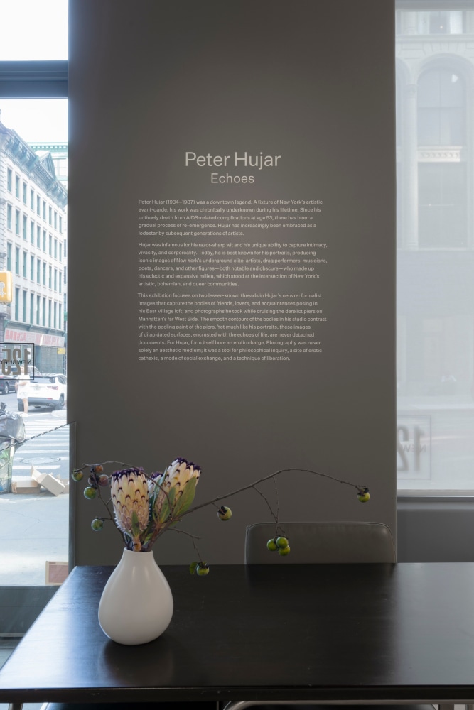
.jpg)
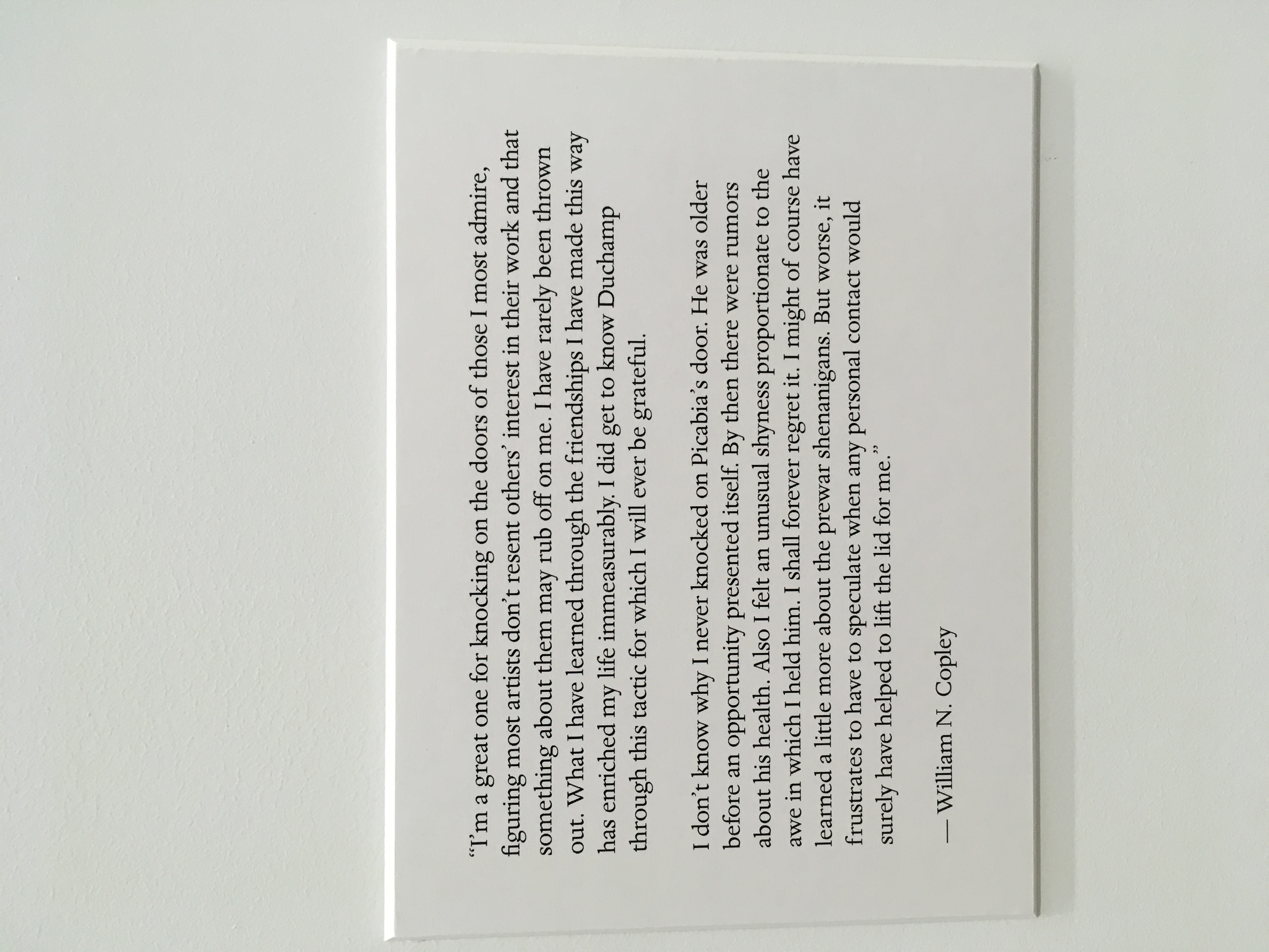